


The Iron Man Logo History, Colors, Font, and Meaning
Every pixel pulses with power. The Iron Man logo is more than just a symbol; it’s a legacy wrapped in red and gold, a beacon of brilliance from the Marvel universe to your screen.
It’s not just fans who recognize that iconic arc reactor design—it’s a master class in branding, echoing the very essence of Tony Stark himself. In this article, you’ll unravel the secrets behind the Iron Man emblem.
Delving into the armor aesthetics and the mind behind Stark Industries, we’ll dissect what makes this superhero emblem resonate beyond the pages of Marvel Comics.
As we explore the design intricacies, the Avengers insignia‘s influence on culture and marketing will come to light.
From T-shirts to towering billboards, understand how an image shapes the identity of a character, morphing from comic book hero logos to an indomitable force in the movie merchandising arena.
Unlock the power behind one of the most recognizable symbols in the pop culture cosmos. The journey ahead is no mere flight of fantasy—it’s a blueprint to iconic movie symbols and the visual identity of characters that stand the test of time.
The Meaning Behind the Iron Man Logo
![]()
There’s a whole world of symbols and signs hidden within logos. Let’s dive into one that’s particularly captivating – the Iron Man logo.
A Symbol of Power
Iron Man, a marvel of technology and human ingenuity, is represented perfectly by his logo. It’s simple, yet bold, mirroring the characteristics of the man (or rather, the suit) it represents.
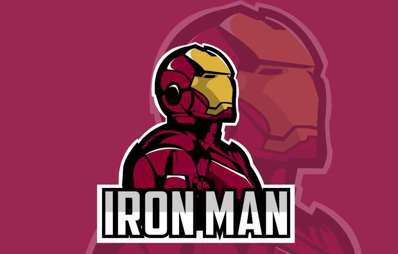
The logo is an outline of Iron Man’s faceplate – the part of the suit that covers Tony Stark’s face. It signifies the transformation of Tony, an ordinary albeit genius billionaire, into a superhero.
Symbol of Transformation
The logo perfectly encapsulates this transformation. It’s a reminder of how technology can empower us, how it can push the boundaries of what is humanly possible. It’s a symbol that resonates with fans around the world, of all ages.
Innovation and Futurism
The sleek lines and sharp angles of the logo are suggestive of innovation and futurism. It’s like a nod towards Tony’s inventive spirit, his constant push for creating better, more advanced tech.
The History of the Iron Man Logo
![]()
Now that we’ve peeled back the layers of the logo’s meaning, let’s take a trip down memory lane to explore its history.
A Logo Born of the Silver Age
The Iron Man logo was born in the Silver Age of Comics, a period of artistic advancement and commercial success for the comic book industry. The logo has seen some tweaks and changes over the years, but the core concept has remained the same.
Evolving with the Times
The logo has evolved, much like the character it represents. From the classic, comic book style to the more streamlined, modern version we see today in the Marvel Cinematic Universe, the logo has always been a faithful reflection of the times.
The Colors of the Iron Man Logo

Colors in logos aren’t chosen randomly. They carry meaning and set the mood for the brand. So, what’s the story behind the colors of the Iron Man logo?
Dominance of Red and Gold
The primary colors used in the Iron Man logo are red and gold. Red signifies power, passion, and action, while gold denotes wealth, success, and high quality. Perfect fit for a billionaire superhero, right?
The Contrast Effect
The strong contrast between the red and gold further emphasizes the power and intensity of the logo. It’s designed to stand out, to make a statement. Just like Iron Man himself.
The Font Used in the Iron Man Logo
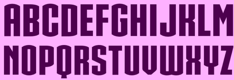
Fonts, much like colors, play a crucial role in logo design. The font in the Iron Man logo deserves a closer look.
Bold and Futuristic
The font used in the Iron Man logo is bold and futuristic. It mirrors the character’s fearless personality and his forward-thinking mindset. It’s as if the font is saying, “Here comes the future, and it’s unstoppable.”
Simplicity is Key
The simplicity of the font makes the logo easily recognizable and memorable. It’s not cluttered or overly complicated. It’s simple, just like the best designs often are.
Impact of the Iron Man Logo in Pop Culture
The Iron Man logo has left an indelible mark in pop culture.
Iconic Status
From comic books to big screen adaptations, the Iron Man logo has become an icon. It’s a symbol recognized by millions around the globe, a testament to the character’s popularity and the enduring appeal of the logo.
Merchandising Powerhouse
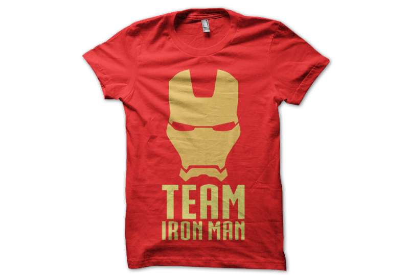
The logo’s simple yet striking design has made it a merchandising powerhouse. From t-shirts to posters, from to collectibles, the Iron Man logo has been plastered on just about anything you can think of. It’s a testament to the logo’s strength and versatility.
The Iron Man Logo in the Digital Age
In this digital age, the Iron Man logo has proven its adaptability and resilience.
Thriving in the Digital Space
The logo has effortlessly made the leap from the physical world to the digital. It’s all over social media, gaming platforms, digital art, and even memes. It’s a digital native, living and thriving in the virtual world.
Augmented and Virtual Reality Adaptations
The logo has also found its way into the realms of augmented and virtual reality. Whether it’s being used in immersive AR games or represented in VR experiences, the logo continues to evolve and adapt to the latest technological advancements.
The Iron Man logo is more than just a simple design. It’s a symbol of power, transformation, and innovation. Its history, colors, and font all add layers of meaning and depth to the logo.
Its impact on pop culture and its adaptability in the digital age are testaments to the logo’s strength and enduring appeal. It’s a logo that truly embodies the spirit of Iron Man.
FAQ On The Iron Man Logo
Who created the Iron Man logo?
The Iron Man logo, a symbol of Tony Stark’s alter ego, was crafted by the creative teams at Marvel Comics. A collaboration of artists, driven by the narrative, sculpted this visual cue that resonates with the essence of the Iron Man suit and its technological marvels.
What does the Iron Man logo represent?
This emblem is Stark Industries’ shining star, capturing the ingenuity behind the man in the metal. It’s a herald of innovation, echoing Tony’s core values—power, protection, and shaping a better future.
Behind the sleek design is a testament to the Arc Reactor’s energy and Iron Man’s prowess.
Why is the Iron Man logo so popular in merchandise?
It’s iconic, plain and simple. The logo’s meld of red and gold seizes attention, igniting a connection with fans worldwide.
It’s splashed across movie merchandise, creating a visual shorthand for courage and cutting-edge tech—a superhero’s stamp in the realm of pop culture memorabilia.
How has the Iron Man logo changed over time?
The logo evolved, staying fresh yet familiar. Early iterations were bulkier, reflecting the comic style of the times. It trimmed and streamlined, paralleling Tony Stark’s advancements in armor.
Today’s logo is sleek, modern—a true reflection of Iron Man’s journey through the Marvel Cinematic Universe.
What impact did the Iron Man films have on the logo’s design?
The films catapulted the logo into a new dimension. Frame by frame, they added depth, shine, and a 3D aspect that screamed blockbuster.
The Avengers insignia shaped a cohesive universe, making the Iron Man logo synonymous with heroism and high stakes on the silver screen.
Are there different versions of the Iron Man logo for various products?
Absolutely. The logo dresses for the occasion—T-shirts sport a casual flair, action figures get a battle-ready badge, and collectibles might flaunt a vintage vibe. There’s a version for every fan, each one spinning the core design to fit the narrative of the product-lined shelves.
Can independent artists use the Iron Man logo on their work?
Tread carefully here. Marvel’s got a tight grip on its IP. The logo is circled by licensing agreements and legal fine print. Creating fan art? Cool. Selling it without permission? Not so cool. Always check the landscape of copyright law.
How does the Iron Man logo influence the perception of the character?
It’s that first hit of recognition, a visual hook that draws you in. When you see that logo, you don’t just see a symbol; you see Tony Stark, the genius, the hero, the Avenger. It influences how we envision the Iron Man story and his place in the Marvel universe.
What elements make up the Iron Man logo?
The central piece is the Arc Reactor, ringed by smooth lines that mimic the armor contours. Color plays a big role—red for power, gold for affluence. It’s a blend of minimalist style and the complexity that is Tony Stark’s high-tech world.
How do designers draw inspiration from the Iron Man logo for other projects?
Designers pluck out that essence—bold but sleek, tech-forward but relatable. Whether cooking up logos for tech startups or crafting icons for digital marketing campaigns, the Iron Man emblem serves as a beacon for modern design that’s as functional as it is aspirational.
Conclusion
So, we’ve flown the circuit, haven’t we? Traced the lines from sketch to screen with the Iron Man logo. It’s a journey through design history, where our emblem emerged not just as Tony Stark’s chest piece, but as a cultural icon—a hybrid of superhero branding and graphic genius.
Here’s your takeaway:
- That arc reactor? More than just a doodle. It’s symbolic, a trademark of perseverance, ingenuity, literally Tony’s beating heart.
- Adaptability, kids. It’s key. This logo morphed over decades, yet never lost its core—a lesson in design longevity.
- Merchandise? Yeah, that’s the logo’s playground, where it flexed its muscles and showed its universal appeal.
We’re talking about a symbol that’s not only plastered on every imaginable product out there but also etches itself in the minds of fans. It’s proof positive that with the right elements—clarity, impact, adaptability—turning a graphic into a legend is entirely possible. Marvel at that!
If you liked this article about the Iron Man logo, you should check out this article about the Batman logo.
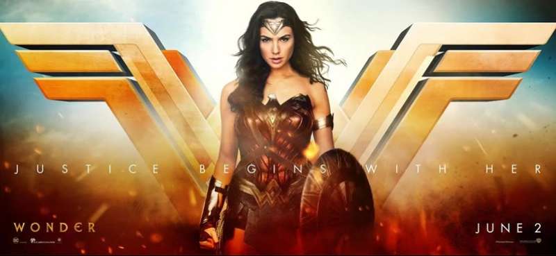
There are also similar articles discussing the Superman logo, the Punisher logo, the Wonder Woman logo, and the Spider-Man logo.
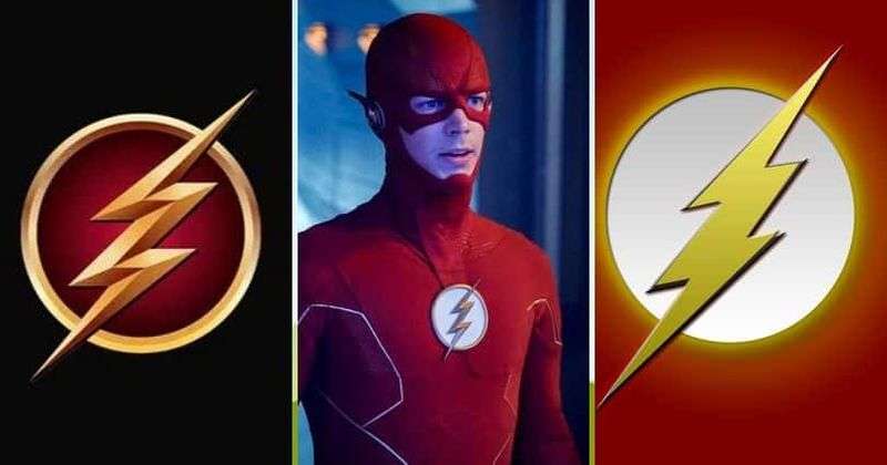
And let’s not forget about articles on the Black Panther logo, the Deadpool logo, the Flash logo, and the Green Lantern logo.
Bogdan Sandu, a seasoned designer with 15 years of diverse experience, has been designing websites since 2008.
Renowned for his expertise in logo design and visual branding, Bogdan has developed a multitude of logos for various clients.
His skills extend to creating posters, vector illustrations, business cards, and brochures. Additionally, Bogdan's UI kits were featured on marketplaces like Visual Hierarchy and UI8.
Latest posts by Bogdan Sandu (see all)
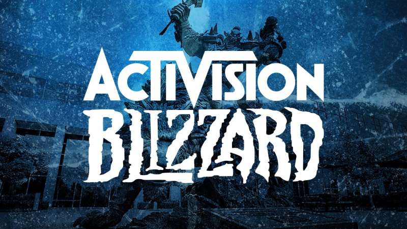
- The Activision Blizzard Logo History, Colors, Font, And Meaning - 29 April 2024
- Rainbow Color Palettes for Joyful Designs - 29 April 2024
- The Bethesda Logo History, Colors, Font, And Meaning - 28 April 2024