The Batman logo stands as one of the most recognized symbols in entertainment history. This bat-shaped emblem represents DC Comics’ iconic vigilante character, first appearing in 1939.
Within the broader landscape of superhero logos, the bat symbol holds a unique position. It helped establish visual branding standards for comic book characters decades before brand identity became a formal discipline.
The current version draws from over 80 years of design iterations. Bob Kane and Bill Finger created the original concept, though countless artists have reinterpreted it since. DC Comics has officially trademarked dozens of variations, each tied to specific eras, films, or comic runs.
What is the Batman Logo?
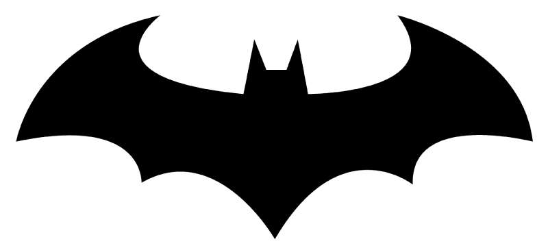
The Batman logo is a stylized bat silhouette enclosed within an oval or shield shape, officially introduced in Detective Comics #27 in May 1939. Created by Bob Kane with Bill Finger, it symbolizes fear, justice, and the character’s transformation from tragedy into purpose.
Design Type: Emblem and icon combination mark
Primary Elements: Bat silhouette with extended wings, optional oval or shield border
Official Introduction Date: May 1939
Original Creator: Bob Kane (artist), Bill Finger (writer, uncredited until 2015)
Trademark Status: Registered trademark of DC Comics, owned by Warner Bros. Discovery
Color Palette: Primary black (#000000) with yellow (#FFF200) accent, though variations exist across media
Usage Context: Comic books, films, television series, video games, merchandise, theme park attractions
How Has the Batman Logo Evolved Over Time?
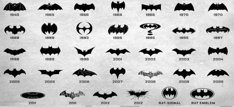
The bat emblem has undergone more than 30 significant redesigns since 1939. Each version reflects its era’s design trends and the character’s tonal shifts.
Early versions featured crude, almost demon-like bat shapes. Modern iterations favor sleek, angular geometry.
Original Batman Logo (1939-1941)
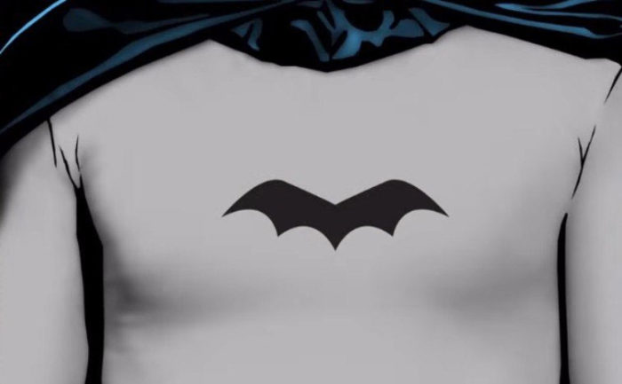
Years Active: 1939-1941
Design Description: Simple black bat shape with pointed ears and scalloped wings, no border or background element
Color Scheme: Solid black on gray costume fabric
Designer: Bob Kane
Context: Created during the Golden Age of Comics when Batman debuted as a darker, more violent character than his peers
Cultural Significance: Established the foundational visual language for the character
Classic Oval Logo (1964-2000)
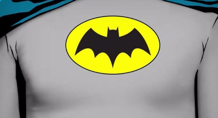
Years Active: 1964-2000
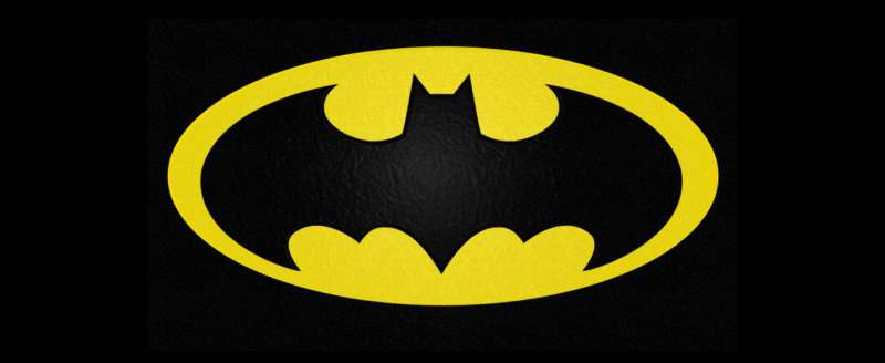
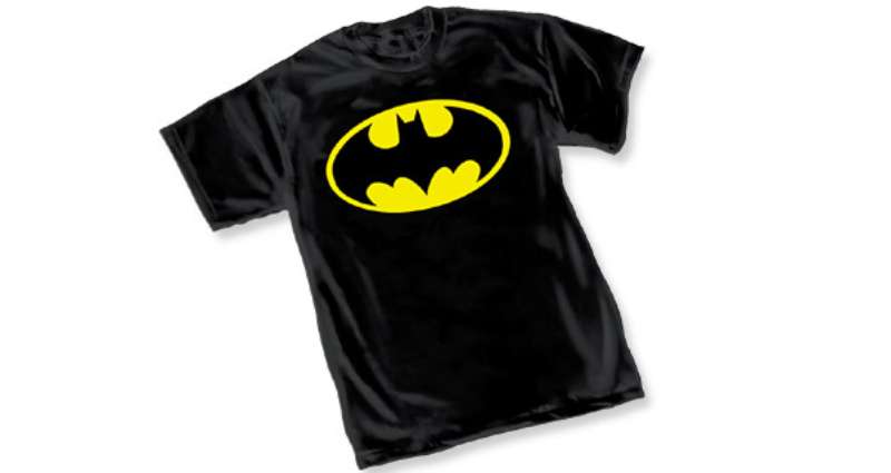
Design Description: Black bat centered within a bright yellow oval, creating strong visual contrast
Color Scheme: Black bat, yellow oval background
Designer: Carmine Infantino (introduced in comics)
Context: Coincided with the 1966 Adam West television series and a lighter, campier tone
Key Changes from Previous: Added the yellow oval background, softened wing edges
Cultural Significance: Became the most commercially recognized version, appearing on decades of merchandise
Tim Burton Film Logo (1989)
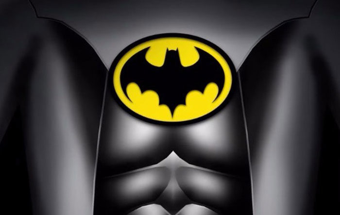
Years Active: 1989-1997 (film franchise)
Design Description: Stylized angular bat within a modified oval, sharper geometry overall
Color Scheme: Black and gold/yellow
Designer: Anton Furst (production designer)
Context: Created for Tim Burton’s darker cinematic reboot starring Michael Keaton
Key Changes from Previous: More aggressive angles, thicker wing structure, gothic influence
Cultural Significance: Redefined Batman’s visual identity for a generation and influenced comic designs
The Dark Knight Logo (2005-2012)
Years Active: 2005-2012
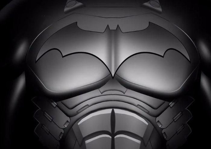
Design Description: Removed the oval entirely, featuring a sharp angular bat silhouette with segmented wings
Color Scheme: Pure black, often rendered with metallic texture
Designer: Created for Christopher Nolan’s trilogy
Context: Matched the grounded, realistic approach of the film series
Key Changes from Previous: Eliminated yellow, embraced minimalist design principles
Cultural Significance: Influenced the broader trend toward darker, more realistic superhero branding
Current DC Logo (2016-Present)
Years Active: 2016-present
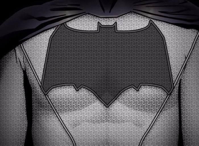
Design Description: Streamlined bat shape used across multiple media properties with slight variations
Color Scheme: Primarily black, adaptable to various color treatments
Context: Unified branding for the DC Extended Universe and beyond
Key Changes from Previous: More versatile, designed for digital applications
What Do the Design Elements of the Batman Logo Mean?
The bat shape carries layered meaning. It represents Bruce Wayne’s childhood fear transformed into a weapon against criminals.
The silhouette suggests nocturnal power and predatory precision. Its wings evoke both protection and threat.
Why Did Batman’s Creators Choose These Specific Colors?
Black dominates the Batman palette for obvious reasons. It connects to night, shadow, and fear.
The hex code #000000 appears in nearly every official version. Color psychology tells us black signals authority, mystery, and power.
Yellow (#FFF200) entered the design in 1964. It created instant visibility and helped the logo pop on comic covers and merchandise.
The complementary color scheme of black and yellow ranks among the highest-contrast pairings possible.
What Typography Style Is Used in the Batman Logo?
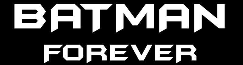
The Batman logo primarily relies on imagery rather than typography. When text appears, it typically uses custom lettering.
The classic “BATMAN” wordmark features bold, angular letterforms. Sharp serifs and thick strokes reinforce the character’s intensity.
Film versions often employ custom typefaces designed specifically for each production.
What Are the Hidden Meanings in the Batman Logo?
The psychology of shapes plays a significant role here. Angular forms suggest aggression and danger.
The bat’s wing span creates horizontal symmetry, implying balance and order within chaos.
Some interpretations see the negative space between wings as suggesting a mouth or cave opening. This wasn’t necessarily intentional but adds visual depth.
How Does the Batman Logo Compare to Competitor Logos?
Among film company logos and franchise emblems, Batman’s bat holds unusual status. It functions both as character identifier and standalone brand mark.
Superman’s “S” shield shares similar recognition but relies more heavily on color and shape combination.
Spider-Man’s spider emblem stays closer to realistic animal representation. Batman abstracts the bat into pure iconography.
Marvel’s Avengers “A” takes a completely different approach with letterform-based design. DC’s approach with Batman prioritizes symbolic imagery.
The bat symbol requires no text to communicate. That’s rare for character branding and speaks to its design effectiveness.
What Are the Technical Specifications of the Batman Logo?
Official Color Codes:
Primary Color: Black Hex: #000000 RGB: (0, 0, 0) CMYK: (0, 0, 0, 100)
Secondary Color: Yellow Hex: #FFF200 RGB: (255, 242, 0) CMYK: (0, 5, 100, 0) Pantone: Yellow C
Dimensions and Proportions:
Aspect ratios vary by version. The oval-enclosed version typically maintains roughly 1.5:1 width-to-height ratio.
Modern vector graphics versions scale infinitely without quality loss.
Clear space requirements generally equal the height of one wing section on all sides.
Minimum reproduction size recommendations ensure the wing details remain visible at small scales.
What Cultural Impact Has the Batman Logo Had?
Few fictional symbols match the Batman logo’s cultural penetration. It appears on clothing, tattoos, street art, and protest signs worldwide.
The bat signal plot device turned the logo into an in-universe icon as well. Gotham City’s citizens recognize it just as real-world audiences do.
It transcends its comic book origins. People who’ve never read a Batman comic recognize that bat shape instantly.
How Does the Batman Logo Fit Into the Overall Brand Identity?
DC Comics maintains strict brand guidelines for Batman imagery. The logo anchors a visual system that extends to typography, color usage, and imagery style.
Warner Bros. treats Batman as a billion-dollar franchise. Every film, game, and product must align with established brand standards.
The logo adapts to different tones. Animated series get playful variations. Gritty films get textured, industrial treatments.
This flexibility within consistency defines strong brand identity management.
How Should the Batman Logo Be Used?
Official Usage Guidelines:
DC Comics and Warner Bros. control all commercial usage. Unauthorized reproduction for profit constitutes trademark infringement.
Fan art exists in a gray area. Personal, non-commercial use typically goes unenforced, but selling Batman logo merchandise without license invites legal action.
Where to Access Official Logos:
Licensed partners receive official assets through Warner Bros. brand portals. Public access to high-resolution official files remains restricted.
Licensing Information:
Commercial licensing requires direct negotiation with Warner Bros. Consumer Products division. Fees vary based on product category, territory, and volume.
Trademark Protection:
The Batman logo holds registered trademark status in most countries. DC actively monitors and enforces against infringement, particularly for commercial products.
FAQ on The Batman Logo
Who Designed the Original Batman Logo?
Bob Kane created the first bat symbol in 1939 for Detective Comics #27.
Bill Finger contributed significantly to Batman’s visual development but received no official credit until 2015.
The original design featured a simple black bat silhouette without any border or background element.
What Does the Batman Logo Symbolize?
The bat emblem represents Bruce Wayne’s transformation of childhood trauma into a weapon against crime.
Bats symbolize fear, darkness, and nocturnal vigilance. The Dark Knight chose this imagery deliberately to intimidate Gotham City criminals.
It functions as both character identifier and psychological tool within the DC Comics universe.
How Many Batman Logo Versions Exist?
Over 30 distinct versions have appeared since 1939. Each film, comic era, and television series typically introduces its own variation.
Tim Burton, Christopher Nolan, and Zack Snyder all commissioned unique designs for their productions.
The logo evolution reflects changing design trends across eight decades.
What Are the Official Batman Logo Colors?
Black and yellow dominate the classic color palette.
The yellow oval version uses hex codes #000000 (black) and #FFF200 (yellow). Modern film versions often drop yellow entirely.
Some adaptations use monochrome colors for a grittier aesthetic.
When Did the Yellow Oval Appear on the Batman Logo?
Carmine Infantino introduced the yellow oval in 1964. It coincided with the lighter tone of the Adam West television era.
This version became the most commercially successful bat symbol design.
It dominated merchandise and print design for nearly four decades.
Why Did Christopher Nolan Change the Batman Logo?
Nolan wanted a realistic, tactical aesthetic for his Dark Knight trilogy. The new design removed the yellow oval completely.
Sharp angles and segmented wings reflected the military-grade equipment approach.
This version influenced how audiences perceive superhero branding today.
Is the Batman Logo Protected by Trademark?
Warner Bros. holds registered trademarks for Batman imagery worldwide. DC Comics actively enforces against unauthorized commercial use.
The bat symbol ranks among the most protected intellectual properties in entertainment.
Infringement cases occur regularly in merchandise markets.
What Font Accompanies the Batman Logo?
No single standard font exists. Most productions create custom lettering specific to their version.
The classic wordmark features bold, angular letterforms with sharp serifs.
Each film franchise typically develops proprietary typography elements matching its visual tone.
Can I Use the Batman Logo Legally?
Personal, non-commercial fan art typically goes unenforced. Selling products featuring the bat symbol without license violates trademark law.
Commercial use requires licensing through Warner Bros. Consumer Products division.
Fees depend on product category, territory, and production volume.
Which Batman Logo Version Is Most Recognized?
The yellow oval version from 1964-2000 holds the highest global recognition. It appeared on decades of merchandise, comic covers, and the iconic television series.
Younger audiences often identify more with Christopher Nolan’s angular black design.
Both versions function as instant brand identifiers across all demographics.
Conclusion
The Batman logo remains a defining achievement in comic book branding. From Bob Kane’s 1939 sketch to Christopher Nolan’s tactical redesign, this bat symbol has adapted while staying instantly recognizable.
Few emblems carry such weight. The Dark Knight’s chest insignia transcends its DC Comics origins.
It works on movie posters, video games, and tattoos alike. Warner Bros. guards it fiercely for good reason.
Whether you prefer the yellow oval or the angular modern silhouette, the caped crusader’s mark speaks without words. That’s the definition of effective logo design.

Renowned for his expertise in logo design and visual branding, Bogdan has developed a multitude of logos for various clients.
His skills extend to creating posters, vector illustrations, business cards, and brochures. Additionally, Bogdan's UI kits were featured on marketplaces like Visual Hierarchy and UI8.
He also wrote in the past years on sites like Design Your Way, WebDesignerDepot, WPDean, Designmodo, Speckyboy, Slider Revolution, and more.
- The Cursor Logo History, Colors, Font, And Meaning - 24 September 2026
- Top 7 Web Design Subscription Services That Replace Full-Time Hires - 24 September 2026
- Canva vs PowerPoint: Which Is Better for Presentations? - 22 September 2026

Bogdan Sandu is a seasoned designer who has been designing websites since 2008. Renowned for his expertise in logo design and visual branding, Bogdan has developed a multitude of logos for various clients. His skills extend to creating posters, vector illustrations, business cards, and brochures. Additionally, Bogdan's UI kits were featured on marketplaces like Visual Hierarchy and UI8. He also wrote in the past years on sites like Design Your Way, WebDesignerDepot, WPDean, Designmodo, Speckyboy, Slider Revolution, and more.
You Might Also Like