


Every word you read right now is shaped by a decision someone made about a font.
Most people use the term loosely, swapping it with “typeface” without a second thought. But understanding what a font actually is, how it differs from a typeface, how it renders on screen, and why it affects everything from readability to brand recognition, changes how you work with type.
This article covers the full picture: font classification, glyph anatomy, file formats, web font loading, licensing, and how fonts are built from scratch.
By the end, you’ll know exactly what a font is and how to make smarter decisions with one.
What Is a Font

A font is a specific file or instance of a typeface at a defined weight, style, and size. Think of it this way: Helvetica is the typeface. Helvetica Neue Bold Italic at 14px is the font.
The word itself comes from the Middle French fondre, meaning “to melt” or “to cast.” That’s a direct reference to how type was physically made: molten metal poured into molds to produce individual letter blocks.
In print, a font was a complete set of metal type pieces in one size and style. One point size change, one new box of metal. Digital tools collapsed that distinction, but the word stuck.
The everyday confusion: most people use “font” and “typeface” interchangeably. Designers will argue about this. Practically speaking, when someone asks you to “change the font,” they almost always mean the typeface family.
A glyph lives inside every font. It’s the individual visual representation of a character. One character can have multiple glyphs: capital A, lowercase a, italic a, and a stylistic alternate are all different glyphs representing the same character.
Monotype’s 2024 Font Use & Forecasting Survey found that 83% of designers acknowledge typography’s role in brand identity. That’s not a surprise to anyone who’s seen a company switch fonts and suddenly look completely different.
Font vs. Typeface: Where the Confusion Comes From

The print industry made the distinction simple: a typeface was the design, a font was the physical object. One drawer of metal type at 12pt Garamond Regular was one font. The whole Garamond family was the typeface.
Digital software quietly blurred this. When Adobe and Apple introduced PostScript in 1985, font files contained the complete typeface design. Suddenly calling a file a “font” felt natural, even if technically it described the entire family.
Today’s working definition:
- Typeface: the design system (Inter, Roboto, Georgia)
- Font: a specific instance within that system (Inter Bold 16px, Roboto Light Italic)
- Font family: all the weights and styles grouped together
Google Fonts labels things as “fonts” in its interface but lists what are technically typeface families. Adobe Fonts does the same. Microsoft’s documentation uses both terms in ways that don’t always agree with each other.
For most practical purposes, the distinction matters most to type designers and print professionals. If you’re doing typography for screens, “font” covers both concepts well enough.
How Fonts Are Classified
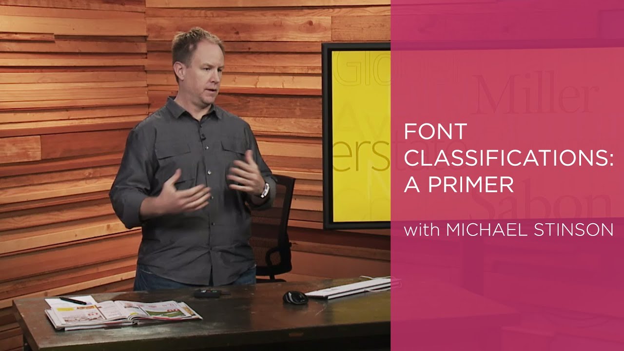
Font classification started getting formal in 1954 when Maximilien Vox developed a system dividing typefaces into nine categories. The current standard used internationally is a simplified version of that, built around five core groups.
Around 70% of Fortune 500 companies use sans-serif fonts in their logos, according to Linearity’s font research. That number tells you a lot about where legibility priorities have landed in the last two decades.
Serif Fonts
Serif fonts carry small strokes, or “feet,” at the ends of letterforms. They’ve been the standard for printed body text for centuries, and roughly 70% of print newspapers still use them for readability (Linearity, 2023).
Times New Roman, Garamond, and Georgia are the familiar names. Garamond dates to the 1540s and remains in active use.
- High stroke contrast between thick and thin parts
- Strong for long-form reading in print
- Signals tradition, authority, credibility
The New York Times uses a custom serif for its body copy specifically because the stroke detail reads well at small sizes on newsprint.
Sans-Serif Fonts
No stroke terminals. Clean endings. This makes them perform well at small sizes on screens where rendering resolution limits fine detail.
Monotype’s 2024 survey: 76% of designers prioritize readability and accessibility when choosing fonts, and sans-serif consistently wins that evaluation for digital interfaces.
- Helvetica, Arial, Inter, Roboto are the core examples
- Google Web Fonts data shows Open Sans leads on professional websites including legal sites
- Low stroke contrast makes them reliable across different rendering environments
- Dominant choice for UI design, app interfaces, and signage
Google’s own interface uses a custom version of Google Sans, built on the same geometric sans-serif principles as Product Sans.
Monospace Fonts
Every character takes up the same horizontal width. That sounds like a limitation. For code, it’s a feature.
Why it matters for developers: monospace makes code scannable because columns align. Indentation becomes visually reliable. Errors stand out.
- Courier, Courier New, Monaco, JetBrains Mono, Fira Code
- Standard in terminal emulators, code editors, and tabular data displays
- Over 90% of user manuals use simple sans-serif or monospace fonts for clarity (Linearity, 2023)
Display and Decorative Fonts
Built for one job: making an impression at large sizes. These fonts break legibility at small sizes on purpose. They’re optimized for headlines, posters, and short runs of text.
Hawaii shows 23.5% of users favoring decorative fonts in design tools, the highest rate of any U.S. state, per Venngage’s platform analysis. Tourism and hospitality brands drive that heavily.
- Impact, Bebas Neue, Playfair Display
- Never use them for body text
- Strong pairing rule: pair a display font with a neutral sans-serif for body copy
Script and Handwritten Fonts
Script fonts simulate handwriting or calligraphy. The range is wide: formal scripts like Edwardian Script, casual brush scripts like Pacifico, and rough handwritten styles like Caveat.
Nevada leads U.S. states in script font usage at 10.34% of users (Venngage, 2024). Makes sense given the entertainment and events industry there.
Avoid using script fonts in all-caps. The letterforms are designed to flow together in mixed case and all-caps breaks that rhythm badly.
The Anatomy of a Font

Every letterform is built from a shared set of structural parts. Knowing these terms matters when you’re adjusting type or communicating with a type designer about what’s wrong with a layout.
| Term | What It Is | Why It Matters |
|---|---|---|
| Baseline | The line letters sit on | Anchor point for vertical alignment |
| X-height | Height of lowercase “x” | Determines perceived size and readability |
| Ascender | Stroke rising above x-height | Affects line spacing needs |
| Descender | Stroke dropping below baseline | Determines minimum line height |
| Cap height | Height of uppercase letters | Used for optical size matching in font pairing |
A high baseline-relative x-height makes text look larger at the same point size. Inter, for example, has a noticeably high x-height compared to Garamond, which is one reason it performs so well at small UI sizes.
Spacing Terms
Kerning: the space between specific pairs of letters. “AV” is a classic kerning problem. Without a kern pair adjustment, those two letters look too far apart.
Tracking: uniform spacing applied across a whole word or block of text. Different from kerning. Tracking affects everything equally; kerning targets individual pairs.
Leading: the vertical space between lines of text. Named after the physical lead strips that typesetters once placed between rows of metal type. Tight leading on long paragraphs is one of the fastest ways to make text feel uncomfortable to read.
A 2013 study found that fonts harder to read, like Monotype Corsiva, improved comprehension scores by 12.8% compared to simpler fonts like Arial. Cognitive load, it turns out, isn’t always the enemy of retention.
Font File Formats
A font on a computer is a file. The format of that file determines where and how it can be used. Using the wrong format in the wrong context is a real problem: print jobs have failed over it, websites have fallen back to system fonts over it.
| Format | Full Name | Best Use | Status |
|---|---|---|---|
| TTF | TrueType Font | Desktop, some web | Widely supported, older standard |
| OTF | OpenType Font | Desktop, print | Current standard for desktop use |
| WOFF2 | Web Open Font Format 2 | Web only | Current web standard |
| EOT | Embedded OpenType | Internet Explorer | Dead format, ignore it |
WOFF2 is the clear winner for web. According to the HTTP Archive’s 2024 Web Almanac, WOFF2 is used on 81% of desktop and 78% of mobile websites, up three percentage points since 2022. Its compression makes it significantly smaller than TTF or OTF files.
For desktop applications and print, OTF is the better pick. The OpenType vs TrueType distinction matters mostly to type designers editing the files. For end users, OTF supports more advanced typographic features like ligatures, alternate glyphs, and small caps through OpenType features. TTF does not.
Where Font Files Live
On macOS, system fonts sit in /System/Library/Fonts/. User-installed fonts go into ~/Library/Fonts/.
On Windows, font files live in C:WindowsFonts. Installing a font system-wide vs. per-user is an actual distinction with permissions implications.
Web fonts don’t install to the OS. Browsers download them into a temporary cache during page load, use them for rendering, then clear them. This is why a font that looks great in a PDF may not be available in a browser without a separate web-specific license.
In 2023, the most popular font formats purchased digitally were TrueType and OpenType, together accounting for 90% of all digital font purchases (WhatFontIs, 2023).
How Fonts Are Rendered

A font file stores letterforms as mathematical vector outlines, not as images. When you type a letter, the OS or browser takes that outline, figures out which pixels on your screen it covers, and draws it. That process is called rasterization.
It sounds simple. It’s not.
Rasterization and Hinting
The core problem: screens have a fixed pixel grid, and font outlines don’t align to it perfectly. A vertical stroke might fall exactly between two pixel columns. Without intervention, it renders as two thin gray columns instead of one solid dark line.
Hinting is the solution. It’s a set of instructions baked into the font file that tells the rasterizer how to adjust letterforms to fit the pixel grid cleanly. Good hinting makes a font look sharp and intentional. Bad hinting, or no hinting, causes strokes to look uneven at small sizes.
TrueType fonts use explicit hinting instructions. PostScript fonts take a different approach, using a smarter rasterizer to interpret abstract positioning information instead.
How macOS and Windows Render Differently
This is where it gets interesting. The two major operating systems have philosophically different approaches to rendering text, and they produce visibly different results.
Windows (ClearType / DirectWrite): forces glyph outlines to align to pixel grid positions. The result is sharp, high-contrast text that prioritizes readability over fidelity to the original design.
macOS (Quartz): uses subpixel positioning and doesn’t force glyphs to the grid. Text looks closer to how it would appear in print, but can appear slightly softer at low resolutions.
Since macOS Mojave (2018), Apple removed subpixel antialiasing by default, relying on greyscale antialiasing instead. On Retina displays this works fine. On external 1080p monitors, some developers notice fonts look softer than they did before.
Google Chrome uses its own rendering path via the Skia Graphics Engine, which sometimes produces results that differ from both the OS defaults, particularly on Windows where it can bypass GDI entirely.
What This Means for Web Design
A font that looks crisp on your MacBook Retina display may look noticeably different on a Windows machine at 1080p. This is not a fixable problem. It’s a fundamental difference in rendering philosophy between the two platforms.
The practical approach: test web typography on both platforms, especially at small sizes. And understand that font spacing decisions that look right on one OS may need adjustment when viewed on the other.
Web Fonts and How They Load

Web fonts don’t come pre-installed. Every time a visitor loads a page, the browser reads the CSS, finds the @font-face rule, identifies which fonts are needed, then goes and fetches them. That fetch takes time, and what happens during that wait is what separates a smooth experience from a broken one.
Web font usage has been climbing steadily since 2010. By 2024, 87% of websites were using web fonts in some form, according to the HTTP Archive Web Almanac.
Where Web Fonts Come From
Self-hosting: font files live on your own server, giving full control over caching, compression, and loading behavior.
Google Fonts: free, CDN-hosted, requires an external connection on each page load. Used on over 50 million websites globally (Linearity, 2023).
Adobe Fonts: subscription-based via Creative Cloud, with a growing library and reliable uptime.
Self-hosting has been gaining ground. The HTTP Archive 2024 data shows 28% of sites use only self-hosted fonts, up noticeably from prior years, as developers look for fewer external dependencies.
FOUT and FOIT: The Two Loading Problems
These are the two ways web font loading can go visibly wrong.
FOIT (Flash of Invisible Text): the browser hides all text until the custom font downloads. On slow connections, this means a blank page where content should be. Chrome, Firefox, and Opera enforce a 3-second timeout before showing a fallback.
FOUT (Flash of Unstyled Text): text renders immediately in a system fallback font, then switches to the custom font when it arrives. Less severe, but it causes a visible layout jump that can shift content under the reader’s cursor.
Most developers today prefer FOUT over FOIT. Invisible text is worse than unstyled text.
The font-display Property
CSS gives you direct control over this behavior with font-display. Each value represents a different trade-off.
| Value | Behavior | Best For |
|---|---|---|
| swap | Show fallback immediately, swap when ready | Body text, long-form content |
| fallback | ~100ms block, then fallback stays if font is slow | Balance of aesthetics and speed |
| optional | Uses font only if it loads near-instantly | Nice-to-have fonts on slow networks |
| block | ~3-second invisible wait, then swap | Display fonts, logos only |
font-display: swap or font-display: fallback are the practical defaults for most projects. optional is underused but genuinely smart for body text when performance is the priority.
Only 12% of desktop sites use font preloading, according to the HTTP Archive 2024 Performance chapter. That’s a missed optimization for the majority of sites loading custom fonts.
The BBC switched from Google Fonts to self-hosted fonts partly to reduce third-party dependencies and improve loading consistency across global markets.
Font Licensing

A font file is software. It ships with a license that controls where and how it can be used. Most designers know this in theory and ignore it in practice until something goes wrong.
Font piracy is a real problem in the industry, with an estimated 90% of all fonts downloaded illegally at some point (WhatFontIs, 2023). That doesn’t mean it’s safe. Type foundries have pursued legal action, and embedding an unlicensed font in a PDF or app can constitute infringement.
License Types
The same typeface often requires a separate license for each context of use. Buying a desktop license doesn’t cover web use, and a web license doesn’t cover embedding in an app.
- Desktop license: install on a computer, use in InDesign, Illustrator, Word. Priced per workstation.
- Web license: host on a server, serve via
@font-face. Priced per domain or monthly pageviews/visitors. - App license: embed in iOS or Android apps. Priced per app or per title.
- ePub/broadcast license: for digital publications and video use. Separate from all of the above.
An agency serving ten client websites from one web license is almost certainly violating the terms. Most foundries price per domain precisely to prevent this.
Free and Open-Source Fonts
The SIL Open Font License (OFL) is the standard open-source license for type. Fonts released under it can be used, modified, and redistributed freely, with one restriction: modified versions can’t be sold under the original name.
Google Fonts is built almost entirely on OFL-licensed fonts. That’s why they’re genuinely free for commercial use, web, print, and apps, without any pageview limits or per-domain fees.
30% of brands commission custom bespoke fonts today (WhatFontIs, 2023). Custom fonts sidestep licensing complexity entirely since the brand owns the design outright, though the cost of commissioning a full type family can run into the tens of thousands.
Small businesses spend an average of $300 annually on font licensing (Linearity, 2023). That’s a real budget line for studios and solo designers working across multiple client projects simultaneously.
How Fonts Are Created

Building a font is part illustration, part software engineering, part obsessive precision. A complete type family with multiple weights, widths, and styles can take a professional type designer years to finish.
The process starts on paper. Most experienced type designers still sketch key letters by hand before digitizing anything, particularly the lowercase “n,” “o,” and “a,” which define the character set’s rhythm and personality.
Tools Used in Type Design
Glyphs App is the industry standard on macOS. TypeType studio, one of the larger commercial type foundries, uses it as their primary tool, with prior work done in FontLab.
The main tools each serve a different audience:
- Glyphs 3: macOS only, professional standard, strong variable font support
- FontLab: cross-platform, deep OpenType feature control, used in major foundries
- RoboFont: highly scriptable, preferred by engineers who want to automate production
- FontForge: free and open-source, steep learning curve, but capable
The Design Process
TypeType’s documented process covers six core stages: concept and sketching, digitizing outlines, spacing and sidebearings, kerning, hinting, and final export testing.
Spacing and kerning alone can take weeks on a complete family. The goal is for every letter combination to feel optically even, not mathematically even. Those are different things, and the difference is what separates usable fonts from beautiful ones.
Variable fonts add another layer of complexity. Instead of designing separate files for each weight, a designer creates multiple “masters” at extreme ends of an axis (say, Thin and Black), and the font interpolates everything in between. The resulting single file contains the whole spectrum. Variable fonts are now used on 33% of desktop websites as of 2024, up from just 1.8% in 2019 (HTTP Archive Web Almanac).
What It Actually Takes
A simple display font with basic Latin support can be built in days. A complete text family with multiple weights, italics, small caps, OpenType alternates, and extended language support takes one to three years of full-time work.
That context explains font pricing. A $200 license for a well-crafted typeface is cheap relative to the labor behind it.
System Fonts vs. Custom Fonts

Every device ships with fonts already installed. Using those fonts in a design costs nothing, loads instantly, and renders consistently across every user’s screen. The trade-off is predictability: your site looks like every other site using the same stack.
Custom fonts let you break from that. They add personality, reinforce brand identity, and can meaningfully improve readability when chosen well. They also add HTTP requests, introduce loading complexity, and require ongoing licensing management.
What’s Available by Default
The system font landscape has shifted significantly. As of 2025, Android holds 46% of global OS market share, Windows 25%, and iOS 18% (GitHub/dcog989 OS data). The default system fonts across these platforms don’t overlap much.
| Platform | Default UI Font | Category |
|---|---|---|
| macOS / iOS | San Francisco | Neo-grotesque sans-serif |
| Windows | Segoe UI | Humanist sans-serif |
| Android | Roboto | Grotesque sans-serif |
None of these are available by name in browser CSS. San Francisco, for example, is accessed via the -apple-system or system-ui CSS keywords, not by font name. Segoe UI and Roboto can be named directly, but only render correctly on their respective platforms.
The System Font Stack Approach
The standard CSS system font stack chains these together so each platform picks its own best option:
font-family: system-ui, -apple-system, BlinkMacSystemFont, "Segoe UI", Roboto, "Helvetica Neue", sans-serif;
GitHub switched to this approach in 2017 and saw significant page load improvements from eliminating custom font requests entirely. Their interface font went from a network request to an instant OS-level render. The visual difference was minimal. The performance difference was real.
When Custom Fonts Are Worth It
Custom fonts make a measurable difference in brand recognition. Consistent use of a specific font can increase brand recognition by up to 80% (Linearity, 2023). That’s a strong argument for marketing sites, product landing pages, and anywhere brand typography carries weight.
For long-form reading interfaces, documentation sites, or any context where performance matters more than brand expression, system fonts are the better call.
The honest answer: most sites would do fine with a system font stack. The ones that genuinely need a custom font know it before they start designing.
FAQ on What Is A Font
What is a font?
A font is a specific instance of a typeface at a defined weight, style, and size. Helvetica is a typeface. Helvetica Bold Italic 14px is a font. The word comes from the French fondre, meaning to cast or melt metal.
What is the difference between a font and a typeface?
A typeface is the design system, like Garamond or Roboto. A font is one specific variant within that system. Most people use both terms interchangeably, and in everyday conversation that’s fine.
What are the main types of fonts?
The five core categories are serif, sans-serif, monospace, display, and script. Each serves a different purpose. Serifs suit print body text. Sans-serifs dominate screens. Monospace is standard in code editors.
What is a glyph in typography?
A glyph is the visual representation of a character. One character can have multiple glyphs: uppercase A, lowercase a, italic a, and stylistic alternates are all distinct glyphs representing the same letter.
What font file formats exist?
WOFF2 is the current web standard, used on 81% of websites. OTF and TTF are standard for desktop and print. EOT is a legacy Internet Explorer format no one uses anymore.
What is font rendering?
Font rendering is the process of converting vector outlines into pixels on screen. It involves rasterization and hinting. macOS and Windows handle this differently, which is why the same font can look noticeably different across platforms.
What is a variable font?
A variable font stores multiple weights and styles in a single file using interpolation between masters. One file replaces an entire family. They’re now used on 33% of desktop websites, up from under 2% in 2019.
What is font licensing?
Font licensing defines where and how a font can legally be used. Desktop, web, app, and broadcast uses each require separate licenses. Using a desktop font on a website without a web license is a common and genuine legal risk.
What is a system font?
A system font is pre-installed on a device’s operating system. macOS uses San Francisco, Windows uses Segoe UI, Android uses Roboto. System fonts load instantly and require no licensing, making them a strong performance choice.
What is the x-height of a font?
X-height is the height of lowercase letters relative to the baseline, measured using the letter “x.” A high x-height makes text appear larger at the same point size, which is why Inter looks bigger than Garamond at identical sizes.
Conclusion
This conclusion is for an article presenting what is a font in full technical and practical detail, from metal type origins to modern variable font files serving a third of the web.
Font classification, file formats, rendering engines, web loading behavior, licensing structures, and the design process all connect back to one thing: how text reaches a reader.
Every choice matters. The difference between WOFF2 and TTF affects load time. The difference between font-display: swap and block affects whether your reader sees content or a blank screen.
Serif or sans-serif, system stack or custom typeface, OFL or commercial license. These aren’t abstract decisions. They shape readability, performance, and legal compliance in equal measure.
Now you have the full picture.

Renowned for his expertise in logo design and visual branding, Bogdan has developed a multitude of logos for various clients.
His skills extend to creating posters, vector illustrations, business cards, and brochures. Additionally, Bogdan's UI kits were featured on marketplaces like Visual Hierarchy and UI8.
He also wrote in the past years on sites like Design Your Way, WebDesignerDepot, WPDean, Designmodo, Speckyboy, Slider Revolution, and more.
- Canva vs PowerPoint: Which Is Better for Presentations? - 22 September 2026
- How to Install Fonts on Mac (Step-by-Step Guide) - 20 September 2026
- From Mockup to Code: How AI-Augmented Development Speeds Up the Design Handoff - 19 September 2026

Bogdan Sandu is a seasoned designer who has been designing websites since 2008. Renowned for his expertise in logo design and visual branding, Bogdan has developed a multitude of logos for various clients. His skills extend to creating posters, vector illustrations, business cards, and brochures. Additionally, Bogdan's UI kits were featured on marketplaces like Visual Hierarchy and UI8. He also wrote in the past years on sites like Design Your Way, WebDesignerDepot, WPDean, Designmodo, Speckyboy, Slider Revolution, and more.
You Might Also Like


