


Every line of text you’ve ever read sits on a baseline. You just never noticed it, and that’s exactly the point.
Understanding what a baseline is in graphic design changes how you approach text alignment, vertical spacing, and layout consistency. It’s the invisible horizontal line where most letters rest, and it affects everything from body copy in a magazine spread to button labels in a mobile app.
This article covers how the baseline works in typography, how it connects to baseline grids, where it shows up in tools like InDesign and Figma, and what happens when you get it wrong. Whether you’re working in print or on screen, the baseline is where good type starts.
What Is a Baseline in Graphic Design

A baseline is the invisible horizontal line where the bottom of most letters in a typeface sits. Every character you read right now rests on one. And you’ve never noticed it, which is kind of the point.
Think of it like ruled notebook paper. The letters “a,” “e,” “x,” and “m” all plant themselves on that line. Uppercase letters like “H” and “T” do the same. But descenders on letters like “g,” “p,” and “y” hang below it, which is why those characters look like they’re dipping down.
The concept dates back to metal typesetting. When printers arranged individual letter blocks side by side, each block had a fixed reference point at the bottom. That reference point was the baseline. The letters didn’t float or drift because the physical blocks forced them into alignment.
Digital tools carry over the same principle. Adobe InDesign, Figma, and Illustrator all use the baseline as the anchor for text positioning. Figma alone has over 10 million monthly active users as of 2025 (Contrary Research), and every one of them interacts with baselines the moment they place a text layer on the canvas.
The baseline sits at the foundation of typography. Without it, text would have no consistent reference for vertical positioning, and everything from body copy to headlines would look randomly placed.
Why the Baseline Matters for Typography

The baseline controls whether your text looks intentional or sloppy. That’s it. Every other reason branches from this one.
When text aligns to a consistent baseline, readers move through lines without friction. Their eyes pick up a predictable rhythm, and the content feels organized even if they can’t explain why. Research from Rello, Pielot, and Marcos found that proper text spacing and alignment can improve reading comprehension continuously up to a font size of 18 points.
Readability drops fast without baseline consistency. Mix two different line spacing values in the same layout, and the text drifts vertically. Columns stop lining up. Captions float in odd positions relative to body copy. The whole page starts looking like nobody reviewed it before it shipped.
The zeroheight Design Systems Report 2025 found that 79% of teams now have a dedicated design systems team, up from 72% in 2024. A big part of what those teams standardize is spacing, and spacing starts with the baseline. When everyone on the team follows the same baseline rules, components stay vertically aligned across every screen and every page.
Baseline and Visual Hierarchy
The baseline doesn’t just keep things neat. It gives you a framework for building visual hierarchy in text-heavy layouts.
Headings, subheadings, and body text all sit on the same baseline reference system. The size changes, the weight changes, but the vertical anchor stays put. That’s what makes a typographic hierarchy feel structured instead of arbitrary.
Skip the baseline, and mixed font sizes in the same layout will look misaligned even when they technically aren’t.
Baseline vs. Other Typographic Lines
The baseline is one of five horizontal reference lines used in typography. Confusing them is easy if you’ve never seen them side by side.
| Line | What It Marks | Example |
|---|---|---|
| Baseline | Where most letters sit | Bottom of “a,” “e,” “H” |
| Cap height | Top of uppercase letters | Top of “T,” “B,” “M” |
| X-height | Top of lowercase letters | Top of “a,” “x,” “o” |
| Ascender line | Top of tall lowercase letters | Top of “b,” “d,” “h” |
| Descender line | Bottom of hanging letters | Bottom of “g,” “p,” “y” |
The baseline acts as the anchor. Every other line is measured relative to it. Cap height is the distance from the baseline to the top of “H.” The x-height is the distance from the baseline to the top of “x.”
How X-Height Relates to the Baseline
X-height is measured directly from the baseline upward. A font with a tall x-height relative to its cap height tends to feel more legible at smaller sizes. Fonts like Verdana and Roboto were designed this way on purpose.
A 2024 study published in Education Sciences tested eight fonts across 51 students and found that passages in Roboto and Arial were read significantly faster than other fonts. Both have relatively tall x-heights, which keeps lowercase text visually prominent even at compact sizes.
When you pair two fonts with different x-heights, the text on a shared baseline can look misaligned even though both technically sit on the same line. That visual mismatch is one of the trickiest parts of pairing fonts.
Baseline Grids in Layout Design

A baseline grid takes the concept of a single baseline and repeats it across the entire page at equal intervals. Every line of text, every heading, every caption snaps to one of those lines.
The spacing between the lines matches the leading of the body text. If your body copy uses 12pt type with 16pt leading, your baseline grid increments are 16pt apart. All text, regardless of size, locks to one of those gridlines.
How Baseline Grids Work in Practice
Print editorial design is where baseline grids have the longest history. Magazines, newspapers, and books rely on them to keep multi-column text aligned horizontally. When you open a well-designed magazine spread and the body text across two columns lines up perfectly, that’s the baseline grid doing its job.
Google’s Material Design uses an 8dp component grid with a 4dp baseline grid specifically for typography. IBM Carbon follows a similar approach with a 2x Grid system using an 8px mini unit. Both systems derive their line heights and spacing from that base unit.
The zeroheight report shows design token usage jumped from 56% in 2024 to 84% in 2025. Spacing tokens are where the baseline grid meets actual code. Instead of a developer guessing margins, they pull a named token that’s already a multiple of the base unit.
Vertical Rhythm and the Baseline Grid
Vertical rhythm is the pattern you get when every element on the page follows the baseline grid. Text, images, buttons, whitespace. All of it measured in multiples of the base unit.
The result looks harmonious in a way that’s hard to describe but obvious when it’s missing. It’s the difference between a layout that feels “right” and one that feels like components were just dropped onto the page.
Headspace reported 20-30% time savings on standard tasks and up to 50% on complex projects after implementing spacing tokens and variables in their design system (Figma). A big part of those savings came from not second-guessing vertical spacing decisions.
How to Use Baselines in Web and Digital Design
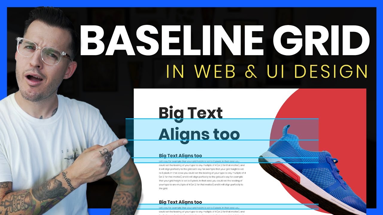
Baselines in web design are trickier than in print. Browsers don’t natively support baseline grids the way InDesign does. You have to build it yourself, or at least approximate it.
The CSS line-height property is the closest thing to a baseline control on the web. Set your body text’s line-height to a value like 24px, and then make every other spacing value (margins, padding, gaps) a multiple of 24. That creates a consistent vertical rhythm.
CSS Baseline Alignment in 2024 and Beyond
Two lines of CSS can now handle baseline alignment. Jake Giltsoff wrote in 2024 about how the new CSS cap unit and calc() can push text down to the baseline without Sass or JavaScript. That’s a big change from the workarounds designers relied on for over 15 years.
The formula looks something like this:
padding-top: calc((2rem - 1cap) / 2);
It automatically accounts for the cap height of whatever font you’re using, so there’s no need to manually enter font metrics.
Figma vs. InDesign for Baseline Work
| Feature | Adobe InDesign | Figma |
|---|---|---|
| Baseline grid | Built-in, full control | Layout grid option |
| Snap to grid | Native paragraph setting | Manual alignment |
| Multi-column alignment | Strong, automatic | Requires workarounds |
| Best for | Print design | Screen and UI design |
InDesign’s baseline grid support is still the strongest in the industry. You set the increment, hit “Align to Baseline Grid” in the paragraph panel, and the text snaps. Done.
Figma’s approach is less rigid. You create a layout grid with horizontal rows set to your baseline increment, but the text doesn’t auto-snap. You align manually. With 90% of designers choosing Figma as their primary UI tool (UX Tools 2023 survey), that gap in baseline support is something a lot of people work around daily.
Tailwind CSS uses padding and spacing as multiples of 4 (1rem = 16px), which maps cleanly to a 4px baseline grid. That alignment between design tool and code framework reduces the friction between handoff and production.
Baseline Alignment Across Multiple Columns

Multi-column layouts break without baseline alignment. It’s that simple.
When you have two or three columns of body text side by side, the lines in each column need to match horizontally. If column one has a 24px line-height and column two has a 22px line-height, the text will drift apart as you read down the page. By the bottom, the misalignment is visible to anyone.
Print Approach
InDesign handles this automatically once you set up a baseline grid and enable “Align to Baseline Grid” on your paragraph styles. Every column locks to the same horizontal gridlines. Headings, pull quotes, captions, everything stays on the same vertical balance system.
Studies referenced by Creative Cow show that 8-10 words per line is the most legible range for printed documents. A 4-column layout in InDesign typically hits that range while keeping all columns locked to the baseline grid.
Web Approach
On the web, you maintain multi-column baseline alignment by keeping every line-height and margin value divisible by your base unit.
If your base unit is 8px, your body text line-height should be 24px (a multiple of 8). Margins between paragraphs should be 16px or 24px. Headings should use line-heights like 32px or 40px.
Common mistakes that break column alignment:
- Using unrelated line-height values across different text elements
- Adding image spacing between text blocks that isn’t a multiple of the base unit
- Ignoring caption and footnote line-heights (they need to follow the grid too)
The grid systems used in editorial and web layouts both depend on baseline alignment to hold multi-column content together. Without that shared reference, the layout quietly falls apart.
Baseline Shift and When to Use It

Baseline shift moves individual characters or inline elements up or down from their default baseline position. It’s a targeted override, not a global setting.
You’ll run into it most often when placing trademark symbols, superscripts, subscripts, or custom logo type. The standard baseline doesn’t always put these elements where they look right, so you nudge them manually.
Where Baseline Shift Gets Used
Trademark and registration symbols are the most common trigger. The default position of ® and ™ rarely lines up cleanly next to body text, especially at larger sizes.
In InDesign and Illustrator, baseline shift is a simple numeric field in the character panel. Bump it up by a few points, and the symbol lifts into position.
Figma, as of 2025, still doesn’t have native baseline shift. Designers on the Figma forum have been requesting this feature since 2018. The workaround is to create a separate text layer and align it manually, which is tedious when you’re doing it across an entire prototype.
When Baseline Shift Creates Problems
Overusing baseline shift breaks the vertical rhythm of your layout. Every character you manually reposition is a character that no longer sits on the baseline grid.
Accessibility is the bigger concern. Screen readers process text in reading order. If you use baseline shift to rearrange visual positioning without updating the underlying text structure, the reading order stays unchanged, and users with assistive technology get a different experience.
WebAIM’s 2025 Million analysis found that 94.8% of homepages still had at least one detectable WCAG failure. Low-contrast text affected 79.1% of pages. Baseline shift won’t trigger those specific errors, but careless typographic overrides add to the pile of accessibility problems that already plague most sites.
Common Baseline Mistakes in Graphic Design
Most baseline problems come from the same handful of mistakes. They’re easy to fix once you know what to look for.
No Baseline Grid at All
This is the most frequent issue. Designers set font sizes and line heights on a per-element basis, winging vertical spacing by eye.
The result looks fine on one screen. Then you add a second column. Or a sidebar. Or a caption block. And the text drifts apart because nothing shares a common vertical reference.
Teams with a design system catch this faster. The zeroheight 2025 report found that 79% of teams now have a dedicated design systems team, and spacing consistency is one of the first things those teams standardize.
Inconsistent Leading Values
Mixed line-height values are a grid killer. If your body text uses 24px line spacing but your captions use 18px, those two elements will never vertically align across adjacent columns.
The fix: pick a base unit (4px or 8px) and make every line-height value a multiple of it. Headings, body text, captions, footnotes. All of them.
Ignoring Non-Body Elements
| Commonly Overlooked | Why It Matters |
|---|---|
| Captions | Float between images and body text |
| Pull quotes | Break column alignment if not on grid |
| Footnotes | Accumulate spacing errors at page bottom |
| Button labels | Drift in UI layouts without baseline snap |
Designers often lock body text to the baseline grid and forget everything else. Captions, pull quotes, and footnotes need to follow the same vertical system, or the layout breaks around them.
Fonts and How They Sit on the Baseline

Not all fonts behave the same way on the baseline. This is where type design gets a bit tricky.
Flat-bottomed letters like “H,” “x,” and “T” sit cleanly on the baseline. Rounded letters like “O,” “C,” and “e” don’t. They extend slightly below (and above) it, by about 1% to 3% of the cap or x-height, according to Peter Karow’s Digital Typefaces.
This is called overshoot. Wikipedia’s entry on baseline typography confirms that glyphs with rounded lower and upper extents dip below the baseline to create the optical illusion that they sit on it.
Why Overshoot Exists
Without overshoot, curved letters look smaller than flat letters even when they’re technically the same height. The human eye reads curves as slightly receding. Type designers compensate by pushing rounded characters just past the boundary.
Google’s logo is a good example. The “g” and “o” extend slightly beyond the same line where the “l” sits, but you’d never notice unless you measured it.
Font Pairing and Baseline Mismatch
Two fonts can share the same point size and still look misaligned on the same baseline. This happens when their vertical metrics (cap height, x-height, ascender proportions) don’t match.
Quick test before committing to a font pair: set both fonts at the same size on the same line. If the lowercase letters look like they’re sitting at slightly different heights, the fonts have mismatched baseline behaviors. Either adjust the sizing or pick a different pair.
Understanding how fonts affect perception goes beyond just pairing. The baseline behavior of a typeface affects its overall feel, even if readers can’t articulate why one combination feels “off.”
Tools That Help You Work With Baselines

Baseline tools fall into two groups: design applications with built-in support, and standalone utilities that fill gaps in those applications.
| Tool | Baseline Support | Best For |
|---|---|---|
| Adobe InDesign | Full baseline grid, snap-to-grid | Print editorial, multi-column layouts |
| Figma | Layout grid (horizontal rows) | UI/UX design, screen layouts |
| Sketch | Limited baseline alignment | macOS-only design projects |
| Gridlover | Generates baseline-friendly CSS | Web typography setup |
| Modular Scale | Calculates type scale ratios | Establishing typographic hierarchy |
InDesign’s Baseline Grid
InDesign is still the gold standard for baseline work in print. You set the increment under Preferences > Grids, match it to your body text leading, and enable “Align to Baseline Grid” in the paragraph panel. Every line of text across every column locks to the same horizontal gridlines.
For poster or editorial layouts, this level of control matters. Multi-column text alignment, heading registration across spreads, and consistent spacing for captions all rely on that grid.
Figma’s Layout Grid Approach
Figma handles baselines differently. You create a layout grid, set it to “Rows” with a fixed height matching your line-height unit, and then visually align text to those rows.
It’s manual. Text doesn’t auto-snap to the grid like it does in InDesign. But Figma’s “Cap height to baseline” vertical trim option (introduced in a recent update) clips the text box between the cap height and baseline, which makes consistent padding on UI elements like buttons much easier.
With over 13 million monthly active users on Figma as of March 2025 (Contrary Research), the demand for better native baseline tools in screen-based design is only going up.
CSS Tools for Web Baselines
Gridlover generates CSS with line-heights and margins already calculated to sit on a baseline grid. You pick a base font size, a scale ratio, and a line-height, and it outputs ready-to-use code.
Modular Scale calculates proportional type sizes that work together harmonically. Combined with a 4px or 8px base unit, it gives you a complete typographic scale that respects the baseline.
Google Fonts provides some font files with better baseline metadata than others. Variable fonts tend to carry more precise vertical metrics, which makes baseline alignment in CSS more predictable.
FAQ on What Is Baseline In Graphic Design
What is a baseline in graphic design?
A baseline is the invisible horizontal line where most letters in a typeface sit. Descenders on letters like “g” and “p” drop below it. It’s the reference point for all vertical text alignment in typography.
Why does the baseline matter for readability?
Text aligned to a consistent baseline creates predictable vertical spacing. Readers move through lines without friction. Without it, body copy drifts, columns misalign, and layouts look like nobody proofread them.
What is a baseline grid?
A baseline grid repeats the baseline at equal intervals across an entire page. Every text element snaps to one of those lines. It locks headings, body text, and captions into a shared vertical rhythm.
How do you set up a baseline grid in InDesign?
Go to Preferences, then Grids. Set the increment to match your body text leading (for example, 12pt). Enable “Align to Baseline Grid” in the paragraph panel. All text across columns will lock to the same horizontal gridlines.
Does Figma support baseline grids?
Figma offers layout grids with horizontal rows, but text doesn’t auto-snap to them. You align manually. Figma’s “Cap height to baseline” vertical trim helps with consistent padding on UI components like buttons.
What is baseline shift?
Baseline shift moves individual characters up or down from their default baseline position. It’s used for trademark symbols, superscripts, and subscripts. Available in InDesign, Illustrator, and Photoshop, but not natively in Figma.
What is the difference between baseline and x-height?
The baseline is where letters sit. The x-height is measured from the baseline to the top of lowercase letters like “a” and “x.” Fonts with taller x-heights tend to feel more legible at small sizes.
How does the baseline relate to leading?
Leading is the vertical distance between the baselines of two consecutive lines of text. If your font is 12pt with 16pt leading, there are 16 points between each baseline. That spacing controls the overall density of your text block.
Can you use baseline grids in web design?
Yes, but browsers don’t natively support them. You approximate a baseline grid by setting your CSS line-height to a fixed value and making all margins, padding, and gaps multiples of that same unit.
What happens when you ignore baseline alignment?
Text across columns drifts apart. Captions float at odd positions. Headings land between gridlines instead of on them. The layout quietly falls apart, and even non-designers will sense something feels wrong.
Conclusion
The baseline in graphic design is the single reference line that holds your entire typographic system together. Without it, text alignment, column registration, and vertical spacing all fall apart.
Whether you’re setting up a baseline grid in InDesign for a magazine spread or calculating CSS line-height values for a responsive layout, the principle stays the same. Lock your text to a consistent vertical rhythm, and the layout takes care of itself.
Pay attention to font metrics when pairing typefaces. Watch for overshoot on rounded characters. Keep your leading values divisible by your base unit.
Good typography isn’t about picking the right font. It’s about placing every letter exactly where it belongs.

Renowned for his expertise in logo design and visual branding, Bogdan has developed a multitude of logos for various clients.
His skills extend to creating posters, vector illustrations, business cards, and brochures. Additionally, Bogdan's UI kits were featured on marketplaces like Visual Hierarchy and UI8.
He also wrote in the past years on sites like Design Your Way, WebDesignerDepot, WPDean, Designmodo, Speckyboy, Slider Revolution, and more.
- The Beehiiv Logo History, Colors, Font, And Meaning - 18 September 2026
- Why Small Teams Wait Too Long to Bring On Specialist Engineers - 17 September 2026
- Versatile Work Sans Font Pairing for Every Project - 16 September 2026

Bogdan Sandu is a seasoned designer who has been designing websites since 2008. Renowned for his expertise in logo design and visual branding, Bogdan has developed a multitude of logos for various clients. His skills extend to creating posters, vector illustrations, business cards, and brochures. Additionally, Bogdan's UI kits were featured on marketplaces like Visual Hierarchy and UI8. He also wrote in the past years on sites like Design Your Way, WebDesignerDepot, WPDean, Designmodo, Speckyboy, Slider Revolution, and more.
You Might Also Like


