YouTube has used the same logo layout since 2017. A white play triangle sits inside a red rounded rectangle, and the name follows on the right as one word in near-black.
The wordmark is drawn in a custom typeface that echoes Alternate Gothic, and the red turned cooler in a refresh YouTube explained in 2025.
What the YouTube logo looks like today
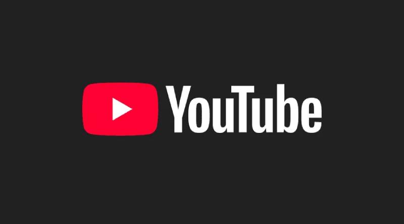
It’s a combination mark, meaning an icon plus a wordmark, and either half can be used on its own. The icon is red and white. The wordmark is near-black on light backgrounds and white on dark ones.
The icon itself is a right-pointing white triangle in a red rectangle with rounded corners. The USPTO filing from August 2017 describes it nearly the same way, a white triangle inside a red rectangle with rounded edges.
The wordmark spells “YouTube” as one word with a capital Y and a capital T, all in a single color. The T no longer sits in a box. The layout is horizontal with the icon first, and when space runs short, YouTube’s brand guidelines say to use the icon alone.
Creative Bloq points out a side effect of the 2017 change. With the type run together in one color, the one-word spelling finally reads clearly.
What the play button and the red box mean
The only documented meaning is a television. Until 2017 the red rounded rectangle around “Tube” stood for a TV screen, and “tube” is slang for television (It’s Nice That and The Verge, both 2017).
The current logo keeps the rectangle but fills it with a triangle, the universal play symbol. A YouTube design director wrote in a Google Design case study that research confirmed how recognizable the play icon was, so the team moved it front and center as the logo icon.
My reading, and not anything YouTube has said, is that the rectangle now looks more like a video window than a TV set.
The red only has a partial explanation. In 2017 Christopher Bettig, then head of YouTube’s art department, told The Verge (a CNBC-hosted copy of the interview also exists) that the team looked for a red that would tie to video. Creative Bloq reports YouTube calling the 2017 red the “RGB of video”, but no YouTube source for that phrase turned up. Google Design’s 2025 account says only that the 2017 red was pure red in the RGB system.
Magenta does have a stated meaning, though it lives in the gradient and not in the logo. Google Design says it stands for imagination and evolution.
YouTube logo colors and HEX codes
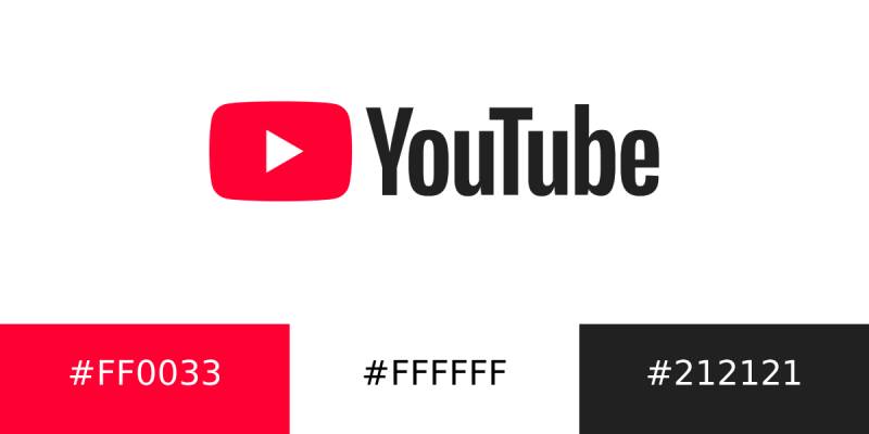
Red, white and near-black. YouTube’s brand site calls them red, white and black, and the 2017 trademark filing claims the same colors, listed as red, black and white.
| Color | HEX | RGB | Role and status |
|---|---|---|---|
| YouTube red, 2017-2024 | #FF0000 | 255, 0, 0 | Icon rectangle. Pure RGB red, per YouTube’s design team. |
| YouTube red, current | #FF0033 | 255, 0, 51 | Icon rectangle. Listed as the logo and icon red in Google’s Partner Marketing Hub. Creative Bloq sampled #ff1a47 from the live logo, so sampled values vary. |
| White | #FFFFFF | 255, 255, 255 | Play triangle, and the wordmark on dark backgrounds. |
| Near-black (“Almost Black”) | #212121 | 33, 33, 33 | Wordmark on light backgrounds. Current YouTube brand site and Google’s Partner Marketing Hub. Earlier brand pages listed #282828. |
The 2017 red comes from YouTube’s own design team (Google Design, 2025). For the current red, the code in Google’s partner guidelines is the safer reference. Creative Bloq’s sampled #ff1a47 differs from it, and the same Creative Bloq comparison read the old red as #fe0000 instead of #FF0000.
YouTube’s own guidelines have named the near-black twice, #282828 in the 2017-era brand pages and #212121 in the current ones. Third-party sites still quote both. Use #212121 for new work.
Plenty of brands lean on red, as this roundup of red logos shows. YouTube’s answer is restraint. Google Design says the team keeps red for brand marks and key interface moments instead of spreading it everywhere.
The red-to-magenta gradient (45 degrees, magenta on the right) stays out of the logo. You’ll find it in the progress bar, topic icons, the Like and Subscribe buttons, the Premium badge and the Live ring.
The full-color logo comes in two versions, an almost black wordmark for light backgrounds and a white wordmark for dark ones. The triangle stays white in both.
Which font does the YouTube logo use?
You can’t buy it. The wordmark is drawn in a custom face named YouTube Logo, which references Alternate Gothic, a condensed sans-serif Morris Fuller Benton designed in 1903. It was optimized for screens and small sizes (Google Design case study).
From 2005 to 2017 the wordmark used a modified Alternate Gothic, drawn into the original logo by Chad Hurley. Creative Bloq names the specific cut as Alternate Gothic No. 2. Since 2017 it has been YouTube Logo, the redrawn, screen-tuned descendant.
Plenty of third-party pages say the logo is set in YouTube Sans, and YouTube’s own account says otherwise. The team began YouTube Sans with the logo in mind, judged it too far from the existing logotype, and built YouTube Logo instead. The point is disputed online, but the first-party account wins.
YouTube Sans is the brand’s display typeface. It was built on the grid of the old play icon, which is where its angled cuts come from, and it debuted with YouTube TV in 2017.
No public font matches YouTube Logo exactly. Alternate Gothic No. 2 is the closest starting point, though it’s a different drawing and should only be treated as a stand-in.
Who designed the YouTube logo?
Co-founder Chad Hurley created the first one in 2005, according to YouTube’s own design case study on Google Design.
The 2017 version was built in-house, per Creative Bloq. CNBC’s coverage at the time named Christopher Bettig, head of YouTube’s art department, as leading the rethink, and Google Design credits Chris Bettig as creative director on its 2025 color story.
Outside partners worked on the pieces around it.
- Saffron Brand Consultants redrew the play icon and co-developed YouTube Sans (It’s Nice That, 2017).
- Letterjuice and URW++ were the type studios that worked with Saffron and YouTube’s UX team on YouTube Sans.
- On the 2025 red, Robyn Lee led visual design, with Jessie Zo as senior visual designer and Rachelle Moon as visual designer (Google Design, 2025).
Google bought YouTube in 2006, so later redesigns sit inside Google’s design world. Nobody has published what any of them cost.
How the logo changed from a TV box to a play button
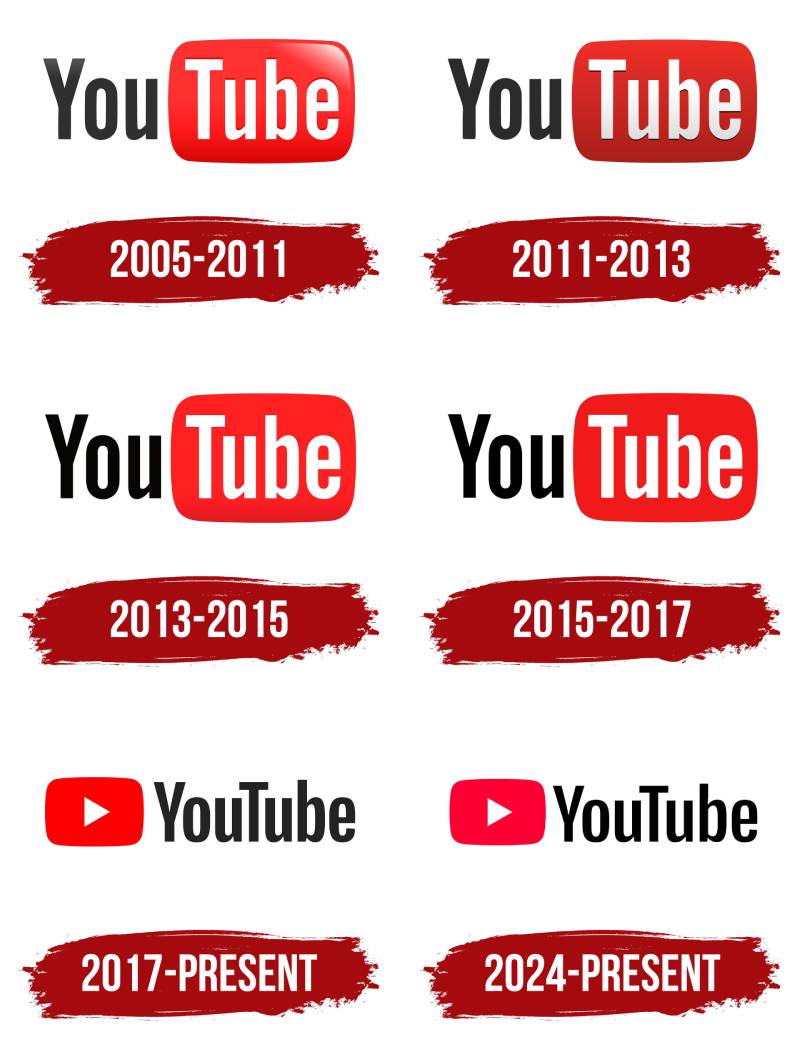
There are six documented versions between 2005 and today, with the major steps landing in 2005, 2011 and 2017. The direction is steady. A glossy TV box slowly becomes a flat red icon that can stand alone.
The glossy red TV box (2005 to 2011)
“You” in black, “Tube” in white inside a red rounded rectangle with enough gradient to read as a television. The type was a modified Alternate Gothic.
The youtube.com domain was activated on 14 February 2005 and the first video went up on 23 April 2005. Creative Bloq treats Valentine’s Day as the launch, and this mark stayed unchanged for six years (Creative Bloq).
Flatter and matte (2011 to 2013)
By 2011 flat-screen TVs had replaced the cathode-ray set the box imitated. YouTube dulled the gloss and removed the 3D feel, though a shadow under the white letters remained.
Shadow out, red brighter (2013 to 2015)
The shadow behind “Tube” disappeared and the red got brighter. Creative Bloq ties both moves to the wider push toward flat, minimal logos.
A darker red (2015 to 2017)
Two years after brightening it, YouTube darkened the red again. Creative Bloq reads that as a bid to look more serious and professional. By this time the play icon was already being promoted into a standalone logo icon, as Google Design’s case study shows.
The play button leaves the box (2017 to 2024)
YouTube chief product officer Neal Mohan announced the new logo on 29 August 2017, alongside a Material Design overhaul of the desktop site, a dark theme and a mobile app refresh. The stated reason was a more flexible logo for a multi-screen world, with the brightened icon doubling as an abbreviated logo on small screens.
Mohan called it the “bright red cherry on top of this update sundae” (as quoted by It’s Nice That).
The “Tube” box was gone, the wordmark ran together in one color, and the red became pure #FF0000.
A trademark footnote. USPTO application 87586605 describes this exact mark. It was filed on 28 August 2017, one day before the announcement, and it covers clothing. Its status is abandoned (no statement of use, February 2022). A parallel application for the same mark (serial 87984068) was filed the same day for software and online services, and it was registered on 12 April 2022 as registration 6701779. The older registration from 2009 describes the TV-box design as “You” and “Tube” in a viewing monitor.
A cooler red (2024 to present)
The layout is unchanged. The red shifted toward pink, and when exactly that happened is disputed. Creative Bloq noticed the change in October 2024 with no announcement. Third-party logo trackers date a soft launch to June 2024 and a global rollout to 22 October 2024. YouTube itself explained the change in 2025 for its 20th anniversary, and Creative Bloq’s own history files it under 2025.
Google Design gives its reasons. In research, color ranked among the top three most outdated elements. The pure red also read as too loud in key interface moments, and it rendered orange on some screens. On TVs it caused burn-in. The fix was a slightly cooler shade.
YouTube’s January 2026 identity refresh added a display typeface called YouTube Display, drawn from the logo’s geometry, plus a motion identity. The logo itself was not among the listed changes (Marketing Dive, 2026).
Full logo, icon and the other forms in use
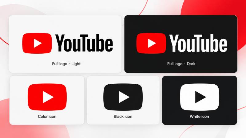
Day to day there are two forms. The full logo is the icon plus the wordmark, almost black on light backgrounds and white on dark. The icon alone, the red rectangle with the white triangle, is for when room is limited, such as a phone screen. YouTube’s brand site provides the icon in three color variations: full-color, monochromatic black and monochromatic white.
Temporary versions have appeared too. For Black History Month in February 2021, YouTube commissioned four Black artists (Leandro Assis, Keisha Okafor, Marco Cheatham and Shanée Benjamin) to redraw the logo, one per week. In August 2023 came an animated blackletter logo for World Calligraphy Day and a tribute to “get ready with me” videos (Creative Bloq).
Where to download the logo and what size to use
Official downloads come from YouTube itself. The brand resources site hosts the logo and the icon. Its guidelines text does not list file formats, so check what the download bundle contains.
If the bundle includes a vector file, that’s the right choice for print, signage and anything that scales. Raster files are fine for fixed-size web and app placements, but never enlarge them.
The print minimum is 0.125 inches (3.1 mm) in height. Archived copies of the guidelines list a minimum digital height of 20dp (one passage on the same archived page mentions 24dp), and Google’s Partner Marketing Hub also uses 20dp, so confirm the live figure before locking a size.
Any use of YouTube brand elements needs approval through the Brand Use Request Form, and YouTube says it cannot approve use on third-party merchandise.
YouTube’s rules for using the logo
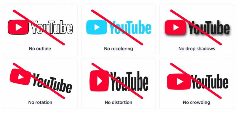
The official brand guidelines cover spacing, backgrounds and approval. Clear space should be equal to or greater than the size of the triangle in the icon (an earlier version of the guidelines measured it by the height of the icon). When a background makes the full-color version hard to see, switch to the monochrome logo. The triangle stays white in the full-color logos, while in the monochrome versions it’s knocked out so the background shows through.
The don’ts are longer.
- Don’t place the full-color logo on red. The white monochrome logo works best there.
- Don’t use colors other than red, almost black or white.
- Don’t change the triangle’s angles or size, replace it with other shapes or words, rotate the logo, or outline the wordmark.
- Don’t use the logo or icon inside a sentence.
- Don’t put the full logo in a row of social media icons. Use the icon there.
And before any of it goes live, submit a Brand Use Request Form for approval.
How YouTube’s logo stacks up against Netflix and TikTok
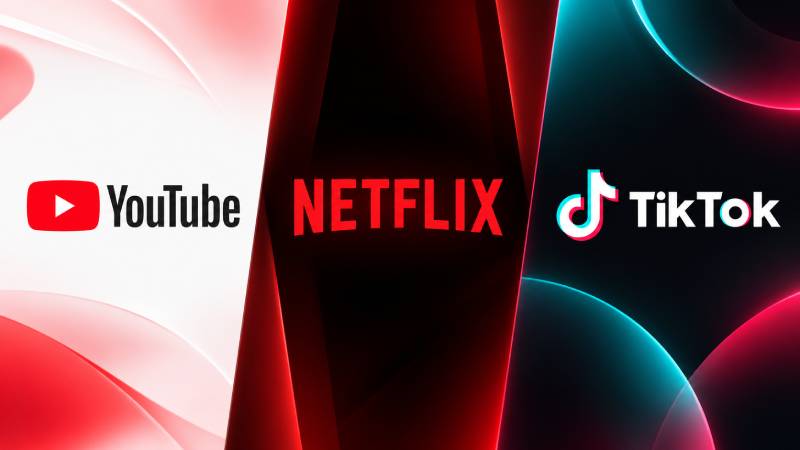
Netflix puts its red in letters and YouTube puts it in an icon. TikTok builds on black.
Look at Netflix’s red wordmark and companion symbol and the parallel with YouTube is clear. Both brands run a full logo plus a compact mark, and both paid for custom type.
| Attribute | YouTube | Netflix |
|---|---|---|
| Core mark | Red play icon plus wordmark | Red wordmark, with a separate symbol |
| Brand typeface | YouTube Sans, 2017, with Saffron, Letterjuice and URW++ | Netflix Sans, 2018, with Dalton Maag |
| Why custom type | Legal issues and ownability | Licensing costs and ownability (replacing Gotham) |
| Compact form | Play icon | Symbol |
The reasons come from Google Design for YouTube and from It’s Nice That’s 2018 report for Netflix.
TikTok’s note-shaped mark goes the other way. It works from black with offset color accents, so layered color does the job that YouTube hands to one flat red.
YouTube’s own guidelines tell designers to pick the icon, not the full logo, when it sits among other social media icons.
Common Questions About the YouTube Logo
Who owns the YouTube logo, and is it trademarked?
Google owns it, and yes, it is treated as a trademark. USPTO records list registration 3714120 (2009), owned by Google LLC, for the old TV-box design. The current mark is registered too, under registration 6701779 (12 April 2022), which covers it for software and online services. A separate 2017 clothing application for the same mark shows as abandoned, which affects that filing only.
Can I show the YouTube logo in my own videos or thumbnails?
Only within YouTube’s rules. Showing the brand in any media, videos included, falls under separate media guidelines, and every use needs approval through the Brand Use Request Form.
Which YouTube logo should an app display?
YouTube’s API branding rules give three options. The standard logo is for features that rely on YouTube, the icon is for attribution in mixed-source setups or tight spaces, and the “developed with YouTube” logo is for apps that depend heavily on the platform. The standard logo and the icon must meet the minimum size, and any YouTube logo in an app must link back to YouTube content.
Does YouTube Kids use the same logo?
No. When the main logo changed in 2017, YouTube Kids dropped its smiling-tube character icon for a hand-drawn-looking take on the main play icon, in a brighter red (9to5Google, 2017).
Is it okay to put the YouTube logo on merchandise?
No. YouTube says it cannot approve any use of its logo or brand features on third-party merchandise of any kind, so the request form will not clear a shirt or mug design.
Choosing the Right Version of the YouTube Logo
The logo has two working forms. Use the full logo where space allows and the red play icon alone where it doesn’t.
The cooler red of the latest refresh changed the code. YouTube moved from #FF0000 to a shade that Google’s Partner Marketing Hub lists as #FF0033. Any layout that must match today’s red should pull from YouTube’s official files, since sampled values only approximate it (Creative Bloq read #ff1a47 from the live logo).
As of October 2026, YouTube’s January 2026 identity refresh did not list the logo among its changes. A revised color code or minimum size on the brand site would change this advice.
For print work, choosing a file format for printing logos comes next, and vector suits the flat shapes of this mark best.

Renowned for his expertise in logo design and visual branding, Bogdan has developed a multitude of logos for various clients.
His skills extend to creating posters, vector illustrations, business cards, and brochures. Additionally, Bogdan's UI kits were featured on marketplaces like Visual Hierarchy and UI8.
He also wrote in the past years on sites like Design Your Way, WebDesignerDepot, WPDean, Designmodo, Speckyboy, Slider Revolution, and more.
- The YouTube Logo History, Colors, Font, and Meaning - 10 November 2026
- Shopify Design Agencies Compared by Budget: Theme Customization vs. Custom Build - 9 November 2026
- Neon Font Generator - 8 November 2026

Bogdan Sandu is a seasoned designer who has been designing websites since 2008. Renowned for his expertise in logo design and visual branding, Bogdan has developed a multitude of logos for various clients. His skills extend to creating posters, vector illustrations, business cards, and brochures. Additionally, Bogdan's UI kits were featured on marketplaces like Visual Hierarchy and UI8. He also wrote in the past years on sites like Design Your Way, WebDesignerDepot, WPDean, Designmodo, Speckyboy, Slider Revolution, and more.
You Might Also Like