The Temu logo represents one of the fastest-growing e-commerce platforms in global retail history.
Launched in September 2022 by PDD Holdings, the parent company behind Chinese marketplace giant Pinduoduo, Temu’s visual identity captures the brand’s mission of delivering affordable products across hundreds of categories.
The orange square design with four product icons and bold white lettering has become instantly recognizable across 90+ international markets.
The logo features a minimalist approach that balances friendliness with modern retail aesthetics, reflecting the platform’s direct-to-consumer business model.
What is the Temu Logo?
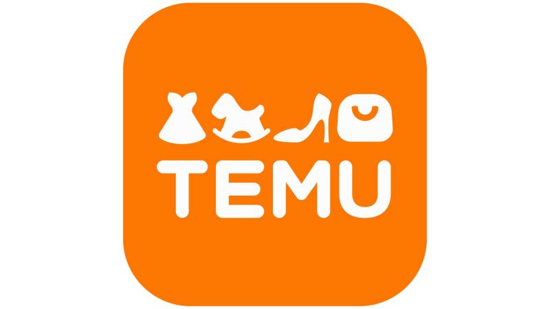
The Temu logo is an orange-background design featuring four white product icons (dress, rocking horse, high-heeled shoe, handbag) positioned above the brand name in rounded sans-serif typography. Introduced in September 2022 alongside the platform’s U.S. launch, the logo was created by PDD Holdings’ internal branding team to represent product diversity and affordability across the marketplace.
Design Type: Combination mark with iconography and wordmark
Primary Elements: Four symbolic product icons, rounded sans-serif typeface, rectangular container with rounded corners
Official Introduction Date: September 2022
Designer/Agency: PDD Holdings internal design team
Trademark Status: Registered trademark of PDD Holdings Inc., operated through subsidiary Whaleco Inc. in the United States
Color Palette:
- Primary Orange: #FB7701 (RGB: 251, 119, 1 / CMYK: 0, 53, 100, 2)
- Alternative shades: #F75B1C, #FF6D00
- White: #FFFFFF (RGB: 255, 255, 255 / CMYK: 0, 0, 0, 0)
Usage Context: Mobile app icon, website header, packaging materials, marketing collateral, digital advertising campaigns, Super Bowl commercials
The four icons directly correspond to product categories available on the platform. Each icon aligns visually with the letter beneath it in the wordmark. The handbag’s U-shaped handle mirrors the letter U, while the shoe’s diagonal line reflects the M’s angular structure.
How Has the Temu Logo Evolved Over Time?

The Temu logo has maintained consistent design since its September 2022 debut, with no major redesigns or variations. Unlike competitors that undergo multiple iterations, Temu’s visual identity remains unchanged to reinforce brand recognition during rapid international expansion.
Original Temu Logo (September 2022-Present)
Years Active: September 2022 to present
Design Description: Orange rectangular background with rounded corners containing four white product icons and the TEMU wordmark in uppercase letters
Color Scheme: Primary orange (#FB7701) with white elements
Designer: PDD Holdings internal branding and design team
Context: Created for simultaneous launch across mobile app and website platforms in the United States market, designed to compete with established players like Amazon, Shein, and AliExpress
Key Changes from Previous: N/A (original design)
Cultural Significance: The logo emerged during a period of inflation and economic uncertainty, positioning Temu as an affordable alternative. The bright orange became synonymous with budget-friendly shopping, with consumers reporting excitement at seeing orange Temu packages arrive at their doorsteps.
The stability in design reflects strategic branding decisions. While most e-commerce platforms refine their logos multiple times, Temu maintained its original identity to build consistent recognition across its expansion into 90+ countries within just over two years.
What Do the Design Elements of the Temu Logo Mean?

The Temu logo uses visual symbolism to communicate product diversity and accessibility. The four icons represent different merchandise categories available on the platform: fashion (dress), children’s products (rocking horse), footwear (high-heeled shoe), and accessories (handbag). This iconography signals that Temu offers comprehensive shopping options beyond single-category retailers.
The Four Product Icons
Each icon serves a dual purpose as both category indicator and visual hierarchy element.
The dress icon positioned above the T represents clothing and fashion categories. The rocking horse above the E symbolizes toys, children’s items, and family products. The high-heeled shoe above the M indicates footwear across all styles. The handbag above the U represents accessories, home goods, and lifestyle products.
These icons weren’t randomly selected. They mirror the letter shapes beneath them, creating intentional alignment between symbol and text.
Why Did Temu Choose These Specific Colors?
Primary Orange (#FB7701)
- Symbolic meaning: Energy, affordability, warmth, optimism
- Psychological impact: Stimulates action, creates sense of urgency, evokes enthusiasm
- Brand connection: Differentiates from competitors while suggesting value pricing
The orange shade falls between red and yellow on the color theory spectrum. Red felt too aggressive and overused in retail. Yellow lacked sufficient contrast for digital displays. Orange provided the perfect middle ground.
White (#FFFFFF)
- Symbolic meaning: Purity, transparency, simplicity, honesty
- Psychological impact: Creates clean appearance, enhances readability, suggests trustworthiness
- Brand connection: Balances the intense orange, provides professional appearance
White serves as the perfect counterpoint. The high contrast ratio between orange and white ensures legibility across all screen sizes and printing applications.
What Typography Style Is Used in the Temu Logo?
The wordmark employs a custom rounded sans-serif font with smooth, minimalist characteristics.
The rounded terminals create a welcoming feel. Each glyph features consistent stroke width and generous spacing. The uppercase treatment projects confidence while maintaining approachability. No sharp angles appear in the letterforms, supporting the friendly brand personality.
What Are the Hidden Meanings in the Temu Logo?
The rounded square container resembles an app icon, intentionally mimicking iOS and Android design standards. This creates immediate familiarity for mobile users.
The four icons create symmetry and balance across the horizontal axis. Each icon occupies equal space, suggesting equal importance across product categories. The empty orange space surrounding the elements can be interpreted as a shopping basket waiting to be filled, subconsciously encouraging purchases.
Designers incorporated Gestalt principles of grouping and proximity, positioning each icon directly above its corresponding letter. This creates visual relationships that guide eye movement from top to bottom.
How Does the Temu Logo Compare to Competitor Logos?

Temu’s orange-dominant design stands apart from competitors in the budget e-commerce space. Shein uses black and white with occasional pink accents. AliExpress employs orange and red but with busier iconography. Amazon relies on lowercase black letters with an arrow-smile. Wish uses blue and white with star elements.
The squared format differentiates Temu from competitors using horizontal rectangles or circular designs. While Shein targets fashion specifically, Temu’s four-icon approach signals broader product selection. Amazon’s arrow suggests A-to-Z selection, but Temu’s explicit product icons provide clearer category communication.
Compared to fast food logos and other retail brands, Temu’s orange selection mirrors the warmth strategies of brands like Nickelodeon or Fanta, though in e-commerce, this hue remains relatively uncommon.
Among tech company logos, Temu’s approach follows minimalist design principles similar to Spotify or SoundCloud, prioritizing simplicity over complexity.
What Are the Technical Specifications of the Temu Logo?

Official Color Codes:
Primary Orange:
Secondary Color (White):
- Hex: #FFFFFF
- RGB: (255, 255, 255)
- CMYK: (0, 0, 0, 0)
Dimensions and Proportions:
The logo maintains a 4:1 approximate width-to-height ratio. Minimum display size recommendations suggest 120 pixels width for digital applications to ensure icon clarity. Clear space around the logo should equal at least 25% of the logo’s height on all sides.
File Formats:
Official versions exist as vector graphics (SVG) for scalability and bitmap formats (PNG with transparency) for quick implementation. The DPI for print applications should maintain 300 minimum for professional quality.
What Cultural Impact Has the Temu Logo Had?
The vibrant orange has become a cultural marker for budget shopping in American and European markets.
Social media users share photos of orange Temu packages with excitement, creating organic brand awareness. The logo appears in viral TikTok unboxing videos and Instagram stories. Super Bowl advertising in 2023 and 2024 brought the logo into mainstream American consciousness, with millions seeing it during peak television events.
The rapid recognition reflects successful brand identity establishment. Within months of launch, consumer surveys showed high logo recall rates among target demographics.
How Does the Temu Logo Fit Into Overall Brand Identity?

The logo serves as the centerpiece of Temu’s broader visual system.
The orange appears consistently across packaging materials, marketing collateral, website design, and social media presence. The rounded shapes from the logo extend to button designs and interface elements throughout the shopping app. Product photography often features white backgrounds, echoing the logo’s color palette.
Brand guidelines likely specify usage rules, though PDD Holdings hasn’t publicly released comprehensive brand style guide documentation.
How Should the Temu Logo Be Used?
Official Usage Guidelines:
Do:
- Maintain the original color specifications without alteration
- Preserve adequate white space around the logo
- Use approved file formats from official sources
- Scale proportionally to maintain aspect ratio
- Display on backgrounds that don’t compromise visibility
Don’t:
- Rotate, distort, or stretch the logo
- Change colors or apply filters
- Place on busy backgrounds that reduce legibility
- Separate icons from wordmark
- Add additional elements or text
Where to Access Official Logos:
Brand asset repositories like Brandfetch provide downloadable versions. Direct requests to PDD Holdings may be necessary for commercial licensing.
Licensing Information:
The Temu logo is a registered trademark. Unauthorized commercial use violates intellectual property laws. Editorial and journalistic use typically falls under fair use provisions, but commercial applications require explicit permission.
Trademark Protection Details:
PDD Holdings protects the mark through U.S. and international trademark registrations. The logo cannot be used in ways that suggest endorsement or affiliation without authorization.
FAQ About the Temu Logo
When was the Temu logo created?
The Temu logo was created in 2022 and launched publicly on September 15, 2022, when the platform went live in the United States. The design was developed by PDD Holdings’ internal branding team in preparation for the international marketplace launch.
Who designed the Temu logo?
The Temu logo was designed by the internal branding and design team at PDD Holdings, the parent company that also owns Pinduoduo. Specific individual designers have not been publicly credited, as the project was handled internally rather than by an external agency.
What do the colors in the Temu logo mean?
The orange color (#FB7701) represents energy, affordability, and optimism, creating emotional connections with budget-conscious shoppers. The white symbolizes honesty, transparency, and simplicity. Together, these colors communicate accessible pricing while maintaining professional credibility and trustworthiness in the e-commerce marketplace.
How many times has the Temu logo been redesigned?
The Temu logo has never been redesigned since its September 2022 introduction. Unlike many brands that undergo multiple iterations, Temu maintained its original visual identity to build consistent brand recognition during rapid international expansion across more than 90 markets worldwide.
Where can I download the official Temu logo?
Official Temu logo files can be accessed through brand asset platforms like Brandfetch, which provide SVG and PNG formats. For commercial licensing or high-resolution versions, contact PDD Holdings directly. Unauthorized reproduction or commercial use without permission violates trademark protections and intellectual property rights.
Is the Temu logo trademarked?
Yes, the Temu logo is a registered trademark owned by PDD Holdings Inc. and operated through its subsidiary Whaleco Inc. in the United States. The trademark covers the visual design, wordmark, and associated brand elements, protecting them from unauthorized commercial use.
What font is used in the Temu logo?
The Temu logo uses a custom rounded sans-serif typeface created specifically for the brand. The font features smooth curves, consistent stroke widths, and rounded terminals that create a friendly, approachable appearance while maintaining legibility across digital and print applications.
Why did Temu choose product icons for their logo?
Temu chose four product icons (dress, rocking horse, shoe, handbag) to visually communicate the platform’s diverse merchandise categories beyond fashion-only competitors. The icons signal comprehensive product selection across clothing, toys, footwear, and accessories, differentiating Temu from single-category retailers like Shein while establishing immediate category recognition.
Conclusion
The Temu logo stands as a strategic graphic design achievement that balances simplicity with meaningful symbolism. The orange-and-white color scheme, four product icons, and rounded typography work together to communicate affordability, diversity, and accessibility across the global e-commerce marketplace.
Since its September 2022 introduction, the logo has remained unchanged, demonstrating confident brand positioning. The design’s success lies in its ability to differentiate Temu from competitors while maintaining approachability. As the platform continues expanding into new international markets, the logo serves as an instantly recognizable symbol of budget-friendly shopping.
The technical specifications ensure consistent reproduction across digital and physical applications. From mobile app icons to packaging materials, the logo maintains its visual impact through proper scale and proportion implementation.
Looking forward, the Temu logo will likely remain a constant as the brand evolves its market position and product offerings in the competitive e-commerce landscape.

Renowned for his expertise in logo design and visual branding, Bogdan has developed a multitude of logos for various clients.
His skills extend to creating posters, vector illustrations, business cards, and brochures. Additionally, Bogdan's UI kits were featured on marketplaces like Visual Hierarchy and UI8.
He also wrote in the past years on sites like Design Your Way, WebDesignerDepot, WPDean, Designmodo, Speckyboy, Slider Revolution, and more.
- Death Note Font Generator - 26 October 2026
- Versatile Georgia Font Pairing for Timeless Layouts - 24 October 2026
- How to Turn Inconsistent UI into One Design System (Without a Full Redesign) - 24 October 2026

Bogdan Sandu is a seasoned designer who has been designing websites since 2008. Renowned for his expertise in logo design and visual branding, Bogdan has developed a multitude of logos for various clients. His skills extend to creating posters, vector illustrations, business cards, and brochures. Additionally, Bogdan's UI kits were featured on marketplaces like Visual Hierarchy and UI8. He also wrote in the past years on sites like Design Your Way, WebDesignerDepot, WPDean, Designmodo, Speckyboy, Slider Revolution, and more.
You Might Also Like