


Every layout tells your eye where to go. Whether you realize it or not, the path your gaze follows across a page is the result of deliberate choices made by the designer.
So what is movement in design? It’s the principle that guides a viewer’s eye through a composition, creating a visual path from one element to the next. Without it, even the most visually striking work falls flat.
This article breaks down how movement works in both static and digital contexts, the specific elements that create it, how it connects to proximity, rhythm, and visual hierarchy, and what to do when too much motion turns direction into distraction.
What Is Movement in Design
Movement is the principle that controls how a viewer’s eye travels across a visual composition. It’s the path your gaze follows when you look at a poster, a webpage, or a product label.
Not the same as animation. That’s a common mix-up. Movement in design exists even in completely static work. A magazine spread, a billboard, a business card. None of these move, but all of them direct your eye somewhere specific.
The principle sits alongside other graphic design principles like balance, contrast, emphasis, and unity. But movement is the one that ties them together. It’s the connective tissue that turns a collection of separate design elements into something with direction and purpose.
Think about it this way. Visual hierarchy tells a viewer what matters most. Movement tells them where to look first, second, and third.
Loopex Digital research from 2026 shows that clear visual hierarchy combined with guided motion can boost conversions by roughly 30%. That’s not a small number. It means the way you direct someone’s eye through a layout has measurable business impact.
And here’s what a lot of people get wrong. They treat movement like decoration. Something you add at the end. But it’s actually structural. It should be baked into a layout from the wireframe stage, not sprinkled on like confetti after everything else is done.
How Movement Works in Visual Composition
Your brain doesn’t just passively receive visual information. It actively organizes it. When you look at a design, your eye is searching for patterns, grouping similar things together, and following lines of force through the composition.
That’s where Gestalt principles come in. Specifically the law of continuity, which says your eye naturally follows lines, curves, and sequences of shapes, even when those shapes intersect or overlap. Your brain prefers smooth, continuous paths over abrupt changes in direction.
UXmatters research found that 49% of consumers abandon brands because of poor user experience. A big part of that comes down to how well (or badly) visual elements guide attention through the interface.
Eye Movement Patterns in Design
Nielsen Norman Group identified the F-pattern back in 2006. Two decades later, it’s still the dominant scanning behavior for text-heavy pages.
Users read horizontally across the top, drop down, read a shorter horizontal strip, then scan vertically down the left side. The shape of the letter F.
But that’s only part of the picture.
| Pattern | Best For | How the Eye Moves |
|---|---|---|
| F-pattern | Text-heavy pages, blogs, articles | Top-left across, then down the left side |
| Z-pattern | Landing pages, minimal-text layouts | Top-left to top-right, diagonal, bottom-left to bottom-right |
| Gutenberg diagram | Evenly distributed content | Top-left (primary), bottom-right (terminal) focus |
The Z-pattern works differently. On pages with less text and more open space, the eye travels from top-left to top-right, then diagonally down to bottom-left, and across to bottom-right. Landing pages and homepages frequently rely on this.
Which pattern you’re designing for changes everything about where you place your focal point and calls to action.
Focal Points and Directional Flow
A focal point anchors the composition. It’s where the eye lands first. Movement is what happens after that initial landing.
Directional cues, like a person’s gaze in a photograph or the angle of a diagonal line, push the eye from the focal point toward secondary information. Then toward a call to action. Then toward supporting content.
Mindfeeder LLC found that calls to action placed above the fold get 304% more clicks than those placed below it. That stat only works, though, if the movement of the surrounding layout actually leads the eye to that button.
A CTA can be above the fold and still get ignored if the composition’s movement pulls attention elsewhere.
Types of Movement in Design
See the Pen
Delightful Squishy Buttons Collection by Bogdan Sandu (@bogdansandu)
on CodePen.
Movement isn’t one thing. It shows up in different forms depending on the medium, the intent, and the tools you’re working with.
Implied Movement vs. Literal Movement
Implied movement exists in static work. Diagonal lines suggest speed. Blurred edges simulate motion. A figure caught mid-stride creates tension that the brain reads as action.
Futurism as an art movement built entire compositions around implied speed and energy. Giacomo Balla’s paintings fractured objects into sequential positions, creating the illusion of motion on a flat surface. That same thinking applies today in poster design and packaging design.
Literal movement is what happens on screens. CSS transitions, scroll-triggered animations, video backgrounds, loading spinners. Actual pixels changing position over time.
Loopex Digital data shows subtle micro-animations and scroll-based storytelling increase engagement by about 20%. But there’s a catch. Cluttered designs with too much motion see bounce rates roughly 50% higher than clean, restrained layouts.
Rhythm as a Driver of Movement
Rhythm is one of those principles that does a lot of heavy lifting for movement, and most people don’t think about it much.
Five types work differently:
- Regular rhythm: equal spacing between identical elements. Think of evenly spaced columns in a grid system
- Alternating rhythm: two or more elements repeating in a set sequence
- Progressive rhythm: elements that gradually change in size, color, or spacing, pulling the eye along a path
- Flowing rhythm: organic, curving patterns that mimic natural forms
- Random rhythm: unpredictable placement that still creates a sense of energy, though this one’s tricky to pull off without creating visual chaos
Progressive rhythm is probably the most useful for guiding the eye. A series of shapes that shrink from left to right creates a clear directional pull. Your eye follows the progression without needing any explicit instruction.
Design Elements That Create Movement

Lines are the most direct tool. Diagonal lines create the strongest sense of movement because they feel unstable, like something is falling or rising. Horizontal lines suggest calm. Vertical lines suggest stability. But diagonals? Those suggest action.
This connects to the psychology of shapes, too. Triangles and arrows inherit that diagonal energy. Circles create circular movement, keeping the eye contained. Squares and rectangles feel static.
Color gradients pull the eye from one value to another. A gradient that shifts from dark to light across a banner creates directional flow just through value change alone. The eye moves from the darker area toward the lighter one.
Saturation shifts work similarly. A desaturated background with one highly saturated element creates a visual magnet. Your eye goes straight to the most colorful thing on the page.
Scale progression is another one. Large elements attract attention first. Place a large heading on the left and progressively smaller text blocks moving right, and you’ve built a movement path using nothing but size. This ties directly into scale and proportion as a compositional tool.
Repetition creates rhythm, and rhythm creates movement. But variety within that repetition keeps the eye from getting bored. A row of identical icons doesn’t pull the eye forward nearly as well as a row where one icon is slightly different.
And then there’s white space. This is the one people underestimate. Negative space doesn’t just give the eye a place to rest. It actively directs flow between elements. When there’s empty space surrounding a single element, your eye is drawn to that element almost involuntarily.
Movement in Graphic Design and Print

Print is where movement has to work hardest because you can’t rely on anything actually moving. No hover states. No scroll triggers. No transitions. Just ink on paper.
Hostinger’s 2026 web design survey found that 40% of visitors value images as the most important element on a website, with colors (39%) and typography close behind. Those same elements carry even more weight in print, where they’re the only tools available.
How Typography Drives Eye Movement
Typographic hierarchy is movement in disguise.
A large, bold headline pulls the eye first. A smaller subheading catches it next. Then body text. Then a caption. Each step down in size and weight creates a natural reading sequence.
Leading (the vertical space between lines) affects pacing. Tight leading speeds the eye up. Generous leading slows it down and adds breathing room. Tracking does something similar horizontally.
The choice of typeface matters too. A script font with flowing letterforms creates a sense of movement just through its form. A geometric sans-serif font feels more static and grounded.
Editorial and Poster Layout Techniques
Josef Müller-Brockmann built entire compositional systems around controlled movement. His work in Swiss design used strict alignment to grids, but then broke those grids strategically to create directional tension.
Saul Bass took the opposite approach with book cover design and film posters. His work used bold, fragmented shapes and strong diagonals that practically shove the eye across the composition. Nothing subtle about it, and that was the point.
Both approaches work. The difference is intent. Müller-Brockmann’s movement is measured and architectural. Bass’s movement is cinematic and forceful. Your project determines which is more appropriate.
Movement in Web and UI Design
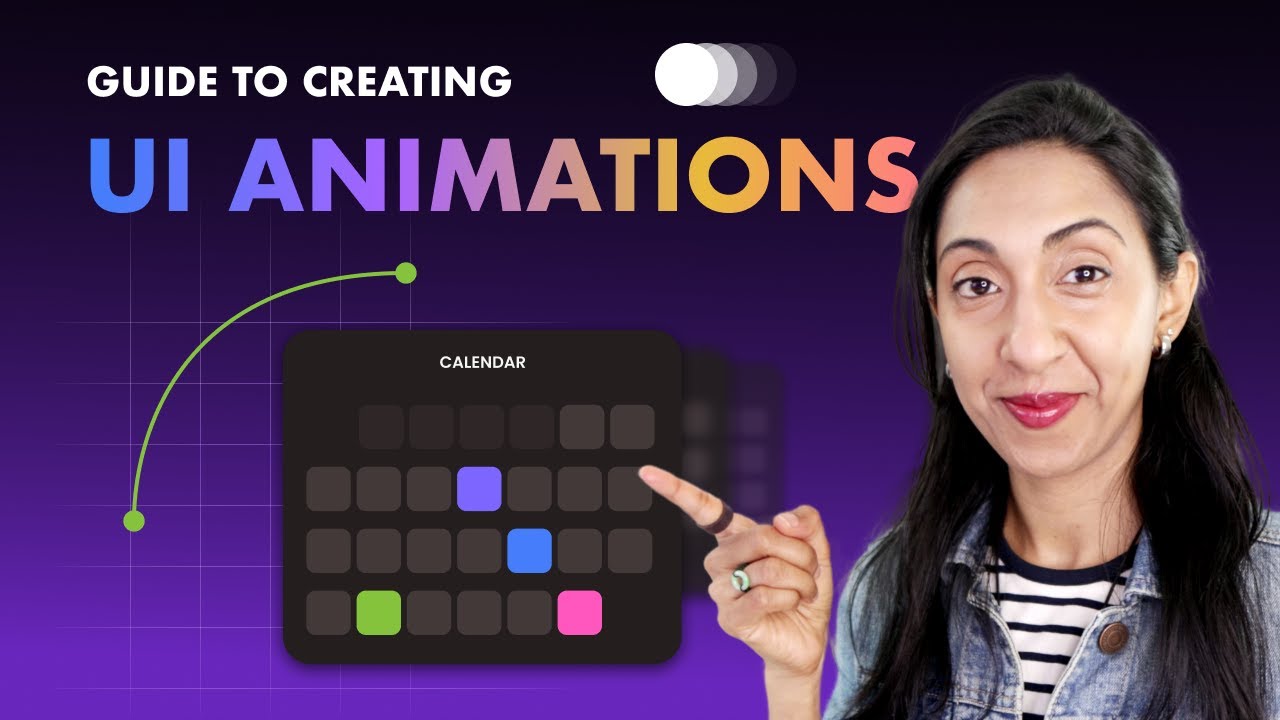
Screen-based design changed movement completely because now things actually move. The viewer’s eye isn’t the only thing in motion. The elements themselves shift, fade, slide, and transform.
Loopex Digital research shows minimal, content-first layouts increase viewing time by roughly 59%. That’s a big number, and it suggests that movement on screen works best when it supports content rather than competing with it.
Animation and Micro-Interactions
Motion graphics and micro-interactions serve different purposes.
A loading spinner tells the user something is happening. A button that subtly shifts color on hover confirms it’s clickable. A card that slides into view as you scroll rewards the act of scrolling. These are functional uses of movement, not decorative ones.
NNGroup research found that animations significantly improve both user engagement and satisfaction when they serve a clear purpose.
The tools have gotten good. GSAP handles complex timeline-based animation sequences. Framer Motion integrates directly with React components. Lottie lets you export After Effects animations as lightweight JSON files. CSS keyframe animations cover most basic transitions without any JavaScript at all.
Motion Design Principles for Interfaces
Google’s Material Design and Apple’s Human Interface Guidelines both publish detailed motion specifications. They agree on the fundamentals:
- Motion should feel natural and physical, like objects have weight
- Transitions should show spatial relationships between screens
- Animation duration matters. Too fast feels glitchy, too slow feels sluggish (200-500ms is the sweet spot for most UI transitions)
But here’s a thing that doesn’t get talked about enough. Performance.
Google factors Core Web Vitals into search rankings, and heavy animation can tank your scores. Loopex Digital data shows only 47% of sites currently meet all three Core Web Vitals thresholds. Adding complex animations to a site that already struggles with performance is a fast way to make things worse.
Hostinger reports that 88% of users who have a positive browsing experience are more likely to return. Movement that causes janky scrolling or slow page loads works against you, even if it looks impressive on a fast connection.
The best approach is to use CSS transforms and opacity changes for animation whenever possible. These properties can be hardware-accelerated by the GPU, which means smoother performance. Animating properties like width, height, or margin forces the browser to recalculate layout on every frame, and that’s where things get slow.
Movement vs. Chaos in Design
There’s a line between directing the eye and overwhelming it. Cross that line, and movement stops being a tool. It becomes noise.
Loopex Digital data from 2026 shows that cluttered designs see bounce rates about 50% higher than minimal, content-first layouts. That stat alone should make you cautious about how much motion you add to any layout.
Too many competing directional cues cancel each other out. If a diagonal line pulls left, a color contrast shift pulls right, and an animated element pulls down, the viewer’s eye doesn’t know where to go. So it leaves.
When Movement Overwhelms
Hostinger’s research found that poor website usability drives 79% of visitors away. Excessive movement is a major contributor to that usability problem.
Watch for these warning signs:
- Multiple animations firing simultaneously on a single screen
- Parallax effects stacked on top of auto-playing video backgrounds
- Competing focal points with no clear starting position for the eye
Airbnb learned this early. Their interface uses subtle zoom-in effects on listing hover states and restrained parallax to add depth. Nothing competes for attention. Each movement serves one purpose, and then it’s done.
Accessibility and Reduced Motion
The Vestibular Disorders Association estimates that roughly 69 million Americans have experienced some form of vestibular dysfunction. That’s not a small edge case. That’s a real chunk of your audience.
Vestibular disorders mean on-screen motion can cause dizziness, nausea, and migraines. WCAG 2.1 addresses this directly through Success Criterion 2.3.3, which requires giving users the ability to disable non-essential animation.
| Accessibility Tool | What It Does | Browser Support |
|---|---|---|
| prefers-reduced-motion (CSS) | Detects OS-level motion preferences | All major browsers |
| WCAG SC 2.2.2 | Requires pause/stop/hide for auto-playing content | Standard requirement |
| WCAG SC 2.3.3 (AAA) | Allows disabling animation from interactions | Recommended practice |
The prefers-reduced-motion CSS media query lets you detect when a user has turned on “Reduce Motion” in their operating system settings. When it’s active, you swap out or remove animations entirely.
AudioEye’s 2024 report found that 96.3% of homepages had detectable WCAG 2 failures. Motion accessibility is frequently part of that problem, especially with parallax scrolling and auto-playing content that lacks pause controls.
Testing Whether Movement Works
The squint test. Squint at your design. If the overall directional flow is still readable, the movement structure is strong enough. If everything blurs into equal visual weight, you have a hierarchy problem.
The 5-second test works too. Show someone the design for five seconds, take it away, and ask where their eye went first and what they noticed. If they can’t answer clearly, your movement isn’t doing its job.
A grayscale version removes color theory from the equation and shows whether your compositional movement relies too heavily on hue and color psychology rather than layout structure.
How to Apply Movement in Your Own Work

Knowing the theory is one thing. Actually building movement into your projects, from the first wireframe to the final handoff, is where most people struggle.
SQ Magazine reports that Figma now holds a 40.65% market share in design tools and supports over 13 million monthly active users as of early 2025. The platform’s Smart Animate feature has made prototyping movement accessible to designers who aren’t writing CSS or JavaScript.
But tools are only part of the equation. The thinking has to come first.
Tools for Prototyping and Testing Movement
Figma Smart Animate: connects two frames and automatically transitions between them. Good for testing basic scroll animations, hover states, and page transitions without leaving the design environment.
Adobe After Effects + Lottie: for more complex sequences. Design the animation in After Effects, export it as a lightweight JSON file through Bodymovin, and developers drop it straight into the codebase.
GSAP (GreenSock): the go-to JavaScript library for production-level animation on the web. Timeline-based, highly performant, and used by brands like Nike, Google, and Apple for their site animations.
| Tool | Best For | Skill Level |
|---|---|---|
| Figma Smart Animate | Quick prototyping, design handoff | Beginner |
| Framer Motion | React-based UI animation | Intermediate |
| GSAP | Complex timeline sequences | Advanced |
| Lottie (After Effects) | Lightweight exported animations | Intermediate |
| CSS Keyframes | Simple transitions, hover effects | Beginner |
Contrary Research data shows 75% of product designers chose Figma as their primary tool in 2023 (UX Tools survey). That means most movement prototyping starts there before moving into code.
Common Mistakes With Movement in Design
Took me a while to figure some of these out. And I still catch myself making the first one occasionally.
Overanimating everything. Not every element needs to slide, fade, or bounce into view. Pick two or three key moments of movement per page. That’s usually enough. When everything moves, nothing stands out.
Ignoring reading order. Your movement should follow the natural reading direction. For left-to-right languages, that generally means eye flow starts at the top-left. Compositions that push the eye against the reading direction feel uncomfortable, even if the viewer can’t articulate why.
Adding movement as an afterthought. This is the big one. If you design a static layout and then try to “add some animation” at the end, it usually looks tacked on. Movement should be part of your mood board and wireframe thinking from day one.
Forgetting about performance. A beautiful scroll-triggered animation that causes the page to drop to 15 frames per second is worse than no animation at all. Always check GPU compositing. Stick to animating transform and opacity properties when possible.
Your mileage may vary depending on the project. A brand identity site for a creative agency can get away with more experimental movement than a healthcare web design project where clarity is everything.
And one more thing. Look at what famous graphic designers actually did with movement. Not what design blogs say they did. Go look at original Saul Bass title sequences. Study Bauhaus design compositions. Look at how Constructivism used diagonal layouts for political posters. The principles haven’t changed. The tools have.
FAQ on What Is Movement In Design
What is movement in design?
Movement is the design principle that controls how a viewer’s eye travels across a composition. It creates a visual path between elements using lines, shapes, color, and spacing. It works in both static layouts and digital interfaces.
What is the difference between movement and rhythm in design?
Movement is the overall directional flow through a composition. Rhythm is one method of creating that flow through repeated patterns of elements. Think of rhythm as a subset of movement, not a separate concept.
How does movement relate to visual hierarchy?
Visual hierarchy determines what the viewer sees first. Movement determines the order they see everything after that. Together, they create a structured reading sequence that guides attention from primary to secondary content.
Can movement exist in static design?
Yes. Implied movement in static work uses diagonal lines, progressive size changes, blurred edges, and directional shapes to suggest motion. A printed poster can direct your eye just as effectively as an animated webpage.
What elements create movement in graphic design?
Lines (especially diagonals), color gradients, scale progression, repetition with variation, and strategic use of negative space all create directional flow. The psychology of shapes plays a role too.
What is the F-pattern in design?
The F-pattern describes how users scan text-heavy web pages. Eyes move horizontally across the top, drop down for a shorter horizontal sweep, then scan vertically down the left side. Nielsen Norman Group identified it through eye-tracking research.
How does animation affect movement in web design?
Animation adds literal movement to layouts through transitions, scroll effects, and micro-interactions. When purposeful, it improves engagement. When overdone, it increases bounce rates and can trigger vestibular disorders in sensitive users.
What is the prefers-reduced-motion CSS query?
It’s a CSS media query that detects whether a user has enabled “Reduce Motion” in their operating system. Designers use it to disable or simplify animations for users who experience discomfort from on-screen movement.
What tools help prototype movement in design?
Figma Smart Animate handles basic prototyping. GSAP and Framer Motion cover production-level web animation. Adobe After Effects paired with Lottie exports complex animations as lightweight files for developers to implement.
What is the biggest mistake designers make with movement?
Adding it as an afterthought. Movement should be planned during wireframing, not sprinkled on after the layout is built. When every element animates, nothing stands out. Restraint matters more than spectacle.
Conclusion
Understanding what is movement in design gives you control over where your viewer looks, how long they stay, and what action they take next. That control is the difference between a layout that works and one that just exists.
Every font choice, every color palette decision, every diagonal line you place on the page contributes to directional flow. Static or animated, print or screen, the principle stays the same.
Start with your focal point. Map the eye’s path during wireframing. Test with real users. And respect the people who need reduced motion.
Movement isn’t about making things flashy. It’s about making compositions feel intentional, from the first glance to the final click. Build it into your process early, and every project gets sharper because of it.

Renowned for his expertise in logo design and visual branding, Bogdan has developed a multitude of logos for various clients.
His skills extend to creating posters, vector illustrations, business cards, and brochures. Additionally, Bogdan's UI kits were featured on marketplaces like Visual Hierarchy and UI8.
He also wrote in the past years on sites like Design Your Way, WebDesignerDepot, WPDean, Designmodo, Speckyboy, Slider Revolution, and more.
- Versatile Work Sans Font Pairing for Every Project - 16 September 2026
- Organize Digital Files Like a Pro Before Your Next Client Handoff - 16 September 2026
- How to Set Up a Digital Menu Board: Hardware to Layout - 15 September 2026

Bogdan Sandu is a seasoned designer who has been designing websites since 2008. Renowned for his expertise in logo design and visual branding, Bogdan has developed a multitude of logos for various clients. His skills extend to creating posters, vector illustrations, business cards, and brochures. Additionally, Bogdan's UI kits were featured on marketplaces like Visual Hierarchy and UI8. He also wrote in the past years on sites like Design Your Way, WebDesignerDepot, WPDean, Designmodo, Speckyboy, Slider Revolution, and more.
You Might Also Like


