


Every diagonal line on a protest poster, every oversized sans-serif headline on a magazine cover, every red-and-black composition that makes you stop scrolling. That’s Constructivism still doing its job, over a hundred years later.
So what is Constructivism in graphic design, exactly? It’s a Russian avant-garde movement from the early 1920s that rejected decoration and treated every visual element as a tool for communication. Geometric forms, photomontage, bold typography, restricted color palettes. These weren’t stylistic preferences. They were ideological commitments.
This article covers the movement’s origins, its core visual principles, how it compares to other modernist movements like Bauhaus and De Stijl, and how to apply Constructivist techniques in your own work today.
What is Constructivism in Graphic Design
Constructivism is a visual and ideological design movement that started in Russia between 1919 and 1921. It rejected decoration for decoration’s sake and treated every design element as a tool for communicating ideas to the public.
The movement came out of a specific political moment. Post-revolution Russia needed a new visual language, one that could speak to millions of people who couldn’t read, who needed to understand factory instructions, who needed to feel part of something bigger. Constructivist designers stepped into that gap.
What separates Constructivism from other early modernist movements is this: the designer wasn’t an artist. The designer was an engineer of visual messages. Every diagonal line, every oversized letter, every sliced photograph served a function. If it didn’t communicate, it didn’t belong.
The core visual DNA is unmistakable. Bold sans-serif typefaces, red-and-black color palettes, photomontage, geometric abstraction, and aggressive diagonal compositions. These weren’t arbitrary choices. Red meant revolution. Black meant the printed word. Diagonals meant forward motion.
The graphic design market reached over $52 billion globally in 2024, according to NextMSC research. That entire industry sits on foundations that movements like Constructivism helped lay. The idea that design should communicate clearly, that typography can carry as much weight as an image, that a restricted palette can actually increase impact. These came directly from Constructivist thinking.
And here’s the thing most design history textbooks gloss over. Constructivism wasn’t just a style. It was a belief system. The Constructivists genuinely thought that good design could reshape society. That’s a heavy claim. But when you look at what they accomplished in about a decade of active work, it’s hard to argue they were wrong about the power of visual communication, at least.
Origins of Constructivist Graphic Design
The 1917 Russian Revolution didn’t just change politics. It blew open the doors for a completely new approach to art and design. The old imperial aesthetics, all that ornamental excess, suddenly felt irrelevant. Dangerous, even. Artists who had been experimenting on the fringes found themselves invited to build the visual language of an entire nation.
Constructivism grew directly from Suprematism, the abstract art movement led by Kazimir Malevich. But where Malevich was interested in pure form (think the Black Square, a painting that was basically a philosophical argument), the Constructivists wanted to take those geometric forms and put them to work. Actual work. Posters. Book covers. Packaging. Textile patterns.
The split happened around 1921. A group of artists including Alexander Rodchenko, Varvara Stepanova, and others formally declared that “pure art” was dead. They called themselves Productivists, then Constructivists. Art had to be useful or it had no right to exist.
What really accelerated things was Futurism, particularly the Italian version’s obsession with speed and machines. The Russians absorbed that energy but redirected it. Instead of glorifying war and chaos (as the Italian Futurists did), Russian Constructivists aimed their work at education, literacy, and industrial production.
VKhUTEMAS, the Soviet state art school founded in Moscow in 1920, became the laboratory for these ideas. With 100 faculty members and 2,500 students, it was actually larger than the Bauhaus, though far less known in the West. Lenin himself signed the decree to create it. The school ran for a decade before political pressure shut it down in 1930.
Early Constructivist graphic work was raw. Propaganda posters, theater set designs, book covers for state publishers. The production quality was often rough because, well, post-revolution Russia didn’t exactly have premium printing facilities. But that roughness became part of the aesthetic. Took me a while to appreciate that when I first studied this stuff.
Key Figures Behind the Movement
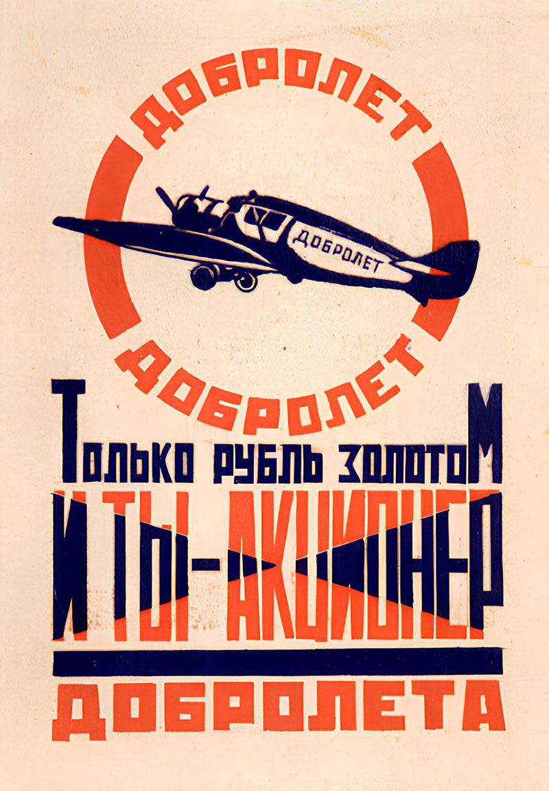
Alexander Rodchenko is probably the name you’ll encounter first. His poster designs for state publishers and his advertising work with the poet Mayakovsky set the template for Constructivist graphic design. Bold type, photomontage, restricted colors. He also taught at VKhUTEMAS, where he pushed students toward industrial applications.
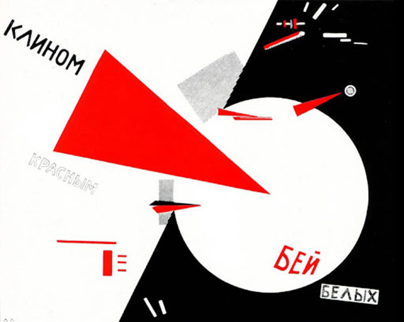
El Lissitzky was the bridge between Russia and the rest of Europe. His “Beat the Whites with the Red Wedge” from 1919 is one of the most reproduced political graphics in history. A red triangle piercing a white circle. That’s it. And it communicates instantly. His Proun series explored the space between painting and architecture, and his typographic experiments influenced a generation of Western designers.
Varvara Stepanova focused on textiles and publication design. She produced over 150 fabric patterns at the First State Textile Print Factory in 1924, using triangles, circles, and squares on monotone surfaces. Her work proved that Constructivist principles could function at industrial scale, not just on gallery walls.
Gustav Klutsis pushed photomontage further than anyone else in the movement. His political posters layered photographs with geometric elements and bold text in ways that wouldn’t look out of place on a modern editorial spread. He’s less famous than Rodchenko, which is honestly a shame.
Visual Principles of Constructivist Design
Strip away the ideology and you’re left with a set of design rules that are remarkably consistent. Constructivist visual language follows a tight internal logic. Every choice connects back to two priorities: clarity and urgency.
Geometric Abstraction as Foundation

Circles, rectangles, triangles, and diagonal lines. That’s the toolkit. Constructivists built entire compositions from these basic forms, treating them like building blocks. The psychology of shapes mattered here. Angular forms created tension. Circles suggested unity. And diagonals, always diagonals, pushed the eye forward.
This wasn’t abstract art for its own sake. Each geometric element was placed to direct attention. The compositions operated almost like instruction manuals for how to read a page. Your eye enters here, moves along this line, lands on this text.
The Restricted Color Palette
Red, black, and white. Sometimes a muted yellow or brown. That’s it.
The restriction was partly practical (fewer ink colors meant cheaper printing) and partly symbolic. Red for revolution. Black for the machine-printed word. White for the paper itself, treated as active space rather than background. Understanding color theory helps explain why this works so well. High contrast between red and black on white creates instant readability, even from a distance. Zippia research shows that a distinctive hue can boost brand recognition by 80%. The Constructivists understood this instinctively, decades before anyone ran the numbers.
| Feature | Constructivist Approach | Purpose |
|---|---|---|
| Primary colors | Red, black, white | Maximum contrast and symbolic meaning |
| Typography | Bold sans-serif, rotated | Structural element, not decoration |
| Layout | Asymmetric, diagonal | Creates movement and urgency |
| Imagery | Photomontage, collage | Blends realism with abstraction |
| Grid | Deliberately broken | Generates visual tension |
Typography as a Structural Element

This is where Constructivism really changed the game. Type wasn’t just text to be read. It was a visual object with weight, direction, and force.
Constructivist designers rotated headlines at sharp angles. They scaled words to fill entire compositions. They mixed font weights dramatically within a single layout, creating a typographic hierarchy that controlled exactly where your attention went. The baseline was something to break, not follow. Leading was compressed or expanded to create density or openness.
Rodchenko’s advertising posters are the clearest example. The text IS the design. Remove the words and you lose the composition entirely. That idea, that typography elements can be the primary design force, still drives editorial and advertising design today.
Photomontage and Collage
Constructivists didn’t invent photomontage, but they turned it into a design method. Gustav Klutsis and Rodchenko combined photographs, cut-out shapes, and bold text into layered compositions that were part poster, part collage, part information graphic.
The technique worked because it mixed the “realness” of photography with the abstraction of geometric design. A photograph of a factory worker placed inside a circle of red, crossed by a diagonal line of bold text. The viewer gets factual imagery and emotional direction simultaneously.
Constructivism vs. Other Early Modernist Design Movements
People mix these up constantly. At a glance, Constructivism, Bauhaus design, and De Stijl all look “geometric and modern.” But the differences matter if you’re going to reference any of them in your own work.
Constructivism vs. Bauhaus
Shared ground: Both rejected ornament. Both believed design should serve society. Both operated through influential schools (VKhUTEMAS and Bauhaus, respectively). El Lissitzky actually connected the two, exhibiting in Berlin and influencing Bauhaus faculty directly. Hannes Meyer, the second Bauhaus director, even tried to set up a student exchange between the schools.
Key difference: Constructivism was rooted in Soviet collectivism. Design served the state and the people as a mass. Bauhaus grew from German industrialism and individual craftsmanship. The Bauhaus wanted to unify art and industry. The Constructivists wanted to abolish the distinction between art and life entirely.
Constructivism vs. De Stijl
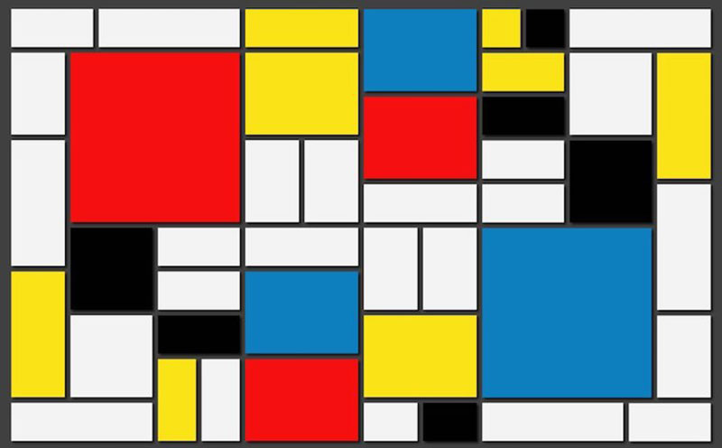
Both movements loved geometry. Mondrian’s grids and Rodchenko’s compositions share a visual DNA. But De Stijl pursued universal visual harmony. Everything balanced. Everything ordered.
Constructivism pursued deliberate imbalance. Asymmetry was the point. Diagonal lines cutting across layouts, text at angles, photomontage elements breaking any sense of rest. Where De Stijl calms you down, Constructivism pushes you to act.
Constructivism vs. Art Deco
Art Deco and Constructivism overlapped in time but disagreed on almost everything. Art Deco celebrated luxury, ornamentation, and individual expression. Constructivism rejected all three. Art Deco was for the consumer class. Constructivism was for the working class.
The visual outputs reflect this split clearly. Art Deco used gold leaf, decorative typefaces, and elaborate illustration. Constructivism used red ink, sans-serif fonts, and photomontage.
| Movement | Ideology | Visual Language | Primary Audience |
|---|---|---|---|
| Constructivism | Social utility, collectivism | Geometric, photomontage, restricted palette | Working class, general public |
| Bauhaus | Art-industry unity | Clean geometry, functional forms | Designers, industry |
| De Stijl | Universal harmony | Primary colors, grid-based | Art world, architecture |
| Art Deco | Luxury and modernity | Ornamental, decorative, rich materials | Consumer and elite classes |
How Constructivism Shaped Modern Typography and Layout

The line from Constructivist experiments to what you see in magazines and websites today is shorter than most people think. A lot of what we call “modern layout” traces directly back to what Rodchenko, Lissitzky, and others were doing in Moscow studios a hundred years ago.
Jan Tschichold and The New Typography
In 1928, a German typographer named Jan Tschichold published “The New Typography,” a book that basically translated Constructivist typographic ideas for Western European designers. Alignment rules changed. Centered text was out. Asymmetric layouts were in. Sans-serif type became the default for “modern” communication.
Tschichold had seen Constructivist work firsthand at exhibitions and through El Lissitzky’s publications. He took those raw, politically charged experiments and codified them into practical rules that any designer or printer could follow. The impact was enormous.
The Path to Swiss Design
From Tschichold’s work, you get a direct path to Swiss design (also called the International Typographic Style) in the 1950s and 60s. The grid systems that Swiss designers are famous for were built on Constructivist ideas about structured layouts and clear visual hierarchy.
The connection is direct. Constructivists broke traditional layouts with diagonals and asymmetry. Tschichold organized those breaks into principles. Swiss designers turned those principles into systems. Your mileage may vary on whether that progression lost some energy along the way (I think it did), but the lineage is clear.
Traces in Contemporary Editorial and Web Layout
Oversized numerals on magazine covers? That’s Constructivist. Diagonal text used as a design accent? Constructivist. Mixed-weight typeface hierarchies where a 72pt headline sits next to 9pt body copy? Constructivist.
Publications like The New York Times Magazine and TIME still regularly use diagonal typography and high-contrast layouts. The Pantone Color Institute notes that 90% of snap judgments about products are based on color alone. Constructivists understood the power of a restricted, high-contrast palette long before that data existed.
The principle of emphasis through scale and proportion that dominates web and editorial design today was, at its root, a Constructivist invention. They figured out that making one element dramatically larger than everything else forces the viewer’s eye to start there. Obvious now. Radical then.
Constructivism in Contemporary Graphic Design
The Constructivist aesthetic keeps coming back. Not as a historical curiosity, but as a working visual language that designers reach for when they need something to feel urgent, bold, or politically charged.
Contemporary Designers Who Draw From Constructivism
Neville Brody’s magazine work in the 1980s (particularly for The Face) pulled heavily from Constructivist layout strategies. Rotated type, photomontage, aggressive movement across the page. David Carson took some of those same ideas and pushed them further into chaos with Ray Gun magazine.
Shepard Fairey is probably the most visible contemporary link. His “Obey” campaign and the Barack Obama “Hope” poster both use Constructivist composition. Restricted color palettes, strong geometric framing, political messaging through graphic design. Fairey has directly cited Rodchenko and Constructivist propaganda posters as influences.
Brands like Nike and Supreme use Constructivist principles in their advertising, according to analysis by Keboto.org. Bold fonts, stark color contrasts, minimal imagery with maximum impact. The logo for Supreme is, at its core, a Constructivist object. White sans-serif type on a red box. That’s it.
Why Designers Keep Returning to Constructivism
Built-in urgency. Diagonal compositions and high-contrast colors create an immediate sense of energy. You can’t look at a well-executed Constructivist layout and feel calm. That makes it perfect for concert posters, protest graphics, and brand campaigns that need to stop people mid-scroll.
Counter-culture association. The movement’s political roots give it automatic credibility in streetwear, music, and activist spaces. When a book cover or album art uses Constructivist language, it signals rebellion and seriousness simultaneously. At least in my experience, clients who ask for “something Constructivist” usually want their audience to feel challenged.
Simplicity that works across media. Limited palettes and geometric forms translate cleanly from print to digital, from a large printed poster to a phone screen. Research from the US Chamber of Commerce shows that 55% of first brand impressions are visual. A Constructivist approach, with its high contrast and bold forms, makes those first impressions count, whether the viewer spends two seconds or two minutes looking.
The graphic design movements that last are the ones designers can actually use, not just admire. Constructivism works because its rules are clear enough to follow but flexible enough to adapt. That balance between structure and expression is, honestly, pretty rare in design history.
How to Apply Constructivist Principles in Your Own Work

Knowing the history is one thing. Using it is another. Constructivist techniques translate surprisingly well into modern tools, but you need to understand what you’re borrowing and why it works.
Start With a Diagonal Grid
Most designers default to vertical and horizontal baseline grids. Constructivist layouts break that habit immediately.
Set up your composition along a 30- or 45-degree axis. Place your primary text block along that diagonal. Then arrange supporting elements (images, secondary text, geometric shapes) to create tension against it. The viewer’s eye should feel pulled in a direction, not resting in place.
In Figma, which now holds a 40.65% market share among design tools according to SQ Magazine, you can rotate entire frames and set angled guides. Affinity Designer handles this well too. The tool doesn’t matter. The grid does.
Limit Your Color Palette Aggressively
Two or three colors. Maximum.
Constructivist work gains its punch from restriction. Pick one dominant color (red is the classic, but any high-saturation color works), one neutral (black or dark gray), and one ground color (white or off-white). That’s your entire color harmony system.
Research from Zippia shows that a consistent color approach boosts brand recognition by 80%. Constructivists proved this with red, black, and white a century before anyone measured it.
Treat Type as a Visual Object
Rotate it. Scale it dramatically. Let a single word fill half the canvas. The Constructivist approach to kerning and tracking was aggressive. Letters pushed close together. Whole words expanded to create rhythm.
Use display fonts with strong geometric shapes. Futura, DIN, and Bebas Neue are modern options that carry Constructivist DNA. Avoid script fonts entirely. They contradict the industrial, mechanical aesthetic.
| Technique | Tool | Constructivist Application | |—|—|—| | Diagonal grid | Figma, Illustrator | Set guides at 30-45 degree angles | | Photomontage | Photoshop, Affinity Photo | Layer photography with geometric cuts | | Type as image | Any vector tool | Rotate, scale, and overlap letterforms | | Restricted palette | Any tool | 2-3 colors only, high contrast |
Study the Originals Directly
MoMA’s online collection has digitized Rodchenko posters and El Lissitzky prints. The State Tretyakov Gallery in Moscow holds the largest physical collection. Tate Modern in London also maintains a solid archive of Russian avant-garde graphic work.
Spend time with original pieces, even digitally. Screenshots from design blogs lose the detail. Go to the museum databases and zoom into the print quality, the ink density, the way type sits against photographic elements.
Common Misuses of Constructivist Style
Constructivism gets borrowed constantly. But a lot of that borrowing is shallow, and some of it actively contradicts what the movement stood for.
Surface Imitation Without Context
The most common mistake. Designers grab the red-and-black palette, slap on some diagonal text, maybe add a star or a fist graphic, and call it “Constructivist.” The visual codes are there but the intent is missing.
Constructivist design was always about something. A message. A call to action. A piece of information that needed to reach as many people as possible. When you strip that purpose out and just use the look, you get decoration wearing a revolutionary costume. Keboto.org research documents how brands like Nike and Coca-Cola have adopted high-contrast Constructivist visual techniques for commercial advertising, which is at least arguably the opposite of what the movement intended.
The Soviet Poster Generator Problem
Online tools and templates that auto-generate “Soviet-style” posters have turned Constructivism into a novelty. Type your name, pick a slogan, get a red poster. It flattens a decade of serious design thinking into a party trick.
The issue isn’t just taste. It’s that these generators reduce a specific visual language with political and social meaning to a meme format. That’s different from referencing a style with awareness. Shepard Fairey references Constructivism with full acknowledgment of its political roots. A novelty generator does not.
Anti-Commercial Roots, Commercial Applications
Here’s where it gets genuinely uncomfortable. Constructivism was an explicitly anti-capitalist movement. The designers who created this visual language did so in opposition to commercial culture and consumer advertising.
Using Constructivist aesthetics to sell luxury products or lifestyle brands creates a real contradiction. Whether that bothers you depends on your position, but you should at least know it’s there. Symbolism in graphic design carries weight whether the designer intends it or not.
The US Chamber of Commerce notes that 55% of brand impressions are visual. If your visual language carries political meaning, your brand absorbs that meaning, even if accidentally. And your audience will notice, especially the ones who know the history.
Resources for Studying Constructivism in Design

If you’re going to use this style, do the reading. The best Constructivist-inspired work comes from designers who actually understand the source material.
Books Worth Owning
“The Struggle for Utopia” by Victor Margolin is the most thorough English-language history of Russian Constructivist graphic design. It covers the political context alongside the visual work.
“Graphic Design: A New History” by Stephen Eskilson places Constructivism within the full arc of graphic design principles and design elements, making it easier to see how the movement connects to what came before and after.
“Russian Constructivist Posters” by Elena Barkhatova is mostly images, and that’s the point. Large reproductions of original posters, book covers, and packaging designs. This is the reference you keep next to your workspace.
Museum Collections and Digital Archives
| Resource | What You’ll Find | Access |
|---|---|---|
| MoMA (New York) | Rodchenko, Lissitzky, Stepanova prints | Free online collection |
| Tate Modern (London) | Russian avant-garde graphic works | Free online archive |
| State Tretyakov Gallery (Moscow) | Largest physical Constructivist collection | In-person, some digital |
| Guggenheim | Curated Constructivism movement page | Free online |
MoMA’s Object:Photo project specifically documents the VKhUTEMAS school and its connection to Constructivist photography and graphic design. It’s one of the best free resources available.
Broader Context Worth Exploring
Don’t stop at Constructivism alone. Look at Brutalist design, which shares Constructivism’s rejection of decoration. Check out postmodern design, which deliberately broke the rules that Constructivism helped establish. And trace the line through to minimalist design, which took Constructivism’s “less is more” attitude in a completely different direction.
Figma’s 2025 design statistics report shows that 84% of designers collaborate with developers at least weekly. Understanding shared design history, including movements like Constructivism that shaped how we think about layout, rhythm, and unity, gives those conversations a common vocabulary.
The famous graphic designers who keep getting referenced in design discourse, Rodchenko, Lissitzky, Tschichold, Brody, all have deep connections to Constructivism. Learning their work in context, rather than through isolated Pinterest screenshots, makes a difference in how you apply their ideas.
FAQ on What Is Constructivism In Graphic Design
What is Constructivism in graphic design?
Constructivism is a Russian avant-garde design movement from the early 1920s. It uses geometric forms, photomontage, bold sans-serif type, and restricted color palettes to communicate messages with clarity and urgency. Decoration was rejected entirely.
Who were the key figures of Constructivist graphic design?
Alexander Rodchenko, El Lissitzky, Varvara Stepanova, and Gustav Klutsis led the movement’s graphic output. Rodchenko’s poster work and Lissitzky’s typographic experiments became the most widely referenced examples in design history.
What colors are used in Constructivist design?
Red, black, and white dominate. The palette was both practical (fewer inks meant cheaper printing) and symbolic. Red represented revolution, black represented the machine-printed word, and white served as active white space.
How is Constructivism different from Bauhaus?
Both rejected ornament, but their roots differ. Constructivism grew from Soviet collectivism and served political goals. Bauhaus emerged from German industrialism and focused on unifying art with craft and manufacturing.
What is photomontage in Constructivist design?
Photomontage combines cut photographs with geometric shapes and bold text into layered compositions. Gustav Klutsis and Rodchenko used this technique extensively in propaganda posters, blending documentary realism with abstract graphic elements.
Is Constructivism still used in modern graphic design?
Yes. Designers like Shepard Fairey and Neville Brody draw directly from Constructivist techniques. The style appears regularly in concert posters, protest graphics, streetwear branding, and social media design campaigns.
What role did typography play in Constructivism?
Typography was treated as a structural design element, not just readable text. Designers rotated headlines, scaled words dramatically, and mixed font weights to control where the viewer’s eye moved across the composition.
What was VKhUTEMAS?
VKhUTEMAS was the Soviet state art and technical school founded in Moscow in 1920. With 2,500 students and 100 faculty, it was larger than the Bauhaus and served as the main training ground for Constructivist designers.
Can I use Constructivist style for commercial branding?
You can, but proceed carefully. Constructivism was explicitly anti-commercial. Using its visual language for luxury or consumer branding creates a contradiction with the movement’s original political and social intent.
What tools work best for creating Constructivist-inspired designs?
Any vector graphics editor works. Figma, Adobe Illustrator, and Affinity Designer all handle diagonal grids, geometric shapes, and bold type well. Photoshop or Affinity Photo are better for photomontage work.
Conclusion
Understanding what is Constructivism in graphic design means looking past the red-and-black posters and seeing the system underneath. It’s a movement where every geometric form, every rotated headline, every photomontage served a specific communicative purpose.
The Constructivist movement gave us tools we still use daily. Asymmetric layouts, typographic scale contrast, restricted monochrome color palettes, and the idea that design should prioritize function over decoration. Alexander Rodchenko, El Lissitzky, and Varvara Stepanova built a visual language that outlived the political system it was made for.
Whether you’re designing a brand identity or a political campaign, these principles still hold up. Learn the history. Then make it yours.

Renowned for his expertise in logo design and visual branding, Bogdan has developed a multitude of logos for various clients.
His skills extend to creating posters, vector illustrations, business cards, and brochures. Additionally, Bogdan's UI kits were featured on marketplaces like Visual Hierarchy and UI8.
He also wrote in the past years on sites like Design Your Way, WebDesignerDepot, WPDean, Designmodo, Speckyboy, Slider Revolution, and more.
- Canva vs PowerPoint: Which Is Better for Presentations? - 22 September 2026
- How to Install Fonts on Mac (Step-by-Step Guide) - 20 September 2026
- From Mockup to Code: How AI-Augmented Development Speeds Up the Design Handoff - 19 September 2026

Bogdan Sandu is a seasoned designer who has been designing websites since 2008. Renowned for his expertise in logo design and visual branding, Bogdan has developed a multitude of logos for various clients. His skills extend to creating posters, vector illustrations, business cards, and brochures. Additionally, Bogdan's UI kits were featured on marketplaces like Visual Hierarchy and UI8. He also wrote in the past years on sites like Design Your Way, WebDesignerDepot, WPDean, Designmodo, Speckyboy, Slider Revolution, and more.
You Might Also Like


