Art Deco shaped the look of an entire era, and graphic designers are still borrowing from it a century later. But what is Art Deco in graphic design, exactly? It’s more than gold borders and geometric patterns on a black background.
Art Deco is a defined visual style with specific rules, rooted in the 1920s decorative arts movement and built on symmetry, bold typography, and structured ornamentation. It influenced everything from travel posters and magazine covers to luxury packaging and brand identities.
This article breaks down where the style came from, what makes it visually distinct, how designers like A.M. Cassandre defined its graphic language, and how to actually apply Art Deco principles in modern design projects without it looking like a costume party.
What Is Art Deco in Graphic Design
Art Deco is a visual design style built on geometric precision, bold symmetry, and decorative richness. It first appeared in graphic work during the early 1920s and dominated commercial visual communication through the late 1930s.
The style shows up in posters, packaging, magazine covers, logos, and advertising layouts. When people talk about Art Deco in architecture or furniture, they’re referencing the same broader movement. But in graphic design specifically, it means something tighter: flat, stylized compositions with strong vertical and horizontal lines, lavish ornamentation, and lettering that doubles as decoration.
According to Cognitive Market Research, the global graphic design market reached $49.1 billion in 2024. A significant portion of current luxury branding and hospitality design pulls directly from Art Deco’s visual vocabulary.
The Art Deco Glass Market tells a similar story. WiseGuy Reports found it hit $1.56 billion in 2024, with geometric patterns holding the largest style share at 35.7%. That number alone shows how deeply Art Deco’s core visual language still drives commercial demand.
What separates Art Deco from other graphic design movements is its strange duality. It’s both machine-age industrial and hand-finished luxurious. Functional and excessively decorative. It embraces modernity while borrowing from ancient Egypt and Mesoamerica. Nothing else in the graphic design timeline hits quite that combination.
Where Art Deco in Graphic Design Came From
The name itself traces back to the 1925 Exposition Internationale des Arts Décoratifs et Industriels Modernes in Paris. Though, the term “Art Deco” wasn’t actually coined until the 1960s, when historians retroactively named the style after that exhibition.
According to Swann Galleries, over 16 million visitors from 20 countries attended the exposition across six months. Graphic design, fashion, jewelry, architecture, and interior design all appeared under one roof. The exhibition’s fourth article explicitly required works of “new inspiration and real originality,” banning any reproduction of historical styles (JSTOR Daily).
The graphic language that emerged there didn’t come from nowhere. It pulled from several sources at once.
- Cubism gave it angular fragmentation and geometric abstraction
- Futurism contributed speed, dynamism, and a celebration of the machine
- Bauhaus pushed the integration of art and industrial production
- Egyptian and Aztec motifs provided the exotic ornamentation that made Art Deco feel ancient and modern simultaneously
The discovery of Tutankhamun’s tomb in 1922 had a massive cultural ripple. Suddenly, sunbursts, stepped forms, and stylized figures with Egyptian proportions showed up everywhere in graphic work.
Cedric Gibbons, art director at MGM, attended the Paris Exposition and brought back ideas that shaped Hollywood set design for the next two decades. That crossover between film, advertising, and graphic design was a defining feature of how Art Deco spread.
Art Deco vs. Art Nouveau in Graphic Design
This is where most confusion happens. And honestly, the two get mixed up constantly, even by people who should know better.
Art Nouveau used flowing, organic, plant-based forms. Whiplash curves. Asymmetric compositions. Think Alphonse Mucha’s theatrical posters with their tangled hair and floral borders.
Art Deco rejected all of that. Sharp angles replaced curves. Geometric repetition replaced organic flow. The typography shifted hard, from ornamental curving lettering to bold, sans-serif geometric faces.
| Feature | Art Nouveau | Art Deco |
|---|---|---|
| Dominant shapes | Organic curves, florals | Geometric angles, zigzags |
| Typography | Ornamental, flowing | Bold, structured, sans-serif |
| Composition | Asymmetric, natural flow | Symmetrical, grid-based |
| Cultural mood | Romantic, handcraft | Industrial, machine-age |
The National Building Museum notes that Art Deco emerged as a direct evolution after Art Nouveau waned during World War I. Designers began to see the machine as something that could contribute positively, not just as a tool of destruction. That mindset shift is visible in every poster, every letterform, every layout choice of the era.
Visual Characteristics of Art Deco Graphic Design

If you’re trying to identify whether something is Art Deco, look for a specific set of design elements. Not just “old looking” or “kind of geometric.” The style has very precise markers.
Symmetrical composition is probably the first thing you’ll notice. Art Deco layouts almost always center around a strong vertical or horizontal axis. The balance is deliberate, sometimes rigid.
Geometric shapes everywhere: chevrons, zigzags, sunbursts, stepped forms, fan motifs, and repeating triangular patterns. These aren’t randomly decorative. They’re structured, measured, precise.
Lavish line work. Decorative borders, framing devices, and intricate rule lines surround compositions. Art Deco didn’t believe in white space the way Swiss design later would. Every surface could carry decoration.
The illustration style is flat and highly stylized. Low realism, high decoration. Human figures look idealized and angular. Animals become geometric symbols. Took me a while to appreciate how much control that requires, actually. Making something look both ornate and clean at the same time is tricky.
The WiseGuy Reports data on Art Deco glass markets confirms this: geometric patterns dominate at 35.7% market share, followed by stylized floral motifs at 28.9% and sunburst designs making up the rest. That hierarchy maps almost perfectly onto how these elements rank in graphic applications too.
Art Deco Typography

The letterforms are where Art Deco gets really distinctive. If you’ve ever seen tall, uniform-stroke, geometrically constructed capital letters on a vintage poster, that’s Art Deco typography doing its thing.
Key characteristics:
- Tall, elongated letterforms with uniform stroke width
- Geometric construction (circles, triangles, rectangles as building blocks)
- Heavy use of all-caps settings with wide letter-spacing
- Minimal serifs or none at all
The typefaces most tied to this era include Broadway, Bifur, Peignot, and modern revivals like Kabel. A.M. Cassandre designed Bifur in 1929, and it’s considered the starting point for Art Deco typography as a category. He followed it with Acier Noir in 1935 and Peignot in 1937.
Alpha Efficiency notes that Art Deco typography is one of the main display font trends for 2024, with its rise closely tied to the maximalist graphic design movement. That tracks. When everything is minimal, the pendulum eventually swings back toward ornament.
Art Deco in Posters, Packaging, and Print
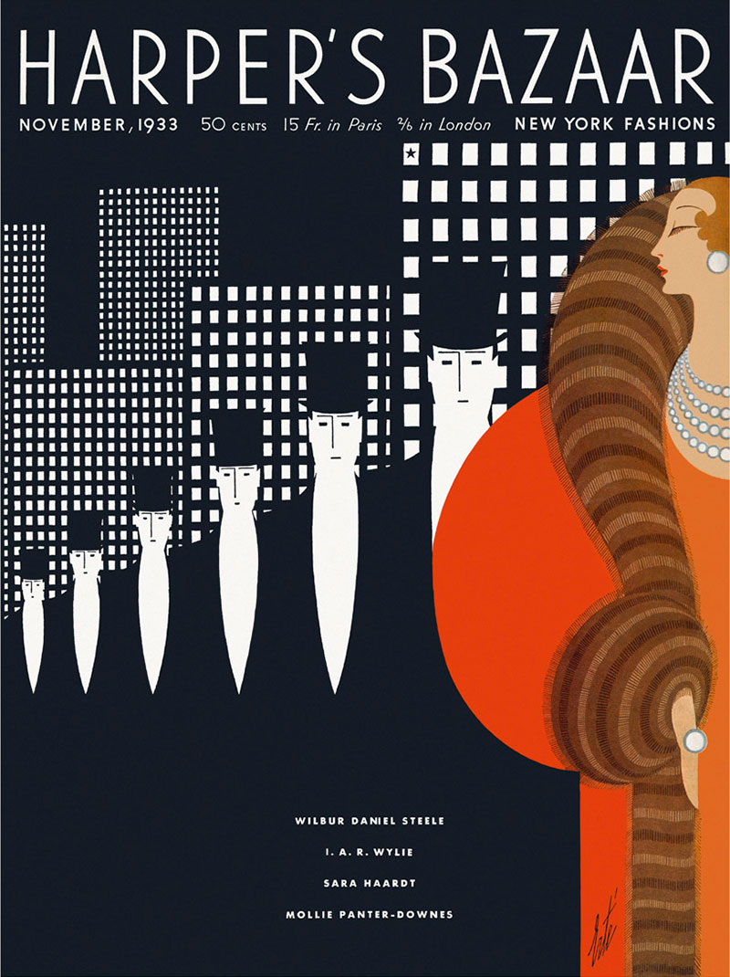
The poster is where Art Deco graphic design lived its best life. No other format gave designers as much room to combine bold type, flat illustration, and decorative geometry at scale.
Travel posters became the most iconic application. Ocean liners, railways, airlines. All of them commissioned Art Deco graphic work to sell the fantasy of luxury travel during the interwar period.
Cassandre’s poster for the SS Normandie (1935) is probably the single most recognized piece of Art Deco graphic design ever produced. According to Dezeen, his poster for cabinet maker Au Bucheron won the grand prix at the 1925 Paris Exposition, which launched his career. He then co-founded the design studio Alliance Graphique in 1926, and the iconic posters for Étoile du Nord, Dubonnet, and the Normandie followed over the next decade.
But travel wasn’t the only game. Art Deco showed up across print design broadly:
- Luxury product packaging (perfume, spirits, cigarettes)
- Magazine covers, especially Vogue and Harper’s Bazaar during the 1920s and 1930s
- Commercial advertising and department store branding
- Book covers and editorial illustration
Erté created over 240 covers for Harper’s Bazaar using an Art Deco style that blurred the line between fashion illustration and fine art. Cassandre himself later designed 38 covers for the same magazine between 1936 and 1940.
The Journal of Antiques and Collectibles notes that Art Deco poster art and ephemera now lead the collectibles market for this period. Prices range widely, but a collection of nine original 1925 Paris Exposition graphics sold at Wright Auctions, showing the enduring commercial value of these graphic works.
Art Deco’s Influence on Modern Graphic Design
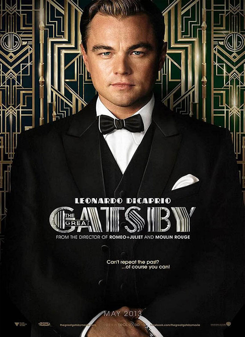
Art Deco didn’t just stop in the 1930s and disappear. It keeps coming back, and each revival teaches us something different about what the style actually is versus what we project onto it.
The 1980s brought the first major revival. Miami Vice’s visual identity, with its pastel-meets-geometric approach, borrowed heavily from Art Deco architecture and graphic language. The Memphis Group’s work during the same period overlapped with Art Deco’s love of bold pattern and bright color palettes, though Memphis pushed further into postmodern territory.
Right now? It’s everywhere again. Designers at EDH Interiors told Real Homes that Art Deco’s resurgence ties directly to a collective push away from minimalism. People want more saturated color, more ornamentation, more personality.
Where Art Deco shows up in current graphic design:
- Luxury and hospitality branding (hotel identities, cocktail bar menus, spa graphics)
- Wedding invitations and event design
- Entertainment marketing (the 2013 Great Gatsby film campaign being the most obvious example)
- Editorial and magazine layouts leaning into retro-glamour aesthetics
Digital tools have made it more accessible than ever. Adobe Illustrator pattern brushes, Art Deco vector packs, and Canva templates all lower the barrier. But accessibility also means dilution, so the quality gap between “used an Art Deco template” and “actually understands Art Deco principles” has gotten wider.
According to Vertical Arts architects, 2024 saw Art Deco fusing with what they call “understated luxury.” The full-blown ornament of the 1920s gets toned down. Clean lines mix with decorative accents on a neutral backbone. Personally, I think that hybrid approach is where the style works best in modern contexts. Going full period-accurate Art Deco in a 2024 brand identity would feel costumey.
How to Apply Art Deco Style in Graphic Design Projects
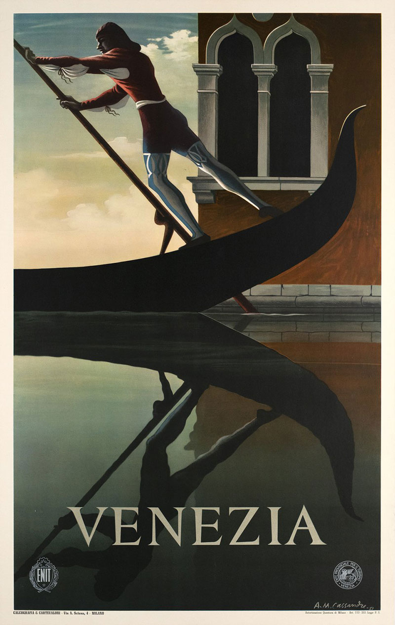
If you want to actually use this style, not just admire it, here’s what I’ve found works. And what doesn’t.
Start with grid systems and symmetrical composition. Art Deco layouts are structured. Set up strong vertical and horizontal axes before placing any element. The alignment should feel deliberate, almost architectural.
Pick the right typeface. This is where most projects fail or succeed. Choose a period-appropriate or revival display typeface for headlines, then pair it with a clean body text face. Art Deco display type and minimal body copy is a classic combination. Trying to make the body text “Art Deco” too usually creates readability problems.
Build a color system around gold and black, or jewel tones with metallic accents. Deep emeralds, sapphire blues, ruby reds. Chrome and brass finish effects. The psychological impact of color in Art Deco is tied to luxury and opulence, so muted pastels won’t read correctly unless you’re going for a deliberate subversion.
Use decorative borders, line rules, and framing elements without overcrowding the layout. This sounds obvious, but the balance between “richly decorated” and “visual noise” is harder than it looks.
Where Art Deco style works best: editorial layouts, branding for luxury goods, event design, product packaging, and poster design.
Where it usually doesn’t: UX/UI for apps, minimalist tech branding, or anything where speed of information processing matters more than atmosphere.
Common Mistakes When Designing in Art Deco Style
After seeing a lot of Art Deco attempts go sideways, here are the patterns I notice.
Overloading decoration. More ornament doesn’t mean more Art Deco. The original designers were very controlled about placement. Every decorative element had a compositional purpose. Dumping zigzag borders, sunbursts, and fan motifs onto one layout just creates clutter.
Mixing incompatible styles. Art Deco paired with flat modern minimalism creates cognitive dissonance. The styles have opposite intentions. One celebrates surface. The other strips it away. You can blend Art Deco with contemporary sensibilities (Vertical Arts calls this “understated luxury”), but that requires taste and restraint, not just slapping a gold border on a white card.
Using generic “vintage” elements that aren’t actually Art Deco. Victorian ornaments, Art Nouveau florals, mid-century modern shapes. These get lumped together under “retro” and the result is a visual identity crisis. Know which era you’re referencing.
Art Deco Graphic Design Examples Worth Studying
If you’re going to learn this style properly, you study the originals. Not Pinterest boards. Not AI-generated “Art Deco inspiration.” The actual work, by the actual people who defined what Art Deco graphic design looks like.
2025 marks the centennial of the 1925 Paris Exposition, and institutions worldwide are responding. The Musée des Arts Décoratifs in Paris opened “1925-2025: One Hundred Years of Art Deco” with over 1,000 works on display (Artnet News). The Sarasota Art Museum is showing 100 rare posters from the William W. Crouse Collection, one of the most significant private collections of Art Deco graphic work in the world.
Swann Galleries listed Cassandre’s Dubonnet triptych (1932) with an estimate of $400,000 to $600,000 for their April 2025 centennial auction. His L.M.S./Best Way poster (1928) previously set the record for any travel poster at auction, selling for $162,500 in 2012.
Those auction numbers tell you something about the lasting value of the graphic work itself. Not just as history, but as objects people want to own.
Here’s where to focus your study time.
| Designer / Work | Period | Why It Matters |
|---|---|---|
| A.M. Cassandre, Normandie poster | 1935 | Definitive Art Deco composition and typographic hierarchy |
| A.M. Cassandre, Dubonnet triptych | 1932 | First serial poster designed for moving vehicles |
| Erté, Harper’s Bazaar covers | 1920s–1930s | Fusion of fashion illustration and decorative geometry |
| Tamara de Lempicka, paintings | 1920s–1930s | Art Deco figural style that influenced graphic portraiture |
| Chrysler Building promotional graphics | 1930 | Corporate visual identity rooted in architectural Art Deco |
Cassandre is the entry point. His Étoile du Nord (1927), the Dubonnet series (1932), and the Normandie poster (1935) cover every key principle of Art Deco graphic design: geometric abstraction, integrated type, flat stylized illustration, and luxurious color harmony. Britannica notes his Dubonnet posters were among the first designed specifically to be seen from fast-moving vehicles.
He also designed three iconic typefaces: Bifur (1929), Acier Noir (1935), and Peignot (1937). His work at MoMA in 1936 led to commissions from Harper’s Bazaar, where he produced 38 covers between 1936 and 1940.
Erté is the other side of Art Deco graphic work. Where Cassandre was geometric and industrial, Erté’s Harper’s Bazaar covers were ornamental, figural, and fashion-forward. Both approaches are authentic Art Deco, just different interpretations of the same underlying principles.
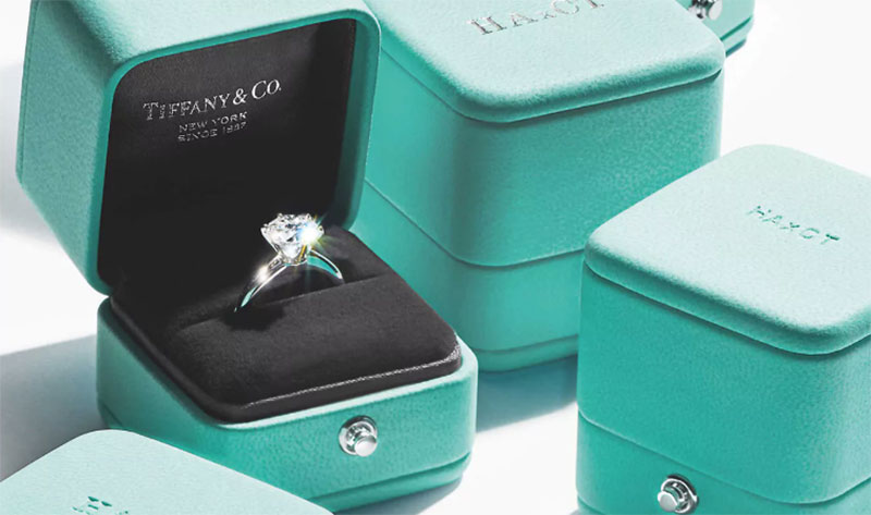
Contemporary reference: Baz Luhrmann’s 2013 Great Gatsby used Art Deco as its entire visual identity framework. According to Wikipedia, the film grossed over $353 million worldwide and won Academy Awards for Best Production Design and Best Costume Design. Warner Bros. ran one of its most aggressive outdoor marketing campaigns ever, blanketing New York and Los Angeles with Art Deco-flavored billboards and subway installations (Archimedia Studios). Tiffany & Co. even launched a “Great Gatsby Collection” tied to the film’s release. That campaign proved Art Deco’s commercial viability as a graphic language to modern audiences at massive scale.
Miami’s South Beach district remains the largest concentration of tropical Art Deco architecture anywhere. The Miami Design Preservation League, founded in 1976, was the first Art Deco Society and sparked a global preservation movement. The graphic branding across South Beach’s hotels and restaurants still draws directly from the original Art Deco palette.
Art Deco Graphic Design and the Broader Decorative Arts Movement
Graphic design was one piece of something much larger. And understanding that larger picture changes how you use the style.
Art Deco touched architecture, fashion, furniture, industrial design, jewelry, and film simultaneously. The National Building Museum calls it “one of the few truly universal styles” because it unified so many aspects of the built and designed world in a way that hasn’t been replicated since.
The shared principles across all these disciplines were consistent.
Geometric order. Whether you’re looking at a Chrysler Building spire, a Cartier bracelet, or a Cassandre poster, the same vocabulary of chevrons, zigzags, sunbursts, and stepped forms appears.
Luxurious materials (or their visual representation). In architecture, that meant chrome, marble, and lacquer. In graphic design elements, it translated to metallic inks, rich color hues, and gradient effects simulating shine and depth.
Celebration of modernity. Speed. Industry. Progress. The Jazz Age optimism runs through everything from ocean liner advertisements to skyscraper ornament to cocktail shaker engravings.
Artnet News reports that Art Deco’s centennial celebrations in 2025 include exhibitions in Paris, Milan, New York, Houston, Brussels, and Tokyo. Mumbai alone has over 1,350 documented Art Deco buildings, according to the Art Deco Mumbai Trust. That kind of global footprint for a single design language is almost unheard of.
Why does this matter for graphic designers specifically?
Because the graphic applications of Art Deco become stronger storytelling tools when you understand the broader movement behind them. A designer who knows that Art Deco celebrated industrial modernity will make different choices than someone who just thinks it means “gold borders and zigzags.”
The decorative vocabulary came from real cultural forces. Post-World War I optimism. The discovery of Tutankhamun’s tomb. Cubism breaking apart visual representation. The machine age making speed and efficiency beautiful rather than threatening.
Those cultural origins inform everything from font psychology choices (tall, confident, mechanical letterforms) to emphasis patterns (strong central focal points framed by symmetrical decoration) to contrast strategies (dark backgrounds with metallic or jewel-toned accents).
The Art Newspaper notes that specialist dealer Galerie Marcilhac describes Art Deco as “a living design language,” with broader geographical demand and younger collectors increasingly drawn to both the historical and contemporary expressions of the style.
If you’re pulling Art Deco into a current project, your results will look more authentic and more intentional when you understand what the style was actually about. Not just how it looked, but why it looked that way.
FAQ on What Is Art Deco In Graphic Design
What defines Art Deco in graphic design?
Art Deco in graphic design is defined by geometric patterns, symmetrical compositions, bold typography, and decorative ornamentation. The style uses flat, stylized illustration with strong vertical and horizontal alignment, often featuring chevrons, sunbursts, and stepped forms.
When did Art Deco graphic design originate?
It emerged in the early 1920s in France and peaked through the late 1930s. The name comes from the 1925 Exposition Internationale des Arts Décoratifs et Industriels Modernes in Paris, though the term wasn’t coined until the 1960s.
How is Art Deco different from Art Nouveau?
Art Nouveau used organic, flowing curves and plant-based forms. Art Deco replaced those with sharp geometric angles, structured symmetry, and sans-serif typography. Art Nouveau is romantic and handcrafted. Art Deco is industrial and machine-age.
What typography is used in Art Deco design?
Art Deco typefaces feature tall, elongated letterforms with uniform stroke width and geometric construction. Classic examples include Broadway, Bifur, and Peignot. Designers typically set headlines in all-caps with wide letter-spacing.
What colors are typical in Art Deco graphic design?
The style relies on rich jewel tones like emerald, sapphire, and ruby, paired with metallic gold, silver, or chrome accents. Black and gold is the most recognized combination. Muted pastels rarely appear in authentic Art Deco work.
Who are the most famous Art Deco graphic designers?
A.M. Cassandre is the most recognized, known for his Normandie and Dubonnet posters. Erté created over 240 Harper’s Bazaar covers. Other key figures include Jean Carlu, Paul Colin, and Charles Loupot.
Is Art Deco still used in modern graphic design?
Yes. Art Deco appears frequently in luxury branding, hospitality design, wedding invitations, and entertainment marketing. The 2013 Great Gatsby film campaign and current hotel branding in Miami’s South Beach are well-known contemporary examples.
What design elements make something look Art Deco?
Look for symmetrical layouts, decorative borders, fan motifs, zigzag patterns, sunburst shapes, and metallic color accents. Flat stylized illustration with low realism and lavish line work are also signature markers of the style.
Where was Art Deco graphic design most commonly applied?
Travel posters, luxury product packaging, magazine covers, commercial advertising, and department store branding. Vogue and Harper’s Bazaar featured Art Deco graphic work extensively during the 1920s and 1930s.
Can Art Deco work in digital and web design?
It works for specific contexts like luxury brand websites, event landing pages, and editorial layouts. Full Art Deco styling is too ornamental for most app interfaces or minimalist tech branding, where speed of readability matters more than atmosphere.
Conclusion
Understanding what is Art Deco in graphic design goes beyond recognizing gold accents and zigzag borders. It means knowing the cultural forces behind the style, from the 1925 Paris Exposition to the influence of Cubism, Constructivism, and Egyptian visual motifs.
The style gave us some of the most enduring work in poster art and commercial illustration. Cassandre’s typeface designs and travel posters set standards that luxury brand identity work still references today.
Whether you’re building a mood board for a hospitality client or picking a display typeface for event graphics, Art Deco gives you a tested visual framework. Rich color palettes, geometric composition, and integrated lettering all work when applied with intent.
Study the originals. Understand the principles behind the decoration. Then make it yours.

Renowned for his expertise in logo design and visual branding, Bogdan has developed a multitude of logos for various clients.
His skills extend to creating posters, vector illustrations, business cards, and brochures. Additionally, Bogdan's UI kits were featured on marketplaces like Visual Hierarchy and UI8.
He also wrote in the past years on sites like Design Your Way, WebDesignerDepot, WPDean, Designmodo, Speckyboy, Slider Revolution, and more.
- Minecraft Font Generator - 8 October 2026
- How Top Meta Ad Creative Is Designed for E-commerce Brands - 8 October 2026
- How photo recovery software works and when to use it - 7 October 2026

Bogdan Sandu is a seasoned designer who has been designing websites since 2008. Renowned for his expertise in logo design and visual branding, Bogdan has developed a multitude of logos for various clients. His skills extend to creating posters, vector illustrations, business cards, and brochures. Additionally, Bogdan's UI kits were featured on marketplaces like Visual Hierarchy and UI8. He also wrote in the past years on sites like Design Your Way, WebDesignerDepot, WPDean, Designmodo, Speckyboy, Slider Revolution, and more.
You Might Also Like