The wrong font at small sizes doesn’t just look bad. It makes text physically harder to read.
Choosing the best fonts for small text comes down to measurable structure: x-height, stroke contrast, aperture openness, and how well a typeface survives pixel-grid rendering. Font psychology plays a role in larger display settings, but at caption size, legibility wins every time.
This guide covers 10 typefaces that hold up where most fonts fail, from UI labels at 10px to body copy at 14px, across both screen and print contexts.
You’ll find out which sans-serif fonts render most clearly at small sizes, when a serif font actually outperforms a sans-serif, and what size and weight settings maximize micro typography legibility on screen.
The Best Fonts For Small Text
Choosing the right font for small text is not a matter of preference. It comes down to measurable structural properties: x-height, stroke contrast, letter-spacing, and optical sizing support. These determine whether text remains readable at 8px or 12px, on low-DPI screens, in dense UI layouts, or in fine print.
Below are the 10 best typefaces for small text, each evaluated against those criteria.
—
Verdana
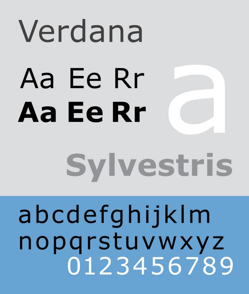
Verdana is a humanist sans-serif font designed by Matthew Carter in 1996, released by Microsoft as part of the Core Fonts for the Web initiative. It maintains clear letter-level legibility at sizes as small as 8px on low-resolution screens.
Verdana suits on-screen body text and UI labels because it was built from pixel patterns rather than print conventions, giving it wider character spacing and larger counters than most sans-serif alternatives at the same point size. A Wichita State University study found Verdana was the most preferred font overall among users who read documents regularly.
What makes Verdana suitable for small text?
Verdana has a large x-height relative to its cap height, which makes lowercase letters appear visually larger without increasing the actual font size. Its counters and apertures are wider than comparably sized fonts like Arial or Helvetica, keeping strokes clearly separated at low resolution. Characters such as lowercase i, l, and the numeral 1 are drawn with distinct features (a horizontal base and hook) specifically to prevent misidentification at small sizes.
Key attributes:
| Attribute | Value |
| Classification | Humanist sans-serif |
| Designer | Matthew Carter, 1996 |
| Weight range | Regular 400, Bold 700 (Verdana Pro adds Light, SemiBold, Black) |
| Variable font | No |
| Optical sizes | No |
| Recommended sizes | 8px–14px for UI labels; 12px–16px for body text |
| Letter-spacing default | Wide (intentionally generous for screen legibility) |
| License | Proprietary (Microsoft); Verdana Pro sold separately |
| Available on | Pre-installed on Windows and macOS; Adobe Fonts (Verdana Pro) |
| Price | Free (bundled); Verdana Pro is paid |
How does Verdana perform at small text sizes?
Verdana renders clearly at 8px on low-DPI displays because its hinting was hand-tuned by Tom Rickner at Agfa Monotype to align character stems cleanly to the pixel grid. Its wide proportions prevent character collision, which is a common problem when fonts designed for print are forced into screen environments. The bold weight uses a double-pixel width, ensuring sufficient contrast between regular and bold even at the smallest readable sizes.
What are the best pairings for Verdana in small text?
Verdana pairs with Georgia for body-plus-heading combinations, since both were designed by Matthew Carter with the same screen-first philosophy and matching visual weight. It pairs with Tahoma when a narrower companion is needed for UI chrome or navigation labels, as Tahoma shares Verdana’s hinting approach in a more compact footprint.
What are the limitations of Verdana for small text?
Verdana’s wide character spacing that helps legibility on screen creates awkward white space when used in print or at display sizes above 24px. The base family is limited to Regular and Bold, with no native italic or intermediate weights, which restricts typographic hierarchy in complex layouts without purchasing Verdana Pro.
Verdana – Recommended Use Cases Within Small Text
- Best for: UI labels, data table captions, tooltips, fine print on low-DPI screens
- Avoid for: Print documents, display headings above 24px, extended body copy in print contexts
- Optimal weight: Regular 400 for body; Bold 700 for labels and emphasis
- Optimal size range: 8px–16px for screen text
—
Georgia

Georgia is a transitional serif font designed by Matthew Carter in 1993 and released by Microsoft in 1996. It delivers reliable body text legibility on screens at sizes where most serif typefaces lose clarity.
Georgia suits editorial body text, blog copy, and news-style layouts because its large x-height and reduced stroke contrast keep thin strokes visible on screen, where competing serifs like Times New Roman fall apart. The New York Times replaced Times New Roman with Georgia for its online content in 2007.
What makes Georgia suitable for small text?
Georgia’s x-height is significantly larger than Times New Roman’s. At 12px, lowercase letters occupy noticeably more vertical space, improving scanability in paragraph-length text. Its serifs are thicker and sturdier than standard print serifs, which prevents them from collapsing on pixel grids. Open counters in letters like a, e, and c maintain their shape at low resolution, reducing misread characters.
Key attributes:
| Attribute | Value |
| Classification | Transitional serif (Scotch Roman) |
| Designer | Matthew Carter, 1993 |
| Weight range | Regular 400, Bold 700; Georgia Pro adds Light, SemiBold, Black, Condensed |
| Variable font | No |
| Optical sizes | No |
| Recommended sizes | 12px–18px for screen body text; 10pt+ for print |
| Letter-spacing default | Generous (wider than print serifs) |
| License | Proprietary (Microsoft); Georgia Pro sold separately |
| Available on | Pre-installed on Windows and macOS; Adobe Fonts |
| Price | Free (bundled); Georgia Pro is paid |
How does Georgia perform at small text sizes?
Georgia renders consistently across platforms because its glyphs were manually hinted by Thomas Rickner. At 72 DPI, which was the standard for early web use, Georgia maintained readable serifs where competitors degraded into noise. On modern high-DPI screens, its proportions hold up well and the typeface looks clean at 13px–18px for paragraph text.
What are the best pairings for Georgia in small text?
Georgia pairs with Verdana for classic screen typography, matching the visual weight and screen-optimized DNA of both designs. It pairs with humanist sans-serifs like Open Sans when a warmer serif heading needs a more neutral body complement in editorial layouts.
What are the limitations of Georgia for small text?
Georgia’s base family is limited to four styles (Regular, Italic, Bold, Bold Italic), which constrains typographic hierarchy for complex systems. Its stroke contrast, while lower than print serifs, is still high enough that it can struggle on very low-resolution displays or screens with poor contrast ratios.
Georgia – Recommended Use Cases Within Small Text
- Best for: Blog body text, editorial layouts, news article copy, e-reader body text
- Avoid for: UI labels below 12px, dark mode interfaces with low contrast, UI controls
- Optimal weight: Regular 400 for body; Bold 700 for subheadings
- Optimal size range: 13px–18px on screen; 10pt–12pt in print
—
Inter

Inter is a neo-grotesque variable font designed by Rasmus Andersson, first released in 2017 as an open-source project. It covers UI text, buttons, labels, and body copy with a single adaptable file spanning Thin 100 to Black 900.
Inter optimizes for screen UI text because it includes an optical size axis that automatically adjusts stroke weight and spacing based on render size, making it one of few free fonts engineered specifically for this purpose. For the 12 months ending May 2025, Inter was accessed 414 billion times on Google Fonts, with 57% year-over-year growth.
What makes Inter suitable for small text?
Inter has a tall x-height combined with open apertures in letters like c, e, and a, keeping these characters distinct at 10px–12px on high-density displays. At sizes below 12px, the font uses semi-opaque pixel pairs on some stems (like the center bar of E and F) to maintain visual weight without pixel collapse. Ink traps and bridges on the text optical size variant add contrast at small render sizes.
Key attributes:
| Attribute | Value |
| Classification | Neo-grotesque sans-serif |
| Designer | Rasmus Andersson, 2017 |
| Weight range | Thin 100 to Black 900 (9 weights) |
| Variable font | Yes |
| Optical sizes | Yes (text and display) |
| Recommended sizes | 12px–24px for UI; 14px–18px for body text |
| Letter-spacing default | 0 (adjustable via opsz axis) |
| License | SIL Open Font License 1.1 |
| Available on | Google Fonts, rsms.me/inter (official), Adobe Fonts |
| Price | Free |
How does Inter perform at small text sizes?
Inter renders clearly at 12px–14px on both high-DPI (Retina) and standard-density screens, adapting through its optical size axis without requiring multiple font files. Figma ships Inter as its default UI typeface. Companies including GitHub, Linear, Vercel, and Mozilla use it for interface copy at small sizes in production. Below 11px, some fine details can still compress, and the Google Fonts distribution removes several OpenType features, including the optical size axis, so the official rsms.me CDN is preferable for full feature access.
What are the best pairings for Inter in small text?
Inter pairs with Merriweather for editorial interfaces that combine UI chrome and reading copy, using Inter for labels and Merriweather for body paragraphs. It pairs with Source Serif 4 when documentation or content-heavy web apps need screen-optimized serif body text alongside a clean sans-serif UI layer.
What are the limitations of Inter for small text?
Inter is not well-suited for extended long-form reading at 16px+, where humanist sans-serifs like Source Sans 3 or DM Sans offer more organic stroke variation that reduces reading fatigue over paragraphs. The Google Fonts distribution strips the optical size axis and true italic, which are significant features for small text use, requiring the official CDN instead.
Inter – Recommended Use Cases Within Small Text
- Best for: UI labels, button text, navigation, forms, data dashboards at 12px–16px
- Avoid for: Long-form article body text, print documents, luxury branding contexts
- Optimal weight: Regular 400 for body; Medium 500 for labels; SemiBold 600 for headings
- Optimal size range: 12px–24px for UI text
—
Roboto
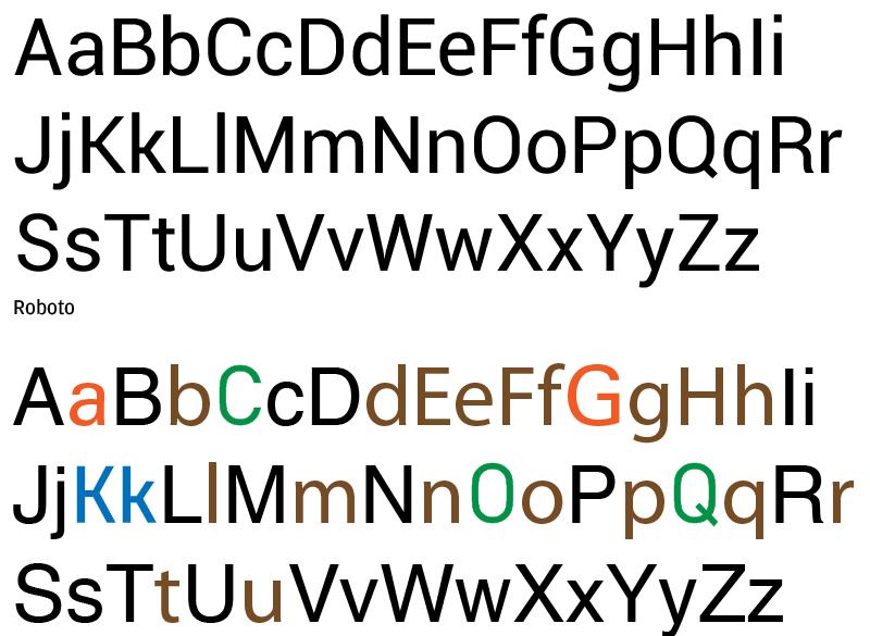
Roboto is a geometric neo-grotesque sans-serif designed by Christian Robertson for Google, first released in 2011 as the system font for Android 4.0. It delivers compact legibility for mobile UI and Material Design interfaces across a full 9-weight range.
Roboto suits Android and Material Design interfaces because its slightly wider, rounder character forms (post-2014 redesign) give it more open apertures than a strict geometric grotesque, while its mechanical skeleton maintains efficient horizontal metrics for dense layouts. By 2024, Roboto and Open Sans together accounted for 51% of all Google Font views, with Roboto recording over 200 billion views.
What makes Roboto suitable for small text?
Roboto’s dual nature combines a geometric skeleton with humanist terminals, which keeps common character pairs like rn/m and cl/d visually distinct at small sizes. The Medium weight (500) sits between Regular and Bold in a way that creates typographic hierarchy without visual heaviness, which Google’s Material Design guidelines rely on for labels, button text, and secondary headings. Weight coverage from Thin 100 to Black 900 enables a single typeface to handle all text hierarchy levels in an app without switching families.
Key attributes:
| Attribute | Value |
| Classification | Geometric neo-grotesque sans-serif |
| Designer | Christian Robertson, Google, 2011 |
| Weight range | Thin 100 to Black 900 (9 static weights) |
| Variable font | Yes (Roboto Flex with 12 axes) |
| Optical sizes | Yes (Roboto Flex) |
| Recommended sizes | 12px–16px for body; 10px–14px for UI labels |
| Letter-spacing default | 0 |
| License | Apache License 2.0 / OFL (varies by variant) |
| Available on | Google Fonts, Adobe Fonts |
| Price | Free |
How does Roboto perform at small text sizes?
Roboto performs reliably at 12px–16px on modern Android devices and high-DPI web screens, where its hinting and geometric skeleton maintain clear stroke separation. On 1x density Android screens, its hinting remains important for legibility. One real-world limitation: Roboto’s narrower apertures, compared to Inter or Open Sans, make it slightly harder to read at the smallest sizes (below 11px) on low-contrast or low-DPI displays.
What are the best pairings for Roboto in small text?
Roboto pairs with Roboto Slab for heading and body combinations within the Google type system, since both share the same skeleton. It pairs with Merriweather when a warmer serif heading is needed above Roboto body copy in editorial or content apps.
What are the limitations of Roboto for small text?
Roboto’s narrower apertures limit its legibility at very small sizes on low-resolution screens compared to Verdana or Inter. Its strongly neutral personality makes it interchangeable with many other grotesque sans-serifs, which can make products feel visually generic if Roboto is the only typeface in use.
Roboto – Recommended Use Cases Within Small Text
- Best for: Android UI text, Material Design systems, app labels and menus at 12px–16px
- Avoid for: UI text below 11px on low-DPI screens, luxury or editorial branding
- Optimal weight: Regular 400 for body; Medium 500 for labels; Bold 700 for headings
- Optimal size range: 12px–18px for UI and body text
—
Open Sans
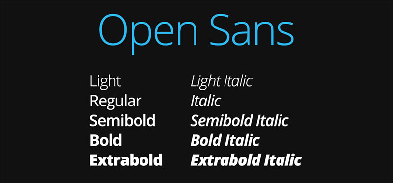
Open Sans is a humanist sans-serif designed by Steve Matteson of Ascender Corporation, created in 2010 and released in 2011. It handles body text and UI labels across web, mobile, and print with 6 weights and matching italics.
Open Sans works best for web body text and accessible interfaces because its higher x-height and more open apertures than Helvetica produce greater legibility at small sizes and across device types. Web design and accessibility researchers consistently rank it among the top-performing sans-serifs for readable on-screen text at 14px and below.
What makes Open Sans suitable for small text?
Open Sans has a higher x-height than Arial and wider letter spacing than Helvetica, making its lowercase characters more readable at 12px–16px. Its humanist proportions give c, e, and a wider apertures that stay open at small sizes, reducing character confusion. The 6-weight range from Light 300 to ExtraBold 800 allows precise weight-based hierarchy without switching typeface families.
Key attributes:
| Attribute | Value |
| Classification | Humanist sans-serif |
| Designer | Steve Matteson, Ascender Corporation, 2010 |
| Weight range | Light 300 to ExtraBold 800 (6 weights) |
| Variable font | Yes |
| Optical sizes | No |
| Recommended sizes | 12px–18px for body text; 10px–14px for UI labels |
| Letter-spacing default | Slightly wide |
| License | SIL Open Font License 1.1 |
| Available on | Google Fonts, Adobe Fonts |
| Price | Free |
How does Open Sans perform at small text sizes?
Open Sans renders clearly at 12px–16px on both standard and high-DPI screens, with open counters that maintain character distinctiveness on smaller mobile displays. It performs better than Arial and Helvetica at very small text sizes because its humanist letterforms tolerate pixel-grid rounding better than strict geometric designs. At sizes below 10px, character spacing becomes tight enough to affect readability, making 12px the practical minimum.
What are the best pairings for Open Sans in small text?
Open Sans pairs with Merriweather as a classic accessibility combination, with Merriweather handling headings and Open Sans covering paragraph text. It pairs with Roboto in mixed-brand or cross-platform designs where Android-native and web contexts need to align without a custom type system.
What are the limitations of Open Sans for small text?
Open Sans lacks optical sizing support, meaning its spacing and stroke weight do not automatically adapt between display and text sizes. Its neutral, widely-used design can make products feel generic, particularly in competitive or premium digital product contexts where brand differentiation through typography matters.
Open Sans – Recommended Use Cases Within Small Text
- Best for: Web body text, accessible government and healthcare interfaces, e-learning platforms at 14px–18px
- Avoid for: Very small UI text below 11px, premium or luxury product typography
- Optimal weight: Regular 400 for body; SemiBold 600 for labels; Bold 700 for headings
- Optimal size range: 12px–18px on screen
—
Tahoma
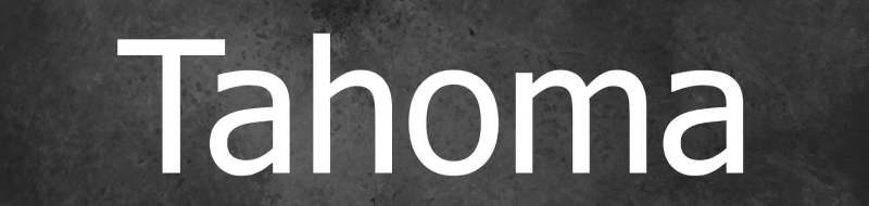
Tahoma is a humanist sans-serif designed by Matthew Carter for Microsoft, developed in 1994 and first released in 1995 with Windows 95. It fits compact UI elements and dialog box text where horizontal space is limited.
Tahoma suits dense UI contexts because its narrower body and tighter letter spacing pack more characters per line than Verdana, while retaining Carter’s screen-optimized hinting approach. It was the default system font across Windows 2000 and Windows XP, used in dialog boxes, menus, and system UI at sizes as small as 8px.
What makes Tahoma suitable for small text?
Tahoma shares Verdana’s pixel-first design approach but with a narrower body and smaller counters, making it more space-efficient for UI chrome while still keeping characters distinct. Its uppercase I is clearly distinguishable from lowercase l, which is a specific design decision Carter made to prevent misidentification in technical and UI contexts. The font’s hinting, hand-tuned by Tom Rickner, maintains clear stem edges on low-resolution displays at 8px–12px.
Key attributes:
| Attribute | Value |
| Classification | Humanist sans-serif |
| Designer | Matthew Carter, Microsoft, 1994 |
| Weight range | Regular 400, Bold 700 (Ascender added Italic and Bold Italic in 2010) |
| Variable font | No |
| Optical sizes | No |
| Recommended sizes | 8px–14px for UI menus and labels; 12px–16px for captions |
| Letter-spacing default | Tight (narrower than Verdana) |
| License | Proprietary (Microsoft) |
| Available on | Pre-installed on Windows and macOS; Adobe Fonts |
| Price | Free (bundled with Windows/Office) |
How does Tahoma perform at small text sizes?
Tahoma renders crisply at 8px–14px in menu and dialog contexts due to its bitmap-origin hinting, which was specifically designed for this use case. Its narrower proportions make it more practical than Verdana in space-constrained UI contexts like navigation bars and dropdown menus on smaller mobile screens. At larger display sizes, its tighter spacing starts to look cramped, limiting its use to small and medium text ranges.
What are the best pairings for Tahoma in small text?
Tahoma pairs with Georgia for heading-body combinations, since both were designed by Carter with compatible visual weight and screen-first philosophy. It pairs with Verdana in report or presentation contexts where Tahoma handles headings in narrower columns and Verdana covers body copy.
What are the limitations of Tahoma for small text?
Tahoma is limited to Regular and Bold weights natively, with no true italic available through Microsoft’s license (Ascender’s italic version requires separate licensing). Its proprietary status makes it unreliable for web use where users on non-Microsoft or non-Apple systems may not have it installed, requiring a fallback font that may break layout assumptions.
Tahoma – Recommended Use Cases Within Small Text
- Best for: Desktop software menus, dialog boxes, UI labels in Windows-native applications, signage with limited horizontal space
- Avoid for: Web-first designs where font availability cannot be guaranteed, body text above 16px
- Optimal weight: Regular 400 for UI labels; Bold 700 for emphasis and headings
- Optimal size range: 8px–14px for UI text; 12px–16px for captions
—
Source Sans Pro
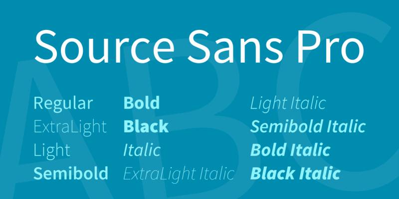
Source Sans Pro (now Source Sans 3) is a humanist sans-serif designed by Paul D. Hunt for Adobe, first released in 2012 as Adobe’s first open-source typeface. It covers UI design, professional documents, and body text across 6 weights with matching italics.
Source Sans Pro works best for UI text and long-form body copy because its humanist proportions give it more organic stroke variation than strict grotesques, reducing reading fatigue at small sizes. It renders well even in very small sizes, making it a reliable choice for UI designs and long-form body copy where legibility must hold across many paragraphs.
What makes Source Sans Pro suitable for small text?
Source Sans Pro has a large x-height with open apertures that keep characters like a, e, and c clearly defined at 12px. Its humanist skeleton provides more organic stroke variation than geometric designs, which helps differentiate letter shapes in dense text blocks. The font performs on screen and in print, making it practical for hybrid design systems that produce both digital interfaces and printed documentation.
Key attributes:
| Attribute | Value |
| Classification | Humanist sans-serif |
| Designer | Paul D. Hunt, Adobe, 2012 |
| Weight range | ExtraLight 200 to Black 900 (6 weights) |
| Variable font | Yes (Source Sans 3) |
| Optical sizes | No |
| Recommended sizes | 12px–18px for body text; 10px–14px for UI labels |
| Letter-spacing default | 0 |
| License | SIL Open Font License 1.1 |
| Available on | Google Fonts, Adobe Fonts |
| Price | Free |
How does Source Sans Pro perform at small text sizes?
Source Sans Pro maintains clear character separation at 12px–16px on both screen and printed output, outperforming many neutral grotesques in extended reading contexts. Its humanist construction provides slightly more warmth than Inter or Roboto, making it better suited for documentation, help centers, and reading-heavy interfaces. It lacks an optical size axis, so spacing does not automatically adjust between text and display sizes.
What are the best pairings for Source Sans Pro in small text?
Source Sans Pro pairs with Source Serif 4 within Adobe’s superfamily for documentation and content-heavy web apps that need consistent visual language across sans and serif text. It pairs with Inter in systems where Source Sans covers long-form reading and Inter handles dense UI chrome.
What are the limitations of Source Sans Pro for small text?
Source Sans Pro lacks optical sizing, meaning its design does not adapt automatically between small UI text and display headings. At sizes below 11px on low-DPI screens, it loses some of the character distinctiveness that purpose-built screen fonts like Verdana or Inter maintain through hinting.
Source Sans Pro – Recommended Use Cases Within Small Text
- Best for: Documentation body text, help center articles, professional forms, print-and-screen hybrid systems
- Avoid for: Very small UI text below 11px, contexts requiring strong brand differentiation
- Optimal weight: Regular 400 for body; SemiBold 600 for labels; Bold 700 for headings
- Optimal size range: 12px–18px for body; 14px–24px for subheadings
—
Merriweather
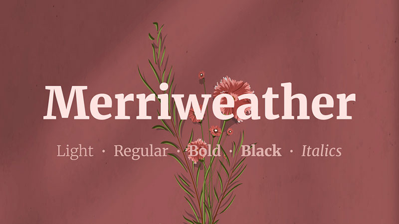
Merriweather is a slab-influenced serif typeface designed by Eben Sorkin and published by Sorkin Type, developed from 2011 with the explicit goal of being a readable body text font for screens. It covers editorial body text, blog posts, and long-form digital reading across 4 weights with matching italics.
Merriweather suits long-form screen reading because its very large x-height, mild diagonal stress, and sturdy slab-influenced serifs were engineered from the start for on-screen legibility rather than adapted from print originals. Sorkin designed it specifically for web deployment across multiple browsers and operating systems.
What makes Merriweather suitable for small text?
Merriweather’s x-height is among the largest in its class, which increases the apparent size of lowercase text without increasing the point size. Its slightly condensed letterforms allow more characters per line than Georgia at the same size, making it more space-efficient for column-based layouts. Sturdy serifs with mild contrast remain visible at 12px–14px on screen, where higher-contrast serifs like Garamond lose fine detail.
Key attributes:
| Attribute | Value |
| Classification | Contemporary serif (slab-influenced) |
| Designer | Eben Sorkin, Sorkin Type, 2011 |
| Weight range | Light 300 to Black 900 (4 weights) |
| Variable font | Yes |
| Optical sizes | No |
| Recommended sizes | 14px–20px for body text; 12px minimum for legibility |
| Letter-spacing default | 0 |
| License | SIL Open Font License 1.1 |
| Available on | Google Fonts |
| Price | Free |
How does Merriweather perform at small text sizes?
Merriweather renders reliably at 14px–18px for screen body text, with serifs that hold their shape at these sizes better than classic serifs with higher stroke contrast. Below 12px, its serifs and diagonal stress begin to compress, reducing legibility in dense, small-text contexts like footnotes or captions. It is less suited for UI labels than for editorial body copy, where its warmth and readability pay off over paragraph-length text.
What are the best pairings for Merriweather in small text?
Merriweather pairs with Lato as a widely-used accessibility combination, where Lato’s open sans-serif forms provide neutral heading contrast above Merriweather’s warm body text. It pairs with Roboto in content-rich apps where Merriweather handles long article body text and Roboto covers all interface chrome.
What are the limitations of Merriweather for small text?
Merriweather’s large x-height can appear almost comical in laser-printed output according to the designer’s own assessment, making it poorly suited for print documents below 11pt. It provides only 4 weights, which limits hierarchical range in complex content systems compared to variable serif alternatives like Source Serif 4.
Merriweather – Recommended Use Cases Within Small Text
- Best for: Blog body text, editorial articles, e-reader content at 14px–18px, news platforms
- Avoid for: Print below 11pt, UI labels below 12px, footnotes and fine print
- Optimal weight: Regular 400 for body; Bold 700 for subheadings; Black 900 for display headings
- Optimal size range: 14px–20px for screen reading
—
IBM Plex Sans

IBM Plex Sans is an open-source humanist sans-serif designed by Mike Abbink (IBM Executive Creative Director) in collaboration with Bold Monday, a Dutch type foundry, released in 2017. It covers UI design, enterprise interfaces, and technical documentation across 7 weights with matching italics.
IBM Plex Sans suits enterprise and technical small text because its American gothic-inspired skeleton was adjusted with a seriffed uppercase I and a tailed lowercase l, specifically to improve legibility in dense UI copy where character confusion causes real errors. IBM replaced Helvetica Neue as its global corporate typeface with Plex across all products and communications.
What makes IBM Plex Sans suitable for small text?
IBM Plex Sans has a large x-height and open counters that maintain character clarity at 12px–14px in enterprise software contexts. Its seriffed uppercase I and tailed lowercase l directly address the I/l/1 disambiguation problem that affects legibility in technical and data-heavy UIs. The 7-weight range from Thin to Bold provides precise hierarchy control for complex, information-dense interfaces.
Key attributes:
| Attribute | Value |
| Classification | Humanist sans-serif (American gothic influence) |
| Designer | Mike Abbink and Bold Monday, 2017 |
| Weight range | Thin 100 to Bold 700 (7 weights) |
| Variable font | No |
| Optical sizes | No |
| Recommended sizes | 12px–18px for UI body; 10px–14px for labels |
| Letter-spacing default | Slightly wide |
| License | SIL Open Font License 1.1 |
| Available on | Google Fonts, IBM’s GitHub |
| Price | Free |
How does IBM Plex Sans perform at small text sizes?
IBM Plex Sans renders cleanly at 12px–16px on screen, with open apertures in c, e, and a that hold their shape at body text sizes. Its slightly more distinctive letterforms make it more legible than neutral grotesques in data tables and technical interfaces where character-level accuracy matters. It has no variable font axis, which means multiple weight files are required for web delivery, increasing HTTP requests compared to Inter or Source Sans 3.
What are the best pairings for IBM Plex Sans in small text?
IBM Plex Sans pairs with IBM Plex Serif for reading-heavy enterprise products, where both typefaces share the same design DNA and weight distribution. It pairs with IBM Plex Mono in developer documentation or code-heavy interfaces where seamless transitions between prose and code are needed.
What are the limitations of IBM Plex Sans for small text?
IBM Plex Sans tops out at Bold 700 with no ExtraBold or Black weight, limiting display-size heading contrast for design systems that use a single typeface across all hierarchy levels. It lacks variable font support, which is a performance disadvantage for web-first products that need to load multiple weights efficiently.
IBM Plex Sans – Recommended Use Cases Within Small Text
- Best for: Enterprise software UI, developer documentation, data dashboards, technical interfaces
- Avoid for: Luxury or editorial contexts, print materials requiring expressive display headings
- Optimal weight: Regular 400 for body; Medium 500 for labels; SemiBold 600 for headings
- Optimal size range: 12px–18px for UI and body text
—
Noto Sans
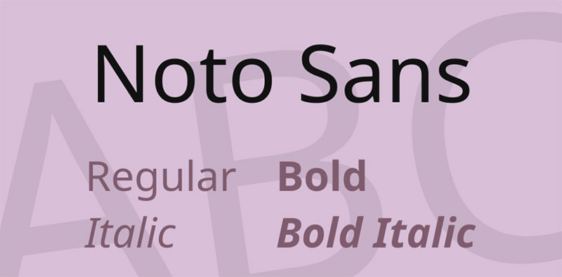
Noto Sans is a humanist sans-serif typeface developed by Google, with design work contributed by multiple type designers across foundries, first released in 2012 and continuously updated. It handles multilingual small text and global digital products across 9 weights with full Unicode coverage for over 800 languages.
Noto Sans suits global products and multilingual interfaces because it eliminates missing glyph boxes (called “tofu”) across over 100 writing systems, providing consistent visual weight and spacing across all supported scripts. Google’s stated goal with Noto was a single cohesive typeface system covering all of Unicode without glyph fallback inconsistencies.
What makes Noto Sans suitable for small text?
Noto Sans has consistent stroke weight and x-height across its Latin characters, with open apertures that maintain legibility at 12px–16px. Its design prioritizes cross-script coherence, ensuring that mixed-language text blocks do not create jarring size or weight mismatches between different character sets. Weight coverage from Thin 100 to Black 900 gives it full hierarchical range for UI systems.
Key attributes:
| Attribute | Value |
| Classification | Humanist sans-serif |
| Designer | Multiple designers, Google, 2012 |
| Weight range | Thin 100 to Black 900 (9 weights) |
| Variable font | Yes |
| Optical sizes | No |
| Recommended sizes | 12px–18px for body; 10px–14px for UI labels |
| Letter-spacing default | 0 |
| License | SIL Open Font License 1.1 |
| Available on | Google Fonts |
| Price | Free |
How does Noto Sans perform at small text sizes?
Noto Sans performs consistently at 12px–16px for Latin text, with clear character separation and open counters that hold up in body text contexts. Its primary design advantage is multilingual consistency: in mixed-script layouts, Noto avoids the visual disruption caused by fallback fonts with different x-heights or stroke weights. For Latin-only projects, Inter or Open Sans often provide more refined small-text optimization, making Noto’s real value in global or multilingual small text contexts.
What are the best pairings for Noto Sans in small text?
Noto Sans pairs with Noto Serif for multilingual editorial products where visual consistency across scripts is more important than typographic personality. It pairs with Inter for digital products targeting global audiences, where Inter handles primary UI text in Latin and Noto provides fallback coverage for non-Latin scripts.
What are the limitations of Noto Sans for small text?
Noto Sans is designed for breadth of coverage rather than typographic refinement, so its Latin characters lack some of the small-text optimizations (like ink traps, optical sizing, and advanced hinting) found in screen-purpose-built fonts like Inter or Verdana. For Latin-only products, its generic visual character can make interfaces feel less distinct than more opinionated typefaces.
Noto Sans – Recommended Use Cases Within Small Text
- Best for: Multilingual apps, global platforms, UI systems requiring consistent rendering across 100+ scripts
- Avoid for: Latin-only products where typographic refinement and brand differentiation matter
- Optimal weight: Regular 400 for body; Medium 500 for labels; Bold 700 for headings
- Optimal size range: 12px–18px for body; 10px–14px for multilingual UI labels
—
Comparison: Best Fonts For Small Text at a Glance
| Font | Classification | Variable | Min. Readable Size | Best Use Case | License |
| Verdana | Humanist sans-serif | No | 8px | UI labels, low-DPI screens | Proprietary |
| Georgia | Transitional serif | No | 12px | Editorial body text | Proprietary |
| Inter | Neo-grotesque sans-serif | Yes | 12px | UI text, dashboards | OFL |
| Roboto | Geometric neo-grotesque | Yes (Flex) | 12px | Android UI, Material Design | Apache / OFL |
| Open Sans | Humanist sans-serif | Yes | 12px | Web body text, accessible UI | OFL |
| Tahoma | Humanist sans-serif | No | 8px | Desktop menus, dialog boxes | Proprietary |
| Source Sans Pro | Humanist sans-serif | Yes | 12px | Documentation, hybrid print/screen | OFL |
| Merriweather | Contemporary serif | Yes | 14px | Blog and editorial reading | OFL |
| IBM Plex Sans | Humanist sans-serif | No | 12px | Enterprise UI, technical docs | OFL |
| Noto Sans | Humanist sans-serif | Yes | 12px | Multilingual global platforms | OFL |
When pairing fonts for small text contexts, the most reliable approach is to pair a screen-optimized sans-serif for UI elements with a purpose-built screen serif for reading-heavy sections. Understanding font spacing is especially important at small sizes: too tight and characters blur together, too wide and words lose cohesion. For fonts for accessibility, x-height, stroke contrast, and open apertures are the three structural attributes that consistently predict legibility across users with varying visual ability.
What Makes a Font Readable at Small Sizes?
Not every font that looks good at 24px holds up at 10px. The difference comes down to five structural attributes that determine whether a typeface stays legible when pixels are limited.
| Attribute | What it measures | Why it matters at small sizes |
| X-height | Height of lowercase letters vs. caps | Larger x-height makes text appear bigger without increasing point size |
| Stroke contrast | Ratio of thick to thin strokes | High contrast loses thin strokes below 12px on low-DPI screens |
| Aperture openness | Opening width on letters like a, e, c | Closed apertures cause misidentification at 10px–14px |
| Letter-spacing | Horizontal space between characters | Tight spacing causes character collision on 96 DPI displays |
| Font hinting | Stem alignment instructions per size | Hand-hinted fonts render cleanly at 8px; auto-hinted fonts blur |
A 2023 study published in the International Journal of Research and Innovation in Social Science found that optimizing inter-letter spacing makes smaller characters up to 20% easier to read compared to default settings.
Readability Consortium research from the University of Central Florida confirmed that switching to a more appropriate typeface for the individual reader produced a 35% boost in reading speed while retaining comprehension.
These five criteria are not independent. A high x-height combined with tight spacing creates a different legibility profile than the same x-height with wide counters. The combination matters as much as any single attribute.
—
How Do Screen Fonts Differ From Print Fonts at Small Sizes?
The core difference is resolution. A typical laser printer outputs at 300–1,200 DPI. A standard desktop monitor renders at 72–130 PPI. At 96 DPI, a 10-point character has only about 13 pixels of vertical space to represent its full design, including capitals, ascenders, descenders, and side bearings (ScienceDirect, ClearType sub-pixel text rendering study).
Print fonts like Garamond and Times New Roman were drawn for high-resolution output. Their thin hairline strokes and high contrast between thick and thin stems look refined in ink. On a 96 DPI screen, those hairlines compress to zero or near-zero pixels, creating blurred noise at small sizes.
Screen fonts solve this structurally, not cosmetically.
Screen-first design choices:
- Thickened thin strokes so they survive pixel-grid rounding
- Enlarged x-height to maximize lowercase legibility within limited vertical pixels
- Wider counters and open apertures to keep letters like a and e distinct
- Hand-hinted stems that align cleanly to the pixel grid at 8px–14px
The Georgia vs. Times New Roman contrast is the clearest example. At 12px on screen, Georgia’s lowercase letters occupy noticeably more vertical space due to its larger x-height. Its serifs are thicker and sturdier, preventing them from collapsing on the pixel grid where Times New Roman’s hairlines disappear.
On high-DPI displays (2x Retina and above), hinting becomes less critical because the pixel density allows the renderer to follow font outlines directly. At 300 DPI and above, it becomes possible to forgo hinting entirely, which is why print fonts can be used at small sizes in high-quality physical documents. The threshold where screen-specific design stops mattering is approximately 200 PPI.
An analysis of 1,000 websites found that 85% prefer using sans-serif fonts on the web, reflecting the practical reality that sans-serif designs with open apertures perform more consistently across the range of screen densities users actually have (Toner Buzz Font Statistics, 2024).
—
What Are the Best Sans-Serif Fonts for Small Text?
Sans-serif typefaces dominate small text contexts on screen, particularly in UI design. Their open apertures and reduced stroke contrast survive pixel-grid rendering better than high-contrast print serifs.
The Web Almanac 2024 (HTTP Archive) reports that 33% of all websites now use variable fonts, up from 29% in 2023, with the majority served through Google Fonts. This shift reflects the practical advantages of optical sizing and single-file delivery for small-text UI contexts.
Which sans-serif font renders most clearly below 12px?
Verdana holds the strongest small-size legibility record of any widely available sans-serif.
- Designed from pixel patterns at the character level, not adapted from print outlines
- Widest counters and letter-spacing of any common sans-serif at equivalent sizes
- Hand-hinted by Tom Rickner at Agfa Monotype for clean stem alignment at 8px
- Lowercase i, l, and numeral 1 drawn with distinct features to prevent misidentification
A Wichita State University study found that Verdana was the most preferred font overall among users who regularly read documents, outperforming Arial, Times New Roman, and Courier across legibility ratings.
Tahoma shares Verdana’s pixel-origin hinting approach but with a narrower body and tighter spacing, making it more space-efficient for dialog boxes and menus. It was the default system font across Windows 2000 and Windows XP precisely for this UI use case at 8px–12px.
What sans-serif fonts work best for multilingual small text?
Noto Sans and IBM Plex Sans cover different angles of multilingual small-text legibility.
Noto Sans coverage: Over 100 writing systems and 800 languages, eliminating “tofu” (missing glyph boxes) in mixed-script UI layouts. Its design prioritizes cross-script visual consistency over typographic refinement, giving it a neutral character that works across global product contexts.
IBM Plex Sans specifics: 7 weights from Thin to Bold, seriffed uppercase I and tailed lowercase l for disambiguation in technical UI. IBM replaced Helvetica Neue with Plex across all global products and communications in 2017. Its large x-height and open counters maintain character clarity at 12px–14px in enterprise dashboards and developer tooling.
For Latin-only products, Inter provides more refined small-text optimization than Noto. Inter was accessed 414 billion times on Google Fonts in the 12 months ending May 2025, with 57% year-over-year growth, making it the most widely adopted screen-optimized sans-serif in current web production (Wikipedia / rsms.me data).
The table below summarizes key structural differences between the top sans-serif options for small text:
| Font | Min. readable size | Variable font | Optical sizing | Primary small-text use case |
| Verdana | 8px | No | No | UI labels, low-DPI screens |
| Inter | 12px | Yes | Yes (opsz axis) | Web UI, dashboards, SaaS |
| Roboto | 12px | Yes (Flex) | Yes (Flex) | Android UI, Material Design |
| IBM Plex Sans | 12px | No | No | Enterprise, technical docs |
| Noto Sans | 12px | Yes | No | Multilingual global platforms |
Roboto’s dual nature (geometric skeleton, humanist terminals) is specifically relevant for small text: its Medium weight (500) creates hierarchy between UI labels and body copy without requiring a weight jump to Bold 700. Google’s Material Design guidelines rely on this weight for buttons, labels, and secondary headings in dense layouts at 12px–14px.
—
What Are the Best Serif Fonts for Small Text?
Serif fonts were historically dismissed for screen use at small sizes. The assumption was that their fine strokes and decorative serifs would collapse on pixel grids. Two typefaces disproved this in the 1990s and remain the strongest serif options for small-screen text today.
The assumption was correct for print-designed serifs like Garamond and Times New Roman. It was never true of fonts designed specifically for screen rendering.
Georgia: The screen serif standard
Georgia is a serif font designed from the ground up to survive pixel-grid rendering. Matthew Carter solved the screen serif problem structurally: larger x-height than any comparable transitional serif, reduced stroke contrast so thin strokes don’t disappear, and thickened serifs that hold their shape at 12px.
The New York Times replaced Times New Roman with Georgia for online content in 2007, after observing that Georgia maintained legibility at the range of sizes their readers encountered across devices. Georgia renders clearly at 12px–18px on screen, with bowl shapes that stay open and readable where Times New Roman’s narrower bowls close up into vertical-stroke patterns.
One direct comparison: Georgia and Times New Roman set at 14px on a 1280×800 screen. Georgia’s lowercase letters appear rounder, more open, and easier to distinguish as word shapes. Times New Roman at the same size reads more like a series of vertical strokes, requiring more cognitive effort to process individual characters.
When does a serif font outperform a sans-serif for small text?
Serifs outperform sans-serifs in one specific context: extended paragraph reading at 14px–18px.
Merriweather was designed by Eben Sorkin at Sorkin Type with the explicit goal of being a workhorse text font for web screens. Its x-height is among the largest in its class. Slightly condensed letterforms allow more characters per line than Georgia at the same point size, which matters for column-based editorial layouts where horizontal space is limited.
Sorkin designed Merriweather’s serifs to be sturdy enough to hold at 12px–14px while keeping stroke contrast low enough to avoid the hairline collapse that breaks other serifs. Below 12px, its serifs and diagonal stress compress, making it unsuitable for UI labels and footnotes.
The practical rule: use a serif font when readers will spend more than a few seconds on a block of text. Use sans-serif for scanning, UI labels, captions, and data values where reading speed at first pass matters more than reading comfort over paragraphs.
Both serif options carry one concrete limitation. Georgia and Merriweather are limited to 4 weights in their base families (Merriweather: Light, Regular, Bold, Black; Georgia: Regular, Bold plus italics). Neither supports an optical size axis. For design systems requiring fine weight control across hierarchy levels, this limits their flexibility compared to variable serifs like Source Serif 4.
—
How Do Variable Fonts Improve Small Text Performance?
Variable fonts address two separate problems at once: typographic refinement at small sizes, and web delivery efficiency.
Variable font usage grew to 33% of desktop pages and 34% of mobile pages in 2024, up from 29% and 30% respectively in 2023, according to the Web Almanac 2024 (HTTP Archive). Google Fonts served 92% of all variable fonts on the web in 2024.
What optical sizing does for small text legibility
Optical sizing is the feature that makes variable fonts genuinely useful for small text, not just for weight flexibility.
The core mechanism: The opsz axis adjusts stroke weight, letter-spacing, aperture width, and counter proportions automatically based on the rendered size. At 10px–12px, the font shifts to a “text” optical size configuration with thicker stems, more open counters, and wider spacing. At 36px+, it shifts to “display” configuration with finer details, tighter spacing, and refined curves.
Ink traps in practice: Inter’s text optical size includes ink traps at stroke junctions that increase perceived contrast at small render sizes. These details are invisible at display sizes but meaningfully improve character distinctiveness at 10px–14px.
This is why the Google Fonts distribution of Inter is insufficient for small-text use cases. Google strips the opsz axis and the true italic from the distributed files to reduce file size. Full optical sizing requires serving Inter from rsms.me/inter or hosting the complete variable font directly.
Performance and delivery advantages
One variable font file replaces 6–9 static weight files for a full weight range.
- A single .woff2 variable font file typically loads between 100–200KB
- Loading 4–6 static weight files can total 400–800KB in combined transfer
- Fewer HTTP requests reduce connection overhead on mobile networks
One case study from a web performance audit reduced a client’s font payload by 73% by switching from static files to a single variable font file (Roberto Moreno Celta, Medium, 2025). This had direct Core Web Vitals benefits, specifically for Largest Contentful Paint, where web fonts are a common blocking resource.
Roboto Flex, released by Google in collaboration with Font Bureau, is one of the most technically complete variable fonts available. It supports 12 axes including weight, width, optical size, grade, and several micro-typographic axes. A single Roboto Flex file can produce an enormous range of typographic variations, from ultra-condensed to expanded, covering every hierarchy level in an app interface without additional files.
The practical limitation for small text specifically: not all variable fonts implement the opsz axis. Inter, Roboto Flex, and Source Sans 3 all include it. Merriweather’s variable version does not. Check opsz support before assuming small-text optimizations apply.
—
What Font Size and Weight Settings Maximize Legibility for Small Text?
Font selection only solves half the problem. The same typeface can be readable or unreadable depending on size, weight, line height, and contrast settings.
The Web Almanac 2024 found that only 29% of mobile sites and 28% of desktop sites have sufficient text color contrast, according to Lighthouse audit data. Contrast failures directly undermine the legibility of otherwise well-chosen fonts at small sizes.
Minimum size thresholds by context
Size requirements vary by context, not just font. The same 12px Inter label is readable in a dense dashboard. The same 12px Merriweather body text is below minimum comfortable threshold for paragraph reading.
UI labels and captions: 10px–12px for Verdana and Tahoma (hinted specifically for this range); 12px minimum for Inter, Roboto, Open Sans, IBM Plex Sans, Noto Sans.
Body text: 14px–16px for sans-serif body copy. The Baymard Institute identifies 16–18px as the optimal range for body text legibility across devices. The optimal font size for body text is generally considered to be between 16 and 18 pixels, according to Baymard Institute research cited by CRO Benchmark 2026.
Serif body text: 14px minimum for Merriweather; 12px minimum for Georgia. Below these thresholds, serif details compress and reduce the legibility advantage serifs provide for paragraph reading.
Weight selection and line height at small sizes
Thin and Light weights (100–300) disappear at small sizes on 1x DPI screens. At 96 DPI, a Thin stroke at 12px can be less than one pixel wide, causing it to render as a grey smear or disappear entirely depending on the anti-aliasing method.
Reliable weight minimums for small text:
- Regular 400 for body text at 14px+ (any font)
- Medium 500 for UI labels at 12px–14px
- Avoid Light 300 below 16px on standard-density screens
- Bold 700 for emphasis at any small size; avoids ambiguity with Regular at close reading distances
Line height directly affects how readable small text feels even when individual characters are legible. Good spacing can reduce reading fatigue by 25%, according to Smashing Magazine 2024. For body text at 12px–16px, a 1.4–1.6 line-height multiplier gives paragraphs enough vertical breathing room for the eye to track from line to line without losing its place.
WCAG accessibility standards define the minimum contrast ratio as 4.5:1 for normal text below 18px (regular weight) and 3:1 for large text above that threshold. At small sizes, high contrast does more for legibility than font selection. A poorly contrasted Inter label at 12px is harder to read than a well-contrasted Times New Roman at the same size, despite Times New Roman’s structural disadvantages at that size on screen.
For fonts for accessibility, x-height and contrast are the two attributes that most consistently predict legibility across users with varying visual ability. The WCAG 4.5:1 minimum is a floor, not a target. AAA compliance at 7:1 is the appropriate standard for any product where small text is a primary reading experience.
Letter-spacing adjustments add measurable legibility at small sizes. Optimizing spacing makes smaller characters easier to read (Arditi, 2004, cited in International Journal of Research and Innovation in Social Science). For most sans-serifs, +0.01em to +0.03em tracking at sizes below 14px increases character separation without making the text look artificially spaced. Verdana and Tahoma are pre-spaced generously and do not require additional tracking at small sizes.
Understanding font spacing helps designers make the right call here. Tracking, kerning, and leading all interact with font size in ways that can either compound or resolve small-text legibility problems.
FAQ on The Best Fonts For Small Text
What is the best font for small text on screens?
Verdana is the strongest option for screen legibility at very small sizes. It was built from pixel patterns, not print outlines. Its wide counters, generous letter-spacing, and hand-hinted stems keep characters clear at 8px and above on low-DPI displays.
What font size is considered small text?
Small text generally refers to anything below 14px on screen or below 10pt in print. UI labels, captions, footnotes, and fine print all fall in this range. Micro typography typically covers the 6pt–9pt range in professional print contexts like legal documents and financial disclosures.
Are sans-serif fonts better than serif fonts for small text?
On low-resolution screens, yes. Sans-serif fonts have lower stroke contrast, which prevents thin strokes from collapsing below 12px. However, screen-optimized serifs like Georgia and Merriweather remain readable at 12px–14px because their serifs were thickened specifically for pixel-grid rendering.
What makes a font legible at small sizes?
Five structural attributes determine small-text legibility: x-height, stroke contrast, aperture openness, letter-spacing, and font hinting quality. A large x-height makes lowercase letters appear bigger without increasing point size. Open apertures prevent misidentification of characters like a, e, and c at 10px–12px.
Is Inter a good font for small text?
Yes. Inter was designed specifically for UI text and screen readability. Its optical size axis automatically adjusts spacing and stroke weight at small sizes. Used by GitHub, Figma, and Linear in production. Best served from the official rsms.me CDN to access the full opsz axis, which Google Fonts strips.
What is the minimum readable font size on a website?
The Baymard Institute identifies 16–18px as optimal for body text. For UI labels, 12px is the practical minimum with a well-hinted accessible font. Below 10px, even purpose-built screen fonts like Verdana lose reliable legibility on standard 96 DPI displays.
Do variable fonts help with small text readability?
Variable fonts with an optical size axis directly improve small-text legibility. The opsz axis thickens strokes, opens counters, and widens spacing automatically at small render sizes. Inter, Roboto Flex, and Source Sans 3 all support this. Not all variable fonts include opsz, so check before assuming the benefit applies.
What font should I use for captions and labels?
Verdana, Tahoma, and Inter are the most reliable options for captions and UI labels at 10px–13px. Verdana and Tahoma are hand-hinted for dialog and menu contexts. Inter adds optical sizing for modern web and app interfaces. Avoid Light weights below 14px on standard-density screens, as stroke width drops below one pixel.
What is the best font for small print in documents?
For fine print in professional documents, Georgia and Source Sans Pro perform well at 8pt–10pt in high-resolution print (300 DPI+). At print resolutions, hinting matters less and structural clarity takes over. Avoid fonts with very high stroke contrast like Garamond below 9pt in print, as hairlines compress.
How does font spacing affect legibility at small sizes?
Research shows optimized font spacing makes smaller characters up to 20% easier to read compared to default settings. For most sans-serifs, adding +0.01em to +0.03em tracking at sizes below 14px improves character separation. Verdana and Tahoma are pre-spaced generously and require no additional tracking adjustment.
Conclusion
This conclusion is for an article presenting the best fonts for small text, and the core takeaway is straightforward: font legibility at small sizes is structural, not subjective.
X-height, stroke contrast, open apertures, and optical sizing determine whether a typeface holds up at 10px or falls apart. Verdana and Georgia remain the most reliable legacy options. Inter and Roboto Flex lead for modern screen contexts.
Matching the right typeface to context matters as much as the selection itself. Captions, UI labels, footnotes, and body copy each have different minimum size thresholds and weight requirements.
Pair your font choice with proper letter-spacing and a contrast ratio that meets WCAG standards. A well-chosen typeface with poor contrast still fails the reader.
Get both right, and small text stops being a problem.

Renowned for his expertise in logo design and visual branding, Bogdan has developed a multitude of logos for various clients.
His skills extend to creating posters, vector illustrations, business cards, and brochures. Additionally, Bogdan's UI kits were featured on marketplaces like Visual Hierarchy and UI8.
He also wrote in the past years on sites like Design Your Way, WebDesignerDepot, WPDean, Designmodo, Speckyboy, Slider Revolution, and more.
- Beautiful Fonts Similar to Poppins You Should Try - 22 October 2026
- Website Redesign: How to Improve Your Website without Losing SEO Rankings - 22 October 2026
- The Coda Logo History, Colors, Font, And Meaning - 20 October 2026

Bogdan Sandu is a seasoned designer who has been designing websites since 2008. Renowned for his expertise in logo design and visual branding, Bogdan has developed a multitude of logos for various clients. His skills extend to creating posters, vector illustrations, business cards, and brochures. Additionally, Bogdan's UI kits were featured on marketplaces like Visual Hierarchy and UI8. He also wrote in the past years on sites like Design Your Way, WebDesignerDepot, WPDean, Designmodo, Speckyboy, Slider Revolution, and more.
You Might Also Like