Pick the wrong font and your laser cutter will do exactly what you told it to — burn through strokes that are too thin, collapse counters that are too narrow, and hand you a pile of warped scraps instead of a finished sign.
Font choice is a technical decision as much as a design one. Stroke width, letter spacing, and counter size determine whether a typeface survives contact with a CO2 or diode laser on wood, acrylic, or leather.
This guide covers the best fonts for laser cutting based on structural attributes that actually hold up during cutting and engraving. You’ll learn which typefaces work across different materials, how to prepare font files in Lightburn and Inkscape, and which licensing terms apply when selling laser-cut products commercially.
The Best Fonts For Laser Cutting
Not every font survives contact with a laser cutter. Thin strokes char, small counters collapse, and delicate serifs just disappear. The fonts below are chosen based on stroke width, letter spacing, and structural attributes that hold up across wood, acrylic, leather, and metal.
Before picking any typeface, convert all text to paths in your design software. Laser cutters cannot read live text boxes.
—
Impact

Impact is a grotesque sans-serif display typeface designed by Geoffrey Lee in 1965, released by the Stephenson Blake foundry and later licensed to Microsoft. It delivers maximum ink coverage in minimum space through compressed letterforms and near-uniform stroke width.
Impact suits laser-cut signage and bold lettering cutouts because its stroke width is consistently heavy across all characters, reducing the risk of thin sections warping or breaking during cutting.
It was included as a core font for the Web by Microsoft in 1996 and is a standard system font across Windows and macOS, making it immediately accessible in Lightburn, Inkscape, and Illustrator.
What makes Impact suitable for laser cutting?
Impact has a very high x-height, reaching nearly three-quarters of the cap line, and extremely short ascenders and descenders. Stroke width is nearly uniform throughout, which means the laser kerf removes material evenly. Letter spacing is tight by default, which works well for word-level cutouts but requires manual kerning adjustments on individual letter cuts.
Key attributes:
| Attribute | Value |
| Classification | Grotesque sans-serif display |
| Designer | Geoffrey Lee, 1965 |
| Weight range | Single weight (Regular only) |
| Variable font | No |
| Letter-spacing default | Very tight / condensed |
| License | Commercial (bundled with Windows/macOS; separate license needed for redistribution) |
| Available on | System font (Windows, macOS), MyFonts |
| Price | Free (system); paid for extended licensing |
How does Impact perform at laser cutting?
Impact’s condensed form and heavy stroke weight render cleanly at letter heights above 15mm. Below that, the tight counters in letters like “e” and “a” can fill in during engraving passes on darker materials. For full cutouts, bridging may be required on enclosed counters (O, A, B, D, P).
What are the best pairings for Impact in laser cutting?
Impact pairs with Arial Bold for secondary text when a consistent weight contrast is needed without mixing serif styles. For wood sign projects, pairing it with a connected script font like Sarina adds contrast between headline and decorative elements.
What are the limitations of Impact for laser cutting?
Impact is a single-weight family with no italic or bold variants, so hierarchy options are limited to size alone. Its tight default kerning requires manual adjustment when cutting individual letters separately.
Impact – Recommended Use Cases Within Laser Cutting
- Best for: Bold word cutouts, signage, stencil-style wood signs
- Avoid for: Small engraved text below 10mm, fine detail engraving on acrylic
- Optimal weight: Regular (only available weight)
- Optimal size range: 18mm+ for cutouts; 12mm+ for engraving
—
Verdana

Verdana is a humanist sans-serif typeface designed by Matthew Carter in 1996 for Microsoft Corporation. It was built specifically for screen clarity, with wide letter spacing, high x-height, and open apertures that translate directly into clean laser-cut geometry.
Verdana works best for engraved text at small sizes because its wide letter spacing keeps individual characters readable even after the laser kerf removes material around each stroke.
What makes Verdana suitable for laser cutting?
The x-height is large relative to cap height. Apertures in characters like “c”, “e”, and “a” are wide and open, which means enclosed forms stay intact at smaller cut sizes. Stroke weight in the Bold variant is substantial enough to avoid fragile thin sections. Default letter-spacing is wide, which reduces the risk of characters merging during engraving on rough materials like unfinished wood.
Key attributes:
| Attribute | Value |
| Classification | Humanist sans-serif |
| Designer | Matthew Carter, 1996 |
| Weight range | Regular, Bold, Italic, Bold Italic (Verdana Pro adds Light, SemiBold, Black) |
| Variable font | No |
| Letter-spacing default | Wide |
| License | Commercial (Microsoft license; bundled with Windows/macOS) |
| Available on | System font, Verdana Pro via Font Bureau/Fontspring |
| Price | Free (system); Verdana Pro from $35 |
How does Verdana perform at laser cutting?
Verdana Bold renders cleanly at letter heights as small as 8mm on smooth acrylic and 12mm on wood, owing to its open counters and even stroke distribution. The Regular weight is borderline for cutting at small sizes as its strokes narrow enough to risk charring on slower laser passes.
What are the best pairings for Verdana in laser cutting?
Verdana Bold pairs with Impact for contrast between body labels and headline text on laser-cut signs. For wedding or gift engraving projects, it pairs well with a connected handwriting style font where Verdana handles information text and the script handles decorative elements.
What are the limitations of Verdana for laser cutting?
The standard Verdana family only offers 4 styles. Verdana’s wide letter spacing increases the footprint of text, which can be a problem on small items like keychains or tags where space is limited.
Verdana – Recommended Use Cases Within Laser Cutting
- Best for: Small engraved labels, product tags, informational text on laser-cut pieces
- Avoid for: Large bold cutout signage where a more condensed form is needed
- Optimal weight: Bold 700 for cutting; Regular 400 for engraving at 14mm+
- Optimal size range: 8mm–30mm for engraving; 15mm+ for cutouts
—
Arial Bold

Arial is a neo-grotesque sans-serif typeface designed by Robin Nicholas and Patricia Saunders in 1982, released by Monotype for IBM. In Bold weight, it delivers consistent stroke width and open letterforms that handle the laser kerf without losing structural integrity.
Arial Bold suits engraved text and simple word cutouts because its stroke contrast is low and its letter forms are geometrically clean with no decorative elements to undercut.
What makes Arial Bold suitable for laser cutting?
Arial has low stroke contrast, meaning thick and thin parts of each letter are close in width. This prevents the laser from burning through thinner sections faster than thicker ones. Its apertures are moderately open, and at Bold weight, all strokes reach a minimum width that holds up in wood at 1/8 inch. It supports over 200 languages, which makes it a reliable choice for multilingual laser-cut projects.
Key attributes:
| Attribute | Value |
| Classification | Neo-grotesque sans-serif |
| Designer | Robin Nicholas, Patricia Saunders, 1982 |
| Weight range | Regular, Bold, Italic, Bold Italic (Arial family includes Narrow, Black, Rounded) |
| Variable font | No |
| Letter-spacing default | 0 (neutral) |
| License | Commercial (bundled with Windows/macOS; Monotype license for extended use) |
| Available on | System font (Windows, macOS, most Linux distributions) |
| Price | Free (system) |
How does Arial Bold perform at laser cutting?
Arial Bold produces clean vector paths with no decorative stroke endings, which makes outline conversion in Inkscape or Illustrator straightforward. It engraves predictably on both wood and acrylic. The font’s neutral spacing means minimal post-processing adjustments are needed before sending to the cutter.
What are the best pairings for Arial Bold in laser cutting?
Arial Bold pairs with Bree Serif for projects that need a friendlier, editorial tone alongside utilitarian labeling. It also pairs with Gotham Bold when a more geometric, structured look is needed and both fonts need to share similar cap heights.
What are the limitations of Arial Bold for laser cutting?
Arial is frequently flagged as a low-originality font choice. For commercial laser-cut products sold on platforms like Etsy, using Arial may make pieces look generic. The standard weight range is limited without purchasing the extended Arial family.
Arial Bold – Recommended Use Cases Within Laser Cutting
- Best for: Utility labels, functional signage, engraved product markings
- Avoid for: Decorative gift items where typographic character matters to buyers
- Optimal weight: Bold 700
- Optimal size range: 10mm–50mm for both engraving and cutouts
—
Barlow Condensed
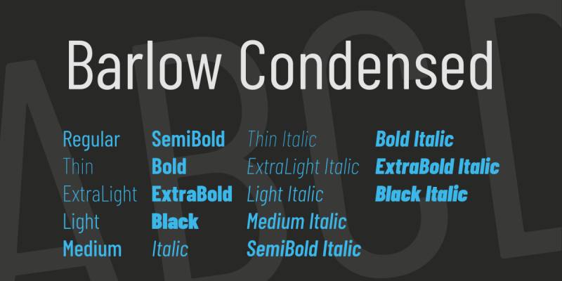
Barlow Condensed is a low-contrast grotesque sans-serif typeface designed by Jeremy Tribby in 2017, released through Google Fonts under the OFL license. It was inspired by California public signage — highway signs, bus lettering, transit systems — and carries that functional clarity into laser cutting applications.
Barlow Condensed works best for word-level cutouts on wood signs and acrylic panels because its condensed width packs more text into a given area while keeping stroke width consistent across all 9 weights.
What makes Barlow Condensed suitable for laser cutting?
Low stroke contrast means thick and thin parts of each letterform are close in width, reducing the chance of thin strokes failing during cutting. Its condensed width allows longer words to fit on smaller pieces without scaling down to a size where strokes become dangerously thin. At Bold and ExtraBold weights, minimum stroke width is substantial enough to hold up in 3mm plywood.
Key attributes:
| Attribute | Value |
| Classification | Condensed grotesque sans-serif |
| Designer | Jeremy Tribby, 2017 |
| Weight range | Thin 100 to Black 900 (9 weights, Roman and Italic) |
| Variable font | No |
| Letter-spacing default | Tight (condensed) |
| License | OFL (free for personal and commercial use) |
| Available on | Google Fonts, Adobe Fonts |
| Price | Free |
How does Barlow Condensed perform at laser cutting?
At SemiBold and Bold weights, Barlow Condensed cuts cleanly on wood at letter heights above 12mm. Its condensed proportions reduce the horizontal footprint of text, which is useful on narrow items like wine bottle tags, key holders, and name plates. Lighter weights (Thin, ExtraLight) are not suitable for cutting at any practical size.
What are the best pairings for Barlow Condensed in laser cutting?
Barlow Condensed pairs with Futura Bold when a clean geometric hierarchy is needed across headline and subheadline text. For [laser-cut sign projects], it pairs well with a connected script for the decorative name element while Barlow Condensed handles supporting information text.
What are the limitations of Barlow Condensed for laser cutting?
Thin and Light weights are too narrow in stroke width for cutting in any material. The default tight letter spacing requires manual tracking adjustments when cutting individual letters as separate pieces, since letters may overlap at the path level.
Barlow Condensed – Recommended Use Cases Within Laser Cutting
- Best for: Compact word cutouts, narrow sign panels, multi-line engraved text
- Avoid for: Weights below SemiBold 600 in any cutting application
- Optimal weight: SemiBold 600 to Bold 700
- Optimal size range: 12mm–60mm
—
Lexend
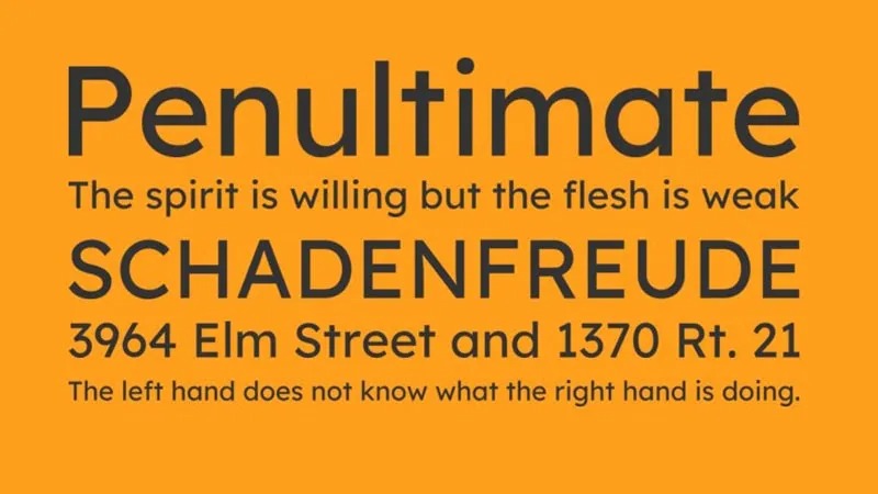
Lexend is a geometric sans-serif font designed by Bonnie Shaver-Troup and Thomas Jockin in 2018, released as an OFL variable font through Google Fonts. It was built to reduce visual stress in reading, using wide letterforms, generous letter spacing, and a consistent stroke weight throughout.
Lexend suits engraved text applications because its wide default tracking keeps characters clearly separated after the laser removes material around each stroke.
What makes Lexend suitable for laser cutting?
Lexend is a variable font with a weight axis from Thin to Black, which means a single file can supply any weight needed without switching font files in Lightburn or Inkscape. Its letter spacing is wide by default, making it one of the more legible choices for small engraved text. Stroke width is low-contrast and evenly distributed.
Key attributes:
| Attribute | Value |
| Classification | Geometric sans-serif |
| Designer | Bonnie Shaver-Troup, Thomas Jockin, 2018 |
| Weight range | Thin 100 to Black 900 (variable axis) |
| Variable font | Yes |
| Letter-spacing default | Wide |
| License | OFL (free for personal and commercial use) |
| Available on | Google Fonts |
| Price | Free |
How does Lexend perform at laser cutting?
Lexend’s wide tracking prevents characters from visually merging when engraved on textured surfaces like unfinished oak or pine. At Bold weight, letter heights as small as 8mm remain legible after engraving. The wide footprint means it takes more horizontal space than Barlow Condensed, so it is less suited for compact items.
What are the best pairings for Lexend in laser cutting?
Lexend pairs with Impact for signage where a bold display headline contrasts with readable engraved body information. It also pairs with Bree Serif when the project needs a warm, editorial tone across both headline and supporting text. Understanding font spacing helps when combining Lexend with tighter typefaces, since its wide tracking may need manual tightening to match.
What are the limitations of Lexend for laser cutting?
Lexend’s wide default letter spacing increases the footprint of any text block, which limits its use on small laser-cut items like jewelry tags, keychains, or business card-sized pieces. Not all laser cutter software loads variable fonts correctly — static weight exports (OTF or TTF) may be needed before import.
Lexend – Recommended Use Cases Within Laser Cutting
- Best for: Engraved informational text on medium to large panels, name signs, awards
- Avoid for: Items smaller than a standard business card where spacing wastes real estate
- Optimal weight: Bold 700 for engraving; ExtraBold 800 for cutouts
- Optimal size range: 8mm–40mm for engraving
—
Bree Serif
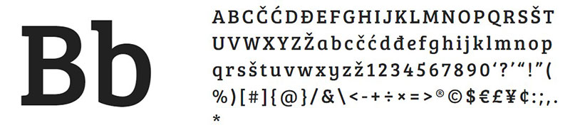
Bree Serif is a slab serif typeface designed by José Scaglione and Veronika Burian, released by TypeTogether in 2013. It won the Gold award for Original Typeface at the 2014 European Design Awards. Its slab-style strokes are thick and uniform, making it a structurally sound option for laser cutting applications where some personality is needed alongside functional reliability.
Bree Serif works best for decorative wood signs and personalized gift engraving because its slab serifs are thick enough to survive the cut without snapping, and its upright italic character gives text a distinctive look without introducing the fragile thin strokes of traditional italic designs.
What makes Bree Serif suitable for laser cutting?
Slab serifs add structural mass at the ends of strokes, which is the opposite of the problem traditional serif fonts have. Where hairline serifs snap or burn away, Bree Serif’s slab terminals are thick enough to hold in 3mm to 6mm material. The single-story “a” and cursive “e” have wide apertures that stay open during engraving. At heavier weights, stroke uniformity improves further.
Key attributes:
| Attribute | Value |
| Classification | Slab serif |
| Designer | José Scaglione, Veronika Burian, 2013 |
| Weight range | Multiple weights (available via TypeTogether; OFL version is Regular) |
| Variable font | No |
| Letter-spacing default | 0 (neutral) |
| License | OFL for Google Fonts version; commercial license via TypeTogether for full family |
| Available on | Google Fonts (Regular), Adobe Fonts, TypeTogether direct |
| Price | Free (OFL version); paid for full commercial family |
How does Bree Serif perform at laser cutting?
Bree Serif performs well on wood at letter heights above 20mm, where its slab terminals remain intact. Below 15mm, the slab details begin to risk merging with adjacent strokes during engraving on low-contrast materials. The OFL version from Google Fonts includes only Regular weight, which limits cutting applications to engraving rather than structural cutouts.
What are the best pairings for Bree Serif in laser cutting?
Bree Serif pairs with Verdana Bold for signs that need a clear contrast between a characterful headline and a neutral supporting text block. It also works with Barlow Condensed when the project requires a condensed sans for secondary information. Guidance on pairing fonts effectively helps when mixing Bree Serif’s upright italic personality with more neutral grotesques.
What are the limitations of Bree Serif for laser cutting?
The free OFL version is Regular weight only, which limits structural use in cutting. Purchasing the full TypeTogether family is necessary for access to heavier weights suitable for cutout work. Bree Serif is not ideal for text below 15mm due to its slab terminal detail.
Bree Serif – Recommended Use Cases Within Laser Cutting
- Best for: Engraved wood signs, personalized gifts, decorative display text
- Avoid for: Small engraved labels; any cutting application using the free Regular weight only
- Optimal weight: Bold or heavier from the full commercial family
- Optimal size range: 20mm+ for engraving; 30mm+ for cutouts
—
Phudu
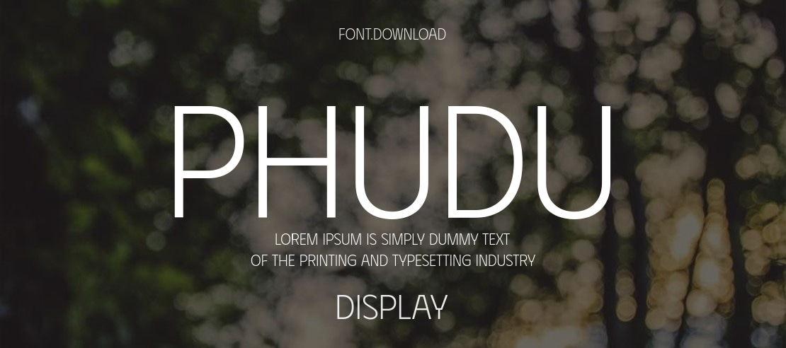
Phudu is a variable sans-serif display typeface designed by Dương Trần in 2022, released through Google Fonts under the OFL license. It draws from Vietnamese hand-lettered billboards and carries that expressive, semi-humanist quality while maintaining even stroke construction suited to laser cutting.
Phudu suits decorative laser cutting projects — nursery signs, event signage, custom gifts — because it brings visual character without introducing the fragile thin-stroke problems common in expressive display fonts.
What makes Phudu suitable for laser cutting?
Phudu’s strokes are built with humanist proportions but without excessive stroke contrast. At ExtraBold and Black weights, all stroke widths are substantial enough to hold up in 3mm to 6mm material. The variable weight axis (Light to Black) lets designers test multiple weight levels in Inkscape before committing to a cut. It supports Cyrillic, Latin, and Vietnamese, which is useful for multilingual engraving projects.
Key attributes:
| Attribute | Value |
| Classification | Display sans-serif (humanist influenced) |
| Designer | Dương Trần, 2022 |
| Weight range | Light 300 to Black 900 (variable axis) |
| Variable font | Yes |
| Letter-spacing default | 0 (neutral) |
| License | OFL (free for personal and commercial use) |
| Available on | Google Fonts, Adobe Fonts |
| Price | Free |
How does Phudu perform at laser cutting?
At ExtraBold and Black weights, Phudu cuts cleanly on plywood at letter heights above 18mm. Its slightly expressive letterforms make it better suited for decorative cutouts than for functional labeling where neutral legibility is the priority. The variable font format means design file sizes stay small, which matters when working with large sign files in Lightburn.
What are the best pairings for Phudu in laser cutting?
Phudu pairs with Verdana Bold for projects combining a decorative headline with readable supporting engraved text. It also pairs with Barlow Condensed Bold when more structured, condensed secondary text is needed alongside Phudu’s expressive forms.
What are the limitations of Phudu for laser cutting?
Phudu is a display font first. At Light and Regular weights, strokes are not wide enough for reliable laser cutting in any standard material. Its expressive character makes it a poor fit for professional or corporate-tone engraving applications.
Phudu – Recommended Use Cases Within Laser Cutting
- Best for: Decorative word cutouts, nursery signs, event name signs, custom gifts
- Avoid for: Weights below SemiBold 600; corporate or professional signage
- Optimal weight: ExtraBold 800 to Black 900 for cutouts
- Optimal size range: 18mm+ for cutouts; 14mm+ for engraving at Bold weight
—
Futura Bold

Futura is a geometric sans-serif typeface designed by Paul Renner in 1927, released by Bauer Type Foundry. It is built on near-perfect circles, triangles, and squares, with strokes of near-even weight throughout. In Bold and ExtraBold weights, this geometric consistency makes it one of the more structurally reliable choices for laser cutting.
Futura Bold suits laser-cut lettering for branding, signage, and product marking because its geometric construction produces clean, predictable vector paths with minimal manual correction needed before cutting.
What makes Futura Bold suitable for laser cutting?
Futura’s strokes are nearly uniform in width, built from geometric primitives rather than calligraphic models. This means there are no hairline connections or thin-stroke transitions to worry about. At Bold weight, the minimum stroke width across all characters is consistent. Tall ascenders help differentiate characters at smaller engraved sizes. It has been the corporate typeface of brands like Volkswagen and IKEA, which speaks to its reliability at all output sizes.
Key attributes:
| Attribute | Value |
| Classification | Geometric sans-serif |
| Designer | Paul Renner, 1927 |
| Weight range | Light to ExtraBold (varies by digitization; Bauer/Neufville Digital version has 6 weights) |
| Variable font | No |
| Letter-spacing default | Wide (generous) |
| License | Commercial (Bauer/Neufville Digital, URW; no free version of original) |
| Available on | Adobe Fonts, MyFonts, Fontspring (URW version) |
| Price | Paid (from ~$35 per weight depending on foundry) |
How does Futura Bold perform at laser cutting?
Futura Bold cuts cleanly in plywood, MDF, and acrylic at letter heights above 12mm. Its geometric letter forms — especially the circular O, C, and G — produce perfect closed paths that require no manual node editing before cutting. The open counters in “a” and “e” stay intact at smaller sizes compared to more condensed alternatives. Understanding what makes a geometric font structural helps explain why Futura outperforms more calligraphic typefaces on laser cutters.
What are the best pairings for Futura Bold in laser cutting?
Futura Bold pairs well with Barlow Condensed for projects that need both display-weight headline text and compact supporting information. A Futura font pairing with a neutral grotesque like Arial works well for functional sign systems where legibility is the primary goal.
What are the limitations of Futura Bold for laser cutting?
Futura has no free version of the original design. Budget projects must use free alternatives like Jost or Nunito Sans, which approximate its geometry without replicating it exactly. Futura’s wide default spacing increases the horizontal footprint of words, which can be a problem on compact laser-cut items.
Futura Bold – Recommended Use Cases Within Laser Cutting
- Best for: Brand signage, clean word cutouts, product labels on acrylic
- Avoid for: Weights below Medium on cutting applications; script-style or decorative projects
- Optimal weight: Bold or ExtraBold for cutouts; Medium for engraving
- Optimal size range: 12mm–80mm
—
Gotham Bold
Gotham is a geometric sans-serif typeface designed by Tobias Frere-Jones and Jesse Ragan in 2000, released through Hoefler & Co. in 2002. Its letterforms were drawn from mid-century architectural signage across New York City. That origin matters for laser cutting — the font was literally designed for physical lettering applications, not for screens.
Gotham Bold suits professional laser-cut signage, custom awards, and branded acrylic pieces because its broad x-height and wide apertures produce readable, structurally sound cuts across a range of materials.
What makes Gotham Bold suitable for laser cutting?
Gotham has a high x-height relative to cap height, which keeps lowercase letters large and readable at smaller cut sizes. Its apertures are wide and open, similar to Futura but with more humanist proportions that make lowercase text more legible. Stroke weight in Bold is consistent throughout, with no thin stroke transitions. The font features 8 weights across 4 widths, giving designers fine control over how much material is removed per character.
Key attributes:
| Attribute | Value |
| Classification | Geometric sans-serif |
| Designer | Tobias Frere-Jones, Jesse Ragan, 2000 |
| Weight range | Thin to Ultra (8 weights); 4 width variations (Normal, Narrow, Condensed, X-Narrow) |
| Variable font | No |
| Letter-spacing default | Neutral to wide |
| License | Commercial (Hoefler & Co.) |
| Available on | Hoefler & Co. direct, Adobe Fonts (subscription) |
| Price | Subscription via Hoefler & Co. or Adobe Fonts |
How does Gotham Bold perform at laser cutting?
Gotham Bold cuts cleanly on wood, acrylic, and leather at letter heights above 10mm. Its wide apertures keep enclosed counters open even on textured materials. The Gotham Condensed variant is particularly useful for compact laser-cut name signs and awards where both character and space efficiency are needed. It is in the permanent collection of MoMA, which reflects the quality of its letterform construction.
What are the best pairings for Gotham Bold in laser cutting?
Gotham Bold pairs with Gotham Book for multi-level typographic hierarchy on awards and plaques — both fonts share the same geometric DNA, so weight contrast carries the hierarchy without style conflict. For mixed-style projects, it pairs with a thick connected script font where Gotham handles all structural text. A Gotham font pairing guide covers the range of options across weights and styles.
What are the limitations of Gotham Bold for laser cutting?
Gotham requires a paid subscription or per-font purchase. There is no OFL or free version of the original, so budget projects must use geometric alternatives. Gotham’s licensing through Hoefler & Co. does not cover unlimited commercial reproduction of laser-cut products — designers selling items with Gotham lettering should verify their license scope.
Gotham Bold – Recommended Use Cases Within Laser Cutting
- Best for: Corporate awards, branded acrylic signage, professional name signs
- Avoid for: Personal or budget projects where a paid license is not viable
- Optimal weight: Bold or Medium for all laser applications
- Optimal size range: 10mm–100mm
—
Arial Bold vs. Futura Bold vs. Gotham Bold
Three of the most common geometric sans choices for laser cutting — here is how they compare on the attributes that matter most for cutting and engraving.
| Font | Stroke contrast | Min cut size | License | Best application |
| Arial Bold | Very low | 10mm | Free (system) | Utility signage, labels |
| Futura Bold | Very low | 12mm | Paid | Brand signage, acrylic |
| Gotham Bold | Low | 10mm | Paid (subscription) | Professional awards, corporate signs |
What font characteristics determine whether a typeface is safe to laser cut?
The global laser cutting machine market was valued at $5.94 billion in 2023 and is growing at 7.6% CAGR through 2032 (Global Market Insights). More makers and small businesses are running CO2 and diode laser cutters than ever. Most font failures happen at the design stage, not the machine stage.
Four structural attributes determine whether a font will survive contact with a laser beam.
| Attribute | What it measures | Why it matters for cutting |
| Stroke width | Thinnest point in any letterform | Must exceed material thickness to avoid warping |
| Stroke contrast | Ratio of thick to thin strokes | High contrast = fragile thin sections |
| Counter size | Enclosed space inside letters (O, A, B) | Narrow counters collapse or require bridging |
| X-height | Height of lowercase letters relative to caps | Larger x-height = readable at smaller cut sizes |
Stroke width is the primary filter
Minimum stroke width should match the material thickness. CutLaserCut’s published guidelines state that any element narrower than 1mm is likely fragile, and that cut widths below the material thickness risk warping.
Thin cutouts and negative space warp during machining. Small features get lost in the laser beam width. Ligatures and connections snap if they fall below the minimum threshold for the material.
SendCutSend’s laser cutting guidelines confirm that interior geometry smaller than 50% of material thickness will not be cut accurately. That rule applies directly to font counters in letters like O, A, B, D, and P.
Stroke contrast determines risk
Low stroke contrast: thick and thin parts of each letter are close in width. High stroke contrast: dramatic difference between thick downstrokes and thin hairlines.
Low contrast wins every time for cutting applications. High-contrast fonts like Bodoni or Times New Roman have hairline serifs that measure under 0.3mm in most digitizations — well below the 1mm fragility threshold on any material.
For engraving applications, contrast tolerance is higher since the laser only removes surface material without creating structural load. Even so, features under 0.3mm will appear patchy during raster engraving passes, according to Ponoko’s laser cutting documentation.
Letter spacing and x-height at small sizes
Fonts with wide default tracking keep characters separated after the kerf removes 0.1mm to 0.4mm of material around each path (CO2 laser range, per CutLaserCut). Without adequate spacing, adjacent characters merge at the engraved surface.
A high x-height keeps lowercase legible at letter heights below 15mm. Fonts optimized for small text — like Verdana and Lexend — carry these properties by design, which is why they transfer well to small engraved labels and tags.
—
How does laser cutting material affect which font to choose?
Font choice is not material-agnostic. A typeface that cuts cleanly in 6mm MDF may shatter in hardwood or melt unevenly in cast acrylic. The laser beam interacts with each material differently, and those differences directly affect the minimum stroke width that survives the cut.
SendCutSend uses fiber lasers producing 0.006″ to 0.040″ kerf depending on material thickness, and CO2 lasers producing 0.010″ to 0.020″ kerf. Those measurements define the lower limit of any font stroke that will retain its intended shape after cutting.
| Material | Min. recommended stroke width | Font weight to use | Notes |
| 3mm plywood / MDF | 3mm | Bold 700+ | Grain direction can snap thin serifs |
| 6mm plywood / MDF | 6mm | ExtraBold 800+ | Requires wider counters too |
| 3mm cast acrylic | 3mm (relaxable slightly) | Bold 700+ | Cleaner cuts than wood; counters more stable |
| Leather | 1.5mm (engraving) | Regular 400+ for engraving | Cutting requires bold; engraving allows detail |
| Stainless steel (fiber) | 0.5mm+ | Black 900 only for cutouts | Tightest tolerances; script fonts not viable |
Wood: grain direction and charring
Wood is the most forgiving material for beginners, but grain direction matters for font survival. Strokes cut perpendicular to the grain are structurally weaker than strokes cut parallel to it.
Hardwoods like oak break more easily than plywood. Plywood’s cross-ply core distributes stress across directions, making it more reliable for detailed font cutouts. Sans-serif fonts with uniform stroke widths — Arial Bold, Verdana Bold, Barlow Condensed SemiBold — outperform high-contrast serif types on wood at any thickness.
Acrylic: precision and counter stability
Cast acrylic produces burr-free cuts and handles more detail than wood (Trotec Laser technical documentation). The rule still applies: no element narrower than the material thickness. On 3mm cast acrylic, that means a minimum 3mm stroke width for cutouts.
Acrylic tolerates slightly tighter counters than wood because it melts cleanly rather than charring. The Glowforge community has documented that fonts like Futura Bold and Gotham Bold cut with clean, polished edges on 3mm cast acrylic at letter heights above 12mm.
Leather and metal: opposite ends of the tolerance range
Leather engraving allows much more font detail than leather cutting. Engraving only removes a shallow surface layer — depth typically 0.0001″ to 0.005″ (Evans Tool and Die data) — so thin strokes survive.
Metal cutouts via fiber laser require only the heaviest weights. Fiber lasers produce a kerf of 0.15mm to 0.38mm on metals (xTool Academy), which is tighter than CO2 kerf. Even so, font strokes below 0.5mm produce fragile metal letterforms that deform under any handling stress.
—
What is the difference between fonts for laser cutting and fonts for laser engraving?
Cutting and engraving are two separate processes that use the same machine but impose entirely different structural requirements on type. Mixing up the two is one of the most common mistakes in font selection for laser projects.
Laser cutting passes the beam fully through the material, creating separate pieces. Laser engraving removes only a shallow surface layer (ablation), leaving the material intact. The font requirements for each are fundamentally different.
Structural load only exists in cutting
When a letter is cut from 3mm plywood, every stroke must be self-supporting. If a stroke is thinner than the material thickness, it will warp, snap, or fall away entirely.
Engraving has no structural requirement because nothing is separated from the substrate. According to Gravotech’s laser font guide, laser engraving can reliably reduce font size below 1mm in height — a scale that would be physically impossible for cut letterforms in any standard sheet material.
Creative Fabrica’s documentation for laser crafters states it directly: cutting requires a thicker, simpler font large enough for the laser to safely cut, while engraving allows fonts with more detail and flourish at a smaller size.
Connected vs. disconnected script fonts
This distinction is where many beginners lose material and time.
- Connected script fonts (letters physically joined) cut as a single piece — the word stays intact
- Disconnected script fonts produce individual letter segments that fall away from the sheet separately
- Sarina, for example, can be bridged for cutting; Brush Script MT cannot without major manual node editing
For vinyl lettering projects, disconnected scripts work because the backing sheet holds letters in place. In laser cutting, there is no backing — every disconnected letter segment becomes an individual piece the moment the laser completes the path.
Raster engraving vs. vector engraving: a font-level difference
Raster (area) engraving fills letters by moving the laser head back and forth in horizontal passes. Vector engraving traces only the outline paths.
Raster engraving skips features under 0.3mm during fast passes, producing a patchy appearance (Ponoko documentation). Fonts for signs that will be raster-engraved need consistent stroke widths above that threshold.
Vector engraving only traces the perimeter of each letterform. The interior of the letter is not filled. Monoline or single-stroke fonts — including Hershey fonts available as Inkscape extensions — are specifically designed for this workflow and produce the fastest, cleanest vector engrave results.
—
How do you convert and prepare a font file for a laser cutter?
No laser cutter reads live text. Every font in every design software must be converted to vector paths before the file reaches the machine. Skipping this step causes the cutter software to either substitute a default font (usually Arial) or produce no cut path at all.
CutLaserCut’s Inkscape and Illustrator guidelines both confirm: if text is not outlined before file submission, the file opens in a default font — and the original typeface is lost entirely.
How do you add bridges to enclosed letter counters before cutting?
Enclosed counters — the space inside O, A, B, D, P, e, g — fall out of the material when fully cut. Bridges (also called tabs or webbing) are small connecting segments added to hold the counter island to the surrounding letter body.
The process in Inkscape or Illustrator:
- Convert text to paths (Object to Path in Inkscape; Create Outlines in Illustrator)
- Enter node editing mode and locate the inner counter path
- Draw a small rectangle overlapping both the counter path and the letter body
- Use the Union or Difference pathfinder to create the bridge gap
- Bridge width should match the minimum cut width for your material
SendCutSend’s guidelines note the smallest bridging dimensions for each material in their material specification pages. For 3mm plywood, bridges should be at least 3mm wide to survive handling after cutting.
Alternatively: choose a stencil font that already includes bridges by design. This eliminates the manual bridging step entirely and is the faster option for production work.
Which font licenses allow commercial use on laser-cut products sold on Etsy or at markets?
OFL (SIL Open Font License) explicitly allows use for laser-cut shapes and sculptures. The OFL-FAQ (updated November 2023, SIL International) lists “3D-printed/laser-cut shapes” as a permitted use without restriction. Lexend, Phudu, Barlow Condensed, and Bree Serif all use OFL licensing.
The license split for fonts commonly used in laser cutting:
- Free commercial use (OFL): Lexend, Phudu, Barlow Condensed, Bree Serif (Google Fonts version)
- System fonts, personal use only: Impact, Arial, Verdana (bundled with Windows/macOS; commercial reproduction requires separate licensing per TypeType’s 2023 font licensing guide)
- Paid commercial license required: Gotham (Hoefler & Co.), Futura (Bauer/Neufville Digital)
A 2020 case documented by Indotype resulted in over €80,000 in rebranding costs for a European e-commerce brand that used a font licensed for a single desktop user across their entire product catalog. For high-volume laser-cut product sellers, font licensing verification before production is not optional.
—
What are common font mistakes that cause laser cutting failures?
Most laser cutting failures traced back to font choice fall into five repeatable patterns. None of them require expensive fixes — all are preventable at the design stage.
Using light or thin font weights
Font weights below Regular 400 are almost never viable for cutting in any standard material at practical letter sizes. At Thin (100) or ExtraLight (200) weights, stroke widths in most typefaces fall below 0.5mm — well under the 1mm fragility threshold documented by CutLaserCut.
What happens: the laser burns through the stroke before completing the path, leaving a charred gap instead of a clean letterform. The piece warps at the cut line.
Barlow Condensed Thin, Lexend Thin, and Futura Light are examples of otherwise good laser cutting fonts whose lightest weights are completely unsuitable for any cutting application. Use SemiBold (600) as the minimum starting weight for cutting tests.
Choosing high-contrast serif fonts
Times New Roman. Bodoni. Didot. Garamond. These are some of the most widely available fonts on any system.
They are also consistently problematic for laser cutting. The hairline serifs in traditional transitional and modern serif fonts measure under 0.3mm in most digitizations — a size that produces patchy raster engraving and structurally impossible cutouts.
YoraHome’s laser engraving test (run at identical power and speed across multiple typefaces) showed that fonts with “the least variation in thicknesses engraved most successfully at smallest sizes.” High stroke contrast is directly correlated with engraving and cutting failures at small sizes.
Scaling text down without rechecking stroke widths
A font that cuts cleanly at 50mm letter height can fail entirely at 15mm. Scaling changes the absolute stroke width in millimeters, even though the proportional design of the font stays the same.
The fix: after scaling, measure the thinnest stroke in your design against the minimum cut width for your material. In Inkscape, use the XML editor or the Object Properties panel to confirm path dimensions before export.
Ashford Lasers’ guidelines confirm: for 3mm acrylic, no element should be narrower than 3mm. A bold font at 50mm height may have strokes of 8mm. The same font scaled to 15mm height will have strokes of approximately 2.4mm — below the threshold for 3mm acrylic.
Not converting text to paths before export
This is the most common beginner mistake. It is also the most avoidable.
- Inkscape: Path > Object to Path
- Adobe Illustrator: Type > Create Outlines (Shift+Ctrl+O)
- CorelDRAW: Arrange > Convert to Curves
If the font file is not installed on the laser cutter operator’s computer (or not embedded in the design file), the software substitutes a system default. The cut path generated is for a different typeface entirely. All font positioning, kerning adjustments, and bridging work done in the original design is lost.
Ignoring kerf offset in tight-fitting assemblies
CO2 laser kerf on wood and plastics typically ranges from 0.1mm to 0.4mm (LaserUser.com technical documentation). For standalone signs and decorative text, this is inconsequential. For assemblies where letters slot into a backing board or fit together as puzzle pieces, the kerf difference makes parts loose or non-fitting.
Lightburn and most professional laser software include a kerf offset setting that compensates by moving the cut path inward or outward by half the kerf width. Most users running decorative text projects skip this step entirely. It matters whenever two cut edges need to meet with precision.
FAQ on The Best Fonts For Laser Cutting
What makes a font good for laser cutting?
A good laser cutting font has uniform stroke width, low stroke contrast, and open counters. Bold sans-serif typefaces outperform decorative or high-contrast serif designs. The thinnest part of any letterform should match or exceed the thickness of your cutting material.
Can I use serif fonts for laser cutting?
Yes, but only slab serif fonts with thick, uniform terminals. Traditional serif fonts like Times New Roman or Garamond have hairline serifs that burn away or snap during cutting. Bree Serif is a reliable slab serif option that holds up in 3mm to 6mm material.
What is the minimum font size for laser cutting?
Letter height should stay above 15mm for cutouts in most materials. For engraving, smaller sizes are possible — Gravotech’s guidelines allow engraving below 1mm height on suitable materials. Always run a test cut on scrap before committing to final material.
Do I need to convert fonts before laser cutting?
Yes. All text must be converted to vector paths before export. In Inkscape use Path › Object to Path. In Illustrator use Type › Create Outlines. Live text is unreadable by laser cutter software and will either be ignored or substituted with a default font.
What fonts work best for engraving on wood?
Sans-serif fonts with consistent stroke widths engrave most cleanly on wood. Arial Bold, Verdana Bold, and Gotham Bold are reliable choices. Avoid thin weights and high-contrast designs — stroke variation causes uneven burn depth across a single character on wood grain.
Can I use script fonts for laser cutting?
Only connected script fonts where all letters physically join into one piece. Disconnected scripts produce individual letter segments that fall away from the sheet. Sarina is a commonly recommended connected script that handles bridging well without losing structural integrity.
What font file format does a laser cutter use?
Laser cutters read vector files, primarily SVG and DXF formats. TTF and OTF font files must be converted to outlined paths first. Lightburn, Inkscape, and CorelDRAW all support SVG and DXF export after text has been converted to curves or outlines.
Are Google Fonts free to use on laser-cut products I sell?
Most Google Fonts use the SIL Open Font License, which explicitly permits use on laser-cut shapes sold commercially. The OFL-FAQ (updated November 2023) lists laser-cut shapes as a permitted use. Always verify the individual font’s license before production at scale.
What font weight should I use for laser cutting?
Start at Bold 700 as a minimum for cutting applications. SemiBold 600 works on some materials with clean counters and wide letter spacing. Weights below Regular 400 are not viable for cutting in standard sheet materials at any practical letter size.
Do font counters need bridging for laser cutting?
Yes, for fully enclosed counters like those in O, A, B, D, and P. Without bridges, the counter island falls free from the letter body. Add manual bridges in Inkscape or Illustrator, or use a stencil font that includes built-in bridges by design.
Conclusion
This conclusion is for an article presenting the best fonts for laser cutting, and the core takeaway is simple: typeface selection is a structural decision before it is a visual one.
Bold geometric sans-serifs like Futura, Gotham, and Barlow Condensed hold up across wood, acrylic, and leather because their stroke weight and letter spacing are built for durability, not just aesthetics.
Script and display options work too, as long as strokes are thick, connected, and properly bridged before the file reaches Lightburn or xTool Creative Space.
Always convert text to vector paths, check your stroke widths against the material thickness, and verify your font licensing before selling laser-cut pieces commercially.
Get those fundamentals right and the font becomes the least likely reason a cut fails.

Renowned for his expertise in logo design and visual branding, Bogdan has developed a multitude of logos for various clients.
His skills extend to creating posters, vector illustrations, business cards, and brochures. Additionally, Bogdan's UI kits were featured on marketplaces like Visual Hierarchy and UI8.
He also wrote in the past years on sites like Design Your Way, WebDesignerDepot, WPDean, Designmodo, Speckyboy, Slider Revolution, and more.
- The Windsurf Logo History, Colors, Font, And Meaning - 10 October 2026
- How to Remove Background From Product Photos (No Photoshop) - 10 October 2026
- How Designers can Build a Stronger Online Creative Identity - 9 October 2026

Bogdan Sandu is a seasoned designer who has been designing websites since 2008. Renowned for his expertise in logo design and visual branding, Bogdan has developed a multitude of logos for various clients. His skills extend to creating posters, vector illustrations, business cards, and brochures. Additionally, Bogdan's UI kits were featured on marketplaces like Visual Hierarchy and UI8. He also wrote in the past years on sites like Design Your Way, WebDesignerDepot, WPDean, Designmodo, Speckyboy, Slider Revolution, and more.
You Might Also Like