The font in your ad is doing more work than you think.
Before a reader processes your headline, your typeface has already signaled whether your brand is trustworthy, premium, or worth a second look. In advertising, that happens in under two seconds. Choosing the best fonts for ads is not a design preference. It is a performance decision.
This guide covers the 10 typefaces that consistently deliver across digital display, print, social media, and out-of-home advertising. For each one, you get classification, weight range, license type, pairing recommendations, and the specific ad formats where it works best.
No filler. No vague advice about “brand personality.” Just the fonts that actually hold up when it counts.
The Best Fonts For Ads
Font choice in advertising is not a style decision. It is a structural one. The wrong typeface kills readability before a reader even processes the message. The right one can hold attention, establish trust, and drive action, all in under two seconds.
Understanding font psychology helps explain why certain typefaces outperform others in ad contexts. Below are the 10 best options, with accurate specs and honest limitations.
—
Helvetica
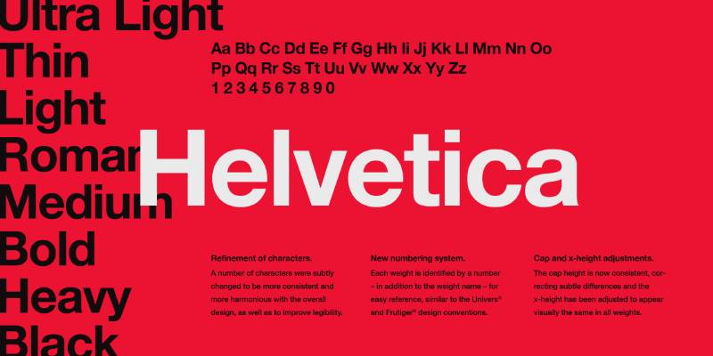
Helvetica is a neo-grotesque sans-serif font designed by Max Miedinger and Eduard Hoffmann in 1957, released by the Haas Type Foundry in Switzerland. It delivers maximum visual neutrality, letting the ad message take priority over the typeface itself.
Helvetica suits corporate and institutional advertising because its tight letter-spacing and high x-height produce a dense, solid appearance that reads clearly at a wide range of sizes. BMW, American Airlines, Lufthansa, and Target all rely on it for advertising and brand identity.
What makes Helvetica suitable for ads?
Helvetica has a tall x-height that increases legibility at distance and at small display sizes. Its stroke terminals sit on horizontal and vertical axes, which prevents visual noise in condensed layouts. The typeface supports 34 weights and widths, covering every hierarchy level a campaign might need.
| Attribute | Value |
| Classification | Neo-grotesque sans-serif |
| Designer | Max Miedinger & Eduard Hoffmann, 1957 |
| Weight range | 34 weights and widths (Thin to Black) |
| Variable font | No (Helvetica Now has variable axis) |
| Letter-spacing default | Tight |
| License | Commercial (Monotype / Linotype) |
| Available on | Adobe Fonts, Monotype, MyFonts |
| Price | Subscription or per-weight purchase |
How does Helvetica perform in ads?
At headline sizes (36px and above), Helvetica delivers high stroke uniformity that reads cleanly on both digital screens and print. Its closed apertures on letters like “c” and “e” reduce misreading in fast-scanning contexts like banner ads and out-of-home placements.
The downside: at small sizes on low-DPI screens, those closed apertures can reduce legibility compared to typefaces with more open letter forms.
What are the best pairings for Helvetica in ads?
Helvetica pairs with Garamond for contrast in stroke weight when a luxury or editorial tone is needed. It pairs with Georgia for digital ads requiring readable body copy alongside a neutral headline. See the Helvetica font pairing guide for more combinations.
What are the limitations of Helvetica for ads?
Helvetica requires a paid commercial license, which adds cost for smaller campaigns. Its ubiquity across major brand identities can reduce differentiation in crowded ad categories.
Helvetica – Recommended Use Cases Within Ads
- Best for: Corporate display ads, out-of-home advertising, institutional brand campaigns
- Avoid for: Small mobile ad body copy below 12px, brands needing strong typographic personality
- Optimal weight: Medium for body; Bold 700 for headlines and CTAs
- Optimal size range: 16px+ for digital; 24px+ for display ads
—
Montserrat
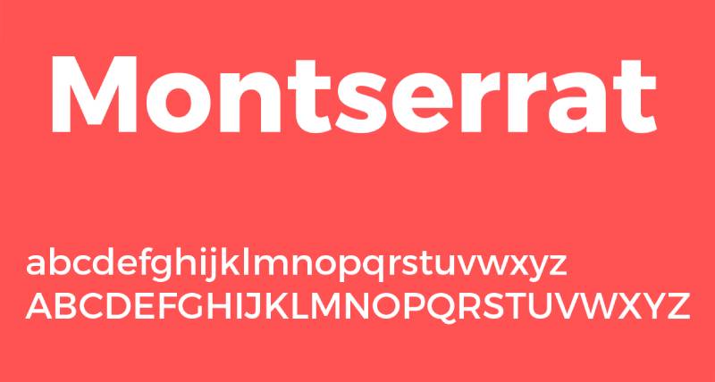
Montserrat is a geometric sans-serif typeface designed by Julieta Ulanovsky in 2011, released through Google Fonts under the SIL Open Font License. It delivers clean, structured typographic hierarchy across both digital and print ad formats.
Montserrat works best for digital advertising because its large x-height and wide apertures maintain legibility at sizes as small as 14px. It is used on over 19 million websites, making it one of the most recognized ad-compatible typefaces available for free.
What makes Montserrat suitable for ads?
Montserrat supports 9 weights from Thin 100 to Black 900, each with a matching italic, giving it the full range needed to establish clear typographic hierarchy in a single ad layout. Short descenders reduce line-height requirements, which is useful in constrained ad formats like banners and carousel cards.
| Attribute | Value |
| Classification | Geometric sans-serif |
| Designer | Julieta Ulanovsky, 2011 |
| Weight range | Thin 100 to Black 900 (9 weights) |
| Variable font | Yes |
| Letter-spacing default | Normal / slightly wide |
| License | OFL (free for personal and commercial use) |
| Available on | Google Fonts, Adobe Fonts |
| Price | Free |
How does Montserrat perform in ads?
Montserrat Bold and ExtraBold render with high contrast at headline sizes, making them effective for attention capture in static and animated display ads. The geometric structure reproduces cleanly across platforms including Facebook, Instagram, and Google Display Network without anti-aliasing issues.
Its free license removes cost barriers for performance-focused advertisers running high-volume campaigns across multiple formats.
What are the best pairings for Montserrat in ads?
Montserrat pairs with Merriweather for contrast in stroke weight when body copy needs warmth alongside a structured headline. It pairs with Roboto when cross-platform consistency is the priority. For a structured pairing reference, check the Montserrat font pairing guide.
What are the limitations of Montserrat for ads?
Its widespread use means lower visual differentiation in categories with many advertisers using Google Fonts. Thin and ExtraLight weights perform poorly at small display sizes due to low stroke contrast on mobile screens.
Montserrat – Recommended Use Cases Within Ads
- Best for: Social media ads, banner ads, startup and DTC brand campaigns
- Avoid for: Body copy below 13px, luxury brand positioning requiring unique typographic identity
- Optimal weight: SemiBold 600 for subheads; Bold 700 to ExtraBold 800 for headlines and CTAs
- Optimal size range: 14px–18px for body copy; 28px+ for ad headlines
—
Futura
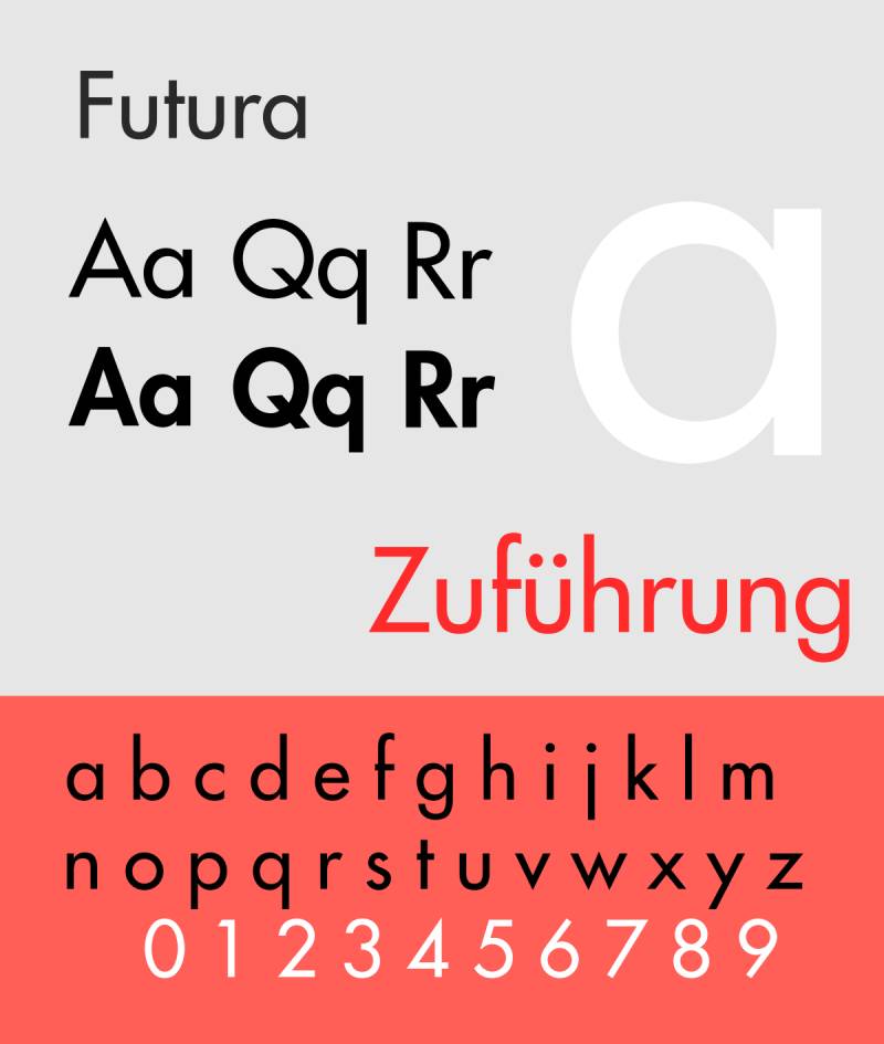
Futura is a geometric sans-serif typeface designed by Paul Renner in 1927, originally published by the Bauer Type Foundry in Germany. It communicates geometric precision and modern authority through uniform stroke weights and circular letterforms.
Futura suits premium and lifestyle advertising because its near-perfect circular geometry (the “O” is almost a perfect circle) creates immediate visual impact at large display sizes. Nike uses Futura Extra Bold Condensed Oblique across its brand and advertising. Supreme’s iconic box logo is set in Futura Heavy Oblique.
What makes Futura suitable for ads?
Futura’s near-uniform stroke weight eliminates optical noise in headline-only ad formats. Its long ascenders create strong vertical rhythm that holds visual hierarchy in layouts with minimal copy. The family includes Light through Extra Bold, condensed variants, and oblique styles across more than 22 styles in the Linotype version.
| Attribute | Value |
| Classification | Geometric sans-serif |
| Designer | Paul Renner, 1927 |
| Weight range | Light to Extra Bold + condensed and oblique variants |
| Variable font | Yes (Futura Now, 2020 reissue) |
| Letter-spacing default | Wide |
| License | Commercial (Monotype / Linotype / Bauer) |
| Available on | Adobe Fonts, MyFonts, Monotype |
| Price | Subscription or per-weight purchase; separate digital ad license required |
How does Futura perform in ads?
Futura renders with high geometric clarity at display sizes of 36px and above. Its wide default spacing between letters helps with legibility in all-caps headline treatments, which is a common ad typography pattern. Condensed variants work well in out-of-home and billboard formats where vertical space is limited.
Futura requires a separate digital ad license from Monotype for paid digital advertising placements. This is a non-trivial consideration for high-impression campaigns.
What are the best pairings for Futura in ads?
Futura pairs with Garamond for luxury and editorial advertising, the high stroke contrast between the two creates visual separation between headline and body layers. It pairs with Bodoni Display for fashion campaigns where maximum headline drama is needed. Check the Futura font pairing guide for additional combinations.
What are the limitations of Futura for ads?
Long ascenders require generous line spacing, which limits its use in copy-heavy ad formats. The digital ad license is separate from the desktop license, adding cost for advertisers running digital campaigns at scale.
Futura – Recommended Use Cases Within Ads
- Best for: Headline-only display ads, luxury and fashion brand campaigns, out-of-home advertising
- Avoid for: Body copy in small digital formats; copy-heavy ad layouts
- Optimal weight: Bold for headlines; Medium for supporting copy
- Optimal size range: 36px+ for headlines; 18px–24px for subheads
—
Proxima Nova
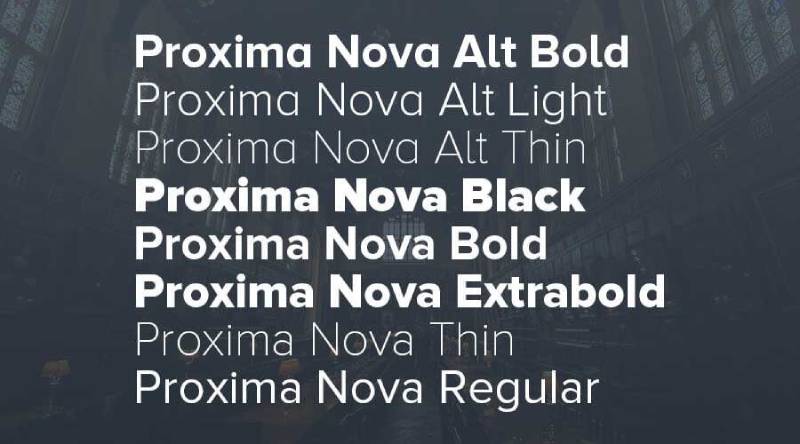
Proxima Nova is a geometric-humanist hybrid sans-serif typeface designed by Mark Simonson, released in 2005 through Mark Simonson Studio. It bridges the geometric structure of Futura with the proportions and readability of humanist sans-serifs.
Proxima Nova works best for digital advertising because its open apertures and balanced proportions maintain character distinction at sizes as small as 12px on screen. It is widely adopted across performance marketing, SaaS product ads, and content-heavy digital campaigns.
What makes Proxima Nova suitable for ads?
Proxima Nova supports 48 styles across 8 weights from Thin to Black, with condensed and extra-condensed widths available. This range lets a single campaign maintain visual consistency from mobile banner (small, condensed) to desktop hero (large, regular or bold) without switching typefaces.
| Attribute | Value |
| Classification | Geometric-humanist sans-serif |
| Designer | Mark Simonson, 2005 |
| Weight range | Thin to Black (8 weights, 48 styles total) |
| Variable font | No |
| Letter-spacing default | Normal |
| License | Commercial (Mark Simonson Studio) |
| Available on | Adobe Fonts, MyFonts, Font Squirrel |
| Price | Subscription (Adobe Fonts) or per-style purchase |
How does Proxima Nova perform in ads?
Proxima Nova’s open apertures on letters like “c”, “e”, and “a” reduce character confusion at small sizes, making it reliable for mobile ad body copy at 13px–16px. Its moderate x-height sits between Futura’s geometric proportions and Helvetica’s tight forms, producing high scanability in short-copy digital formats.
What are the best pairings for Proxima Nova in ads?
Proxima Nova pairs with Playfair Display for campaigns targeting upmarket audiences, the serif contrast adds authority to a clean sans-serif foundation. It pairs with Georgia when a warmer body copy tone is needed in digital display campaigns.
What are the limitations of Proxima Nova for ads?
Proxima Nova has no variable font version, which means each weight requires a separate file load in web-based ad formats. The commercial license is per-style, so building the full 48-style family carries significant cost.
Proxima Nova – Recommended Use Cases Within Ads
- Best for: Digital display ads, performance marketing creative, SaaS and tech brand campaigns
- Avoid for: Budget-constrained campaigns where OFL alternatives like Montserrat are sufficient
- Optimal weight: Regular 400 for body; Semibold 600 to Bold 700 for CTAs and headlines
- Optimal size range: 13px–16px for body copy; 24px–48px for headlines
—
Bebas Neue
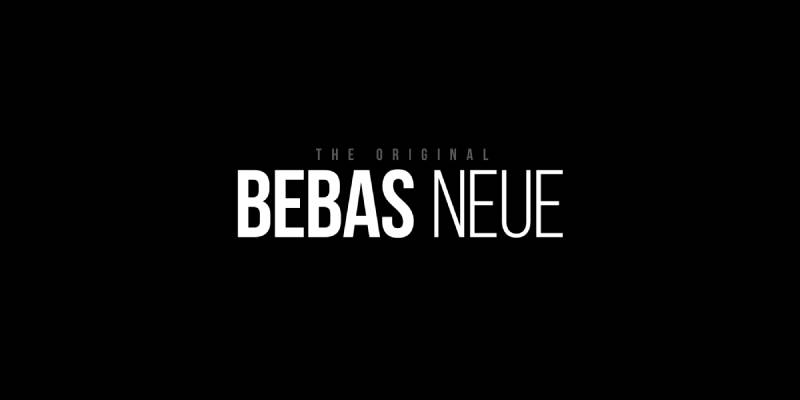
Bebas Neue is a condensed display sans-serif typeface designed by Ryoichi Tsunekawa, released in 2010 and available on Google Fonts. It delivers maximum visual weight in minimal horizontal space, making it a strong choice for short, high-impact ad headlines.
Bebas Neue suits headline-only advertising formats because its tall, narrow letterforms allow large point sizes within tight layout constraints. It appears frequently in sports, fitness, and entertainment advertising where bold typographic impact is the primary goal.
What makes Bebas Neue suitable for ads?
Bebas Neue has a very high x-height and consistent vertical stroke weight, producing strong contrast against background imagery. Its condensed proportions allow headline sizes of 60px–120px within standard banner ad dimensions without text overflow. The typeface is available in 5 weights from Thin to Bold.
| Attribute | Value |
| Classification | Condensed display sans-serif |
| Designer | Ryoichi Tsunekawa, 2010 |
| Weight range | Thin to Bold (5 weights) |
| Variable font | No |
| Recommended sizes | 36px+ for headlines; avoid below 24px |
| Letter-spacing default | Tight |
| License | OFL (free for commercial use) |
| Available on | Google Fonts |
| Price | Free |
How does Bebas Neue perform in ads?
At sizes above 36px, Bebas Neue delivers strong typographic punch with uniform stroke weight that holds up well against both light and dark backgrounds. Its condensed letterforms scale to large sizes without losing structural integrity, which makes it effective for billboard formats and video ad titles.
Performance drops sharply below 20px. The condensed proportions compress character spacing in ways that reduce legibility in small-format digital placements.
What are the best pairings for Bebas Neue in ads?
Bebas Neue pairs with Open Sans for contrast in weight and proportion when body copy is needed below the headline. It pairs with Roboto Condensed when a more unified condensed system is needed across headline and sub-headline levels.
What are the limitations of Bebas Neue for ads?
Bebas Neue is uppercase-only, which limits its use to headline and display contexts. It does not support lowercase letters, removing it from consideration for any ad format requiring mixed-case body copy or CTA text.
Bebas Neue – Recommended Use Cases Within Ads
- Best for: Sports, fitness, and entertainment ad headlines; billboard and video ad titles; short promotional callouts
- Avoid for: Any copy requiring lowercase; small digital ad formats below 24px
- Optimal weight: Regular for most headline use; Bold for maximum impact
- Optimal size range: 36px–120px for headlines
—
Garamond
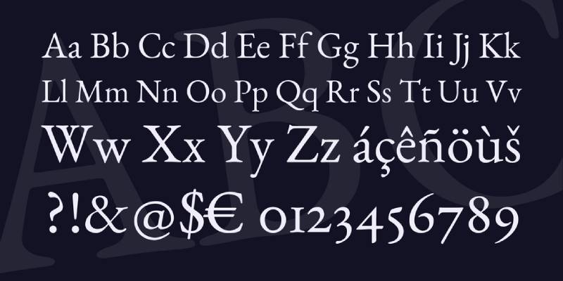
Garamond is a classical serif typeface originating from the 16th century, with modern digital versions including Adobe Garamond Pro (designed by Robert Slimbach, 1989) and EB Garamond (open-source revival). It conveys authority, heritage, and editorial credibility in advertising contexts.
Garamond suits luxury, publishing, and high-end retail advertising because its moderate stroke contrast and refined letterforms signal quality without shouting. Brands like Apple have used it in product copy, and it remains a standard in fashion and editorial advertising.
What makes Garamond suitable for ads?
Garamond has moderate stroke contrast and small, refined serifs that guide the eye across short to medium text blocks. Its compact proportions allow more characters per line than most serif typefaces, which is useful in print ads and email marketing where copy density matters.
| Attribute | Value |
| Classification | Old-style serif |
| Designer | Robert Slimbach (Adobe version, 1989); original 16th century |
| Weight range | Regular, Italic, Bold, Bold Italic (Adobe version) |
| Variable font | No (Adobe version); EB Garamond has variable axis |
| Letter-spacing default | Normal |
| License | Commercial (Adobe Garamond Pro); OFL (EB Garamond) |
| Available on | Adobe Fonts; Google Fonts (EB Garamond) |
| Price | Adobe subscription; Free (EB Garamond) |
How does Garamond perform in ads?
Garamond renders with high typographic elegance at print sizes of 10pt and above, making it a reliable choice for magazine ads, direct mail, and printed retail campaigns. On screen, it performs best at 18px and above. Below that threshold, its fine hairline strokes can break down on standard-DPI displays.
What are the best pairings for Garamond in ads?
Garamond pairs with Futura for the classic high-fashion editorial contrast. It pairs with Gill Sans when a warmer, more humanist sans-serif is needed for subheadlines or CTA text. Check the Garamond font pairing guide for more examples.
What are the limitations of Garamond for ads?
Adobe Garamond Pro has a narrow weight range (Regular and Bold only), which limits typographic hierarchy in complex ad layouts. Fine hairline strokes perform poorly in small-size digital placements on low-DPI screens.
Garamond – Recommended Use Cases Within Ads
- Best for: Print advertising for luxury, fashion, and publishing brands; email marketing body copy; high-end retail campaigns
- Avoid for: Mobile display ads below 16px; performance marketing where bold CTA contrast is critical
- Optimal weight: Regular for body copy; Bold for product names and headlines
- Optimal size range: 10pt–14pt print; 18px–24px digital
—
Roboto
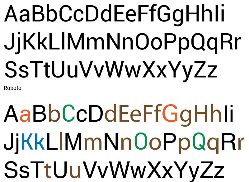
Roboto is a neo-grotesque sans-serif typeface designed by Christian Robertson, released by Google in 2011 as the default system font for Android. It blends grotesque structure with humanist curves to produce a typeface optimized for screen rendering at small to medium sizes.
Roboto suits mobile advertising and digital display campaigns because it was engineered specifically for on-screen legibility. Google found in internal testing that ads with well-rendered type like Roboto saw measurably higher engagement. It is the most downloaded font on Google Fonts.
What makes Roboto suitable for ads?
Roboto has a large x-height and wide apertures on letters like “c”, “e”, and “a”, which reduce character confusion at 12px–16px on standard and high-DPI screens. It supports 12 styles from Thin 100 to Black 900, covering every weight needed for a complete ad typographic system.
| Attribute | Value |
| Classification | Neo-grotesque sans-serif |
| Designer | Christian Robertson, 2011 (Google) |
| Weight range | Thin 100 to Black 900 (6 weights + italics) |
| Variable font | Yes (Roboto Flex) |
| Recommended sizes | 12px–16px body; 24px+ headlines |
| Letter-spacing default | Normal |
| License | Apache 2.0 (free for commercial use) |
| Available on | Google Fonts |
| Price | Free |
How does Roboto perform in ads?
Roboto renders cleanly on Android and Chrome environments, which together cover a substantial share of mobile ad impressions. Its mechanical precision at body sizes prevents letter-spacing irregularities that can affect brand perception in repeated ad exposure. Roboto Condensed adds a narrower variant useful in space-constrained ad formats.
What are the best pairings for Roboto in ads?
Roboto pairs with Playfair Display for contrast in stroke style when a blend of modern and editorial tone is needed. It pairs with Montserrat when a more structured, geometric headline is preferred over Roboto’s own bolder weights. See the Roboto font pairing guide for additional options.
What are the limitations of Roboto for ads?
Roboto’s near-ubiquity on Android and web means it carries no typographic distinctiveness on its own. In competitive ad categories, its neutral appearance can reduce brand memorability compared to more distinctive typefaces.
Roboto – Recommended Use Cases Within Ads
- Best for: Mobile display ads, Google Ads creative, app-based advertising, performance marketing at scale
- Avoid for: Luxury and premium brand campaigns requiring typographic distinction
- Optimal weight: Regular 400 for body copy; Bold 700 for CTAs
- Optimal size range: 12px–16px for body; 24px–48px for headlines
—
Playfair Display

Playfair Display is a transitional serif typeface designed by Claus Eggers Sørensen, released in 2011 through Google Fonts. It uses high stroke contrast between thick verticals and thin hairlines to communicate editorial sophistication in display contexts.
Playfair Display suits luxury, fashion, and lifestyle advertising because its high stroke contrast creates immediate visual hierarchy without additional design elements. It is frequently paired with sans-serif body fonts in premium brand campaigns and editorial-style digital ads.
What makes Playfair Display suitable for ads?
Playfair Display has a high stroke contrast ratio, with vertical strokes several times heavier than horizontal hairlines. This creates strong visual hierarchy at headline sizes and makes the typeface immediately recognizable as premium. It supports Regular, Medium, SemiBold, Bold, ExtraBold, and Black weights, plus italics.
| Attribute | Value |
| Classification | Transitional serif |
| Designer | Claus Eggers Sørensen, 2011 |
| Weight range | Regular 400 to Black 900 (6 weights + italics) |
| Variable font | Yes |
| Letter-spacing default | Normal |
| License | OFL (free for commercial use) |
| Available on | Google Fonts |
| Price | Free |
How does Playfair Display perform in ads?
At sizes above 24px, Playfair Display’s high stroke contrast delivers strong typographic drama that immediately signals premium positioning. Its italic variants work particularly well for product name callouts and taglines in fashion and beauty advertising. Below 18px on screen, the thin hairline strokes can degrade on standard-DPI displays.
What are the best pairings for Playfair Display in ads?
Playfair Display pairs with Montserrat for a clean contrast between editorial serif headline and geometric sans body copy. It pairs with Source Sans Pro when a more neutral, functional body copy tone is needed. The Playfair Display font pairing guide covers a broader set of combinations.
What are the limitations of Playfair Display for ads?
Hairline strokes in Regular and Medium weights perform poorly in small digital formats below 18px. The high stroke contrast that makes it effective at display sizes creates legibility issues in reversed-out text on textured or image-heavy backgrounds.
Playfair Display – Recommended Use Cases Within Ads
- Best for: Luxury and fashion brand display ads, premium retail campaigns, editorial-style social media ads
- Avoid for: Body copy below 18px, performance marketing where CTA clarity is critical, reversed-out text on complex backgrounds
- Optimal weight: Bold 700 to Black 900 for headlines; SemiBold 600 for product names
- Optimal size range: 24px–72px for headlines
—
Open Sans
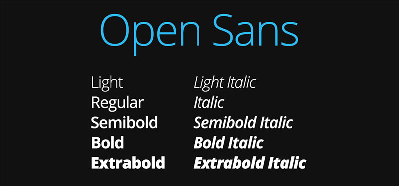
Open Sans is a humanist sans-serif typeface designed by Steve Matteson and commissioned by Google, released in 2011 under the Apache License. It prioritizes screen legibility and neutral readability across diverse advertising contexts.
Open Sans works best for copy-heavy digital advertising, email marketing, and ads targeting broad audiences because its wide apertures and neutral forms reduce cognitive load during reading. It has been one of the most widely used web fonts globally since its release.
What makes Open Sans suitable for ads?
Open Sans has upright, neutral letterforms with wide letter spacing and generous x-height that perform consistently across browsers, operating systems, and screen resolutions. It supports 10 styles from Light 300 to ExtraBold 800, providing enough range for two-level typographic hierarchy in most ad formats.
| Attribute | Value |
| Classification | Humanist sans-serif |
| Designer | Steve Matteson, 2011 (Google) |
| Weight range | Light 300 to ExtraBold 800 (5 weights + italics) |
| Variable font | Yes |
| Letter-spacing default | Normal to slightly wide |
| License | Apache 2.0 (free for commercial use) |
| Available on | Google Fonts |
| Price | Free |
How does Open Sans perform in ads?
Open Sans maintains clear character distinction down to 11px on high-DPI displays, making it one of the most reliable choices for small-text digital ad placements. Its wide apertures outperform Helvetica and Roboto on low-DPI screens where closed apertures lose definition. Google used Open Sans across its own product interfaces for years, a direct signal of its screen rendering quality.
What are the best pairings for Open Sans in ads?
Open Sans pairs with Oswald for a high-weight contrast between condensed display headline and humanist body copy. It pairs with Playfair Display when a premium or editorial tone is needed in the headline layer. See the Open Sans font pairing guide for additional combinations.
What are the limitations of Open Sans for ads?
Open Sans lacks a Black 900 weight, which limits its maximum typographic impact in bold headline-only ad formats. Its neutral, functional aesthetic works against brand differentiation in crowded ad categories where typographic character is a competitive advantage.
Open Sans – Recommended Use Cases Within Ads
- Best for: Email marketing ads, long-copy digital display ads, Google Ads text campaigns, accessibility-focused advertising
- Avoid for: Premium or luxury brand campaigns requiring typographic distinction; headline-only display ad formats
- Optimal weight: Regular 400 for body copy; Bold 700 for headlines and CTAs
- Optimal size range: 11px–16px for body copy; 24px–48px for headlines
—
Gotham
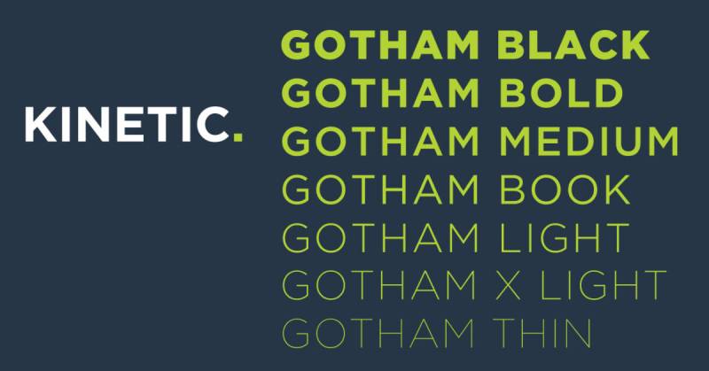
Gotham is a geometric sans-serif typeface designed by Tobias Frere-Jones, released in 2000 by Hoefler & Co. It draws from mid-20th century American sign-painting lettering and delivers clean geometric structure with a distinctly contemporary authority.
Gotham suits political, corporate, and high-authority brand advertising. Barack Obama’s 2008 presidential campaign used Gotham as its primary typeface across all advertising and visual identity materials, bringing it widespread recognition as a typeface that communicates trustworthy authority.
What makes Gotham suitable for ads?
Gotham has a moderate x-height and balanced circular letterforms that produce clear legibility across print and digital formats. Its stroke weight is slightly more variable than Futura’s pure geometry, giving it a warmer, less sterile appearance that improves readability in longer ad copy contexts. The family includes over 66 styles across 8 weights and 4 widths.
| Attribute | Value |
| Classification | Geometric sans-serif |
| Designer | Tobias Frere-Jones, 2000 |
| Weight range | Thin to Ultra (8 weights, 66+ styles) |
| Variable font | No |
| Letter-spacing default | Normal to slightly tight |
| License | Commercial (Hoefler & Co.) |
| Available on | Hoefler & Co. (fonts.com / typography.com) |
| Price | Subscription ($99–$199/year for web + desktop) |
How does Gotham perform in ads?
Gotham’s geometric clarity performs consistently at display sizes from 18px to 120px+. Its slightly humanist geometry compared to Futura makes it more readable in mixed-case headline and subhead treatments, which is useful in ad formats where both headline and body copy share the same typeface. The Condensed variant handles tight banner ad formats efficiently.
What are the best pairings for Gotham in ads?
Gotham pairs with Bodoni for high-fashion and luxury advertising where geometric and high-contrast serif creates strong visual hierarchy. It pairs with Mercury Text when long-copy print ads require a complementary serif for extended body reading. The Gotham font pairing guide covers more options.
What are the limitations of Gotham for ads?
Gotham is only available through a Hoefler & Co. subscription, with no free or perpetual license option. It has no variable font version, which means each weight and width is a separate file in web-based ad delivery environments.
Gotham – Recommended Use Cases Within Ads
- Best for: Corporate, political, and institutional brand campaigns; out-of-home advertising; premium direct mail
- Avoid for: Budget-constrained campaigns where Montserrat or Proxima Nova serve the same function at lower cost
- Optimal weight: Book or Medium for body copy; Bold to Black for headlines and CTAs
- Optimal size range: 14px–18px for body; 28px–72px for headlines
—
Choosing the Right Font for Your Ad Format
No single typeface fits every ad context. The right choice depends on format, audience, and budget. Below is a quick decision reference.
| Ad Format | Best Font | Why |
| Social media display | Montserrat, Roboto | Free, wide weight range, screen-optimized |
| Luxury / fashion print | Garamond, Playfair Display, Futura | High stroke contrast, editorial signal |
| Billboard / out-of-home | Bebas Neue, Helvetica, Gotham | High visual weight at large display sizes |
| Corporate / institutional | Gotham, Helvetica, Proxima Nova | Authority, neutrality, full weight range |
| Performance / mobile ads | Roboto, Open Sans | Legibility at small sizes, free license |
Understanding the structural differences between a serif font and a sans-serif font is the starting point for every ad typography decision. Beyond classification, the key variables are x-height, weight range, license type, and rendering performance at your target ad size.
Font licensing is also worth checking before any campaign goes live. Several of the fonts above require separate digital ad licenses for paid impression-based placements, and Futura is the most common example of this.
For more on how fonts affect ad performance, fonts for Facebook ads and fonts for advertising are worth exploring for platform-specific guidance.
What Makes a Font Effective for Advertising?
Font choice in advertising is a structural decision, not a stylistic one. The typeface you pick determines whether your message gets read or skipped in the roughly two seconds a viewer gives an ad before scrolling.
MoldStud research (2024) found that choosing a font effectively can boost readability by 20–30%, directly affecting whether users engage with ad content at all.
Four structural attributes determine how a font performs in an advertising context:
- X-height: the height of lowercase letters relative to capitals. Higher x-height means better legibility at small sizes.
- Stroke contrast: the ratio between thick and thin strokes. High contrast reads as premium. Low contrast reads as neutral or functional.
- Weight range: the number of available weights from Thin to Black. A wider range allows a single typeface to cover all hierarchy levels in one ad layout.
- Aperture width: how open the gaps are in letters like “c”, “e”, and “a”. Wider apertures reduce character confusion at small sizes.
Rendering environment changes which attributes matter most. Print ads prioritize stroke contrast and optical sizing. Digital ads prioritize aperture width and x-height for screen rendering. Out-of-home formats need stroke weight that holds at 60px and above.
How does x-height affect ad legibility?
X-height is the single most reliable predictor of whether a font stays readable when scaled down. A 2024 poster study presented at the Society for the Scientific Study of Reading (Cooreman and Beier) confirmed x-height as a primary factor in font legibility assessment.
FontFYI analysis shows that Inter, with an x-height of 0.53–0.55 of its cap height, reads as clearly at 14px as most other fonts do at 16px. Roboto sits at around 0.52. Both were built for screen environments where small sizes are standard.
In ad terms: a high x-height typeface handles mobile display copy at 12px–14px without legibility loss. A low x-height typeface fails at those sizes and forces larger minimum sizes, which compresses available layout space.
Why does font licensing matter for paid advertising campaigns?
Desktop licenses and digital ad licenses are separate legal agreements. Using a desktop-licensed font in paid digital placements is a license violation, regardless of how the font was acquired.
Production Type demanded $150,000 per infringement from Nike in 2023 for using the Kreuz Light font across videos and social media imagery without the correct license (Extensis). Nike had purchased desktop licenses, not digital-use licenses.
License types to check before any campaign:
- Desktop license: print and local design use only
- Web license: CSS @font-face embedding
- Digital ad license: paid impression-based placements (required by Monotype for Futura, Helvetica, Gotham)
- OFL: free for all commercial use including digital ads (Montserrat, Roboto, Open Sans, Playfair Display)
In January 2022, a Munich court ruled that loading Google Fonts from Google’s CDN violated GDPR, ordering €100 in damages with warnings of fines up to €250,000 for future violations. Self-hosting OFL fonts removes both the licensing risk and the GDPR exposure simultaneously.
—
How Do Ad Fonts Perform Across Different Formats?
Mobile now accounts for almost two-thirds of digital ad investment worldwide, according to Statista’s 2024 data. Global mobile ad spending reached $402 billion in 2024. Font selection cannot be made for desktop and applied universally.
Each ad format creates different rendering conditions. The table below maps format categories to the structural font attributes that matter most in each context.
| Ad Format | Critical Attribute | Minimum Size Guidance |
| Mobile display / in-app | Wide aperture, high x-height | 12px–16px body copy |
| Social media (static) | Weight range, stroke contrast | 18px+ headline; 14px+ body |
| Out-of-home / billboard | Stroke weight, condensed variant | 36px+ (scaled to viewing distance) |
| Print advertising | Optical sizing, stroke weight | 10pt–14pt body; 18pt+ headline |
Which fonts work best for social media ad creative?
Social media ad creative lives or dies in a scroll. The font has under two seconds to register before the viewer moves on.
Google Ads research found that sans-serif fonts generated 12% more clicks than serif fonts in digital ad placements (2023). On social platforms where speed of recognition matters more than editorial authority, this is a meaningful performance delta.
Montserrat Bold and Roboto Bold both render cleanly at the compressed sizes common in carousel and story formats. Their wide apertures prevent character confusion on standard-DPI mobile screens. Playfair Display Black works for luxury brand creative where the high stroke contrast signals premium positioning, but only at sizes above 24px where the hairline strokes hold.
Instagram data (2023) linked uniform visual identity to 26% higher story interaction rates. Typography is part of that visual identity. Using the same typeface system across organic and paid placements contributes directly to those interaction gains.
What font attributes matter most for out-of-home advertising?
Distance reading removes fine typographic detail. At 10 meters, hairline strokes disappear. Tight letter spacing collapses. Only high-stroke-weight, condensed, or wide typefaces survive at billboard scale.
A road sign legibility study in the Interdisciplinary Journal of Signage and Wayfinding tested 33 fonts at distance. The top two performers were Gill Sans and Avenir Medium, both sans-serif, confirming that sans-serif classification outperforms serif at distance-reading distances.
Bebas Neue’s condensed structure allows 80px–120px headlines within standard billboard proportions. Helvetica Bold holds legibility because its tight letter-spacing and horizontal stroke terminals create dense, solid letterforms that read as a unit rather than as individual characters at distance. Futura Bold’s near-uniform stroke weight also scales cleanly, though its long ascenders require additional line spacing in multi-line headline layouts.
—
How Do Serif and Sans-Serif Fonts Compare in Advertising?
The classification decision shapes brand signal before a reader processes any words. Serif and sans-serif typefaces trigger different perception frameworks in under 200 milliseconds of visual processing.
A 2022 study published in the Journal of Business Administration Research (Wang Zheng, University Malaysia Sarawak) tested serif versus sans-serif typefaces across three experiments with 102–134 participants. Results confirmed that serif typefaces score higher on perceived luxury and visual complexity, while sans-serif typefaces score higher on competence and authority signals.
| Category | Recommended Classification | Primary Reason |
| Luxury / fashion print ads | Serif font | High stroke contrast signals premium |
| Performance digital ads | Sans-serif font | Open apertures, consistent screen rendering |
| Out-of-home headlines | Condensed sans-serif | Maximum weight in minimum horizontal space |
| Email marketing body copy | Humanist sans-serif | Web-safe rendering, neutral readability |
When do serif fonts outperform sans-serif in ads?
Serif fonts win in contexts where the brand promise centers on heritage, authority, or luxury. Garamond in a financial services print campaign. Playfair Display in a premium DTC beauty ad. The stroke detail signals craft and permanence.
A 2024 study presented at the Marketing Trends Congress confirmed that serif typefaces enhance luxury perception when used in brand naming and advertising contexts. Brands like Dior, Vogue, and Chanel have maintained serif-anchored typographic identities precisely because the classification reinforces their market positioning.
The tradeoff is rendering. Serif hairline strokes degrade on standard-DPI mobile screens below 18px. The same typeface that communicates elegance in a full-page magazine ad can become visually noisy in a 300×250 display unit on a mid-range Android device.
When does sans-serif dominate?
Performance and reach trump elegance. An analysis of 1,000 websites found that 85% use sans-serif fonts on the web, according to Toner Buzz research. The dominance reflects practical reality: open apertures, consistent cross-platform rendering, and weight ranges that cover every hierarchy level in a single license.
DTC brands running high-volume Facebook and Google display campaigns almost universally rely on sans-serif typefaces. Roboto, Montserrat, and Open Sans are free, screen-optimized, and available in variable font versions that reduce file load time in programmatic ad delivery.
A serif vs sans-serif comparison shows that the performance gap in digital contexts is structural, not aesthetic. Open apertures reduce misread characters at small sizes. That matters when a mobile ad body copy line is set at 13px on a device the brand has no control over.
—
What Are the Best Font Pairings for Ad Layouts?
Most ad layouts require exactly two typographic levels: headline and body (or CTA). A third level adds complexity without adding clarity. The pairing decision is about contrast, not variety.
Criteo’s 2024 commerce media report found a 35% uplift in ad recall with brand consistency across placements. A consistent font pairing system applied across display, social, and email formats is one of the most direct ways to build that consistency.
Which font pairings work for luxury ad campaigns?
Classic pairing: Futura Bold headline + Garamond body. This is the standard high-fashion editorial combination. Geometric sans-serif headline creates clean hierarchy. Old-style serif body signals craft and editorial authority. Vogue, Chanel, and Louis Vuitton campaigns use variants of this structure.
The contrast works because Futura’s uniform stroke weight is the exact opposite of Garamond’s variable stroke contrast. Neither competes with the other. The Garamond font pairing guide and the Futura font pairing guide both cover extended luxury-context combinations.
Alternative: Playfair Display Black headline + Lato Regular body. Playfair’s high stroke contrast at 48px+ creates immediate visual drama. Lato’s humanist curves provide readable body copy with a warmer tone than geometric alternatives.
Which font pairings work for performance and DTC advertising?
Performance pairing priorities are different. Free license, screen-optimized rendering, and fast file delivery matter as much as visual contrast.
Montserrat Bold + Merriweather Regular is a proven free pairing for DTC display ads. Montserrat handles headline weight. Merriweather’s generous x-height and open counters hold body copy legibility at 14px.
Roboto Bold + Open Sans Regular covers mobile-first campaigns. Both are Apache-licensed, both render consistently across Android and Chrome environments, and Roboto Flex is a variable font that reduces ad file weight in programmatic delivery. See the Roboto font pairing guide for performance-context combinations.
A font pairing generator can validate combinations across weight scales before creative production begins, reducing the number of revision cycles in high-volume campaign work.
—
How Does Font Choice Affect Ad Performance Metrics?
Typography affects click-through rates, brand recall, and viewer dwell time. These are measurable outcomes, not subjective impressions.
Google Analytics data shows that pages with well-chosen typography experience a 15% higher retention rate compared to those with poorly designed text elements (MoldStud, 2024). In ad contexts, higher retention translates directly to longer exposure time and improved message comprehension.
Font weight and CTA performance
Call-to-action button typography follows a specific pattern in A/B test data. Bold 700 weight consistently outperforms Regular 400 for CTA text.
Why it works structurally: heavier stroke weight increases contrast ratio between the CTA text and its background. Higher contrast reduces processing time. Faster processing = lower cognitive load = higher click probability.
Designers working with fonts for Facebook ads consistently observe this pattern in Meta’s creative tools, where Bold weight variants on CTA overlays outperform lighter weights in engagement benchmarks.
Brand recall and typographic consistency
Adweek data shows consistent branding increases brand recall by 33% compared to inconsistent strategies. Typography is a core component of that consistency signal.
Lucidpress (Marq) 2023 research found that 86% of consumers say consistency makes brands more trustworthy. Using the same font system across paid and organic content builds that trust at scale, without additional creative cost.
YouTube’s 2023 analytics showed that consistent thumbnail treatment boosts CTR by 22%. Thumbnail typography (font family, weight, color) is part of that treatment. Brands like MrBeast and major DTC advertisers use standardized font systems across all thumbnail and ad creative to compound this recognition effect.
Variable fonts and technical ad performance
Variable fonts store all weight and width variations in a single file. A standard multi-weight font system might load 4–6 separate files. A variable font loads one.
WOFF2 format compression can reduce font file sizes by up to 30% compared to older web font formats, according to content-and-marketing.com research. In programmatic ad delivery where load time directly affects viewability scores, this is not a minor detail.
Roboto Flex, Montserrat Variable, and Open Sans Variable are all available under open licenses. They cover the major performance advertising use cases without cost and with measurably better delivery performance than their static equivalents.
—
What Are the Most Common Font Mistakes in Advertising?
Font mistakes in advertising are structural failures. They are not stylistic misjudgments. They produce measurable problems: reduced legibility, license violations, or typographic collapse at scale.
95% of users consider typography a critical aspect of design, impacting first impressions and willingness to engage (MoldStud, 2024). Getting it wrong is not a small thing.
Using script or decorative fonts below safe sizes
Script fonts fail below 18px on screen. Decorative display fonts fail below 24px. Both classifications depend on fine strokes and complex letterforms that break down at small sizes on standard-DPI displays.
A script font or a display font placed in a mobile ad body copy position produces unreadable text on a significant share of devices. The font looks correct in Figma at 100% zoom on a Retina display. It breaks on a budget Android at real delivery size.
The fix: restrict script and display classifications to headline-only use at 36px minimum. Use open-aperture humanist or geometric sans-serif for body copy and CTA text.
Ignoring platform-specific license requirements
Desktop license. Web license. Digital ad license. These are three separate agreements, even for the same font family.
Production Type sued Nike in 2023 for using the Kreuz Light font in videos and social media without a digital-use license, seeking $150,000 per infringement. Nike had desktop licenses. That did not cover digital advertising placements.
Fonts that require separate digital ad licenses include Futura (Monotype/Linotype), Helvetica (Monotype), and Gotham (Hoefler & Co). OFL fonts like Montserrat, Roboto, Playfair Display, and Open Sans carry no such restriction, which is one reason performance advertisers running high-impression campaigns default to them. Full details on license types are covered in the font licensing guide.
Pairing two typefaces with no structural contrast
Futura + Montserrat. Roboto + Open Sans. Two geometric sans-serifs in the same weight range produce typographic monotony. The headline does not separate from the body. The CTA does not pull focus.
Contrast requires difference in classification, weight, or width, preferably two of the three. Geometric sans-serif headline + old-style serif body. Condensed display + humanist regular. Bold 800 + Light 300. Any of these creates the separation that makes hierarchy readable at a glance.
Pairing fonts correctly means choosing typefaces that differ structurally, not just visually. The contrast should be legible in a thumbnail preview at 100px wide. If the two typefaces look interchangeable at that scale, the pairing is wrong.
Setting condensed fonts at mobile body copy sizes
Bebas Neue below 20px. Condensed Gotham below 16px. Futura Condensed below 18px. All three fail at mobile body copy sizes because condensed proportions compress horizontal character spacing to the point where letters read as visual noise rather than distinct letterforms.
Condensed typefaces belong at headline sizes, where their narrow proportions allow large point sizes within tight layout constraints. Below 24px, switch to normal or wide proportions. Below 16px, switch to a humanist sans-serif with wide apertures and high x-height. Font spacing decisions compound the problem: tight tracking at small sizes makes condensed fonts even harder to parse.
FAQ on The Best Fonts For Ads
What is the best font for ads?
There is no single answer. Helvetica, Montserrat, and Futura are the most consistently effective across formats. The right choice depends on ad type, brand positioning, and rendering environment. Sans-serif fonts dominate digital advertising due to better screen legibility.
What font do most advertisers use?
Montserrat and Roboto are the most widely used in digital advertising, largely because both are free under open licenses. Gotham and Proxima Nova appear frequently in premium brand campaigns. Bebas Neue is a go-to for bold, headline-only display ads.
Are serif fonts bad for ads?
No. Serif fonts like Garamond and Playfair Display perform well in luxury print advertising and premium digital campaigns. They signal authority and heritage. The issue is rendering: hairline strokes degrade on low-DPI mobile screens below 18px.
What font size should I use for ad copy?
Use at least 16px for body copy in digital ads. Headlines work best at 28px and above. For print, 10pt–14pt covers body copy. Billboard and out-of-home formats need 36px minimum, scaled to viewing distance.
Can I use Google Fonts in paid ads?
Yes. Google Fonts are released under the SIL Open Font License or Apache 2.0, both of which permit free commercial use including paid advertising placements. Montserrat, Roboto, Open Sans, and Playfair Display are all available with no licensing cost.
Do fonts affect click-through rates?
Yes. Google Ads data from 2023 found that ads using sans-serif fonts generated 12% more clicks than those using serif fonts in digital placements. Font weight on CTA buttons also affects click behavior, with Bold 700 consistently outperforming lighter weights.
What is the best font for Facebook ads?
Montserrat, Roboto, and Open Sans perform reliably in Facebook ad creative. All three render cleanly at mobile sizes, carry free commercial licenses, and support the full weight range needed for headline and body hierarchy within a single ad layout.
What font works best for billboard advertising?
Bebas Neue, Helvetica Bold, and Futura Bold are the strongest choices for billboard fonts. High stroke weight and condensed proportions allow large headline sizes within standard billboard dimensions. Avoid thin weights and serif hairlines at distance.
How many fonts should I use in one ad?
Two. One for the headline, one for body copy or CTA text. Using more than two typefaces in a single ad creates visual noise and weakens hierarchy. The two fonts should contrast by classification or weight, not just by color or size.
Do I need to license fonts separately for digital advertising?
For commercial fonts like Futura, Helvetica, and Gotham, yes. Desktop licenses do not cover digital ad placements. Production Type sued Nike in 2023 for exactly this. OFL fonts like Montserrat and Roboto require no separate digital ad license.
Conclusion
This conclusion is for an article presenting the best fonts for ads, and the core takeaway is simple: typeface selection is a technical decision with measurable consequences.
X-height, stroke contrast, weight range, and font licensing all determine whether your ad typography holds up across digital display, print, and out-of-home formats.
Free options like Montserrat, Roboto, and Open Sans cover most digital advertising use cases without cost or legal exposure. Commercial typefaces like Gotham and Proxima Nova justify their price in campaigns where typographic distinction matters.
Pair by contrast. Test at actual delivery sizes. Check your license before launch.
Advertising typography that fails at 13px on a mid-range Android is not a font problem. It is a decision problem. Now you have the information to make the right one.

Renowned for his expertise in logo design and visual branding, Bogdan has developed a multitude of logos for various clients.
His skills extend to creating posters, vector illustrations, business cards, and brochures. Additionally, Bogdan's UI kits were featured on marketplaces like Visual Hierarchy and UI8.
He also wrote in the past years on sites like Design Your Way, WebDesignerDepot, WPDean, Designmodo, Speckyboy, Slider Revolution, and more.
- The Windsurf Logo History, Colors, Font, And Meaning - 10 October 2026
- How to Remove Background From Product Photos (No Photoshop) - 10 October 2026
- How Designers can Build a Stronger Online Creative Identity - 9 October 2026

Bogdan Sandu is a seasoned designer who has been designing websites since 2008. Renowned for his expertise in logo design and visual branding, Bogdan has developed a multitude of logos for various clients. His skills extend to creating posters, vector illustrations, business cards, and brochures. Additionally, Bogdan's UI kits were featured on marketplaces like Visual Hierarchy and UI8. He also wrote in the past years on sites like Design Your Way, WebDesignerDepot, WPDean, Designmodo, Speckyboy, Slider Revolution, and more.
You Might Also Like