Your email signature is the last thing people read. The font you use there either reinforces your professionalism or quietly undermines it.
Most people spend time on colors, logos, and layout, then pick whatever typeface looks decent at the moment. The problem is that email client compatibility doesn’t care about aesthetics. Gmail, Outlook, and Apple Mail each handle font rendering differently, and a typeface that looks clean on your screen can break completely on someone else’s device.
This guide covers the best fonts for email signatures, with specs, rendering behavior, and real compatibility data for each one, so you can make a decision that holds up across every client and device your recipients use.
The Best Fonts For Email Signatures
Your email signature renders differently depending on the client, device, and OS. Gmail, Outlook, and Apple Mail each have their own fallback rules. If you pick a typeface that isn’t pre-installed on the recipient’s device, the client overrides it, usually with Times New Roman or the system default, and your carefully crafted signature falls apart.
The safest path is sticking to web-safe fonts: typefaces pre-installed across Windows, macOS, iOS, and Android. Every font listed here meets that standard.
Font choice also carries psychological weight. A font psychology perspective shows that sans-serifs read as modern and neutral, while serifs carry authority and warmth. Both categories work in professional email signatures, but the context matters.
A quick breakdown of what to expect from each category in email:
| Category | Perception | Email client risk | Best for |
| Sans-serif | Modern, neutral | Very low | Tech, corporate, startups |
| Serif | Authoritative, warm | Low | Law, finance, editorial |
| Script / Display | Expressive, personal | High (not web-safe) | Avoid in signatures |
Recommended size range for email signatures: 10px to 14px for contact details, 14px to 16px for your name.
—
Arial
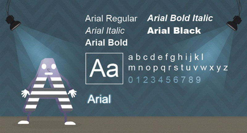
Arial is a neo-grotesque sans-serif font designed by Robin Nicholas and Patricia Saunders in 1982, released by Monotype Typography. It delivers consistent cross-platform text rendering in digital environments without requiring a font license.
Arial suits email signatures because it has 100% compatibility on both PC and Mac, making it Gmail’s own fallback font. According to WiseStamp, Arial is the single most compatible typeface across all major email clients, including Outlook, Apple Mail, and mobile clients.
What makes Arial suitable for email signatures?
Arial has a medium x-height that improves legibility at small sizes. Its open counters in letters like “c”, “e”, and “a” reduce character confusion at 10px to 12px. The letter spacing defaults to 0, which keeps compact signature layouts tight without crowding.
Key attributes:
| Attribute | Value |
| Classification | Neo-grotesque sans-serif |
| Designer | Robin Nicholas & Patricia Saunders, 1982 |
| Weight range | Regular, Italic, Bold, Bold Italic, Black, Narrow |
| Variable font | No |
| Recommended sizes | 10px–14px for signature body; 14px–16px for name |
| Letter-spacing default | 0 |
| License | Proprietary (bundled with Windows and macOS) |
| Available on | Pre-installed on Windows, macOS, iOS, Android |
| Price | Free (system font) |
How does Arial perform in email client rendering?
Arial renders at Regular, Bold, and Italic in email HTML. Arial Black and Arial Narrow are separate font files and are not reliably web-safe in email. On Android, Arial maps to Droid Sans Serif, which preserves the general layout but can shift spacing slightly.
What are the best pairings for Arial in email signatures?
Arial pairs with Georgia for a classic sans/serif contrast, using Arial for contact details and Georgia for the name line. It also pairs with Verdana when a slightly wider, softer feel is needed, though both being sans-serif reduces contrast. The Arial + Georgia combination is standard practice in corporate email design.
For more on combining typefaces effectively, the font pairing generator is a useful starting point.
What are the limitations of Arial for email signatures?
Arial lacks distinguishable characters between uppercase “I” and lowercase “l”, which can cause readability issues in names and URLs inside signatures. It was replaced as Microsoft Office’s default by Calibri in 2007 and by Aptos in 2024, so some recipients associate it with older document styles.
Arial – Recommended Use Cases Within Email Signatures
- Best for: Contact detail lines, job titles, multi-line signature layouts
- Avoid for: Signatures with alphanumeric codes or URLs where “I” vs “l” confusion matters
- Optimal weight: Regular 400 for body; Bold 700 for name
- Optimal size range: 10px–14px for details; 14px–16px for name
—
Georgia
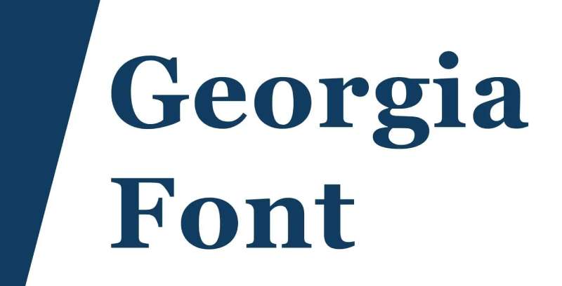
Georgia is a transitional serif font designed by Matthew Carter in 1993, released by Microsoft in 1996 as part of the Core Fonts for the Web initiative. It was built specifically for on-screen legibility, not adapted from print.
Georgia works best for professional email signatures in editorial, legal, and finance contexts because its generous x-height, open counters, and low stroke contrast keep serifs intact at 10px to 14px on screen. The New York Times switched its standard body font from Times New Roman to Georgia in 2007, citing superior screen rendering.
What makes Georgia suitable for email signatures?
Georgia’s x-height is notably larger than Times New Roman’s, which means lowercase letters fill more vertical space at the same point size, improving readability without increasing font size. Stroke contrast is moderate; thin strokes don’t disappear at small sizes the way they do in high-contrast serif designs. Letter spacing is slightly more generous than Helvetica at the same size.
Key attributes:
| Attribute | Value |
| Classification | Transitional serif |
| Designer | Matthew Carter, 1993 |
| Weight range | Regular, Italic, Bold, Bold Italic (Georgia Pro adds Light, Semibold, Black) |
| Variable font | No |
| Recommended sizes | 10px–14px for body; 14px–16px for name |
| Letter-spacing default | Slightly loose (designed for screen) |
| License | Proprietary Microsoft (bundled); Georgia Pro available via Monotype |
| Available on | Pre-installed on Windows, macOS, iOS |
| Price | Free (system font); Georgia Pro is paid |
How does Georgia perform in email signature rendering?
Georgia renders at 99% compatibility on PC and Mac according to WiseStamp email client data. On Android, it maps to Droid Serif, which preserves the serif structure. Its TrueType hinting, handled by Thomas Rickner, was designed pixel-by-pixel for 72 DPI screens, which means it holds up better than most serifs at small signature sizes.
What are the best pairings for Georgia in email signatures?
Georgia pairs with Arial for the most common professional contrast, using Georgia for the name and Arial for contact details. It also pairs with Verdana when a warmer, softer sans-serif tone is needed in the supporting lines. The Georgia + Arial combination is the most widely-used serif/sans pairing in corporate email signatures.
See the Georgia font pairing guide for more combination options.
What are the limitations of Georgia for email signatures?
Georgia’s base family covers only 4 weights: Regular, Italic, Bold, and Bold Italic. Bold is unusually heavy due to pixel grid constraints from the 1990s design process, which can look disproportionate at large sizes. Georgia Pro expands the weight range but requires a separate license and isn’t pre-installed on most systems.
Georgia – Recommended Use Cases Within Email Signatures
- Best for: Name display line in legal, finance, or editorial signatures
- Avoid for: Tech company signatures where a modern sans-serif tone is expected
- Optimal weight: Regular 400 for body; Bold 700 for name
- Optimal size range: 10px–14px for contact details; 14px–16px for name
—
Verdana
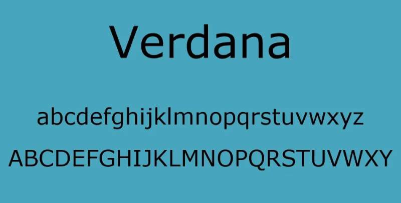
Verdana is a humanist sans-serif typeface designed by Matthew Carter for Microsoft, with hinting by Thomas Rickner, released in 1996 as part of the Core Fonts for the Web initiative. It maximizes character distinction at small screen sizes through unusually wide letter proportions.
Verdana is the strongest choice for compact email signature layouts where contact details run small. Its wide letterforms and large x-height reduce visual crowding at 9px to 12px, and it achieves 100% compatibility on both PC and Mac.
What makes Verdana suitable for email signatures?
Verdana has a larger x-height than Arial at the same point size, and its letterforms are wider, which increases the visual space inside and between characters. Letter spacing is generous by default, reducing character collision at small sizes. Wide proportions mean it occupies more horizontal space than Arial, so it requires slightly shorter lines in multi-column signature layouts.
Key attributes:
| Attribute | Value |
| Classification | Humanist sans-serif |
| Designer | Matthew Carter, 1996 |
| Weight range | Regular, Italic, Bold, Bold Italic |
| Variable font | No |
| Recommended sizes | 9px–13px for body; 13px–16px for name |
| Letter-spacing default | Wide (intentional for screen legibility) |
| License | Proprietary Microsoft (bundled) |
| Available on | Pre-installed on Windows, macOS, iOS; maps to Droid Sans on Android |
| Price | Free (system font) |
How does Verdana perform in email signature rendering?
Verdana’s wide proportions make it visually larger than Arial at the same size. At 10px, Verdana renders with noticeably more visual separation between characters than any other web-safe sans-serif, which reduces misread characters in phone numbers and email addresses. One downside: the wide tracking means signatures take up more horizontal space, which can push multi-column layouts to wrap unexpectedly on mobile.
What are the best pairings for Verdana in email signatures?
Verdana pairs with Georgia for a complementary screen-optimized combination, both designed by Matthew Carter with similar legibility goals. It pairs with Times New Roman when a more formal serif contrast is needed, though this combination is less common in modern signature design.
What are the limitations of Verdana for email signatures?
Verdana’s wide character proportions make it space-inefficient. A signature using Verdana at 11px occupies roughly 15 to 20% more horizontal space than the same text in Arial, which can cause layout issues on mobile email clients. The base family covers only 4 weights, with no Light or Medium option for mid-level hierarchy.
Verdana – Recommended Use Cases Within Email Signatures
- Best for: Signatures with small contact text where maximum readability matters
- Avoid for: Multi-column signature layouts on mobile
- Optimal weight: Regular 400 for body; Bold 700 for name
- Optimal size range: 9px–13px for details; 13px–16px for name
—
Helvetica
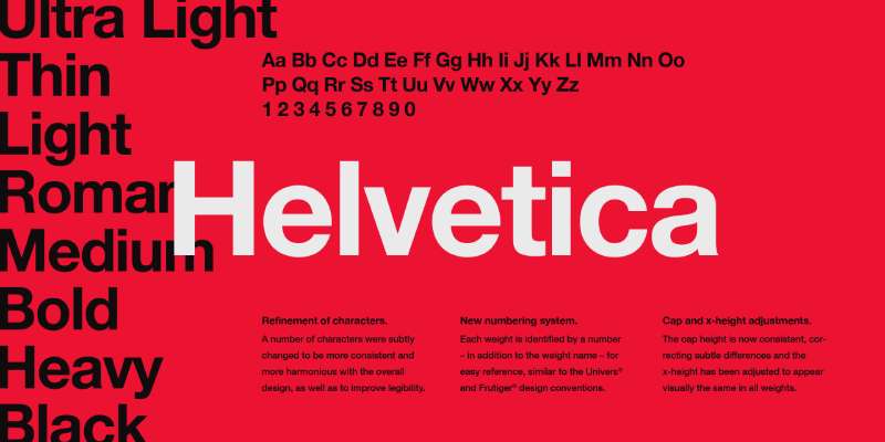
Helvetica is a neo-grotesque sans-serif typeface designed by Max Miedinger and Eduard Hoffmann in 1957, released by the Haas Type Foundry in Switzerland and later licensed by Linotype. It delivers neutral, high-clarity typography across both print and screen environments.
Helvetica works well in Mac-heavy environments because macOS defaults to Helvetica when a CSS declaration specifies font-family: sans-serif, making it a reliable system font for Apple Mail and Safari-rendered signatures. BMW, Lufthansa, and NASA use Helvetica as their primary brand typeface, which signals its association with professional, institutional design.
What makes Helvetica suitable for email signatures?
Helvetica has a high x-height and tight default letter spacing, which produces a dense, compact block of text in short signature layouts. Its stroke terminations cut horizontally and vertically, which makes letterforms appear consistent across screen resolutions. On macOS, it renders as the primary sans-serif system font, but on Windows it is not pre-installed, requiring a fallback to Arial.
Key attributes:
| Attribute | Value |
| Classification | Neo-grotesque sans-serif |
| Designer | Max Miedinger & Eduard Hoffmann, 1957 |
| Weight range | Neue Helvetica: Thin 25 to Black 95, 34 styles |
| Variable font | No (standard); some variable versions via Monotype |
| Recommended sizes | 10px–14px for body; 14px–16px for name |
| Letter-spacing default | Tight |
| License | Commercial (Linotype/Monotype); not free |
| Available on | macOS (pre-installed); Windows requires license |
| Price | Paid; individual styles via Monotype/MyFonts |
How does Helvetica perform in email signature rendering?
On macOS and iOS, Helvetica renders natively and cleanly. On Windows, email clients substitute Arial, which is metrically identical, so layout doesn’t break. Helvetica’s tight apertures on letters like “c” and “e” can reduce character distinction at sizes below 10px on lower-DPI screens, so it works better at 12px and above.
Curious how the Gmail font handles Helvetica versus Arial? The two are nearly indistinguishable in Gmail’s rendering engine because Arial was built to match Helvetica’s metrics exactly.
What are the best pairings for Helvetica in email signatures?
Helvetica pairs with Garamond for a clean modern/classic contrast, placing Helvetica on the name line and Garamond on supporting text. It also pairs with Georgia when the full signature needs to run on both Mac and Windows without licensing complications. See Helvetica font pairing for documented combinations.
What are the limitations of Helvetica for email signatures?
Helvetica is not pre-installed on Windows, meaning Windows users see Arial as a substitute. This isn’t a layout problem since the metrics match, but it does mean you’re not actually controlling the typeface for roughly half your recipients. Tight letter spacing can also create readability issues in small-print contact lines below 10px.
Helvetica – Recommended Use Cases Within Email Signatures
- Best for: Mac-first organizations; design, architecture, or branding firms
- Avoid for: Cross-platform organizations needing true font consistency on both Windows and Mac
- Optimal weight: Regular 55 for body; Medium 65 for name
- Optimal size range: 12px–16px for all signature lines
—
Calibri
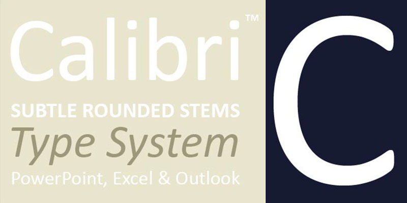
Calibri is a humanist sans-serif typeface designed by Lucas de Groot in 2002 to 2004, released by Microsoft in 2007 with Windows Vista as part of the ClearType Font Collection. It was built to improve text rendering on LCD screens using Microsoft’s ClearType technology.
Calibri suits email signatures in Microsoft-heavy corporate environments because it is pre-installed across all Windows and Office versions from 2007 to 2024, making it the most familiar typeface for Outlook users. The US Department of State adopted Calibri for official documents in February 2023.
What makes Calibri suitable for email signatures?
Calibri features subtly rounded stems and corners, which are visible at larger sizes but don’t interfere with legibility at 10px to 14px. Its open counters and tall x-height produce clean character shapes on LCD screens. It covers 6 weights: Light, Regular, Semibold, Bold, Bold Italic, and Light Italic, giving more hierarchy options than most web-safe fonts.
Key attributes:
| Attribute | Value |
| Classification | Humanist sans-serif |
| Designer | Lucas de Groot, 2002–2004 |
| Weight range | Light, Regular, Semibold, Bold (6 styles total) |
| Variable font | No |
| Recommended sizes | 10px–14px for body; 14px–16px for name |
| Letter-spacing default | 0 (moderate) |
| License | Proprietary Microsoft (bundled with Windows and Office) |
| Available on | Windows Vista+, Microsoft Office 2007+; not pre-installed on macOS |
| Price | Free with Windows/Office; paid separately via Monotype (~$49/style) |
How does Calibri perform in email signature rendering?
Calibri renders cleanly in Outlook on Windows because it’s a native system font. On macOS and iOS, it falls back to the system sans-serif (Helvetica or San Francisco) if not installed, which can shift character spacing and line breaks in the signature. It was replaced as the Microsoft Office default by Aptos in January 2024, so its presence on new Windows installs going forward may decline.
What are the best pairings for Calibri in email signatures?
Calibri pairs with Cambria, another Microsoft ClearType font, for a harmonious sans/serif combination within the same design family. It also works with Georgia when a more traditional serif contrast is needed. Both pairings are common in Microsoft 365-centric organizations.
What are the limitations of Calibri for email signatures?
Calibri is not pre-installed on macOS, so Mac recipients without Microsoft Office installed see a fallback font, breaking the signature’s intended appearance. The “I” and “l” characters are indistinguishable, identical to the issue in Arial and Open Sans. As of January 2024, it is no longer the default Microsoft Office font.
Calibri – Recommended Use Cases Within Email Signatures
- Best for: Windows-only corporate environments; Outlook-primary workflows
- Avoid for: Organizations with significant Mac or mobile-first user bases
- Optimal weight: Regular 400 for body; Bold 700 for name
- Optimal size range: 10px–14px for details; 14px–16px for name
—
Times New Roman
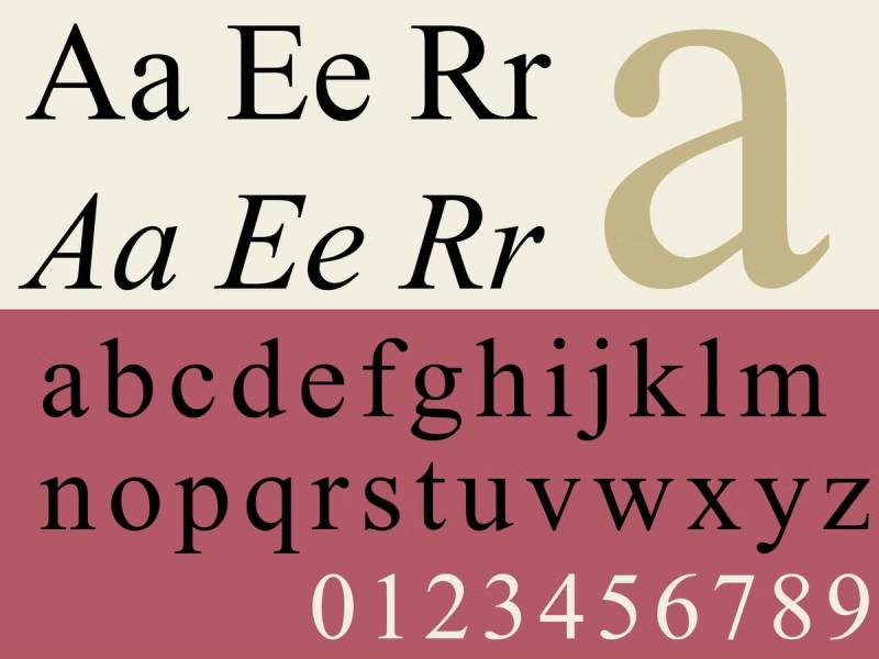
Times New Roman is a transitional serif typeface designed by Stanley Morison and Victor Lardent in 1931, originally commissioned by The Times of London. It delivers high text density at small print sizes through narrow character widths and high stroke contrast.
Times New Roman suits formal professional email signatures in legal, academic, and government contexts because it is Outlook’s default fallback font, meaning it renders at 99% compatibility on PC. It is the most recognized formal serif typeface in professional email worldwide.
What makes Times New Roman suitable for email signatures?
Times New Roman has a moderate x-height and narrow character widths, which allow more text per line compared to Georgia or Verdana at the same size. Its high stroke contrast between thick and thin strokes is a drawback on low-DPI screens, where thin strokes can disappear at sizes below 11px. It performs better in print than on screen, which is why Georgia was created as its screen-optimized alternative.
Key attributes:
| Attribute | Value |
| Classification | Transitional serif |
| Designer | Stanley Morison & Victor Lardent, 1931 |
| Weight range | Regular, Italic, Bold, Bold Italic |
| Variable font | No |
| Recommended sizes | 11px–14px for body; 14px–16px for name |
| Letter-spacing default | Tight |
| License | Proprietary (bundled with Windows and macOS) |
| Available on | Pre-installed on Windows, macOS, iOS, Android |
| Price | Free (system font) |
How does Times New Roman perform in email signature rendering?
Times New Roman is Outlook’s primary fallback font on Windows, so any signature that fails to load its specified font will default to this. Its narrow letterforms render more text per line but can produce crowded, vertical-stripe-like patterns at 10px on screens, where thin strokes optically disappear. Minimum readable size for screen signatures is 11px.
What are the best pairings for Times New Roman in email signatures?
Times New Roman pairs with Arial for the most traditional professional combination, with Times New Roman on the name line and Arial on contact details. It pairs with Helvetica for a more contemporary tone while retaining the serif name treatment. The Times/Arial pairing is the most common in legal and government email signatures.
What are the limitations of Times New Roman for email signatures?
High stroke contrast causes thin strokes to render poorly at sizes below 11px on standard-DPI screens. The narrow character widths that made it efficient for newspaper printing become a readability liability on screens, especially on mobile where rendering engines don’t apply the same hinting optimization as desktop clients.
Times New Roman – Recommended Use Cases Within Email Signatures
- Best for: Legal, academic, and government signatures; any context requiring formal authority
- Avoid for: Tech, startup, or design-oriented signatures; sizes below 11px
- Optimal weight: Regular 400 for body; Bold 700 for name
- Optimal size range: 11px–14px for details; 14px–16px for name
—
Trebuchet MS
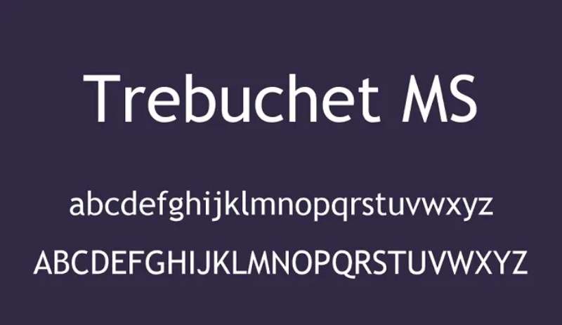
Trebuchet MS is a humanist sans-serif font designed by Vincent Connare for Microsoft in 1996, released as part of the Core Fonts for the Web initiative. It draws from geometric and humanist sans-serif traditions while prioritizing character distinction at small screen sizes.
Trebuchet MS suits email signatures where visual personality matters within the safe-font constraint. Connare specifically designed each character to be “significantly distinguishable” from similar letterforms, reducing misread characters in contact details.
What makes Trebuchet MS suitable for email signatures?
Trebuchet MS has a large x-height and clean lines designed for legibility at small sizes, per Microsoft’s own documentation. Its narrow letterforms are more space-efficient than Verdana, making it a better choice for multi-line signatures. Unique character details, like the curled lowercase “l” and serif-like bars on “i” and “j”, help distinguish characters that look similar in other web-safe fonts.
Key attributes:
| Attribute | Value |
| Classification | Humanist sans-serif |
| Designer | Vincent Connare, 1996 |
| Weight range | Regular, Italic, Bold, Bold Italic |
| Variable font | No |
| Recommended sizes | 10px–14px for body; 14px–16px for name |
| Letter-spacing default | Moderate |
| License | Proprietary Microsoft (bundled) |
| Available on | Pre-installed on Windows, macOS; limited Android support |
| Price | Free (system font) |
How does Trebuchet MS perform in email signature rendering?
Trebuchet MS is not supported by all mobile operating systems, particularly on Android, where it may fall back to Droid Sans. On Windows and macOS it renders well in both Outlook and Apple Mail. Email developer Manning Krull notes that Trebuchet MS falls outside the core web-safe email font list, meaning Android fallback behavior is unpredictable.
What are the best pairings for Trebuchet MS in email signatures?
Trebuchet MS pairs with Georgia for a humanist sans/transitional serif combination that works across both Windows and macOS. It pairs with Times New Roman for a more formal tone, though the personality contrast is significant. The Trebuchet MS + Georgia pairing is less common than Arial + Georgia but provides more visual distinctiveness.
What are the limitations of Trebuchet MS for email signatures?
Trebuchet MS has unreliable Android support. Organizations with mobile-heavy recipient bases should default to Arial or Verdana and list Trebuchet MS as the first option in a CSS font stack, with Arial as the fallback. Only 4 weights are available, matching the base range of most other Microsoft web-safe fonts.
Trebuchet MS – Recommended Use Cases Within Email Signatures
- Best for: Desktop-primary corporate environments; signatures needing more personality than Arial
- Avoid for: Mobile-first organizations; signatures sent to Android-heavy audiences
- Optimal weight: Regular 400 for body; Bold 700 for name
- Optimal size range: 10px–14px for details; 14px–16px for name
—
Garamond

Garamond is an old-style serif typeface originating with French punchcutter Claude Garamond in the 1530s to 1540s. Modern digital versions include Adobe Garamond (Robert Slimbach, 1989) and EB Garamond (Georg Duffner, 2011, OFL license). It sets more compactly than most serifs at the same nominal size, reducing space consumption in dense layouts.
Garamond suits email signatures in editorial, publishing, and academic contexts where a formal serif with historical credibility is preferred. Adobe Garamond is the typeface used in all American editions of the Harry Potter series, which demonstrates its long-form text performance at small sizes.
What makes Garamond suitable for email signatures?
Garamond has a low x-height compared to Georgia or Times New Roman, which gives it a more classical, compact appearance. Its high stroke contrast requires sizes of at least 11px on screen to prevent thin strokes from disappearing. The typeface sets approximately 15 to 20% more compactly than Times New Roman at the same size, allowing more text per line without reducing font size.
Key attributes:
| Attribute | Value |
| Classification | Old-style serif |
| Designer | Claude Garamond (c.1530s); Adobe Garamond by Robert Slimbach, 1989 |
| Weight range | Adobe Garamond: 6 weights; EB Garamond: Regular through Bold with variable axis |
| Variable font | Yes (EB Garamond since 2019) |
| Optical sizes | Yes, EB Garamond: 8pt and 12pt optimized variants |
| Recommended sizes | 11px–14px for body; 14px–16px for name |
| Letter-spacing default | Moderate |
| License | Adobe Garamond: Commercial (Adobe Fonts); EB Garamond: OFL (free) |
| Available on | Windows (bundled, basic version); Adobe Fonts; Google Fonts (EB Garamond) |
| Price | Free (system/EB Garamond); Adobe Fonts subscription for Adobe Garamond |
How does Garamond perform in email signature rendering?
The version of Garamond bundled with Microsoft Windows is the Monotype Drawing Office 1922 revival, which is pre-installed and web-safe. Adobe Garamond and EB Garamond are not pre-installed and require font stacks with Times New Roman or Georgia as fallbacks. High stroke contrast makes thin strokes fragile at sizes below 11px on standard-DPI screens.
What are the best pairings for Garamond in email signatures?
Garamond pairs with Helvetica for a strong old-style/modernist contrast, a combination used in editorial and luxury branding. It pairs with Arial when Helvetica isn’t available on Windows, which is the more reliable cross-platform option. The Garamond + Helvetica pairing is unconventional but well-documented in editorial design practice. See Garamond font pairing options for reference.
What are the limitations of Garamond for email signatures?
Garamond’s high stroke contrast causes thin strokes to degrade at sizes below 11px on standard-resolution screens. The Windows-bundled version has limited weight coverage. Adobe Garamond and EB Garamond are not pre-installed on most systems and require font stack fallbacks, meaning recipients without those versions installed will see a different typeface.
Garamond – Recommended Use Cases Within Email Signatures
- Best for: Academic, publishing, and legal signatures; name display at 14px or larger
- Avoid for: Contact detail lines below 11px; tech or startup signatures
- Optimal weight: Regular for body; Bold for name
- Optimal size range: 11px–16px for all lines
—
Tahoma
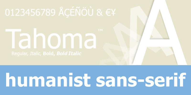
Tahoma is a humanist sans-serif typeface designed by Matthew Carter for Microsoft, released in 1994 as a Windows system font. It uses tighter character spacing than Verdana while maintaining wide letterforms, which makes it more space-efficient than Verdana without the spacing gaps of Arial.
Tahoma suits email signatures where legibility matters at small sizes but space efficiency is more important than Verdana’s open spacing. It has 100% compatibility across Windows and macOS and renders cleanly in Outlook, Apple Mail, and Gmail.
What makes Tahoma suitable for email signatures?
Tahoma’s character spacing is tighter than Verdana’s, which allows more text per line at the same point size. It shares Verdana’s wide letterforms and large x-height but reduces the excess horizontal space between characters. The result is a font that sits between Arial’s compactness and Verdana’s openness in terms of line density.
Key attributes:
| Attribute | Value |
| Classification | Humanist sans-serif |
| Designer | Matthew Carter, 1994 |
| Weight range | Regular, Bold |
| Variable font | No |
| Recommended sizes | 10px–14px for body; 14px–16px for name |
| Letter-spacing default | Tight (less than Verdana, more than Arial) |
| License | Proprietary Microsoft (bundled) |
| Available on | Pre-installed on Windows, macOS |
| Price | Free (system font) |
How does Tahoma perform in email signature rendering?
Tahoma renders consistently across Windows and macOS email clients. It has higher contrast between thick and thin strokes than Verdana, which gives it a sharper on-screen appearance at 12px and above. This additional contrast works well in desktop email clients but can reduce legibility at sizes below 10px on mobile.
What are the best pairings for Tahoma in email signatures?
Tahoma pairs with Georgia for a practical screen-optimized sans/serif combination, both designed for Windows rendering environments. It also pairs with Times New Roman for more formal signatures, though the contrast between Tahoma’s modern character and Times New Roman’s newspaper heritage is significant.
What are the limitations of Tahoma for email signatures?
Tahoma provides only 2 weights: Regular and Bold. There is no Italic, Semibold, Light, or any intermediate option, which limits hierarchy options in multi-line signatures. It is also one of the least distinctive web-safe fonts visually, sitting between Arial and Verdana in appearance without a strong identity of its own.
Tahoma – Recommended Use Cases Within Email Signatures
- Best for: Multi-line signatures needing more density than Verdana but more openness than Arial
- Avoid for: Signatures requiring more than two weight levels; italic name treatments
- Optimal weight: Regular for body; Bold for name
- Optimal size range: 10px–14px for all signature lines
—
Open Sans
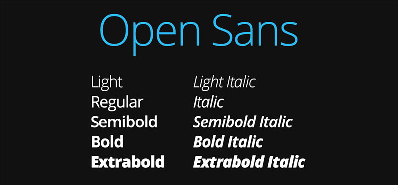
Open Sans is a humanist sans-serif font designed by Steve Matteson, released in 2011 via Google Fonts under the Apache License 2.0. It was derived from Matteson’s earlier Droid Sans for Android and optimized for web and print legibility across devices.
Open Sans suits email signatures in modern tech and startup environments where a clean, neutral sans-serif that extends beyond the Microsoft system font list is preferred. It is one of the most used fonts on the web. However, because it is not a pre-installed system font on all platforms, it requires a reliable fallback stack.
What makes Open Sans suitable for email signatures?
Open Sans has wide apertures on letters like “c”, “e”, and “a”, which reduce character ambiguity at small sizes. Its large x-height improves legibility at 10px to 14px on screen. The family covers 10 weights from Light 300 to ExtraBold 800, providing more hierarchy control than any web-safe system font.
Key attributes:
| Attribute | Value |
| Classification | Humanist sans-serif |
| Designer | Steve Matteson, 2011 |
| Weight range | Light 300 to ExtraBold 800 (10 weights including italics) |
| Variable font | Yes (available on Google Fonts) |
| Recommended sizes | 10px–14px for body; 14px–16px for name |
| Letter-spacing default | 0 (moderate) |
| License | Apache License 2.0 (free for commercial use) |
| Available on | Google Fonts; not pre-installed on most OS |
| Price | Free |
How does Open Sans perform in email signature rendering?
Open Sans is not a system font on Windows or macOS by default, which means email clients that don’t support web fonts (Outlook desktop, most mobile clients) will substitute their system sans-serif, typically Arial or Helvetica. Gmail on Chrome does support @font-face declarations in some cases, but this is inconsistent. A properly structured font stack with Arial or Helvetica as fallback preserves layout even when Open Sans doesn’t load.
What are the best pairings for Open Sans in email signatures?
Open Sans pairs with Merriweather for a complementary sans/serif combination designed with similar screen-legibility goals. It also pairs with Georgia when a web-safe serif fallback is needed for environments that don’t load Open Sans. The Open Sans font pairing guide covers these combinations in detail.
What are the limitations of Open Sans for email signatures?
Open Sans is not a pre-installed system font, so email clients that don’t support web fonts will ignore it and substitute Arial or the system default. This affects the majority of email clients, including Outlook desktop on Windows. The “I” and “l” characters are also indistinguishable, matching the same readability issue found in Arial, Calibri, and Helvetica. It is better suited to HTML email newsletters with full CSS control than basic signature blocks.
Open Sans – Recommended Use Cases Within Email Signatures
- Best for: Gmail signatures with web font support; HTML email signatures with full CSS control
- Avoid for: Outlook-primary environments; any context where font fallback consistency is critical
- Optimal weight: Regular 400 for body; SemiBold 600 for name
- Optimal size range: 10px–14px for details; 14px–16px for name
—
Calibri vs. Arial vs. Georgia: Quick Comparison
| Font | Type | PC/Mac compatibility | Android | Weight options | Best context |
| Arial | Sans-serif | 100% / 100% | Droid Sans | 4 styles | Universal default |
| Georgia | Serif | 99% / 99% | Droid Serif | 4 styles | Editorial, legal, finance |
| Verdana | Sans-serif | 100% / 100% | Droid Sans | 4 styles | Small-size legibility priority |
| Calibri | Sans-serif | 100% / Limited | System fallback | 6 styles | Windows/Outlook-first orgs |
| Helvetica | Sans-serif | Limited / 100% | System fallback | 34 styles | Mac-first, design/branding |
| Open Sans | Sans-serif | Fallback / Fallback | System fallback | 10 styles | HTML email with CSS control |
For deeper context on the difference between serif and sans-serif typefaces and when to choose each, see this serif vs sans-serif fonts overview. If you’re working on broader fonts for professional documents beyond signatures, the same web-safe logic applies.
The right choice depends on your email client environment, brand tone, and recipient device mix. Arial is the safest pick. Georgia is the best serif. Verdana wins on small-text legibility. Everything else is a trade-off worth understanding before you commit.
FAQ on The Best Fonts For Email Signatures
What is the best font for a professional email signature?
Arial is the most reliable choice. It renders at 100% compatibility across Gmail, Outlook, and Apple Mail. Georgia is the best option if you prefer a serif font. Both are web-safe and pre-installed on Windows and macOS.
What font size should I use in an email signature?
Use 10px to 14px for contact details and 14px to 16px for your name. Anything below 10px risks becoming unreadable on mobile clients. Stick to these ranges for consistent cross-device rendering.
Are Google Fonts safe to use in email signatures?
No. Google Fonts are not pre-installed on most devices. Outlook desktop ignores them entirely. Email clients fall back to Arial or the system default, breaking your intended design. Use web-safe fonts instead.
What is the difference between web-safe fonts and email-safe fonts?
Web-safe fonts work reliably in browsers. Email-safe fonts are a shorter list: Arial, Georgia, Verdana, Times New Roman, Trebuchet MS, and Courier New. These are pre-loaded on virtually every device email clients run on.
Does font choice affect how my email signature looks on mobile?
Yes. Verdana and Arial scale well on mobile due to their large x-height and wide letterforms. High-contrast serifs like Times New Roman can lose thin strokes at small sizes on low-DPI mobile screens.
Can I use Calibri in my email signature?
Calibri works on Windows and Outlook but is not pre-installed on macOS. Mac recipients without Microsoft Office installed will see a fallback font. For cross-platform consistency, Arial or Georgia are safer choices.
What font does Gmail use by default?
Gmail defaults to Arial as its fallback sans-serif font. When a CSS declaration specifies font-family: sans-serif, Windows renders Arial and macOS renders Helvetica. At small sizes, the two are visually identical.
Should I use a serif or sans-serif font in my email signature?
It depends on your industry. Sans-serif fonts like Arial and Verdana suit tech and corporate contexts. Serif fonts like Georgia work better in legal, finance, and editorial environments where authority and warmth matter more.
What font weight should I use for my name in an email signature?
Bold 700 is standard for the name line. It creates a clear visual hierarchy above contact details set in Regular 400. Avoid weights lighter than Regular for body text, as they can disappear at small sizes.
How do I make sure my email signature font looks the same for everyone?
Build a font stack with a web-safe fallback. For example: font-family: Georgia, 'Times New Roman', serif. This ensures that if Georgia isn’t available, the next closest option renders instead of a random system default.
Conclusion
This conclusion is for an article presenting the best fonts for email signatures, and the core takeaway is straightforward: web-safe fonts are non-negotiable if you want consistent rendering across every client and device.
Arial and Verdana lead for sans-serif signatures. Georgia remains the top serif choice for legal, finance, and editorial contexts.
Font size, weight, and a proper fallback font stack matter just as much as the typeface itself. A signature that looks sharp in Outlook but breaks in Apple Mail isn’t a finished signature.
Pick one typeface. Set your hierarchy. Test it across clients. Corporate email branding starts at the signature level, and typography is the first signal your recipients actually notice.

Renowned for his expertise in logo design and visual branding, Bogdan has developed a multitude of logos for various clients.
His skills extend to creating posters, vector illustrations, business cards, and brochures. Additionally, Bogdan's UI kits were featured on marketplaces like Visual Hierarchy and UI8.
He also wrote in the past years on sites like Design Your Way, WebDesignerDepot, WPDean, Designmodo, Speckyboy, Slider Revolution, and more.
- The Beehiiv Logo History, Colors, Font, And Meaning - 18 September 2026
- Why Small Teams Wait Too Long to Bring On Specialist Engineers - 17 September 2026
- Versatile Work Sans Font Pairing for Every Project - 16 September 2026

Bogdan Sandu is a seasoned designer who has been designing websites since 2008. Renowned for his expertise in logo design and visual branding, Bogdan has developed a multitude of logos for various clients. His skills extend to creating posters, vector illustrations, business cards, and brochures. Additionally, Bogdan's UI kits were featured on marketplaces like Visual Hierarchy and UI8. He also wrote in the past years on sites like Design Your Way, WebDesignerDepot, WPDean, Designmodo, Speckyboy, Slider Revolution, and more.
You Might Also Like