

Professional Typography: The 20 Best Fonts for Professional Documents

Picture this: You’ve crafted an impeccable proposal, your arguments are watertight, the data’s rock-solid. Then someone says, “I can barely get through this with that font choice.” Heart sinks.
Fonts, they’re silent persuaders; unsung heroes of readability, professionalism, and impact. And yet, they remain an afterthought for many. This changes now.
Selecting the best fonts for professional documents is not just about aesthetics; it’s about sending the right message, ensuring clarity, and upholding brand identity in every line you type.
Within this space, we’ll explore the significance of font pairing, line spacing, and typography, key elements that turn a bland document into a standout one.
By the close of our journey together, you’ll command a robust arsenal of typefaces like Times New Roman and Arial, balanced with design finesse.
We’re not just picking fonts; we’re setting the stage for your words to resonate with utmost professionalism. Strength lies in fine details — let’s dive into the world of serifs, sans-serifs, and document formatting finesse.
The Best Fonts for Professional Documents
| Best Fonts for Professional Documents | Category/Style | Design Era/Designer | Legibility | Usage Context |
|---|---|---|---|---|
| Times New Roman | Serif | 1931, Stanley Morison | Very high | Reports, articles, resumes |
| Garamond | Old-style Serif | 16th century, Claude Garamond | High | Books, magazines |
| Cambria | Serif | 2004, Microsoft ClearType | High | Web, electronic documents |
| Georgia | Serif | 1993, Matthew Carter | Very high | Web, print |
| Baskerville | Transitional Serif | Mid-18th century,John Baskerville | High | Books, academic papers |
| Merriweather | Serif | 2011, Sorkin Type Co. | High | Web readability |
| Bookman Old Style | Serif | Late 19th century | High | Headings, print materials |
| Lora | Serif | 2011, Cyreal | High | Digital and print media |
| Playfair Display | Serif | 2011, Claus Eggers Sørensen | Moderate-High | Titles, elegant materials |
| Century Schoolbook | Serif | Early 20th century | High | Textbooks, legal documents |
| Arial | Sans-serif | 1982, Robin Nicholas and Patricia Saunders | Very high | Reports, presentations |
| Helvetica | Sans-serif | 1957, Max Miedinger | Very high | Signage, text bodies |
| Verdana | Sans-serif | 1996, Matthew Carter | Very high | Web, small text readability |
| Calibri | Sans-serif | 2007, Lucas de Groot | High | Office documents |
| Roboto | Sans-serif | 2011, Google | High | Digital, mobile, and web |
| Proxima Nova | Sans-serif | 2005, Mark Simonson | High | Digital and print |
| Futura | Geometric Sans-serif | 1927, Paul Renner | Moderate | Displays, logos |
| Open Sans | Sans-serif | 2011, Steve Matteson | High | Web, print |
| Gill Sans | Humanist Sans-serif | 1928, Eric Gill | High | Signage, advertisements |
| Frutiger | Humanist Sans-serif | 1976, Adrian Frutiger | High | Signage, corporate identity |
Top Serif Fonts
Times New Roman
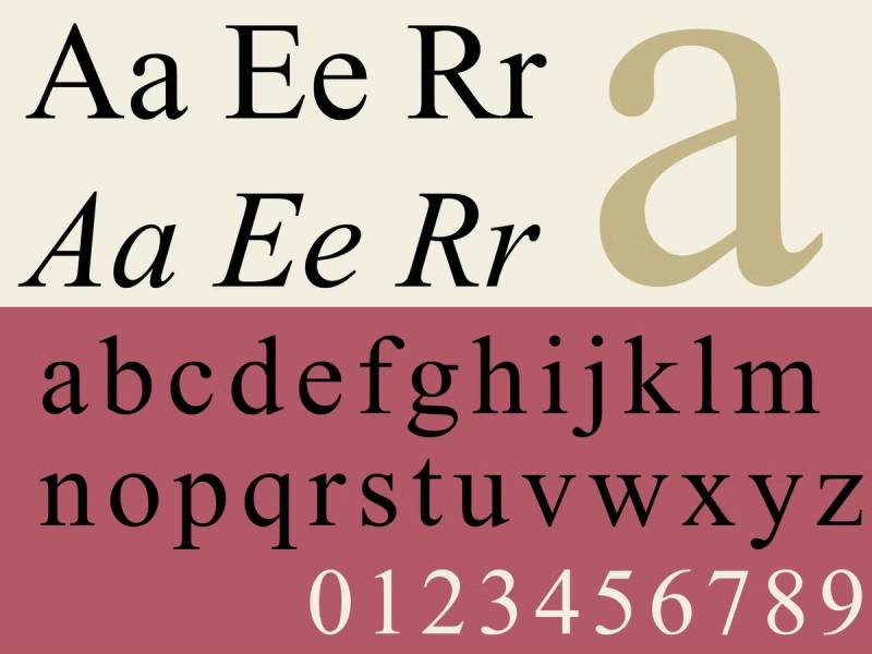
You’ve seen it. You’ve used it. Times New Roman is the quintessential professional font. It’s like that reliable friend who’s always there for you. Perfect for anything from reports to resumes. It’s got this old-school vibe but in a good way, you know?
Garamond
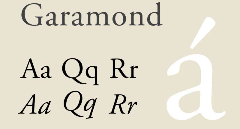
Next up, Garamond. This one’s got style and grace. It’s one of those fonts that say, “I mean business, but I’m also about elegance.” Great for when your document needs a touch of sophistication.
Cambria
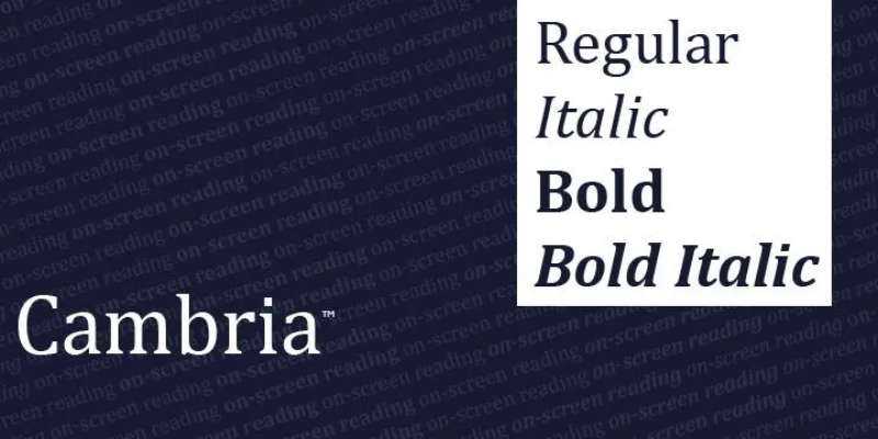
Cambria. Oh, this one’s a gem for on-screen reading. It’s like Times New Roman’s younger, cooler sibling. Designed for clarity, especially on screens, it’s a solid choice for e-documents.
Georgia
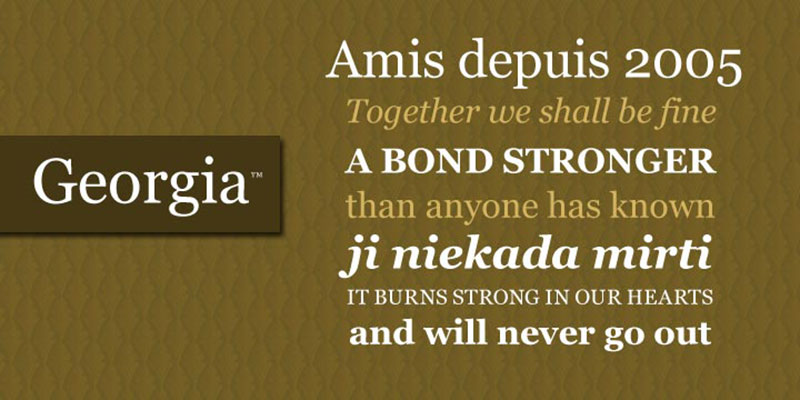
Georgia – a modern serif. It’s like the friendly face in a crowd. Designed for the screen, it’s super readable even at smaller sizes. If your document is gonna be read on screens, Georgia is your go-to.
Baskerville
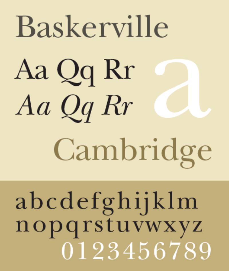
Baskerville. This one’s classic, with a hint of luxury. It’s kind of like wearing a designer watch. It’s not loud, but it speaks quality and sophistication.
Merriweather
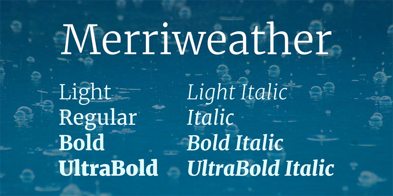
For web content, Merriweather is a star. It’s a newer font but has quickly earned its place. It’s easy on the eyes, which is perfect for longer reads on screens.
Bookman Old Style
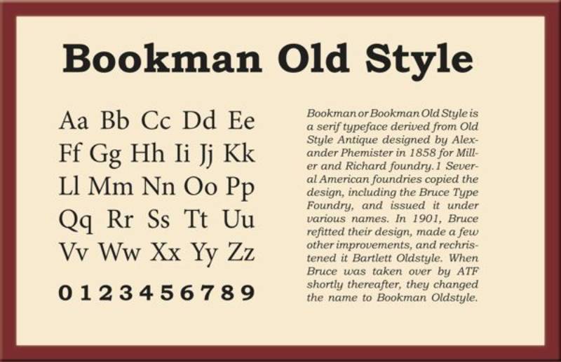
Then there’s Bookman Old Style. It’s got that vintage charm but still fits perfectly in today’s world. It’s like a classic novel – timeless.
Lora
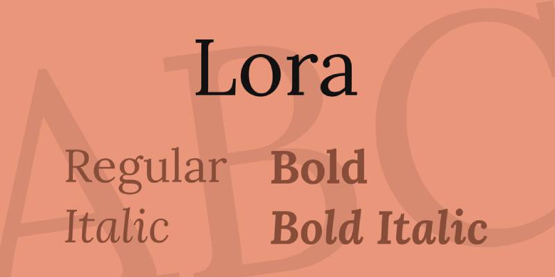
Lora is a bit of a balance between old and new. It’s got the classic feel of a serif but with a modern twist. It works great both in print and on screens.
Playfair Display
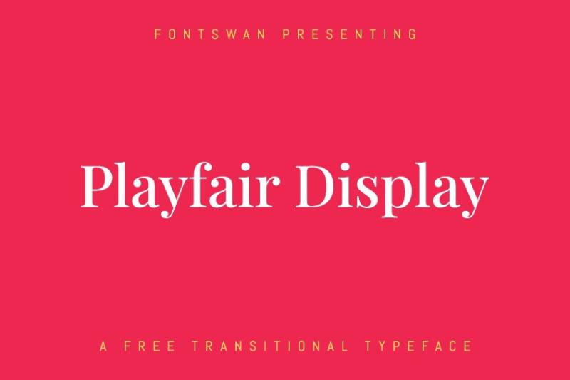
Playfair Display is for when you want to add a bit of flair. It’s like the font version of a statement piece. Elegant, stylish, and sure to catch the eye.
Century Schoolbook
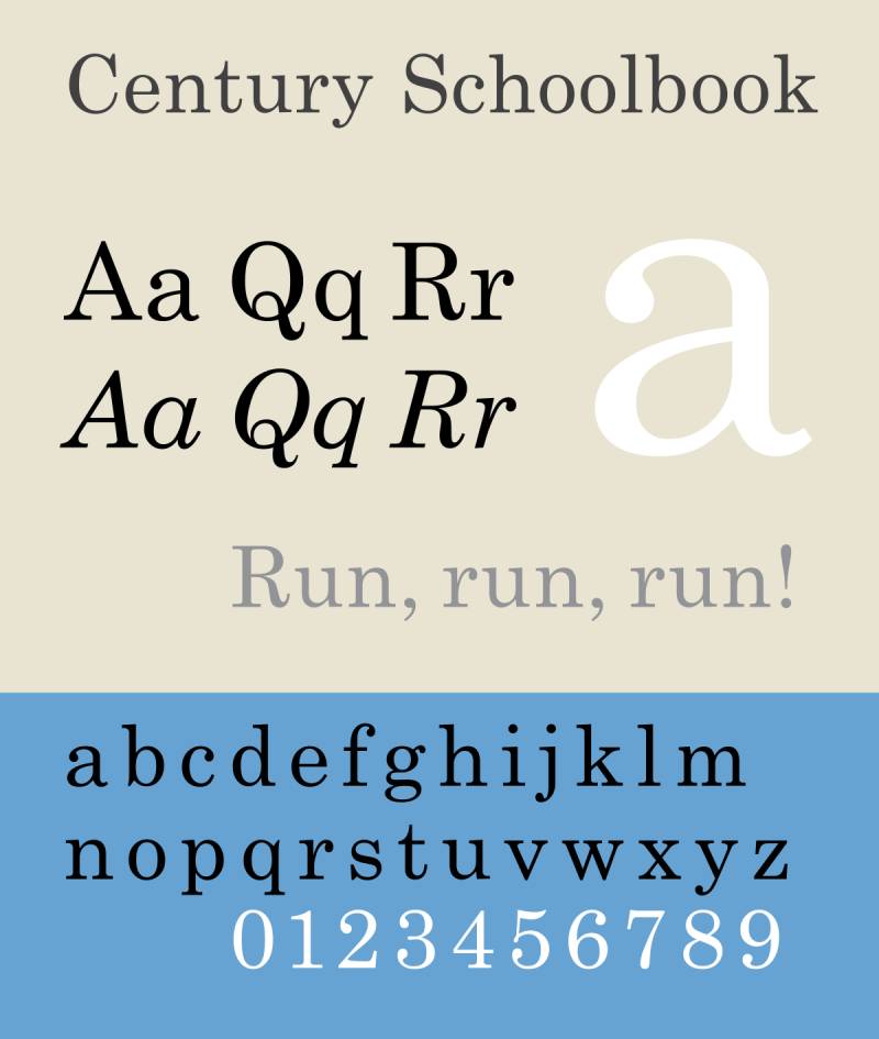
Last but not least, Century Schoolbook. This one’s like the wise professor of fonts. It’s authoritative, clear, and perfect for academic or serious business documents.
Top Sans Serif Fonts
Arial
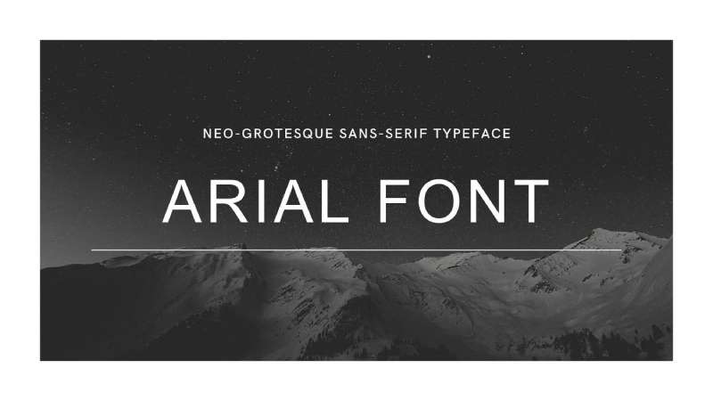
Starting with the ubiquitous Arial. It’s everywhere, and for good reason. Arial is like the jeans and t-shirt of fonts – simple, reliable, and goes with everything. It’s a no-fuss choice for any professional document.
Helvetica
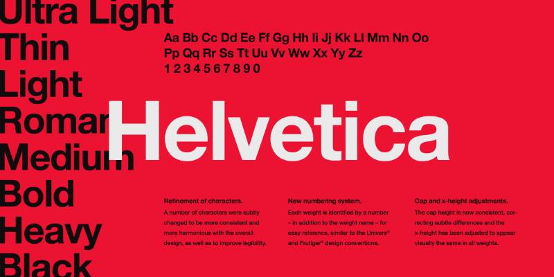
Helvetica steps in with its reputation as the designer’s darling. It’s the tailored suit of fonts. Crisp, professional, and with an air of sophistication. It’s perfect when you want your document to have that extra edge of professionalism.
Verdana
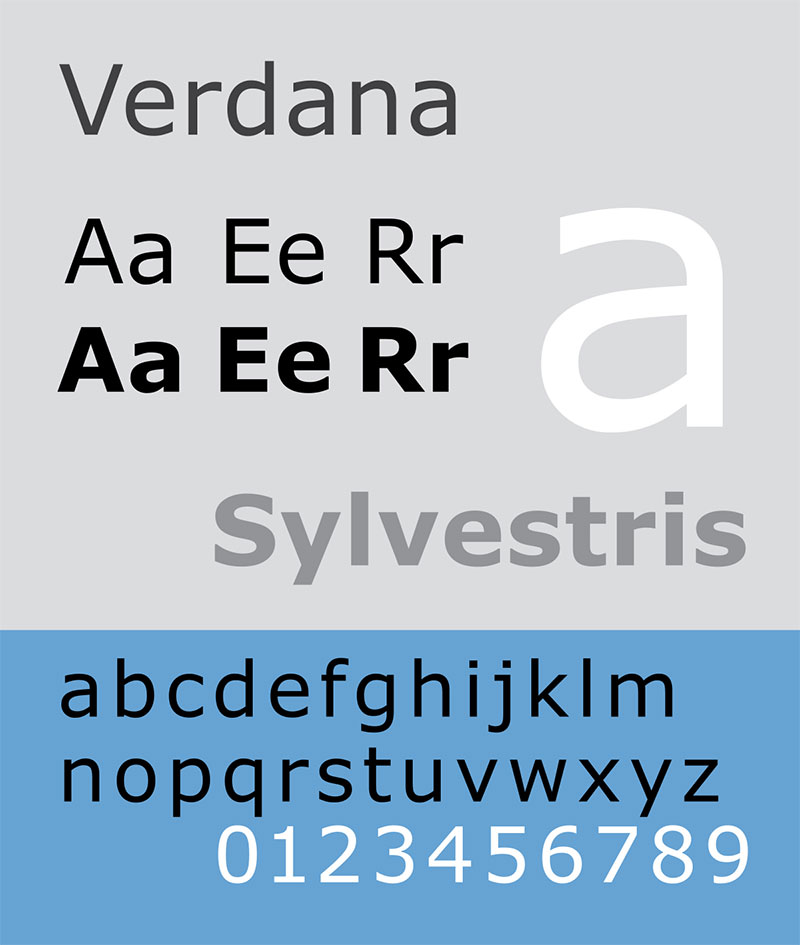
Then there’s Verdana. Born for the digital world, it’s super legible on screens. Think of Verdana as your friendly neighborhood font – approachable and clear, especially for web content.
Calibri
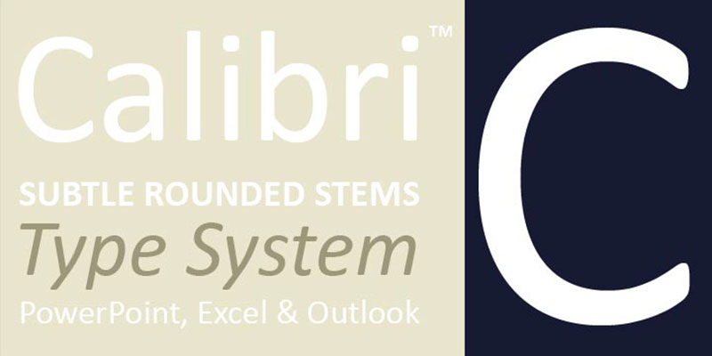
Ah, Calibri. If Arial is the classic, Calibri is the modern twist. It became a star thanks to Microsoft Office. It’s casual yet polished, great for both print and on-screen documents.
Roboto

Now, meet Roboto. Google’s brainchild. It’s like the smart, trendy friend who knows how to communicate. Designed for digital readability, it’s a hit for websites and online documents.
Proxima Nova
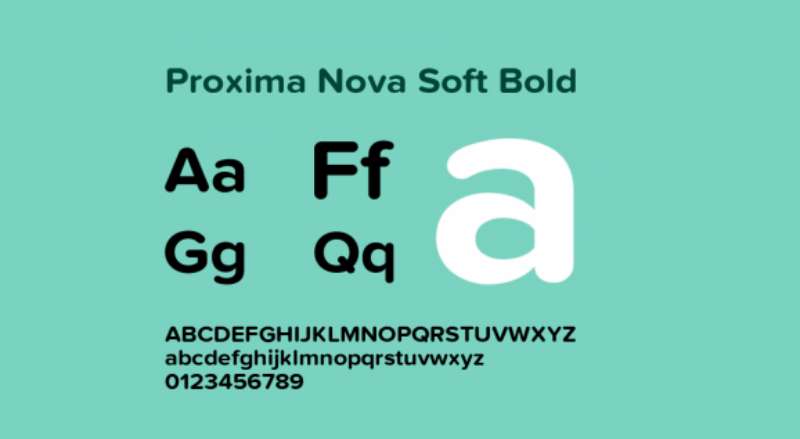
Proxima Nova straddles the line between friendly and formal. It’s like Helvetica’s more relaxed cousin. It brings modernity without losing the professional touch, perfect for contemporary documents.
Futura
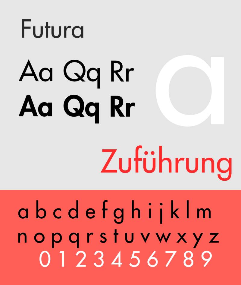
Futura is the geometric one. It screams elegance and forward-thinking. It’s the kind of font you use when you want your document to stand out in a crowd, in a good way.
Open Sans
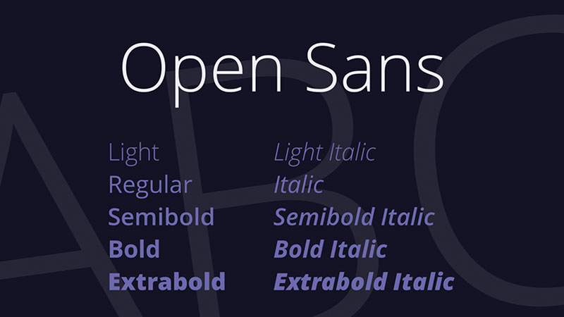
Enter Open Sans. This font is like your all-around, versatile player. It’s friendly, legible, and a jack-of-all-trades, making it ideal for a wide range of professional documents.
Gill Sans
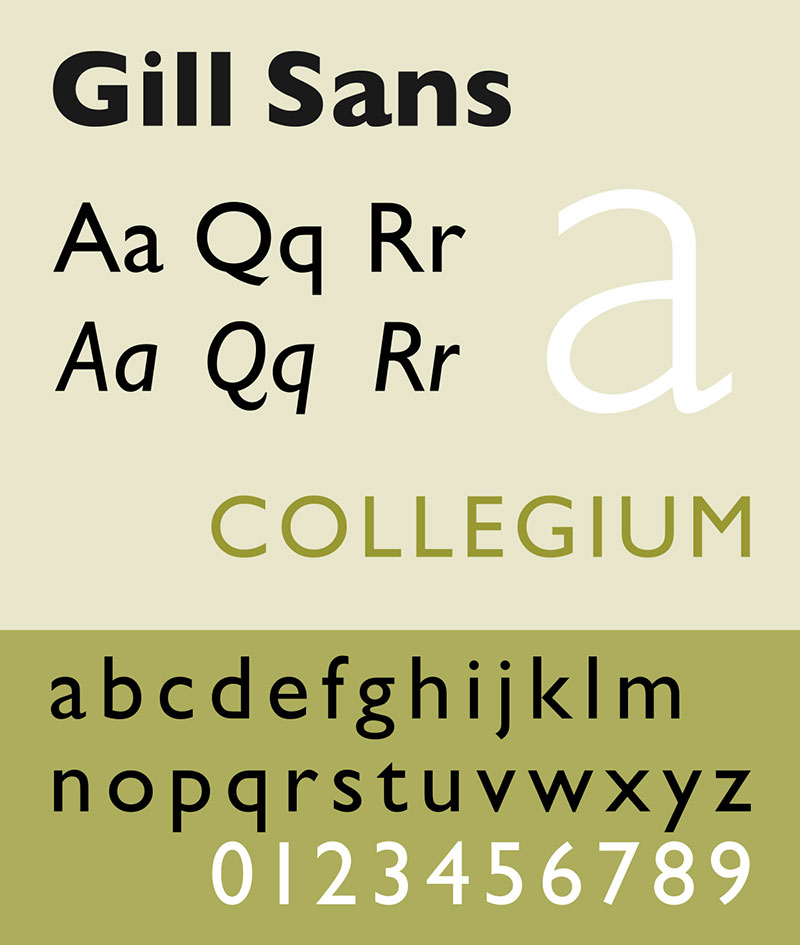
Gill Sans adds a touch of British charm. It’s perfect for standing out while maintaining that professional demeanor. It’s like having a polite, well-spoken friend who knows how to impress.
Frutiger
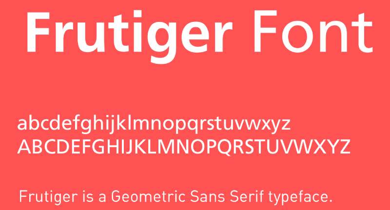
Last but certainly not least, Frutiger. It’s clear, legible, and versatile. It’s the great all-rounder, the kind you want on your team for just about any professional document.
Selecting the Right Font for Your Document
Choosing the best fonts for professional documents isn’t just about picking the prettiest one. It’s like matching your shoes to your outfit – it needs to be just right.
Factors Influencing Font Choice
The purpose and format of the document (print or digital)
First things first, think about where your document is going to live. Is it a print report or a digital file? Like wearing sunglasses indoors versus outdoors, the environment matters. Serif fonts like Cambria or Garamond are your pals for print, while sans serifs like Arial or Roboto shine on screens.
Audience expectations and content familiarity
Also, who’s reading your document? If it’s a bunch of corporate folks, maybe stick to classics like Times New Roman. But if you’re aiming for a more modern crowd, something like Open Sans might be more up your alley.
Font Size and Readability
Recommended font sizes for body text and headings
Let’s talk size – because it does matter. For body text, sticking around 10-12 points is a safe bet. Headings? They can go bigger, but not so big they’re screaming at you.
Balancing readability with aesthetic appeal
It’s a balancing act. You want your font to be easy on the eyes but also to look sharp. So, if you’re picking Merriweather for its elegance, make sure it’s not so fancy it’s hard to read.
Pairing and Combining Fonts
Now, let’s mix and match. Pairing fonts is like making a great playlist – it’s all about harmony and contrast.
Strategies for Effective Font Pairing
Complementary pairings for headlines and body text
Imagine this: Playfair Display for your headlines, with its stylish flair, paired with the down-to-earth Open Sans for body text. It’s like having a lead singer with a solid backing band.
Using fonts from the same family for cohesion
Or, keep it in the family. Fonts from the same family naturally go well together, like siblings. Think Arial for your headers and Arial Narrow for your body text – similar, but with just enough difference to keep things interesting.
Examples of Effective Font Pairings
Safe and commonly used font pairings for various mediums
For a fail-safe combo, try Georgia for your headlines and Helvetica for your body. It’s like peanut butter and jelly – classic and always a good choice.
Aesthetic Considerations in Font Selection
Talking about fonts is like discussing the secret sauce of a great dish. It’s not just what you say in your documents; it’s how it visually sings to the reader. So, let’s dive into the aesthetics of choosing the best fonts for professional documents.
Impact of Font Choice on Document Aesthetics
How different fonts convey different brand messages
It’s like wearing a suit to a business meeting versus a hoodie to a casual brunch. Each font has its own vibe. A font like Baskerville feels like a firm handshake – it’s serious and commands respect. On the flip side, a font like Roboto is like a friendly smile – approachable and easy-going.
The influence of font style on the overall design and reader perception
Fonts also shape how your document is perceived. Choose a font like Playfair Display, and it adds a touch of elegance, like adding a bit of spice to a meal. But go for something like Arial, and it’s like a clean, clear broth – straightforward and no-nonsense.
Font Availability and Practicality
Considerations for font availability across platforms
Ever tried reading something on your phone, and it just looks off? That’s because not all fonts play well with every device. Stick to widely available fonts like Helvetica or Georgia for a smooth, cross-platform experience.
Choosing widely available fonts for broader accessibility
It’s like making a playlist that everyone can groove to. You want fonts that everyone can read, regardless of what device they’re on. So, when you pick a font, think about everyone in your audience, from smartphone scrollers to desktop devotees.
FAQ On The Best Fonts For Professional Documents
What’s the Best Font for a Resume?
When you’re typing up that resume, stick to classics like Arial or Times New Roman. They’re like the crisp white shirt of the font family: universally respected, easy on the eyes, and they play nice with the ATS systems that companies use to scan your resume.
Is Serif or Sans-Serif Better for Reports?
Reports scream for serifs! All that dense text needs a little foot—serifs, see? They guide the eye along, making your annual report less of a marathon. Think Times New Roman or Garamond; they’re the long-distance runners of typefaces in your font arsenal.
How Does Font Choice Impact Brand Identity?
Brand identity? Big stuff. Your font’s the handshake, the first impression. Choose wisely. A unique sans-serif like Helvetica can shout modernity, while a tailored serif like Baskerville whispers class. Consistency and coherence with your logo and company values are key — keep it tight, keep it right.
Can Font Affect Document Readability Online?
Absolutely. Online ain’t print. You need clear, legible fonts for that glare-ridden screen life. Sans-serifs like Verdana or Lato? Chefs’ kiss for web readability. They’re clean, they’re crisp, and they minimize squinting. Your audience will thank you — less eye strain equals happier readers.
What Fonts Are Best Suited for Legal Documents?
Legal docs aren’t the place for flourishes. They crave fonts that command respect. Times New Roman gets the job done, no muss, no fuss. Fonts with clear, unambiguous characters like Arial are also perfect for those all-important contracts and agreements where every letter counts.
Which Font Should I Use for a Business Proposal?
Your business proposal deserves a font that means business, too. Sans-serifs like Arial or Calibri keep it sleek; they say you’re not stuck in the last century. They’ve got a modern vibe that reads “I’m here to work, and I look good doing it.”
When Is It Appropriate to Use Multiple Fonts in One Document?
Multiple fonts? Play it like jazz — mix with care. Pair a bold sans-serif for your headings (think Helvetica Bold) with a subtle serif for body text (hello, Garamond). It’s all about contrast and hierarchy. Just like in music, harmony is key — keep it to a duo for best results.
How Does Font Size Affect Professional Documents?
Font size isn’t just volume control for the eyes, it’s about nailing that readability sweet spot. Aim for 10-12 points in body text. Headings hit higher at 14-16 points. It’s like setting the table before a feast—it’s not just what you serve, it’s how you present it.
Should I Consider Print-Friendly Fonts for Documents?
Think ahead. A print-friendly font is the Swiss Army knife in your design toolbox. It ensures your doc survives the journey from screen to print without a hiccup. Fonts like Georgia or Tahoma are practical choices, keeping prints sharp and not slurping up your ink like it’s going out of style.
What’s the Best Font for Slide Presentations?
Caught in the projector’s glare? Sans-serif steals the show in slide presentations. A font like Calibri or Open Sans is like having a wingman; they’re there to support your spoken word, not overshadow it. Legible at a distance, and clean—even Steve from accounting can’t miss the point.
Conclusion
Wrapping this up, we’ve combed through a treasure trove of typographical gems to elevate your professional documents. Fonts are the wardrobe of the written word — donning the right ones determines whether your text strides confidently into the boardroom or just schleps by.
Serif or sans-serif? Each commands its own stage — serifs with their traditional gravitas in long reads, sans-serifs shining in digital clarity. Times New Roman, Calibri, Arial… these aren’t just names; they’re workhorses that pull their weight in legibility and professionalism.
Font pairing? A delicate dance between style and function. Font size and line spacing? The breath between thoughts allowing your message room to resonate. This is about more than squiggles on a page; it’s about crafting a silent symphony that amplifies your voice without uttering a sound.
Your takeaway? Choose fonts with intention. Let the silent charisma of your chosen typefaces carry your message forward, leaving a mark of impeccable professionalism, one well-designed document at a time.
If you enjoyed reading this article on the best fonts for professional documents, you should check out these articles also:
- 12 Amazing Fonts Similar To Baskerville That You Need To Have
- 15 Best Fonts Similar To Montserrat You Can Use In Your Designs
- 15 Fonts Similar To Calibri To Download Right Now For Your Work
Bogdan Sandu, a seasoned designer with 15 years of diverse experience, has been designing websites since 2008.
Renowned for his expertise in logo design and visual branding, Bogdan has developed a multitude of logos for various clients.
His skills extend to creating posters, vector illustrations, business cards, and brochures. Additionally, Bogdan's UI kits were featured on marketplaces like Visual Hierarchy and UI8.
Latest posts by Bogdan Sandu (see all)
- Think Pink: Soft and Strong Pink Color Palettes - 14 May 2024
- Fashion Typography: What Font Does Vogue Use? - 14 May 2024
- The Kirin Logo History, Colors, Font, And Meaning - 13 May 2024