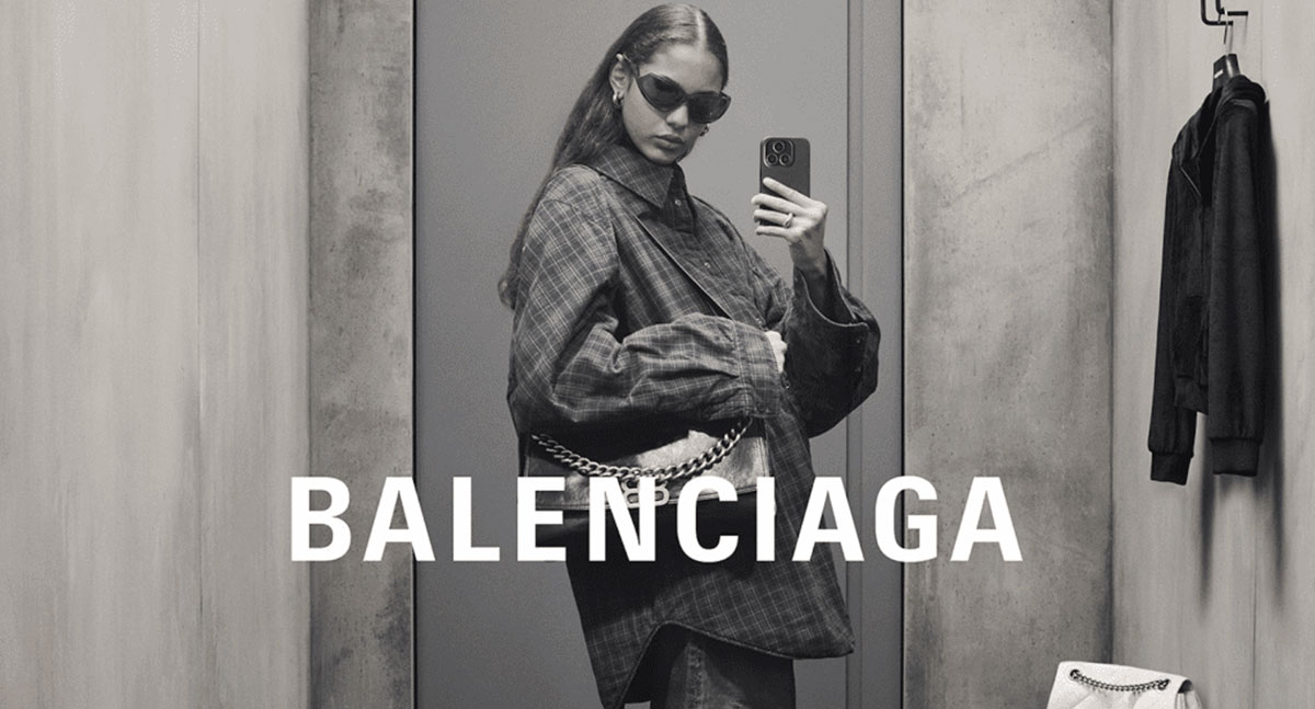
Balenciaga uses BB Condensed Bold, a bespoke condensed sans-serif typeface commissioned specifically for the brand and designed by Friedrich Althausen. The current wordmark was introduced in 2017 under creative director Demna Gvasalia, replacing the geometric sans-serif Gotham Medium that had served as the brand’s primary font for roughly 17 years.
BB Condensed Bold is proprietary. It is not available to the public through any foundry or font platform.
What Type of Font Is BB Condensed Bold?

BB Condensed Bold is a condensed geometric sans-serif. The letterforms are narrow and tall, with uniform stroke weight and tight letter spacing across the entire wordmark.
The typography carries no serifs, no decorative elements, and no variation in stroke contrast. It reads as flat, direct, and deliberately utilitarian. That is exactly the point.
Visually, it shares characteristics with industrial display typefaces used in public transport signage, which was the stated inspiration behind the 2017 redesign. The condensed proportions allow the full “BALENCIAGA” wordmark to occupy a tight horizontal space while still carrying strong visual weight.
Key typographic attributes:
- Classification: Condensed geometric sans-serif
- Weight: Bold
- Case: All caps in logo usage
- Tracking: Very tight, letters nearly touching
- X-height: High relative to cap height
- Stroke contrast: Monolinear (none)
This kind of condensed font structure gives the logo its characteristic density. It does not whisper luxury. It states it plainly.
Who Designed the Balenciaga Font?
Friedrich Althausen designed BB Condensed Bold. The typeface was created specifically for Balenciaga and is not associated with a commercial type foundry or public release.
The design work on the 2017 visual identity was carried out in collaboration with Munich-based studio Bureau Borsche, working alongside Demna Gvasalia’s in-house creative team. No external agency managed the full rebrand independently.
Because BB Condensed Bold was commissioned as a bespoke typeface, it is protected intellectual property owned by Kering Group, Balenciaga’s parent company. It will not appear on Adobe Fonts, Google Fonts, or any commercial foundry.
Is the Balenciaga Font Free to Use?
No. BB Condensed Bold is proprietary and unavailable for public download or licensing. This is consistent with how most major luxury fashion houses handle their custom typefaces.
The closest free alternative that visually approximates the Balenciaga wordmark is Utah Condensed Bold, available for personal use. For commercial projects, a paid license is required through the appropriate foundry.
Other accessible options that share similar typographic qualities:
| Font | Similarity to BB Condensed Bold | License | Source |
| Utah Condensed Bold | Closest match; identical proportions. | Personal Use | DaFont |
| Univers 67 Bold | Similar weight and classic tight tracking. | Commercial | Adobe Fonts |
| Zurich STD Bold | Comparable “Grotesk” structure. | Commercial | Bitstream |
| Oswald Bold | Optimized for digital; free and accessible. | OFL (Free) | Google Fonts |
If you are trying to replicate the Balenciaga aesthetic for personal branding or design practice, Utah Condensed Bold is the most commonly recommended starting point. It does not match exactly, but the proportions and weight are close enough to get the feel right.
Worth noting: using the actual Balenciaga wordmark or any close imitation commercially would likely conflict with trademark protections held by Kering Group. Font licensing is one thing. Trademark law is another.
What Font Did Balenciaga Use Before?

Before the 2017 rebrand, Balenciaga’s logo used Gotham Medium, a geometric sans-serif font designed by Tobias Frere-Jones and published by Hoefler & Co. The brand used it for approximately 17 years.
Gotham Medium is a wider, more open typeface. It projects a sense of authority without aggression, which suited Balenciaga’s position as a classic luxury house before the Gvasalia era shifted the brand toward a more confrontational, streetwear-influenced aesthetic.
A brief timeline of Balenciaga’s logo typefaces:
- Original era: Script lettering attributed to Cristóbal Balenciaga, reflecting early 20th-century couture norms
- Post-revival: Lightweight sans-serif similar to FM Bolyar Sans Pro 400 and Zurich Std Roman Extended
- 2000–2013 (approx.): Gotham Medium by Hoefler & Co., geometric sans-serif
- 2013 update: Bolder version, closer to Sweet Sans Medium Small Caps
- 2017–present: BB Condensed Bold by Friedrich Althausen, bespoke and proprietary
The shift from Gotham to BB Condensed Bold was not a subtle refresh. It was a deliberate move away from warm geometric sans-serif toward something colder, harder, and more industrial. That contrast maps directly onto the shift in creative direction from Nicolas Ghesquière to Demna Gvasalia.
Free Alternatives to the Balenciaga Font
Utah Condensed Bold is the most-referenced free alternative, and it holds up well for personal design work. It shares the condensed proportions and bold weight that define the current Balenciaga wordmark style.
If you need something available on Google Fonts, Oswald Bold is a reasonable substitute. It is condensed, bold, and works well at display sizes. The letterforms are slightly more humanist than BB Condensed Bold, but the overall weight and density are comparable.
For a more precise match in terms of geometric construction, consider:
- Barlow Condensed Bold (Google Fonts, free OFL)
- Encode Sans Condensed Bold (Google Fonts, free OFL)
- Bebas Neue (Google Fonts, free) – more display-oriented, but shares the all-caps bold condensed feel
None of these are exact matches. BB Condensed Bold was designed with a specific purpose, and the fine details of its letterforms are genuinely custom. But for projects where you need the general visual language of the Balenciaga logo without trademark issues, these alternatives get you there.
If you want to explore broader options within the category, there are many well-curated resources covering the best fonts for luxury brands and fashion-specific typefaces that suit high-end branding contexts.
How to Use a Balenciaga-Style Font in Your Projects
In Figma or Adobe Illustrator
Download Utah Condensed Bold or Oswald Bold and install it system-wide. Both Figma and Illustrator pick up locally installed fonts automatically.
For the condensed, high-tracking-reduction look of the Balenciaga wordmark, set your character spacing to -20 to -40 depending on the font. The letters should sit close together without overlapping. That tight spacing is what gives the wordmark its compressed, confident feel.
In Canva
Canva does not carry Utah Condensed Bold natively, but you can upload fonts to Canva using the Brand Kit feature (available on paid plans). Upload the font file after downloading from a licensed source.
Alternatively, Canva’s built-in “Oswald” or “Barlow Condensed” options in bold weight work well as placeholders for luxury fashion-style wordmarks.
In Photoshop
Install the font at the OS level. If you are on Windows, right-click the font file and select “Install.” On macOS, open it with Font Book and click “Install Font.” Once installed, Photoshop picks it up on the next launch. For a more detailed walkthrough, see this guide on how to add fonts to Photoshop.
Why Did Balenciaga Choose This Font?
Demna Gvasalia cited public transport signage as the direct inspiration. Balenciaga’s own statement at the time of the 2017 launch described the result as “a visually shortened logo which gives a simple, bold stamp to the timeless deluxe Balenciaga signature.”
That phrasing matters. “Stamp” is the right word. The current logo does not suggest luxury through elegance or refinement. It asserts it through mass and confidence.
This was a calculated departure from how luxury logos typically work. Brands like Dior, Chanel, and Louis Vuitton use typographic refinement, monograms, or decorative framing to signal exclusivity. Balenciaga removed all of that. What’s left is 9 letters in caps, squeezed together, printed black on white.
The decision also reflected Gvasalia’s broader design philosophy. His work at Vetements and his early Balenciaga collections deliberately referenced mundane, everyday objects. The logo followed the same logic. Using a font that looks like it belongs on a bus stop or a municipal sign was not accidental. It was the statement.
From a font psychology perspective, condensed bold sans-serif typefaces communicate strength, modernity, and directness. They do not suggest warmth or approachability. For a brand repositioning itself at the intersection of haute couture and streetwear, that psychological register was exactly right. The emphasis sits entirely on the name itself, with no visual hierarchy beyond the letterforms.
Compare this to how Gucci or Off-White handle their wordmarks, and the contrast becomes clear. Gucci leans into Edwardian serif refinement. Off-White uses quotation marks and industrial labeling as irony. Balenciaga just uses weight and condensation, with nothing else added. It is blunt in a way that, oddly, reads as extremely considered.
The logo‘s monochrome execution reinforces this. Black on white only. No gradients, no color variations in the standard usage. The visual hierarchy of any Balenciaga piece is built around the wordmark dominating whatever surface it sits on, which is only possible because the typography is dense enough to hold that weight without additional support.
FAQ on What Font Does Balenciaga Use
What font does Balenciaga currently use?
Balenciaga uses BB Condensed Bold, a bespoke condensed sans-serif typeface designed by Friedrich Althausen.
It was introduced in 2017 under creative director Demna Gvasalia and is exclusive to the brand. It is not publicly available through any foundry or font platform.
Is the Balenciaga font available for free download?
No. BB Condensed Bold is proprietary and owned by Kering Group.
The closest free alternative is Utah Condensed Bold, available on DaFont for personal use. For commercial work, a separate license is required.
What font did Balenciaga use before 2017?
Before the 2017 rebrand, Balenciaga’s wordmark used Gotham Medium, a geometric sans-serif designed by Tobias Frere-Jones and published by Hoefler & Co.
The brand used it for approximately 17 years before Demna Gvasalia overhauled the visual identity.
Who designed the current Balenciaga typeface?
Friedrich Althausen designed BB Condensed Bold specifically for Balenciaga.
The work was carried out in collaboration with Munich studio Bureau Borsche alongside Gvasalia’s in-house creative team. No external agency managed the rebrand independently.
What type of font is used in the Balenciaga logo?
It is a condensed geometric sans-serif. The letterforms are narrow and tall, with uniform stroke weight, no serifs, and very tight kerning.
The all-caps wordmark sits with letters nearly touching, which creates the logo’s dense, assertive look.
What inspired the Balenciaga font choice?
Demna Gvasalia cited public transport signage as the direct reference. Balenciaga’s official statement described the result as a “simple, bold stamp” on the brand’s signature.
The utilitarian source was intentional, reflecting Gvasalia’s broader philosophy of referencing everyday, mundane design objects.
Are there free Google Fonts alternatives to the Balenciaga font?
Yes. Oswald Bold and Barlow Condensed Bold are both available on Google Fonts for free under the OFL license.
Neither is an exact match, but both share the condensed bold sans-serif structure that defines the Balenciaga wordmark aesthetic.
Does Balenciaga use the same font across all branding materials?
The BB Condensed Bold wordmark is consistent across clothing tags, packaging, advertising, and digital platforms.
Body copy and secondary text across website and campaign materials may use complementary system fonts, but the primary brand typography stays uniform.
How does the Balenciaga font compare to other luxury brand fonts?
Most luxury fashion house fonts rely on refined serifs or elegant scripts. Balenciaga does the opposite.
BB Condensed Bold is blunt, industrial, and deliberately plain. Where Gucci uses Edwardian serif refinement, Balenciaga uses weight and compression with nothing decorative added.
Can I use a Balenciaga-style font for my clothing brand?
You can use a similar condensed bold sans-serif for your own branding without legal issues, as long as you are not replicating the actual Balenciaga wordmark or trademark.
Utah Condensed Bold or Oswald Bold are solid starting points. Check out options curated specifically for clothing brand typography to find the right fit.
Conclusion
If you came here asking what font does Balenciaga use, the answer is BB Condensed Bold, a proprietary condensed sans-serif commissioned from Friedrich Althausen and introduced in 2017 under Demna Gvasalia’s creative direction.
The typeface is not available for public download. For personal projects, Utah Condensed Bold is the closest free alternative to the Balenciaga logo typeface.
The wordmark’s bold uppercase lettering, tight leading, and utilitarian roots reflect a deliberate brand identity shift, one that pulled the fashion house away from traditional luxury typographic hierarchy toward something starker and more direct.
It is a display font built to make a single, confident statement.

Renowned for his expertise in logo design and visual branding, Bogdan has developed a multitude of logos for various clients.
His skills extend to creating posters, vector illustrations, business cards, and brochures. Additionally, Bogdan's UI kits were featured on marketplaces like Visual Hierarchy and UI8.
He also wrote in the past years on sites like Design Your Way, WebDesignerDepot, WPDean, Designmodo, Speckyboy, Slider Revolution, and more.
- The Windsurf Logo History, Colors, Font, And Meaning - 10 October 2026
- How to Remove Background From Product Photos (No Photoshop) - 10 October 2026
- How Designers can Build a Stronger Online Creative Identity - 9 October 2026

Bogdan Sandu is a seasoned designer who has been designing websites since 2008. Renowned for his expertise in logo design and visual branding, Bogdan has developed a multitude of logos for various clients. His skills extend to creating posters, vector illustrations, business cards, and brochures. Additionally, Bogdan's UI kits were featured on marketplaces like Visual Hierarchy and UI8. He also wrote in the past years on sites like Design Your Way, WebDesignerDepot, WPDean, Designmodo, Speckyboy, Slider Revolution, and more.
You Might Also Like