
Exquisite Luxury Brand Fonts Used by Top Brands
In the tapestry of luxury, typography weaves its silent narrative. Elegance speaks volumes—often in fonts that whisper prestige with every painstakingly crafted letter.
Imagine Gucci’s grace, Chanel’s charm, carved by the intangible hand of luxury brands fonts—the unsung heroes behind iconic logos.
Entwining sophisticated script with rich-textured serif—the likes of Garamond and Didot—these fonts are the regalia of visual identity.
For the discerning eye, they create a subtle dance of aesthetic typeface choices. It’s an art. A science. A mystery solved by few, pursued by many.
By the end of this read, exclusive type designs will unravel. You’ll grasp how high-fashion typography and the brand identity intertwine, shaping a bespoke brand experience as unique as a tailored suit.
Delve into the decadence of font licensing, minimalist design software proficiencies, and why a touch of negative space can elevate a simple name into a status symbol.
Prepare for a journey into the timelessness of typography, where brand equity meets artistry in a symphony of curves and lines.
Luxury brands fonts to check out
Myriad
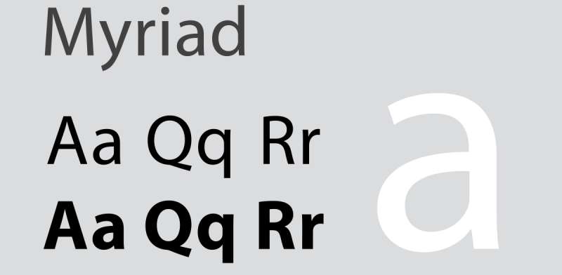
Robert Slimbach and Carol Twombly created a new typeface for Adobe in 1992. It was readable and accessible due to the absence of serifs, clear forms, and well-drawn letter proportions. There are numerous examples of this in the branding of Wells Fargo, Modern Telegraph, Nippon Airlines, LinkedIn, Rolls-Royce, and Walmart up until 2017. If you want to portray laconicism and simplicity, use this.
Numerous brands favour Myriad since it has a reputation for being heartfelt and enthused. It’s written in a sans serif font. Myriad was chosen by Walmart because of its creative quality and emotion. The motif is most importantly booted by Myriad.
Optima
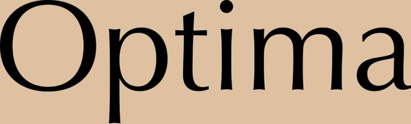
The lengthy, curved lines of the Optima typeface (Hermann Zapf, 1955) were influenced by the age-old practise of stone cutting. Due to the sans-serif font, it is also very legible. In contrast to other types with varying line width, Optima has a fluidity that makes it both lovely and readable. The Optima typeface is used by Yves Saint Laurent and Estee Lauder.
Futura
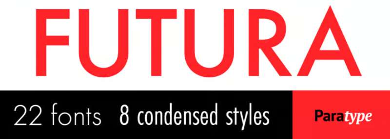
Some well-known typefaces in the sans serif genre are in high demand among logo designers. Famous fashion companies like Nike and Cisco have intriguing designs for their company logos using the Futura font. Redbull has used the same typeface in Futura BQ with black and bold characters, which is as amazing-sounding as it is.
Helvetica® Now
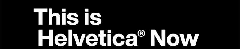
The original version of Helvetica is arguably the most widely used font ever, especially in branding. Every single glyph of Helvetica has been rebuilt and revised for clarity, simplicity, and neutrality in this vast new edition. There are 48 weights in the Helvetica Now family, ranging from Light Micro to Extremely Black Display, each with a corresponding italic. Helvetica is used by several well-known companies, including the NYC Subway and multinational corporations. American Airlines, Jeep, and Panasonic are three well-known companies that employ Helvetica in their logos. Helvetica Today was created by Max Miedinger, Charles Nix, Jan Hendrik Weber, Monotype Studio, and was released by Monotype.
Univers

Adrian Frutiger, a Swiss designer, created it in the 1950s. He maintained “visual awareness between broad and thin lines” while avoiding precise geometry. A huge and widely-liked serifless font family, the modern Univers is utilised by well-known companies including eBay, Swiss International Airlines, BP, Unicef, and Western Union, as well as municipal and transportation organisations (street navigation in London, Toronto Metro, Frankfurt Airport). Brands searching for straightforward, adaptable, and accessible typography may consider Univers.
Officina Sans

Officina sans has developed into a desirable privilege for users as a result of its fascinating and attention-grabbing approach to the audience. The font sights discuss the concept they are attempting to push as well as the particular characters that have developed vividness at first glance. The sans serif font used in the design of the Amazon logo is an excellent example.
Frutiger
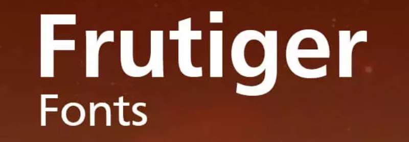
Adrian Frutiger created the Frutiger typeface in 1975, and it is straightforward, professional, and enjoyable. Its accessibility and fluidity make it the perfect sans serif typeface for a logo that exists online. It was initially intended for use as signage at the French airport of Charles de Gaulle. It continues to be one of the most readable fonts in print and on the web because the goal when designing it was to create a font that could be viewed well from a distance. Frutiger is the typeface used by Flickr and Shutterfly.
Didot
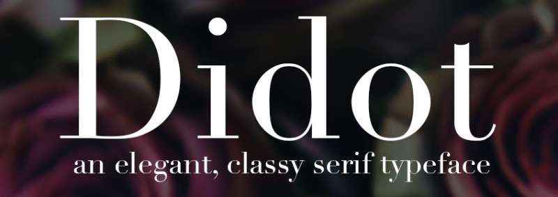
Didot enjoys enormous fame in the fashion world. Largest clothing retailers like Zara, Giorgio Armani, and CBS all use Didot into their logos. Didot gives off a more opulent, fashionable, and mature vibe because to its exquisite circline lines, petite serifs, and contrast. Didot was found to be the most expensive font in a survey.
Proxima Nova
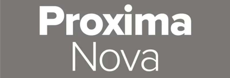
Proxima Nova’s adaptability and contemporary appearance have led to comparisons to the new Helvetica. The 48-font family’s use on tens of thousands of websites, including BuzzFeed, Mashable, and NBC News, has made it one of the most well-liked due to its unique combination of traditional geometry and contemporary proportions.
Gotham
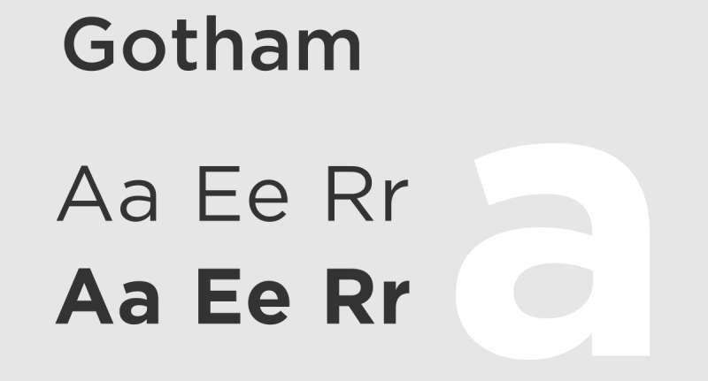
Gotham is an expensive sans serif font. Similar to Spotify, numerous well-known music launchers have adopted this font in their logos to give them a unique yet alluring bold appearance. Similar to how the characters were bravely crafted by Discovery Channel in medium style for an ambitious approach.
Garamond
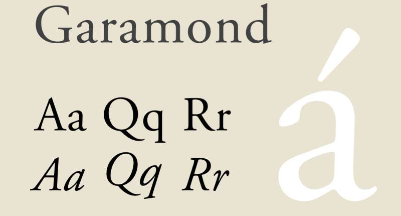
The entire European typography was influenced by one of the earliest fonts, which Claude Garamond created in France in the 16th century. Small serifs, moderate contrast, and rounded forms are characteristics of the several types that make up the Garamond family today. For periodicals like magazines, newspapers, and books like “Harry Potter” published in the United States, Garamond is frequently used. For a while, Apple exploited it for marketing purposes (a version called Apple Garamond). The logos of American Eagle and Abercrombie & Fitch also display it.
FF Dax
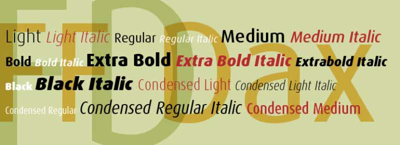
Hans Reichel created the contemporary sans serif typeface FF Dax in 1995. Although maintaining a strong focus on character, its light, streamlined style creates the idea of mobility, accessibility, and motivation for action. Political parties, banks, embassies, airlines, and communication and delivery services have all employed the FF Dax logotype in their marketing and communications efforts. FF Dax appears in the logos of UPS and The British Embassy.
Avant Garde
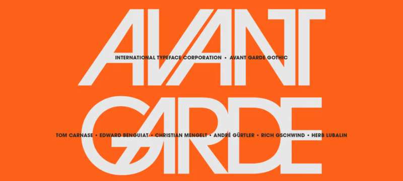
Shortline texts and headlines are the most common places where avant-garde font design may be seen. It is a sans-serif typeface that is well renowned for being distinctive and appealing. Reputable clothing companies like Calvin Klein and Adidas utilise the word avant-garde in their logos. It was decided to go with Avant Garde because of the fantastically intimidating glare it gives the emblem.
Freight Sans
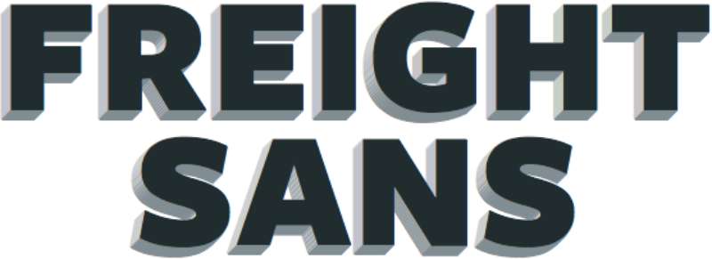
Freight Sans is well known for its adaptable black and bold, brave gape as well as the seductive characters utilised in the Reed & Mackey for an alluring appearance. The text line of StarBucks also uses a sans serif font family.
Clarendon
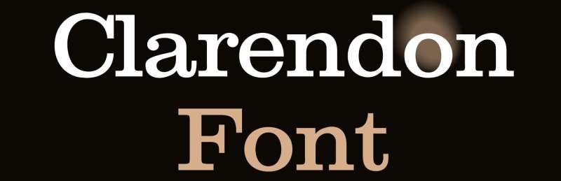
A classic slab-serif font from a time when all media was print is called Clarendon (Robert Besley, 1845). It was first created for a letter foundry in London and has been applied to print displays with three-dimensional type and posters (think WANTED… DEAD OR ALIVE). The strong form of the serifs and the variable width of its curving lines is well-tolerated in print and large point sizes. Consider Clarendon for a wordmark that only employs a few letters in large font or for a logo that is mostly used in print, on signage, clothing, or textiles. Clarendon is the typeface used by People magazine, Sony, and Well-Fargo.
Bodoni
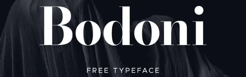
Giambattista Bodoni, a well-known Italian publisher and type designer, created the Bodoni font. Vogue and Nirvana both picked the Bodoni font for their logos. Because of the combination of thick and thin lines, the logo has a very striking and contrasted appearance. The Mamma Mia musical album posters also featured Bodoni.
Bebas Neue
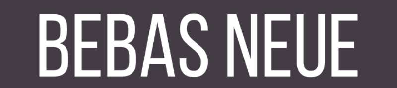
According to demand, the well-known online destination for watching movies and television shows, Netflix, offers this typeface in an attractive and inviting red hue. This combination offers a passionate, appealing, and cutting-edge vision. The top logo design company recommends Bebas Nene as a typeface to utilise for a stylish appearance.
FAQ On Luxury Brands Fonts
What defines a font as “luxury”?
A so-called “luxury” font exudes elegance, exclusivity, and a timeless appeal. Think Chanel’s clarity or Gucci’s flair.
It’s less about the price, more the design pedigree—high-end typefaces like Didot, which mirror the craftsmanship of a Rolex. It’s design nuances lending to an unmistakable air of sophistication.
How do luxury brands choose their fonts?
Brands like Dior or Tiffany & Co. select fonts that compliment their brand identity seamlessly. It’s akin to choosing the right accessory for a bespoke suit.
Key factors? Legibility, uniqueness, and how well it translates across visual identity platforms—digital or print. Often, it’s a tailored, custom font that only they own.
Can luxury fonts increase brand value?
Absolutely. A signature brand font is an investment; the fabric of the brand’s visual identity. It’s the understated thread that sews together perception and prestige. Brands like Hermes wield this power deftly—the right typography can significantly uplift the brand equity.
Are luxury brand fonts always serif?
Not strictly. While serif fonts do carry a traditional and timeless elegance, luxury brands are flirting with sans serifs too.
Hermes, for example, redefined modernism with a cleaner look. The key? It must resonate with the brand’s tone—whether it’s minimalist or rich-textured.
How do luxury fonts differ from regular fonts?
Luxury fonts, like fine wine, have nuances—a sophisticated script, refined serifs, perhaps a hint of exclusive design elements. It’s the storytelling in every stroke. Regular fonts get the job done; luxury fonts whisper a brand’s legacy in every print and pixel.
What role do fonts play in luxury brand marketing?
In marketing, fonts are silent spokespeople. Luxury brands leverage fonts to convey luxury marketing messages with precision—a branding fixture as pivotal as the logo itself.
They’re the visual whisper behind every campaign, cradling elegance while shouting brand identity from the rooftops.
Is it necessary to custom-design a font for a luxury brand?
Necessary? Not always. Strategic? Generally, yes. A bespoke font can serve as the signature for a brand’s narrative. It’s about carving out a niche in an oversaturated marketplace and owning a piece of the typographical realm that is associated exclusively with the brand’s ethos.
Can a brand’s choice of font become iconic?
Picture the sleekness of the Rolex typeface or the distinguished lines of Vogue’s cover. These fonts are icons in their own right.
They’ve transcended typography, becoming synonyms with the high-fashion identity they adorn. When a font becomes iconic, it’s etched into cultural memory.
What are the legal considerations for using luxury fonts?
It’s as serious as any luxury marketing deal. Font licensing—especially when you start dealing with custom fonts—is a legal dance.
Use a commercial font? You’ll need the correct license. Thinking of mirroring a luxury brand’s font? Tread carefully; intellectual property rights are as robust as Fort Knox.
How often do luxury brands update their fonts?
Brands evolve. Visual identities mature. Some luxury brands keep their script for decades—it becomes part of their brand equity.
Others adapt with trends, opting for a font elegance refresh to stay relevant or signal a new era. It’s a rare balance between timelessness and innovation.
Conclusion
So, we’ve traipsed the golden path of luxury brands fonts, brushed with the plush velvety essence of couture typography. Unmistakably, it’s more than letters on a page, more than pixels on a screen—it’s the heartbeat of brand identity.
From Didot’s sleek serifs to Garamond’s warm elegance, we picked apart how each curve, each stroke, tells a silent story—a narrative steeped in exclusivity and sophistication.
The takeaway? Fonts carry the torch for a brand’s legacy, elevating it from the chatter of the mass market into the high-fashion air. They are the quiet custodians of luxury, the unsung heroes behind each exclusive type design.
Next time the sparkle of a Rolex catches your eye or the latest Chanel campaign graces your screen, look beyond the logo. Ponder on the font, that unsung hero, and you’ll catch a glimpse into the soul of luxury.
If you liked this article about luxury brands fonts, you should check out this article about autumn fonts.
There are also similar articles discussing money fonts, propaganda fonts, quirky fonts, and classic car fonts.
And let’s not forget about articles on coffee fonts, Hawaii fonts, striped fonts, and barbershop fonts.
Bogdan Sandu, a seasoned designer with 15 years of diverse experience, has been designing websites since 2008.
Renowned for his expertise in logo design and visual branding, Bogdan has developed a multitude of logos for various clients.
His skills extend to creating posters, vector illustrations, business cards, and brochures. Additionally, Bogdan's UI kits were featured on marketplaces like Visual Hierarchy and UI8.
Latest posts by Bogdan Sandu (see all)
- Green Color Palettes for Designers To Use - 11 May 2024
- Digital Style: What Font Does Cash App Use? - 11 May 2024
- The Coors Light Logo History, Colors, Font, And Meaning - 10 May 2024