Your shop’s typography speaks before you do. Walk past any barbershop with faded vintage signage or bold script lettering, and you already know what kind of experience waits inside.
The best barbershop fonts blend heritage with readability, masculine strength with approachable style. They reference classic barber pole aesthetics without looking dated, and they work equally well on storefronts, business cards, and Instagram posts.
This guide breaks down sixteen typefaces that nail the barbershop aesthetic. You’ll find everything from Victorian blackletter to modern geometric sans-serifs, each with specific use cases, pairing recommendations, and licensing details.
No fluff. Just fonts that work.
The Best Barbershop Fonts
Parlour Sans
Overview
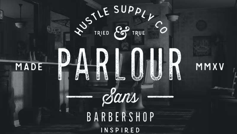
Parlour Sans is a display font created specifically with barbershops, menswear brands, and tattoo shops in mind. The typeface draws inspiration from Movember culture and the masculine aesthetic of traditional grooming establishments.
Character Features
The lowercase letters include pre-applied texture for a worn, authentic appearance. Uppercase characters remain clean without degradation.
Full alphabet coverage with numbers, punctuation, and extra glyphs. The textured lowercase creates instant vintage authenticity without additional design work.
Historical Context
Parlour Sans emerged from the modern barbershop renaissance that began in the 2010s. It represents the hipster barber culture movement where classic grooming met contemporary design sensibilities.
The name “Parlour” references the old-fashioned term for barbershops.
Best Use Cases
- Barbershop window signage and storefront lettering
- Business cards and appointment reminders
- Social media graphics for grooming brands
- T-shirt designs and merchandise
- Price lists and service menus
Pairing Recommendations
Combine with clean sans-serif fonts for body text. Works well alongside script typefaces for vintage label designs.
Try pairing with geometric sans serifs for a balanced retro-modern look.
Technical Specifications
- Format: OTF
- Weights: Regular (textured lowercase), Regular (clean uppercase)
- Language Support: Full Latin alphabet
- Licensing: Free for personal use; commercial license required for business applications
Jolly Barber
Overview
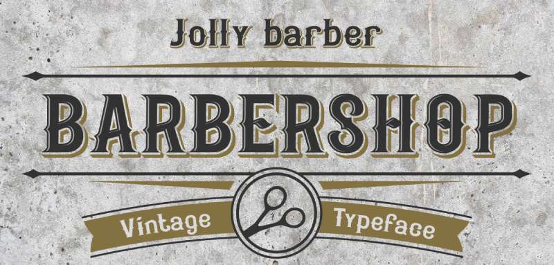
Jolly Barber is a blackletter vintage typeface by Fractal font factory. Released in February 2021, this decorative font captures the old-school barbershop spirit through gothic-inspired letterforms.
Character Features
Bold, ornamental letterforms with exaggerated curves and edges. The blackletter construction features distinctive serifs and vintage flair.
Three layered styles included:
- Base (solid fill)
- Inner (inline detail)
- Shadow (drop shadow effect)
These styles can stack for multi-dimensional text treatments.
Historical Context
Blackletter fonts trace back to medieval manuscript traditions. Jolly Barber modernizes this heritage for contemporary barber branding.
The gothic aesthetic connects to the gentleman’s club era of barbering from the late 1800s and early 1900s.
Best Use Cases
- Logo design for traditional barbershops
- Vintage-style signage and wall murals
- T-shirt graphics and merchandise
- Poster designs for promotions
- Product labels for grooming supplies
Pairing Recommendations
Balance with simple sans serifs for supporting text. The ornate character works best as headline type only.
Avoid pairing with other decorative fonts. Keep secondary typography minimal.
Technical Specifications
- Format: OTF, TTF, WOFF, WOFF2
- Weights: Base, Inner, Shadow (3 styles)
- Language Support: Latin
- Licensing: Paid font; commercial license available through Creative Fabrica and Creative Market
Alvaro Condensed
Overview
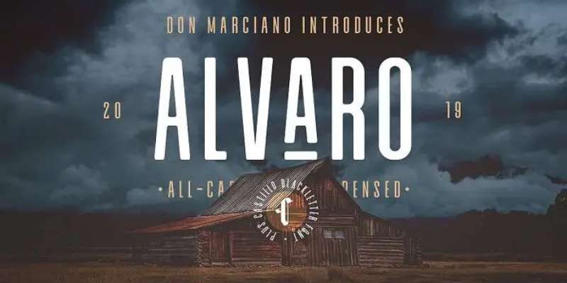
Alvaro Condensed is a modern condensed sans-serif designed by Juan Miguel Castillo and published through Don Marciano in 2019. Created using Fontself Maker, this typeface brings a sleek, contemporary edge to barbershop branding.
Character Features
Tall, narrow letterforms with uniform stroke width. The condensed proportions give an elongated appearance while maintaining legibility.
Clean lines without decorative elements. 211 glyphs included covering standard Latin characters.
Lowercase letters positioned lower than traditional placement, creating a distinctive mid-century look.
Historical Context
Alvaro Condensed represents the minimalist approach to barbershop design that emerged in the 2010s. It bridges traditional craftsmanship with modern aesthetic values.
The font pairs with Castillo, a complementary blackletter font, showing the designer’s intent for vintage-modern combinations.
Best Use Cases
- Minimalist barbershop logos
- Instagram and social media headers
- Clean storefront signage
- Modern business card designs
- Flyers and promotional materials
Pairing Recommendations
Works alongside blackletter fonts for classic-meets-modern branding. Pair with script fonts for added personality.
The condensed width allows combination with wider typefaces for visual hierarchy.
Technical Specifications
- Format: OTF, TTF
- Weights: Regular
- Language Support: Extended Latin, Central/Eastern European characters
- Licensing: Free for personal use; commercial license required
Mosaic
Overview
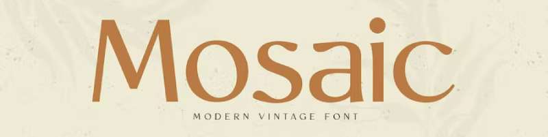
Mosaic is a modern vintage serif font created by Sensatype Studio. This typeface blends retro barbershop aesthetics with contemporary design sensibilities.
Character Features
Serif letterforms with unique vintage styling. Extra ligatures included for distinctive text treatments.
The characters balance between classic serif structure and decorative elements. Clean enough for readability while maintaining period-appropriate character.
Lowercase and uppercase characters with complete punctuation set.
Historical Context
Mosaic draws from mid-century typography traditions. The design references classic Americana signage and heritage branding.
This font fits the nostalgia-driven barbershop trend that values authenticity and craft heritage.
Best Use Cases
- Barbershop logos with vintage appeal
- Coffee shop and barbershop hybrid branding
- Fashion and lifestyle brands
- Poster typography for promotional materials
- Retro-styled packaging design
Pairing Recommendations
Combine with geometric sans serifs for body copy. The vintage character pairs well with modern supporting fonts.
Script fonts work as accent elements alongside Mosaic headlines.
Technical Specifications
- Format: OTF, TTF, WOFF
- Weights: Regular
- Language Support: English, Western European, Central/Eastern European
- Licensing: Free for personal use (1001Fonts FFP License); paid for commercial use
Zing Rust
Overview
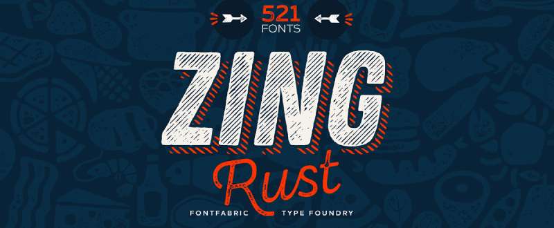
Zing Rust is a handmade grunge font family by Fontfabric, designed by Svet Simova and Stan Partalev. Released November 20, 2017, this Bulgarian-made typeface contains an unprecedented 521 font styles.
Character Features
Hand-drawn letterforms with authentic grunge textures. The family includes four major sub-families:
- Zing Rust (display)
- Zing Script Rust (cursive with OpenType features)
- Zing Sans Rust (geometric sans)
- Zing Goodies Rust (icons, banners, catchwords)
Texture options include classic grunge, halftone dots, diagonal lines, and shadow layers. Contextual alternates and swashes available in script variants.
Historical Context
Zing Rust represents the handcrafted aesthetic popular in craft businesses. The grunge textures connect to industrial-era printing and vintage advertising.
Food-related icons in Goodies Rust reflect the café-barbershop crossover trend.
Best Use Cases
- Barbershop logos requiring authentic texture
- Menu boards and price lists
- Social media branding
- Packaging design for grooming products
- Wall signage and interior decoration
Pairing Recommendations
Mix sub-families within the Zing Rust system for cohesive branding. The 521 styles allow 1,829+ combinations.
Use Sans Rust for small text, Script Rust for accents, and main Rust for headlines.
Technical Specifications
- Format: OTF
- Weights: Multiple weights per sub-family (Thin to Bold, 16 base variations)
- Language Support: Extended Latin
- Licensing: Free demo version (6 styles); paid commercial license for full family
Noir
Overview
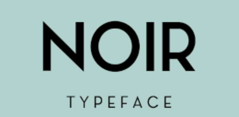
Noir is a geometric sans-serif font family designed by Milos Mitrovic and published by Mindburger Studio in 2015. Based in Norway (originally Serbia), the foundry created this contemporary typeface with early 20th-century influences.
Character Features
12 fonts ranging from light to extremely heavy weights. The geometric structure carries organic personality with warmth in each letterform.
Light weights suit small text applications. Heavy weights work for bold display headlines.
Rich OpenType feature set for professional typographic control.
Historical Context
Noir references early 20th-century geometric typefaces while maintaining modern functionality. The design emerged during the hipster barbershop boom of the mid-2010s.
The name “Noir” suggests sophistication and masculine elegance.
Best Use Cases
- Modern barbershop logo systems
- Web design headers and body text
- Business cards and stationery
- Signage with weight variation
- Brand identity systems
Pairing Recommendations
Use multiple weights within the Noir family for typographic hierarchy. Light for body, Bold for emphasis.
Pair with serif fonts for traditional-modern contrast.
Technical Specifications
- Format: OTF, TTF, WOFF
- Weights: 12 styles (Light through Heavy, including italics)
- Language Support: Extended Latin, Cyrillic, Greek (Pro version)
- Licensing: Paid; Std and Pro versions available
Mozsár
Overview
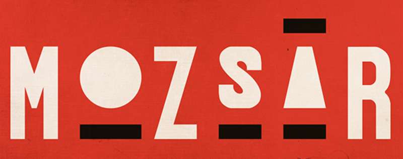
Mozsár is a unicase display typeface designed by Miklós Ferencz. Named after Mozsár Street in downtown Budapest (pronounced “mo-zhar,” meaning mortar in Hungarian), this constructivist-inspired font offers a distinctive alternative for barbershop branding.
Character Features
Pure geometric shapes with equal width and height proportions. Some exceptions create an element of visual unexpectedness.
Unicase design (single case mixing uppercase and lowercase characteristics). Two variants alternate randomly as users type through OpenType’s contextual alternates (CALT) feature.
The design intentionally departs from strict typographical rules for a friendlier appearance.
Historical Context
Mozsár draws from early 20th-century constructivist design movements. The typeface was originally created for a Budapest café-restaurant with bohemian atmosphere.
This aesthetic connects to Central European design heritage rarely seen in barbershop typography.
Best Use Cases
- Display titles and headlines
- Shop nameplates
- Window signage at large sizes
- Brand identity with Eastern European flair
- Interior wall typography
Not recommended for extended text blocks due to readability at small sizes.
Pairing Recommendations
Combine with simple geometric sans serifs for supporting copy. The distinctive character requires neutral accompaniment.
Avoid other display fonts. Use white space generously around Mozsár headlines.
Technical Specifications
- Format: OTF
- Weights: Regular (1 style)
- Language Support: Latin with extended characters
- Licensing: Paid; available through MyFonts
Stay Alive
Overview
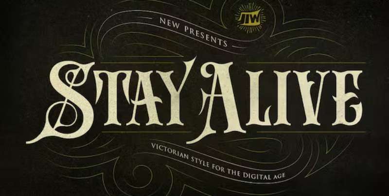
Stay Alive is a Victorian-inspired display font created by Storictype (jiwstudio). This decorative typeface reimagines 19th-century typography for contemporary barbershop applications.
Character Features
Ornate letterforms with sharp serifs and bold presence. Intricate decorative details create eye-catching headline text.
The characters feature embellishments that reference Victorian-era advertising and signage traditions.
Strong and dramatic presence suitable for attention-demanding applications.
Historical Context
Victorian typography dominated the late 1800s during the golden age of traditional barbershops. Stay Alive modernizes this heritage while preserving period-appropriate drama.
The design bridges historical craftsmanship with digital-age functionality.
Best Use Cases
- Vintage barbershop poster designs
- Logo treatments requiring dramatic flair
- Special event promotional materials
- Heritage-focused brand identities
- Wall art and interior signage
Pairing Recommendations
Balance with clean sans-serif body text. The ornamental nature demands simple supporting typography.
Works alongside subtle scripts for vintage label aesthetics. Maintain balance by limiting Stay Alive to headlines only.
Technical Specifications
- Format: OTF
- Weights: Regular (400)
- Language Support: Latin
- Licensing: Paid; available through Creative Fabrica and Envato Elements
The Stampline Stencil
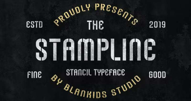
Stampline Stencil brings military-grade precision to barbershop branding. Created by Blankids Studio, this display font channels the bold, utilitarian aesthetic of army stenciling into a modern typeface.
Perfect for shops wanting that no-nonsense, disciplined vibe.
Character Features
Sharp edges define every letterform. Breaks cut through strokes to mimic authentic stencil construction.
The uppercase characters dominate with strong geometric shapes. Thick main strokes create instant readability at any size, while the stencil gaps add textured depth without sacrificing clarity.
Condensed proportions maximize space efficiency on signage.
Historical Context
Stencil typography emerged from practical necessity in the 1930s.
Two competing versions hit the market in 1937. Gerry Powell designed one for American Type Founders, while R. Hunter Middleton created another for Ludlow Typograph Company.
Stampline draws from this heritage but strips away the vintage weight. The result feels contemporary yet rooted in that industrial past where function drove every design decision.
Military aesthetics merged with barbershop culture through the 1940s-60s. Veterans opened shops and brought that clean-cut discipline with them.
Best Use Cases
Signage: Window displays demand attention. Stencil letters cut through visual noise on busy streets.
Logos: Works brilliantly for shops emphasizing precision cuts and disciplined grooming standards.
Print materials like business cards and appointment reminders benefit from the compact letterforms. Digital applications handle well at small sizes due to the clear stroke separation.
Avoid body text. This is a headline workhorse.
Pairing Recommendations
Sans-serif companions: Pair with Nexa or similar geometric faces for price lists and service menus.
Script fonts create strong contrast. The rigid stencil structure plays beautifully against flowing cursive for dual-identity branding.
Keep supporting text simple. Let Stampline own the visual hierarchy.
Technical Specifications
Available in OTF format. Includes uppercase letters, lowercase (though uppercase dominates most applications), numerals, and basic punctuation.
Multilingual support covers European accents.
Free for personal projects. Commercial licensing required for business use through the foundry’s marketplace presence.
Smythe Regular
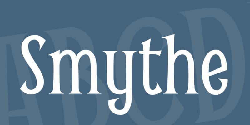
Vernon Adams designed Smythe Regular as a mashup of Arts and Crafts movement typography from the late 1800s and early 1900s. Released under the SIL Open Font License, it’s free for both personal and commercial work.
The Art Deco influence runs deep.
Character Features
Flared serifs give each letter distinctive personality. The proportions feel slightly condensed, creating a vertical emphasis that draws the eye upward.
Glyphic terminals add organic warmth to an otherwise structured design.
Letterforms blend multiple historical references into one cohesive family. You’ll spot Victorian decorative elements mixed with early modernist simplification.
The x-height sits lower than contemporary fonts, reinforcing that vintage character.
Historical Context
This font pulls from the period when barbershops were luxury destinations for men. Between 1890 and 1930, shop signage emphasized craftsmanship through ornate lettering.
Adams studied original typeface specimens from this era. The Batfink influence (a quirky detail he noted) adds unexpected charm without compromising the period authenticity.
Available through Google Fonts since its release.
Best Use Cases
Display text: Seasonal promotions and special event announcements look sophisticated in Smythe.
Logos benefit from the condensed proportions. The letterforms stack well vertically or run horizontally with equal effectiveness.
Posters and printed materials: Halloween specials, holiday hours, vintage-themed campaigns all find a natural home here.
Skip it for body text. Readability drops at smaller sizes.
Pairing Recommendations
Modern sans-serif fonts provide clean contrast. Brandon Grotesque works particularly well for supporting information.
Combine with simple geometric typefaces for service menus and pricing sheets. The decorative Smythe headlines paired with plain body copy creates professional balance.
Avoid pairing with other ornate fonts. Too much decoration kills clarity.
Technical Specifications
TTF format. Single weight (Regular). Covers Latin character sets with decent international language support.
Zero cost under OFL licensing.
Works across all major operating systems and design software. No special installation requirements beyond standard font folder placement.
Ignite
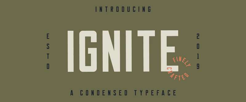
James Lafuente created Ignite as a condensed sans-serif inspired by vintage lettering textbooks. The typeface bridges historical reference with modern sensibility.
Released around 2019, it’s gained traction in contemporary barbershop branding.
Character Features
Condensed letterforms pack maximum impact into minimal horizontal space. The tight proportions work exceptionally well for vertical signage formats.
Clean geometric construction keeps each character legible even when compressed.
Stroke weight remains consistent throughout, creating that handcrafted aesthetic Lafuente aimed for. The vertical stress reinforces the compressed nature without feeling artificially squeezed.
Uppercase letters dominate the character set, though lowercase exists for flexibility.
Historical Context
Mid-century lettering manuals emphasized proportion and spacing through rigorous practice exercises. Ignite captures that disciplined approach while stripping away excessive ornamentation.
The vintage textbook influence comes through in the precise geometric relationships between letters. Nothing feels arbitrary.
Modern barbershops in the 2010s-2020s embraced this aesthetic. They wanted vintage credibility without full historical recreation.
Best Use Cases
Logo design: The condensed nature fits perfectly in square or vertical formats.
Packaging for grooming products benefits from Ignite’s modern-vintage balance. Pomades, beard oils, and styling products look contemporary yet timeless.
Branding materials: Business cards, social media graphics, and promotional posters all work well.
Website headlines maintain readability at various screen sizes. The clean construction translates smoothly from print to digital.
Pairing Recommendations
Serif companions: Slab serif fonts add weight and stability. Use them for body copy while Ignite handles headlines.
Script fonts create dynamic tension. The rigid geometric structure plays against flowing curves effectively.
Keep font spacing generous. The condensed letters need breathing room around them.
Technical Specifications
Available in OTF and TTF formats. Demo version includes basic character set for personal use.
Full commercial version expands glyph count and adds extended punctuation. Multilingual support varies by license tier.
Purchase through Creative Market or similar foundry marketplaces. Personal use version often free, commercial requires purchase.
Marones
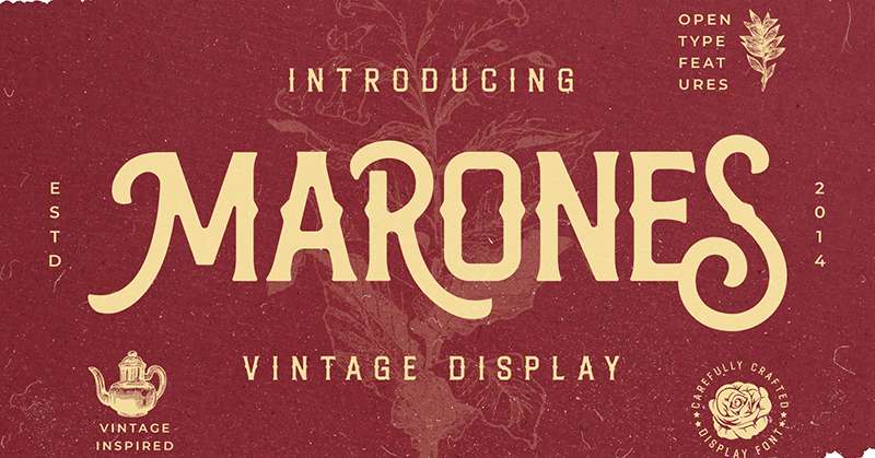
Ahmad Ramzi Fahruddin designed Marones for Arterfak Project in 2020. This all-caps serif font channels Western frontier aesthetics through Victorian-era letterforms.
The inky texture and prominent spurs give it that old-school garage authenticity.
Character Features
Spurred serifs jut out boldly from main strokes. The decorative elements reference Victorian wood type used in 19th-century poster printing.
Inline detailing adds dimensional depth to each character. This inky effect creates visual texture that reads as vintage craftsmanship.
Four stylistic sets let designers mix and match alternates. This flexibility prevents the monotony that sometimes plagues all-caps typefaces.
Thick stroke weight commands attention. The letterforms work best at display sizes where those details shine.
Historical Context
The design pulls from multiple historical sources. Old-school automotive signage, cowboy-era typography, and lumberjack branding all contribute DNA.
Victorian letterpress printing shops used similar ornate serifs for advertising posters in the 1880s-1900s. Marones modernizes these references without direct replication.
Western saloons and barbershops shared visual language in frontier towns. Both emphasized masculine, rugged aesthetics through bold lettering.
Best Use Cases
Packaging design: Grooming products targeting heritage-conscious customers benefit from Marones’ vintage authority.
Signage applications where Western or vintage themes align with shop identity. Works particularly well for barbershops in rural or Western-themed locations.
Apparel and merchandise: T-shirts, hats, and bags all provide canvases where Marones delivers character.
Sticker designs and craft projects embrace the decorative nature without overwhelming smaller formats.
Pairing Recommendations
Simple sans-serifs keep supporting text readable. The ornate Marones headlines need clean companions.
Script fonts can work if kept minimal. Avoid overly decorative scripts that compete with Marones’ personality.
Establish clear typographic hierarchy by reserving Marones for main headlines only.
Technical Specifications
OTF and TTF formats available. 350+ glyphs include stylistic alternates and international characters.
Multilingual support covers European languages.
Free for personal use. Commercial licensing required through Arterfak Project or Creative Fabrica. PUA encoding enables easy access to alternates and special characters.
Albertson
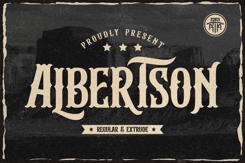
Ahmad Ramzi Fahruddin designed Albertson for Arterfak Project in 2021. This strong retro font references automotive culture, woodworking, and DIY handicraft aesthetics from mid-20th century America.
The modern Western vibe appeals to barbershops emphasizing rugged masculinity.
Character Features
All-caps construction with bold, assertive strokes. The letterforms carry weight without feeling heavy or clumsy.
Four alternate character sets provide mixing flexibility. This prevents repetitive patterns when the same letters appear close together.
Vintage-inspired proportions with slightly condensed width. The design maximizes impact while maintaining clear readability.
Decorative elements stay restrained compared to more ornate Western fonts. Albertson strikes a balance between personality and practicality.
Historical Context
Post-war American design (1940s-1960s) emphasized bold simplicity. Automotive signage, workshop branding, and hardware store displays used similar strong letterforms.
Lumberjack culture and outdoor work aesthetics influenced mid-century masculine branding. Barbershops adopted this visual language to signal toughness and traditional values.
The cowboy and Western expansion mythology continues resonating in modern grooming culture. Albertson taps into those associations without requiring literal Western themes.
Best Use Cases
Logo design: The strong shapes create memorable marks that read well at any size.
Packaging for beard oils, pomades, and men’s grooming lines fits Albertson’s vintage-masculine positioning.
Classic design applications: Labels, signage, and promotional materials all benefit from the retro authority.
Print projects like business cards and appointment cards work well. The bold letters ensure visibility even in wallet-sized formats.
Pairing Recommendations
Clean geometric sans-serifs provide neutral support text. Let Albertson dominate as the display typeface.
Consider pairing fonts with contrasting weights. Light body copy balances Albertson’s bold presence.
Avoid script fonts unless absolutely necessary. The vintage masculine aesthetic clashes with overly decorative cursive.
Technical Specifications
Available in OTF and TTF formats. 350+ glyphs include multilingual characters and alternate sets.
PUA encoding simplifies access to special characters and alternates.
Personal use version free. Commercial licensing available through Arterfak Project storefront or MyFonts. Desktop, web, and app licenses sold separately.
Black Quality
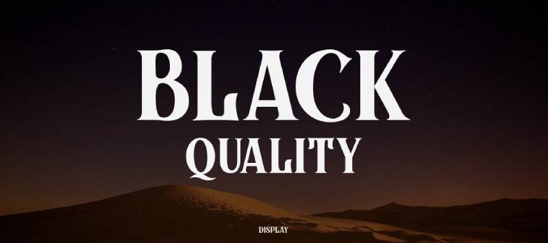
Alit Suarnegara designed Black Quality for Alit Design in 2019. This blackletter font family took five months from sketch to final files, resulting in an elegant Victorian-inspired typeface with multiple style variations.
The layerable design offers unusual flexibility for a blackletter.
Character Features
Ornate letterforms dripping with Victorian flourishes. The traditional blackletter skeleton gets decorated with inline details and decorative terminals.
Multiple style options: Outline, Inline, Rough, and Shadow versions let designers layer effects or use styles individually.
Thick main strokes contrast sharply with delicate hairline details. This creates the characteristic blackletter texture that reads as formal and historical.
Extensive ornament set ships as bonus content. These decorative elements integrate seamlessly with the letterforms for cohesive vintage compositions.
Historical Context
Blackletter (Gothic) scripts dominated European typography from the 12th through 15th centuries. Victorian revival in the 1800s brought these letterforms back for decorative applications.
Barbershops in the late 1800s and early 1900s used blackletter signage to convey establishment and tradition. The ornate letters signaled quality and craftsmanship.
Beer logos, wine packaging, and tattoo studios continue using blackletter to access these heritage associations. Barbershops share similar positioning needs.
Best Use Cases
Wine and spirits packaging: The elegant blackletter suggests premium quality and traditional methods.
Tattoo studio branding fits naturally with Black Quality’s ornate personality. Both industries trade on heritage and artistic craftsmanship.
Beer logos and brewery branding: The Victorian aesthetic aligns with craft beer culture’s obsession with historical authenticity.
Barbershop signage where traditional elegance matters more than minimalism. Works best for shops in historic buildings or serving older demographics.
Pairing Recommendations
Simple sans-serifs prevent visual overload. Black Quality carries enough decorative weight for entire design systems.
Avoid pairing with other ornate fonts. The blackletter already maximizes decorative impact.
Use sparingly in layouts. A little blackletter goes a long way toward establishing vintage credibility.
Technical Specifications
OTF and TTF formats. Eleven style variations within the family package.
Includes ornament font with 100+ decorative elements. PUA encoding enables access without special software.
Demo version available for testing. Full commercial license sold through Alit Design, Creative Market, and MyFonts. Desktop, webfont, and app licenses available separately.
Hustlers Rough
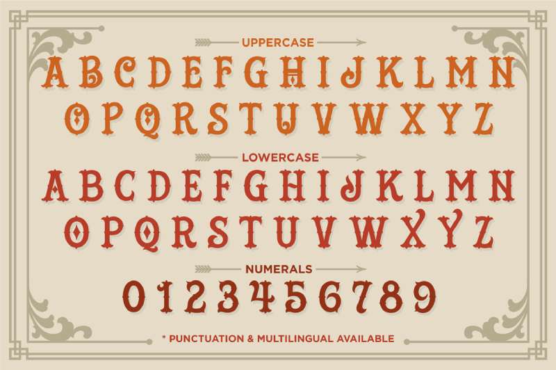
Gilang Purnama Jaya designed Hustlers Rough for Decade Type Foundry in 2013. This Victorian display font draws inspiration from carnival, circus, and tattoo shop signage of the late 1800s.
The rough texture version adds authentic vintage wear.
Character Features
Ornate letterforms packed with decorative serifs and elaborate terminals. The carnival influence shows in exuberant curves and theatrical proportions.
Distressed texture: The Rough version overlays authentic wear patterns. This aged effect simulates decades of paint weathering and surface degradation.
Median spurs add complexity to stroke endings. These Victorian-era details reference hand-painted circus posters and carnival banners.
The clean version (sold separately) offers the same letterforms without texture for different applications.
Historical Context
Late 1800s American entertainment culture relied on bold, attention-grabbing typography. Circus posters, carnival signage, and traveling show advertisements pushed decorative limits.
Tattoo shops in port cities adopted similar aesthetic language. The ornate letters suggested artistry and permanent quality.
Barbershops and these entertainment venues shared customer demographics. Working-class men frequented all three, creating visual language overlap.
Best Use Cases
Vintage signage reproduction: Shops aiming for authentic 1880s-1920s aesthetics find perfect match here.
Merchandise design including t-shirts, hats, and grooming product packaging. The theatrical personality translates well to apparel.
Poster design: Concert posters, event announcements, and promotional materials benefit from the carnival energy.
Large display sizes showcase the intricate details best. Small text applications lose the ornate features.
Pairing Recommendations
Clean geometric sans-serifs calm the visual chaos. Hustlers Rough needs simple companions to prevent overwhelming layouts.
Consider minimal script fonts for subtle contrast. Avoid ornate scripts that compete with the decorative display face.
Establish strict hierarchy. Reserve Hustlers Rough for main headlines only.
Technical Specifications
OTF and TTF formats. Demo version includes uppercase and lowercase (limited character set).
Commercial version expands to 300+ glyphs including European accents and special characters. Both Clean and Rough versions sold as package.
Available through MyFonts and Decade Typefoundry. Desktop licenses based on user count. Webfont and app licenses sold separately.
Admiral CAT
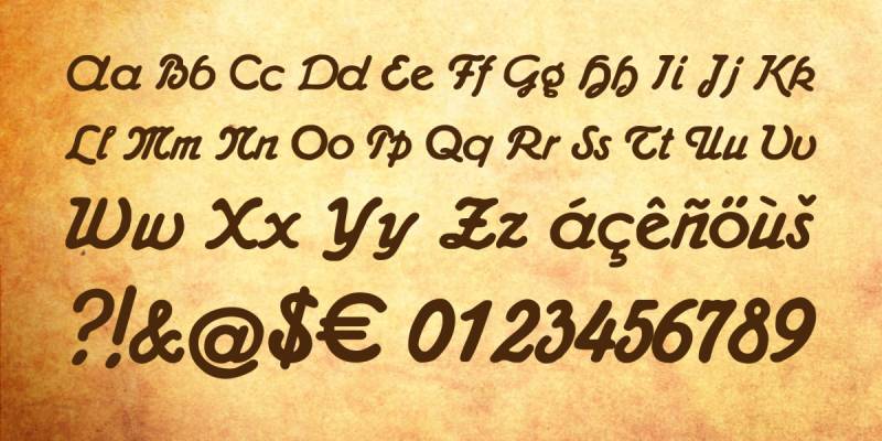
Peter Wiegel designed Admiral CAT in 2014 based on typefaces from the Wilhelm Woellmers Schriftgiesserei foundry in Berlin. This script font references early 20th-century advertising typography with rounded, friendly letterforms.
Released under dual GPL and OFL licensing, it’s completely free for all uses.
Character Features
Rounded cursive letters with consistent stroke weight. The script flows naturally without excessive decoration or flourishes.
Friendly, approachable personality distinguishes Admiral CAT from more formal scripts. The letterforms feel handwritten but maintain professional polish.
Vintage advertising influence shows in the letter proportions and spacing. The design optimized for large format posters and commercial signage.
244 glyphs include extensive European language support and special characters.
Historical Context
Wilhelm Woellmers’ Berlin foundry specialized in advertising typefaces during the early 1900s. They produced fonts specifically for posters, brass letters, and large-format commercial applications.
This practical commercial focus shaped the letterforms. Readability and impact mattered more than artistic experimentation.
Barbershops in the 1920s-1940s used similar rounded scripts for friendly, welcoming signage. The style suggested personal service and attention.
Best Use Cases
Signage with personality: The quirky middle ground between formal and casual makes Admiral CAT versatile.
Business materials requiring warmth without sacrificing professionalism. Appointment cards, service menus, and promotional flyers all work well.
Digital applications: Website headers and social media graphics benefit from the friendly script character.
Works at both display and moderate text sizes. The clear letterforms maintain readability better than more decorative scripts.
Pairing Recommendations
Bold sans-serifs create strong contrast with the flowing script. This combination balances personality with stability.
Geometric typefaces provide structural counterpoint to Admiral CAT’s organic curves.
Consider using for secondary headlines while reserving main headlines for bolder display faces.
Technical Specifications
TTF format. Single weight with extensive character coverage (244 glyphs).
Dual licensing under GPL with font exception and OFL 1.1. Completely free for commercial and personal use without restrictions.
Compatible with all major operating systems. No special installation requirements. Works in standard design software and word processors.
Moonline
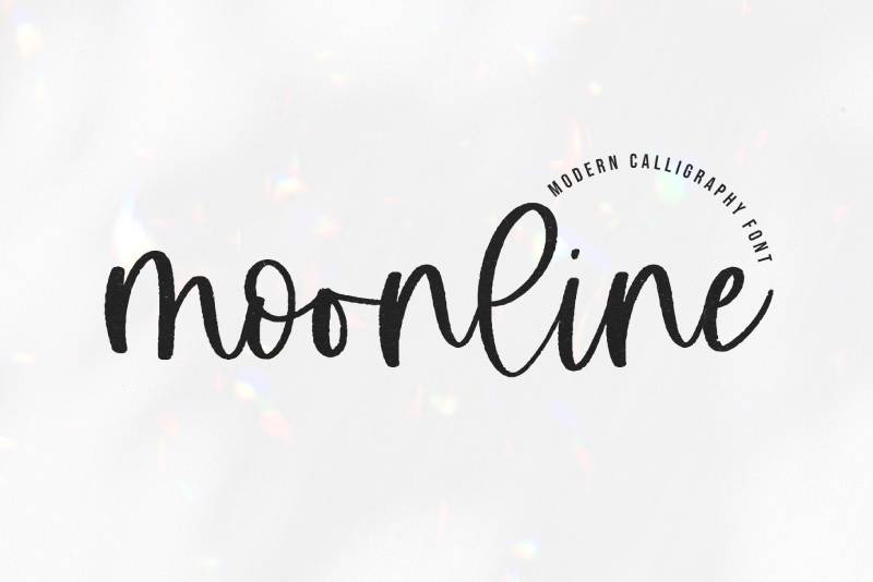
KA Designs created Moonline as a handwritten script with modern calligraphy aesthetics and subtle texture. The font balances contemporary appeal with vintage letterpress character, making it suitable for barbershop branding that wants personality without excessive decoration.
Character Features
Textured strokes create authentic handwritten appearance. The subtle roughness mimics natural pen pressure variations without overwhelming readability.
Delicate line weight remains consistent enough for signage applications. Unlike thinner scripts that disappear at distance, Moonline maintains visibility while preserving its refined character.
Modern calligraphy influence shows in the flowing connections between letters. Ligatures create smooth visual flow without requiring manual adjustment.
Historical Context
Contemporary script fonts emerged as digital alternatives to traditional sign painting in the 2010s. Designers sought ways to capture handcrafted aesthetics through typeface design rather than actual brush lettering.
Barbershops adopted this approach for hours signage, promotional materials, and secondary branding elements. The delicate scripts provided contrast against bold vintage display faces.
Best Use Cases
Signage for working hours: The font’s readability at moderate sizes makes it practical for informational displays.
Social media graphics benefit from the modern handwritten aesthetic. Instagram posts, promotional images, and digital marketing materials all work well.
Pairing with bold slab serif fonts creates effective contrast. The delicate script balances heavy vintage letterforms.
Website headers and navigation elements maintain legibility while adding personality.
Pairing Recommendations
Vintage slab serifs provide structural contrast. The geometric rigidity balances Moonline’s organic flow.
Bold sans-serifs work for body copy and supporting information. Keep the script reserved for headlines and accent text.
Avoid pairing with other decorative fonts. One script element per design prevents visual chaos.
Technical Specifications
Available in TTF and OTF formats. Includes accent characters for international language support.
Free for personal use. Commercial licensing available through KA Designs and Creative Market.
Works across standard design software and operating systems. No special installation requirements beyond basic font folder placement.
Monoline Script
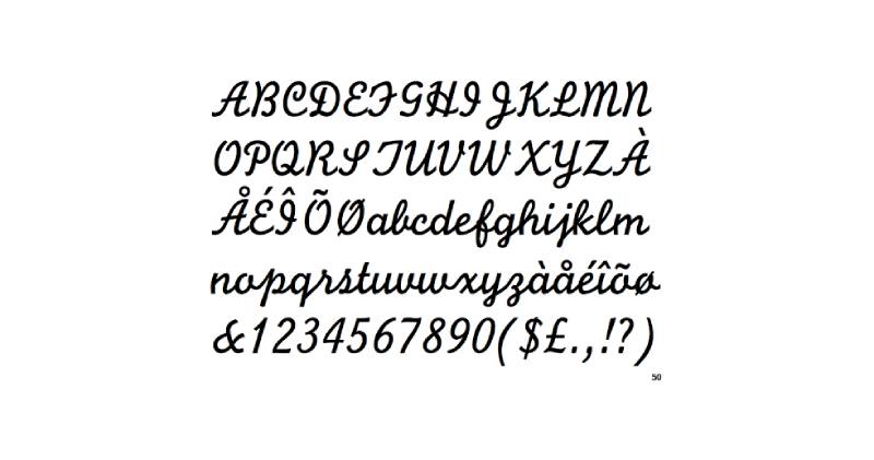
The Monotype Design Studio created Monoline Script in 1933 for the Monotype Corporation. This medium-weight script features tightly spaced lowercase letters and represents early 20th-century commercial lettering aesthetics.
Single-weight stroke construction defines the entire typeface.
Character Features
Uniform line thickness throughout all letterforms. The monoline construction eliminates thick-thin contrast typical of calligraphic scripts.
Lowercase letters sit extremely close together. The tight kerning creates dense text blocks that demand careful spacing consideration.
Profusion of connecting strokes between characters. The script flows continuously with minimal breaks in the letter connections.
Moderate slant angle keeps the typeface readable while maintaining cursive character.
Historical Context
1930s commercial typography emphasized functionality over artistic expression. Monoline Script emerged during this period as a practical alternative to formal copperplate scripts.
Barbershops in the mid-20th century used similar scripts for appointment cards and promotional materials. The streamlined character suggested modern efficiency.
The monoline construction simplified printing processes. Without delicate hairlines to manage, the font reproduced reliably across various printing methods.
Best Use Cases
Logo elements: Works well for taglines and supporting text within logo compositions.
Barbershop signage where elegant cursive adds sophistication without excessive formality. The straightforward construction prevents overly precious appearance.
Print materials including business cards and service menus. The historical authenticity appeals to vintage-conscious establishments.
Small to moderate text sizes. The uniform weight maintains readability better than high-contrast scripts.
Pairing Recommendations
Geometric sans-serifs complement the streamlined script aesthetic. Both share modernist simplification principles.
Art Deco display faces create historically consistent combinations. The 1930s origin aligns with Art Deco’s peak popularity.
Use sparingly as accent typography. The tightly spaced nature limits long-form text applications.
Technical Specifications
Single weight available. Published by Monotype with comprehensive licensing options.
Desktop, webfont, and app licenses sold separately through MyFonts. Commercial use requires appropriate license purchase.
Extensive glyph coverage including international characters. OpenType features provide alternate characters for specific design needs.
Beardsons
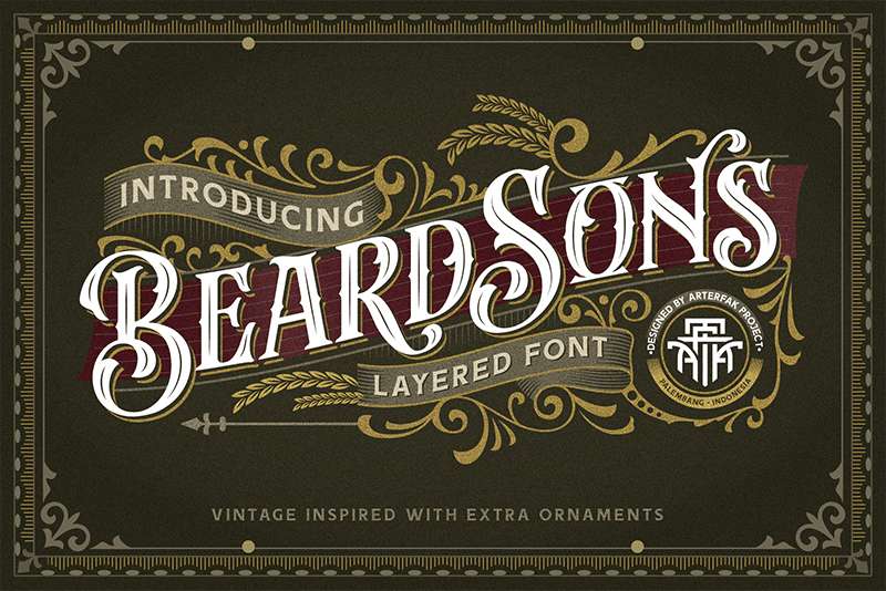
Ahmad Ramzi Fahruddin designed Beardsons for Arterfak Project with three layerable style variations. Normal, Inline, and Shadow versions allow stacking for dimensional effects or standalone use.
The all-caps ornamental design draws from vintage signage and historical emblems.
Character Features
High ornamental detailing throughout letterforms. Victorian-inspired flourishes and decorative terminals create elaborate character construction.
Layered font system: Normal provides base letterforms, Inline adds dimensional detail, Shadow creates depth effects.
All-caps construction limits lowercase applications. The design focuses entirely on display typography at large sizes.
Multilingual character support extends usability across European languages. Accent marks and special characters maintain consistent ornamental style.
Bonus ornament set includes decorative elements in font format. These extras integrate seamlessly with the letterforms for comprehensive vintage compositions.
Historical Context
19th-century Victorian signage emphasized ornamental excess. Beardsons captures this aesthetic through carefully crafted decorative elements that reference historical letterpress design.
Barbershop heritage from the 1880s-1920s provides direct inspiration. Shops during this era used elaborate signage to signal quality and tradition.
The layered font approach modernizes historical techniques. Original sign painters built dimension through manual layering; Beardsons replicates this digitally.
Best Use Cases
Vintage graphics and heritage branding: Perfect for shops emphasizing historical authenticity.
Apparel design including t-shirts and merchandise. The ornamental character translates well to screen printing and embroidery.
Logo design for traditional barbershops. The elaborate letterforms create memorable brand marks.
Display purposes only. The intricate details require large sizes for proper appreciation.
Pairing Recommendations
Simple sans-serifs prevent ornamental overload. Clean supporting text lets Beardsons dominate visually.
Minimal script fonts can work for contrast if kept restrained. Avoid competing decorative elements.
Establish strict hierarchy reserving Beardsons for main headlines exclusively.
Technical Specifications
TTF and OTF formats. Four style variations: Normal, Inline, Shadow, and Extras (ornaments).
Free for personal use. Commercial licensing through Arterfak Project, Creative Market, and MyFonts.
108+ glyphs per style including international characters. Compatible with standard design software.
Holtzberg
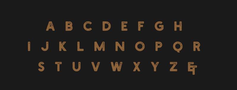
Hustle Supply Co. released Holtzberg as a free vintage font with stamp/letterpress texture effects. Designer Jeremy Vessey created the typeface to evoke bold mid-century advertising aesthetics.
The distressed finish suggests decades of use and weathering.
Character Features
Textured surface treatment throughout all letterforms. Stamp and letterpress effects create authentic vintage wear patterns.
Bold stroke weight ensures visibility despite texture degradation. The heavy construction maintains legibility even with distressed details.
Limited character set focuses on essential letters and numbers. The design prioritizes aesthetic impact over comprehensive glyph coverage.
Uppercase-dominant construction with basic punctuation. Designed for headline use rather than text blocks.
Historical Context
Mid-20th-century advertising relied on letterpress printing. The physical printing process created distinctive texture characteristics that Holtzberg replicates digitally.
Restaurants, barbershops, and retail establishments used similar bold letterpress signage in the 1940s-1960s. The tactile quality suggested authenticity and established presence.
Berlin’s Wilhelm Woellmers foundry specialized in advertising typefaces during this era. Holtzberg references this commercial typography tradition.
Best Use Cases
Vintage logos: The letterpress texture provides instant heritage credibility.
Restaurant, barbershop, bar, and coffee shop branding. The aesthetic fits establishments emphasizing craft and tradition.
Headline typography for posters and promotional materials. Works best at large display sizes where texture details show clearly.
Print applications where the distressed character enhances vintage authenticity.
Pairing Recommendations
Clean modern sans-serifs balance the textured vintage aesthetic. Mixing eras creates visual interest without confusion.
Simple serif fonts work for body copy. The straightforward letterforms prevent competing with Holtzberg’s texture.
Limit Holtzberg to headlines. The distressed nature prevents extended reading comfort.
Technical Specifications
OTF format. Single weight with integrated texture effects.
Completely free for personal and commercial use. No licensing fees or restrictions.
54 characters including basic Latin alphabet, numbers, and essential punctuation. Works on Mac and Windows systems.
Nexa
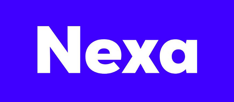
Svetoslav Simov designed Nexa for Fontfabric in 2012. This modern geometric sans-serif family consists of 16 fonts (eight uprights with eight italics) and exemplifies contemporary Bulgarian type design.
The clean geometry and extensive weight range provide exceptional versatility.
Character Features
Geometric construction based on circles and straight lines. The letterforms reference DIN, Futura, and AvantGarde principles while maintaining unique character.
Modern minimalist aesthetic with friendly approachability. The geometric rigor softens through subtle curves and balanced proportions.
Well-balanced letterforms suitable for both headlines and text. The x-height and spacing create excellent legibility across sizes.
OpenType features include contextual alternates and various numeral styles. The technical sophistication supports professional typography needs.
Historical Context
2012 release positioned Nexa during the geometric sans-serif renaissance. Designers sought alternatives to overused classics like Gotham and Proxima Nova.
Bulgarian type design gained international recognition through Fontfabric’s releases. Simov’s geometric focus established a distinctive studio aesthetic.
Barbershops adopted Nexa in the 2010s for its modern professionalism. The clean lines suggested contemporary service while remaining approachable and masculine.
Best Use Cases
Web design and digital applications: The clear letterforms maintain readability across screen resolutions.
Print materials including magazines, brochures, and business cards. The weight range handles diverse hierarchy needs.
Branding projects requiring modern sophistication without cold formality. Nexa balances geometry with warmth.
Both headline and body text applications. The family’s versatility eliminates need for multiple typeface pairings.
Pairing Recommendations
Works independently across most applications. The weight variety handles complete typographic systems.
Pair with simple scripts for accent contrast. The geometric structure plays well against organic handwriting.
Consider slab serif combinations for editorial applications. The structural contrast creates effective hierarchy.
Technical Specifications
TTF and OTF formats. 16 styles: eight weights (Extra Light to Black) with matching italics.
Extended Latin and Cyrillic character support with language localization. Over 230 glyphs per weight.
Free demo versions for testing. Full commercial licenses available through Fontfabric, MyFonts, and Adobe Fonts.
Qanelas Soft
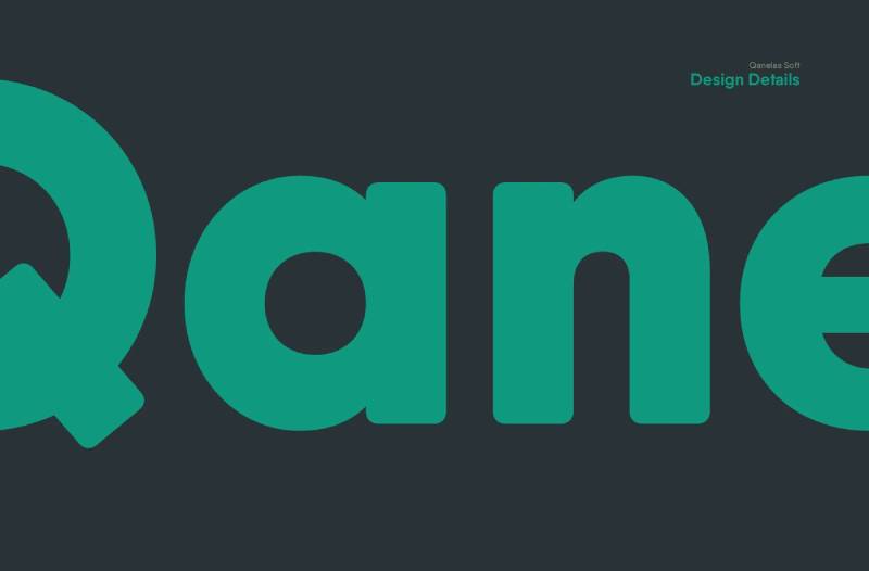
Radomir Tinkov designed Qanelas Soft as a friendlier variant of his original Qanelas font family. Released in 2016, this modern geometric sans-serif features 20 weights (10 uprights with matching italics).
The rounded terminals soften the geometric construction.
Character Features
Geometric foundation with softened corners and terminals. The rounded details add warmth while maintaining structural clarity.
Extensive weight range from Thin to Heavy. The 10 upright weights provide granular control over typographic tone.
Matching italics for every weight. The complete family offers 20 total styles for comprehensive typographic flexibility.
Powerful OpenType features including proportional figures, fractions, and alternate characters. Technical sophistication supports professional publishing needs.
Historical Context
2016 represented peak demand for humanized geometric sans-serifs. Designers wanted geometric clarity with approachable warmth.
Qanelas Soft responded to feedback requesting friendlier alternatives to the original Qanelas. The market demanded versatility without geometric coldness.
Barbershops and grooming businesses adopted the typeface for its modern professionalism. The soft geometry suggested quality service without intimidating formality.
Best Use Cases
Branding and corporate identity: The extensive weight range handles complete brand systems.
Editorial design for magazines and publications. The readable text weights balance with expressive display options.
Web and digital interfaces. The geometric clarity maintains legibility across devices and sizes.
Signage applications where friendly professionalism matters. The soft terminals prevent harsh industrial appearance.
Pairing Recommendations
Works as standalone typographic system. Twenty weights eliminate most pairing needs.
Combine with script fonts for contrast. The geometric structure balances organic handwriting beautifully.
Consider slab serif combinations for editorial layouts. The soft geometry complements robust slab construction.
Technical Specifications
OTF and TTF formats. 20 styles total with comprehensive OpenType feature support.
Extensive language support including Cyrillic. Over 570 glyphs per weight.
Free demo versions (Medium weight) available. Full commercial licenses through Radomir Tinkov’s website, MyFonts, and font marketplaces.
Uptown
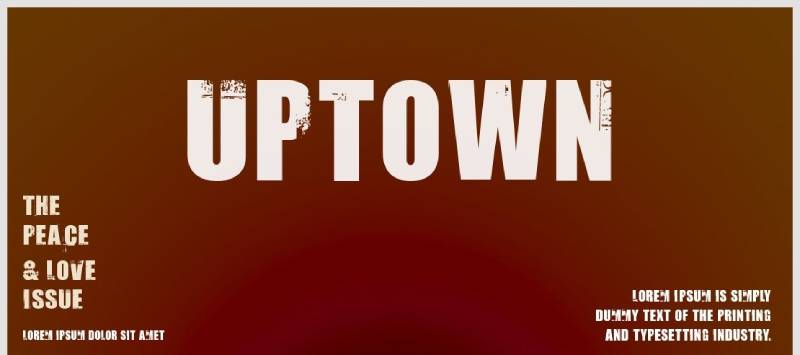
Anthem Type created Uptown as a distressed display font with eroded, weathered aesthetics. The free typeface evokes vintage urban signage through textured letterforms.
Available since before 2005, it remains popular for retro projects.
Character Features
Heavy distressing throughout all letterforms. Eroded edges and weathered surfaces create authentic vintage wear.
Bold construction ensures readability despite texture degradation. The thick strokes survive distress effects while maintaining letter recognition.
Uppercase and lowercase available with numbers and basic punctuation. The character set covers essential typography needs.
Condensed proportions maximize space efficiency. The letterforms pack density without sacrificing impact.
Historical Context
Urban signage from the 1960s-1970s deteriorated over decades of weather exposure. Uptown replicates this authentic aging process digitally.
Barbershops in older urban neighborhoods often displayed weathered signage that became part of their character. The worn aesthetics suggested longevity and established presence.
Distressed fonts gained popularity in the 2000s as designers sought authentic vintage aesthetics beyond clean retro reproductions.
Best Use Cases
Logo design for modern barbershops: The vintage wear suggests heritage even for new establishments.
Website headers and digital branding. The distressed texture adds character to otherwise flat digital interfaces.
Poster design and promotional materials. The weathered aesthetic creates nostalgic appeal.
Urban and street-style branding. The gritty texture aligns with contemporary urban aesthetics.
Pairing Recommendations
Clean modern sans-serifs provide readable contrast. The distressed display headlines need simple supporting typography.
Minimal use of additional decorative elements. Uptown carries sufficient visual interest alone.
Reserve for headlines and short text bursts. Extended reading in distressed fonts creates eye strain.
Technical Specifications
TTF format. Single weight with integrated distress effects.
100% free for personal and commercial use. No restrictions or licensing fees.
95 glyphs including uppercase, lowercase, numbers, and basic punctuation. Compatible with Mac and Windows systems.
Vito
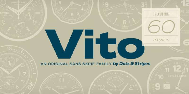
Thomas Gabriel designed Vito for Typejockeys/Dots&Stripes Type from 2014-2015. This strong elegant sans-serif family offers 60 styles across five widths (Compressed, Condensed, Normal, Extended, Wide) with six weights each plus italics.
Selected as a Typographica favorite in 2015.
Character Features
Five width variations provide exceptional typographic flexibility. Each width carries distinct personality while maintaining family cohesion.
Six weights from ExtraLight to Black. The range handles delicate display work through heavy impact typography.
Matching italics for every weight and width combination. Complete family totals 60 individual styles.
Extensive OpenType features including small caps, alternates, and stylistic sets. Professional-grade typography tools built into every weight.
Masculine sporty character with elegant refinement. The personality balances strength with sophistication.
Historical Context
2015 marked peak interest in variable-width type families. Designers sought alternatives to simple weight-based systems.
Vito’s width-focused approach provided novel design possibilities. Instead of just heavier/lighter, designers could modulate narrow/wide for expressive typography.
Barbershops adopted Vito for its masculine strength combined with elegant restraint. The family handled complete branding systems from business cards through vehicle graphics.
Best Use Cases
Magazine and packaging design: The width variety enables dynamic layouts with single-family coherence.
Corporate identity and branding systems. Sixty styles handle every typographic need without additional typefaces.
Movie titles and entertainment graphics. The sporty masculine character suits action-oriented content.
Marketing materials and logos. The extensive options support complex hierarchy needs.
Pairing Recommendations
Functions as complete typographic system. Sixty styles eliminate most pairing requirements.
Mix widths within single designs. Compressed headlines with Extended body copy creates dynamic contrast.
Consider script accents for contrast. The geometric sans-serif structure balances organic handwriting.
Technical Specifications
OTF format. 60 total styles across five widths and six weights with italics.
Extensive language support and OpenType features. Over 500 glyphs per style.
Individual weights start at $70. Essential package (20 hand-picked styles) and complete family package ($750) available through MyFonts and Dots&Stripes Type.
FAQ on The Best Barbershop Fonts
What makes a font suitable for barbershop branding?
Barbershop fonts need masculine energy and vintage appeal. Look for bold letterforms with strong presence that work across signage, business cards, and logos. The typeface should reflect traditional grooming culture while maintaining readability at various sizes.
Should I use serif or sans-serif fonts for my barbershop?
Both work depending on your vibe. Serif fonts deliver classic, heritage feels perfect for traditional shops. Sans-serif fonts offer clean, modern aesthetics. Many successful barbershops mix both for visual interest.
Are script fonts appropriate for barbershop logos?
Script fonts add authenticity when used sparingly. They evoke hand-painted signage from vintage barber shops. Just avoid overly decorative options that sacrifice legibility. Pair scripts with bold display fonts for balance.
What’s the best way to pair barbershop fonts?
Combine contrasting styles with intention. Use a bold vintage typeface for your shop name, then pair it with a simpler font for supporting text. Understanding how to pair fonts prevents visual chaos while maintaining personality.
Where can I find free fonts for my barbershop?
Google Fonts offers solid options like Bebas Neue and Oswald. Font Squirrel and DaFont provide additional free choices. Always verify font licensing for commercial use before implementing them in your branding.
How do vintage barbershop fonts differ from modern ones?
Vintage fonts feature ornate details, condensed letterforms, and retro styling reminiscent of 1920s barbering. Modern barbershop fonts lean toward geometric shapes and cleaner lines. Both styles work, but vintage typography connects directly to barbershop heritage and tradition.
What font size should I use for barbershop signage?
Prioritize visibility from the street. Your shop name needs high contrast against its background with sufficient size. Consider visual hierarchy when adding phone numbers or services below your main signage.
Can I use multiple fonts in my barbershop branding?
Stick to 2-3 fonts maximum across all materials. Too many typefaces create confusion and weaken your brand identity. Establish clear typographic hierarchy with one font for headlines and another for body text.
How does font psychology apply to barbershop design?
Fonts communicate personality before words do. Bold, angular typefaces suggest strength and reliability. Font psychology explains why geometric sans-serifs feel modern while ornate serifs evoke tradition and craftsmanship.
Should barbershop fonts match specific design movements?
Many barbers draw from Art Deco or vintage Americana. Understanding graphic design movements helps you create cohesive branding. Just ensure your font choices align with your shop’s actual atmosphere and target clientele.
Conclusion
Choosing the best barbershop fonts shapes your entire brand identity. The right typeface communicates quality, tradition, and attention to detail before customers walk through your door.
Start with your shop’s personality. Traditional establishments benefit from Victorian blackletter and ornate serif fonts. Modern shops need geometric sans-serifs with clean lines.
Consider practical applications beyond aesthetics. Your chosen fonts must work across signage, business cards, social media, and merchandise while maintaining readability at various sizes.
Don’t overthink it. Pick two complementary typefaces, establish clear hierarchy, and maintain consistency across all materials.
Your lettering speaks volumes. Make it count.

Renowned for his expertise in logo design and visual branding, Bogdan has developed a multitude of logos for various clients.
His skills extend to creating posters, vector illustrations, business cards, and brochures. Additionally, Bogdan's UI kits were featured on marketplaces like Visual Hierarchy and UI8.
He also wrote in the past years on sites like Design Your Way, WebDesignerDepot, WPDean, Designmodo, Speckyboy, Slider Revolution, and more.
- The Beehiiv Logo History, Colors, Font, And Meaning - 18 September 2026
- Versatile Work Sans Font Pairing for Every Project - 16 September 2026
- Organize Digital Files Like a Pro Before Your Next Client Handoff - 16 September 2026

Bogdan Sandu is a seasoned designer who has been designing websites since 2008. Renowned for his expertise in logo design and visual branding, Bogdan has developed a multitude of logos for various clients. His skills extend to creating posters, vector illustrations, business cards, and brochures. Additionally, Bogdan's UI kits were featured on marketplaces like Visual Hierarchy and UI8. He also wrote in the past years on sites like Design Your Way, WebDesignerDepot, WPDean, Designmodo, Speckyboy, Slider Revolution, and more.
You Might Also Like