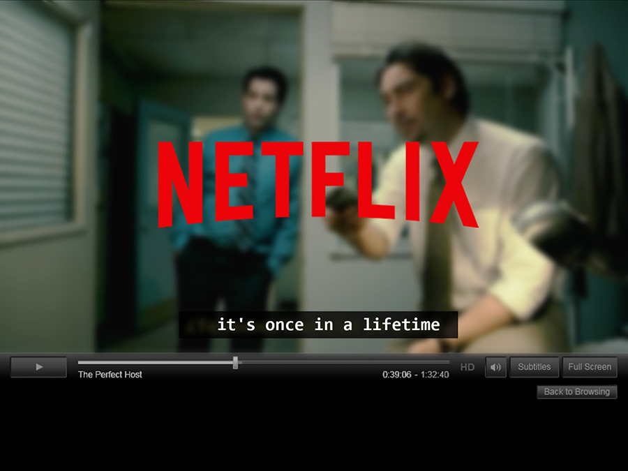
What font does Netflix use for subtitles? (Answered)
Imagine a world where every letter on your screen leaps to life, bearing an identity as individualistic and nuanced as the characters portrayed in your favorite shows.
That’s precisely the landscape of the Netflix font—a realm where typography isn’t just an afterthought, but a cornerstone of brand identity.
Dive with me into the meticulously crafted universe of Netflix Sans, a font that transcends mere alphabets to become an emblem of innovation in digital typography.
It’s a journey that unearths the symbiosis between visual identity and the user interface, highlighting the pivotal role of custom typeface in the user experience of millions.
Through this article, you’ll decode the secrets behind this screen-optimized marvel—its birth, its evolution, and its place in upholding coherence across user interface elements.
A glimpse into this typographic chapter is your key to understanding how branding font choices can spell the difference between good and iconic in the branding cosmos.
Prepare to have the curtain lifted on a story untold—a story of letters that bind, define, and refine the global giant that is Netflix.
About the Netflix Subtitles
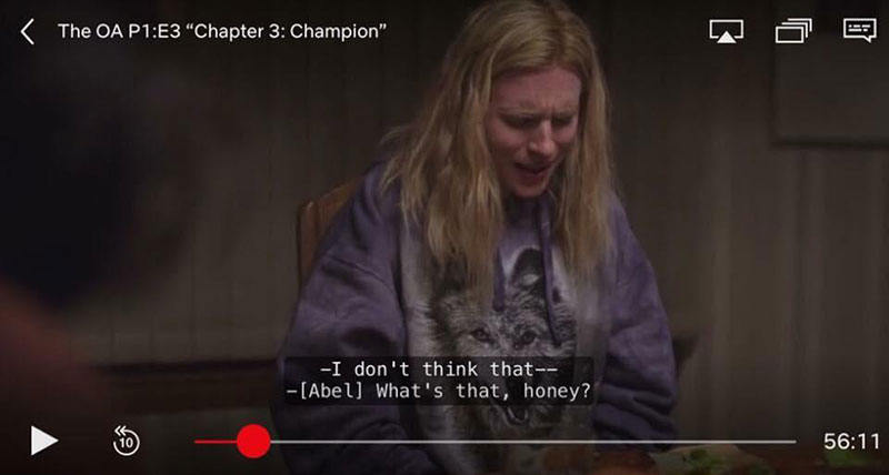
Importantly, subtitles can be customized completely, and your style, context, and preferences can be changed. There is a range of typewriter, cursive, print, console, and more font types. All caps for your subtitles can also be picked. To make the change, go to account > parenting > subtitle > fonts.
Besides, the shadow color or contour may also be changed. Netflix will remember your preferences once you have selected them and use them for other site headings by default. For a better visibility, Netflix applies a drop shadow on subtitles. The effect can be modified as desired to distinguish text from the context better.
Regular Netflix Subtitles font
Although Netflix’s Subtitle font can be set manually, Netflix’s standard or default font is Consolas.
Consolas
In programming environments and other conditions, Consolas is aimed at using monospaced fonts. Every character has the same breadth and is the right choice for personal and business correspondence, like an old typewriter. The improved Windows font display allows monospace fonts such as Courier with proportions closer to regular text. This makes the expanded text on the computer more easily readable.
OpenType contains a hanging or lining numeral, slashed, pointed, and regular zeros, and a selection of lowercase letters with alternate shapes. By changing the number of bars and waves, the text’s look can be tailored to a personal taste. Consolas features a range of fonts built to benefit from ClearType to enhance the reading experience in Windows Vista and Office 2007 in Microsoft ClearType Font Collections.
Fonts similar to Consolas
Tiresias Info font
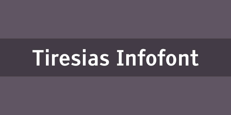
There are two choices in the Tiresia font – the free Infofont and a paid Screenfont, made for TV in particular, with more expansive spaces and displays. The Family consists of a full collection of fonts in six types designed for readability in a simple sans serif with clean lines. This may be one of the most readable fonts you’ll find, making it very suitable.
Times New Roman
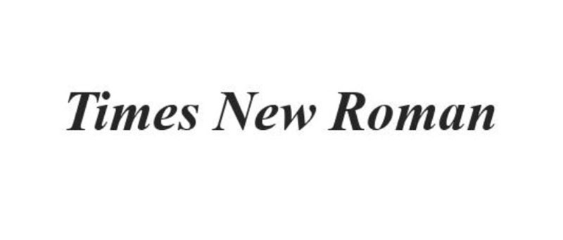
Serif typography is Times New Roman. In 1931 it was commissioned by the British newspaper The Times and designed with Victor Lardent, a lettering artist in the advertising department of The Times, by Stanley Morison, the artistic advisor of the British brans of the printers’ equipment company Monotype.
In every publication that wants a classic yet realistic look, Times New Roman sees itself as the body text. In conjunction with excellent readability, books and newspapers are very much used.
Helvetica
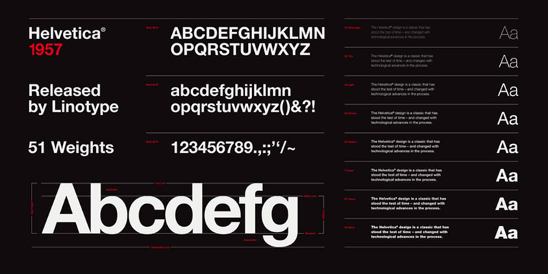
Helvetica is a neo-gothic or practical style inspired by Akzidenz-Grotesk and other German and Swiss types of the 19th century. This material became one of the most common typographical features of the twentieth century, which originated from Swiss work in the 1950s and 1960s.
The Netflix logo font
![]()
The first thing you note is that it’s not the same “N” as in “Netflix” itself. It has a rounded base, which gives the primary logo a node, but the letter itself appears on the 3-D page. The letter is made from a single red band, with a drop shadow folding over it.
Graphique is the font used for the Netflix logo. The graphic was originally designed as a hot metal font of Haas Schriftgießerei, Switzerland by Swiss artist Hermann Eidenbenz, in 1945.
Digitally remastered and extended the profile typeface, the German type designer Ralph M. Unger and the OTF Pro digital edition contains over 400 characters, including both the Latin and Cyrillic glyph sets. Graphique Pro is a very narrow, highly economical font for headlines, posters, signatures, CD covers, titles in books, and much more.
Fonts Similar to Graphique
Grumpy
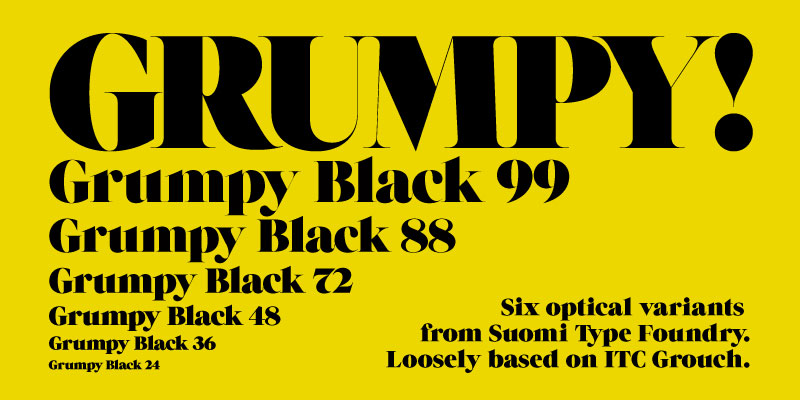
Tomi Haaparanta designed grumpy, a heavy high contrast serif typeface published in 2011 through Suomi Type Foundry. ITC Grouch, a typeface initially adapted to the heaviest weights of Caslon, influenced Grumpy’s style.
Grumpy includes six optically adjusted kerning pairs with over 2,000 optical versions that were common in the 1970s and “dense, not touching.”
Lust
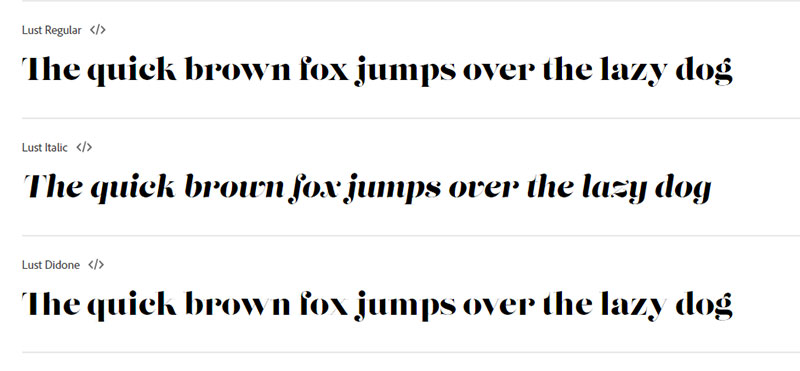
Lust has been developed and published in 2012 by Neil Summerour. It is an understatement to suggest that desire is best used for showcase purposes – this is a form of extreme inconsistency to ridiculously sharp serifs. Lust describes Summerour as a typographical pleasure of guiltiness.”
Some other best font for subtitles
Roboto
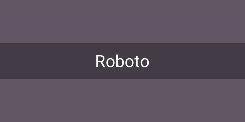
Roboto is one of the most common styles in contemporary times. It is used universally for many purposes across computer types, screen sizes and. No exception is made to subtitles and subtitles.
And it’s fast and easy to read because the eye is so familiar with this typeface. The aim is to promote the user’s comprehension of the content by using a subtitle, and so Roboto is the right choice.
Arial
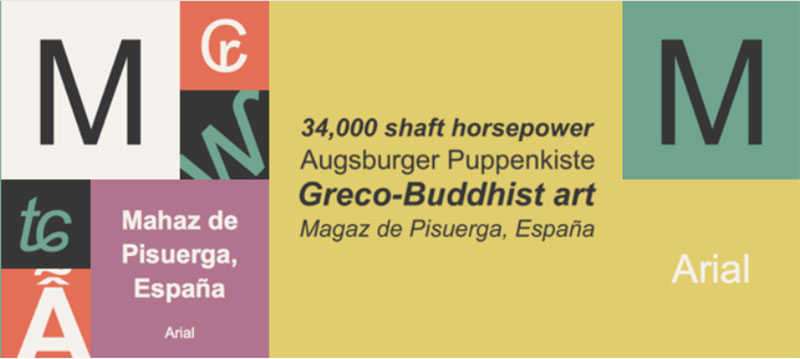
It is a good alternative for closed subtitles as it is universal, has a vital feature and glyph collection, and a natural shape.
Cinecav
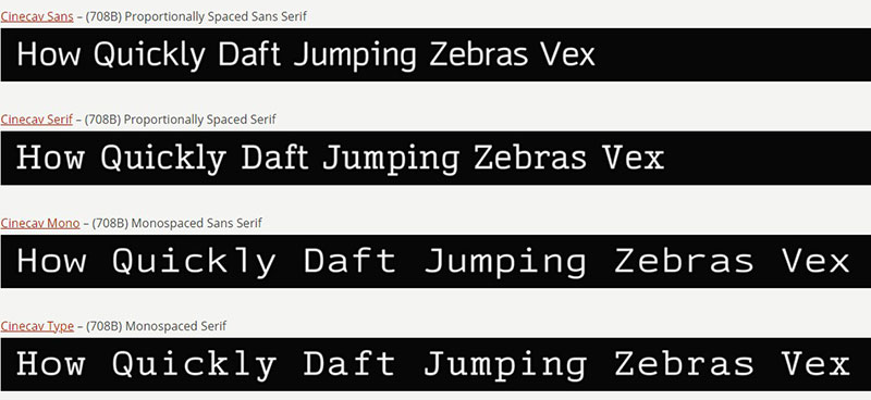
This typeface incorporates italics appropriate for subtleties – often difficult to acquire – and includes characters for dozens of languages. Lastly, this font is commonly used for TV and film.
Subtitles and subtitles are planned everywhere. The most frequent example of video use is music lyrics, language translation, emphasis, and voice-over. They can also be used for concept titles such as books, journals, art, or music. Healthy subtitles do not distract or integrate into them. The subtitle font aims to provide descriptive and straightforward text that doesn’t distract or prevent any visual details on the computer.
FAQ On The Netflix Font
What is the Netflix Font Called?
Netflix Sans is the custom typeface of the streaming behemoth, crafted with the user interface squarely in mind. It exudes brand identity while optimizing for digital legibility and embodying the company’s distinct voice.
Who Designed the Netflix Font?
The gifted minds at Dalton Maag, a renowned typeface design studio, collaborated with the Netflix in-house design team. Together, they unveiled a font seeped in brand essence, yet functional for a seamless viewer experience.
Can I Use Netflix Sans for My Projects?
No, Netflix Sans is a proprietary font, serving strictly as part of Netflix’s branding strategy. The licensing is exclusive, meaning you won’t find it up for grabs in public domain or for sale.
What Makes Netflix Sans Unique?
Crafted as a branding font, Netflix Sans is a typographic chameleon, adept at both assertiveness and subtlety. It’s expressly designed for screen-optimized legibility, scaling gracefully from billboard size down to miniature user interface typography.
How Does Netflix Sans Enhance User Experience?
Netflix Sans was sculpted with UX design principles at its core. Its uncluttered, modern aesthetic ensures optimum readability across devices, reinforcing user familiarity with consistent branding.
How Does the Netflix Font Impact Brand Identity?
A custom font like Netflix Sans can be a potent instrument in a company’s branding toolkit. Harmonizing visual branding consistency, it wears the corporate identity while etching the visual distinctiveness into viewers’ minds.
Is Netflix Sans a Global Font?
Absolutely. Netflix Sans was conceived with global reach in mind, weaving in multicultural versatility to cover a sweeping range of linguistic needs and embracing diverse user interface elements.
What Challenges Were Involved in Creating Netflix Sans?
One crucial challenge was engineering a font that could carry the brand’s visual identity yet perform effortlessly across myriad platforms. Balancing typeface aesthetics and functionality was paramount in its creation.
How Often Does Netflix Update Their Font?
While not commonplace, font updates occur in response to evolving brand strategy or technological advancements. The arrival of Netflix Sans shows a commitment to a long-term visual identity, suggesting infrequent changes.
How Does Netflix Sans Compare to Other Brand Fonts?
Netflix Sans stands tall among bespoke brand typefaces, aligning itself with the likes of Google’s Roboto and Apple’s San Francisco.
What sets it apart is its tailored alignment with Netflix’s digital media presence and content platform branding goals.
Conclusion
Drenched in the artful nuances of type, the Netflix font, Netflix Sans, reflects a design revelation—a tactile emblem of brand identity as much as a functional asset. We’ve dissected its anatomy, from typography marrow to branding skin, unveiling how a bespoke typeface breathes life into the canvas of digital media.
Bearing witness to this typeface’s evolution, it’s clear: the keen eyes at Dalton Maag, hand in hand with visionaries behind the screens, didn’t merely craft letters; they built bridges between viewers and the narratives they cherish. Revolving around custom typography, Netflix Sans is nothing short of a seminal chapter in visual branding chronicles.
With each curve and lineament meticulously considered, the underlying message resonates deep and true—a font encapsulates more than just text; it cradles an identity, distilling the essence of a global powerhouse into the silhouettes of speech. Herein lies the tacit power of Netflix Sans—an etching of brand permanence in the fleeting world of content engagement.
If you liked this article about the Netflix font, you should check out this article about the YouTube font.
There are also similar articles discussing the CNN font, the Twitch font, the Reddit font, and the Minecraft font.
And let’s not forget about articles on the Medium font, the Disney font, the Slack font, and the Instagram font.
Bogdan Sandu, a seasoned designer with 15 years of diverse experience, has been designing websites since 2008.
Renowned for his expertise in logo design and visual branding, Bogdan has developed a multitude of logos for various clients.
His skills extend to creating posters, vector illustrations, business cards, and brochures. Additionally, Bogdan's UI kits were featured on marketplaces like Visual Hierarchy and UI8.
Latest posts by Bogdan Sandu (see all)