Twitch uses Roobert, a mono-linear geometric sans-serif font designed by Martin Vácha and published through Displaay Type Foundry in 2018.
Twitch adopted a customized version of Roobert in September 2019 as part of a full platform rebrand unveiled at TwitchCon 2019. The font appears across Twitch’s chat interface, UI menus, marketing materials, and all major brand touchpoints.
What Type of Font Is Roobert?
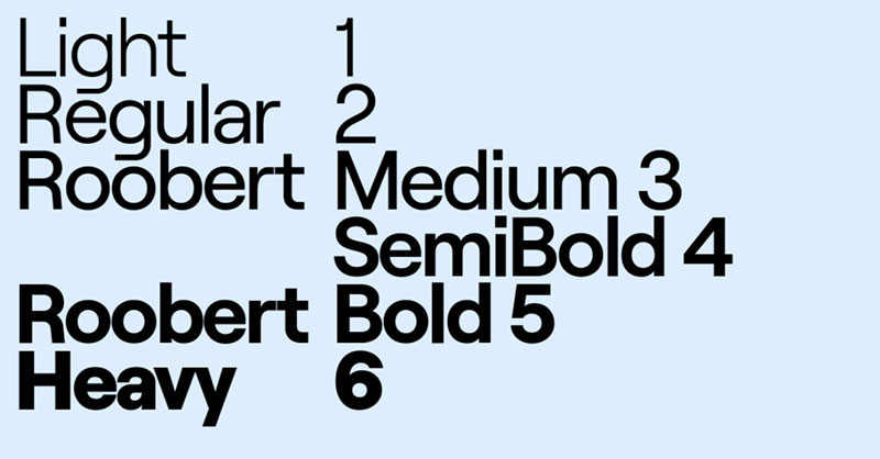
Roobert is a geometric, mono-linear sans-serif typeface. “Mono-linear” means the stroke width stays consistent throughout each letterform, with no variation between thick and thin strokes.
Its terminals are horizontal and vertical, and the stems connect smoothly without sharp joints. The single-story lowercase “g” (with a rounded bottom corner) is one of its most recognizable details, borrowed directly from the Moog logotype.
Roobert is available in 6 weights with matching italics, from Light to Black. This range makes it practical for both display headlines and body text in streaming interfaces, overlays, and channel branding.
As a geometric font, it shares DNA with typefaces like Futura and Circular, but reads warmer and more approachable. That balance between precision and personality is a big part of why Twitch picked it. Clean enough for small UI text. Distinct enough to carry a brand.
Who Designed Roobert?
Martin Vácha designed Roobert. It was originally commissioned as a custom typeface for Moogfest 2017, the annual music and technology festival celebrating the legacy of Robert Moog.
The font was then published commercially by Displaay Type Foundry, an independent foundry headquartered in Prague, Czech Republic (now operating from Berlin). Displaay released Roobert to the public in 2018, one year after its Moogfest debut.
When Twitch adopted it in 2019, the platform used a customized version of the retail typeface rather than an off-the-shelf license. According to Twitch’s creative team (via Creative Bloq), Roobert was chosen partly because it felt “modeled off the retro Moog synthesizer logotype,” which they said “added a few cool points.”
The font is not proprietary to Twitch. Any individual or business can license Roobert directly from Displaay.
Is Roobert Free to Use?
Roobert is free for personal use. Displaay offers a full trial download at no cost, which includes the complete glyph set and all OpenType features.
Commercial use requires a paid license. Displaay’s licensing model is a perpetual, one-time fee that scales with your business size. Pricing starts from around 65 EUR for basic commercial use, though exact costs vary depending on the scope of the project.
You can download Roobert and purchase commercial licenses directly at displaay.net. Roobert is not available on Google Fonts or Adobe Fonts.
If you want Roobert for a stream overlay, personal branding project, or portfolio piece, the free personal license covers that. The moment you use it for client work, a product, or any commercial output, you need to buy the appropriate license. Displaay is clear about this, and font licensing for commercial projects isn’t something to skip.
What Font Did Twitch Use Before Roobert?
Before 2019, Twitch used system-level fonts including Helvetica Neue across its UI, which was standard practice for many web platforms at the time.
The original Twitch logo (pre-rebrand) used a techno-style typeface called Dimitri, released by Ben Balvanz through the Fontalicious font family. Dimitri was designed with two styles, Regular and Black, and 237 defined characters with 94 special glyphs.
The 2019 rebrand, handled by creative agency Collins in collaboration with Twitch’s in-house design team, replaced both the old logo letterforms and the generic UI fonts with a unified Roobert system. It was the first major rebrand since Twitch launched in 2011.
| Era | Font Used | Context |
| Pre-2019 | Dimitri | Logo wordmark |
| Pre-2019 | Helvetica Neue | UI and body text |
| 2019 onwards | Roobert (customized) | All brand touchpoints |
| 2019 onwards | Inter | Chat and UI body text |
What Are the Best Free Alternatives to Roobert?
Roobert isn’t on Google Fonts, and the commercial license costs money. These are the closest free or accessible alternatives:
| Font | Why It’s Similar | License | Source |
| Inter | Geometric, screen-optimized, clean terminals | Open source (SIL OFL) | Google Fonts |
| DM Sans | Mono-linear structure, geometric warmth | Open source (SIL OFL) | Google Fonts |
| Space Grotesk | Similar weight range, quirky details | Open source (SIL OFL) | Google Fonts |
| Nunito | Rounded geometric, approachable feel | Open source (SIL OFL) | Google Fonts |
| Work Sans | Neutral geometric, multi-weight | Open source (SIL OFL) | Google Fonts |
Inter is actually what Twitch uses for chat and UI body text now, which makes it the most “on-brand” free choice for streamers trying to match the platform’s aesthetic. You can find pairing ideas for Inter font combinations if you want to build a full type system around it.
Space Grotesk and DM Sans are both solid picks if you want something with a bit more personality than Inter while staying readable at small sizes.
How to Use Roobert Alternatives in Your Stream Design
Most streamers work in Canva, Figma, or OBS Studio. Here’s how to get these fonts into each one.
Canva
Canva has Inter and DM Sans built into its font library. Search by name in the font selector and they’ll appear instantly. For pro accounts, you can upload fonts to Canva and add the Roobert trial file directly.
Figma
Figma pulls fonts from your local system. Install the font file on your machine, restart the Figma desktop app, and it appears in the font picker. Adding fonts to Figma this way takes under two minutes.
OBS Studio
OBS uses system fonts for text sources. Install any font at the OS level, then restart OBS. The font will appear in the “Text (GDI+)” or “Text (FreeType 2)” source dropdown. Inter and Space Grotesk both render cleanly at the small sizes common in stream overlays.
CSS embed (for web-based overlays)
“ @import url('https://fonts.googleapis.com/css2?family=Inter:wght@400;500;600&display=swap');
body { font-family: ‘Inter’, sans-serif; } `
This pulls Inter directly from Google Fonts with three weights. Enough to replicate Twitch’s own typographic hierarchy in a custom overlay.
Why Did Twitch Choose Roobert?
Three reasons drove the decision, and Twitch’s creative team was fairly open about them at the time of the rebrand.
The Moog connection. Twitch’s community is deeply tied to music, gaming culture, and creative subcultures. Roobert was literally born out of Moogfest, a festival celebrating electronic music innovation. That backstory aligned with how Twitch wanted to position itself as a platform built by and for creators, not just a corporate streaming service.
Geometric clarity at scale. Twitch’s UI renders at dozens of different sizes across desktop, mobile, and TV. A mono-linear geometric sans-serif holds up better across those contexts than a font with high stroke contrast. Roobert’s horizontal and vertical terminals render crisply even at small sizes, which matters a lot in chat where text moves fast.
Personality without noise. The rebrand’s creative direction (handled by Collins) leaned into retro arcade aesthetics, vibrant color, and bold letterforms. Roobert’s subtle quirks, especially the single-story “g,” gave the typography some personality without the font becoming a visual distraction. It supports the brand’s visual hierarchy rather than competing with it.
The 2019 redesign also introduced Twitch’s “Ultraviolet” purple (#9146FF) as the primary brand color. Roobert’s clean structure pairs well with that color because the font doesn’t fight for attention. It just sits there and reads well, which is exactly what you want from a platform where the stream itself is always the main focal point.
Other platforms that have gone through similar rebrands, like the YouTube font update or the Discord font system, tend to follow the same logic: pick a geometric or humanist sans-serif, optimize for screen rendering, and make sure it has enough weights to handle both display and body use cases. Twitch’s Roobert choice fits that pattern, but with a cultural rationale that most rebrands don’t bother to build in.
FAQ on The What Font Does Twitch Use
What is the main font Twitch uses?
Twitch uses Roobert, a geometric mono-linear sans-serif typeface.
It was adopted in 2019 as part of the platform’s first major rebrand. Roobert appears across chat, menus, and all marketing materials.
Who made the Roobert font?
Martin Vácha designed Roobert. It was published by Displaay Type Foundry, an independent foundry based in Prague.
The typeface was originally created for Moogfest 2017 before becoming a commercial release in 2018.
Is the Twitch font free to download?
Roobert is free for personal use only. Commercial projects require a paid license purchased directly from Displaay at displaay.net.
It is not available on Google Fonts or Adobe Fonts.
What font does Twitch chat use?
Twitch chat uses Inter for body text. Inter is a geometric sans-serif designed by Rasmus Andersson, built specifically for screen readability at small sizes.
Roobert handles headings and brand-level UI. Inter handles the actual reading experience.
What font did Twitch use before Roobert?
Before 2019, Twitch used Helvetica Neue for its UI and a techno-style typeface called Dimitri for its logo wordmark.
Both were replaced during the TwitchCon 2019 rebrand, handled by creative agency Collins.
What type of font is Roobert?
Roobert is a geometric, mono-linear sans-serif. Stroke width stays consistent across all letterforms, and terminals are clean and horizontal.
It comes in 6 weights with matching italics, making it flexible for both display and body use.
Can I use Roobert for my Twitch stream overlays?
Yes, the free personal license covers non-commercial stream overlays and personal branding projects.
If your overlays are part of paid client work or a commercial product, you need the commercial license from Displaay.
What are the best free alternatives to Roobert?
Inter, DM Sans, and Space Grotesk are the closest free options, all available on Google Fonts.
Inter is actually Twitch’s own choice for chat text, so it’s the most on-brand free alternative for streamers.
Why did Twitch choose Roobert specifically?
Roobert was named after Robert Moog, inventor of the Moog synthesizer. That cultural connection aligned with Twitch’s creator-focused identity.
The font’s geometric clarity also holds up well across Twitch’s UI at varying screen sizes and text weights.
Does Twitch use a custom version of Roobert?
Yes. Twitch licensed and applied a customized version of the retail Roobert typeface rather than using it straight from Displaay’s standard release.
The public version at displaay.net is functionally the same family but without Twitch’s specific modifications.
Conclusion
Now you know what font does Twitch use: Roobert, a geometric sans-serif from Displaay Type Foundry, adopted during the 2019 platform rebrand alongside Inter for chat body text.
The choice wasn’t random. It tied directly to Robert Moog’s legacy and Twitch’s streamer branding identity.
For stream overlay fonts and channel design work, Inter and Space Grotesk are your most practical free alternatives. Both hold up well in live streaming aesthetics without costing anything.
If you need the real thing, Roobert’s commercial license is available at displaay.net.

Renowned for his expertise in logo design and visual branding, Bogdan has developed a multitude of logos for various clients.
His skills extend to creating posters, vector illustrations, business cards, and brochures. Additionally, Bogdan's UI kits were featured on marketplaces like Visual Hierarchy and UI8.
He also wrote in the past years on sites like Design Your Way, WebDesignerDepot, WPDean, Designmodo, Speckyboy, Slider Revolution, and more.
- The Windsurf Logo History, Colors, Font, And Meaning - 10 October 2026
- How to Remove Background From Product Photos (No Photoshop) - 10 October 2026
- How Designers can Build a Stronger Online Creative Identity - 9 October 2026

Bogdan Sandu is a seasoned designer who has been designing websites since 2008. Renowned for his expertise in logo design and visual branding, Bogdan has developed a multitude of logos for various clients. His skills extend to creating posters, vector illustrations, business cards, and brochures. Additionally, Bogdan's UI kits were featured on marketplaces like Visual Hierarchy and UI8. He also wrote in the past years on sites like Design Your Way, WebDesignerDepot, WPDean, Designmodo, Speckyboy, Slider Revolution, and more.
You Might Also Like