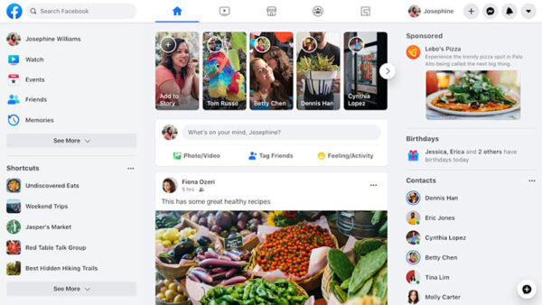
YouTube uses Roboto as its primary UI font, a neo-grotesque sans-serif font designed by Christian Robertson and released by Google in 2011.
Roboto handles video titles, descriptions, comments, and most interface text across the platform. For marketing materials and brand-specific displays, YouTube uses a separate custom typeface called YouTube Sans, launched in 2017. The logo itself is based on a modified version of Alternate Gothic, a condensed grotesque typeface.
So, there are actually 3 distinct typefaces at play here. Each one has a specific role, and they are not interchangeable.
What Type of Font Is Roboto?
Roboto is classified as a neo-grotesque sans-serif. It shares structural DNA with grotesque typefaces like Helvetica, but it is friendlier and more open at small sizes.
Technically, it has a dual nature: a mechanical, geometric skeleton paired with humanist open curves. That combination makes it feel neutral without being cold, which is exactly what a platform like YouTube needs for body text and UI copy.
Key typographic characteristics:
- Geometric skeleton with open counters
- High x-height, which helps readability at small sizes
- Consistent tracking across weights
- Available in 12 styles: Thin through Black, each with an italic
It was originally built as the system font for Android 4.0 in 2011, then significantly redesigned for Android 5.0 in 2014. By 2013, Google had rolled it out across YouTube, Google Maps, and Google Play.
What Type of Font Is YouTube Sans?
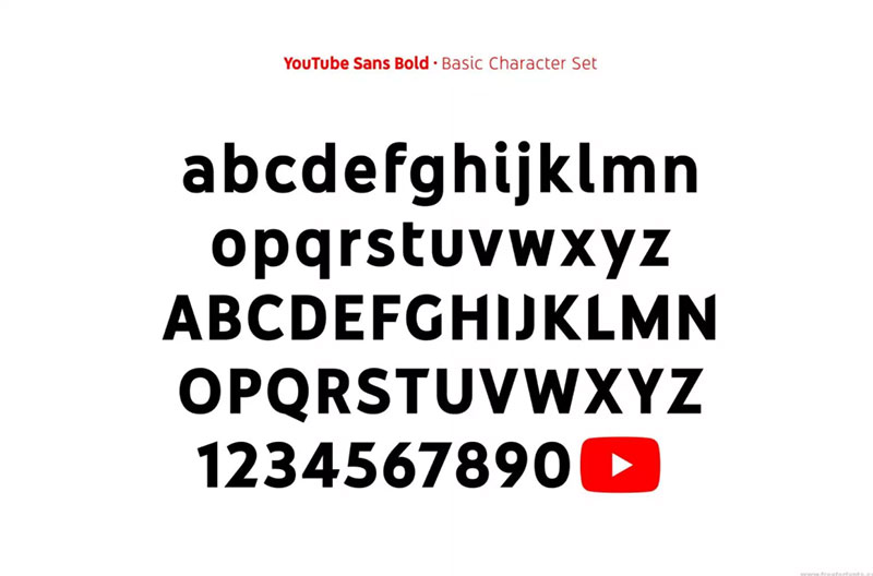
YouTube Sans is a custom display sans-serif. It is not a body text font. It was built for high-impact use: headlines, marketing campaigns, and product branding across YouTube TV and YouTube Music.
The design pulls directly from the YouTube play button icon. The letterforms use the same diagonal angle found in the triangular play icon, creating cuts into the ends of strokes. Rounded outer edges mirror the rounded corners of the play button container.
Structurally, it sits between geometric and humanist classifications. It is not as cold as a pure geometric face, but it is far more structured than a humanist one.
YouTube Sans is available in 7 weights, from Light to Black, and was later developed as a variable font to improve loading performance and design flexibility across products.
Who Designed Roboto and YouTube Sans?
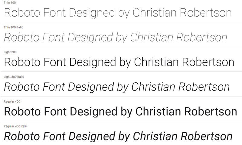
Roboto was designed by Christian Robertson, working in-house at Google. Robertson previously ran a personal type foundry called Betatype, through which he had released the Ubuntu Titling font. Roboto was created entirely within Google and first released publicly on January 12, 2012.
YouTube Sans was a collaborative project. Google’s design team kicked off the project in 2014, then brought in branding agency Saffron, type studio Letterjuice, and type technology company URW++ to develop it. The first public version launched in 2017 alongside YouTube TV. The team continued iterating, with Version 4 (a full ground-up redraw of every glyph) completed in 2018-2019.
As for the logo typeface, Alternate Gothic was originally designed by Morris Fuller Benton in 1903. The YouTube logo was created by co-founder Chad Hurley in 2005, using a modified version of that typeface.
Is Roboto Free to Use?
Roboto is completely free, including for commercial projects. It is licensed under the Apache License 2.0 (most variants have since been re-licensed under the Open Font License), and it is available directly from Google Fonts.
You can download it, embed it in websites via a CSS link, use it in Figma, Canva, Adobe products, or anywhere else without paying anything. There are zero restrictions for commercial use.
YouTube Sans is a different story. It is a proprietary font owned by YouTube/Google and is not publicly available for free download. Some sites offer unofficial downloads labeled “personal use only,” but those are not officially licensed distributions.
If you need something that looks like YouTube Sans for a project, the honest answer is: use an alternative (covered below).
What Font Did YouTube Use Before?
YouTube’s font history has a few distinct chapters:
- 2005-2011: Basic web-safe sans-serif fonts, prioritizing function over brand identity
- 2011: First version of YouTube Sans introduced during an early redesign, focused on a cleaner look
- 2013: Roboto adopted across the interface as part of Google’s broader Material Design rollout
- 2017: YouTube Sans publicly debuted with the YouTube TV launch, alongside a full brand refresh
- 2018-2019: YouTube Sans V4 released, with every glyph redrawn from scratch and variable font support added
The 2017 rebrand was the most significant shift. Before that point, YouTube’s typography was largely borrowed from Google’s broader design system rather than being something distinctly YouTube’s own.
Worth noting: the logo text has remained relatively stable since the 2017 update, even as the rest of the brand’s typography evolved around it.
What Are the Best Free Alternatives to YouTube Sans?
Since YouTube Sans is proprietary, designers often look for alternatives that capture a similar feel: geometric-leaning, modern, clean, with good weight range. Here are 5 solid options:
| Font | Similarity to YouTube Sans | License | Source |
| Roboto | Same family; cleaner and less display-focused | Free (OFL) | Google Fonts |
| DM Sans | Geometric sans with open forms; similar weight range | Free (OFL) | Google Fonts |
| Inter | Designed for screens; neutral and highly readable | Free (OFL) | Google Fonts |
| Work Sans | Clean grotesque with display-ready weights | Free (OFL) | Google Fonts |
| Space Grotesk | More personality than Roboto; still geometric | Free (OFL) | Google Fonts |
Inter is my personal go-to when I need something that reads well at small sizes on a dark background. It was literally built for screen use, which makes it a natural fit for anything YouTube-adjacent in terms of design context.
If you are specifically trying to match the logo’s condensed, bold style (based on Alternate Gothic), look at fonts similar to Roboto or condensed grotesque options like Barlow Condensed or League Gothic, both available free on Google Fonts.
How to Use Roboto in Your Projects
In a Website (CSS Embed)
Add Roboto to any site via Google Fonts with a single line in your HTML <head>:
“ <link href="https://fonts.googleapis.com/css2?family=Roboto:wght@400;700&display=swap" rel="stylesheet"> `
Then apply it in CSS:
` body { font-family: 'Roboto', sans-serif; } `
Using display=swap is good practice. It tells the browser to show a fallback font while Roboto loads, which avoids invisible text during page load.
In Figma or Canva
Roboto is built into both tools. In Figma, just type “Roboto” in the font picker. In Canva, it’s in the free font library. No installation needed.
For YouTube Thumbnails
Roboto Bold or Roboto Black at large sizes works well. Most creators actually use heavier display fonts for thumbnails (Impact, Anton, Bebas Neue), but Roboto Bold at 60px+ is clean and readable at thumbnail scale. If you want to explore options, check this guide on the best fonts for YouTube thumbnails.
Why Did YouTube Choose These Fonts?
Roboto for the UI was partly a practical decision. YouTube is a Google product, and Roboto was already the system font across Android and Google’s product ecosystem. Using it on YouTube created immediate consistency across Google’s platforms without extra overhead.
But there is also a functional reason. Roboto’s high x-height and open counters make it readable at small sizes across a wide range of devices and screen resolutions. For a platform displaying millions of video titles, often at 14-16px on mobile, that matters a lot. Bad font choice at that scale creates real friction.
YouTube Sans was a brand problem solved through type. According to Google Design’s own account of the project, the team started it in 2014 because YouTube had no clear typographic identity. The only thing holding the brand together visually was the color red and the logo. Everything else was borrowed from Google’s broader design system.
YouTube Sans gave the platform something it could actually own: a typeface that tied directly back to the play button, which is YouTube’s most recognizable visual element. The diagonal cuts in the letterforms reference the triangle inside the icon. The rounded outer forms reference the rounded rectangle surrounding it. That kind of systematic thinking is what separates a real brand identity from a collection of design decisions that happen to coexist.
The choice to keep Roboto for body text while using YouTube Sans only for display contexts is also deliberate. YouTube Sans has too much personality for long-form reading. It would be exhausting at body text size. Roboto does the quiet, functional work. YouTube Sans gets the stage when the brand needs to speak louder.
That pairing structure (functional body font + expressive display font) shows up across well-designed platforms. It is worth studying if you are building a visual identity for any digital product. You can explore more about these decisions in the context of typography elements and how they interact within a design system.
Other platforms have made similar moves. If you are curious how this compares to other tech companies’ font choices, it is worth looking at the Twitch font, the Reddit font, or the Netflix font to see how streaming and social platforms each approach brand typography differently.
FAQ on What Font Does YouTube Use
What is the main font YouTube uses?
Roboto is YouTube’s primary UI font. It handles video titles, descriptions, comments, and most interface text. It is a neo-grotesque sans-serif designed by Christian Robertson and released by Google in 2011.
Does YouTube have a custom font?
Yes. YouTube commissioned YouTube Sans in 2014, developed with branding agency Saffron and type studio Letterjuice. It launched publicly in 2017 and is used for marketing materials, headlines, and YouTube TV branding.
What font does the YouTube logo use?
The YouTube logo is based on a modified version of Alternate Gothic, a condensed grotesque typeface originally designed by Morris Fuller Benton in 1903. The logo itself was created by YouTube co-founder Chad Hurley in 2005.
Is the YouTube font free to download?
Roboto is completely free. It is available on Google Fonts under the Open Font License, covering personal and commercial use. YouTube Sans is proprietary and not officially available for public download.
What font does YouTube use for video titles?
Video titles use Roboto, typically in Regular or Medium weight. It renders clearly across desktop and mobile screen sizes, which is the core reason Google chose it for YouTube’s visual hierarchy.
What font does YouTube use for thumbnails?
YouTube does not enforce a font for thumbnails. Creators choose their own. Common picks include Impact, Bebas Neue, and Anton. For a more on-brand look, Roboto Bold works well. See the best fonts for YouTube thumbnails for a full breakdown.
What font is similar to YouTube Sans?
DM Sans, Inter, and Work Sans are the closest free alternatives. All three are geometric sans-serif fonts with a good weight range and strong screen performance. All are available on Google Fonts.
Does YouTube use the same font as Google?
For UI text, yes. Roboto is Google’s system font across Android, Google Maps, and YouTube. But YouTube also has YouTube Sans, a proprietary typeface that gives the platform a typographic identity separate from the broader Google ecosystem.
What font does YouTube use on mobile?
The mobile app uses Roboto on Android. On iOS, the system may substitute San Francisco (Apple’s default) in some contexts, though YouTube’s design targets Roboto as the intended mobile app font across the interface.
What font does YouTube use for subtitles?
YouTube auto-generated captions default to a plain sans-serif, often rendered by the browser or OS. Users can customize caption fonts in accessibility settings. Roboto is the closest match to YouTube’s native style for subtitle font choices.
Conclusion
If you have been wondering what font does YouTube use, the answer comes down to three typefaces with three distinct jobs: Roboto for the interface, YouTube Sans for brand display, and Alternate Gothic for the logo.
Each one was chosen for a specific reason, not just aesthetics. Roboto handles the functional load across billions of video titles and comments. YouTube Sans gives the platform a typographic identity it can actually own.
Roboto is free and ready to use in any project. If you need something closer to YouTube Sans, DM Sans or Inter are solid starting points, both available on Google Fonts at no cost.

Renowned for his expertise in logo design and visual branding, Bogdan has developed a multitude of logos for various clients.
His skills extend to creating posters, vector illustrations, business cards, and brochures. Additionally, Bogdan's UI kits were featured on marketplaces like Visual Hierarchy and UI8.
He also wrote in the past years on sites like Design Your Way, WebDesignerDepot, WPDean, Designmodo, Speckyboy, Slider Revolution, and more.
- Canva vs Midjourney: AI Design Tools Compared - 28 September 2026
- A Brand Identity Is Only Finished When Someone Else Can Use It - 28 September 2026
- Friendly Karla Font Pairing Ideas for Modern Brands - 26 September 2026

Bogdan Sandu is a seasoned designer who has been designing websites since 2008. Renowned for his expertise in logo design and visual branding, Bogdan has developed a multitude of logos for various clients. His skills extend to creating posters, vector illustrations, business cards, and brochures. Additionally, Bogdan's UI kits were featured on marketplaces like Visual Hierarchy and UI8. He also wrote in the past years on sites like Design Your Way, WebDesignerDepot, WPDean, Designmodo, Speckyboy, Slider Revolution, and more.
You Might Also Like