The wrong subtitle font doesn’t just look bad. It makes people stop watching.
Choosing the best fonts for subtitles affects readability, accessibility, and how long viewers stay engaged with your content. With 70% of Americans now watching video with captions turned on, caption typography is no longer a minor detail.
Not all fonts survive compression, small screens, or fast-moving video backgrounds. Some collapse into illegible smears at 16px. Others pass broadcast compliance checks but fail real viewers with low vision.
This guide covers the 10 most readable subtitle fonts used across streaming, broadcast, and social media video. You’ll learn what makes each one work structurally, which platforms use them by default, and how to match the right typeface to your specific video context.
The Best Fonts for Subtitles
Good subtitle typography is almost invisible. Viewers read it, absorb it, and move on without thinking about the typeface at all. That’s the goal.
The fonts below are ranked by practical performance across broadcast, streaming, and social media video. Each entry covers structural attributes, real-world usage, pairings, and limitations, so you can match the right typeface to your specific context.
| Font | Classification | Best Context | License |
| Arial | Neo-grotesque sans-serif | General-purpose, professional video | Commercial (bundled) |
| Roboto | Neo-grotesque sans-serif | YouTube, Android, streaming | Apache 2.0 / OFL (free) |
| Helvetica Neue | Neo-grotesque sans-serif | Film, broadcast, premium content | Commercial |
| Open Sans | Humanist sans-serif | Web video, multilingual content | OFL (free) |
| Verdana | Humanist sans-serif | Low-resolution and mobile screens | Commercial (bundled) |
| Montserrat | Geometric sans-serif | Social media, short-form video | OFL (free) |
| Atkinson Hyperlegible | Grotesque sans-serif | Accessibility, low-vision viewers | OFL (free) |
| Tiresias Screenfont | Humanist sans-serif | Broadcast TV, closed captions | GPL v3 / restricted |
| Noto Sans | Humanist sans-serif | Multilingual, global content | OFL (free) |
| Lato | Humanist sans-serif | Documentary, educational video | OFL (free) |
—
Arial
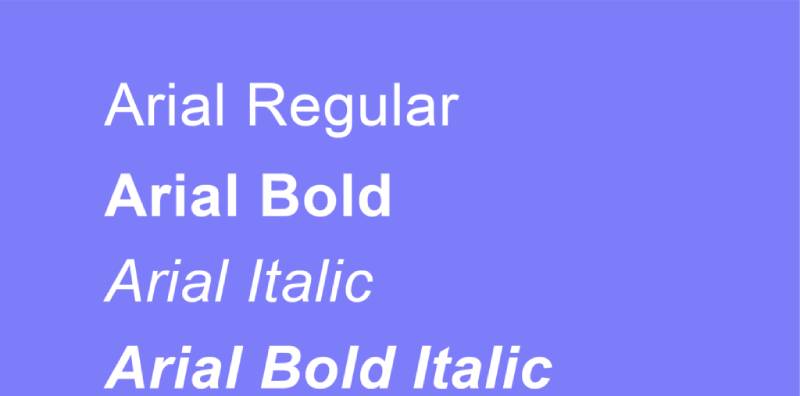
Arial is a neo-grotesque sans-serif font designed by Robin Nicholas and Patricia Saunders in 1982, released by Monotype Typography. It delivers neutral, high-legibility caption text across screen sizes and resolutions.
Arial suits general-purpose subtitle use because its open counters and diagonally cut stroke terminals reduce character ambiguity at small sizes. It has been bundled with every version of Microsoft Windows since 3.1 and macOS, making it one of the most universally rendered typefaces for on-screen text.
What makes Arial suitable for subtitles?
Arial has a moderate x-height and consistent stroke weight, both of which support legibility at 14px–22px on standard video displays.
Its open apertures in letters like c, e, and a reduce the chance of misread characters. Arial Black (weight 900) adds strong contrast for reversed-out text, though it should be avoided for long subtitle lines.
| Attribute | Value |
| Classification | Neo-grotesque sans-serif |
| Designer | Robin Nicholas & Patricia Saunders, 1982 |
| Weight range | Regular 400 – Black 900 (+ Narrow, Rounded variants) |
| Variable font | No (static weights only) |
| Recommended sizes | 14px–22px for subtitles; 18px+ for mobile |
| Letter-spacing default | 0 (neutral) |
| License | Commercial; bundled free with Windows and macOS |
| Available on | Microsoft, Apple, Adobe Fonts |
| Price | Free (bundled); paid for extended licensing |
How does Arial perform at subtitle rendering?
Arial renders cleanly at both 1× and 2× pixel density. Its hinting is well-optimized for screen, particularly on Windows GDI and DirectWrite environments.
One known weakness: the lowercase l and uppercase I are visually identical in Arial, which can cause misreads in caption text. This is a structural limitation shared with Calibri, Roboto, and Helvetica.
What are the best pairings for Arial in subtitles?
Arial pairs with Georgia when a heading/subtitle contrast is needed, and with serif fonts like Times New Roman for documentary-style title cards where a more formal tone is needed.
What are the limitations of Arial for subtitles?
Arial is not available as a variable font, limiting responsive weight adjustments in modern web video players. Its l/I homoglyph issue is a concrete readability problem in mixed-case subtitle text.
Arial — Recommended Use Cases Within Subtitle Design
- Best for: Corporate training videos, professional presentations, general broadcast captions
- Avoid for: Accessibility-first projects where character distinction is critical
- Optimal weight: Regular 400 for body captions; Bold 700 for emphasis
- Optimal size range: 16px–22px for standard subtitle tracks
—
Roboto

Roboto is a neo-grotesque sans-serif typeface designed by Christian Robertson, released by Google in 2011 as the system font for Android 4.0. It serves as the default subtitle font for YouTube and Google Play across all platforms.
Roboto works best for streaming subtitle use because it combines a mechanically consistent skeleton with open, humanist curves, producing high legibility from 12px upward. By 2024, Roboto accounted for roughly 26% of all Google Fonts views, making it one of the most-rendered fonts in digital video worldwide.
What makes Roboto suitable for subtitles?
Roboto has a dual-natured structure: geometric stroke widths with humanist apertures. This combination prevents character crowding at small sizes while keeping the typeface neutral enough not to distract from video content.
Its Medium weight (500) is particularly well-suited to subtitle use, sitting between Regular and Bold without the heaviness that Bold introduces on tight caption lines. The Roboto Flex variable font version adds 12 adjustable axes including optical size, which makes it one of the most technically capable options for responsive video players.
| Attribute | Value |
| Classification | Neo-grotesque sans-serif |
| Designer | Christian Robertson, 2011 |
| Weight range | Thin 100 – Black 900 (6 static weights + italics) |
| Variable font | Yes — Roboto Flex (12 axes including optical size) |
| Optical sizes | Yes (via Roboto Flex) |
| Recommended sizes | 14px–20px for subtitle tracks |
| Letter-spacing default | 0 |
| License | Apache 2.0 / OFL (free, commercial use permitted) |
| Available on | Google Fonts, Adobe Fonts |
| Price | Free |
How does Roboto perform at subtitle rendering?
Roboto renders well on both high-DPI (retina) and 1× Android displays due to strong hinting applied during development. Its slightly wide and rounded letterforms (introduced in the 2014 redesign) reduce visual compression in longer caption lines.
The l/I homoglyph problem from Arial is present in Roboto as well, a known trade-off in neo-grotesque fonts.
What are the best pairings for Roboto in subtitles?
Roboto pairs with Roboto Slab for title card and heading contrast within the same video UI. For pairing across font families, Lora (a calligraphic serif) provides strong contrast without conflicting with Roboto’s mechanical structure.
What are the limitations of Roboto for subtitles?
Roboto uses narrow apertures in its static versions, which limits legibility on very low-resolution displays below 720p. It also lacks true italics; oblique styles are used instead, which can look mechanical in dialogues requiring emphasis.
Roboto — Recommended Use Cases Within Subtitle Design
- Best for: YouTube, Google Play, Android video apps, Material Design UI subtitles
- Avoid for: Print-based subtitle burn-ins where true italic rendering is needed
- Optimal weight: Medium 500 for subtitle body; Bold 700 for emphasis or speaker labels
- Optimal size range: 14px–20px
—
Helvetica Neue
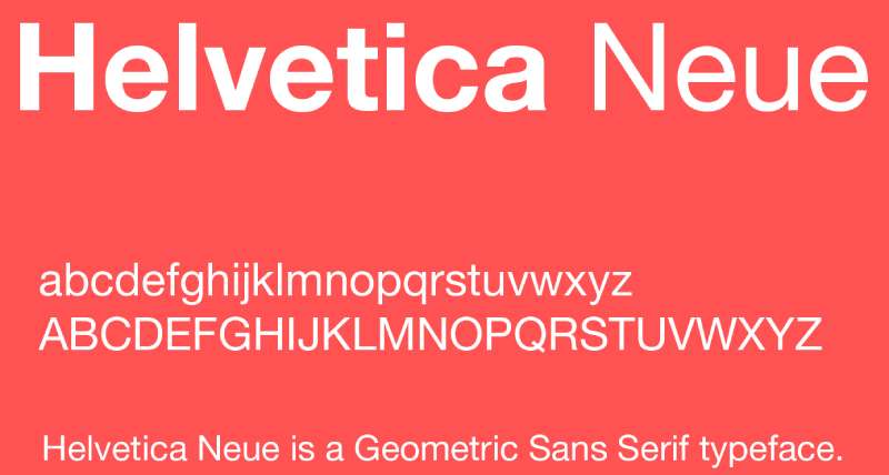
Helvetica Neue is a neo-grotesque sans-serif designed by Max Miedinger and Eduard Hoffmann, originally released as Helvetica in 1957 by Haas’sche Schriftgiesserei, with the Neue revision standardizing the family’s proportions and weights. Rights are now held by Monotype Imaging.
Helvetica Neue suits premium film and broadcast subtitle use because its tightly regularized letterforms maintain consistent visual rhythm across long dialogue runs. It is a reliable choice for movie subtitles where neutral professionalism is non-negotiable.
What makes Helvetica Neue suitable for subtitles?
Helvetica Neue has a large cap height, moderate x-height, and uniform horizontal stroke weight, which produce stable, predictable rendering at broadcast resolutions.
Its many weights (from Ultra Light 25 to Black 95 in the full Neue family) allow fine-grained control over caption hierarchy without switching typefaces. The neutrality of the design means it works across genres — documentary, drama, and feature film — without creating tonal friction with the visuals.
| Attribute | Value |
| Classification | Neo-grotesque sans-serif |
| Designer | Max Miedinger & Eduard Hoffmann, 1957 (Neue: 1983) |
| Weight range | Ultra Light 25 – Black 95 (full Neue family) |
| Variable font | No (Helvetica Now has variable support) |
| Recommended sizes | 16px–24px for subtitles; 18px minimum for broadcast |
| Letter-spacing default | 0 (tight in condensed variants) |
| License | Commercial — requires paid license from Monotype |
| Available on | Adobe Fonts, Monotype, MyFonts |
| Price | Paid subscription or one-time desktop license |
How does Helvetica Neue perform at subtitle rendering?
Helvetica Neue performs best at 18px and above, where its stroke uniformity reads cleanly on both SDR and HDR displays. Below 16px on mobile, its tight apertures can reduce character distinction on lower-resolution panels.
It is one of the most-specified fonts in film subtitle style guides, particularly for European productions where it has near-standard status.
What are the best pairings for Helvetica Neue in subtitles?
Helvetica Neue pairs with Garamond for title card contrast in film contexts, and with its own weight variants (Light 35 for body, Medium 65 for speaker labels) as a single-family subtitle system. Check the Helvetica pairing guide for more on cross-family combinations.
What are the limitations of Helvetica Neue for subtitles?
Helvetica Neue requires a paid commercial license, which adds cost for independent creators and small productions. It is also not available on Google Fonts, limiting its use in web-based video players that depend on system-accessible or CDN-hosted fonts.
Helvetica Neue — Recommended Use Cases Within Subtitle Design
- Best for: Feature films, European broadcast, premium streaming where licensing budget exists
- Avoid for: Web-embedded subtitle tracks where font loading is handled via CSS
- Optimal weight: Regular 55 for subtitle body; Medium 65 for speaker differentiation
- Optimal size range: 18px–26px
—
Open Sans

Open Sans is a humanist sans-serif designed by Steve Matteson, Type Director of Ascender Corp, available through Google Fonts under the OFL. It covers a 897-character set including Latin, Greek, and Cyrillic, making it one of the most complete free options for multilingual subtitle tracks.
Open Sans works best for web video and multilingual subtitle content because its upright stress and wide open forms maintain legibility across character sets that other fonts render poorly.
What makes Open Sans suitable for subtitles?
Open Sans has a high x-height relative to its cap height, and its letterforms use wide apertures in c, e, and s that prevent character collapse at small sizes.
Optimized from the start for print, web, and mobile interfaces, Open Sans was the default WordPress admin font for years, giving it exceptional cross-browser hinting that translates directly to video caption rendering. It supports 6 weights and italics, covering the full range of subtitle hierarchy needs without switching families.
| Attribute | Value |
| Classification | Humanist sans-serif |
| Designer | Steve Matteson (Ascender Corp) |
| Weight range | Light 300 – ExtraBold 800 |
| Variable font | Yes (weight and width axes) |
| Recommended sizes | 14px–22px for subtitle tracks |
| Letter-spacing default | 0 (slightly open feel) |
| License | OFL — free for personal and commercial use |
| Available on | Google Fonts, Adobe Fonts |
| Price | Free |
How does Open Sans perform at subtitle rendering?
Open Sans renders consistently across Windows, macOS, Android, and iOS at standard subtitle sizes. Its humanist proportions produce a slightly warmer appearance than Arial or Roboto, which works well for educational and documentary content where tone matters.
Used by over 21 million websites, its rendering behavior is among the most tested and stable of any web font available today.
What are the best pairings for Open Sans in subtitles?
Open Sans pairs with Roboto for multi-layer video UI systems where both font families need to coexist. It also pairs with Merriweather for documentary-style productions that mix subtitle text with editorial-style title cards. See the Open Sans pairing guide for specific combinations.
What are the limitations of Open Sans for subtitles?
Open Sans has a relatively wide default spacing that can increase line length in tight caption layouts. For vertical subtitle formats (used in some East Asian broadcast standards), Open Sans does not support vertical text rendering.
Open Sans — Recommended Use Cases Within Subtitle Design
- Best for: Web-embedded subtitles, multilingual caption tracks, educational video
- Avoid for: East Asian vertical text subtitle formats
- Optimal weight: Regular 400 for body; SemiBold 600 for speaker labels
- Optimal size range: 14px–20px
—
Verdana
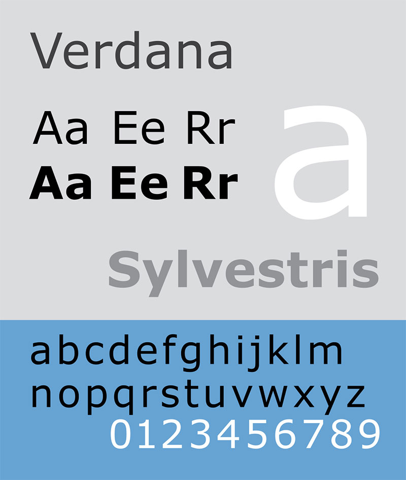
Verdana is a humanist sans-serif font designed by Matthew Carter for Microsoft Corporation, released in 1996 as part of the Core Fonts for the Web collection, with hinting by Thomas Rickner. It was built specifically to address on-screen readability at low pixel densities.
Verdana optimizes subtitle legibility on low-resolution and small mobile screens because its wider letterforms and larger x-height maintain character distinction even when rendered at 8pt–12pt.
What makes Verdana suitable for subtitles?
Verdana has one of the highest x-height-to-cap-height ratios of any web-safe font, and its letterforms are intentionally wide to account for pixel-grid alignment on early computer displays.
Its wide character spacing reduces inter-character collision at small sizes, a direct advantage for mobile subtitle rendering below 720p. IKEA used Verdana as their corporate typeface until 2019, demonstrating its reliability at both large-scale and small-scale text display.
| Attribute | Value |
| Classification | Humanist sans-serif |
| Designer | Matthew Carter for Microsoft, 1996 |
| Weight range | Regular, Bold (basic); Verdana Pro extends to 20 styles |
| Variable font | No |
| Recommended sizes | 8px–16px for small-screen subtitle tracks |
| Letter-spacing default | Wide (intentional) |
| License | Commercial (bundled with Windows and macOS) |
| Available on | Microsoft, Apple (bundled) |
| Price | Free (bundled); Verdana Pro requires a paid license |
How does Verdana perform at subtitle rendering?
Verdana’s pixel-oriented design makes it the strongest performer among web-safe fonts on screens below 1080p, particularly on Android devices with 1× pixel density.
Its wider character widths mean subtitle lines take up more horizontal space, which can cause line-wrapping issues in narrow caption containers. This is a known trade-off.
What are the best pairings for Verdana in subtitles?
Verdana pairs with Georgia (its designed companion font) for documentary and educational video where a serif/sans contrast is needed within the same video UI. It also pairs with Trebuchet MS for a consistent Microsoft-ecosystem subtitle system across older broadcast hardware.
What are the limitations of Verdana for subtitles?
Verdana’s wide letter-spacing is a liability at larger subtitle sizes (20px+) where it can feel loose and disconnected. The base family offers only two weights (Regular and Bold), which limits hierarchy control compared to fonts with 6–9 weight steps.
Verdana — Recommended Use Cases Within Subtitle Design
- Best for: Low-resolution mobile video, older broadcast hardware, accessibility-focused caption tracks
- Avoid for: High-end film subtitles at large sizes where wide spacing looks unpolished
- Optimal weight: Regular for body; Bold for speaker labels
- Optimal size range: 12px–18px on mobile; up to 20px on standard displays
—
Montserrat
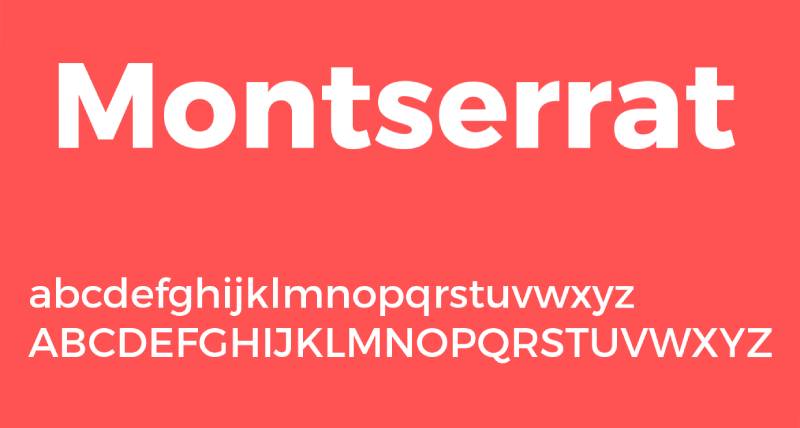
Montserrat is a geometric sans-serif typeface designed by Julieta Ulanovsky, created in 2010 and published via Google Fonts in 2011 under the OFL. It was inspired by urban signage from the Montserrat neighbourhood of Buenos Aires.
Montserrat suits short-form social media subtitle use because its bold geometric forms and high stroke contrast stay legible on small mobile screens even at reduced sizes. Submagic’s analysis of 2 million videos ranked Montserrat Bold as the single most-used subtitle font by video creators in 2025–2026.
What makes Montserrat suitable for subtitles?
Montserrat has strong geometric stroke weight and clearly defined letterforms at heavy weights (Bold 700, ExtraBold 800). These attributes maintain contrast on busy video backgrounds without requiring a text outline or drop shadow.
It supports 18 styles and a variable font axis, giving creators full weight control in a single font file. At Bold weight, it performs particularly well in all-caps short bursts, though all-caps extended subtitle lines reduce readability.
| Attribute | Value |
| Classification | Geometric sans-serif |
| Designer | Julieta Ulanovsky, 2010/2011 |
| Weight range | Thin 100 – Black 900 (18 styles) |
| Variable font | Yes |
| Recommended sizes | 14px–20px for subtitle body; Bold at 16px+ for impact |
| Letter-spacing default | Slightly wide |
| License | OFL — free for personal and commercial use |
| Available on | Google Fonts |
| Price | Free |
How does Montserrat perform at subtitle rendering?
Montserrat Bold and ExtraBold hold up on mobile screens at 14px+, with strong contrast that reduces the need for background boxes in short-form video. Its geometric curves render crisply on both retina and standard displays.
At lighter weights (Regular 400 and below), Montserrat loses its on-screen presence and becomes harder to read over busy video backgrounds without a semi-transparent backdrop.
What are the best pairings for Montserrat in subtitles?
Montserrat pairs with Lora for hybrid video layouts where title cards use serif type. Within short-form platforms, it is most often used as a standalone caption font without pairing. For more combinations, the Montserrat pairing guide covers structured use cases.
What are the limitations of Montserrat for subtitles?
Montserrat’s geometric construction produces less character distinction than humanist alternatives like Open Sans or Verdana, particularly between characters like I, l, and 1. It is not ideal for extended subtitle reading (10+ caption lines in sequence) at Regular weight.
Montserrat — Recommended Use Cases Within Subtitle Design
- Best for: TikTok, Instagram Reels, YouTube Shorts, brand video subtitles
- Avoid for: Long-form documentary subtitles at Regular weight; all-caps extended lines
- Optimal weight: Bold 700 for primary subtitle text; ExtraBold 800 for high-impact moments
- Optimal size range: 16px–22px for mobile-first content
—
Atkinson Hyperlegible

Atkinson Hyperlegible is a grotesque sans-serif typeface developed by Applied Design Works for the Braille Institute of America, released in 2019 under the SIL Open Font License. It maximizes character distinction specifically to serve viewers with low or impaired vision.
Atkinson Hyperlegible works best for accessibility-first subtitle projects because it uses exaggerated letterform differences between visually similar characters, a structural approach that measurably reduces misread text. Max Deryagin, Chair of SUBTLE (the UK Subtitlers’ Association), recommends it specifically for accessible captioning.
What makes Atkinson Hyperlegible suitable for subtitles?
The typeface exaggerates differences between characters that are frequently confused: I vs l vs 1, O vs 0, b vs d vs p.
Each character is designed to be unambiguous even when rendered at small sizes or on low-contrast backgrounds. It won Fast Company’s Innovation by Design Award in 2019. In 2025, the Braille Institute released Atkinson Hyperlegible Next, adding a variable weight axis and expanded language support.
| Attribute | Value |
| Classification | Grotesque sans-serif |
| Designer | Applied Design Works for Braille Institute, 2019 |
| Weight range | Regular and Bold (static); Hyperlegible Next adds variable weight axis |
| Variable font | Yes (Atkinson Hyperlegible Next, 2025) |
| Recommended sizes | 14px–22px; effective as low as 12px for low-vision contexts |
| Letter-spacing default | Slightly wide (for character separation) |
| License | OFL — free for personal and commercial use |
| Available on | Google Fonts, Braille Institute website |
| Price | Free |
How does Atkinson Hyperlegible perform at subtitle rendering?
Atkinson Hyperlegible renders with high character clarity on both HDR and SDR displays, and its exaggerated letterform differences remain perceptible even through video compression artifacts (a real problem in streaming at lower bitrates).
Its wider character forms slightly increase line length compared to Roboto or Arial at equivalent sizes, which may require minor layout adjustments in tight subtitle containers.
What are the best pairings for Atkinson Hyperlegible in subtitles?
Atkinson Hyperlegible is typically used as a standalone caption font in accessibility contexts. When paired in multi-layer video UI, it combines with Noto Sans for multilingual caption tracks where consistent accessibility standards need to be maintained across character sets.
What are the limitations of Atkinson Hyperlegible for subtitles?
The static version offers only Regular and Bold weights, which limits hierarchy options in complex subtitle systems. Atkinson Hyperlegible Next (2025) addresses this with a variable axis, but the updated version is newer and less widely tested in production environments.
Atkinson Hyperlegible — Recommended Use Cases Within Subtitle Design
- Best for: Public broadcast accessibility, educational video, government and healthcare content
- Avoid for: Stylized brand content where a distinctive visual identity is required
- Optimal weight: Regular 400 for subtitle body; Bold for speaker labels
- Optimal size range: 14px–22px; 16px minimum recommended for compliance contexts
—
Tiresias Screenfont
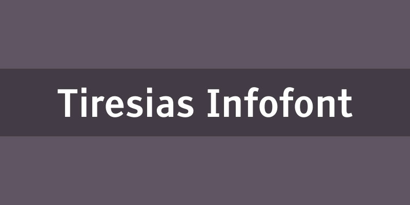
Tiresias Screenfont is a humanist sans-serif developed in 1998 by the RNIB (Royal National Institute of Blind People) scientific research unit in collaboration with Loughborough University, working with optometrists. It was created specifically for digital television subtitling and is mandated by Ofcom for UK broadcast closed captions.
Tiresias Screenfont is the leading broadcast-standard caption font for television because it was designed from the ground up for on-screen legibility at low resolution, meeting the requirements of CEA-708 and EBU STL subtitle formats.
What makes Tiresias Screenfont suitable for subtitles?
Tiresias Screenfont uses deliberately open letterforms and wide spacing, developed through testing with visually impaired viewers. Its character shapes avoid the close-set counters that reduce legibility on standard-definition television screens.
The BBC uses Tiresias Screenfont as its standard subtitle typeface. That institutional adoption reflects its position as the only font in this list specifically engineered for closed captioning rather than adapted to it.
| Attribute | Value |
| Classification | Humanist sans-serif |
| Designer | RNIB & Loughborough University, 1998 |
| Weight range | Limited (Regular; Bold in some variants) |
| Variable font | No |
| Recommended sizes | Standard broadcast caption sizes per EBU R 37 |
| Letter-spacing default | Wide |
| License | GPL v3 (Screenfont has restricted free distribution) |
| Available on | RNIB; restricted redistribution |
| Price | Free under GPL v3 with restrictions |
How does Tiresias Screenfont perform at subtitle rendering?
Tiresias Screenfont performs best in broadcast closed caption environments, particularly on standard-definition and older HD displays where its wide apertures prevent glyph collapse.
On modern 4K displays at web-standard subtitle sizes, its wider spacing can look slightly dated compared to more refined humanist sans-serifs like Open Sans or Atkinson Hyperlegible.
What are the best pairings for Tiresias Screenfont in subtitles?
Tiresias Screenfont is used as a standalone caption font in broadcast contexts. It is not commonly paired with other typefaces within video, given its specialized function as a closed caption display font.
What are the limitations of Tiresias Screenfont for subtitles?
Tiresias Screenfont has a restricted free license with limited redistribution rights, making it difficult to deploy in web-based subtitle systems outside of broadcast workflows. Its limited weight range offers only basic hierarchy control compared to variable-font alternatives.
Tiresias Screenfont — Recommended Use Cases Within Subtitle Design
- Best for: UK broadcast closed captions, Ofcom-compliant television subtitling, BBC-standard productions
- Avoid for: Web-embedded subtitle tracks, streaming platforms, social media video
- Optimal weight: Regular for all subtitle body text
- Optimal size range: Per EBU R 37 broadcast specifications
—
Noto Sans
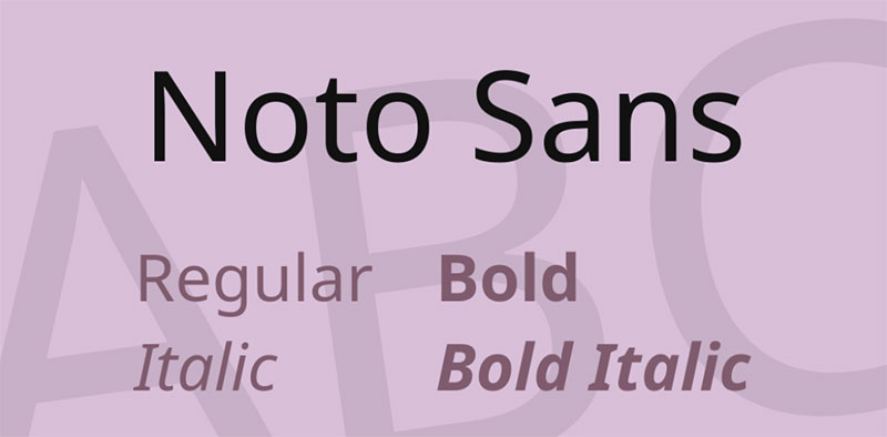
Noto Sans is a humanist sans-serif typeface developed by Google, designed to support all scripts in the Unicode standard, available free under the OFL. The name “Noto” refers to “no tofu,” meaning it eliminates the blank rectangle (tofu) that appears when a font lacks a glyph for a particular character.
Noto Sans works best for multilingual and global subtitle content because it provides consistent typographic rendering across Latin, Cyrillic, Arabic, Devanagari, CJK, and dozens of other scripts within a single coordinated family.
What makes Noto Sans suitable for subtitles?
Noto Sans covers over 1,000 languages and 150 writing systems. For subtitle tracks that need to render correctly across multiple character sets in a single file, there is no comparable alternative at the same price point (free).
Its Latin version has a humanist structure with open apertures and moderate x-height, performing on par with Open Sans in terms of Latin subtitle legibility. The main subtitle advantage is consistency: IKEA adopted a customized Noto Sans derivative (Noto IKEA) for its global signage in 2019, illustrating the font’s reliability across scripts at both display and caption sizes.
| Attribute | Value |
| Classification | Humanist sans-serif |
| Designer | Google (multiple contributors) |
| Weight range | Thin 100 – Black 900 (variable font available) |
| Variable font | Yes |
| Recommended sizes | 14px–22px for subtitle tracks |
| Letter-spacing default | 0 |
| License | OFL — free for personal and commercial use |
| Available on | Google Fonts |
| Price | Free |
How does Noto Sans perform at subtitle rendering?
Noto Sans renders Latin script cleanly at standard subtitle sizes, but its primary advantage is cross-script consistency. For productions distributing subtitle tracks in 5+ languages, using Noto Sans across all tracks ensures visual coherence regardless of script.
For Latin-only subtitle tracks, Roboto or Open Sans offer slightly more refined hinting at small sizes.
What are the best pairings for Noto Sans in subtitles?
Noto Sans pairs with Noto Serif for multilingual title card systems. Within a Latin-focused video UI, it pairs well with Open Sans for body text where Noto Sans handles multilingual caption overflow.
What are the limitations of Noto Sans for subtitles?
The Noto family is distributed as separate files per script, which adds complexity to subtitle system setup when multiple writing systems need to be loaded. For Latin-only projects, it offers no meaningful advantage over Roboto or Open Sans.
Noto Sans — Recommended Use Cases Within Subtitle Design
- Best for: Global streaming platforms, multilingual subtitle tracks, content distributed across 5+ languages
- Avoid for: Single-language Latin subtitle tracks where a more refined option is available
- Optimal weight: Regular 400 for body; SemiBold 600 for speaker labels
- Optimal size range: 14px–20px
—
Lato

Lato is a humanist sans-serif designed by Łukasz Dziedzic and released in 2010 by his foundry tyPoland, available under the OFL. “Lato” means “Summer” in Polish. The typeface balances geometric structure with subtle humanist warmth, particularly visible in its semi-rounded letterforms.
Lato suits documentary and educational subtitle use because its clean construction and neutral tone create a professional reading experience across extended caption sequences. It is used by over 11 million websites and consistently ranks among the top-10 most-served Google Fonts.
What makes Lato suitable for subtitles?
Lato has a moderate x-height with semi-rounded terminals that reduce the mechanical coldness common in geometric sans-serifs. This produces a slightly warmer visual tone without sacrificing legibility, which works particularly well for educational and interview-style video.
It supports 5 weights (plus matching italics), including a Hairline style and a Heavy weight, giving enough hierarchy range for subtitle body text and speaker labels within a single family.
| Attribute | Value |
| Classification | Humanist sans-serif |
| Designer | Łukasz Dziedzic, 2010 |
| Weight range | Thin 100 – Black 900 (18 styles including italics) |
| Variable font | No |
| Recommended sizes | 14px–22px for subtitle tracks; 16px+ for body |
| Letter-spacing default | 0 (Slightly open and approachable) |
| License | OFL (Free for personal and commercial use) |
| Available on | Google Fonts, Adobe Fonts, Fontsource |
| Price | Free |
How does Lato perform at subtitle rendering?
Lato renders cleanly across screen types with consistent stroke weight at subtitle sizes. Its semi-rounded terminals give it good performance on lower-contrast backgrounds without requiring a drop shadow in most contexts.
At small sizes below 14px, Lato’s humanist curves can lose definition on 1× density displays. Lato is not a variable font, which limits weight-axis control in modern responsive video players. For Lato pairing options, humanist serifs like Merriweather create strong hierarchy contrast.
What are the best pairings for Lato in subtitles?
Lato pairs with Merriweather for documentary productions that use serif title cards alongside sans-serif caption text. It also combines with Roboto in UI-heavy video platforms where Lato handles captions and Roboto manages interface labels. The Lato pairing guide covers more specific combinations.
What are the limitations of Lato for subtitles?
Lato is not available as a variable font, which is a growing limitation as web video players move toward variable-font subtitle rendering for performance. Below 14px on 1× density screens, its humanist curves render less crisply than Roboto or Open Sans at equivalent sizes.
Lato — Recommended Use Cases Within Subtitle Design
- Best for: Documentary subtitles, educational video, interview and talking-head content
- Avoid for: Variable-font-dependent web video systems; sizes below 14px on mobile
- Optimal weight: Regular 400 for body; Bold 700 for speaker labels or emphasis
- Optimal size range: 16px–22px for standard subtitle tracks
What Makes a Font Readable in Subtitle Contexts?
Not every typeface works on screen. A font that looks clean in print can collapse into an unreadable smear at 16px over a moving background, especially on compressed video streams where artifacts blur fine details.
A 2022 University of South Florida study found that sans-serif fonts increase subtitle reading speed by 12% compared to serif fonts in video environments. That single finding explains why every major platform, from YouTube to BBC, defaults to sans-serif caption typography.
How x-height affects subtitle legibility at small sizes
X-height is the ratio of a lowercase letter’s height to its cap height. For subtitle use, a ratio between 0.65 and 0.75 is ideal.
Fonts with high x-height, like Verdana and Atkinson Hyperlegible, keep lowercase characters visually large even at 14px. That means viewers spend less cognitive effort distinguishing letters and more attention on the content itself.
- Verdana x-height ratio: ~0.55 (wide, intentionally large)
- Roboto x-height ratio: ~0.53 (moderate, clean rendering)
- Atkinson Hyperlegible x-height ratio: ~0.54 (optimized for distinction)
Stroke weight consistency matters equally. Fonts with uniform stroke width, like Arial or Roboto, avoid thin strokes that disappear on compressed streams at lower bitrates (common below 2Mbps on mobile networks).
Why stroke contrast works differently on screen than in print
High stroke contrast kills subtitle legibility. Typefaces like Bodoni or Didot have thin strokes that look elegant in print but render as broken lines on video at small sizes or after compression.
Sans-serif fonts with consistent stroke width hold their form through H.264 and H.265 video compression, which is why nearly every subtitle legibility standard specifies proportional sans-serif as the default font class.
| Attribute | Good for subtitles | Problematic for subtitles |
| Stroke weight | Uniform (e.g., Arial, Roboto) | High contrast (e.g., Bodoni, Didot) |
| Apertures | Open (e.g., Open Sans, Verdana) | Closed (e.g., Futura, some grotesques) |
| X-height | High 0.65–0.75 ratio | Low ratio (makes lowercase small) |
| Character distinction | l/I/1 visually different | l/I/1 identical (Arial, Roboto, Helvetica) |
The l/I/1 homoglyph problem deserves a direct call-out. Arial, Roboto, and Helvetica all render lowercase l and uppercase I as identical characters. For subtitle text where proper names, abbreviations, and numbers appear frequently, this is a real readability liability, not a theoretical one.
Atkinson Hyperlegible and Tiresias Screenfont both solve this through exaggerated character differentiation, which is exactly why they were designed specifically for display contexts.
—
How Do Subtitle Standards and Accessibility Rules Affect Font Choice?
Font choice for subtitles is not always a creative decision. For broadcast, streaming, and public-sector video, it is frequently a compliance requirement.
Subtitled videos can boost viewership by up to 40% according to Sonix research, and 80% of Netflix users activate subtitles at least once monthly. At that scale, accessibility and format compliance become structural, not optional.
Broadcast standards (BBC, EBU R 37, Ofcom)
BBC subtitle guidelines (2024 version): specify Reith Sans as the preferred authoring font for EBU-TT-D production. For Teletext-based closed captions, line length is capped at 37 fixed-width characters per line, a constraint that directly affects font choice since monospaced fonts produce predictable line widths.
Ofcom mandates Tiresias Screenfont as the standard for UK broadcast closed captions. That mandate has been in place since the font was developed by the RNIB in 1998, and it remains in force for linear television output.
EBU-TT-D (Tech 3380) is the modern XML-based subtitle format used by European public service and commercial broadcasters. It restricts font sizing to percentage values rather than pixel values, making font rendering dependent on the player’s viewport calculation rather than a fixed size.
Streaming platform guidelines (Netflix, YouTube)
Netflix’s English Timed Text Style Guide specifies Arial as a generic placeholder for the font class proportionalSansSerif, with font size defined relative to video resolution to fit 42 characters per line in white on a semi-transparent background.
The default user-facing Netflix subtitle font is Consolas, a monospaced font designed by Luc(as) de Groot for Microsoft. Consolas is a programmer’s font repurposed for caption display, which explains why it looks functional rather than typographically refined.
YouTube uses Roboto as its subtitle system font. Roboto Medium is the default weight, rendered white with a semi-transparent dark background box. The platform allows users to override font choice in accessibility settings.
Accessibility compliance requirements (WCAG 2.1, ADA, CEA-708)
WCAG 2.1 Level AA requires a minimum contrast ratio of 4.5:1 between subtitle text and its background. For large text (18pt+ or 14pt bold), the threshold drops to 3:1.
In April 2024, the US Department of Justice published a final rule requiring state and local government web content to comply with WCAG 2.1 Level AA within three to four years, a mandate that directly affects subtitle contrast and font weight requirements for public-sector video.
- CEA-708 (US digital closed captions): 32 characters per line maximum
- Section 508: requires sans-serif fonts on display screens at 3/16 inch minimum cap height
- ADA: at least one mode of characters on display screens must use sans-serif classification
These requirements are not optional for regulated content. A font that fails contrast requirements at a given weight is a compliance problem, not just an aesthetic one.
—
How Does Screen Type and Video Format Change the Right Font?
The best subtitle font for a Netflix drama is not the best subtitle font for a TikTok clip. Screen size, resolution, compression level, and viewing distance all change which typographic attributes matter most.
According to Sonix research, 70% of Americans now watch content with subtitles. Of those, the majority watch on mobile, where viewing distance is shorter and screen resolution varies more widely than on television.
Font selection for mobile and short-form video
Submagic’s analysis of 2 million videos found Montserrat Bold ranked as the most-used subtitle font for short-form content in 2025–2026. Its geometric weight holds contrast on small screens without requiring a background box in most lighting conditions.
For short-form vertical video (1080×1920): minimum font size is 48px on a 1080p base, according to OpusClip’s best practices guide. At that size, Montserrat Bold and Roboto Medium both render cleanly. Below 48px on mobile, only high x-height humanist fonts remain legible.
85% of social media videos are watched without sound (Facebook data), which makes caption legibility directly tied to viewer retention. If the font fails at 5 seconds into a clip, the viewer is gone.
Font selection for broadcast and streaming at HD/4K
At 1080p and 4K, the font rendering pipeline is different. Modern high-DPI displays (2× retina and above) do not depend on hinting for clean rendering, which means fonts like Helvetica Neue and Roboto perform consistently without the pixel-grid compromises required on 1× displays.
| Context | Recommended font | Why |
| Short-form mobile (TikTok, Reels) | Montserrat Bold | High weight holds on small screens |
| YouTube / web video | Roboto Medium | Platform default, optimized hinting |
| Broadcast TV (UK) | Tiresias Screenfont | Ofcom mandated, low-res optimized |
| Netflix / premium streaming | Arial (proportionalSansSerif) | Platform spec default |
| Multilingual global content | Noto Sans | 1,000+ language coverage, no glyph gaps |
Multilingual subtitle tracks introduce a separate problem. SRT and VTT files reference font family names but do not embed the font. If a viewer’s device lacks the specified font for a given script (Arabic, Devanagari, CJK), the rendering falls back to a system default, often producing inconsistent glyph sizes across languages. Noto Sans is the only free option that eliminates this across 150+ writing systems.
—
What Font Size, Weight, and Spacing Settings Produce the Best Subtitle Legibility?
Font choice is only part of the equation. The wrong size, weight, or spacing setting can make even the best subtitle font difficult to read.
A practical sizing rule from legibility research: subtitle text should occupy roughly 1/20 to 1/30 of the vertical video height. For 1080p, that translates to a rendered line height of 36–54px inclusive, with visual font size at 24–36px depending on player scaling.
Recommended size and weight by platform
Mobile-first (vertical 1080×1920): 48px minimum, Bold 700 weight, white text, dark semi-transparent background box.
Standard web video (16:9, 1080p): 22–36px rendered size, Regular 400 to Medium 500, with a 2–4px dark stroke or drop shadow for contrast over variable backgrounds.
Broadcast (Teletext / EBU-TT): font size defined as a percentage of video cell resolution, not pixels. Minimum 5% cell height per EBU-TT default style definitions.
- Maximum characters per line: 42 (Netflix), 37 (BBC Teletext, EBU), 32 (CEA-708 US broadcast)
- Optimal reading rate: approximately 21 characters per second (Video Tap guidelines)
- Line height: 1.2–1.4× font size for comfortable reading across devices
Letter-spacing adjustments are rarely needed at Regular weight. Adding +0.02em can improve legibility on heavily compressed streams (below 1.5Mbps) where character edges blur, but it increases line length and may trigger unwanted line breaks in narrow subtitle containers.
Regarding font spacing: the default tracking for most subtitle-optimized fonts is 0, and it should stay there unless you are specifically compensating for compression artifacts or rendering on very low-DPI screens.
Background treatment options for subtitle contrast
Three approaches. Each has a specific use case:
Drop shadow: Netflix’s default for burned-in captions. White text, subtle black drop shadow at 1–2px offset. Works well on dark-to-medium backgrounds. Fails on light or overexposed scenes.
Text outline: 2–4px dark stroke around white text. More robust than drop shadow across varying backgrounds. Common in social media captioning tools like CapCut. Adds visual weight, so avoid at Bold 700 or heavier.
Semi-transparent background box: The most reliable option for accessibility compliance. A black box at 50–75% opacity behind white text. Guarantees contrast ratio regardless of background video content. BBC and EBU-TT both support and recommend this approach for closed captions.
—
How Do Subtitle Fonts Perform Differently Across Video Editing and Captioning Tools?
A font that looks correct in your editing software may render differently in the final export, on the streaming platform, or on the viewer’s device. Each tool handles font embedding and rendering differently.
The global AI subtitle generation market was valued at USD 1.03 billion in 2023 and is projected to reach USD 7.42 billion by 2032 (Sonix research), reflecting how much of subtitle production has shifted to software-driven workflows where font handling is largely automated.
Professional video editing tools (Premiere Pro, DaVinci Resolve, After Effects)
Adobe Premiere Pro and After Effects render burned-in subtitles using the system font renderer. Any font installed on the system can be applied to subtitle tracks. For exported SRT files, font styling is stripped; only the text and timing remain.
If you work in DaVinci Resolve, see the guide on how to add fonts to DaVinci Resolve to install subtitle-specific fonts like Atkinson Hyperlegible or Noto Sans before beginning a caption project. Font assignment in Resolve’s subtitle inspector applies per-track, not per-clip.
| Tool | Font scope | Export behavior |
| Adobe Premiere Pro | System fonts | Burned-in only; SRT strips styling |
| DaVinci Resolve | System fonts | Per-track assignment; renders on export |
| After Effects | System fonts (AE renderer) | Burned-in; full styling preserved |
| Adobe Premiere (SRT export) | N/A | Platform renders its default font |
Font licensing matters most at this stage. Burning a commercially licensed font into a distributed video constitutes an embedding use case. Many desktop font licenses do not cover video embedding. Always verify the license before burning a custom font into commercial content. OFL-licensed fonts (Roboto, Open Sans, Montserrat, Atkinson Hyperlegible, Noto Sans, Lato) are all safe for this use.
Consumer and online captioning tools (CapCut, iMovie, VEED, Kapwing)
CapCut’s subtitle editor supports a curated library of system and bundled fonts. For custom fonts, the guide on how to add fonts to CapCut covers the import process on both iOS and Android, where font installation is handled through the app rather than the operating system.
iMovie has limited subtitle font customization. For anyone editing primarily in iMovie, the guide on how to add fonts to iMovie explains what is and is not possible within the application’s constraints. The short version: iMovie uses system fonts for titles but does not support custom subtitle styling through its standard subtitle tool.
Online tools like VEED and Kapwing generate styled captions as burned-in overlays. Both support Roboto, Open Sans, and Montserrat from their default libraries. Kapwing’s subtitle generator, specifically, uses Roboto as its default weight with a drop shadow, matching YouTube’s visual standard.
—
How Does Font Choice Affect Subtitle Readability for Viewers With Visual Impairments?
Accessibility-focused subtitle typography follows different design logic than general legibility. The goal is not just readability for average-vision viewers. It is ensuring that viewers with low vision, dyslexia, or color vision deficiency can follow the caption track without additional effort.
According to the World Health Organization, at least 2.2 billion people globally have a near or distance vision impairment. For streaming platforms serving global audiences, that represents a substantial portion of the subtitle user base.
Atkinson Hyperlegible and its design methodology
Atkinson Hyperlegible was developed by Applied Design Works for the Braille Institute of America in 2019. Its core design principle: exaggerate differences between visually similar characters rather than simply simplifying letterforms.
Characters that are traditionally problematic, specifically I vs l vs 1, O vs 0, and b vs d vs p, are made unambiguous through deliberate shape variation. Max Deryagin, Chair of SUBTLE (the UK Subtitlers’ Association), recommends it specifically for accessible captioning contexts.
In 2025, the Braille Institute released Atkinson Hyperlegible Next, which adds a variable weight axis and expanded character support for more languages. The original version offers only Regular and Bold, which limited its hierarchy options in complex subtitle systems. The 2025 update addresses that directly.
Tiresias Screenfont and low-vision testing
Tiresias Screenfont was developed in 1998 through collaboration between the RNIB scientific research unit and Loughborough University, with optometrists involved in design review. It was tested with visually impaired viewers throughout development, a process that almost no other subtitle font can claim.
The BBC adopted it as the standard subtitle font for UK broadcast and it remains Ofcom-mandated for closed captions on linear television. Its wide spacing and open letterforms are specifically tuned for standard-definition television rendering, where low resolution is the primary legibility challenge.
Dyslexia-friendly attributes and color vision considerations
For dyslexic viewers, the key font attributes in subtitle contexts are consistent baseline, open counters, and wider tracking. None of the top 10 fonts in this article were specifically designed for dyslexia, but Open Sans, Atkinson Hyperlegible, and Verdana come closest to meeting those structural requirements.
For a broader look at how these attributes apply across use cases, see the guides on fonts for dyslexia and fonts for accessibility, which cover typeface selection principles that apply directly to caption design decisions.
Color vision deficiency affects approximately 8% of men and 0.5% of women globally. For subtitle contrast, this means font color choices cannot rely on color alone. White text on a semi-transparent dark background box passes contrast requirements for all major color vision deficiency types. Yellow text (used in some European subtitle traditions) can fail for viewers with tritanopia.
The practical takeaway: font choice and background treatment are interdependent for accessibility compliance. A high-legibility font with poor contrast treatment fails the same viewers it was designed to help.
FAQ on The Best Fonts For Subtitles
What is the most readable font for subtitles?
Roboto and Arial consistently rank as the most readable subtitle fonts across screen sizes. Both are sans-serif typefaces with open apertures, consistent stroke weight, and strong rendering at small sizes, making them reliable defaults for most video contexts.
What font does Netflix use for subtitles?
Netflix uses Consolas as its default subtitle font. Its Timed Text Style Guide specifies Arial as a generic placeholder for the proportionalSansSerif font class, with font size scaled relative to video resolution to fit 42 characters per line.
What font does YouTube use for subtitles?
YouTube uses Roboto Medium as its default caption font. It renders white text with a semi-transparent dark background box. Roboto was designed by Google as the Android system font and is optimized for on-screen legibility across all device sizes.
Are serif fonts good for subtitles?
Generally, no. A 2022 University of South Florida study found sans-serif fonts increase subtitle reading speed by 12% compared to serif fonts in video environments. Serif strokes collapse under video compression, reducing legibility at typical caption sizes.
What font size should subtitles be?
For web video at 1080p, rendered subtitle size should fall between 24px and 36px. For vertical mobile video at 1080×1920, use a minimum of 48px. Broadcast standards like EBU-TT define size as a percentage of video cell resolution rather than fixed pixel values.
What is the best font for closed captions?
Tiresias Screenfont is the standard for broadcast closed captions in the UK, mandated by Ofcom. For web-based closed captions, Atkinson Hyperlegible and Roboto are strong alternatives, both offering high character distinction and strong contrast at small sizes.
What font is best for subtitles on social media?
Montserrat Bold is the top-performing subtitle font for short-form social video. Submagic’s analysis of 2 million videos ranked it first. Its geometric weight holds legibility on mobile screens without requiring a background box, making it ideal for TikTok, Reels, and Shorts.
Should subtitle fonts be bold?
Not always. Regular 400 weight works for most subtitle body text. Bold 700 suits speaker labels or emphasis. At very small sizes or on busy video backgrounds, Medium 500 often performs better than Bold, which can appear heavy and reduce character spacing clarity.
What makes a font accessible for subtitles?
An accessible subtitle font distinguishes visually similar characters like I, l, and 1, meets WCAG 2.1’s 4.5:1 contrast ratio requirement, and maintains legibility at small sizes. Atkinson Hyperlegible was specifically designed for this purpose and is recommended by professional subtitlers.
Can I use any font for subtitles?
Technically yes, but practically no. Display fonts, script fonts, and high-contrast serif typefaces lose legibility under video compression. Font licensing also applies when burning fonts into distributed video. OFL-licensed fonts like Open Sans, Roboto, and Noto Sans are safe for commercial subtitle use.
Conclusion
This conclusion is for an article presenting the best fonts for subtitles, and the core takeaway is straightforward: subtitle font choice is a technical decision, not just a visual one.
Roboto and Arial handle most streaming and web video contexts reliably. Tiresias Screenfont and Atkinson Hyperlegible serve broadcast and accessibility requirements where character distinction and contrast compliance are non-negotiable.
Platform matters. Short-form video on Reels or Shorts calls for Montserrat Bold at 48px minimum. Multilingual caption tracks need Noto Sans to avoid glyph gaps across writing systems.
Get the x-height, stroke weight, and contrast ratio right, and your subtitles will work across closed captions, open captions, and web video without adjustment.
The best caption typography is the kind viewers never notice. That’s the standard worth aiming for.

Renowned for his expertise in logo design and visual branding, Bogdan has developed a multitude of logos for various clients.
His skills extend to creating posters, vector illustrations, business cards, and brochures. Additionally, Bogdan's UI kits were featured on marketplaces like Visual Hierarchy and UI8.
He also wrote in the past years on sites like Design Your Way, WebDesignerDepot, WPDean, Designmodo, Speckyboy, Slider Revolution, and more.
- Death Note Font Generator - 26 October 2026
- 5 Best AI Presentation Makers: Tested & Compared - 26 October 2026
- Versatile Georgia Font Pairing for Timeless Layouts - 24 October 2026

Bogdan Sandu is a seasoned designer who has been designing websites since 2008. Renowned for his expertise in logo design and visual branding, Bogdan has developed a multitude of logos for various clients. His skills extend to creating posters, vector illustrations, business cards, and brochures. Additionally, Bogdan's UI kits were featured on marketplaces like Visual Hierarchy and UI8. He also wrote in the past years on sites like Design Your Way, WebDesignerDepot, WPDean, Designmodo, Speckyboy, Slider Revolution, and more.
You Might Also Like