Most font combinations look fine. A few actually work. And when it comes to Merriweather font pairing, the right choice can be the difference between a site that reads effortlessly and one that quietly frustrates your visitors.
Merriweather is a screen-optimized serif font designed by Eben Sorkin. Its large x-height and open counters make it one of the most readable body text choices on Google Fonts. But it needs the right companion to build proper typographic hierarchy.
This guide covers the 10 best fonts to pair with Merriweather, with recommended weights, use cases, and ready-to-use CSS for each combination.
Best Merriweather Font Pairings
Merriweather is a serif font designed by Eben Sorkin in 2010, built specifically for screen readability. Its large x-height, open counters, and sturdy strokes make it one of the most reliable body text choices on Google Fonts.
Knowing how to pair fonts well matters. The right companion shapes your typographic hierarchy, affects readability, and sets the overall tone of your design. The wrong one creates visual tension with no payoff.
Every pairing below follows the same logic: contrast that serves the reader, not just contrast for its own sake.
Merriweather + Open Sans

Why This Pairing Works
Both fonts were built with screen readability as the main goal. Open Sans is a sans-serif font with humanist proportions that match Merriweather’s generous x-height naturally.
The structural contrast between the two is clean and functional. Merriweather’s serifs create a clear visual separation from Open Sans’s smooth, open forms. Nothing feels forced here.
Best Use Cases
- Long-form blogs and editorial sites
- Marketing landing pages
- Documentation and knowledge bases
- Corporate and professional websites
How to Use It (Weights and Roles)
Merriweather Bold (700) works for H1 and H2 headings. Open Sans Regular (400) handles body text. Open Sans SemiBold (600) works well for subheadings and inline labels.
Suggested CSS Setup
@import url('https://fonts.googleapis.com/css2?family=Merriweather:wght@700&family=Open+Sans:wght@400;600&display=swap');
h1, h2, h3 { font-family: ‘Merriweather’, serif; font-weight: 700; } body, p { font-family: ‘Open Sans’, sans-serif; font-weight: 400; line-height: 1.75; }
When to Avoid It
Skip this combo for fashion, luxury, or editorial projects where you need a stronger typographic personality. Both fonts are functional and neutral. That’s a strength for utility-driven sites, but it can feel flat in brand-forward contexts.
Merriweather + Lato

Why This Pairing Works
Lato is a humanist sans-serif with a warm, approachable feel. It shares that same warmth with Merriweather, so the two feel like they belong together without being identical.
The font spacing in Lato is slightly looser than Open Sans, which gives body text a more relaxed rhythm. Good for content-heavy sites where readers spend a lot of time on the page.
Best Use Cases
- Personal blogs and writing portfolios
- Educational platforms
- Health and wellness sites
- Non-profit and informational websites
How to Use It (Weights and Roles)
Merriweather Regular (400) as body text, Lato Black (900) or Bold (700) for headings. This reversal works well when you want lighter body copy with bold, punchy headings. Lato Light (300) works nicely for captions and secondary text.
Suggested CSS Setup
@import url('https://fonts.googleapis.com/css2?family=Lato:wght@700;900&family=Merriweather:wght@400&display=swap');
h1, h2, h3 { font-family: ‘Lato’, sans-serif; font-weight: 700; } body, p { font-family: ‘Merriweather’, serif; font-weight: 400; line-height: 1.8; }
When to Avoid It
Both fonts lean casual and friendly. If your project calls for a more authoritative or editorial tone, this combination might not carry enough weight. Consider Merriweather + Oswald instead.
Merriweather + Roboto

Why This Pairing Works
Roboto was created by Google for Android, and Merriweather was built for Google Fonts. They share the same design environment, which shows. Both fonts prioritize screen performance, and the digital-first approach means they load and render well together.
Roboto is slightly more mechanical than Lato or Open Sans, which gives this pairing a cleaner, more technical feel. The contrast between Roboto’s neo-grotesque structure and Merriweather’s warm serifs is restrained but clear.
Best Use Cases
- SaaS product sites and documentation
- Government and institutional websites
- Long-form journalism and news sites
- Developer blogs and technical content
How to Use It (Weights and Roles)
Roboto Bold (700) for headings, Merriweather Regular (400) for body text. Merriweather Light (300) works well for figure captions. This setup is one of the most widely used font combinations on the web.
Suggested CSS Setup
@import url('https://fonts.googleapis.com/css2?family=Merriweather:wght@300;400&family=Roboto:wght@500;700&display=swap');
h1, h2, h3 { font-family: ‘Roboto’, sans-serif; font-weight: 700; } body, p { font-family: ‘Merriweather’, serif; font-weight: 400; line-height: 1.75; }
When to Avoid It
If your design needs warmth or personality, this pairing can feel a bit cold. It’s reliable and functional, but it won’t win design awards. Not a great fit for lifestyle brands or creative agencies.
Merriweather + Montserrat

Why This Pairing Works
Montserrat is a geometric sans-serif built on circles and straight lines. Merriweather is an organic, humanist serif. That difference in construction is exactly what makes this combination work.
The contrast in structure creates clear typographic hierarchy without needing extreme size differences. Montserrat’s bold uppercase headings read as distinctly different from Merriweather’s warm body text.
Best Use Cases
- Brand landing pages
- Tech startup websites
- Portfolio sites
- Magazines and editorial layouts
How to Use It (Weights and Roles)
Montserrat SemiBold (600) for H1/H2, Montserrat Regular (400) for navigation and UI labels. Merriweather Regular (400) for body text. Add Montserrat Bold (700) for buttons and CTAs if needed. Keep it to three weights maximum to avoid extra load time.
Suggested CSS Setup
@import url('https://fonts.googleapis.com/css2?family=Merriweather:wght@400&family=Montserrat:wght@400;600;700&display=swap');
h1, h2, h3 { font-family: ‘Montserrat’, sans-serif; font-weight: 600; letter-spacing: 0.01em; } body, p { font-family: ‘Merriweather’, serif; font-weight: 400; line-height: 1.75; }
When to Avoid It
Don’t use this combination for minimalist or text-heavy designs where subtlety matters. The geometric-versus-organic contrast is a bit bold. It can overpower quieter, more understated layouts.
Merriweather + Source Sans Pro
Why This Pairing Works
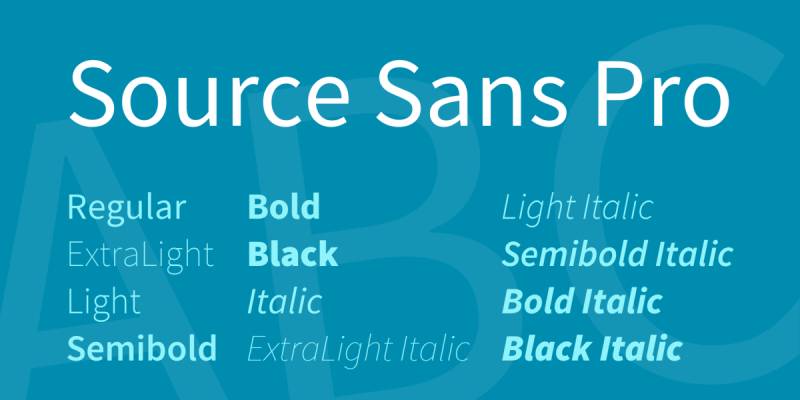
Source Sans Pro is Adobe’s first open-source typeface. It was designed by Paul D. Hunt for user interface environments, which gives it a clean, neutral structure that sits quietly under headings.
Merriweather and Source Sans Pro have compatible x-heights, which means you don’t need to fight with size adjustments to make them look balanced. They just work together out of the box.
Best Use Cases
- Corporate websites and intranets
- Product documentation
- News and content platforms
- Annual reports and white papers
How to Use It (Weights and Roles)
Merriweather Bold (700) for headings, Source Sans Pro Regular (400) for body text. Source Sans Pro SemiBold (600) works for navigation and secondary labels. This is a very clean setup, especially for content-dense layouts.
Suggested CSS Setup
@import url('https://fonts.googleapis.com/css2?family=Merriweather:wght@700&family=Source+Sans+Pro:wght@400;600&display=swap');
h1, h2, h3 { font-family: ‘Merriweather’, serif; font-weight: 700; } body, p { font-family: ‘Source Sans Pro’, sans-serif; font-weight: 400; line-height: 1.7; }
When to Avoid It
This is a utility-focused pairing. If your site needs to stand out visually, Source Sans Pro won’t give you much personality to work with. It’s a workhorse, not a showpiece.
Merriweather + Oswald
Why This Pairing Works
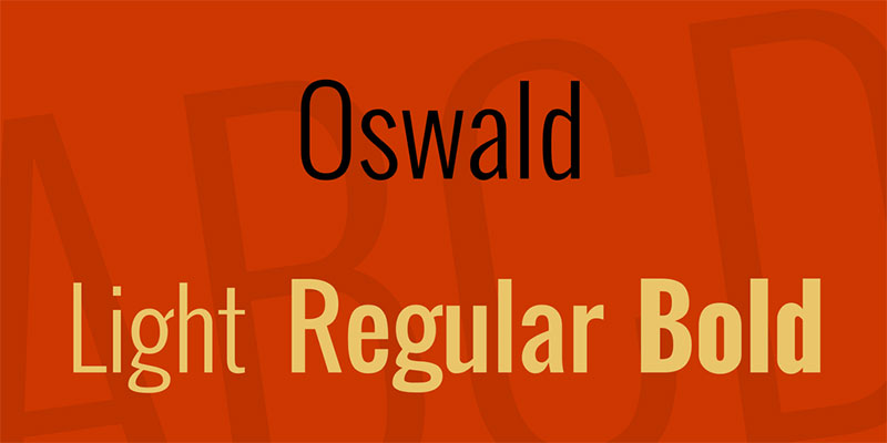
Oswald is a condensed sans-serif with strong vertical lines. That condensed structure gives Oswald-based headings a completely different visual weight from Merriweather’s wider, more relaxed letterforms.
The result is high contrast in both style and proportion. Merriweather handles body text well, and Oswald’s simple lines make Merriweather’s serifs stand out even more by comparison.
Best Use Cases
- Sports and fitness websites
- News and media publications
- Poster and print design
- E-commerce product pages
How to Use It (Weights and Roles)
Oswald Bold (700) for display headings, Merriweather Regular (400) for body text. Oswald Regular (400) works for subheadings when you want less visual punch. Never use Oswald for body text. Its condensed proportions make long passages uncomfortable to read.
Suggested CSS Setup
@import url('https://fonts.googleapis.com/css2?family=Merriweather:wght@400&family=Oswald:wght@400;700&display=swap');
h1, h2 { font-family: ‘Oswald’, sans-serif; font-weight: 700; text-transform: uppercase; letter-spacing: 0.03em; } body, p { font-family: ‘Merriweather’, serif; font-weight: 400; line-height: 1.8; }
When to Avoid It
Skip this for professional services, finance, or any brand that needs to feel refined and calm. Oswald reads loud. That’s great for editorial impact, but it can feel too aggressive in formal contexts.
Merriweather + Raleway
Why This Pairing Works
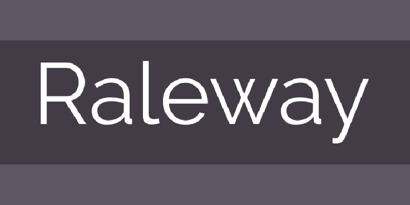
Raleway’s thin, geometric elegance sits at the opposite end of the personality scale from Merriweather’s sturdy, grounded serif. That’s exactly what makes it work. Raleway floats as a heading. Merriweather anchors the body text.
The contrast in texture is one of the most visually interesting combinations on this list. Raleway’s airy letterforms at large sizes look striking above Merriweather’s solid, readable paragraphs.
Best Use Cases
- Content-heavy blogs and magazines
- SaaS landing pages
- Corporate communication sites
- Personal portfolios with a clean aesthetic
How to Use It (Weights and Roles)
Raleway Light (300) or Regular (400) for headings at large sizes (36px and above). Merriweather Regular (400) for body text. Never use Raleway Light below 24px. It becomes unreadable at smaller sizes.
Suggested CSS Setup
@import url('https://fonts.googleapis.com/css2?family=Merriweather:wght@400&family=Raleway:wght@300;400&display=swap');
h1, h2, h3 { font-family: ‘Raleway’, sans-serif; font-weight: 300; letter-spacing: 0.02em; } body, p { font-family: ‘Merriweather’, serif; font-weight: 400; line-height: 1.75; }
When to Avoid It
Avoid this combination in mobile-first designs where heading sizes are small. Raleway’s thin weights need space to breathe. On compressed screens, the visual contrast collapses and the hierarchy becomes hard to read.
Merriweather + Nunito

Why This Pairing Works
Nunito is a rounded sans-serif with soft terminals. That softness creates a friendly, warm feel that pairs well with Merriweather’s more structured, traditional serif forms. The contrast exists, but it’s gentle rather than jarring.
This combination works particularly well for brands that want to feel approachable but still professional. The rounded shapes of Nunito balance Merriweather’s slightly formal character.
Best Use Cases
- Education and e-learning platforms
- Health and wellness apps
- Children’s and family-focused content
- Community and lifestyle blogs
How to Use It (Weights and Roles)
Nunito Bold (700) or ExtraBold (800) for headings, Merriweather Regular (400) for body text. Nunito Regular (400) works well for UI labels and navigation. The weight contrast between heading and body is important here. Don’t use Nunito Regular for both.
Suggested CSS Setup
@import url('https://fonts.googleapis.com/css2?family=Merriweather:wght@400&family=Nunito:wght@400;700;800&display=swap');
h1, h2, h3 { font-family: ‘Nunito’, sans-serif; font-weight: 700; } body, p { font-family: ‘Merriweather’, serif; font-weight: 400; line-height: 1.8; }
When to Avoid It
This pairing is too soft for formal or high-stakes contexts. Finance, legal, or enterprise software sites need more visual authority than Nunito offers. The rounded terminals signal approachability, which isn’t always the right signal to send.
Merriweather + Playfair Display

Why This Pairing Works
This is a serif-on-serif combination, which usually requires careful handling. But it works here because Playfair Display is a high-contrast transitional serif with dramatic thick-thin strokes, while Merriweather is sturdy and even-stroked. The structural difference between them is large enough to create clear hierarchy.
Playfair Display as a heading creates an editorial, almost magazine-like feel. Merriweather as body text keeps things grounded and readable. Together, they read as sophisticated and considered.
Best Use Cases
- Luxury and fashion editorial sites
- Wedding and event websites
- Literary blogs and book-related content
- High-end brand identity pages
How to Use It (Weights and Roles)
Playfair Display Black (900) or Bold (700) for display headings, Merriweather Regular (400) for body text. Size contrast matters here more than in other pairings. Use a 3:1 ratio or greater between heading and body sizes to make the serif-on-serif hierarchy obvious.
Suggested CSS Setup
@import url('https://fonts.googleapis.com/css2?family=Merriweather:wght@400&family=Playfair+Display:wght@700;900&display=swap');
h1, h2 { font-family: ‘Playfair Display’, serif; font-weight: 900; } body, p { font-family: ‘Merriweather’, serif; font-weight: 400; line-height: 1.8; }
When to Avoid It
Two serifs competing at similar sizes looks like a mistake, not a choice. If your layout doesn’t give headings enough size and visual separation, this pairing breaks down fast. Also avoid it for technical or functional interfaces. It reads too decorative for utility-first products.
Merriweather + Inter

Why This Pairing Works
Inter was designed specifically for computer screens, optimized at small sizes and across different display densities. So was Merriweather. That shared design philosophy means both fonts render cleanly at any resolution, which matters a lot for multi-device web projects.
Inter’s mechanical precision sits in quiet contrast to Merriweather’s warmth. The result is a pairing that feels modern without being cold, and authoritative without being stiff. Good for web design projects that need to work everywhere.
Best Use Cases
- SaaS dashboards and product interfaces
- Developer documentation sites
- News and media platforms
- Content-heavy app landing pages
How to Use It (Weights and Roles)
Inter SemiBold (600) or Bold (700) for headings and UI labels, Merriweather Regular (400) for long-form body text. Inter Regular (400) works well for secondary text, captions, and navigation items. This is a clean three-role setup that scales well.
Suggested CSS Setup
@import url('https://fonts.googleapis.com/css2?family=Inter:wght@400;600;700&family=Merriweather:wght@400&display=swap');
h1, h2, h3 { font-family: ‘Inter’, sans-serif; font-weight: 600; } body, p { font-family: ‘Merriweather’, serif; font-weight: 400; line-height: 1.75; } nav, caption, label { font-family: ‘Inter’, sans-serif; font-weight: 400; }
When to Avoid It
Inter is a neutral, utilitarian typeface. It has very little personality on its own. For brands that need a strong typographic identity, this combination won’t express much. Use it when function matters more than character, not the other way around.
FAQ on Merriweather Font Pairing
What fonts pair best with Merriweather?
The strongest options are Open Sans, Lato, Roboto, and Montserrat. All are available on Google Fonts. Each brings a different level of contrast. Open Sans and Lato lean warm. Montserrat and Roboto lean structured. Your choice depends on the tone your project needs.
Should Merriweather be used for headings or body text?
Both work, but Merriweather really shines as body text. It was designed for on-screen reading, with a large x-height and open counters. For headings, pair it with a bold sans-serif like Montserrat or Oswald to create clear typographic hierarchy.
Is Merriweather good for web design?
Yes. It was built specifically for screen readability. The sturdy serifs and generous leading make long passages comfortable to read. It performs well across different screen sizes and resolutions, which makes it a reliable choice for content-heavy websites.
Can you pair two serif fonts with Merriweather?
You can, but it requires care. Playfair Display is the strongest option because its high-contrast strokes differ clearly from Merriweather’s even weight. Use a 3:1 size ratio minimum between heading and body to keep the hierarchy readable.
What font weight should I use for Merriweather body text?
Regular (400) is the standard for body text. It reads cleanly at 16-18px on screen. Merriweather Light (300) works for captions or secondary text. Avoid using Bold (700) for long passages. It slows reading and creates unnecessary visual tension.
Is Merriweather free to use?
Yes. It is available under the SIL Open Font License through Google Fonts. You can use it for personal and commercial projects at no cost. No font licensing fees apply. You can also modify and redistribute it freely.
What is the difference between Merriweather and Merriweather Sans?
Merriweather is a serif typeface. Merriweather Sans is its companion sans-serif, designed specifically to complement it. They share similar proportions and spacing, which makes them a natural pairing for projects that need visual consistency across headings and body text.
How do I load Merriweather and a paired font in CSS?
Use a single Google Fonts import request for both fonts. Combine them in one URL to reduce HTTP requests. Always add display=swap to prevent invisible text during loading. Load only the weights you actually use. Each unused weight adds unnecessary page load overhead.
Does Merriweather work well for print design?
It works, but it was optimized for screens. For print design, fonts like Garamond or Caslon handle ink rendering better at small sizes. Merriweather’s sturdy strokes can look slightly heavy in print. It performs better in digital editorial layouts than in physical documents.
What Google Fonts combination uses Merriweather best?
Merriweather + Open Sans is the most widely used combination on Google Fonts based on usage data. It covers the widest range of projects. Blogs, marketing sites, documentation, and corporate sites all benefit from this pairing. It’s the safest starting point if you’re unsure where to begin.
Conclusion
This article on Merriweather font pairing covered ten combinations worth using, each with a different purpose and tone.
The right font combination shapes how readers experience your content. A good pairing creates visual hierarchy, supports readability, and fits the context of the design.
Merriweather works across blogs, editorial sites, product pages, and corporate platforms. Its compatibility with both geometric and humanist sans-serif typefaces gives you real flexibility.
Start with Open Sans or Lato if you’re unsure. Move toward Montserrat or Oswald when you need stronger font contrast. Use Playfair Display only when size and spacing give it room to work.
Pick one combination, test it at your actual body text size, and adjust from there.

Renowned for his expertise in logo design and visual branding, Bogdan has developed a multitude of logos for various clients.
His skills extend to creating posters, vector illustrations, business cards, and brochures. Additionally, Bogdan's UI kits were featured on marketplaces like Visual Hierarchy and UI8.
He also wrote in the past years on sites like Design Your Way, WebDesignerDepot, WPDean, Designmodo, Speckyboy, Slider Revolution, and more.
- The Windsurf Logo History, Colors, Font, And Meaning - 10 October 2026
- How to Remove Background From Product Photos (No Photoshop) - 10 October 2026
- How Designers can Build a Stronger Online Creative Identity - 9 October 2026

Bogdan Sandu is a seasoned designer who has been designing websites since 2008. Renowned for his expertise in logo design and visual branding, Bogdan has developed a multitude of logos for various clients. His skills extend to creating posters, vector illustrations, business cards, and brochures. Additionally, Bogdan's UI kits were featured on marketplaces like Visual Hierarchy and UI8. He also wrote in the past years on sites like Design Your Way, WebDesignerDepot, WPDean, Designmodo, Speckyboy, Slider Revolution, and more.
You Might Also Like