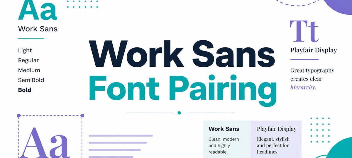
Most fonts are forgettable. Work Sans is not.
Designed by Wei Huang for Google Fonts, Work Sans is a geometric sans-serif font built for screen readability first. It is clean, neutral, and versatile enough to work across web design, branding, dashboards, and editorial layouts.
But a great font still needs the right companion. The wrong pairing kills typographic hierarchy. The right one makes everything click.
This guide covers the best Work Sans font pairing options available, from high-contrast serif combinations to modern sans-serif duos. You will learn which fonts complement its character, how to assign heading and body roles, and which weights produce the clearest results.
Whether you are building a website, a brand identity, or a content platform, there is a combination here that fits.
Work Sans Font Pairing
Work Sans + Playfair Display

What This Pairing Does
Work Sans handles body text with screen-optimized clarity. Playfair Display brings high-contrast Didone serifs to headings, creating a strong serif vs. sans-serif contrast that feels editorial and refined.
The combination works because their personalities differ just enough. One is functional and neutral. The other is expressive and dramatic.
Best Use Cases
- Fashion and lifestyle brands
- Editorial websites and blogs
- Portfolio sites and agency landing pages
How to Assign the Roles
Playfair Display as heading, Work Sans as body text. This is the standard assignment and it works well. Reversing the roles is possible for short UI copy, but Playfair struggles at small sizes.
Font Weights That Work Best
Playfair Display Bold (700) or Black (900) for hero headings. Work Sans Regular (400) for body, Work Sans Medium (500) for subheadings. This creates clear typographic hierarchy without fighting for attention.
What to Watch Out For
Playfair’s hairline strokes break down at small sizes. Keep it at 24px minimum for headings. Also, Playfair has a strong personality, so keep surrounding design elements simple to avoid a cluttered feel.
Work Sans + Merriweather
What This Pairing Does
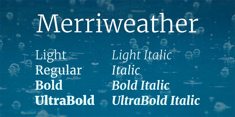
Merriweather was built for screen readability, and so was Work Sans. Both fonts share a digital-first design philosophy, which means they naturally complement each other without needing much adjustment.
The pairing feels sturdy and reliable. Good for content-heavy sites where readers spend real time on the page.
Best Use Cases
- News and publication websites
- Documentation and long-form blogs
- Corporate and professional platforms
How to Assign the Roles
Work Sans as heading, Merriweather as body. The reverse also works well. Merriweather’s slightly condensed letterforms hold up beautifully in paragraph text, while Work Sans provides clean, legible heading visual hierarchy.
Font Weights That Work Best
Work Sans SemiBold (600) or Bold (700) for headings. Merriweather Regular (400) for body. Merriweather Bold (700) works well for pull quotes and emphasized sections.
What to Watch Out For
Merriweather’s slightly condensed design can feel tight on narrow mobile screens. Bump line-height to at least 1.7 for body text. At small weights, it loses some of its authority.
Work Sans + Lora
What This Pairing Does
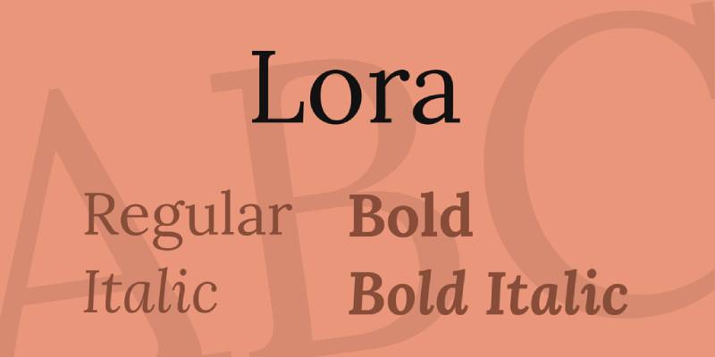
Lora is a calligraphic serif with brushed curves and driving serifs. Work Sans is clean and geometric. The contrast between the two creates a pairing that feels both warm and precise, which is harder to pull off than it sounds.
Best Use Cases
- Content platforms and editorial sites
- Creative publications and online magazines
- Branding for boutique and lifestyle businesses
How to Assign the Roles
Work Sans as heading, Lora as body text. This setup plays on Lora’s strength as a serif font built for sustained reading. Lora as heading with Work Sans body also works for a more literary, editorial tone.
Font Weights That Work Best
Work Sans Bold (700) for headings. Lora Regular (400) for body, with Lora Italic for emphasis instead of a separate bold weight. Keeps the palette clean.
What to Watch Out For
Lora’s calligraphic curves can feel ornate if the surrounding design is too decorative. Works best in layouts with plenty of white space.
Work Sans + Inter

What This Pairing Does
This is a sans-serif on sans-serif pairing. Both fonts were built for screen use, both are clean and neutral. The contrast here comes from weight and size differences rather than style differences.
It’s a very modern combination. Feels right at home in SaaS products and dashboards.
Best Use Cases
- Web apps and dashboards
- Tech startups and SaaS products
- Mobile UI and design systems
How to Assign the Roles
Work Sans for headings and labels, Inter for body text and UI copy. Alternatively, flip them. Both are versatile enough to handle either role. The key is using weight contrast to separate heading levels.
Font Weights That Work Best
Work Sans SemiBold (600) or Bold (700) for headings. Inter Regular (400) for body. Inter Medium (500) for secondary labels and navigation. This keeps the UI readable without feeling heavy.
What to Watch Out For
Because both fonts are neutral, this pairing can feel flat if weight contrast is not handled carefully. Avoid pairing both at Regular weight. Size difference alone is not always enough to create clear hierarchy.
Work Sans + Poppins
What This Pairing Does
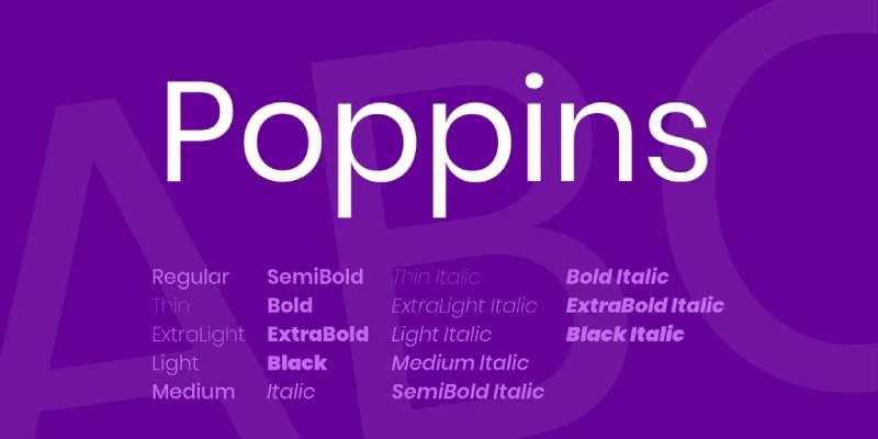
Poppins is geometric with rounded, friendly letterforms. Work Sans is more neutral and slightly grotesque in origin. Together they create contrast through personality rather than serif vs. sans-serif structure.
Best Use Cases
- Education and e-learning platforms
- Consumer apps and tech products
- Startup landing pages and SaaS marketing sites
How to Assign the Roles
Poppins for headings, Work Sans for body. Poppins’s rounded geometry grabs attention in larger sizes. Work Sans keeps body text legible and neutral. The combination is approachable without being childish.
Font Weights That Work Best
Poppins Bold (700) or SemiBold (600) for headings. Work Sans Regular (400) for body. Work Sans Light (300) works well for captions and supporting text.
What to Watch Out For
Poppins takes up more horizontal space than Work Sans. On narrow layouts, long headings can wrap unexpectedly. Check line lengths on mobile before finalizing. Also, Poppins Light can feel too thin at small sizes.
Work Sans + Roboto Mono
What This Pairing Does
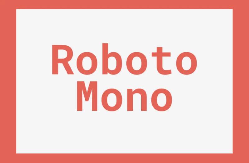
This is a functional pairing. Work Sans handles prose and headings. Roboto Mono handles code blocks, data, and technical content. The contrast between proportional and monospaced creates a clear visual separation between narrative and technical information.
Best Use Cases
- Developer documentation and technical blogs
- Design system documentation
- Data-heavy dashboards and tools
How to Assign the Roles
Work Sans for all headings, body, and UI labels. Roboto Mono strictly for code, data tables, terminal output, and technical strings. Never use Roboto Mono for long body text. It is a monospaced font built for short bursts of technical content.
Font Weights That Work Best
Work Sans Medium (500) or SemiBold (600) for headings. Work Sans Regular (400) for body. Roboto Mono Regular (400) or Light (300) for code. Bold Roboto Mono draws too much attention away from the prose.
What to Watch Out For
Roboto Mono at Regular weight looks heavier than Work Sans Regular. Adjust font size or use Light weight for Roboto Mono to balance visual weight across the page.
Work Sans + IBM Plex Serif
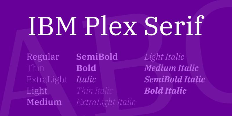
What This Pairing Does
IBM Plex Serif brings a structured, systematic serif to the pairing. Work Sans brings a clean grotesque sans-serif. The combination feels intelligent and deliberate, like something you’d find in an enterprise product or a well-funded editorial project.
Best Use Cases
- Enterprise software and B2B platforms
- Professional publications and research sites
- Finance and legal web design
How to Assign the Roles
Work Sans as the primary heading sans-serif font, IBM Plex Serif for body or long-form reading. Reversing the roles also works well, especially when the content demands a more editorial feel with strong, serif-forward headings.
Font Weights That Work Best
Work Sans SemiBold (600) for headings. IBM Plex Serif Regular (400) for body text. IBM Plex Serif Bold can add structure to subheadings without breaking the system’s consistency.
What to Watch Out For
IBM Plex Serif has a fairly specific personality rooted in IBM’s design language. It can feel corporate in contexts that call for warmth. If that’s a concern, Lora or Source Serif Pro are softer alternatives.
Work Sans + Fraunces

What This Pairing Does
Fraunces is an optical-size variable font with a softness and expressiveness that contrasts sharply with Work Sans’s neutral utility. The pairing creates the most personality-driven combination on this list.
Best Use Cases
- Food, beverage, and hospitality brands
- Creative studios and independent publications
- Branding projects that need character and warmth
How to Assign the Roles
Fraunces as heading, Work Sans as body. Fraunces is a display font at heart and performs best at large sizes. Work Sans keeps body text grounded and legible while Fraunces handles the expressive side of the pairing.
Font Weights That Work Best
Fraunces Bold or SemiBold for headings, ideally at optical size “display.” Work Sans Regular (400) for body. Work Sans Light (300) adds breathing room in editorial layouts with generous line spacing.
What to Watch Out For
Fraunces is highly stylized. Too much of it makes a design feel heavy-handed. Use it sparingly for primary headings only. In UI contexts, this pairing can feel out of place. Stick to branding and editorial work.
Work Sans + Source Serif Pro
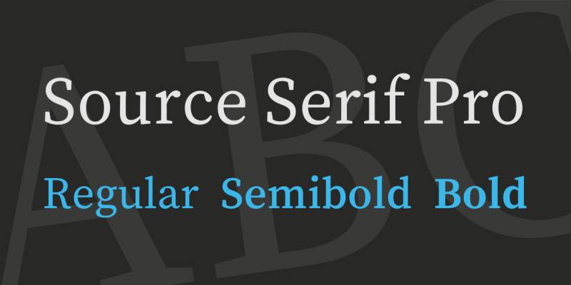
What This Pairing Does
Source Serif Pro is a transitional serif designed for long reading sessions at screen sizes. Work Sans is built for the same environment. This is a highly compatible pairing, both technically and aesthetically.
Best Use Cases
- News sites and digital magazines
- Documentation and knowledge bases
- Education platforms and online courses
How to Assign the Roles
Work Sans for headings and navigation, Source Serif Pro for body text and long-form articles. Source Serif Pro’s generous x-height makes it exceptionally readable at body sizes, which is where it belongs.
Font Weights That Work Best
Work Sans Bold (700) for main headings, SemiBold (600) for subheadings. Source Serif Pro Regular (400) for body. Available in eight weights, so there is plenty of flexibility for complex content hierarchies.
What to Watch Out For
Source Serif Pro and Work Sans can feel too similar in tone if both are used at regular weights and the same size. Make the weight contrast obvious, especially between H2 headings and body copy.
Work Sans + Libre Baskerville
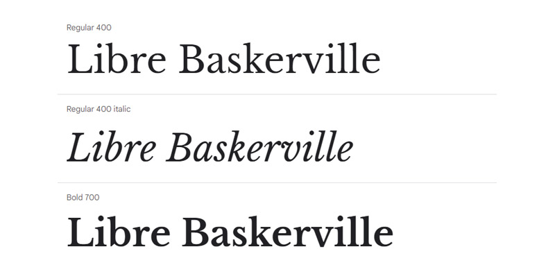
What This Pairing Does
Libre Baskerville is a web-optimized version of the classic Baskerville transitional serif. It brings historical authority and legibility to the pairing. Work Sans brings the clean, modern counterbalance.
This combination works well when you want something that feels trustworthy and established, but not stuffy.
Best Use Cases
- Legal, academic, and professional services sites
- Blogs and independent publishing
- Brand typography for established or heritage-oriented businesses
How to Assign the Roles
Work Sans as heading, Libre Baskerville as body. This is the more common setup. For a more classic feel, flip the roles and use Libre Baskerville for headings, leaning into its serif character at display sizes where it looks most authoritative.
Font Weights That Work Best
Work Sans SemiBold (600) or Bold (700) for headings. Libre Baskerville Regular (400) for body. Note that Libre Baskerville only comes in Regular and Bold, so weight options are limited compared to other fonts on this list. Use font spacing adjustments to compensate for the limited weight range.
What to Watch Out For
Libre Baskerville is available in just two weights. Plan your hierarchy around size and spacing rather than relying on weight variation. It also renders slightly heavier than Work Sans on screen, so size calibration matters.
FAQ on Work Sans Font Pairing
What fonts pair best with Work Sans?
Playfair Display, Merriweather, Lora, and IBM Plex Serif are top choices. For sans-serif combinations, Inter and Poppins work well. The best pick depends on your project. Editorial work favors serifs. UI and web apps lean toward clean sans-serif pairings.
Should Work Sans be used as a heading or body font?
Both. Work Sans handles headings cleanly at heavier weights and stays readable in body text at Regular (400). Its slightly condensed letterforms make it efficient at any size. Most designers use it as the heading font paired with a serif for body.
Does Work Sans pair well with serif fonts?
Yes, and it is one of its strongest qualities. Work Sans creates natural contrast against serifs like Lora, Source Serif Pro, and Libre Baskerville. The geometric structure of Work Sans offsets the warmth of most serif typefaces cleanly.
What is the best Work Sans pairing for websites?
Work Sans with Merriweather or Lora works well for content-heavy sites. For product and SaaS sites, Work Sans with Inter is a reliable choice. Both combinations hold up across screen sizes and produce clear typographic hierarchy.
What weights work best when pairing fonts with Work Sans?
Use Work Sans SemiBold (600) or Bold (700) for headings. Keep body fonts at Regular (400). Work Sans spans nine weights from Thin to Black, so there is room to build a full font weight system without switching typefaces.
Is Work Sans good for branding and logo design?
Yes. Its neutral, modern character makes it a solid base for brand typography. It pairs well with expressive display fonts like Fraunces for added personality. For logos, Work Sans Bold or Black delivers clean, confident results across print and screen.
Can Work Sans be paired with another sans-serif font?
Yes, but weight contrast becomes critical. Pairing Work Sans with Inter or Poppins requires clear size and weight differences to avoid a flat layout. Rely on visual hierarchy through scale rather than style contrast when combining two sans-serif fonts.
Is Work Sans available for free?
Yes. Work Sans is an open-source typeface hosted on Google Fonts, released under the SIL Open Font License. It is free for personal and commercial use. Variable font support is also available, which makes it flexible for responsive web design projects.
What makes Work Sans different from similar fonts like Inter or Roboto?
Work Sans draws from early grotesque typefaces, giving it slightly more character than the purely neutral Inter or Roboto. Its letterforms are a bit more condensed than Roboto. Designers who find Inter too mechanical often prefer Work Sans as a friendlier alternative.
How do I use Work Sans in a font pairing for mobile UI?
Use Work Sans Medium (500) or SemiBold (600) for labels and headings. Pair with Inter or Poppins for body copy. Keep font spacing generous on small screens. Work Sans’s condensed letterforms help preserve space without sacrificing readability on mobile.
Conclusion
This conclusion is for an article presenting the best Work Sans font pairing options across web design, branding, and editorial contexts.
Work Sans is one of the more flexible geometric typefaces on Google Fonts. It holds its own as a heading font and performs just as well in body text roles.
The right companion depends on your goals. Pair it with Playfair Display or Lora for editorial warmth. Reach for Inter or Poppins when building UI-first designs. Use Fraunces when the project needs personality.
Good font pairing is not just about aesthetics. It shapes how readers move through content, how hierarchy reads at a glance, and how your design feels at scale.
Work Sans makes that process easier than most. Pick your combination, set your weights, and let the typography do the work.

Renowned for his expertise in logo design and visual branding, Bogdan has developed a multitude of logos for various clients.
His skills extend to creating posters, vector illustrations, business cards, and brochures. Additionally, Bogdan's UI kits were featured on marketplaces like Visual Hierarchy and UI8.
He also wrote in the past years on sites like Design Your Way, WebDesignerDepot, WPDean, Designmodo, Speckyboy, Slider Revolution, and more.
- The Windsurf Logo History, Colors, Font, And Meaning - 10 October 2026
- How to Remove Background From Product Photos (No Photoshop) - 10 October 2026
- How Designers can Build a Stronger Online Creative Identity - 9 October 2026

Bogdan Sandu is a seasoned designer who has been designing websites since 2008. Renowned for his expertise in logo design and visual branding, Bogdan has developed a multitude of logos for various clients. His skills extend to creating posters, vector illustrations, business cards, and brochures. Additionally, Bogdan's UI kits were featured on marketplaces like Visual Hierarchy and UI8. He also wrote in the past years on sites like Design Your Way, WebDesignerDepot, WPDean, Designmodo, Speckyboy, Slider Revolution, and more.
You Might Also Like