Every sans-serif typeface you’ve ever used traces back to a category that people once considered ugly. So, what is a grotesque font, and why does it matter to anyone picking type today?
Grotesque fonts are the original sans-serifs, born in the 19th century when anything without decorative strokes looked bizarre to the public. They gave us Akzidenz-Grotesk, inspired Helvetica, and quietly shaped modern typography from the ground up.
This article covers what defines a grotesque typeface, how it differs from neo-grotesque, geometric, and humanist alternatives, and when to actually use one. You’ll also find specific font recommendations, identification tips, and practical guidance for web and print projects.
What Is a Grotesque Font
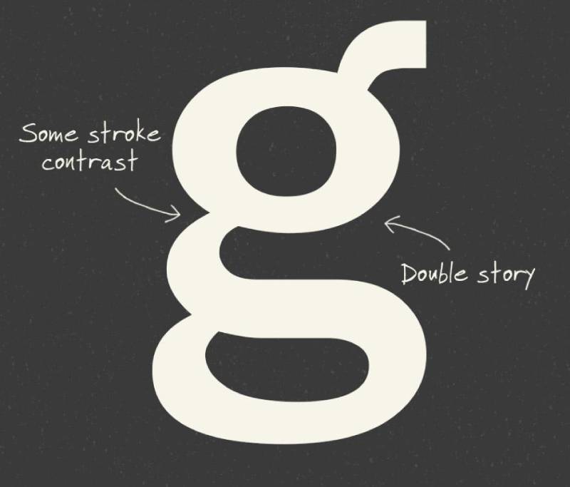
A grotesque font is a category of sans-serif typeface that first appeared in the early 19th century. The name comes from the public reaction to these designs. People in the 1800s were so used to serif fonts that anything without those small decorative strokes at the end of letters looked, well, grotesque to them.
The word didn’t mean ugly. It meant strange, unfamiliar, outside the norm.
Grotesque typefaces sit in a specific place within type classification systems like Vox-ATypI. They are the original sans-serifs, and everything that came after (Helvetica, Futura, Gill Sans) traces back to this starting point in some way.
Core visual traits that define a grotesque font include:
- Low stroke contrast, but not perfectly uniform like later sans-serifs
- Tight or nearly closed apertures on letters like C, S, and e
- Squared curves and vertical terminal endings
- Double-story lowercase “a” and “g” in most designs
- A slightly irregular, industrial character across glyphs
That irregularity is the whole point. Grotesques carry a roughness that later sans-serif categories intentionally smoothed away.
The global font and typeface market was valued at roughly $1.14 billion in 2024 and is projected to grow at a CAGR of about 3.85%, according to Global Growth Insights. Sans-serif fonts, including grotesques and their descendants, dominate this market. Toner Buzz data shows that approximately 75% of Fortune 500 companies use sans-serif fonts in their logos.
Grotesque fonts aren’t the polished corporate choice, though. They’re the foundation that made those polished choices possible.
Grotesque vs. Neo-Grotesque Typefaces
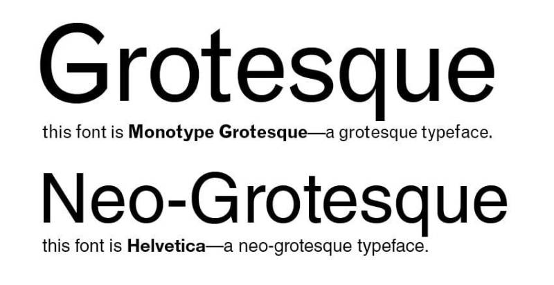
This is the distinction that trips up most people. And honestly, the line between grotesque and neo-grotesque is blurry enough that even experienced designers argue about it.
Here’s the short version: neo-grotesque fonts are the cleaned-up, standardized evolution of grotesque fonts. The “neo” literally means new.
Where Grotesque Ends and Neo-Grotesque Begins
Grotesque typefaces came first, starting in the 1830s and developing through the late 1800s. They were built for poster design and commercial printing, not for long-form reading. The letterforms have character, sometimes awkward character, because they were cut individually by different craftspeople across different foundries and eras.
Neo-grotesque fonts showed up in the mid-20th century. Max Miedinger designed Neue Haas Grotesk (later renamed Helvetica) in 1957. Adrian Frutiger released Univers the same year. Both drew directly from Akzidenz-Grotesk but stripped away the quirks to create something neutral and systematic.
| Feature | Grotesque | Neo-grotesque |
|---|---|---|
| Era | 19th century | Mid-20th century |
| Apertures | Tight, nearly closed | Even tighter, more uniform |
| Lowercase g | Usually double-story | Often single-story |
| Stroke variation | Slight, noticeable | Almost invisible |
| Overall feel | Rough Characterful |
Clean Neutral |
According to Monotype’s 2024 Global Font Use Survey, 83% of designers say typography plays a critical role in branding. That emphasis explains why neo-grotesques became the corporate default. They don’t call attention to themselves.
Why the Distinction Matters in Type Selection
Pick the wrong one and you send the wrong signal. Grotesque fonts carry warmth and personality. Neo-grotesques communicate neutrality and professionalism.
A brand style guide for a craft brewery would probably lean grotesque. A multinational bank would reach for the neo-grotesque. Both are sans-serif, but the emotional registers are completely different.
Looka’s 2024 data found that 80% of the top 10 fonts used in logo design were sans-serifs. But the trend is shifting away from rigid, polished faces like Helvetica and Futura toward more characterful options. Creative Boom reported that designers in 2024-2025 have been pushing back against what one creative director called “the homogenisation of sans serifs.”
Grotesques are benefiting from that pushback.
Visual Characteristics of Grotesque Typefaces
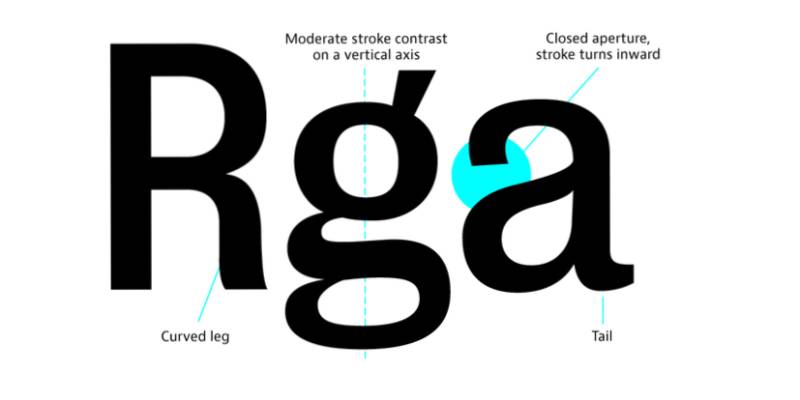
You can identify a grotesque typeface by a handful of specific design features. These aren’t abstract concepts. They’re visible, concrete details you can spot once you know what to look for.
Stroke contrast: Low but present. The thickness of a letter’s strokes doesn’t change dramatically, but it’s not perfectly even either. Compare this to a geometric sans-serif like Futura, where strokes aim for total uniformity.
Apertures: Nearly closed. Look at the openings on letters like lowercase c, e, and s. In grotesque fonts, these openings are tight and somewhat pinched. This is one of the quickest ways to distinguish them from humanist fonts, which have wide, open apertures.
Terminals: Vertical or squared-off. Where a letter’s stroke ends (like the tips of the lowercase c), you’ll find blunt, perpendicular cuts instead of angled or rounded endings.
The lowercase g: Almost always a double-story form in traditional grotesques. That’s the version with a closed loop at the bottom, not the simpler hook shape you see in geometric designs.
Grotesques also tend to have a larger x-height relative to the cap height. This affects how the type “feels” at smaller sizes and in blocks of body text.
There’s a reason designers describe grotesques as having “personality.” Those tight apertures and slightly uneven proportions give each letter a presence that cleaner sans-serifs deliberately avoid. The German standards institute DIN even used Helvetica (a neo-grotesque) as a negative example for legibility in its 2013 DIN 1450 standard, partly because of those pinched openings that grotesques passed down to their successors.
History of Grotesque Type Design
The history of grotesque typefaces is really the history of sans-serif type itself. Before grotesques, there was no such thing as a commercially successful letterform without serifs.
Early Sans-Serifs and the “Grotesque” Label
The first sans-serif type appeared in England around 1816. It didn’t make much noise. But by the 1830s, foundries were starting to experiment.
William Thorowgood introduced his “Seven Line Grotesque” in 1832, often cited as one of the first sans-serif typefaces designed for general commercial use. It was uppercase only, made for signage and advertising.
The first sans-serif sold in Germany arrived in 1833, imported from Caslon & Livermore in London. It was also an all-caps design. The first book composed entirely in upper- and lowercase sans-serif type wasn’t published until 1900.
These early designs were strictly display type. Nobody considered using them for body text. They were loud, attention-grabbing tools for the booming industrial advertising market of the 19th century.
By the late 1800s, Germany had a huge number of small local type foundries, each offering their own versions of sans-serif type. This fragmented ecosystem produced countless variations, many of which would later be collected under the grotesque umbrella.
Akzidenz-Grotesk and Its Influence on Modern Type
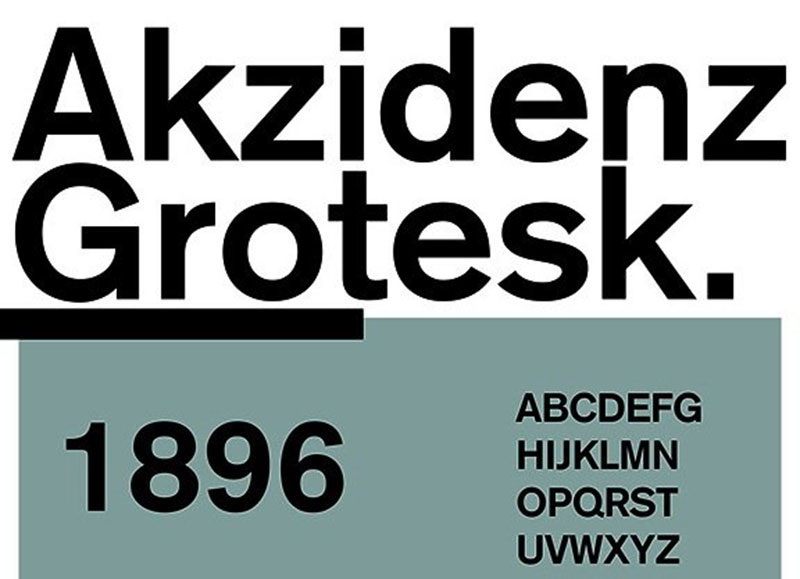
In 1898, the H. Berthold Type Foundry in Berlin released Akzidenz-Grotesk. Or more accurately, H. Berthold and its recently acquired subsidiary Bauer & Co. in Stuttgart released it together. The name itself tells you everything about its intended purpose: “Akzidenz” meant commercial or jobbing printing (tickets, forms, advertisements), and “Grotesk” was simply the German word for sans-serif.
Recent research by Dan Reynolds and Indra Kupferschmid traced the design back to a drop-shadowed display face called Schattierte Grotesk, which Bauer & Co. had released around 1894-95. Remove the shadow, and you get Akzidenz-Grotesk.
Nobody knows who actually designed it. For years it was attributed to Ferdinand Theinhardt, but researchers have disproven that claim.
The typeface wasn’t even Berthold’s biggest seller at first. A 1921 company publication described it “almost apologetically,” according to researchers. But something changed after World War II.
Swiss design pioneers like Josef Muller-Brockmann and Armin Hofmann adopted Akzidenz-Grotesk as a cornerstone of what became the International Typographic Style. They liked its straightforward, “matter-of-fact” quality compared to the more stylized geometric sans-serifs (Futura, Kabel) that had been popular in the 1920s and 30s.
This popularity directly inspired the creation of Helvetica and Univers in 1957. Max Miedinger used Akzidenz-Grotesk as a model for Neue Haas Grotesk, which was later renamed Helvetica. The goal was to keep the grotesque foundation but make it more regular and consistent.
More than sixty years separate the first and last metal-type weights of Akzidenz-Grotesk. Berthold kept adding styles until 1966, and in 2007 released Akzidenz-Grotesk Pro+ with Cyrillic and Greek support. The American Red Cross uses it as a corporate font to this day.
Common Grotesque Fonts Used Today
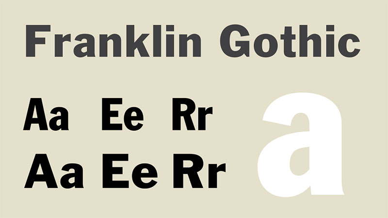
Grotesque typefaces never disappeared. They’ve been continuously revived, redrawn, and reimagined for over a century. Here are the ones you’ll actually encounter in professional design work.
Akzidenz-Grotesk (Berthold, 1898) is still the reference point. It’s the typeface that started everything in this category. Expensive to license, but nothing else quite captures its specific blend of industrial precision and human irregularity.
Franklin Gothic (ATF, 1902) was designed by Morris Fuller Benton for American Type Founders. It’s a workhorse. Heavier in weight than Akzidenz-Grotesk, with a more condensed feel. You see it constantly in newspaper headlines and editorial layouts.
Knockout (Hoefler&Co) is a modern grotesque family with 32 styles organized by width and weight. It was directly inspired by 19th- and early 20th-century American wood type and advertising faces.
Founders Grotesk (Klim Type Foundry) comes from New Zealand type designer Kris Sowersby. It pulls from early grotesque models but with contemporary sensibilities in the spacing and proportions.
Neue Montreal (Pangram Pangram) has been called “a versatile grotesque with the spirit of a display font.” Creative Boom noted it was already being used by local brands in Montreal, including the city’s football club rebrand.
| Typeface | Foundry | Strengths |
|---|---|---|
| Akzidenz-Grotesk | Berthold | Historical authority Wide family |
| Franklin Gothic | ATF / ITC | Headline impact Editorial use |
| Knockout | Hoefler & Co | Range of widths Display power |
| Founders Grotesk | Klim | Modern craftsmanship Text quality |
| Neue Montreal | Pangram Pangram | Accessible pricing Contemporary feel |
For those working with tighter budgets, free Google Fonts options exist that carry some grotesque DNA. Fonts like Inter and Work Sans borrow characteristics from the grotesque tradition, though purists might place them closer to neo-grotesque territory.
Understanding font licensing matters here. Akzidenz-Grotesk from Berthold is exclusively distributed by them and carries premium pricing. Knockout and Founders Grotesk also require paid licenses. These aren’t cheap typefaces, and for good reason. The craftsmanship in drawing, hinting, and spacing a quality grotesque font family is significant.
When to Use a Grotesque Font
Grotesques aren’t a universal solution. They shine in some contexts and fall flat in others. Knowing which is which saves you from those “something feels off but I can’t explain why” design moments.
Editorial and magazine layouts are natural homes for grotesque typefaces. The slight roughness in the letterforms creates visual tension that keeps pages interesting. Grotesques were born in the print world, and they still perform well there. Franklin Gothic has been a newspaper and magazine standard for over a century.
Branding that needs character without being loud. If a brand identity asks for something grounded and real but not sterile, a grotesque is often the answer. Craft industries, cultural institutions, and independent studios tend to reach for these over neo-grotesques. The psychology behind typeface choices matters here. Grotesques communicate authenticity in a way that Helvetica simply doesn’t.
According to Monotype’s 2024 survey, 76% of designers prioritize readability and accessibility when selecting type. That’s where grotesques require careful thought.
Display and headline use is where grotesques really do well. Large sizes show off their character. The tight apertures and squared terminals gain presence at 48pt and above.
For body text, you need to be more careful. Those same tight apertures that look great in headlines can reduce legibility at 10pt or 12pt. If you’re setting long paragraphs, a humanist sans or even a slab serif might serve your readers better.
When to pick something else entirely:
- Ultra-clean corporate identity work (neo-grotesque territory)
- Friendly, approachable consumer apps (geometric sans-serifs do this better)
- Long-form body text at small sizes (humanist sans or serif)
Pairing grotesque fonts with contrasting serif typefaces is a reliable strategy. The tension between the grotesque’s industrial roots and a serif’s classical structure creates a typographic hierarchy that pulls the reader through the layout naturally.
Grotesque Fonts in Web Design and Digital Interfaces
Using grotesque typefaces on screens is a different game than using them in print. The same tight apertures that give grotesques their character on a poster can cause readability problems at 14px on a mobile screen.
HTTP Archive’s 2024 Web Almanac found that 87% of web pages now use web fonts. That’s up from near zero in 2011. Every custom font file you load is an additional resource the browser has to download before text appears.
Grotesques come with a specific tradeoff. Their closed letterforms can make characters like lowercase c, e, and o harder to distinguish at small sizes, especially on low-resolution displays. This is a known issue with the entire grotesque and neo-grotesque family. The German DIN 1450 legibility standard actually cites Helvetica as a negative example for exactly this reason.
But at headline sizes? Grotesques look fantastic on screens. The squared terminals and low stroke contrast render cleanly in both light and dark mode environments.
Variable Font Versions and Responsive Design
According to Figma’s 2025 web design statistics, 41.3% of mobile websites used variable fonts. That’s a significant jump from the 34% HTTP Archive reported in 2024.
Several grotesque font families now ship variable versions. A single variable font file can contain multiple weights and widths, which means fewer HTTP requests and smaller total file sizes compared to loading separate files for regular, bold, and italic.
Performance benefits for grotesques specifically:
- One file replaces what used to be 4-6 separate font files
- Smoother weight transitions for responsive visual hierarchy across breakpoints
- Font subsetting can reduce file sizes by 70-95% according to DebugBear
CSS Implementation and Fallback Strategies
When you load a licensed grotesque as a web font, you need a fallback stack. If the font file fails to load or takes too long, visitors see whatever system font the browser defaults to.
A practical CSS font-family declaration might look like this: your licensed grotesque first, then Arial or Helvetica as fallbacks, then the generic sans-serif keyword.
Self-hosting gives you better control over caching and compression than pulling from a third-party CDN. The WOFF2 format is the current standard for web design, offering the smallest file sizes with full browser support.
HTTP Archive’s 2025 data shows that 18.3% of desktop sites now use preconnect hints for fonts and 12% use preload. Both techniques tell the browser to start downloading font files earlier, reducing the delay before text renders.
How Grotesque Differs from Geometric and Humanist Sans-Serifs

Sans-serif is not one style. It’s a family of at least four distinct subcategories, and each one handles letterforms differently. Confusing them is like calling every car a sedan.
The Vox-ATypI classification system (the closest thing type design has to an industry standard) splits sans-serifs into grotesque, neo-grotesque, geometric, and humanist groups.
| Category | Built from | Key example | Personality |
|---|---|---|---|
| Grotesque | Industrial models | Akzidenz-Grotesk | Rough Characterful |
| Neo-grotesque | Refined grotesque | Helvetica | Neutral Corporate |
| Geometric | Circles and lines | Futura | Clean Mathematical |
| Humanist | Handwriting structure | Gill Sans | Warm Readable |
Look at the lowercase “a” across these four categories and the difference becomes obvious. Geometric sans-serifs often use a single-story “a” (just a circle with a tail). Grotesques almost always use a double-story “a” (the kind you’d write by hand, with an arch over a bowl).
The lowercase “o” is another giveaway. In a geometric typeface, it’s often a perfect or near-perfect circle. In a grotesque, it’s slightly squared off with subtle asymmetries.
Humanist sans-serifs sit at the opposite end of the spectrum from grotesques. Typefaces like Frutiger and Gill Sans draw from calligraphic forms. They have open apertures, visible stroke contrast, and more variation in letter width. These make them excellent for body text and accessibility, but they lack the industrial edge that grotesques bring.
Monotype’s 2024 survey found that 76% of designers prioritize readability and accessibility when choosing type. That priority tends to favor humanist designs for body copy and grotesques for display and branding use.
The practical question isn’t which category is “better.” It’s which one matches the job. A packaging design for a craft spirits brand benefits from a grotesque’s weight and texture. An airport wayfinding system needs a humanist’s legibility at a distance. A tech startup’s app interface might lean geometric for its mathematical precision.
How to Identify a Grotesque Font
You don’t need to be a type designer to tell whether something is a grotesque. A few quick checks will get you there about 90% of the time.
Check the lowercase g first. If it has two stories (a closed loop at the bottom connected to an upper bowl), you’re likely looking at a grotesque. Single-story g? Probably geometric or neo-grotesque.
Look at the letter C. See how much the opening closes in on itself. In grotesques, the top and bottom terminals of the C almost touch, leaving a narrow gap. Humanist designs leave that opening wide. This aperture test also works on lowercase e and s.
Compare the stroke widths. Run your eye along a lowercase h or n. In a geometric sans, the strokes will be almost perfectly even. In a grotesque, you’ll notice slight variation, especially where curved strokes meet straight stems.
Feel the overall vibe. Took me a while to learn this, but grotesques have a quality that’s hard to describe technically. If you compare a specimen to Helvetica and it looks similar but somehow rougher or more “alive,” it’s probably a grotesque rather than a neo-grotesque. Your mileage may vary on this one, but it becomes intuitive with practice.
If you’re trying to identify a specific typeface you’ve spotted in the wild, font identification tools like WhatTheFont and Fontspring Matcherator can help. Upload a screenshot or photo and these tools will compare the letterforms against their databases.
Browser developer tools are another option. Right-click on text, inspect the element, and check the computed CSS. The font-family property will tell you exactly what’s rendering. At least, it will if the site used proper font formats and the web fonts loaded correctly.
Google Fonts is used on over 11.9 million websites according to Toner Buzz, so there’s a decent chance the font you’re looking at is freely available and identifiable through their directory.
FAQ on What Is A Grotesque Font
What is a grotesque font?
A grotesque font is a category of sans-serif typeface originating in the 19th century. These fonts have low stroke contrast, tight apertures, and squared terminals. The name came from the public’s reaction to letterforms without serifs, which looked strange at the time.
What is the difference between grotesque and neo-grotesque fonts?
Grotesque fonts retain irregular, characterful details from their industrial origins. Neo-grotesque typefaces like Helvetica and Univers refined those forms into cleaner, more uniform designs. The key split happened in the 1950s with the Swiss International Style movement.
Is Helvetica a grotesque font?
No. Helvetica is classified as a neo-grotesque, not a grotesque. Max Miedinger designed it in 1957 using Akzidenz-Grotesk as a model, but he deliberately removed the irregularities and quirks that define true grotesque typefaces.
What are some examples of grotesque fonts?
The most recognized grotesque fonts include Akzidenz-Grotesk (1898), Franklin Gothic (1902), Knockout by Hoefler&Co, and Founders Grotesk from Klim Type Foundry. Each carries the slightly rough, industrial character typical of the category.
Why are they called grotesque fonts?
The term “grotesque” meant strange or outside the norm, not ugly. When sans-serif type first appeared in the early 1800s, the absence of serifs looked so unusual compared to standard letterforms that people labeled them grotesque out of surprise.
Are grotesque fonts good for body text?
It depends on the size. Grotesque fonts have tight apertures that can reduce legibility at small sizes in long paragraphs. They work better as headline or display type. For body text, humanist sans-serifs tend to perform better.
What is the oldest grotesque font?
William Thorowgood’s Seven Line Grotesque from 1832 is often cited as one of the earliest. But Akzidenz-Grotesk, released by the Berthold foundry in 1898, became the first grotesque to gain widespread commercial use and lasting influence.
How do I identify a grotesque typeface?
Check the lowercase g for a double-story form. Look at the C and e for nearly closed apertures. Compare stroke widths for slight variation. If it looks like Helvetica but rougher and less uniform, it’s likely a grotesque.
Can grotesque fonts be used for logos?
Yes. Grotesque fonts work well for branding that needs character without being decorative. The American Red Cross uses Akzidenz-Grotesk in its identity. Their industrial weight and visual texture make them a strong choice for distinctive logo work.
What is the difference between grotesque and geometric sans-serif fonts?
Geometric sans-serifs like Futura are built from circles and straight lines, aiming for mathematical precision. Grotesque fonts are based on industrial letterforms with more irregularity and tighter apertures. They feel rougher and less constructed by comparison.
Conclusion
Understanding what is a grotesque font gives you a clearer picture of how type classification actually works. These aren’t just old relics from the 1800s. They’re the foundation that every modern sans-serif builds on.
From Akzidenz-Grotesk’s release by the Berthold foundry in 1898 to contemporary revivals like Founders Grotesk and Knockout, the grotesque tradition keeps showing up in editorial layouts, brand typography, and print design projects.
The tight apertures, squared terminals, and double-story letterforms give grotesques a visual weight that cleaner alternatives can’t replicate. That roughness is the point.
Whether you’re selecting a display typeface for headlines or building a visual identity with real texture, grotesque fonts remain one of the most reliable tools in the type designer’s kit.

Renowned for his expertise in logo design and visual branding, Bogdan has developed a multitude of logos for various clients.
His skills extend to creating posters, vector illustrations, business cards, and brochures. Additionally, Bogdan's UI kits were featured on marketplaces like Visual Hierarchy and UI8.
He also wrote in the past years on sites like Design Your Way, WebDesignerDepot, WPDean, Designmodo, Speckyboy, Slider Revolution, and more.
- The Windsurf Logo History, Colors, Font, And Meaning - 10 October 2026
- How to Remove Background From Product Photos (No Photoshop) - 10 October 2026
- How Designers can Build a Stronger Online Creative Identity - 9 October 2026

Bogdan Sandu is a seasoned designer who has been designing websites since 2008. Renowned for his expertise in logo design and visual branding, Bogdan has developed a multitude of logos for various clients. His skills extend to creating posters, vector illustrations, business cards, and brochures. Additionally, Bogdan's UI kits were featured on marketplaces like Visual Hierarchy and UI8. He also wrote in the past years on sites like Design Your Way, WebDesignerDepot, WPDean, Designmodo, Speckyboy, Slider Revolution, and more.
You Might Also Like