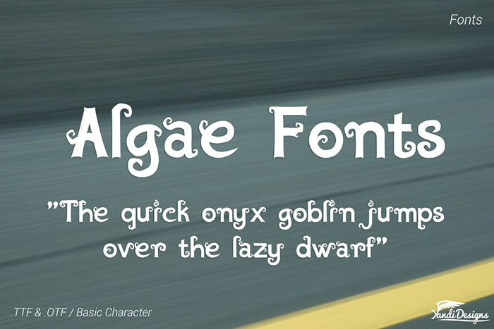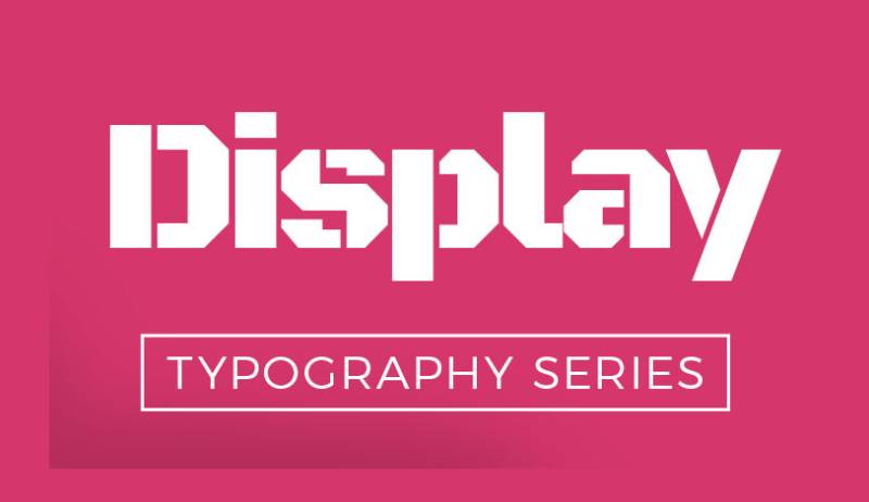
Not every typeface is built for the same job. A display typeface is designed specifically for large-scale use, think headlines, posters, and short title text where visual impact matters more than reading comfort.
Most designers learn this distinction the hard way, by choosing a beautiful decorative font for body copy and watching it fall apart at small sizes.
Understanding display typeface characteristics, how they differ from body text typefaces, and where they belong in a layout changes how you approach every typographic decision.
This article covers the definition, main categories, visual traits, real-world applications, and the most widely used display fonts worth knowing.
What Is a Display Typeface
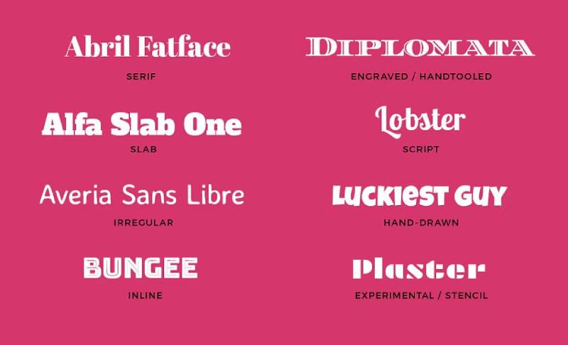
A display typeface is a typeface designed specifically for use at large sizes. Think headlines, poster titles, event banners, and short bursts of text where the goal is immediate visual impact, not sustained reading comfort.
The word “display” comes directly from print history. Type set for advertising, announcements, or editorial headlines was called display type, as opposed to body type, which handled the long reading passages. That distinction still holds today.
A display typeface prioritizes personality and presence over legibility at small sizes. Tight letter spacing, high stroke contrast, decorative details, and bold letterforms are all acceptable trade-offs because the type will almost never appear smaller than 24pt in real use.
Key distinction: A display typeface is engineered for a single size range and a single communication purpose. It is not a flexible workhorse. It is a focused tool.
Monotype’s 2024 Global Font Use Survey found that 83% of designers acknowledge typography as critical to brand identity, which partly explains why expressive, distinctive display type has held its ground even as minimalist design trends cycle in and out.
Well-known display typefaces include Playfair Display, Bebas Neue, Abril Fatface, Lobster, and Didot. Each is immediately recognizable at headline sizes and immediately problematic at body text sizes. That trade-off is not a flaw. It is the point.
How Display Typefaces Differ From Body Text Typefaces
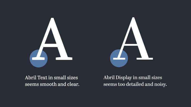
The difference between a display typeface and a body text typeface is not just aesthetic. It is structural and functional. They are built for different jobs, at different sizes, under different reading conditions.
Body text typefaces like Garamond, Georgia, or Inter are designed for sustained reading. Long paragraphs. Small sizes. Low fatigue. Their letterforms are open, spacing is generous, and stroke contrast is deliberately moderate so thin strokes do not disappear at 12pt.
Display typefaces work the opposite way. High stroke contrast is fine because the type is large. Tight spacing creates visual density that looks intentional, not cramped. Decorative details that would disappear or muddy at small sizes become defining features at 60pt or above.
| Characteristic | Display Typeface | Body Text Typeface |
| Optimal size range | 24pt and above | 8pt to 14pt |
| Stroke contrast | High to extreme | Low to moderate |
| Spacing | Tight, stylized | Open, generous |
| Decorative detail | Common | Minimal |
| Character set | Sometimes limited | Full, with alternates |
Research from the Readability Consortium at UCF found that switching to a more appropriate typeface for the reader produced a 35% boost in reading speed. That is a direct argument for using the right typeface category for the right context.
Using a display typeface for body copy is one of the more common mistakes in editorial and web design. I’ve seen it a lot with Playfair Display on blog posts. It looks beautiful in the browser mock-up, then exhausting in actual reading. The decorative contrast that makes it striking at headline size becomes noise at paragraph size.
The practical rule: if you are setting more than two lines of continuous text, you are outside display typeface territory.
Main Categories of Display Typefaces
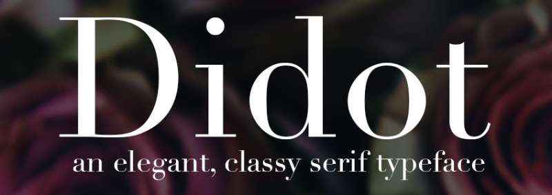
Display typefaces cover a wide range of styles. The category is defined by usage, not by a single visual approach. A condensed slab serif used on a beer label and an ornate script used on a wedding invitation are both display typefaces. They just serve very different tonal purposes.
Serif Display Typefaces
High contrast, classical character: Serif display typefaces like Didot, Bodoni, and Playfair Display are built on dramatic thin-to-thick stroke contrast. That contrast looks intentional and refined at large sizes.
- Common in fashion editorial, luxury branding, and magazine covers
- Didot is used by brands like Vogue and Giorgio Armani
- Thin hairline strokes break down badly below 18pt
These typefaces are where high stroke contrast is a feature, not a liability. At a 72pt headline, Bodoni looks authoritative. At 10pt body copy, it looks broken.
Sans-Serif Display Typefaces
Sans-serif display typefaces trade ornament for impact. Bebas Neue, Futura Display, and Impact are built for raw visual weight, not elegance.
Bebas Neue is probably the most overused display font of the last decade. It is on every gym poster, YouTube thumbnail, and event flyer you have ever seen. That ubiquity is also the clearest proof that bold sans-serif display type works at grabbing attention fast.
- Works well in all-caps settings at large sizes
- Good for sports, tech, and high-energy branding
- Usually limited in weight variety compared to text families
Script Display Typefaces
Script display typefaces imitate handwriting or calligraphy. Lobster and Pacifico are common examples. They add personality and warmth but sacrifice legibility even faster than other display categories.
Where they work: food and beverage packaging, wedding and event design, lifestyle branding.
Where they fail: anywhere the text is longer than a few words, and anywhere the background is busy or low contrast.
A script font used as a display typeface is one of the trickiest calls in type selection. The warmth is real. The legibility risk is also real.
Decorative Display Typefaces
Decorative typefaces are the loosest category. They are defined more by what they do than what they look like. These are novelty typefaces, themed typefaces, illustrated letterforms, and anything built for a specific visual effect rather than general-purpose use.
- Think Art Deco lettering, horror-themed fonts, retro wood type revivals
- Zero flexibility across contexts
- High impact when the context matches the typeface’s personality exactly
- Easy to overuse or misuse
As Wikipedia notes, the term “display typeface” is sometimes incorrectly used as a synonym for decorative or novelty type. Decorative typefaces are actually a subcategory of display typefaces, not a separate classification.
Visual Characteristics of Display Typefaces
Knowing what makes a typeface a display typeface visually helps when you are scanning a type library and trying to figure out what you are looking at.
High stroke contrast is the most consistent signal. The difference between thin and thick strokes in a display typeface is often extreme, sometimes to the point where hairline strokes are barely visible except at large sizes. Didot is the classic example here.
Tight or unconventional letter spacing is another marker. Display typefaces are often designed with tighter default spacing than text typefaces, because the designer assumed the type would be used large and set manually by a designer who would adjust kerning and tracking as needed.
| Visual Feature | What It Signals |
| Extreme stroke contrast | Designed for large-scale use only |
| Decorative terminals or swashes | Expressive, limited to short text |
| Tight default spacing | Intended for headline setting |
| Condensed or extended proportions | Optimized for a specific layout format |
| Limited glyph set | Not built for extended typesetting |
Some display typefaces also include alternate glyph variants, swash capitals, ligatures, and ornamental characters that only work at display sizes. These OpenType features are part of the character of the typeface, not just add-ons.
Limited character sets are also common. Some display typefaces ship without italics, without numerals, or with a minimal number of weights. That is a design choice, not an oversight. The type was not built for versatility. It was built for one specific kind of visual work.
Where Display Typefaces Are Used
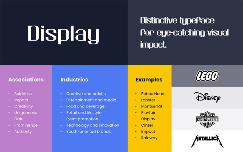
Display typefaces show up wherever the goal is to stop someone mid-scroll, mid-glance, or mid-walk. The context changes. The purpose does not.
Print Applications
Print is where display typefaces started and where they still perform at their best. High-resolution output means every detail of a carefully drawn letterform is visible.
- Poster design: maximum visual punch at maximum size
- Magazine covers: editorial display type like Vogue’s use of Didot
- Book covers and packaging labels
- Advertising headlines in newspapers and catalogs
The Industrial Revolution in the 19th century created the first real demand for display type. Wood block typefaces were cut specifically for large-format poster printing because metal type could not be made large enough without becoming too heavy to set. That is where the display typeface category was born as a practical necessity.
Digital and Web Use
Web Almanac data from 2024 shows that variable fonts now appear on 34% of mobile pages, up from 29% in 2022. Many of those variable fonts are display typefaces adapted for responsive use.
Display typefaces in digital contexts work well in:
- Landing page hero sections and above-the-fold headlines
- App splash screens and onboarding flows
- Social media graphics and story formats
- Pull quotes and editorial callouts in long-form web content
The catch with display type on screen is rendering. Thin hairline strokes in high-contrast display typefaces can look beautiful on retina displays and jagged on standard monitors. Testing across devices before committing to a display typeface for a web project is not optional.
Branding and Identity
Display typefaces in branding tend to anchor a visual identity at the headline or logotype level, paired with a more neutral text typeface for supporting copy. About 30% of brands now commission custom typefaces rather than licensing existing ones (WhatFontIs, 2023), and many of those custom typefaces are display-first designs.
The visual identity work for Vogue, which has used a variant of Didot for decades, is a textbook case of a display typeface becoming inseparable from brand recognition. The typeface does not just label the brand. It carries the entire tone.
Display typefaces also work in: logotypes (where letterforms are often customized further), event and campaign branding, retail signage, and packaging where the product name needs to compete on shelf.
How to Choose a Display Typeface
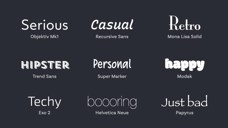
Picking a display typeface is a tonal decision before it is a technical one. The letterforms communicate personality before anyone reads a single word, which is both the power and the risk.
Match Tone to Context
Monotype’s 2024 survey found that 76% of designers prioritize readability and accessibility when selecting fonts, but for display type, the tonal match matters just as much as legibility at size.
Ask yourself: does this typeface communicate the same thing as the content it is labeling?
- A heavy condensed sans like Bebas Neue reads as aggressive and modern
- A high-contrast serif like Playfair Display reads as refined and editorial
- A script display typeface reads as personal, handcrafted, or celebratory
Getting this wrong is more damaging than using no display type at all. A mismatched display typeface creates immediate cognitive dissonance, and readers pick that up even when they cannot name it.
Consider Font Pairing Early
A display typeface does not work in isolation. It needs a companion text typeface that either contrasts it clearly or complements it closely. The display face handles hierarchy at the top. The text face handles readability below.
Good pairing fonts approach for display type: pair a decorative or high-contrast display typeface with a neutral, readable sans-serif font for body. Pair a geometric sans-serif display typeface with a humanist serif text typeface. The contrast between the two creates typographic hierarchy without needing to lean heavily on size differences alone.
Abril Fatface, for example, pairs well with Lato or Source Sans for body copy. The visual tension between the heavy decorative display face and the clean, neutral text face is exactly the kind of contrast that makes a layout readable and interesting at the same time.
Check Licensing Before Committing
Display typefaces are not always free to use commercially. This is an area where a lot of small studios and freelancers get caught. A typeface that looks free on Google Fonts may still require a commercial license for certain uses, like merchandise or broadcast.
- Check the license for web embedding, print, digital advertising, and app use separately
- Custom or premium display typefaces often have per-project or per-seat licensing
- Free alternatives exist for most popular display typefaces, but they vary in quality
Understanding font licensing before a project is finalized saves real problems down the line. I have seen rebrands delayed because a display typeface the team loved turned out to have broadcast restrictions they had not checked.
Display Typefaces in Web Design
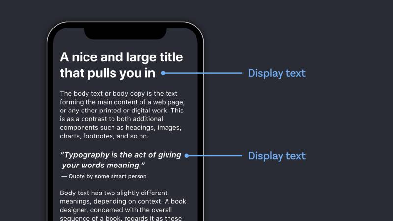
Web fonts are now on roughly 88% of websites, up from 87% in 2024, according to the Web Almanac by HTTP Archive. Display typefaces are a significant part of that growth, particularly as variable font adoption continues to rise.
The technical side of using a display typeface on the web is genuinely trickier than using a text typeface. High stroke contrast, decorative terminals, and tight spacing all create rendering challenges that a neutral sans-serif body font simply does not have.
Variable Fonts and Display Type
Web Almanac 2024 data shows variable fonts now appear on 34% of mobile pages, up from 29% in 2022. Playfair Display updated to a full variable format in November 2023 (v2.1), adding axes for weight, width, and optical size.
What that means practically:
- One file handles everything from Hairline to Black weight
- Optical size axis adjusts stroke contrast automatically based on display size
- Width axis allows condensed settings without loading a separate font file
If you are only using a display typeface at one weight in one size, a static file is fine. Once you need two or more weight variants, the variable version becomes more efficient, both for file management and HTTP requests.
Font Loading and Performance
WOFF2 is the correct format. It handles 81% of desktop and 78% of mobile web font usage (Web Almanac 2024), and it is supported by every browser that also supports variable fonts.
For display typefaces specifically, font loading strategy matters more than people assume. A decorative headline font that loads late causes a visible layout shift, which is worse than a body font loading late because the headline is usually the first thing a visitor sees.
- Use
font-display: swapas a baseline - Preload your display font file in the HTML
<head> - Subset the font to only the characters you actually use
- Self-host when possible rather than depending on Google Fonts CDN
About 12% of desktop pages now use a font preload hint (Web Almanac 2025), up from 11% the year before. The sites doing this are mostly performance-focused projects where font loading is treated as a first-class concern, not an afterthought.
CSS and Responsive Display Typography
Display typefaces need more active typographic control in CSS than body fonts do. The decorative details that look intentional at 80px can look cluttered at 32px on a smaller viewport.
Practical CSS approach for responsive display type:
- Use
clamp()for fluid type scaling rather than fixed breakpoints - Adjust
letter-spacingtighter as size increases (what looks right at 40px often needs tightening at 80px) - Test
line-heightat every major breakpoint, not just desktop - Consider
font-optical-sizing: autofor variable display fonts
Google’s 2023 Material Design update showed that adjusting line height ratios for UI elements boosted form completion rates by 18% (DeveloperUX). That kind of spacing precision matters at display sizes too, not just body text.
Accessibility with Display Typefaces
Decorative display fonts present real accessibility risks. High contrast, low x-height, and tight spacing all reduce legibility for users with low vision or reading difficulties.
The Web Content Accessibility Guidelines (WCAG) do not prohibit display typefaces, but they do require sufficient contrast ratios and readable text at scaled sizes. The practical implication: do not use a display typeface for any text that needs to remain readable when a user increases browser font size.
Accessibility checklist for display type on the web:
- Color contrast ratio of at least 4.5:1 against the background
- Never use display type for navigation labels or form inputs
- Keep display text short (one to three words is ideal for complex decorative fonts)
Well-Known Display Typefaces Worth Knowing
Consistent font use can increase brand recognition by up to 80%, according to Linearity’s font statistics analysis. Which display typefaces are doing that work matters.
The list below covers typefaces that appear consistently across professional work, are widely available, and each demonstrates something specific about what display type can do.
| Typeface | Style | Known For | Common Use |
| Playfair Display | Serif display | High contrast, editorial tone | Editorial, luxury branding |
| Bebas Neue | Sans-serif display | Condensed all-caps, bold weight | Sports, YouTube, advertising |
| Abril Fatface | Serif display | 19th-century advertising influence | Digital agencies, luxury hotel branding |
| Lobster | Script display | Flowing cursive, high recognition | Food and beverage, casual branding |
| Impact | Sans-serif display | Maximum weight, condensed width | Memes, posters, high-visibility signage |
Playfair Display
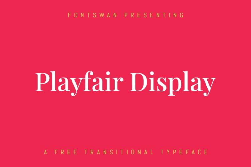
Playfair Display is a transitional serif designed to echo the broad-nib-to-pointed-pen shift of the late 18th century. The high stroke contrast is a deliberate reference to that period’s engraving aesthetics.
Where it works: editorial websites, fashion and beauty brands, magazine cover typography, hero sections on premium product pages.
It updated to a variable format (v2.1) in 2023, making it one of the more technically capable display fonts freely available. Available on Google Fonts. Pairs well with a neutral sans-serif like Lato or Source Sans for body text.
Bebas Neue
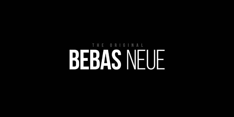
Nothing says “I need a big headline fast” quite like Bebas Neue. It is condensed, all-caps, and aggressively weighted. You have seen it everywhere because it works, even if that ubiquity has made it a slightly safe choice.
Available free on Google Fonts. Works at any large size. Absolutely useless for anything requiring mixed case or extended text.
Best pairing: a geometric or humanist sans for subheadings, something like Montserrat or Open Sans for supporting body copy. The all-caps nature means you will need a secondary font for literally everything else in the layout.
Abril Fatface
Abril Fatface is part of the broader Abril family, which includes 18 styles covering both display and text use. The display cut draws from 19th-century French and UK advertising headlines, designed specifically for large-scale titling work.
The stark contrast in stroke widths looks dramatic at 60pt and completely breaks down at anything below 18pt. Inkbotdesign’s analysis notes it works well for luxury hotel branding and digital agency sites, where that classical advertising personality fits the client.
Free on Google Fonts. Pairs cleanly with Lato for body text. The Abril Fatface pairing with Lato is one of the more reliable editorial combinations in the Google Fonts library.
Overused Display Fonts to Watch Out For
Some display typefaces have been used so often in specific contexts that they now carry unintended baggage.
- Lobster: Overused in food and casual branding since around 2012. Still functional, but instantly recognizable as a “cheap website” signal in some contexts
- Impact: Permanently associated with internet memes. Hard to use seriously in 2025
- Bebas Neue: Everywhere. Works well but no longer distinctive without strong supporting design
None of these are bad typefaces. They are just typefaces that require more design effort around them to feel fresh. If your logo or headline font is one of these, the rest of the design has to work harder to compensate.
Spotify is a good example of this done right. For Wrapped 2023 and 2024, they used custom retro-inspired display typefaces rather than reaching for an off-the-shelf solution, which is partly why Wrapped typography generates its own conversation each year.
Understanding the psychology behind font choices helps here. Display typefaces carry associations built up over years of use, and those associations are not always aligned with what a brand actually needs to communicate. Checking those associations before committing to a display typeface is worth the effort.
For more on how typography works as a system, including how display type fits into broader typographic decisions, the elements of typography cover the foundational principles that make display type selection easier to reason through.
FAQ on What Is a Display Typeface
What is a display typeface?
A display typeface is a typeface designed for large-scale use at headline sizes, typically 24pt and above.
It prioritizes visual impact over readability at small sizes, making it suited for titles, posters, and short bursts of text rather than body copy.
What is the difference between a display font and a text font?
A display font is built for large sizes with high stroke contrast and tight spacing. A text font is built for small sizes, long reading, and sustained legibility.
Using a display typeface for body copy is one of the most common typography mistakes in design.
What are some examples of display typefaces?
Common examples include Playfair Display, Bebas Neue, Abril Fatface, Lobster, Impact, and Didot.
Each serves a different tonal purpose. Playfair Display reads as editorial and refined. Bebas Neue reads as bold and modern. Lobster reads as casual and handcrafted.
When should you use a display typeface?
Use a display typeface for headlines, poster titles, logotypes, hero section text, magazine covers, and packaging labels.
Never use it for body copy, navigation labels, form inputs, or any text exceeding two or three lines of continuous reading.
Are display typefaces the same as decorative fonts?
Not exactly. Decorative typefaces are a subcategory of display typefaces. All decorative fonts are display fonts, but not all display fonts are decorative.
A serif font like Didot is a display typeface without being novelty or ornamental in nature.
Can display typefaces be used in web design?
Yes. Display typefaces work well in web hero sections, landing page headlines, and editorial headers.
Performance and rendering need careful handling. Use WOFF2 format, preload the font file, and test across screen sizes. Thin hairline strokes in high-contrast display fonts can break on lower-resolution screens.
How do you pair a display typeface with body text?
Pair a decorative or high-contrast display typeface with a neutral, readable body font. The contrast between them creates clear typographic hierarchy.
Abril Fatface with Lato and Playfair Display with Source Sans Pro are both reliable combinations used widely in editorial and branding work.
What makes a typeface a display typeface?
High stroke contrast, tight default letter spacing, expressive letterforms, and decorative details that only work at large sizes are the defining visual characteristics.
Many display typefaces also have limited character sets, fewer weights, and no italic variants because they were never designed for extended typesetting.
Are display typefaces bad for accessibility?
They can be. High contrast, low x-height, and tight spacing reduce legibility for users with low vision or reading difficulties.
Keep display type short, ensure sufficient color contrast, and never use it for text that needs to scale with browser font size settings.
What is the best free display typeface for web projects?
Playfair Display is one of the strongest free options, available on Google Fonts with a variable font update released in 2023 that adds weight, width, and optical size axes.
Bebas Neue works for bold sans-serif headlines. Abril Fatface suits editorial and luxury branding contexts.
Conclusion
This conclusion is for an article presenting what is a display typeface, and the core takeaway is straightforward: display typefaces are purpose-built tools, not general-purpose fonts.
Serif display options like Playfair Display and Abril Fatface suit editorial and luxury contexts. Condensed sans-serif faces like Bebas Neue work for high-energy, large-scale headline typography. Script and decorative letterforms serve branding work where personality carries weight.
Getting the font pairing right, checking licensing, and testing rendering across screen sizes separates a polished layout from a problematic one.
Display typeface design is ultimately about matching expressive letterforms to the right context at the right size. Pick the wrong one and the whole layout fights itself. Pick the right one and the typographic hierarchy does the work for you.

Renowned for his expertise in logo design and visual branding, Bogdan has developed a multitude of logos for various clients.
His skills extend to creating posters, vector illustrations, business cards, and brochures. Additionally, Bogdan's UI kits were featured on marketplaces like Visual Hierarchy and UI8.
He also wrote in the past years on sites like Design Your Way, WebDesignerDepot, WPDean, Designmodo, Speckyboy, Slider Revolution, and more.
- The Windsurf Logo History, Colors, Font, And Meaning - 10 October 2026
- How to Remove Background From Product Photos (No Photoshop) - 10 October 2026
- How Designers can Build a Stronger Online Creative Identity - 9 October 2026

Bogdan Sandu is a seasoned designer who has been designing websites since 2008. Renowned for his expertise in logo design and visual branding, Bogdan has developed a multitude of logos for various clients. His skills extend to creating posters, vector illustrations, business cards, and brochures. Additionally, Bogdan's UI kits were featured on marketplaces like Visual Hierarchy and UI8. He also wrote in the past years on sites like Design Your Way, WebDesignerDepot, WPDean, Designmodo, Speckyboy, Slider Revolution, and more.
You Might Also Like