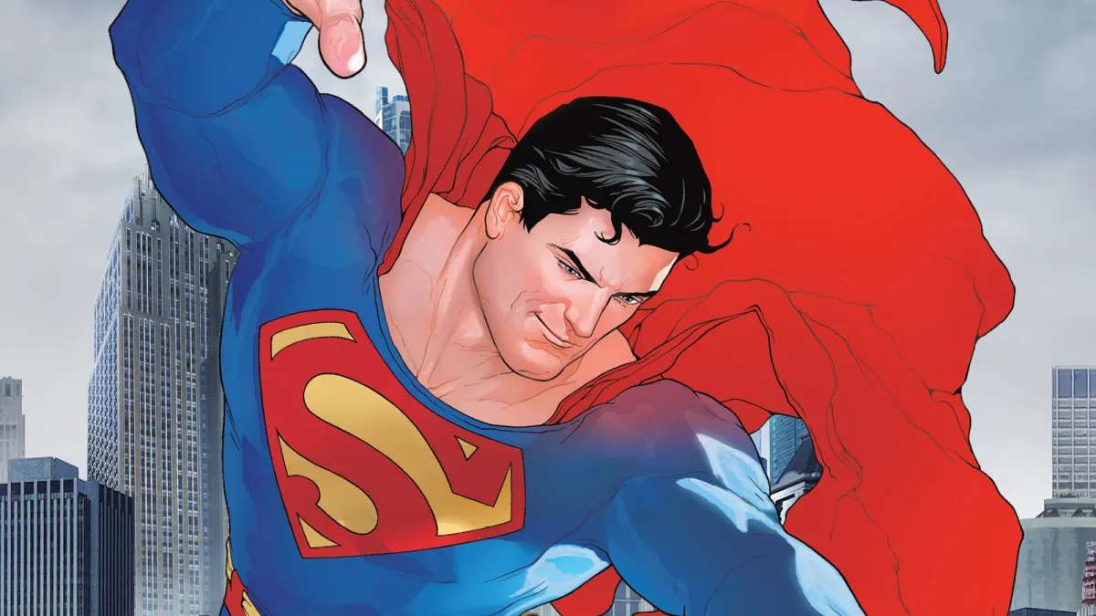
Superman does not use a standard commercial typeface. The iconic “S” in the chest shield is a custom-designed letterform created specifically for the character, first drawn by co-creator Joe Shuster in 1938 for Action Comics #1.
For the title lettering on comic book covers, the closest publicly available match is Up Up and Away, a commercial display font designed by John Roshell and published by Comicraft. The 2025 Superman film directed by James Gunn uses a modified version of Ultimatum Bold, also by Comicraft.
—
What Type of Font Is the Superman Lettering?
The S-shield letterform is a custom display glyph, not a typeface. It does not belong to any font classification because it was never part of an alphabet system.
Visually, it draws from 1930s display lettering traditions used in circus posters and newspaper headlines. The letterform features heavy serifs, dramatic thick-thin stroke contrast, and strong angular edges that read clearly at a distance.
The title lettering on comic book covers (separate from the shield) follows a condensed bold display style. This category of display font prioritizes impact over readability at small sizes, which makes it well-suited for covers, posters, and headlines.
Up Up and Away, the closest font to the comic title lettering, features:
- Tall ascenders and large x-height
- Cut-out letterforms with bold, angular structure
- 5 style variants: Regular, Inline, Outline, Shadow, and Popup
- Strong visual weight that suits superhero branding
The 2025 film title uses Ultimatum Bold, a squarish sans-serif typeface. It is available in variable format and static fonts across four weights with obliques.
Who Designed the Superman Font?
The original S-shield letterform was drawn by Joe Shuster, co-creator of Superman, in 1938. It was never digitized as a usable typeface.
The Up Up and Away font was designed by John Roshell and published through Comicraft, the comic book lettering studio he co-founded with Richard Starkings in 1992.
Roshell is one of the most prolific comic book letterers in the industry. He designed logos for the Avengers, Daredevil, and Black Panther, and has lettered thousands of issues for Marvel, DC, Dark Horse, and Blizzard.
Ultimatum Bold, used in the 2025 film, was also created by John Roshell through Comicraft. Roshell confirmed in early 2026 that Ultimatum was the main font on the Superman movie posters.
| Context | Font | Designer | Foundry |
| S-Shield emblem | Custom glyph (not a font) | Joe Shuster | DC Comics |
| Comic book title lettering | Up Up and Away | John Roshell | Comicraft |
| 2025 film title | Ultimatum Bold (modified) | John Roshell | Comicraft |
Is the Superman Font Free to Use?
No. None of the fonts associated with Superman are free.
The S-shield itself is a registered trademark owned by DC Comics, a subsidiary of Warner Bros. Discovery. Using it commercially without a license triggers legal action.
Up Up and Away is a commercial font sold through Comicraft and MyFonts. It is not available for free download. A license is required for both personal and commercial projects.
Ultimatum Bold is also a paid Comicraft font. It is not available on Google Fonts or Adobe Fonts for free. You can purchase a license directly through Comicraft or MyFonts.
There are fan-made fonts inspired by the Superman lettering that are available for free or low cost on sites like Dafont and FontBolt. These are not official DC Comics fonts and should be used carefully, especially for any commercial work where font licensing matters.
What Font Did Superman Use Before?
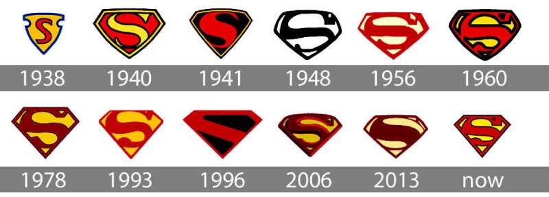
The Superman wordmark and chest emblem have gone through at least 15 major design iterations since 1938, more if you count every film and television adaptation separately.
The key shifts in the logo’s history:
- 1938: Joe Shuster’s original hand-drawn shield, resembling a police badge with a red “S”
- 1940–1941: Artists including Wayne Boring reshaped the shield from a triangle toward a pentagon
- 1941: Fleischer Studios animated cartoons introduced the diamond shape for the first time
- 1944: DC Comics trademarked the design, standardizing the S-shield across all publications
- 1978: The Superman: The Movie costume team redesigned the emblem with a more dimensional, “alien” quality for Christopher Reeve’s costume
- 2013: Man of Steel introduced a darker, more geometric version with narrower stroke endings for Henry Cavill’s costume
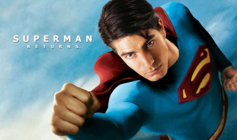
Each film adaptation brought its own typographic take on the wordmark as well. The 1978 Richard Donner film used heavily stylized hand-lettering with a 3D dimensional quality. The 2006 Superman Returns revived a version closer to the Reeve-era aesthetic.
What Are the Best Free Alternatives to the Superman Font?
If you need a Superman-inspired look for a design project and cannot license the official fonts, several free options come reasonably close.
| Font | Similarity | License | Source |
| Bebas Neue | Bold condensed display, strong visual weight | Free | Google Fonts |
| Oswald | Condensed sans-serif, works well for superhero headlines | Free | Google Fonts |
| Anton | Heavy display weight, upright and bold | Free | Google Fonts |
| Passion One | Rounded condensed style, slightly softer than Superman lettering | Free | Google Fonts |
| Pauls Super Font | Directly inspired by Superman logo lettering | Free (personal) | DaFont |
None of these replicate the exact letterform of the S-shield. But for logo work or poster designs that need that bold, authoritative superhero feel, Bebas Neue and Oswald are the most practical starting points.
If you want fonts specifically built for comic book design, Comicraft’s catalog is the best place to look. Most of their fonts are paid, but they are purpose-built for exactly this kind of work.
How to Use Superman-Style Fonts in Your Design Software
In Figma and Canva
Google Fonts options like Bebas Neue and Oswald load directly inside both tools without any manual installation. Search the font name in the text panel and apply immediately.
For paid Comicraft fonts like Ultimatum or Up Up and Away, download the font files after purchase and upload them to Canva through the Brand Kit section (Canva Pro required).
In Photoshop and Illustrator
Install the font file at the system level (double-click the .otf or .ttf file and click Install). Once installed, it appears automatically inside Photoshop and Illustrator without any extra steps.
If you need a walkthrough, there are guides available for adding fonts to Photoshop and adding fonts to Illustrator that cover both Mac and Windows.
CSS / Web Use
For Google Fonts options, embed via a standard link tag and reference in your CSS stack. Example for Oswald:
“ <link href="https://fonts.googleapis.com/css2?family=Oswald:wght@700&display=swap" rel="stylesheet">
font-family: ‘Oswald’, sans-serif; font-weight: 700; text-transform: uppercase; `
Adding text-transform: uppercase is important here. Superman-style lettering is always set in caps, and this keeps the look consistent without manually typing in uppercase every time.
Why Did Superman Use This Font Style?
Joe Shuster designed the original S-shield in 1938 without referencing any existing typeface. His stated goal was simple: put the first letter of the character’s name on the chest in a way that felt like a heraldic crest, not a logo.
“I had a heraldic crest in the back of my mind when I made it,” Shuster recalled. “It was a little fancy triangle with curves at the top.”
The heavy serif style and thick stroke contrast were consistent with the display lettering conventions of the 1930s. Circus posters, newspaper mastheads, and pulp magazine covers from that era all used similar letterforms. Shuster was likely drawing from what he saw around him.
The visual weight of the letterform does real work. A thick, high-contrast glyph reads clearly on a chest at any size, from a small panel in a comic book to a billboard. That’s not accidental. Good emphasis in graphic design starts with making the most important element impossible to miss.
DC Comics trademarked the design in 1944, partly inspired by how Disney trademarked Mickey Mouse around the same period. That decision locked in the core proportions for commercial purposes and gave DC legal grounds to protect the design across all media.
For the 2025 film, James Gunn’s production team chose Ultimatum Bold because it carries the same geometric authority as the historical Superman wordmarks while feeling more contemporary. The squarish structure of Ultimatum aligns with modern superhero branding without drifting into the overly stylized territory that dates some older comic logos quickly.
The connection between font choice and brand identity here is direct. A logo built around a custom glyph and bold display lettering communicates strength, clarity, and permanence. Those are exactly the qualities that have kept the Superman visual identity recognizable for over 85 years across comics, film, television, and merchandise.
If you want to go deeper on how typography shapes brand perception, it helps to understand font psychology and how specific letterform choices affect how a character or brand is perceived at first glance.
Also worth looking at: the Batman font, the Spider-Man font, and The Avengers font, all of which take very different typographic approaches to superhero branding despite coming from the same comic book tradition.
FAQ on What Font Does Superman Use
Is there an actual Superman font?
Not exactly. The “S” in the chest shield is a custom-designed glyph, not a typeface.
For title lettering, the closest commercial match is Up Up and Away by John Roshell of Comicraft.
What font is used in the Superman logo?
The S-shield letterform was hand-drawn by Joe Shuster in 1938 and never converted into a usable font.
DC Comics owns the trademark. No publicly available typeface replicates it exactly.
What font does the 2025 Superman movie use?
The 2025 James Gunn film uses a modified version of Ultimatum Bold, a squarish condensed font created by Comicraft.
It appears across the official poster and the film’s website.
Who designed the Superman typeface?
Joe Shuster drew the original S-shield. The comic book title lettering style is closest to fonts by John Roshell, co-founder of Comicraft, who has lettered thousands of DC and Marvel comics.
Can I download the Superman font for free?
No official Superman font exists as a free download.
Fan-made options like Pauls Super Font are available on Dafont for personal use. For commercial work, proper font licensing through Comicraft is required.
What font is similar to the Superman logo?
For free options, Bebas Neue and Oswald on Google Fonts come closest in terms of bold condensed weight and display character.
Comicraft’s Up Up and Away is the most accurate paid alternative for comic book title lettering.
Is the Superman font a serif or sans-serif?
The S-shield glyph has heavy serif-style strokes with dramatic thick-thin contrast, echoing 1930s display lettering.
Ultimatum Bold, used in the 2025 film, is a sans-serif by contrast.
What font do DC Comics use for Superman comic covers?
DC has used custom and licensed lettering across different eras. The title lettering on classic covers resembles Up Up and Away by Comicraft.
Comicraft has officially lettered Superman comics for DC for decades, making their fonts the closest verified match.
What font does Superman Returns use?
The 2006 film Superman Returns used hand-styled lettering that referenced the Christopher Reeve-era aesthetic from the 1978 Richard Donner film.
No specific commercial font has been officially identified for that title treatment.
How do I make text look like the Superman logo?
Use a bold condensed display font like Bebas Neue or Oswald, set in all caps, with a high-contrast red and yellow color palette.
Adding a thick outer stroke and a drop shadow gets you closest to the classic Superman wordmark style.
Conclusion
So, what font does Superman use? The honest answer is: no single typeface tells the whole story.
The S-shield is a custom glyph with roots in 1930s display lettering, the comic book title lettering points to Comicraft’s Up Up and Away, and the 2025 DC Extended Universe film lands on Ultimatum Bold.
Each version reflects the era it came from. For designers looking to recreate that superhero logo typography, Bebas Neue and Oswald are solid free starting points.
For anything closer to the real thing, Comicraft is where the authentic comic book lettering lives.

Renowned for his expertise in logo design and visual branding, Bogdan has developed a multitude of logos for various clients.
His skills extend to creating posters, vector illustrations, business cards, and brochures. Additionally, Bogdan's UI kits were featured on marketplaces like Visual Hierarchy and UI8.
He also wrote in the past years on sites like Design Your Way, WebDesignerDepot, WPDean, Designmodo, Speckyboy, Slider Revolution, and more.
- The Windsurf Logo History, Colors, Font, And Meaning - 10 October 2026
- How to Remove Background From Product Photos (No Photoshop) - 10 October 2026
- How Designers can Build a Stronger Online Creative Identity - 9 October 2026

Bogdan Sandu is a seasoned designer who has been designing websites since 2008. Renowned for his expertise in logo design and visual branding, Bogdan has developed a multitude of logos for various clients. His skills extend to creating posters, vector illustrations, business cards, and brochures. Additionally, Bogdan's UI kits were featured on marketplaces like Visual Hierarchy and UI8. He also wrote in the past years on sites like Design Your Way, WebDesignerDepot, WPDean, Designmodo, Speckyboy, Slider Revolution, and more.
You Might Also Like