Download The Rocket League Font And Use It In Your Designs
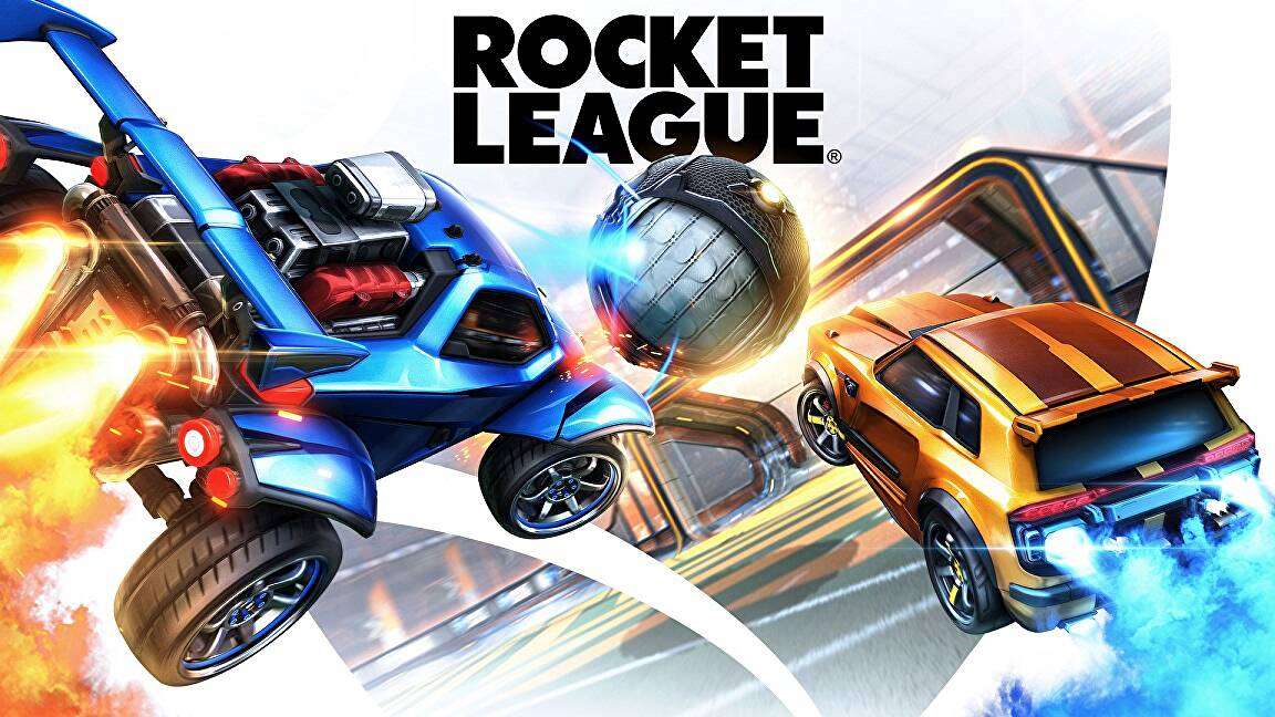
Imagine zooming across an arena, a blur of metallic sheen and roaring engines. Suddenly, a name flashes on the screen, illuminated by neon – it’s unmistakable, the Rocket League font, a typeface that’s become synonymous with high-octane thrills in the gaming world.
It screams speed, precision, and the kind of edge only the slickest digital design can convey.
Here’s the thing: whether you’re a seasoned designer with eyes for aesthetics or a gamer passionate about the visuals that define your favorite virtual worlds, that iconic typography holds secrets to more than just style.
It’s a gateway to understanding the nexus of esports logo design and game interface typography.
Dive headfirst with me, a palette wielding, pixel-perfecting maestro, into the compelling universe of fonts where the Rocket League text style reigns supreme.
Together we’ll decode the nuances of video game graphic design, unearthing the ‘how’ and ‘why’ of futuristic typeface choices that do more than just look good—they resonate with gamer communities and forge brand identities.
Expect to emerge fluent in the visual language that drives the adrenaline-fueled spectacle of Car soccer typeface and why it matters in the grander scheme of gaming typography.
About Rocket League
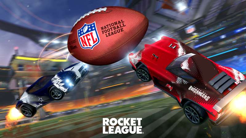
In a nutshell, Rocket League is a multiplayer computer game that borrows elements from both racing and soccer/football while creating a unique formula. On the one hand, there is the game’s “Racing” mode, which lets you drive a car around the track while performing jaw-dropping jumps thanks to your unique talents.
In addition, there are the traditional football/soccer rules, which require you to direct the ball to the “net,” score some goals and finish the game with a better result than the other team. Not to mention, if you’re a brand-new gamer, you can find the Rocket League logo on practically every gaming platform out there.
Rocket League Logo: Meaning and History
The Rocket League’s visual identity has through two iterations of its logo, and it opted for minimalism. In contrast to the most recent revamp, which had a radically minimalistic design, the original emblem was the most intricate and colorful.
2014 – 2015
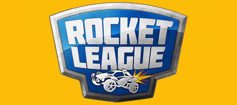
The cross-platform video game’s original logo was a complex geometric design with a top and bottom that resembled two rectangles placed on top of each other. A chrome frame encircled the full outside of the design. It was broad and substantial (in 3D). The icon’s primary area was tinted blue, and the icon and the text were placed on top of this background. Naturally, the racing car in the emblem was the main visual. It had big wheels and was white with beautiful details. The video game’s name appeared in large fonts in the text portion. In the upper register, it had a chic sans-serif at first.
2015 – 2020

The 2015 makeover included a new badge concept, which is still visible today albeit in a different form. It had a black logotype on a three-dimensional blue emblem with a white automobile image on it. Both phrases were capitalized and arranged one under the other in a bold, contemporary sans-serif typeface. A gradient gray sphere adorned the crest’s upper left corner. Along with the original form, there were also two flat monochrome variations with a white crest and a black artwork on it, or its opposite version.
2020 – Today
The logo was modified following Psyonix’s acquisition of Epic Games. This move to free-to-play was also impacted by the transition. The Octane shield is absent from the current version of the emblem. All graphic elements were eliminated as a result of the redesign so that the game’s name could take center stage. There isn’t even the slightest alteration made to the phrase “Rocket League.” As before, it is written in capital letters, painted in black, and made up of big, broad characters.
Rocket League Logo Font

The name is written in a Futura ExtraBold-like geometric chopped typeface. The letter “G” is the lone alternative. The other indicators are all the same. This font was developed by designer Paul Renner in 1927. The icon’s color scheme is fairly diverse and consists of a gray ball and a blue shield with white accents.
Futura ExtraBold consists with:
- Futura ExtraBold Compressed
- Futura ExtraBold Italic
- Futura ExtraBold Oblique
- Futura ExtraBold Outline
- Futura ExtraBold Shaded
The ideal typeface for all of your whimsical ideas is Futura ExtraBold. The Extra Bold font subfamily is used. The Futura ExtraBold can be used to make intriguing covers, shop and store names, and logos. In addition, the Futura ExtraBold typeface is ideal for branding tasks, home furnishings designs, product packaging, or just for chic text overlays on any background image.
The following logos, movie posters, album covers, etc., in addition to Rocket League, also feature the Futura typeface: Calvin Klein, Wedding Crashers, Cluedo Logo, Cosmopolis, Forza Horizon, Father of the Bride, Licence to Kill, Gravity, Dope Logo, Life of Pi, Native, Rage Valley, Ninja Assassin, The Wolf Among Us, PEGI Logo.
For the Rocket League wordmark, which consists of large geometric characters, designers created their own collection of glyphs. Other fonts that are similar but not identical Twentieth Century Ultra Bold, Gotham Bold/Heavy, and Akagi Pro Fat.
Gotham Bold Font
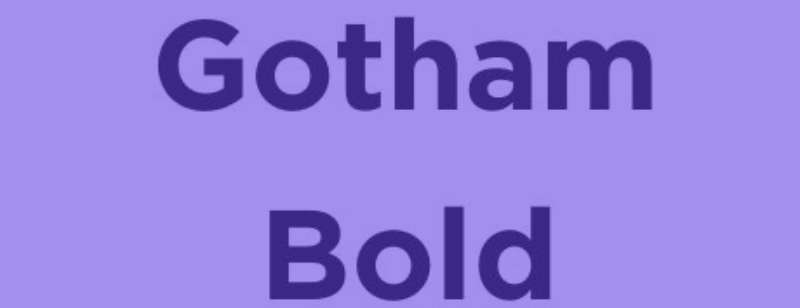
Only the foundation of a large family of fonts, the iconic Gotham typeface was inspired by the strong architectural capitals. Gotham is a strong and essential design that comes in four distinct widths and a variety of weights, as well as comprehensive character sets, extended language compatibility, and variations for various media. The same eight weights, from Thin to Ultra, are offered in both roman and italic for each of the Gotham family’s four widths. To ensure that each style has a heavier equivalent that gives the same level of emphasis, Gotham maintains visually consistent gaps between its weights.
Twentieth Century Ultra Bold

Between 1936 and 1947, Sol Hess created and drew Twentieth Century at the Lanston Monotype drawing department. The Monotype typeface library received its first weight in 1959. The geometric forms that served as the foundation for Twentieth Century began in Germany in the early 1920s and were fundamental to the Bauhaus movement at the time. The emphasis shifted from needless ornamentation to form and function.
It was most acceptable to use this simple sans-serif with geometric shapes. Text can be set using the softer weights of the Twentieth Century font family, while headlines and advertisements can be displayed using bold and condensed styles. It is frequently spelled 20th century.
Akagi Pro Font

The well-known Akagi typeface has been entirely rebuilt and expanded in Akagi Pro. The expansion continues to be described as modern, tidy, straightforward, and friendly. It adds more than 250 additional characters per weight, numerous new ligature options, expanded stylistic alternates, four sets of figures, new symbols, case-sensitive punctuation, superscripts, subscripts, ordinals, expanded language support, and two new styles that give the lighter weights of the family even more flexibility.
Use of the Rocket League Font
Creating movie posters, banners, posters, sports logos, titles, game graphics, game development, distinctive emblems, printing on fabrics, card printing, technical documentation, and much more is simple thanks to their striking appearance.
License Info
Please be advised that the Futura ExtraBold typeface is only available for personal use. For commercial use or any kind of support, you must, nevertheless, get in touch with the author.
FAQ On The Rocket League Font
Can I Download the Rocket League Font?
Sure thing, you can. It’s floating around the web, you see. Just search for fan-made versions or hit up places like Steam Workshop – they’ve got a variety of options, especially with downloadable content.
Is the Rocket League Font Free to Use?
Here’s the scoop – it’s a mix. Some versions out there are up for grabs at no cost, yup. But, always check the usage rights. You don’t want to score an own goal with copyright issues, trust me.
What’s the Official Name of the Rocket League Font?
Officially? It’s a custom deal, no name-brand stuff. Psyonix hasn’t released it for public use. The ones you find online? They’re homages, crafted by fans who love the game’s bold digital font vibe.
Can I Use the Rocket League Font for My Logo?
You’re feeling inspired, right? I get it. But remember, those gaming typography rights? Tricky territory. For your own brand, you’re better off using something similar but not identical. Stay clear of legal tussles, yeah?
How Do I Install the Rocket League Font?
Piece of cake. Download the font file, unzip if it’s packed tight, and right-click to install. Gamer communities often have step-by-steps if you hit a bump.
Is the Rocket League Font Used in Other Esports Titles?
Not as such. Each game usually rocks its own style. But hey, the influence is there – you’ll see esports tournaments borrowing from that futuristic typeface look for that hype factor.
Can I Modify the Rocket League Font?
Go for it if it’s for personal use. Just don’t distribute modified versions if the license hollers ‘no.’ Graphics in digital branding – it’s an art, and respect for the original creator’s vision is key.
What Font Is Closest to the Rocket League Font?
Ah, looking for twins, are we? There are a few. Think along the lines of Impact or Bebas Neue. They’ve got that rocket league text style swagger. Solid and impactful, just how you like it.
How Do I Make Text Look Like the Rocket League Font?
You need a program with juice, like Adobe Illustrator or Photoshop. Thicken up a sans-serif font, tilt it maybe, slap on a gradient. Play with it. That’s the spirit of user-generated content, right?
Why Does the Rocket League Font Look So Unique?
It’s all about that brand identity, setting the game apart. The designers over at Psyonix? They knew what they were doing. It’s bold, dynamic – echoes the pace of online multiplayer games with every curve and line.
Conclusion
Well, we’ve done the full lap, haven’t we? Talked about the Rocket League font, that sleek symbol of digital octane joy. We’ve explored the ins, the outs, the maybes, and the no-gos.
Designed by the creators over at Psyonix, this font’s beyond just letters on a screen. It’s a vibe, a feeling – the rush of a last-second goal, the tension of an overtime thriller. We’ve unpacked alternatives, like Impact or Bebas Neue, for when you need that similar look without stepping on any toes.
So, design aficionados and Rocket League die-hards, keep those concepts in your back pocket.
- Feel like crafting a logo? Remember, inspiration – cool; imitation – not so much.
- Want to mess around with some typeface? Mix it up, but play fair with copyright, okay?
Until next time – boost, flip, and keep that aesthetic just as rad as a Rocket League aerial goal. Keep creating, keep playing, and definitely keep designing.
If you liked this article about the Rocket League font, you should check out this article about the the Batman font.
There are also similar articles discussing the Superman font, Captain America font, Black Panther font, and GTA font.
And let’s not forget about articles on the Hulk font, Call of Duty font, Apex Legends font, and The Sims font.
- Rainbow Color Palettes for Joyful Designs - 29 April 2024
- The Bethesda Logo History, Colors, Font, And Meaning - 28 April 2024
- Out of This World: Space Color Palettes for Cosmic Designs - 28 April 2024


