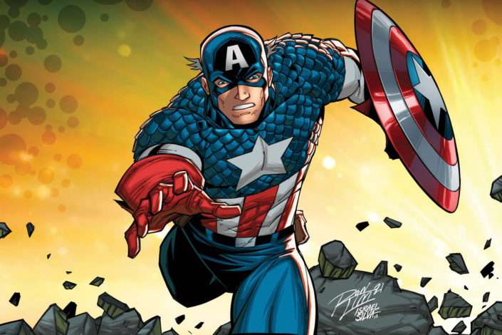
Captain America uses American Captain, a bold condensed display typeface designed by Michael Gene Adkins and published by The Fontry. The font closely matches the title lettering from the 2011 film Captain America: The First Avenger and has since become the go-to typeface for anyone recreating the Captain America logo style.
It was first released in 2010, with an updated version published in 2011. The Fontry holds all commercial rights to the font.
—
What Type of Font Is American Captain?
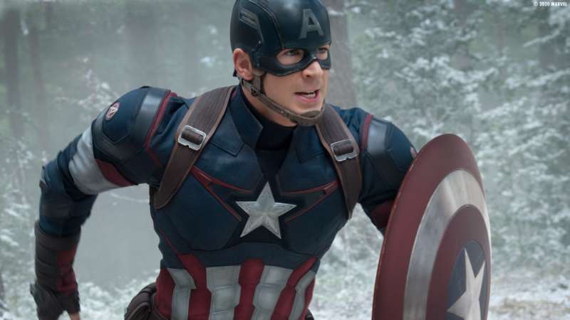
American Captain is a condensed sans-serif display font. It sits in the category of bold block lettering that pulls from American military and wartime graphic design, specifically 1940s signpainting and comic book lettering traditions.
Its letterforms are tall, narrow, and heavy. There’s almost no variation in stroke width, which gives it that punchy, all-caps look you see on WW2-era propaganda posters and vintage athletic gear.
A few visual traits worth noting:
- Strictly uppercase construction (no lowercase in the free version)
- Tight letter spacing by default
- Blunt terminals with minimal ornamentation
- Uniform stroke weight throughout
If you’re thinking about typography classifications, this one sits firmly in the display category, not meant for body copy. It’s a display font built for headlines, posters, and titles.
That condensed structure is intentional. Condensed fonts like this one let designers pack large text into tight spaces without losing visual weight, which is exactly what movie title treatment demands.
Who Designed American Captain?
Michael Gene Adkins designed American Captain. He co-founded The Fontry in 1992 alongside James L. Stirling, and the foundry’s roots are in the signmaking and screenprinting industries.
That background shows up directly in the font. The letterforms weren’t built for books or UIs. They were made to be read from a distance, printed on surfaces, cut from vinyl.
The font draws inspiration from lettering styles that go back to at least the 1940s, passed down through generations of hand-letterers and signpainters. Adkins essentially codified that tradition into a usable digital typeface.
American Captain was not commissioned by Marvel. It’s a commercially released typeface that happens to closely match the movie’s title lettering, not an official Marvel asset. Understanding font licensing matters here, especially if you’re planning to use it in a project.
Is American Captain Free to Use?
The free version is available for personal use only. Commercial use requires a paid license from The Fontry.
| Version | Cost | Use Case | Character Support |
| Free (personal) | $0 | Personal projects only | Uppercase, numbers, Greek, Cyrillic |
| Commercial family | Paid (contact Fontry) | Branding, advertising, products | 6 styles, full language support |
The commercial package includes 6 styles and adds OpenType features: small caps, fractions, stylistic sets, and glyph replacements. It also covers Central European characters, Hebrew, Greek, and Cyrillic.
You can download the free version from DaFont or Font Squirrel. For commercial licensing, contact The Fontry directly via their website or at the_fontry@yahoo.com.
Don’t paste it onto a paid product without checking the license. Marvel is definitely watching, and so are IP lawyers.
What Font Did Captain America Use Before?
The Captain America comic logo has gone through several distinct iterations since the character debuted in Captain America Comics #1 in March 1941, with hand-lettered type by co-creators Joe Simon and Jack Kirby.
Here’s a rough timeline of how the lettering evolved:
- 1941 original: Hand-lettered by Joe Simon, bold and irregular, purely hand-drawn
- 1982 revival: Marvel recreated the Simon-era logo for a special cover run
- 1995 redesign: Designer Todd Klein submitted new options to Marvel, building on Serpentine Bold (designed by Dick Jensen, 1972) with custom modifications
- 2011 film title: American Captain by The Fontry closely matches the movie treatment
- Civil War (2016): The “CIVIL WAR” subtitle used Komu A, a sans-serif designed by Slovakian designer Ján Filpek
Each era of the Captain America logo reflects the graphic design norms of its time. The 1940s versions were raw and hand-made. The 1990s redesign leaned into computer-aided precision. The MCU title treatment went back to something that felt vintage and solid.
That kind of typographic evolution is worth understanding if you’re into graphic design movements or how logo design shifts alongside culture.
What Are the Best Free Alternatives to American Captain?
You can’t use American Captain commercially without paying. Here are 5 alternatives that get close to that same bold condensed superhero look:
| Font | Similarity | License | Source |
| Captain Canaveral | Very close condensed block style | Free | DaFont |
| Bebas Neue | Condensed all-caps sans-serif | Free | Google Fonts |
| Mecha Condensed Bold | Strong geometric block letterforms | Free (personal) | DaFont |
| Rajdhani SemiBold | Clean condensed feel, more modern | Free (OFL) | Google Fonts |
| Oswald Bold | Tall, narrow, confident presence | Free (OFL) | Google Fonts |
Bebas Neue is probably the most used alternative in the design world right now. It’s not a perfect match, but it has that same tall, commanding presence. Bold condensed fonts like these work well for poster design, titles, and anything needing that patriotic-military-retro feel.
If you’re specifically looking for something close to Impact’s weight but with a more heroic character, check out the fonts similar to Impact list. Some of those overlap well with the American Captain aesthetic.
How to Use American Captain in Design Tools
Once you’ve downloaded the OTF or TTF file from DaFont, the installation process is the same across most platforms: unzip, right-click the font file, and install.
Figma: Go to your local font folder after installing. Figma picks up system fonts automatically, no import needed.
Photoshop: Install the font to your system first. It’ll appear in the font list inside Photoshop on next launch. If you need a step-by-step walkthrough, this guide on how to add fonts to Photoshop covers it clearly.
Canva: Free plan users can’t upload custom fonts. If you’re on Canva Pro, you can upload fonts to Canva directly through the Brand Kit section.
Illustrator: Same process as Photoshop. System install, then it shows up automatically. Here’s a full guide on how to add fonts to Adobe Illustrator if you hit any issues.
CSS / Web: American Captain isn’t on Google Fonts, so you’d need to self-host it. Use @font-face with the OTF or TTF file. Just make sure your license covers web embedding before going live.
Why Did Marvel Choose This Style of Font?
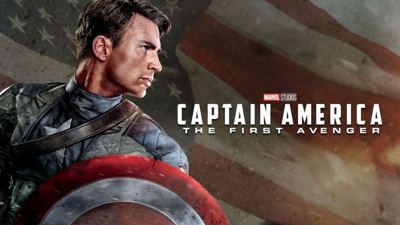
The short answer: it matches the character.
Captain America is a product of 1940s America. His visual identity, the shield, the red-white-and-blue color palette, and the typography, all pull from that wartime era. A condensed bold sans-serif reads as strong, stable, and unapologetically American. That’s intentional.
The psychology behind this font choice is grounded in how people respond to letterform weight and proportion. Heavy, tall letters communicate authority and toughness. They don’t invite doubt. That’s exactly what a super-soldier character needs on a movie poster.
It also connects to emphasis as a design principle. The all-caps treatment and condensed weight make sure the title commands attention before any other element on the poster.
Compare that to something like the Avengers font, which leans more into a sharp, angular sci-fi direction. Or the Spider-Man font, which is looser and more playful.
Each Marvel character has its own typographic logic. Captain America’s version just happens to be the most grounded in actual American graphic design history, which makes it feel authentic rather than invented. That’s good visual storytelling.
The same thinking applies to other superhero fonts. If you’re curious how the approach compares, check out the Superman font or the Batman font. They’re all doing the same thing: using typography to communicate character before a word is even read.
FAQ on What Font Does Captain America Use
What is the Captain America font called?
It’s called American Captain, designed by Michael Gene Adkins and published by The Fontry in 2010.
The font closely matches the title lettering from the 2011 film and is the most recognized typeface associated with the character.
Is the Captain America font free?
The basic version is free for personal use only.
Commercial projects require a paid license from The Fontry. The full commercial family includes 6 styles with complete character sets and OpenType features.
Where can I download the Captain America font?
The free personal-use version is available on DaFont and Font Squirrel.
For commercial licensing, contact The Fontry directly at their official website. Don’t use the free version on paid projects without checking the license terms.
What type of font is American Captain?
It’s a condensed sans-serif display font with bold, all-caps letterforms and uniform stroke weight.
The style draws from 1940s American military lettering, signpainting, and comic book typography traditions. It reads as strong and authoritative at large sizes.
Did Marvel commission the Captain America font?
No. American Captain is a commercially released typeface, not an official Marvel asset.
It was designed independently by Michael Gene Adkins at The Fontry and happens to closely match the movie title lettering from the 2011 film.
What font is used in Captain America: Civil War?
The “CIVIL WAR” subtitle used Komu A, a sans-serif typeface designed by Slovakian designer Ján Filpek.
The “Captain America” portion of that title still used lettering closest to American Captain. Different films in the MCU often apply slight typographic variations.
What are the best free alternatives to the Captain America font?
Bebas Neue and Oswald Bold are the most practical free alternatives, both available on Google Fonts.
Captain Canaveral on DaFont is also a close match. All three share that tall, condensed bold presence without requiring a commercial license.
What fonts are similar to Impact that work for superhero designs?
Impact is a heavy grotesque, not a true match for American Captain, but both share that commanding, bold display quality.
Fonts like Bebas Neue, Oswald, and Mecha Condensed sit closer to the superhero lettering style. Check out this list of fonts similar to Impact for more options.
How does the Captain America font compare to other Marvel superhero fonts?
Each Marvel character uses distinct typography to reinforce personality. The Spider-Man font is looser and more playful. The Superman font leans toward bold slab serifs.
American Captain is the most historically grounded, pulling directly from real 1940s American graphic design rather than invented superhero aesthetics.
Can I use the Captain America font style for my own logo?
You can use American Captain for a logo, but only with a commercial license from The Fontry.
Review the logo design principles around font licensing before committing to any typeface for brand use. Free alternatives like Bebas Neue carry open licenses that are much simpler to work with.
Conclusion
Now you know what font does Captain America use: American Captain, a condensed sans-serif display typeface by Michael Gene Adkins at The Fontry, rooted in 1940s military lettering and wartime poster typography.
For personal projects, the free version works fine. For anything commercial, get the proper license or reach for a free alternative like Bebas Neue or Oswald Bold.
The font choice isn’t random. It reinforces Steve Rogers’ identity through patriotic bold lettering that connects comic book heritage with MCU branding, making it one of the most recognizable pieces of superhero typography in Marvel’s visual history.

Renowned for his expertise in logo design and visual branding, Bogdan has developed a multitude of logos for various clients.
His skills extend to creating posters, vector illustrations, business cards, and brochures. Additionally, Bogdan's UI kits were featured on marketplaces like Visual Hierarchy and UI8.
He also wrote in the past years on sites like Design Your Way, WebDesignerDepot, WPDean, Designmodo, Speckyboy, Slider Revolution, and more.
- Canva AI Features Reviewed: Are They Actually Useful? - 4 October 2026
- The Substack Logo History, Colors, Font, And Meaning - 2 October 2026
- How UX Design Impacts SaaS User Retention and Churn - 1 October 2026

Bogdan Sandu is a seasoned designer who has been designing websites since 2008. Renowned for his expertise in logo design and visual branding, Bogdan has developed a multitude of logos for various clients. His skills extend to creating posters, vector illustrations, business cards, and brochures. Additionally, Bogdan's UI kits were featured on marketplaces like Visual Hierarchy and UI8. He also wrote in the past years on sites like Design Your Way, WebDesignerDepot, WPDean, Designmodo, Speckyboy, Slider Revolution, and more.
You Might Also Like