Batman does not use a single, unified font. Every film, TV series, and comic era has commissioned or adapted its own custom lettering, with the Batman wordmark consistently built from bold, angular letterforms featuring sharp serifs and heavy strokes.
The most widely recognized Batman title treatment is proprietary to its specific production. No single typeface has been officially licensed across all Batman branding by Warner Bros. or DC Comics.
What Type of Font Does Batman Use?
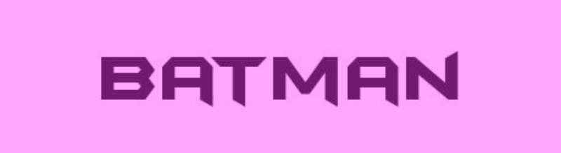
Across its 85-year history, Batman typography has stayed within a consistent typographic territory: bold, condensed display lettering with strong vertical stress and angular construction.
The classic DC Comics wordmark uses sharp-serif display lettering, with thick strokes, tight tracking, and a compressed horizontal footprint. This is a condensed font approach, built for impact at large scale.
The x-height across most Batman title treatments is relatively low, pushing visual weight into the capitals. That makes the lettering read as authoritative and severe, matching the character’s psychological identity.
In terms of classification, Batman’s lettering sits in display font territory, specifically within bold gothic and angular serif sub-categories. It is not a humanist typeface and carries none of the warmth associated with, say, a serif font designed for body text.
Emphasis is achieved through weight alone, not contrast of style. The letters are uniformly heavy.
Who Designed the Batman Font?
There is no single designer. Batman’s lettering has been handled by different studios and graphic designers for each major production. Here’s how it breaks down by era:
- 1966 TV series (Adam West): Hand-lettered credits with comics-based irregular contrast. In 2012, designer Ryan Hughes created Kane, a typeface directly based on that lettering style.
- Batman: The Animated Series (1992): Used Plaza, a font designed by Alan Meeks and released by Letraset in 1975. Plaza references Art Deco letterforms from the 1930s, paired with caps from Empire (1937).
- Tim Burton’s Batman (1989) and Batman Returns (1992): Custom-designed wordmarks with no confirmed commercial typeface match. The closest identified alternative for Batman Returns is Danmark URW Bold.
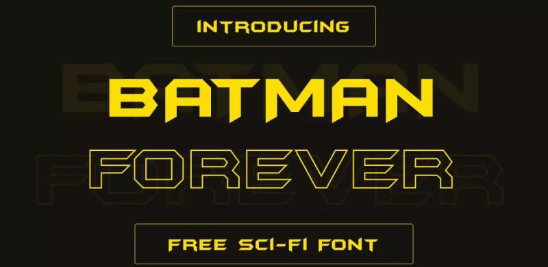
- Batman Forever (1995): Custom lettering. A fan-made digital recreation called Batman Forever is widely available as a free download.
- The Dark Knight Trilogy (2005–2012): Custom proprietary lettering commissioned for Christopher Nolan’s films. Not publicly available.
- The Batman (2022): Bold, blocky red-and-black custom lettering debuted at DC FanDome 2020. Designed specifically for Matt Reeves’ production.
The Batman: The Animated Series use of Plaza is one of the few confirmed, commercially available typefaces in Batman’s title history.
Is the Batman Font Free to Use?
Most Batman title fonts are proprietary and not publicly available. But here is the breakdown by version:
Plaza (Animated Series font): Commercial license. Available through Letraset and various font retailers. Not free.
Batman Forever font (fan recreation): Available as a free download from sites like FontMeme and FontBolt. Personal use only. Not licensed for commercial projects involving the Batman brand.
Kane (based on 1966 lettering): Created by Ryan Hughes in 2012. Available for download, though font licensing terms vary depending on the source. Check the specific distributor before any commercial use.
Tim Burton era, Nolan trilogy, Matt Reeves era: All custom. None publicly available. Using lookalikes is fine for fan projects, but any commercial application requires licensing through Warner Bros. Consumer Products.
Selling products that use Batman lettering without a license, regardless of which font you use, constitutes trademark infringement. Personal, non-commercial fan art typically goes unenforced, but it is not a legal green light.
What Font Did Batman Use Before?
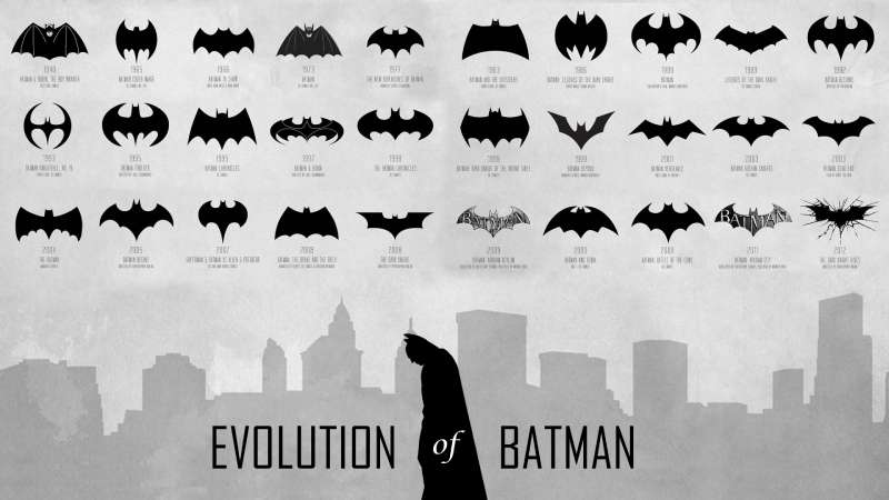
Batman’s typographic history is really a series of distinct rebrands, each tied to a specific director’s vision or editorial era.
Pre-1966 (comics era): Hand-lettered title cards and cover typography, no standardized typeface. DC Comics lettering was done by staff letterers and varied across issues.
1966: Comics-style irregular hand lettering in the TV series, later replicated by the Kane typeface.
1992: Plaza (Art Deco) for Batman: The Animated Series, chosen to match the show’s Dark Deco visual aesthetic set in a noir 1930s-influenced Gotham City.
1989–1997 (Burton/Schumacher era): Custom wordmarks per film, progressively more stylized from Burton’s gothic restraint to Schumacher’s neon excess in Batman Forever and Batman & Robin.
2005–2012 (Nolan era): Stripped-back, militaristic custom lettering. The yellow oval was removed entirely. Typography matched the grounded, tactical aesthetic Nolan applied to everything in the production.
Each shift in lettering tracked almost exactly with the shift in tone. That is not a coincidence.
What Are the Best Free Alternatives to Batman-Style Fonts?
If you need a bold, dark, condensed typeface with a similar visual weight to Batman’s title lettering, these are solid options:
| Font | Similarity | License | Source |
| Bebas Neue | Bold condensed all-caps display, strong vertical stress | Free | Google Fonts |
| Oswald | Condensed gothic feel, heavy weight variants | Free | Google Fonts |
| Black Han Sans | Ultra-bold, tight letterforms, angular construction | Free | Google Fonts |
| Chunk Five | Slab serif with heavy strokes, vintage poster feel | Free (OFL) | Font Squirrel |
| Plaza (fan version) | Direct Art Deco match to Animated Series lettering | Check license | Various font sites |
Bebas Neue is probably the most practical choice for most designers. It is free, widely available, and carries the same compressed, all-caps authority that Batman’s branding relies on.
Oswald works better when you need mixed case. It is one of the best free Google Fonts for anything that needs weight and edge without going full decorative.
How to Use Batman-Style Fonts in Your Design Projects
In Figma or Adobe Illustrator
Download Bebas Neue or Oswald directly from Google Fonts. Both are straightforward installs. If you need to add fonts to Adobe Illustrator, install them at the system level first, then restart the application.
For a closer match to the 1989 Batman film aesthetic, pair a bold condensed typeface with a textured or distressed layer in Illustrator. The custom wordmark from that era had deliberate roughness to it.
In Canva
Bebas Neue is available natively in Canva’s font library. No need to upload fonts to Canva separately. Search directly in the font picker.
For fan art or poster work, pair it with a dark color palette in near-black and deep yellow. That combination carries the strongest Batman visual association, referencing the yellow oval era that ran from 1964 to 2000.
In CSS (Web Use)
Oswald and Bebas Neue are both available via Google Fonts embed. Drop this into your stylesheet for Bebas Neue:
“ @import url('https://fonts.googleapis.com/css2?family=Bebas+Neue&display=swap');
h1 { font-family: ‘Bebas Neue’, sans-serif; letter-spacing: 0.05em; } `
Tight tracking and uppercase text are key to getting the Batman visual feel in a web context.
Why Did Batman Choose Custom Lettering Instead of a Standard Font?
Batman’s branding is one of the most aggressively protected intellectual properties in entertainment. Warner Bros. holds registered trademarks on dozens of Batman logo variations. Custom lettering is part of that protection strategy: a typeface that exists nowhere else is inherently more defensible than a commercial font anyone can license.
Beyond legal strategy, the character demands it. Font psychology consistently shows that angular, heavy letterforms communicate threat, authority, and dominance. A standard geometric sans-serif font would undercut that immediately.
Each director’s choice of lettering also functioned as a creative statement. Tim Burton’s 1989 wordmark leaned gothic and slightly theatrical. Nolan’s stripped it back to something almost stencil-like. Matt Reeves went high-contrast red-on-black, matching the neo-noir, Zodiac-killer-influenced tone of his film.
The lettering was never decoration. It was always part of the storytelling.
DC Comics and Warner Bros. have consistently used custom Batman typography as a signal of brand authority. Alongside comparable franchises like The Avengers, Spider-Man, and Superman, Batman’s lettering sits in a category of superhero branding where the title treatment itself carries the weight of decades of cultural recognition.
That is a harder thing to achieve with a typeface off the shelf. And it is why every Batman production starts from scratch.
FAQ on What Font Does Batman Use
Is there one official Batman font?
No. Batman has never used a single standardized typeface across all productions.
Every film, series, and comic era commissioned its own custom lettering. Warner Bros. and DC Comics treat each version as a distinct, proprietary design tied to that production’s visual identity.
What font does the Batman logo use?
The Batman logo relies almost entirely on the bat symbol, not typography.
When a wordmark appears, it uses custom lettering built from bold, angular, sharp-serif display strokes. No commercial typeface has been officially confirmed for the core DC Comics Batman wordmark.
What font was used in Batman: The Animated Series?
Plaza was the primary typeface, designed by Alan Meeks and released by Letraset in 1975.
It references Art Deco letterforms from the 1930s, which matched the show’s Dark Deco visual style. Plaza is a commercial font, not freely available.
What font did Tim Burton’s Batman use?
Burton’s 1989 Batman wordmark was custom-designed with no confirmed commercial typeface match.
For Batman Returns (1992), the closest identified alternative is Danmark URW Bold. Both treatments were bespoke, gothic in tone, and not publicly available as downloadable fonts.
What font is used in The Batman (2022)?
Matt Reeves’ 2022 film uses bold, blocky custom lettering in a high-contrast red-and-black palette.
The logo was first revealed at DC FanDome in 2020. It was designed specifically for the production and is not a commercially licensed typeface.
Can I download the Batman font for free?
Fan-made recreations exist. The Batman Forever font is available as a free personal-use download on sites like FontMeme and FontBolt.
Kane, based on the 1966 Adam West series lettering, is also downloadable. Neither is licensed for commercial use involving the Batman trademark.
What free font looks most like the Batman logo?
Bebas Neue is the closest freely available match for Batman’s bold, condensed display aesthetic.
It is a condensed font available on Google Fonts at no cost. Oswald and Black Han Sans are solid alternatives with similar visual weight and tight letterform construction.
What font is used in Batman comic books?
DC Comics lettering was historically done by hand by staff letterers, varying across titles and decades.
There is no single confirmed typeface used across all Batman comic book runs. Modern DC lettering is largely digital, using proprietary in-house typefaces developed for print and digital formats.
Why does each Batman film use a different font?
Each director treats the Batman title card as part of their film’s overall visual language.
Nolan stripped the lettering back to match his tactical realism. Reeves went high-contrast noir. Burton leaned gothic. The psychology behind each font choice directly mirrors the tone of that specific production.
Is the Batman font related to the Gotham typeface?
Only by name. The Gotham typeface is a geometric sans-serif font designed by Tobias Frere-Jones, released in 2000 through Hoefler & Co.
It is named after New York City’s nickname, not the fictional city in DC Comics. Batman’s actual title lettering shares none of Gotham’s clean geometric structure.
Conclusion
So, what font does Batman use? There is no single answer, and that is the point.
Every era of Batman typography, from the Art Deco Plaza lettering in the Animated Series to Matt Reeves’ high-contrast custom wordmark, was built to serve a specific tone and visual identity.
The DC Comics Batman wordmark has always leaned on bold, angular, condensed display lettering as its foundation, even as individual productions pushed that in different directions.
For designers working on Batman-inspired projects, iconic fonts like Bebas Neue or Oswald get you close without the trademark complications.

Renowned for his expertise in logo design and visual branding, Bogdan has developed a multitude of logos for various clients.
His skills extend to creating posters, vector illustrations, business cards, and brochures. Additionally, Bogdan's UI kits were featured on marketplaces like Visual Hierarchy and UI8.
He also wrote in the past years on sites like Design Your Way, WebDesignerDepot, WPDean, Designmodo, Speckyboy, Slider Revolution, and more.
- The Beehiiv Logo History, Colors, Font, And Meaning - 18 September 2026
- Versatile Work Sans Font Pairing for Every Project - 16 September 2026
- Organize Digital Files Like a Pro Before Your Next Client Handoff - 16 September 2026

Bogdan Sandu is a seasoned designer who has been designing websites since 2008. Renowned for his expertise in logo design and visual branding, Bogdan has developed a multitude of logos for various clients. His skills extend to creating posters, vector illustrations, business cards, and brochures. Additionally, Bogdan's UI kits were featured on marketplaces like Visual Hierarchy and UI8. He also wrote in the past years on sites like Design Your Way, WebDesignerDepot, WPDean, Designmodo, Speckyboy, Slider Revolution, and more.
You Might Also Like