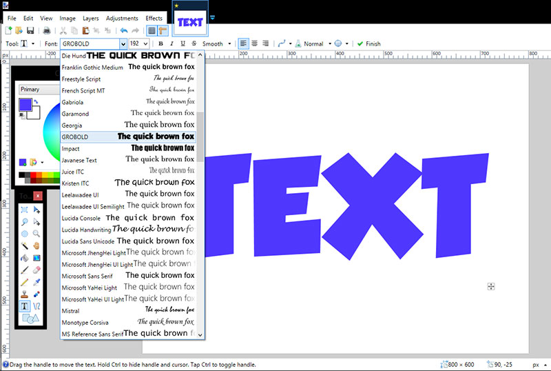
Spider-Man has no single official font. Marvel Comics has used different typefaces across comics, animated series, and films since the character’s debut in 1962. The most recognizable current wordmark is a custom Marvel lettering design introduced in 2005. For the Marvel Cinematic Universe film titles, the “SPIDER-MAN” portion uses Good Times, a geometric sans-serif display typeface designed by Ray Larabie and published by Typodermic Fonts.
Here’s a quick breakdown before we go deeper:
| Media | Font / Typeface | Era |
| Original comic wordmark | Custom sans-serif | 1962–1978 |
| Animated Series title | Custom jagged lettering | 1994 |
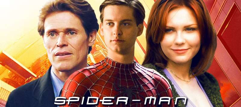
| Sam Raimi films | Customized Mata / Homoarakhan | 2002–2007 |
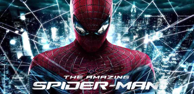
| Amazing Spider-Man films | Amazing Spider-Man Slant | 2012–2014 |
| MCU films | Good Times (Typodermic) | 2017–2021 |
| Into the Spider-Verse | Similar to Veto Bold / Slate Pro | 2018 |
What Type of Font Is Used in the Spider-Man Logo?
The answer depends on which version you mean, and that’s where people get confused.
The current general Marvel wordmark (introduced 2005) uses custom lettering, not a commercially available font. It features geometric, rounded letterforms with slight arch construction, where the first and last characters dip downward. The result is a stable, bold wordmark with soft edges that reads as friendly rather than aggressive.
The MCU film titles use Good Times, a condensed geometric display typeface. It belongs to the techno/futuristic category of display fonts. Capsule-shaped letterforms, uniform stroke weight, and disconnected strokes define its look. Zero serifs. Very 1980s sci-fi in character, which creates an interesting tension against Spider-Man’s fundamentally street-level personality.
The 1994 Animated Series logo went in a completely different direction: tall, jagged, almost fang-like letterforms with aggressive notches carved into each stroke. Technically, this is a custom design with some characteristics of a serif font, though the serifs here function more as decorative spikes than readability aids.
Why the Typographic Variety?
Spider-Man spans over 60 years of publishing and film history. Each era had its own design language.
The 1960s original wordmark reflected comic book production norms: flat, uppercase, bold, and practical. The 1994 animated logo mirrored the angular, edgy aesthetic of 90s action cartoons competing on Saturday morning television. The 2002 Raimi film used a dimensional chrome treatment that was absolutely everywhere in early 2000s movie design.
The MCU chose Good Times partly because it reads cleanly on posters and screens across multiple sizes, and partly because its technical, engineered look supports the high-tech suit narrative Peter Parker carries in those films.
Who Designed the Fonts Used for Spider-Man?
Several designers and foundries are involved here, depending on which font you’re asking about.
Good Times (MCU films): Designed by Ray Larabie and published by Typodermic Fonts, a foundry based in Nagoya, Japan. Larabie created it in 1998, drawing inspiration from the lettering on Pontiac cars from the late 1980s and early 1990s. It wasn’t designed specifically for Marvel. Sony’s marketing team selected it for the MCU Spider-Man film titles.
Customized Mata (Raimi trilogy): The original Mata typeface was designed by Greg Samata in 1993. Sony’s design team modified it with obliquing and a chrome effect for the 2002 film. The fan recreation known as Homoarakhan was released anonymously and is widely acknowledged as an unauthorized derivative.
Amazing Spider-Man Slant (2012–2014): Created by independent designer P.A. Vannucci, directly based on the movie’s title logo. This is a fan-made recreation made available as a free download.
ITC Serif Gothic deserves a mention here, even though it’s not directly tied to movie titles. Designed by Herb Lubalin and Tony DiSpigna in 1972, it appears throughout Marvel Comics contexts and has a strong association with 1970s superhero aesthetics. It’s a hybrid typeface: geometric sans-serif structure with subtle serifs added, loosely based on Lubalin’s earlier Avant Garde. If you’ve seen it used in Star Wars and Star Trek promotional materials from the 1970s, you already know exactly what it looks like.
Is the Spider-Man Font Free to Use?
Depends on which one you want.
Good Times is free for commercial desktop use. Ray Larabie made it available through Typodermic’s website, DaFont, Font Squirrel, and Adobe Fonts. The desktop license covers posters, logos, graphics, and merchandise. Web embedding and app use require a separate license purchased through Fontspring or directly from Typodermic.
Homoarakhan is available as a free download on DaFont and 1001Fonts. It is, however, an unauthorized derivative of a commercial typeface (Mata by Greg Samata), so there are ethical and legal considerations worth knowing before using it in professional work.
ITC Serif Gothic is a commercial typeface. It’s available through Adobe Fonts with a Creative Cloud subscription, and through Elsner+Flake for direct licensing. It is not free.
The custom Marvel wordmark lettering (the 2005 standard comic logo) is proprietary. Marvel owns it. No public download exists, and using it commercially without authorization would be a font licensing and trademark issue.
What Font Did Spider-Man Use Before?
The original 1962 wordmark on Amazing Fantasy #15 and subsequent early issues used a straightforward uppercase sans-serif with block letterforms, yellow with red undersides, and a slight downward curve. No single commercial font has been definitively identified as the source. It followed the practical production conventions of comic book lettering at the time.
By 1979, Marvel redesigned the wordmark. Letters became white with broad red-orange outlines, arranged in an arch with a light gradient. Critics of that era’s design tend to describe it as having a cartoonish quality, which honestly isn’t wrong.
The 1985 version went harder. The lettering adopted a slanted, 3D perspective treatment: orange letters with wide yellow edges, giving the impression the words were leaning forward. A hanging spider appeared directly over the letter “M.” Very much a product of its era.
The 1994 Animated Series introduced the tall, jagged lettering that became iconic for an entire generation of fans. That version stayed in various forms until the 2005 redesign cleaned everything up into the current geometric wordmark with its characteristic arch.
What Are the Best Free Alternatives to Good Times?
If you’re trying to get a similar look to the MCU film titles without paying for anything, these are solid options:
| Font | Similarity | License | Source |
| Orbitron | Geometric, capsule shapes, techno feel | Free (OFL) | Google Fonts |
| Audiowide | Rounded geometric, display-focused | Free (OFL) | Google Fonts |
| Exo 2 | Clean geometric, strong weight range | Free (OFL) | Google Fonts |
| Quantico | Military-tech aesthetic, condensed | Free (OFL) | Google Fonts |
| Rajdhani | Geometric, bold display weight available | Free (OFL) | Google Fonts |
For alternatives to the 1994 Animated Series jagged aesthetic, look at Komika Title or Badaboom BB on DaFont. These capture that aggressive, comic-book-first energy better than the geometric alternatives above.
If you want something closer to the comic lettering tradition specifically, check out what fonts comics actually use for dialogue and title lettering. The pipeline there is different from film branding.
How to Use Good Times or a Spider-Man Style Font in Your Design
In Figma or Illustrator
Download Good Times from DaFont or Font Squirrel. Install it system-wide, then it appears in Figma automatically after a browser refresh. In Illustrator, restart the application after installation.
One thing worth knowing: Good Times is caps-only. It has no lowercase alphabet. If your design needs mixed case, you’re either pairing it with a different typeface for body copy or choosing a different display font entirely. For typography that mixes case naturally, Orbitron or Exo 2 handle this better.
CSS Embed via Google Fonts
Good Times isn’t on Google Fonts, so there’s no direct embed. Orbitron is the closest Google Fonts option. Add this to your stylesheet:
“ @import url('https://fonts.googleapis.com/css2?family=Orbitron:wght@700;900&display=swap');
.spiderman-title { font-family: ‘Orbitron’, sans-serif; font-weight: 900; letter-spacing: 0.05em; text-transform: uppercase; } `
Tracking matters here. The original Good Times logo treatment applies slight letter spacing. Too tight and the capsule shapes start to feel cramped. Around 0.05–0.1em usually hits the right point.
In Canva
Canva doesn’t include Good Times in its standard library. You can upload fonts to Canva if you have a Pro account. The free tier won’t let you import custom fonts, so your best bet within free Canva is searching for Orbitron or a similar geometric option in the font browser.
Why Did Spider-Man’s Film Branding Land on Good Times?
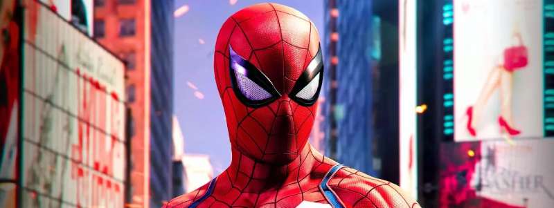
No official statement from Sony or Marvel’s design team explains the specific choice. But the reasoning isn’t hard to work out.
Good Times was created in 1998, made widely available for free, and had already accumulated significant cultural recognition before the MCU Spider-Man films arrived in 2017. Its techno-geometric structure connects to the high-tech world of Stark Industries and the Avengers, which is exactly the context Peter Parker enters in the MCU storyline.
The font also works across the scale requirements of modern film marketing: it reads cleanly on a phone screen in a trailer and holds up at billboard scale without losing character. That’s not a trivial consideration. Visual hierarchy in film marketing requires title treatments that function across dozens of different contexts simultaneously.
Compare this to the Raimi trilogy’s approach. The chrome dimensional treatment used on those posters reflected a design era when 3D text effects were a major production value signal. Audiences associated that visual language with big-budget, serious filmmaking. By 2017, that aesthetic read as dated. Good Times offered something that felt engineered and clean without carrying the baggage of early 2000s Photoshop effects.
The psychology of this font choice is interesting: geometric typefaces generally signal precision, technology, and modernity. For a teenager in a Stark-designed suit operating within a global superhero organization, that framing actually makes sense. It’s a long way from the hand-lettered comic book origins, but it reflects how the character’s brand positioning shifted over 60 years.
If you’re curious how Spider-Man’s approach compares to other Marvel properties, the Avengers font follows a similar logic: bold, geometric, built to scale. The Batman font and Superman font take very different typographic directions that reflect those characters’ fundamentally different visual identities.
Other superhero franchises have made similarly deliberate font choices. The Captain America font leans into a more military-stencil aesthetic, while the Teenage Mutant Ninja Turtles font takes an entirely different approach rooted in comic book lettering tradition. Each franchise’s typography reflects its brand positioning as much as its visual design.
FAQ on The What Font Does Spider-Man Use
What font does Spider-Man use in the MCU movies?
The “SPIDER-MAN” portion of the MCU film titles uses Good Times, a geometric sans-serif display typeface.
Ray Larabie designed it in 1998 and published it through Typodermic Fonts. It appears in Homecoming, Far From Home, and No Way Home.
Is the Spider-Man font free to download?
Good Times is free for commercial desktop use. Download it from DaFont, Font Squirrel, or Typodermic’s website.
Web and app embedding requires a paid license. The official Marvel comic wordmark is proprietary and not available for download.
What font was used in the Sam Raimi Spider-Man trilogy?
Sony’s design team used a customized version of Mata, a typeface originally designed by Greg Samata in 1993.
The fan recreation called Homoarakhan mimics that treatment. It’s widely available but is an unauthorized derivative of the original Mata design.
What font does Spider-Man: Into the Spider-Verse use?
The title uses lettering similar to Veto Bold by Linotype, though some researchers identify Slate Pro Condensed Bold as a closer match.
Neither is an exact fit. The Spider-Verse films used heavily customized type paired with comic book halftone visual techniques.
What is the original Spider-Man comic book font?
The 1962 Amazing Fantasy #15 wordmark used a custom uppercase sans-serif with block letterforms in yellow with red undersides.
No specific commercial typeface has been confirmed as the source. Marvel’s comic lettering evolved significantly through each decade.
Who designed the Good Times font used in Spider-Man films?
Ray Larabie created Good Times in 1998, drawing inspiration from Pontiac car lettering used between 1989 and 1994.
Larabie is a Canadian type designer based in Nagoya, Japan, operating through his foundry Typodermic Fonts, which houses over 500 typefaces.
What font does the Spider-Man logo use today?
The current general Marvel wordmark, introduced in 2005, uses custom proprietary lettering, not a commercially available typeface.
It features rounded geometric shapes with a slight arch, where the first and last characters dip downward. It is not publicly downloadable.
Are there free alternatives to the Spider-Man font?
Yes. Orbitron and Audiowide on Google Fonts are the closest free options to Good Times.
Both are geometric sans-serif fonts released under the Open Font License, meaning free personal and commercial use with no restrictions.
What font was used for the Spider-Man Animated Series logo?
The 1994 Fox Kids series used custom lettering with tall, jagged, fang-like letterforms rendered in yellow with a red drop shadow.
It was not based on a commercial typeface. The aggressive, angular style was designed to stand out against competing Saturday morning cartoon branding.
What font does The Amazing Spider-Man (2012) use?
The Marc Webb films used Amazing Spider-Man Slant, a fan-made typeface created by P.A. Vannucci based directly on the movie’s title logo.
It has a slanted, italicized style with rounded edges. It is available as a free italic font download for personal use.
Conclusion
So, what font does Spider-Man use? There’s no single answer. The Marvel Comics wordmark, the MCU film titles, the animated series lettering, and the Raimi trilogy each made different typographic choices for different reasons.
Good Times by Ray Larabie is the most practical takeaway for designers. It’s free, commercially licensed, and directly tied to the Spider-Man brand identity most people recognize today.
Understanding the full comic book title design history behind this franchise shows how much storytelling a superhero wordmark can carry across six decades of Peter Parker’s visual identity.

Renowned for his expertise in logo design and visual branding, Bogdan has developed a multitude of logos for various clients.
His skills extend to creating posters, vector illustrations, business cards, and brochures. Additionally, Bogdan's UI kits were featured on marketplaces like Visual Hierarchy and UI8.
He also wrote in the past years on sites like Design Your Way, WebDesignerDepot, WPDean, Designmodo, Speckyboy, Slider Revolution, and more.
- Canva AI Features Reviewed: Are They Actually Useful? - 4 October 2026
- The Substack Logo History, Colors, Font, And Meaning - 2 October 2026
- How UX Design Impacts SaaS User Retention and Churn - 1 October 2026

Bogdan Sandu is a seasoned designer who has been designing websites since 2008. Renowned for his expertise in logo design and visual branding, Bogdan has developed a multitude of logos for various clients. His skills extend to creating posters, vector illustrations, business cards, and brochures. Additionally, Bogdan's UI kits were featured on marketplaces like Visual Hierarchy and UI8. He also wrote in the past years on sites like Design Your Way, WebDesignerDepot, WPDean, Designmodo, Speckyboy, Slider Revolution, and more.
You Might Also Like