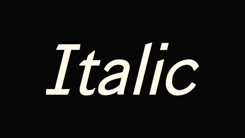
Most people use italic text every day without thinking about it. A quick Ctrl+I in a document, a book title in an essay, a label in a mobile app. But what is an italic font, really? It’s not just slanted letters.
True italic typefaces carry over 500 years of design history, starting with Aldus Manutius in Venice and evolving into one of the most misunderstood elements of modern typography. The difference between a real italic and a browser-generated fake one affects readability, accessibility, and how professional your work looks.
This article covers how italic fonts differ from oblique and roman styles, when to use them (and when not to), how they work in CSS and HTML, and how type designers actually build them from scratch.
What Is an Italic Font
An italic font is a style of typeface where the letters slant to the right and often take on completely different shapes compared to their upright roman counterparts. It’s not just regular text tilted sideways. That’s a common misconception.
True italic letterforms are drawn separately by the type designer. Characters like the lowercase “a,” “e,” “f,” and “g” frequently get redesigned into forms that look nothing like the roman version. The single-story “a” in many italic cuts is probably the most obvious example.
The distinction between a true italic and a simple slant matters more than most people realize. A true italic carries a calligraphic quality, rooted in the way Renaissance scribes wrote by hand. An oblique font, on the other hand, is literally the roman design mechanically angled. Same glyph shapes, just leaning over.
The HTTP Archive’s 2024 Web Almanac found that the italic axis (ital) appears in only about 0.5% of variable fonts on desktop. Weight dominates at 99%. So while italics remain fundamental to typography, the variable font world hasn’t fully caught up yet.
Monotype’s 2024 Font Use and Forecasting Survey reported that 76% of designers prioritize readability and accessibility when choosing fonts. Italic cuts play directly into that conversation, since they affect how text gets read, scanned, and processed.
Where the Name Comes From
The word “italic” comes from Italy. Specifically, from Venice in 1501.
Aldus Manutius, a scholar-turned-printer, commissioned punchcutter Francesco Griffo to create a typeface based on the handwriting style of Italian humanist scholars. The result first appeared in an edition of Virgil’s poetry, published in a small, portable octavo format. This was the first book printed entirely in italic type.
Griffo modeled his letterforms after the cancellaresca script, a cursive handwriting popular among educated Italians at the time. The letters were narrower than roman type, which meant more text fit on each page. For Manutius, this was a practical choice, not a stylistic one. He wanted affordable, pocket-sized editions of Greek and Latin classics.
The Venetian Senate gave Manutius exclusive rights to the italic design. Three Popes confirmed that patent. But it was counterfeited as early as 1502, and within decades, printers across Europe were cutting their own versions.
Something worth noting: Manutius never intended italic for emphasis. He used it as the primary text style for entire books. The shift toward using italics specifically for emphasis within roman text didn’t happen until the 1700s.
How Italic Fonts Differ from Regular (Roman) Fonts
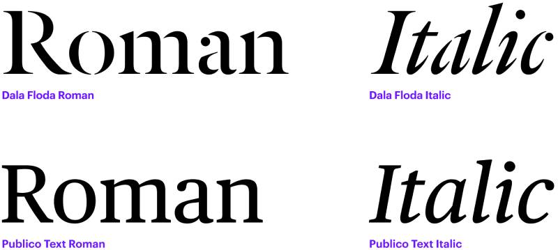
The most visible difference is the slant angle. Italic letters lean to the right, usually between 8 and 12 degrees. But slant alone doesn’t make a font italic.
True italics change the actual structure of individual characters. Look at the lowercase “a” in most serif font italics. The double-story “a” from the roman version becomes a single-story form. The “f” often drops below the baseline with a descending tail. The “g” simplifies into a single loop.
These aren’t cosmetic tweaks. They’re fundamentally different letter drawings.
Structural Changes Beyond Slant
Stroke rhythm: Italic characters tend to have a more flowing, connected quality. Entry and exit strokes on letters like “n,” “m,” and “u” curve more naturally, mimicking pen movement.
Character width: Many italic designs are slightly narrower than their roman counterparts. Historian Harry Carter noted that Manutius’s original italic was about the same width as roman type, but modern italics have trended narrower.
Spacing adjustments: The side bearings (the space on either side of each letter) get recalculated for italic. You can’t just slant the roman spacing and expect it to work. The font spacing requires separate attention.
According to the HTTP Archive’s 2025 Web Almanac, roughly 88% of websites now use web fonts. Within those type families, the italic cut is one of the most commonly loaded secondary styles after bold, though most sites only load two to three weights total.
Serif Italics vs. Sans-Serif Italics
| Feature | Serif italic | Sans-serif italic |
|---|---|---|
| Letterform changes | Significant (a, e, f, g redesigned) | Minimal to moderate |
| Calligraphic quality | Strong, pen-influenced | Subtle or absent |
| Visual contrast with roman | High | Lower |
| Common alternative | Rarely replaced by oblique | Often uses oblique instead |
Serif italics like those in Garamond or Baskerville are almost always true italics with substantial letterform changes. The calligraphic DNA shows clearly.
Sans-serif font families handle it differently. Some, like Gill Sans and FF Meta, include true italic cuts with distinct character shapes. Others, like Helvetica, only offer an oblique. The label might say “italic,” but the letters are just slanted versions of the roman.
Italic vs. Oblique vs. Cursive
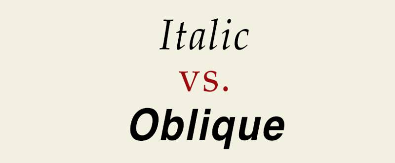
These three terms get mixed up constantly. And honestly, some font vendors make it worse by labeling oblique designs as “italic” on the packaging.
Here’s what actually separates them.
True italic: A separately designed companion to the roman. Different letterforms, calligraphic influence, intentional design decisions for each character. Think of it as a related but distinct sibling within the type family.
Oblique: The roman letterforms slanted mechanically. Same character shapes, same proportions, just tilted. Many grotesque and neo-grotesque sans-serifs ship with obliques rather than true italics.
Cursive: A broader category of handwriting-based type. All italics historically descend from cursive script traditions, but in modern typographic use, cursive refers to script fonts and connected letterforms. Not the same thing as italic in a professional typographic context.
Why the Difference Matters in Practice
CSS gives you three font-style values: normal, italic, and oblique. When you declare font-style: italic, the browser first looks for a true italic font file. If it can’t find one, it falls back to an oblique. If neither exists, the browser fakes it by slanting the roman.
That fake slant (sometimes called “faux italic”) looks bad. Always.
The browser just applies a mathematical transformation to the roman glyphs. Curves get distorted. Stroke weights become inconsistent. Counters (the enclosed spaces inside letters like “o” and “d”) warp in ways the type designer never intended.
The 2024 Web Almanac data shows the ital variable font axis is used on only about 3% of desktop pages that employ font-variation-settings, compared to 75% for weight. The slnt axis (which handles oblique angles) appears on roughly 9% of desktop pages. Most developers still load separate static font files for italic rather than using variable font axes.
Took me a while to understand why some fonts look “off” in italic on certain sites. Nine times out of ten, the designer loaded the roman weight through @font-face but forgot to load the italic file. The browser just winged it. Looked terrible.
Oblique as a Deliberate Design Choice
Not every oblique is lazy design. Some type designers, like Adrian Frutiger, have argued that oblique styles are more appropriate for sans-serif aesthetics. The logic: sans-serif typefaces are built on geometric or rational principles, so a calligraphic italic feels out of place.
Helvetica’s oblique was a conscious decision, not a shortcut. Futura’s oblique follows the same thinking.
But other designers disagree. Martin Majoor (designer of FF Scala) has pushed for true italics even in sans-serif families. Humanist sans-serif typefaces, which take more cues from calligraphy and traditional lettering, almost always include true italic designs. Gill Sans, Goudy Sans, and FF Meta all go that route.
Common Uses of Italic Type
The most familiar use: emphasis. When you want a word or phrase to stand out within a paragraph, you italicize it. Bold draws the eye harder. Italic is more like a nudge.
But italic has a whole set of conventions behind it that go beyond simple stress.
Emphasis and Differentiation in Body Text
Every major style guide assigns specific roles to italic text. APA, Chicago, and MLA all require italics for titles of longer works (books, films, albums, journals). Shorter works like articles and chapters get quotation marks instead.
Foreign words and phrases get italicized on first use. Technical terms being introduced for the first time follow the same pattern. After the first occurrence, you switch back to roman.
Linearity’s font statistics report notes that consistent font use can increase brand recognition by up to 80%. Italic plays into that consistency. When a brand’s typography system defines exactly when and how italic appears (think pull quotes, metadata labels, navigation hints) it becomes part of the visual identity.
Editorial and Publishing Conventions
In book cover design and interior layout, italic serves structural purposes.
- Chapter epigraphs and dedications
- Internal dialogue or thought in fiction
- Stage directions in plays and screenplays
- Latin names in scientific texts (genus and species)
In editorial design, pull quotes often appear in italic to distinguish them from body copy. Magazine layouts use italic captions under photographs. Footnotes sometimes appear in a smaller italic to separate them visually from the main argument.
UI and Digital Applications
On the web, italic shows up in specific interface patterns.
Placeholder text inside form fields frequently renders in italic to signal that it’s a hint, not actual user input. Helper text below inputs follows the same convention. Metadata labels (timestamps, author names, categories) often get the italic treatment to create typographic hierarchy without changing font size or weight.
The Monotype survey found that 83% of designers consider typography important for branding and communication. Italic is a core tool in that toolkit, even if it’s not the first thing people think of.
How to Use Italic Fonts in CSS and HTML
Two HTML tags produce italic rendering, and they’re not interchangeable.
The <em> tag carries semantic meaning. It tells browsers (and screen readers) that the enclosed text has stress emphasis. The <i> tag is purely visual. It renders text in italic without any semantic weight.
Which one you pick depends on intent. If you’re emphasizing a word for meaning (“She never said that”), use <em>. If you’re following a stylistic convention like italicizing a book title or a foreign phrase, <i> is the correct choice.
CSS font-style Property
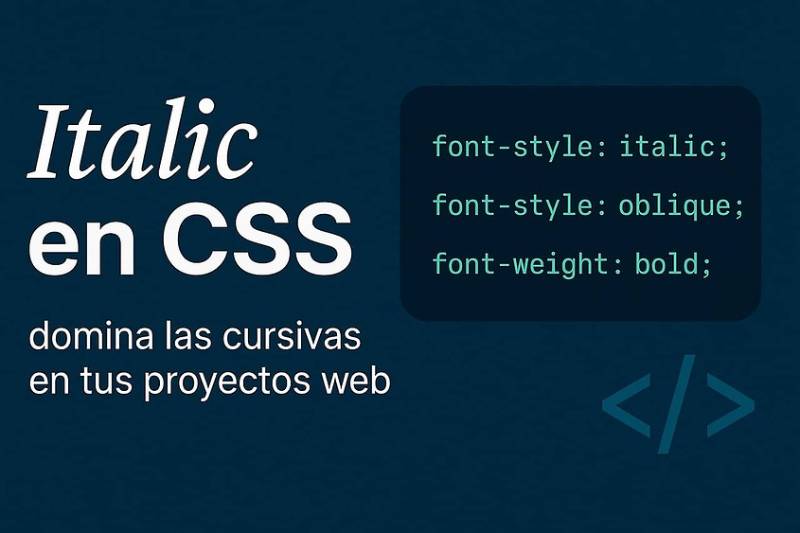
The font-style property accepts three values:
normalfor upright roman renderingitalicfor true italic (with oblique fallback)obliquefor slanted roman, with an optional degree value likeoblique 12deg
When you set font-style: italic, the browser looks for a matching italic font face in the loaded family. If one exists, it renders properly. If not, the browser synthesizes it. You can block that synthesis with font-synthesis: none, though browser support varies.
According to the HTTP Archive’s 2024 data, the weight axis handles 75% of variable font settings on desktop. The italic axis barely registers at 3%. Most teams still load separate .woff2 files for roman and italic rather than relying on a single variable font file.
Loading Italic Fonts with @font-face
This is where people trip up. If you declare a @font-face rule for your font but only point it at the roman file, the browser has no italic to work with. You need a second @font-face block with the same font-family name but with font-style: italic and a source pointing to the italic file.
Skip this step and you get faux italic everywhere. The browser just tilts the roman glyphs, and things like stroke weight, character proportions, and kerning all fall apart.
The 2025 Web Almanac reports that web font usage has reached 88% of all websites. But loading practices still vary wildly. Some sites load six or seven font files. Others load one roman weight and let the browser fake everything else.
Accessibility and Screen Readers
Here’s something that catches people off guard. Screen readers, by default, do not announce italic or bold text to users. Stanford’s accessibility guidelines confirm this. Someone using a screen reader won’t know a word is italicized unless the HTML uses <em>, which conveys emphasis through voice inflection in some (but not all) screen readers.
The <i> tag is silent. It’s purely presentational.
An eye-tracking study published in ACM Transactions on Accessible Computing tested 97 participants (48 with dyslexia) across 12 different fonts. Roman font styles significantly outperformed italic in reading speed for both groups. The British Dyslexia Association’s 2023 Style Guide explicitly recommends avoiding italics, stating they can make text appear to run together and cause visual crowding.
So if your site serves content to a broad audience, long blocks of italic body text are a bad idea. Short phrases for emphasis work fine. Entire paragraphs don’t. Use bold for emphasis when possible, and reserve italic for conventions like titles and foreign terms where the semantic HTML (<cite>, <i lang="...">) carries the meaning.
Italic Fonts in Design Systems and Branding
A brand style guide that includes italic rules prevents inconsistency. Without clear direction, different team members will use italic for different reasons. Some will italicize captions. Others will italicize labels. The result looks messy.
How Italic Fits into a Type Family
Professional type families typically ship with italic cuts across multiple weights. You’ll get light italic, regular italic, medium italic, bold italic, and sometimes more. That gives a design system real flexibility.
Not every family offers this. Budget fonts or free offerings sometimes include only a roman and a bold. No italic at all. This forces designers to either accept faux italic or choose a different typeface.
Monotype’s 2024 survey found that 70% of creatives purchase fonts from popular marketplaces. When buying, checking for a full set of italic weights is the kind of detail that saves headaches later. Spending $300 on a family that doesn’t include italic (when your brand guidelines rely on it) is a costly mistake.
Performance Cost of Loading Italic Files
Every additional font file adds weight to your page.
The 2025 HTTP Archive data shows the median web font file sits around 35-36 kilobytes. Loading a roman, an italic, a bold, and a bold italic means roughly 140 KB just in fonts, before anything else on the page loads. That adds up on mobile connections.
Variable fonts solve this. A single variable font file can contain the roman, italic, and multiple weights in one package. The 2024 Web Almanac reported that about 33% of websites now use variable fonts, up from 28% in 2022. Google Fonts serves 92% of these.
But there’s a catch. Only about 0.5% of variable fonts on the web actually include an ital axis. Most variable fonts only expose weight. So the promise of “one file for everything” isn’t fully realized for italic yet.
When Designers Skip Italic Entirely
Some teams decide italic isn’t worth the performance cost or design complexity. They use other methods for emphasis instead.
- Font weight changes (semibold instead of italic)
- Color shifts within color theory guidelines
- Underlines for links and interactive elements
- Size adjustments for visual hierarchy
This works in some contexts, especially in UI-heavy products where the typographic palette is intentionally minimal. Minimalist design systems often strip away italic to reduce visual noise and keep the interface clean.
But for editorial content, long-form articles, and any context where style guide conventions apply, dropping italic creates problems. You lose the ability to properly format titles, foreign terms, and emphasis in a way readers expect. Brand typography that omits italic is limiting itself from day one.
Popular Typefaces Known for Their Italic Designs
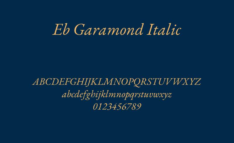
Some typefaces are famous partly because of how good their italics look. The italic cut can make or break a type family, especially in editorial and book work where italic text shows up on nearly every page.
Around 70% of Fortune 500 companies use sans-serif fonts in their logos, according to Linearity’s font statistics report. But when those brands need body text for reports, publications, or long-form content, serif typefaces with strong italic designs still dominate.
Garamond Italic
Garamond’s italic is one of the most admired in the history of type design. The letterforms have a warm, calligraphic quality that traces back to the work of Robert Granjon, who cut the original italic companion for Claude Garamond’s roman in the 16th century.
The lowercase “a” shifts to a single-story form. The “f” extends below the baseline with a sweeping descender. These aren’t decorative flourishes. They come directly from the way Renaissance scribes moved a pen across the page.
Google’s original logo used the Garamond typeface before switching to a custom sans-serif, showing just how far this 500-year-old design has traveled.
Times New Roman Italic
For most people, Times New Roman is the default reference point for what italic text looks like. It ships with every Windows and Mac installation. It’s the baseline.
Stanley Morison, who commissioned the typeface for The Times of London in 1931, described its italic as influenced by the Didot family’s late 18th-century designs. The result is a compact, efficient italic with moderate slant and clear letterform differentiation from the roman.
FontReach data shows Arial leading web usage at roughly 62% of the top million sites, but Times New Roman remains one of the most widely installed system fonts across all operating systems. Its italic gets loaded (and faked) millions of times daily.
Baskerville Italic
Transitional serif characteristics define Baskerville’s italic. John Baskerville designed it in the 1750s with sharper contrast between thick and thin strokes than the old-style faces that came before.
The italic is distinct and graceful, with a stronger vertical stress than Garamond’s. It sits between old-style warmth and the rigid geometry of modern faces like Bodoni.
Amazon’s Kindle uses Bookerly, a typeface heavily influenced by Baskerville’s proportions, for its default reading experience.
Sans-Serif Italics and Obliques
| Typeface | Style | True italic or oblique |
|---|---|---|
| Gill Sans | Humanist sans-serif | True italic |
| Futura | Geometric sans-serif | Oblique |
| Helvetica | Neo-grotesque sans-serif | Oblique (labeled italic) |
| FF Meta | Humanist sans-serif | True italic |
The pattern is straightforward. Geometric and neo-grotesque sans-serifs lean toward obliques. Humanist sans-serifs lean toward true italics. The reasoning: humanist designs already draw from calligraphic traditions, so a true italic feels like a natural extension.
Creative Boom’s 2024 font roundup highlighted that many trending typefaces now include both weight and italic variable font axes. Neue Montreal, for instance, ships with 14 styles (seven uprights and seven italics), giving designers full flexibility across a single family.
When Not to Use Italic Fonts
Italic works well in small doses. It falls apart when overused.
An eye-tracking study published in ACM Transactions on Accessible Computing found that roman font styles significantly outperformed italic in reading speed for both dyslexic and non-dyslexic readers. Hill and Scharff’s earlier research at Stephen F. Austin University confirmed that response times to plain text were faster than to italicized text across screen-based tasks.
Long Passages in Italic Reduce Readability
Setting entire paragraphs in italic is something you see in older print design occasionally, usually for block quotes or prefaces. On screen, it’s harder to justify.
The British Dyslexia Association’s 2023 Style Guide explicitly says to avoid italics because they make text appear to run together and cause visual crowding. The recommendation: use bold for emphasis instead.
Around 10% of the population has dyslexia, according to the ACM study. That’s a significant portion of any audience.
Small Sizes on Screen
Italic at small sizes loses clarity fast. The slanted strokes and thinner curves that give italic its character become muddy below about 12px on standard-resolution displays.
Boyarski et al.’s screen display research found that readers preferred Verdana over Verdana Italic for on-screen reading. The italic version was harder to process at body text sizes.
Stacking Multiple Emphasis Styles
Bold plus italic plus underline. It happens more than it should.
Each layer of emphasis reduces the impact of every other layer. When everything is “important,” nothing stands out. The graphic design principles of contrast apply here: emphasis works through difference, not accumulation.
Stanford’s accessibility guidelines make the same point. Overusing bold and italic causes all users to lose track of what’s actually being stressed, with even worse effects for readers with cognitive differences.
Cultural and Contextual Misreadings
In casual digital writing (texts, social media, comments), italic sometimes reads as sarcasm or passive aggression. The phrase “That’s really great” lands differently in italic than in roman.
If your content targets informal audiences, keep this in mind. What you intend as emphasis might get interpreted as tone.
How Italic Fonts Are Created by Type Designers
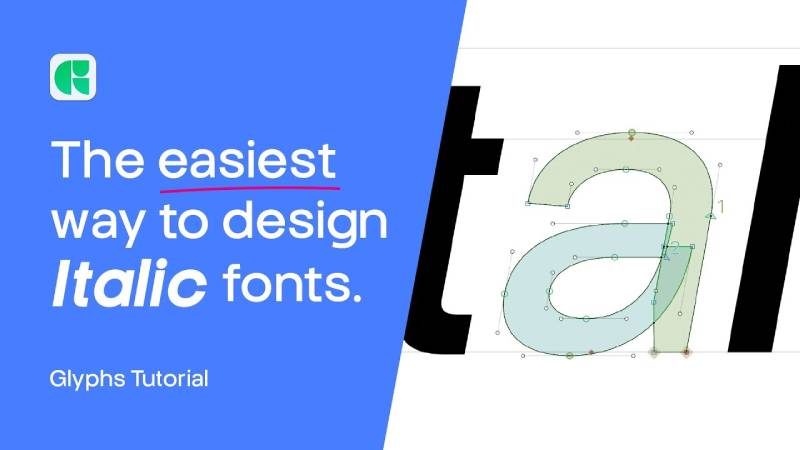
Designing an italic is not pressing a “slant” button. It’s drawing a separate set of letterforms from scratch, or close to it.
FontLab’s documentation states that a typical italic slope falls between 9 and 12 degrees, though anything from 7 to 14 degrees is common. When an operating system generates a faux italic, it applies around 20 degrees, partly to compensate for having no actual design changes.
Drawing Italic as a Separate Set of Glyphs
Serif typefaces get the most redesign work. The lowercase “a,” “e,” “f,” and “g” typically change form entirely. Entry and exit strokes shift. Character widths adjust. The calligraphic influence means the type designer is essentially channeling pen movement into vector curves.
Sans-serif italics require less redrawing, but even the most constructed geometric sans-serif benefits from optical corrections after slanting. Round parts distort when tilted mechanically. Counters become uneven. Stroke weights look inconsistent.
Tools Type Designers Use
| Tool | Platform | Key strength |
|---|---|---|
| Glyphs | macOS | Streamlined interface, popular with indie designers |
| FontLab 8 | macOS Windows |
Deep control over variable font axes, cross-platform |
| RoboFont | macOS | Python scripting, highly customizable workflows |
FontLab 8.4 introduced 500 improvements over the previous version, including better italic angle handling. The software gives the italic angle “full respect” when centering, aligning, or adding anchors, according to its release notes. That detail matters when you’re adjusting leading and tracking across slanted letterforms.
Glyphs has become the go-to for many independent type foundries. RoboFont appeals to designers who want to script repetitive tasks in Python.
How Variable Font Technology Changes Italic Design
The HTTP Archive’s 2024 Web Almanac reported that about 33% of websites now use variable fonts. But only around 0.5% of those variable fonts actually support an ital axis.
Variable fonts handle italic through two possible axes. The ital axis switches between distinct roman and italic designs (a binary toggle, essentially). The slnt axis controls the angle of slant continuously, which is closer to an oblique approach.
The distinction matters for type designers. Building an ital axis means designing two complete sets of compatible letterforms that the browser can interpolate between. That’s significantly more work than adding a slnt axis, which just rotates existing shapes.
The font and typeface market is valued at roughly $1.2 billion in 2025, according to multiple industry reports, with a projected CAGR of about 4.1% through 2033. Variable font technology, including italic axis support, is one of the key growth drivers as web design continues to demand more flexible and performant typography solutions.
For now, most type designers still produce static italic font files alongside their roman cuts. The variable font future is real, but the italic axis remains the least adopted of all registered OpenType variation axes. That gap will close as tooling improves and browser rendering catches up, but we’re not there yet.
FAQ on Italic Fonts
What is the difference between italic and oblique fonts?
An italic font features redesigned letterforms with calligraphic influence. An oblique font is simply the roman design slanted mechanically. True italics change character shapes (like the lowercase “a” and “f”), while obliques keep the same shapes at an angle.
Who invented italic type?
Aldus Manutius introduced italic type in Venice in 1501. His punchcutter Francesco Griffo designed the letterforms based on humanist cursive handwriting. The first complete book printed in italic was an edition of Virgil’s poetry.
When should you use italic text?
Use italic for emphasis within body text, titles of books and films, foreign words on first use, and technical terms being introduced. Style guides like APA, Chicago, and MLA each define specific italic conventions for academic and editorial writing.
Is italic text harder to read?
Yes, in long passages. Research published in ACM Transactions on Accessible Computing found that roman font styles outperformed italic in reading speed. The British Dyslexia Association recommends avoiding italics because they cause visual crowding.
What is the HTML tag for italic text?
Two tags produce italic rendering. The <em> tag adds semantic emphasis that screen readers can detect. The <i> tag is purely visual with no meaning attached. Pick based on whether you’re emphasizing or following a style convention.
How do you apply italic in CSS?
Use font-style: italic in your CSS. The browser will look for a true italic font file first. If none exists, it synthesizes a faux italic by slanting the roman glyphs, which typically looks distorted and unprofessional.
Do all fonts have an italic version?
No. Many free and budget fonts ship without an italic cut. Some sans-serif families only include an oblique style. Professional type families usually offer italic across multiple weights, from light to bold, but you need to verify before purchasing.
What is faux italic?
Faux italic is a browser-generated slant applied when no true italic font file is loaded. The browser tilts roman glyphs at roughly 20 degrees. Curves distort, stroke weights become uneven, and the result looks noticeably worse than a designed italic.
Can variable fonts include italic?
Yes, through the ital or slnt axis. But only about 0.5% of variable fonts on the web actually include an italic axis, according to the HTTP Archive’s 2024 data. Most variable fonts only support weight variation.
Are italic fonts bad for accessibility?
They can be. Screen readers typically do not announce italic text unless it’s wrapped in an <em> tag. For readers with dyslexia, italic reduces reading performance. Bold is generally a safer choice for visual emphasis in accessible design.
Conclusion
Understanding what is an italic font goes beyond knowing how to press Ctrl+I. It means recognizing the difference between a true italic with redesigned letterforms and a faux slant that distorts your text.
The choices you make around font style affect readability, accessibility, and how your content performs across devices. Loading the correct italic file through @font-face, using ` for semantic emphasis, and avoiding italic in long body text are practical decisions that shape user experience.
Whether you’re building a design system, formatting an academic paper, or selecting a type family for a publishing project, italic is a tool with specific rules. Use it with intention.
Good typography doesn’t happen by accident. It happens when every style choice, including italic, serves a clear purpose.

Renowned for his expertise in logo design and visual branding, Bogdan has developed a multitude of logos for various clients.
His skills extend to creating posters, vector illustrations, business cards, and brochures. Additionally, Bogdan's UI kits were featured on marketplaces like Visual Hierarchy and UI8.
He also wrote in the past years on sites like Design Your Way, WebDesignerDepot, WPDean, Designmodo, Speckyboy, Slider Revolution, and more.
- Free Browser 3D Tools for Designers Who Refuse to Install Anything - 9 September 2026
- Clean DM Sans Font Pairing Ideas for Minimal Design - 8 September 2026
- How to Prepare Before Applying for Graphic Design Jobs - 7 September 2026

Bogdan Sandu is a seasoned designer who has been designing websites since 2008. Renowned for his expertise in logo design and visual branding, Bogdan has developed a multitude of logos for various clients. His skills extend to creating posters, vector illustrations, business cards, and brochures. Additionally, Bogdan's UI kits were featured on marketplaces like Visual Hierarchy and UI8. He also wrote in the past years on sites like Design Your Way, WebDesignerDepot, WPDean, Designmodo, Speckyboy, Slider Revolution, and more.
You Might Also Like