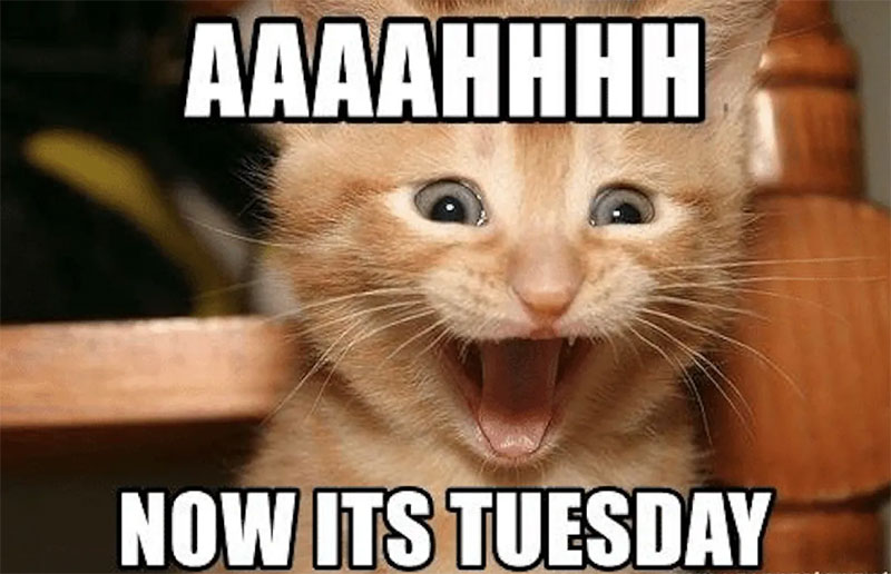
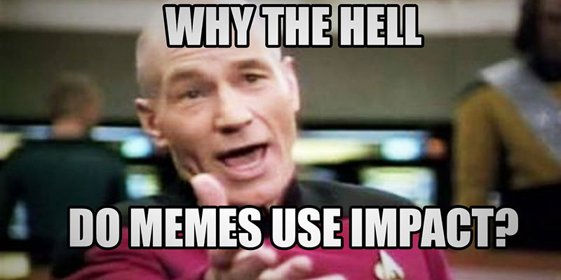
The font used in the vast majority of classic internet memes is Impact, a condensed grotesque sans-serif font designed by Geoffrey Lee in 1965 and released by the Stephenson Blake foundry of Sheffield, England.
Impact commissioned its way into meme culture through a mix of accident and practicality. It ships with Windows by default, it was one of 11 Core Fonts for the Web that Microsoft distributed freely in 1996, and it was already installed on the machines of early internet forum users who started captioning images in the early 2000s.
The standard meme text style: all-caps Impact, white fill, black stroke. That combination reads against virtually any background without adjustment.
—
What Type of Font Is Impact?
Impact is classified as a condensed grotesque sans-serif display typeface. It belongs to the same industrial type family as Haettenschweiler and Franklin Gothic Condensed, fonts built for maximum ink coverage in minimum horizontal space.
A few technical traits worth knowing:
- x-height: Extremely high, nearly three-quarters of the cap height
- Stroke weight: Very heavy, near-uniform across letterforms
- Letter spacing: Compressed to near-zero
- Ascenders/descenders: Unusually short, keeping the cap height dominant
- Apertures: Narrow, which limits readability at small sizes
Geoffrey Lee originally designed it for poster and advertising work. The goal was literally to get as much ink on paper as possible within a given size, while maintaining a high x-height. That’s exactly the same requirement meme captions have: big, readable, fitting on a single line over a photo.
As a display font, Impact was never meant for body text. It works at large sizes. At small sizes, especially in lowercase, it gets tricky to read. Meme culture solved this by defaulting to all caps, which sidesteps the awkward lowercase entirely.
Why Does the Condensed Shape Matter for Memes?
A condensed font fits more characters in less horizontal space. For a top-text/bottom-text meme format, that matters a lot.
With Impact, a creator can fit a full sentence across the width of a 500px image without the text wrapping awkwardly. Wider fonts like Arial simply don’t compress the same way. The tracking in Impact is so tight that uppercase characters sit almost flush against each other.
Research published in the Journal of Visual Culture in 2014 noted that most uppercase characters in Impact are essentially fixed-width rectangles, which means meme generators can overlay text automatically without worrying about kerning or leading adjustments. The automation practically builds itself.
—
Who Designed Impact?
Geoffrey Lee designed Impact in 1965 while working as an advertising design director. He released it through Stephenson Blake, one of the last British metal type foundries still operating at that time.
The design rights later moved to Monotype, which licensed the font to Microsoft as part of a broader package in the 1980s and 1990s. That Microsoft deal is what put Impact on nearly every Windows PC in the world.
Lee later released Impact Wide in 2002 as a self-distributed digital variant, which includes alternate characters and an italic style that the original digitisation omitted. The standard version of Impact used in memes today is the Microsoft digitisation, not Lee’s 2002 release.
Worth noting: the original metal type had bevelled dots on “i” and “j,” and flared stroke ends. Neither survived the digitisation. The meme font is technically a simplified version of Lee’s original design.
—
Is Impact Free to Use?
This is where it gets slightly complicated. Impact is not an open-source font. It is a proprietary commercial typeface owned by Monotype.
Most people who “have” Impact on their computer received it bundled with Windows or macOS. That bundled copy comes with a license tied to the operating system, covering personal use. It does not automatically grant commercial rights for things like brand logos, printed merchandise, or large-scale advertising campaigns.
For commercial use outside personal design work, a separate font license is required. Impact is available for purchase through Monotype’s platforms, including MyFonts, with desktop licenses priced based on the number of users. Web font and app licenses are sold separately.
For most meme creation (personal, non-commercial), the bundled license is fine. Running a commercial meme generator or using Impact in paid advertising is a different situation.
Where to Get a Legitimate Copy
- Already installed: Check your system fonts first. Windows and macOS both bundle it
- Monotype / MyFonts: Purchase a commercial desktop license directly
- Monotype Fonts subscription: Access via subscription for broader commercial coverage
Impact is not available on Google Fonts. There is no free, open-source version of the actual Impact typeface.
—
What Font Did Memes Use Before Impact?
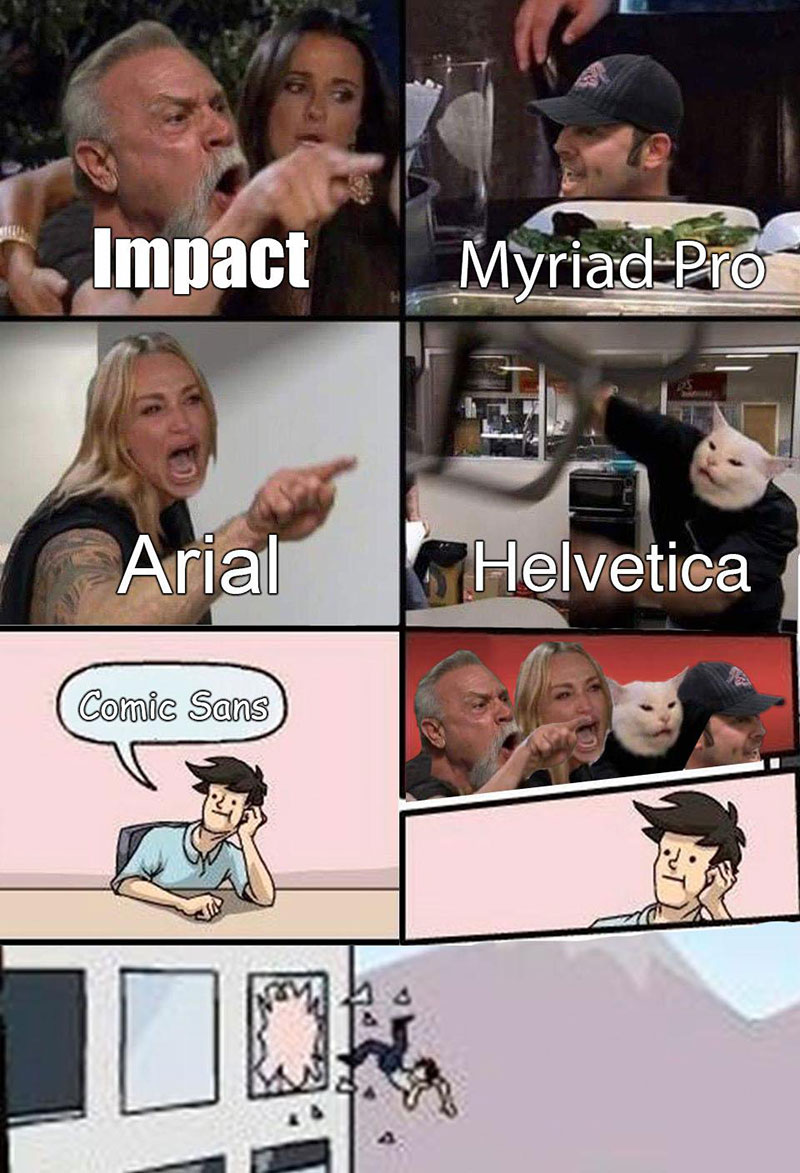
Before Impact became the default, early image macro creators on Something Awful forums used Arial and Comic Sans. Richard Kyanka, founder of Something Awful, recalled that Arial was the initial go-to for captioning images, sometimes Comic Sans when the tone was more playful or antagonistic.
The shift to Impact happened organically around the mid-2000s. According to Kyanka, one early viral image featuring bold, all-caps Impact text spread fast, and others started copying the format. No one decided Impact was “the meme font.” It just won by replication.
The I Can Has Cheezburger site (launched January 2007) locked it in. Their LOL Builder tool set Impact as the default typeface. Since the site was receiving up to 1.5 million daily hits at its peak, that default choice effectively trained an entire generation of meme creators to associate Impact with internet humor.
Once Imgflip, Meme Generator, Quickmeme, 9GAG, and Imgur all followed with Impact as their default, it was over. No other font had a chance.
—
What Are the Best Free Alternatives to Impact?
If you want the meme look without the licensing complications, or if you want something that renders better on modern screens, these 4 free options are worth knowing:
| Font | Similarity to Impact | License | Source |
| Anton | Closest match. Ultra-condensed, heavy weight, designed for screens | OFL (free commercial use) | Google Fonts |
| Bebas Neue | All-caps display font, geometric, bold condensed proportions | SIL OFL (free commercial use) | Google Fonts / Fontfabric |
| Oswald | Condensed sans-serif, multiple weights, cleaner curves | OFL (free commercial use) | Google Fonts |
| Haettenschweiler | Very close structural sibling, same grotesque condensed style | Bundled with Windows | System font |
Anton is generally the first recommendation. It was designed specifically for digital screens by Vernon Adams, licensed under OFL-1.1, and has approximately 88-90% structural similarity to Impact according to typography comparison tools.
For a more detailed breakdown of fonts similar to Impact, including options with lowercase support and broader character sets, there are dedicated comparisons worth checking.
Bebas Neue is worth mentioning separately. It is all-caps only, which is actually fine for meme text. The SIL OFL license means it is genuinely free for personal and commercial use with no restrictions.
—
How to Apply the Meme Font in Common Tools
Using Impact in Canva
Canva includes Impact in its font library for paid and free accounts. Search “Impact” in the font picker. It may appear under the name “Impact” or as a system font depending on your plan.
If you want Anton as a free alternative with full commercial coverage, it’s available directly through Canva’s Google Fonts integration. Both fonts work with Canva’s text outline feature, which is how you get the white text with black stroke look.
Using Impact in Photoshop
If Impact is installed on your system, it shows up in Photoshop’s font menu automatically. The classic meme styling requires two settings:
- Set fill color to white
- Add a stroke layer style at 2-4px in black
Knowing how to add fonts to Photoshop matters if you want to swap Impact out for Anton or Bebas Neue on a machine where those aren’t pre-installed.
Using the Meme Font in Online Generators
Most meme generators handle this automatically. Imgflip, Meme Generator, and Kapwing all default to Impact (or a close system equivalent) with white fill and black outline pre-applied.
If you’re building something custom in CapCut, Anton and Open Sans Extra Bold are solid replacements available directly in the app. CapCut’s text outline controls let you replicate the classic look precisely.
Embedding via CSS (for web projects)
To use Anton as a web-safe Impact replacement:
“ @import url('https://fonts.googleapis.com/css2?family=Anton&display=swap');
.meme-text { font-family: ‘Anton’, Impact, sans-serif; color: white; text-shadow: 2px 2px 0 #000, -2px -2px 0 #000, 2px -2px 0 #000, -2px 2px 0 #000; text-transform: uppercase; } `
The text-shadow approach replicates the stroke effect without requiring SVG or canvas. It works across all modern browsers.
—
Why Did Meme Culture Choose Impact Specifically?
Honestly, a lot of it was timing and defaults. But there are real design reasons it stuck around.
Legibility over any background. Impact’s high x-height, heavy stroke weight, and compressed letterspacing mean it reads clearly even at small sizes over busy photos. Add a black outline and it becomes nearly impossible to lose against any background color combination.
Zero typographic decisions required. When someone opens a meme generator, they want to type text and hit export. Impact requires no size adjustments, no weight choices, no pairing decisions. It’s one font, one weight, one style. Constraints like this, as researchers Kate Brideau and Charles Berret noted in their 2014 paper, actually enable creativity because creators focus on the joke rather than the design.
Universal availability. In the early 2000s, Impact was on every Windows machine. This mattered because meme creators were sharing templates and screenshots, not layered design files. The recipient of a meme image didn’t need to have Impact installed to view it. The text was already burned into the image. But creators needed it installed to replicate the format, and almost everyone did.
The typography choice was never really a conscious branding decision. It was a function of what was available, what was readable, and what got copied. Once it became the standard, using anything else started reading as ironic or intentionally off-format. That’s still true today. A meme in Comic Sans or Helvetica signals something different from one in Impact. The font psychology works because the format is so well-established that deviating from it is itself a communicative act.
Modern meme formats have moved away from the classic top-text/bottom-text layout. TikTok memes, reaction formats, and screenshot-based memes often use platform-native fonts or no caption font at all. But whenever someone wants to signal “this is a classic meme,” Impact still does it in a single glance. That kind of immediate recognition is genuinely hard to replace.
FAQ on What Font Is Used for Memes
What is the most commonly used font in memes?
Impact is the classic meme font. It’s a condensed grotesque sans-serif typeface designed in 1965, rendered in white with a black stroke. Most image macro generators still default to it today.
Why is Impact the standard font for memes?
It was bundled with Windows 98 as one of Microsoft’s Core Fonts for the Web, making it available on virtually every PC. Early meme sites like I Can Has Cheezburger set it as default, and the format stuck.
Is Impact free to download and use?
Impact is a proprietary Monotype font, not open-source. The copy bundled with Windows covers personal use. Commercial use, such as advertising or merchandise, requires a separate license purchased through Monotype or MyFonts.
What font do modern memes use?
Newer meme formats often skip Impact entirely. TikTok captions use platform-native text. Screenshot memes use system fonts. But the classic image macro format still defaults to Impact or its closest free alternative, Anton.
What is the best free alternative to Impact for memes?
Anton, available free on Google Fonts under the SIL Open Font License, is the closest structural match. Bebas Neue and Oswald are solid options too, both free for personal and commercial use.
What font does Imgflip use for memes?
Imgflip defaults to Impact with white fill and a black outline stroke. Users can switch fonts inside the editor, but the out-of-the-box meme text style is the standard Impact image macro format.
What is the meme font called on Google Fonts?
Impact itself is not on Google Fonts. The closest available option is Anton, a condensed bold sans-serif designed specifically for screen use. It shares Impact’s tight letter spacing and heavy stroke weight.
Can I use the meme font in Canva?
Yes. Canva includes Impact in its font library. Anton is also available via the Google Fonts integration. Apply a text outline in white or black to replicate the classic meme caption styling inside the Canva editor.
What font is used for memes on TikTok?
TikTok has its own built-in bold condensed typeface for captions, distinct from Impact. It varies slightly by update. Many creators also use Anton or Classic for that heavy, high-contrast meme text look within the app.
What was the meme font before Impact became popular?
Before Impact, early Something Awful forum users captioned images in Arial and Comic Sans. The shift to Impact happened organically around 2005 to 2007 and was cemented by I Can Has Cheezburger’s default font choice.
Conclusion
So, what font is used for memes? Impact, almost always. A condensed grotesque sans-serif from 1965 that ended up defining internet visual culture through a mix of default settings, viral image macros, and meme generator standardization.
If you need a free alternative, Anton from Google Fonts is the practical choice for bold meme text with a clean commercial license.
The meme caption font you pick still signals something. Impact reads as classic. Bebas Neue reads as modern. Comic Sans reads as intentional chaos. Choose accordingly.

Renowned for his expertise in logo design and visual branding, Bogdan has developed a multitude of logos for various clients.
His skills extend to creating posters, vector illustrations, business cards, and brochures. Additionally, Bogdan's UI kits were featured on marketplaces like Visual Hierarchy and UI8.
He also wrote in the past years on sites like Design Your Way, WebDesignerDepot, WPDean, Designmodo, Speckyboy, Slider Revolution, and more.
- Best Visual Regression Testing Tools for Web and App Design in 2026 - 13 October 2026
- Jujutsu Kaisen Font Generator - 12 October 2026
- The Windsurf Logo History, Colors, Font, And Meaning - 10 October 2026

Bogdan Sandu is a seasoned designer who has been designing websites since 2008. Renowned for his expertise in logo design and visual branding, Bogdan has developed a multitude of logos for various clients. His skills extend to creating posters, vector illustrations, business cards, and brochures. Additionally, Bogdan's UI kits were featured on marketplaces like Visual Hierarchy and UI8. He also wrote in the past years on sites like Design Your Way, WebDesignerDepot, WPDean, Designmodo, Speckyboy, Slider Revolution, and more.
You Might Also Like