Facebook uses Facebook Sans as its current UI and branding typeface, a custom sans-serif font commissioned from Dalton Maag, a London-based type foundry.
For its broader Meta brand system, the company uses Optimistic Display (headings) and Optimistic Text (body copy), both also designed by Dalton Maag.
The original Facebook logo typeface was Klavika Bold, a geometric sans-serif created by Eric Olson at Process Type Foundry, modified by the design agency Cuban Council in 2005.
Neither Facebook Sans nor the Optimistic family is publicly available for general use. Both are proprietary typefaces owned by Meta.
What Type of Font Is Facebook Sans?
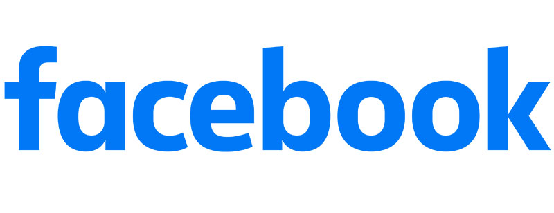
Facebook Sans is a geometric sans-serif with humanist touches. It sits in a category of typefaces that prioritize screen legibility over stylistic expression.
The letterforms are clean, with slightly rounded terminals that soften what would otherwise be a strictly technical appearance.
Key visual traits:
- Rounded stroke endings for approachability
- Open apertures for legibility at small sizes
- Single-story “a” (updated from the earlier double-story version in 2015)
- Slightly angled ascenders on letters like “b” and “k”
- Consistent stroke weight across weights
This classification puts it in the same general family as typefaces like Inter and DM Sans. Not identical, but the same design philosophy: readable, neutral, system-friendly.
Optimistic Display, used across Meta’s broader brand, has more personality. It has monocular and binocular forms of the letter “g,” available in Light, Medium, and Bold weights, with both Text and Display optical sizes.
Who Designed the Facebook Font?
Facebook Sans was designed by Dalton Maag, a type foundry based in London.
Dalton Maag has created custom typefaces for major brands including Nokia, Ubuntu, and BMW. Facebook Sans is version 1.001 of the family, with 11 styles in total.
The Optimistic family (used across Meta’s full brand system) was also created by Dalton Maag, commissioned after Facebook rebranded as Meta in 2021.
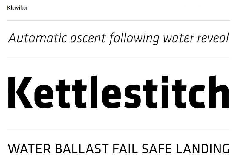
The original Facebook logo font, Klavika, was designed by Eric Olson and released through Process Type Foundry in 2004. Cuban Council, the design agency hired by Facebook in 2005, modified Klavika to create the iconic wordmark. Their changes included:
- Straightening the awkward “f-a” meeting point
- Widening the “c” to match the “e”
- Pushing the disconnected parts of the “k” together
Minor stuff, but it made a real difference to how the wordmark read.
Is the Facebook Font Free to Use?
Short answer: no.
Facebook Sans is a proprietary typeface owned by Meta. It is not available on Google Fonts, Adobe Fonts, or any public font library.
Files for Facebook Sans have surfaced on third-party font download sites, but using those carries licensing risk. The font was created under a commercial agreement with Dalton Maag, and Meta has not released it for public use.
Optimistic (Display and Text) is similarly proprietary. It is used internally across Meta’s product ecosystem, including Meta Horizon OS, but it has not been released publicly.
The closest legitimate option to the original logo font is Klavika, available commercially through Process Type Foundry. It is not free, but it is the genuine source typeface that Facebook’s logo was based on.
| Font | Status | Source |
|---|---|---|
| Facebook Sans | Proprietary | Not publicly available |
| Optimistic Display/Text | Proprietary | Not publicly available |
| Klavika Bold | Commercial | Process Type Foundry |
Understanding font licensing matters here. Downloading proprietary fonts from unofficial sites may expose you to legal issues, even for personal projects.
What Font Did Facebook Use Before?
Facebook’s typography has gone through several clear phases.
2004: The original “TheFacebook” logo used a simple sans-serif with light blue text on a dark blue background. No formal typeface was officially credited.
2005: Facebook hired Cuban Council, who built the wordmark using a modified version of Klavika Bold. This became the face of Facebook for a decade.
2015: The wordmark was quietly updated. The double-story “a” became a single-story version, edges were softened, and the overall feel got less angular. Body text on the platform shifted toward a system font approach, with Helvetica and Arial depending on device.
2016: The web interface moved toward Geneva for body text, a slightly thinner option than Helvetica.
Post-2021: After the Meta rebrand, the platform consolidated on Facebook Sans for UI use, with Optimistic handling the parent brand layer.
The shift from Klavika to a fully custom proprietary typeface mirrors what other major platforms did around the same period. At billions of UI instances, licensing costs and multilingual support requirements make building in-house the more practical call.
Free Alternatives to Facebook Sans
Since Facebook Sans is not publicly available, here are 5 free alternatives with similar characteristics: geometric structure, humanist warmth, and strong legibility at small sizes.
| Font | Similarity | License | Source |
|---|---|---|---|
| Inter | Very close. Open apertures, strong screen rendering | Open Source | Google Fonts |
| DM Sans | Rounded terminals, clean geometric base | Open Source | Google Fonts |
| Nunito | Softer curves, approachable weight range | Open Source | Google Fonts |
| Work Sans | Slightly more condensed, similar geometric structure | Open Source | Google Fonts |
| Outfit | Clean, modern, similar weight distribution | Open Source | Google Fonts |
Inter is the closest practical match for UI work. It was specifically built for screen rendering, and its proportions align closely with what Facebook Sans does across the platform interface.
For pairing any of these alternatives with a complementary display typeface, a font pairing generator removes most of the guesswork.
How to Use a Facebook-Style Font in Your Projects
The Optimistic and Facebook Sans families are off-limits for outside use, but the free alternatives above are not.
For web projects, Inter is available via Google Fonts:
<link href="https://fonts.googleapis.com/css2?family=Inter:wght@300;400;500;700&display=swap" rel="stylesheet">
Then in CSS:
body {
  font-family: 'Inter', -apple-system, BlinkMacSystemFont, 'Segoe UI', Roboto, sans-serif;
}
That fallback stack mirrors what Facebook itself uses for OS-level rendering. On Windows, users see Segoe UI. On macOS and iOS, they get San Francisco. On Android, Roboto takes over.
For design tools, the process depends on what you’re using:
- Adding fonts to Figma requires the Figma Desktop app and a local font install
- Uploading fonts to Canva is available on paid plans via the Brand Kit section
- Adding fonts to Photoshop works by installing the .otf or .ttf to your OS font folder
- Adding fonts to Adobe Illustrator follows the same system-level install process
For video and motion work, adding fonts to After Effects and adding fonts to DaVinci Resolve both rely on OS-level installation rather than in-app imports.
If you’re creating Facebook ad creatives specifically, knowing the best fonts for Facebook ads helps you match the platform’s visual tone without using the actual proprietary typeface.
Why Did Facebook Choose These Fonts?

Klavika (2005) was chosen because it looked modern without feeling cold. The geometric construction gave it a tech-forward appearance, while Cuban Council’s modifications made the wordmark more readable and less jagged. It fit what Facebook needed at the time: credible, not corporate.
The move to a fully custom typeface was about consistency at scale. Running a licensed font across billions of UI instances in dozens of languages creates real overhead, both financial and technical. Dalton Maag built Facebook Sans with multilingual support and screen rendering as the primary requirements.
Meta’s design team documented that Optimistic was built to unify the visual language across Meta’s full product ecosystem, from the Facebook app to Meta Horizon OS hardware. The name reflects a deliberate repositioning: from social media company to something broader.
The font psychology behind every Facebook choice follows a consistent logic. Geometric, sans-serif, clean. No serifs, no decorative details, nothing that slows reading across mixed-language content at massive scale.
Curious how this compares to other platforms? The WhatsApp font, TikTok font, and Pinterest font each solve the same design challenge with different approaches. Worth a look if you’re studying how major apps handle typography at scale.
FAQ on What Font Does Facebook Use
What font does Facebook use in its interface?
Facebook uses Facebook Sans, a custom sans-serif typeface created by Dalton Maag. It is proprietary and not publicly available. For the broader Meta brand, Optimistic Display and Optimistic Text handle headings and body copy respectively.
What font did Facebook use originally?
The original Facebook wordmark used Klavika Bold, a geometric sans-serif designed by Eric Olson at Process Type Foundry. Design agency Cuban Council modified it for Facebook in 2005, adjusting spacing and letterform details to create the iconic logo.
Is the Facebook font available to download for free?
No. Facebook Sans and the Optimistic family are proprietary typefaces owned by Meta. They are not on Google Fonts or Adobe Fonts. Files on unofficial download sites carry licensing risk and are not authorized for use.
What font does Facebook use on mobile?
The Facebook app relies on Facebook Sans where available. On iOS, the system falls back to San Francisco. On Android, it falls back to Roboto. The platform uses a system font stack for broad device compatibility.
What font does Facebook use for its logo?
The current wordmark uses Facebook Sans, a refined version of the Klavika-derived design. The 2015 update replaced the double-story “a” with a single-story version and softened the edges, giving the logo a less angular, more approachable appearance.
What is the CSS font stack Facebook uses?
Facebook’s UI relies on a system font stack:
font-family: -apple-system, BlinkMacSystemFont, 'Segoe UI', Roboto, Helvetica, Arial, sans-serif;
This renders Segoe UI on Windows, San Francisco on macOS and iOS, and Roboto on Android devices.
Who designed the Facebook font?
Dalton Maag, a London-based type foundry, designed Facebook Sans and the Optimistic family for Meta. The original Klavika font used in the logo was created by Eric Olson at Process Type Foundry and later modified by Cuban Council in 2005.
What free font looks most like Facebook Sans?
Inter is the closest free alternative. It shares similar open apertures, geometric structure, and strong screen rendering. DM Sans and Nunito are also reasonable matches. All three are available through Google Fonts under an open-source license.
Why did Facebook switch from Klavika to a custom font?
Scale and consistency. Running a licensed typeface across billions of UI instances in dozens of languages is costly and technically complex. Facebook Sans was built specifically for multilingual support and screen legibility across all devices and platforms Meta operates.
What font does Meta use across its brand system?
Meta uses Optimistic Display for headings and Optimistic Text for body copy across its brand touchpoints, including Meta Horizon OS. Both were designed by Dalton Maag after the 2021 rebrand and are distinct from Facebook Sans used in the app UI.
Conclusion
If you’ve been wondering what font does Facebook use, the answer has layers.
The app UI runs on Facebook Sans, a proprietary geometric sans-serif built by Dalton Maag. The Meta brand system uses Optimistic Display and Optimistic Text. And the original logo? That was Klavika Bold, modified by Cuban Council back in 2005.
None of these are publicly available.
For practical use, Inter or DM Sans are your best free alternatives. Both share the same clean, screen-optimized structure that defines Facebook’s visual identity.
The font choices across Facebook’s history reflect one consistent priority: legibility at scale, across devices, languages, and screen sizes. Everything else is secondary.

Renowned for his expertise in logo design and visual branding, Bogdan has developed a multitude of logos for various clients.
His skills extend to creating posters, vector illustrations, business cards, and brochures. Additionally, Bogdan's UI kits were featured on marketplaces like Visual Hierarchy and UI8.
He also wrote in the past years on sites like Design Your Way, WebDesignerDepot, WPDean, Designmodo, Speckyboy, Slider Revolution, and more.
- The Windsurf Logo History, Colors, Font, And Meaning - 10 October 2026
- How to Remove Background From Product Photos (No Photoshop) - 10 October 2026
- How Designers can Build a Stronger Online Creative Identity - 9 October 2026

Bogdan Sandu is a seasoned designer who has been designing websites since 2008. Renowned for his expertise in logo design and visual branding, Bogdan has developed a multitude of logos for various clients. His skills extend to creating posters, vector illustrations, business cards, and brochures. Additionally, Bogdan's UI kits were featured on marketplaces like Visual Hierarchy and UI8. He also wrote in the past years on sites like Design Your Way, WebDesignerDepot, WPDean, Designmodo, Speckyboy, Slider Revolution, and more.
You Might Also Like