WhatsApp uses Helvetica Neue for its logo wordmark, a neo-grotesque sans-serif font published by Linotype and originally designed by Max Miedinger and Eduard Hoffmann.
For its in-app chat interface, WhatsApp relies on the native system font of whatever device you’re on. iOS displays San Francisco, and Android shows Roboto. WhatsApp doesn’t bundle a custom UI typeface, it defers entirely to the operating system.
What Type of Font Is Helvetica Neue?
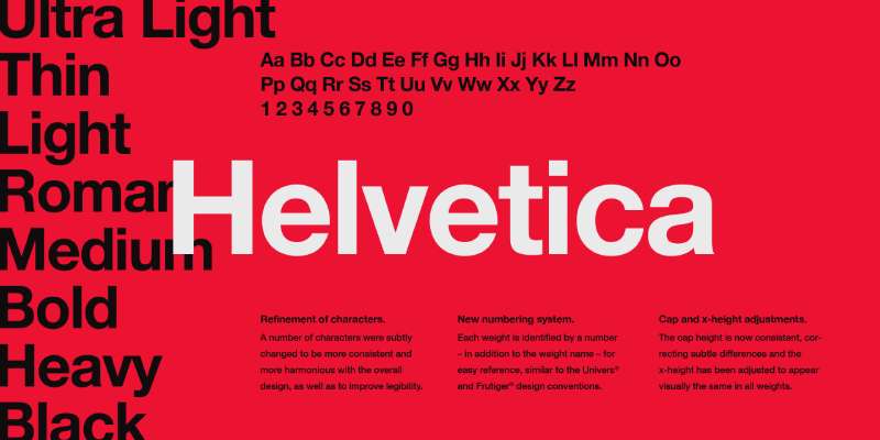
Helvetica Neue is a neo-grotesque sans-serif typeface. It sits in the same classification family as Arial and Univers, though it’s cleaner and more neutral than both.
A few things that define it visually:
- Strokes terminate on perfectly horizontal or vertical lines (no angled cuts)
- Tight letter spacing that creates a dense, compact appearance
- High x-height that improves legibility at small sizes
- Uniform stroke weight with minimal contrast between thick and thin
These traits make it a go-to for typography in apps and interfaces where clarity at small sizes matters. It doesn’t draw attention to itself, which is often exactly what you want in a messaging app.
How the System Fonts Differ by Platform
San Francisco (iOS): Designed by Apple in 2014, specifically for screen interfaces. It uses optical sizing, meaning the letterforms change slightly depending on text size to stay readable. Available only on Apple platforms.
Roboto (Android): Designed by Google for Material Design. Slightly more geometric than San Francisco, with a mechanical structure and open forms. Free and open-source.
Both are humanist-leaning sans-serifs optimized for digital screens. The experience feels consistent across both even though the actual typefaces differ.
Who Designed Helvetica Neue?
Max Miedinger designed the original Helvetica in 1957, working with Eduard Hoffmann at the Haas Type Foundry in Switzerland. It was initially called Neue Haas Grotesk.
Linotype licensed the design in 1960 and renamed it “Helvetica,” derived from Helvetia, the Latin name for Switzerland. The Neue Helvetica revision came later, produced by the Linotype Design Studio to standardize the family across weights and styles.
It was not created for WhatsApp. Helvetica predates WhatsApp by over 50 years. WhatsApp simply licensed a widely used commercial typeface for its wordmark rather than commissioning something custom.
The Linotype font library is now owned by Monotype, which handles current licensing for the Neue Helvetica family.
Is Helvetica Neue Free to Use?
No. Helvetica Neue is a commercial typeface and requires a paid license for virtually any use.
| License Type | Primary Use Case | Starting Price (2026) | Terms & Limits |
| Desktop | Print, logos, local design software (Figma, Adobe). | $314.00 | For a single-user “Pack” (e.g., Sentinel or Hoefler Text). |
| Webfont | Cloud.typography (Standard Subscription). | $199.00/year | Includes the entire library; up to 250k pageviews/mo. |
| Mobile App | Embedding in iOS/Android app code. | Contact Sales | Price scales based on app popularity and user base. |
| Electronic Doc | E-books, PDFs, e-Magazines. | ~$300 – $500 | One-time fee per title or per version. |
Licenses are managed through Monotype and vendors like MyFonts or Fonts.com. Desktop font licensing starts around $280 for eight weights. Web licensing is significantly more expensive, starting at roughly $500 per year depending on traffic volume.
San Francisco, the iOS system font, is available for download but restricted by Apple’s license. You can use it for mocking up Apple platform interfaces, but not for general commercial use or other platforms. Roboto, the Android font, is fully free and available on Google Fonts under the Apache 2.0 license.
What Font Did WhatsApp Use Before?
In its earliest versions (2009 onward), WhatsApp used a generic system font for the interface. There was no consistent branded typeface. The app was functional-first, and typography wasn’t a primary concern in that period.
The Helvetica Neue wordmark has been part of the WhatsApp visual identity since the app’s early branding took shape, roughly around 2013-2014. It survived the Facebook acquisition in 2014 and the Meta rebrand in 2021 without meaningful change.
The iOS interface previously relied on Helvetica Neue as the system font too, before Apple replaced it with San Francisco in 2015 with iOS 9. So prior to 2015, WhatsApp on iPhone used Helvetica Neue both in the logo and throughout the chat interface.
What Are the Best Free Alternatives to Helvetica Neue?
If you want the Helvetica Neue look without the licensing cost, there are solid free options:
| Font | Similarity | License | Source |
| Inter | Closest open-source match, optimized for UI | Free (OFL) | Google Fonts |
| Roboto | Geometric structure, similar neutrality | Free (Apache 2.0) | Google Fonts |
| TeX Gyre Heros | Direct Helvetica clone | Free (GUST) | CTAN / various |
| Nimbus Sans | Open-source Helvetica equivalent | Free (GPL) | URW Fonts |
Inter is probably the most useful alternative for UI work right now. It was specifically built for screen interfaces and handles small sizes well. Many developers use it as a drop-in replacement when Helvetica licensing isn’t an option.
Check out the best free Google Fonts if you want a broader list beyond these four. There’s no shortage of quality options available at zero cost.
How to Use a Helvetica Alternative in Your Project
In Figma or Web Design
Inter is on Google Fonts, so adding it is straightforward. For web projects, paste this into your HTML:
“ <link href="https://fonts.googleapis.com/css2?family=Inter:wght@400;500;700&display=swap" rel="stylesheet"> `
Then set your CSS: font-family: ‘Inter’, sans-serif;
If you want to mirror the actual WhatsApp experience exactly, use the system font stack instead:
` font-family: -apple-system, BlinkMacSystemFont, 'Segoe UI', Roboto, 'Helvetica Neue', Arial, sans-serif; `
This gives iOS users San Francisco, Android users Roboto, and Windows users Segoe UI, which is exactly how WhatsApp renders text across devices. It’s the most honest way to replicate the feel without any font files.
In Photoshop or Illustrator
Download Inter from Google Fonts and install it to your system. After that it appears automatically in both tools. If you want to add fonts to Photoshop or need to add fonts to Adobe Illustrator, the process is the same: install to system, restart the app.
For Roboto specifically, it’s available as a Roboto font pairing resource if you’re building full design systems and need pairing guidance alongside it.
Why Did WhatsApp Choose This Font?
Helvetica Neue was not a bold creative decision. It was a practical one.
In the early 2010s, Helvetica Neue was the default system font on iOS (used from iOS 7 through iOS 8). Choosing it for the logo meant the wordmark naturally matched the interface text on the dominant smartphone platform of the time. There was visual consistency baked in without extra effort.
It’s also worth noting that Helvetica carries a certain design credibility. It’s been used by the New York City MTA, NASA, Apple, and hundreds of major brands. Picking it signals seriousness and restraint without saying either out loud. For an app built around simple, reliable communication, that fit was obvious.
The decision to use system fonts for the chat UI reflects a different priority: performance and platform consistency. Bundling a custom font into a mobile app adds file size and render overhead. Using the OS font avoids both problems. Users also see text rendered in a typeface their eye is already used to, which makes long chat sessions less fatiguing than they might be with an unfamiliar face.
Apps like Slack and Notion have taken similar approaches, leaning on system fonts for body text while using licensed or custom typefaces for marketing and branding. WhatsApp just happened to get there early and stick with it consistently. Understanding font psychology explains why neutral, familiar typefaces tend to work better in communication tools than expressive or stylized ones, people are reading content, not admiring letterforms.
For a broader look at how these decisions fit into typography as a discipline, or to explore how the best fonts for apps are chosen in practice, those resources go deeper into the reasoning behind UI type choices.
FAQ on What Font Does WhatsApp Use
What is the main font WhatsApp uses?
WhatsApp uses Helvetica Neue for its logo wordmark. For the chat interface, it relies on the system font of your device. iOS shows San Francisco, Android shows Roboto. No single font covers the entire app.
Does WhatsApp use the same font on iPhone and Android?
No. On iPhone, WhatsApp renders chat text in San Francisco, Apple’s native UI typeface. On Android, it uses Roboto. The logo stays Helvetica Neue on both platforms regardless of the operating system.
What font does WhatsApp use for chat messages?
Chat messages display in your device’s system font. WhatsApp doesn’t load a custom typeface for message text. It pulls whatever the OS provides, which keeps rendering fast and consistent with the rest of the phone’s interface.
Can you change the font in WhatsApp?
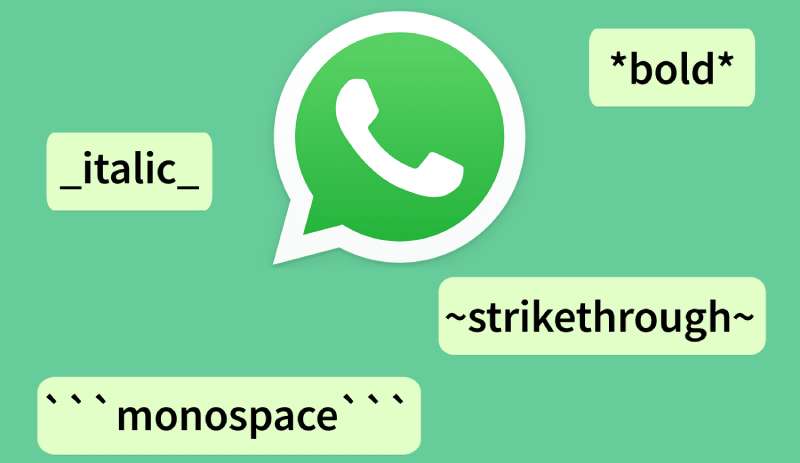
You can’t install a custom font. WhatsApp does support basic monospaced font formatting using triple backticks. Bold, italic, and strikethrough are also available through simple markdown-style syntax within messages.
What font does the WhatsApp logo use?
The WhatsApp logo uses Helvetica Neue 75 Bold, a neo-grotesque sans-serif from the Neue Helvetica family. It was designed by Max Miedinger and Eduard Hoffmann and is licensed commercially through Monotype.
Is the WhatsApp font free to download?
Helvetica Neue is a paid commercial font. Roboto is free on Google Fonts under Apache 2.0. San Francisco is free to download but restricted to Apple platform mockups only. None of them are freely usable without conditions.
What font is similar to the WhatsApp font?
Inter is the closest free alternative for UI work. TeX Gyre Heros is a direct open-source Helvetica clone. Both capture the neutral, clean character of Helvetica Neue without requiring a paid license. Roboto is another practical option for screen use.
Did WhatsApp change its font recently?
The Helvetica Neue wordmark has stayed consistent since WhatsApp’s early branding years. The biggest indirect change came in 2015 when Apple replaced Helvetica Neue with San Francisco as the iOS system font, which automatically updated how WhatsApp’s chat interface looked on iPhone.
What font size does WhatsApp use by default?
WhatsApp follows the system font size settings of your device by default. It also has its own control under Settings, Chats, Font Size, with three options: Small, Medium, and Large. Medium is the default on most devices.
Why does WhatsApp use system fonts instead of a custom typeface?
System fonts reduce app size and improve text rendering performance. They also feel familiar to users. Bundling a custom font adds overhead with little visible benefit in a messaging interface where readability, not brand expression, is the priority.
Conclusion
So, what font does WhatsApp use? Helvetica Neue for the logo, and the native system font, San Francisco on iOS, Roboto on Android, for everything inside the app.
It’s a deliberate split. The wordmark gets a licensed commercial typeface with decades of design credibility behind it. The chat interface gets whatever the OS provides, prioritizing rendering speed and cross-platform consistency over brand expression.
For designers looking to replicate the look, Inter covers most use cases for free. For developers, the system font stack handles the rest without adding a single font file to the project.

Renowned for his expertise in logo design and visual branding, Bogdan has developed a multitude of logos for various clients.
His skills extend to creating posters, vector illustrations, business cards, and brochures. Additionally, Bogdan's UI kits were featured on marketplaces like Visual Hierarchy and UI8.
He also wrote in the past years on sites like Design Your Way, WebDesignerDepot, WPDean, Designmodo, Speckyboy, Slider Revolution, and more.
- The Windsurf Logo History, Colors, Font, And Meaning - 10 October 2026
- How to Remove Background From Product Photos (No Photoshop) - 10 October 2026
- How Designers can Build a Stronger Online Creative Identity - 9 October 2026

Bogdan Sandu is a seasoned designer who has been designing websites since 2008. Renowned for his expertise in logo design and visual branding, Bogdan has developed a multitude of logos for various clients. His skills extend to creating posters, vector illustrations, business cards, and brochures. Additionally, Bogdan's UI kits were featured on marketplaces like Visual Hierarchy and UI8. He also wrote in the past years on sites like Design Your Way, WebDesignerDepot, WPDean, Designmodo, Speckyboy, Slider Revolution, and more.
You Might Also Like