
Game Show Typography: What Font Does Jeopardy Use?
Every time the iconic Jeopardy! theme plays, viewers are not just drawn to the trivia; the distinct visual style of the game board captivates.
Have you ever paused, perhaps mid-clue, wondering what font does Jeopardy use? This question ventures deeper than simple curiosity—it straddles design principles, media influence, and the subtle art of viewer engagement.
This article peels back layers of the Jeopardy! aesthetic, especially focusing on its typographic decisions—from the logo to the clue cards and everything in between.
You’ll gain insights into how strategic font choices enhance readability, evoke emotions, and create memorable brand continuity.
Dive into the evolution of the Jeopardy! design, explore comparisons with typefaces like Swiss 911 and ITC Korinna, and appreciate how these choices mold viewer experience.
Understanding this integration of typography and television design could refine your perspective on how fonts function in complex environments, well beyond their basic aesthetic appeal.
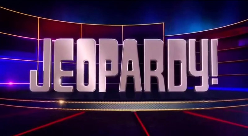
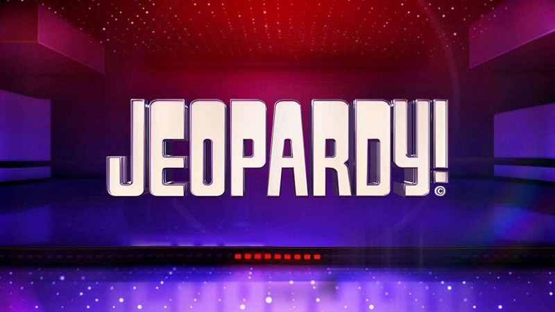
Jeopardy! Logo and Branding
![]()
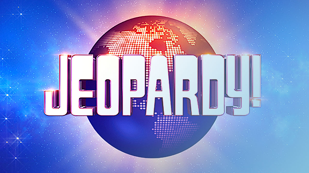
Logo Design
Let’s dive into the visual evolution of an iconic TV show logo.
It started as just another design but grew into a symbol recognized in living rooms everywhere.
The intriguing narrative behind the Jeopardy! logo offers a glimpse into the changes it has undergone, morphing to align with technological advancements and viewer expectations.
This journey almost mirrors shifting societal trends, each version of the logo maintaining a delicate balance between tradition and innovation.
When exploring typefaces comparable to the logo’s design, both the Anonymous and Annual typefaces spring to mind.
These fonts share a straightforward, unembellished aesthetic, remaining readable at varying sizes, a key requirement for fonts used in broadcasting.
Font and Aesthetic Choice
Discussing timeless logos, how does Gyparody stack up against the actual font in the Jeopardy! logo? Designed by Ray Larabie, Gyparody mirrors many characteristics, providing a sans-serif presentation with a slightly whimsical touch, mimicking the blend of professionalism and playfulness that Jeopardy! broadcasts each night.
This sort of typeface selection is pivotal, serving not just the need for aesthetics, but also for viewer engagement during rapid-fire questioning.
The branding extends beyond the logo font.
It encompasses a multitude of elements, from the color schemes on set to the typography on digital platforms, ensuring that viewers receive a consistent visual experience regardless of how they encounter the brand.
This consistency helps forge a strong, recognizable brand identity that viewers can connect with, time and time again.
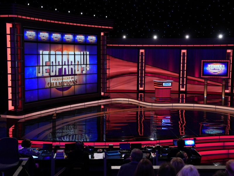
Typography on the Game Board
Category Titles and Dollar Levels
Switching gears to something a bit more technical but certainly crucial—the typefaces on the game board itself.
Swiss 911, a variant of the well-integrated Helvetica family, captures this role beautifully.
It’s employed in various applications across the board, demonstrating its versatility and functional prowess.
What makes Swiss 911 a standout choice is its high legibility and modern appearance, which enhances the board’s functionality while enabling quick viewer processing—a necessity in a fast-paced quiz setting.
Clue Cards
It’s fascinating to dissect why ITC Korinna makes the perfect fit for clue cards.
This choice isn’t arbitrary.
It balances ornamentation with clarity, ensuring that the clues are not only visually appealing but also easy on the eyes, which is crucial during high-stakes moments of the game.
The designers behind Jeopardy! have masterfully selected a typeface that supports both aesthetic allure and the practical aspect of clue readability.
Typography in the Show’s Elements
“Daily Double” Type
The “Daily Double” graphics are particularly noteworthy.
The blend of Square 721 and Eurostile echoes this segment’s dynamic nature, with subtle nods to Art Nouveau designs.
These fonts contribute to the graphic’s visual impact, enhancing viewer excitement and engagement when a contestant stumbles upon these potentially game-changing moments.
Set Design and Fonts
Delving deeper into the set’s design, it’s impossible to ignore the contributions of designers like Henry J. Lickel and Naomi Slodki.
Their expertise shines through in the strategic font choices that populate the background, melding seamlessly with the show’s overall aesthetic.
The typographic decisions made here aim to complement the architectural elements of the set, maintaining continuity and enhancing the overall cohesiveness of the show’s visual presentation.
Typography in Popular Culture
Typography in Other Game Shows
Comparing Jeopardy!’s typographic approach to other shows reveals a keen attention to detail and a commitment to conveying a unique identity.
While many game shows opt for flashy, attention-grabbing fonts, Jeopardy! maintains a balance, opting for elegance and functionality.
This careful selection sets it apart, underlining its standing as a beacon of intellectual challenge rather than mere entertainment.
Cultural Influence of Jeopardy!’s Typography
Finally, reflecting on the broader impacts, the selection of ITC Korinna not only characterizes the visual aspect of Jeopardy! but also imprints on the cultural fabric of televised game shows.
The font’s presence has transcended its media origin, becoming a touchstone of design excellence in TV land.
The legacy of such typographic choices underscores how integral font selection is in crafting not only a show’s identity but also its enduring influence on pop culture’s visual language.
FAQ On What Font Does Jeopardy Use
What typeface is used in the Jeopardy! logo?
The Jeopardy! logo famously utilizes a modified version of the font Gyparody, designed by Ray Larabie.
This typeface captures a balance between playful quirkiness and stark professionalism, reflecting the spirit of the game show while ensuring high visibility and brand recognition.
Is the Jeopardy! board font the same as the logo font?
No, the game board fonts differ from the logo font.
For the categories and dollar values, Swiss 911 was chosen for its strong legibility and clean presentation, ensuring that viewers can easily read the text from any distance, crucial during the fast-paced game.
Can I download the Jeopardy! font?
While the exact custom font used in the Jeopardy! logo is not available for public download due to copyright restrictions, the font Gyparody which closely resembles the typeface used in the logo, is available for purchase and download from various font repositories.
How has the Jeopardy! typography changed over the years?
Over the decades, Jeopardy! has tweaked its typography to keep up with changing design trends and technology improvements.
From subtle shifts in typeface weight to more significant changes in font style for both the logo and game board, each alteration has aimed to enhance visual aesthetics and viewer experience.
What font is used for the Daily Double in Jeopardy?
The “Daily Double” text makes use of a combination of fonts, primarily Square 721 blended subtly with Eurostile.
This mix helps in distinguishing these special game elements from regular clues, adding an extra layer of excitement visually.
Why was ITC Korinna chosen for the clue cards in Jeopardy?
ITC Korinna was selected for the clue cards for its excellent balance of style and clarity.
Its distinctive serifs and moderate decoration enhance readability while injecting personality into the presentation, a key in maintaining viewer engagement during complex trivia.
How do typography choices in Jeopardy influence viewer engagement?
Strategic typography in Jeopardy, from the dynamic Swiss 911 on the game board to the memorable logo design, enhances connectivity with the audience.
Good typography ensures clarity in communication, crucial in a game based on speed and precision, thereby deepening viewer engagement.
What are some alternative fonts similar to the Jeopardy! logo font?
For those looking to capture a similar vibe to the Jeopardy! logo, fonts such as Futura Bold, Helvetica Inserat, and Twentieth Century Bold offer comparable boldness and geometric structure.
These alternatives also provide an accessible option for achieving a professional and engaging visual presentation.
How do the font choices on Jeopardy! compare with other game shows?
Jeopardy! opts for a more classical typography approach, emphasizing readability and traditional elegance, unlike other game shows that might choose flashier, more decorative fonts.
This underscores its branding as a serious trivia game that values content clarity and historical consistency.
What’s the impact of Jeopardy!’s typography in the larger realm of TV show branding?
Jeopardy!’s consistent use of thoughtfully selected typefaces like ITC Korinna and Swiss 911 establishes a strong visual identity that resonates beyond just a game show format.
Its typography has influenced norms within the television industry, setting standards for how type choices can enhance brand recognizability and audience loyalty.
Conclusion
Exploring what font does Jeopardy use uncovers more than just the mechanics of typography; it reveals how deeply design intertwines with viewer perception and brand identity.
Jeopardy!’s careful curation of fonts like Gyparody, Swiss 911, and ITC Korinna underscores the game’s legacy as a beacon of wit and intellect.
These type choices not only ease legibility but also enhance the game show atmosphere, making every clue a visual treat.
- Visual Branding: This isn’t just about aesthetics; it’s about crafting an iconic image that fans immediately recognize.
- Typography in Broadcasting: Secondary, yet vital, the right font choice commands attention and retains interest, crucial in the fast-paced world of live game shows.
Diving into Jeopardy!’s typographic world is more than a lesson in good design—it’s a master class in how visual elements can create an enduring legacy.
Bogdan Sandu, a seasoned designer with 15 years of diverse experience, has been designing websites since 2008.
Renowned for his expertise in logo design and visual branding, Bogdan has developed a multitude of logos for various clients.
His skills extend to creating posters, vector illustrations, business cards, and brochures. Additionally, Bogdan's UI kits were featured on marketplaces like Visual Hierarchy and UI8.
Latest posts by Bogdan Sandu (see all)
- Bright Color Palettes for Eye-Catching Designs - 18 May 2024
- Venmo’s Visual Voice: What Font Does Venmo Use? - 18 May 2024
- The Hoegaarden Logo History, Colors, Font, And Meaning - 17 May 2024