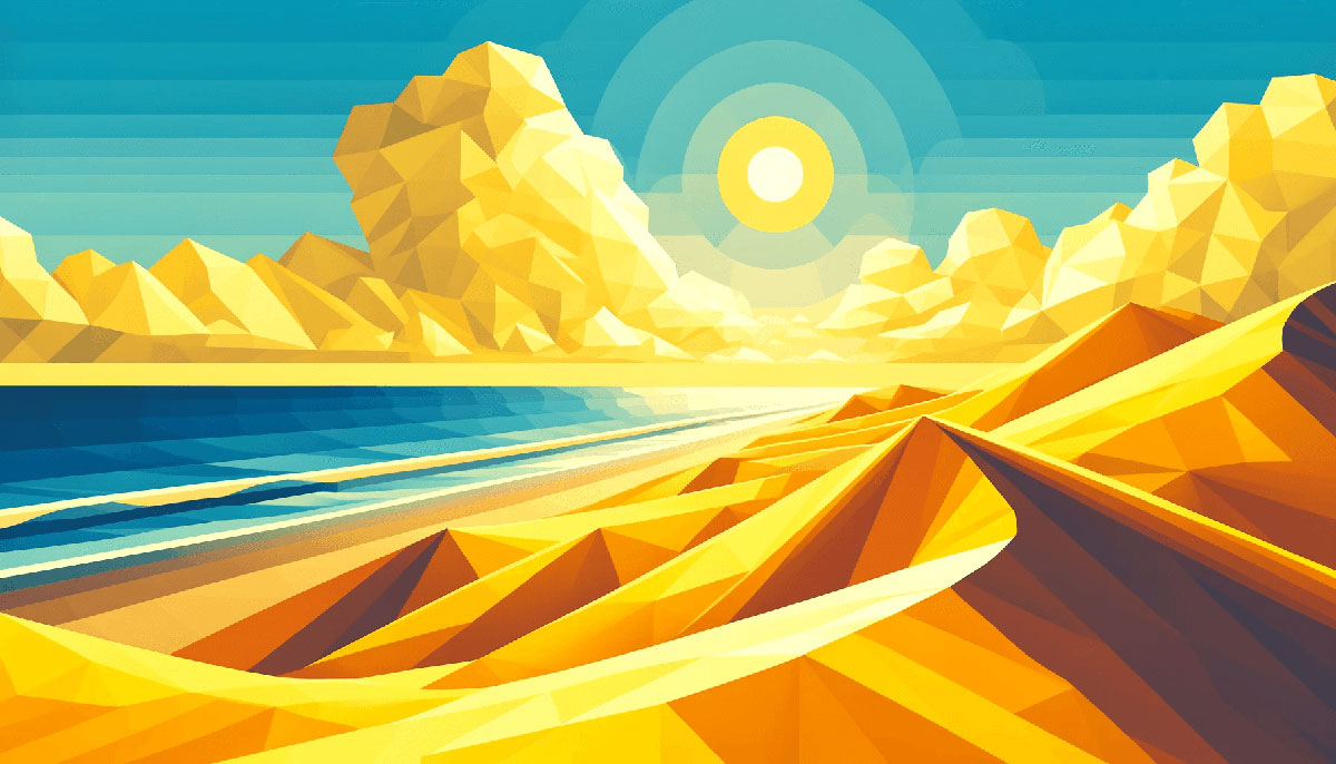
Yellow transforms designs from forgettable to magnetic in seconds. It’s the color of sunshine, energy, and instant attention, but choosing the wrong shade can wreck your entire visual identity.
This guide presents 15 yellow color palettes with exact hex codes, pairing strategies, and proven use cases. You’ll discover which combinations work for branding, web design, and print, plus how to avoid common mistakes that make yellow look cheap or overwhelming.
From pastel lemon to bold saffron, each palette includes color psychology insights, complementary schemes, and real-world applications across digital and physical media.
Yellow Color Palettes
Sunny Citrus
| #FFFF00 | #FFD700 | #FFA500 | #FFEA99 | #FFB915 |
Color Codes
Pure yellow (#FFFF00) anchors this vibrant scheme, transitioning through gold (#FFD700) and orange (#FFA500) to softer cream tones.
Best Use Cases
Food packaging, summer campaigns, children’s products, energy drink branding. Works for call-to-action buttons and warning indicators.
Color Mood
Energy, optimism, cheerfulness. Triggers appetite and demands attention without aggression.
Pairing Suggestions
Pair with navy blue for trust, charcoal for sophistication, or white for clean minimalism. Complements purple palettes using complementary color schemes.
Design Applications
Digital interfaces, packaging design, poster layouts. High visibility in both print and web applications.
Golden Mustard
| #F4E409 | #EEBA0B | #CA7B09 | #A63C06 | #3F1D0B |
Color Codes
Ranges from bright aureolin (#F4E409) through saffron (#EEBA0B) and ochre (#CA7B09) to deep brown anchors. Creates earthy progression.
Best Use Cases
Vintage branding, autumn collections, craft beer labels, artisan products. Perfect for rustic or heritage brands.
Color Mood
Warmth, comfort, authenticity. Evokes handcrafted quality and traditional values.
Pairing Suggestions
Combines well with cream backgrounds, forest green accents, or burnt sienna. Use with analogous colors for harmonious schemes.
Design Applications
Restaurant interiors, organic food branding, retro graphics. Works across print menus, signage, textile patterns.
Pastel Lemon
| #FFFFD6 | #FFFFBF | #FCFCAD | #FCFC91 | #FFEE8C |
Color Codes
Soft ivory (#FFFFD6) through cream (#FFFFBF) to pastel yellow (#FFEE8C). Gentle hue variations with low saturation.
Best Use Cases
Baby products, spring collections, wellness brands, stationery. Ideal for backgrounds requiring subtle warmth without visual strain.
Color Mood
Gentle, calming, delicate. Creates peaceful, approachable atmosphere.
Pairing Suggestions
Match with soft pink, mint green, or lavender for cohesive pastel schemes. Works with white for minimal designs.
Design Applications
Nursery decor, cosmetic packaging, wedding invitations. Effective in both digital and physical mood boards.
Vibrant Neon
| #F7FF00 | #E4F600 | #DDFF00 | #C7F701 | #F7F702 |
Color Codes
Electric lime shades from #F7FF00 to chartreuse (#C7F701). Maximum brightness, minimal variation in hue.
Best Use Cases
Tech startups, nightclub branding, sports apparel, youth marketing. High-impact digital advertising and event graphics.
Color Mood
Energetic, modern, rebellious. Demands attention, signals innovation and forward-thinking.
Pairing Suggestions
Black backgrounds maximize impact, dark grays soften intensity. Avoid combining with other bright colors.
Design Applications
Motion graphics, app interfaces, festival posters. Best in RGB for screens; difficult to reproduce in CMYK print.
Warm Amber
| #FFC300 | #FFAA00 | #FF9500 | #FF7B00 | #FFDD00 |
Color Codes
Amber tones from golden yellow (#FFC300) through orange gradients to safety orange (#FF7B00). Creates radiant warmth.
Best Use Cases
Sunset themes, energy brands, tropical products, adventure tourism. Works for heating/comfort product marketing.
Color Mood
Inviting, enthusiastic, optimistic. Radiates warmth and approachability.
Pairing Suggestions
Pairs with teal for dynamic contrast, bronze for luxury, white for clarity. Use in gradient blends.
Design Applications
Beverage packaging, fitness branding, travel websites. Effective in gradient backgrounds and visual hierarchy systems.
Soft Buttercup
| #FFF9AE | #F8ED62 | #E9D700 | #DAB600 | #A98600 |
Color Codes
Pale butter (#FFF9AE) transitioning to rich goldenrod (#A98600). Balanced progression from light to saturated tones.
Best Use Cases
Bakery branding, gourmet food packaging, handmade soap labels, flower shop identities. Natural product emphasis.
Color Mood
Fresh, natural, wholesome. Suggests organic quality and artisan craftsmanship.
Pairing Suggestions
Combine with sage green, cream, or taupe for earthy schemes. Works with monochromatic variations.
Design Applications
Product labels, farmers market signage, recipe blogs. Translates well across digital and print media.
Classic Yellow
| #FFDE21 | #FFD32C | #E0BC00 | #FFEA99 | #F7DE3A |
Color Codes
Standard yellow shades (#FFDE21, #F7DE3A) with golden (#E0BC00) and cream (#FFEA99) supporting tones. Versatile range.
Best Use Cases
Corporate branding, transportation, educational materials, safety equipment. Universal recognition across cultures.
Color Mood
Confident, clear, attention-grabbing. Signals caution while maintaining friendliness.
Pairing Suggestions
Matches black for maximum readability, blue for trust, gray for professionalism. Standard in triadic color schemes.
Design Applications
Logo design, traffic signage, highlighting systems. Follows Pantone standards for consistency.
Honey Glow
| #FFF5B4 | #FFE500 | #FFC800 | #834A29 | #5B2F15 |
Color Codes
Vanilla (#FFF5B4) to bright canary (#FFE500) with brown anchors (#834A29, #5B2F15). Combines sweetness with grounding.
Best Use Cases
Coffee shops, honey producers, skincare lines, wellness centers. Natural product positioning.
Color Mood
Comforting, cozy, nourishing. Evokes warmth and natural sweetness.
Pairing Suggestions
Works with beige, terracotta, or ivory for warm palettes. Pair with color psychology for appetite appeal.
Design Applications
Restaurant branding, jar labels, spa interiors. Effective in both brand guidelines and environmental design.
Bright Canary
| #FFDD00 | #FFF600 | #FFFF9F | #FDCC0D | #FFB300 |
Color Codes
Ukraine yellow (#FFDD00) through pure lemon (#FFF600) to solid gold (#FDCC0D). High-energy spectrum with selective yellow accents.
Best Use Cases
Sports teams, children’s entertainment, celebration themes, promotional materials. Maximum visibility applications.
Color Mood
Joyful, playful, celebratory. Radiates pure happiness and excitement.
Pairing Suggestions
Combine with royal blue for sports, white for freshness, red for festive energy. Strong in tetradic schemes.
Design Applications
Team jerseys, party supplies, gaming interfaces. Works across merchandise and digital platforms.
Earthy Ochre
| #D8B207 | #FFD102 | #677842 | #323E2A | #EDECF2 |
Color Codes
Rich ochre (#D8B207) with olive green (#677842) and charcoal (#323E2A). Nature-inspired with mineral undertones.
Best Use Cases
Eco-friendly brands, outdoor gear, ceramics, botanical products. Heritage and sustainability messaging.
Color Mood
Grounded, organic, stable. Conveys environmental consciousness and durability.
Pairing Suggestions
Match with forest green, sand, or slate gray. Natural fit for analogous palettes.
Design Applications
Outdoor apparel, natural cosmetics, garden centers. Translates well to sustainable packaging.
Fresh Lemonade
| #FFF44F | #FFFACD | #FFE523 | #FFD500 | #FBE53A |
Color Codes
Lemon (#FFF44F) with chiffon (#FFFACD) softness. Pure citrus range from pale yellow to zesty accents.
Best Use Cases
Beverage brands, cleaning products, spring marketing, citrus packaging. Fresh, clean product positioning.
Color Mood
Refreshing, clean, invigorating. Suggests cleanliness and natural freshness.
Pairing Suggestions
Works with white for purity, lime green for citrus, sky blue for clarity. Perfect in three-color combinations.
Design Applications
Product labels, spa branding, juice bars. High contrast in both digital and print.
Sunset Gold
| #FCCD11 | #E92C2C | #2F3269 | #CC1616 | #FFB300 |
Color Codes
Jonquil (#FCCD11) paired with fire engine red (#E92C2C) and Delft blue (#2F3269). Bold primary mix.
Best Use Cases
Fast food, automotive, toys, carnival themes. High-energy retail environments.
Color Mood
Bold, passionate, adventurous. Creates excitement and urgency.
Pairing Suggestions
Classic with primary reds and blues. Strong emphasis in visual hierarchies.
Design Applications
Event posters, retail signage, toy packaging. Demands attention across all media.
Spring Daffodil
| #E2AC02 | #FFE401 | #FDF39A | #68B7C6 | #0085A4 |
Color Codes
Golden yellow (#E2AC02) balanced with teal (#68B7C6) and cyan (#0085A4). Split-complementary harmony.
Best Use Cases
Seasonal campaigns, garden centers, outdoor brands, travel agencies. Fresh, optimistic messaging.
Color Mood
Hopeful, fresh, balanced. Combines warmth with cool tranquility.
Pairing Suggestions
Natural pairing with turquoise, aquamarine, or powder blue. Follows color wheel principles.
Design Applications
Tourism branding, florist shops, website headers. Works in both minimalist and decorative styles.
Mellow Cream
| #FDFBD4 | #F0E68C | #FFDB58 | #DBCC79 | #8A804C |
Color Codes
Cream (#FDFBD4) through khaki (#F0E68C) to mustard (#FFDB58). Muted, sophisticated range.
Best Use Cases
Vintage fashion, stationery, interior design, antique shops. Classic, timeless aesthetic.
Color Mood
Refined, gentle, nostalgic. Evokes elegance without pretension.
Pairing Suggestions
Pairs with tan, ecru, or dusty rose. Perfect for neutral schemes.
Design Applications
Book covers, textile design, boutique branding. Adaptable across typography and layout systems.
Bold Saffron
| #F4C430 | #FFBF00 | #FF9B21 | #F8C746 | #FCDF91 |
Color Codes
Saffron (#F4C430) with amber (#FFBF00) richness. Warm spectrum from golden to apricot (#FCDF91).
Best Use Cases
Spice brands, cultural events, luxury goods, exotic travel. Premium positioning with warmth.
Color Mood
Luxurious, exotic, warm. Suggests richness and cultural depth.
Pairing Suggestions
Works with burgundy, deep teal, or gold accents. Strong in warm color systems.
Design Applications
Restaurant menus, luxury logos, cultural posters. Effective with refined typography and balanced layouts.
FAQ on Yellow Color Palettes
What colors go best with yellow in a palette?
Navy blue, charcoal gray, and white create strong contrast with yellow. Purple offers complementary harmony, while teal and coral bring warmth.
Analogous pairings with orange and green create natural, harmonious schemes following color theory principles.
How do I choose the right yellow shade for branding?
Match yellow’s saturation and hue to your brand personality. Bright yellows signal energy and youth, while mustard tones convey sophistication.
Test your selection in both RGB for digital and CMYK for print to ensure brand consistency.
What’s the difference between pastel and neon yellow palettes?
Pastel yellows have low saturation with added white, creating soft, calming schemes. Neon yellows maximize brightness and intensity for high-energy applications.
Pastels work for baby products and weddings, while neons dominate tech, sports, and youth marketing.
Are yellow color palettes accessible for web design?
Pure yellow (#FFFF00) on white backgrounds fails accessibility standards. Use darker yellows (#E6B800) or pair with black for sufficient contrast ratios.
Test combinations with accessibility tools to meet WCAG guidelines for web interfaces and ensure readability across devices.
How do yellow palettes affect color psychology in design?
Yellow triggers feelings of happiness, optimism, and energy through color psychology. It stimulates appetite in food branding and creates urgency in call-to-action buttons.
Overuse can cause anxiety or visual fatigue, so balance yellow with neutral tones for comfortable viewing experiences.
What yellow palette works best for vintage designs?
Mustard, ochre, and goldenrod create authentic vintage aesthetics. Pair with browns, cream, and olive green for retro schemes.
Muted saturation with earthy undertones matches mid-century design movements and nostalgic branding approaches.
Can I use multiple yellow shades in one palette?
Yes. Monochromatic yellow palettes using varied tints, tones, and shades create depth without additional hues. This approach works for minimalist designs.
Combine pale yellow backgrounds with golden accents and mustard highlights for dimensional, cohesive schemes.
What are the hex codes for popular yellow tones?
Lemon: #FFF44F, Gold: #FFD700, Mustard: #FFDB58, Saffron: #F4C430, Amber: #FFBF00.
Pastel Yellow: #FFEE8C, Canary: #FFFF00, Goldenrod: #DAA520. Use Pantone matching for print accuracy.
How do seasonal yellow palettes differ?
Spring palettes favor soft pastels and buttery tones. Summer schemes use vibrant, sun-bleached yellows with high energy.
Autumn combinations feature golden, ochre, and harvest tones paired with burnt orange and rust.
What mistakes should I avoid with yellow color palettes?
Avoid pure yellow text on white backgrounds due to poor readability. Don’t combine multiple bright yellows without neutral anchors.
Test CMYK conversions early, as screen yellows often print duller. Ensure proper contrast ratios for visual hierarchy and accessibility compliance.
Conclusion
Choosing the right yellow color palettes transforms designs from ordinary to memorable. Whether you’re building a visual identity, optimizing web interfaces, or creating print materials, these 15 palettes provide proven combinations with exact hex codes.
From pastel schemes to vibrant combinations, each palette addresses specific design challenges. Apply color theory principles, test contrast ratios, and consider psychological impact when implementing these schemes.
Start with complementary pairings, maintain visual balance, and ensure accessibility across platforms. The right golden, mustard, or lemon tone depends on your brand strategy and audience expectations.
Apply these color combinations strategically to create designs that capture attention and drive engagement.

Renowned for his expertise in logo design and visual branding, Bogdan has developed a multitude of logos for various clients.
His skills extend to creating posters, vector illustrations, business cards, and brochures. Additionally, Bogdan's UI kits were featured on marketplaces like Visual Hierarchy and UI8.
He also wrote in the past years on sites like Design Your Way, WebDesignerDepot, WPDean, Designmodo, Speckyboy, Slider Revolution, and more.
- The Windsurf Logo History, Colors, Font, And Meaning - 10 October 2026
- How to Remove Background From Product Photos (No Photoshop) - 10 October 2026
- How Designers can Build a Stronger Online Creative Identity - 9 October 2026

Bogdan Sandu is a seasoned designer who has been designing websites since 2008. Renowned for his expertise in logo design and visual branding, Bogdan has developed a multitude of logos for various clients. His skills extend to creating posters, vector illustrations, business cards, and brochures. Additionally, Bogdan's UI kits were featured on marketplaces like Visual Hierarchy and UI8. He also wrote in the past years on sites like Design Your Way, WebDesignerDepot, WPDean, Designmodo, Speckyboy, Slider Revolution, and more.
You Might Also Like