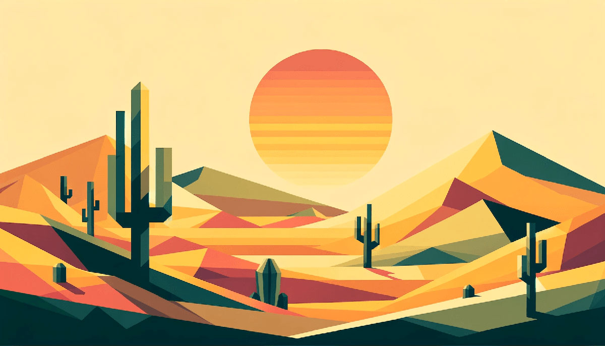
Most design problems aren’t color problems – they’re too-many-colors problems.
Three is the number that works. A single dominant tone, one supporting hue, and a sharp accent. That structure covers branding, UI, packaging, and print without tipping into visual noise.
Three color palettes work because they force real decisions – about color harmony, contrast, and hierarchy – instead of letting extra shades paper over weak choices.
Below are 15 tested combinations, each with hex codes, harmony type, use cases, and application ratios. Whether you’re working on a logo, a web layout, or a brand identity, there’s a palette here built for it.
Three Color Palettes
Three colors. That’s all it takes to build a palette that actually works. Not five, not eight – just three, chosen with intention and placed with purpose.
A solid three-color design scheme gives you a dominant base, a supporting tone, and an accent. The 60-30-10 rule applies here almost universally. Get that ratio wrong and even a great color combination falls flat.
The palettes below are built around color harmony principles – triadic, analogous, complementary, and split-complementary structures pulled from color theory fundamentals. Each includes hex codes, use case guidance, and notes on mood.
—
Navy, White, Gold
| #1B2A4A | #FFFFFF | #C9A84C |
Color harmony type: Complementary with neutral bridge
What Makes This Combination Work
Deep navy blue and warm gold sit at opposite ends of the warm-cool spectrum. White acts as a buffer, stopping the contrast from feeling harsh.
Best Use Cases
- Finance and legal branding
- Luxury packaging
- Wedding stationery
- Portfolio websites
- Book cover design
Mood and Color Psychology
Evokes trust, authority, and sophistication. Common in banking, law, and premium hospitality.
How to Apply the Three Colors
- Dominant (60%): Navy for backgrounds and large surfaces
- Secondary (30%): White for text areas, cards, negative space
- Accent (10%): Gold for CTAs, borders, key details
Works Well With
Serif fonts, clean grid systems, and minimal white space layouts.
—
Mustard, Sage, Forest Green
| #E3B448 | #CBD18F | #3A6B35 |
Color harmony type: Analogous
What Makes This Combination Work
All three hues pull from the yellow-green segment of the color wheel, giving this palette natural color balance without feeling forced. The contrast between mustard and forest green keeps it from going flat.
Best Use Cases
- Eco and sustainability brands
- Natural food packaging
- Outdoor and lifestyle products
- Autumn editorial design
- Nature-themed web design
Mood and Color Psychology
Grounded, organic, slightly retro. Works for brands that want to feel natural without being clinical.
How to Apply the Three Colors
- Dominant (60%): Sage for backgrounds and large areas
- Secondary (30%): Mustard for mid-level UI elements and section accents
- Accent (10%): Forest green for CTAs and bold highlights
Works Well With
Earthy textures, slab serif or hand-lettered fonts, and loose asymmetric layouts.
—
Prussian Blue, Burnt Orange, Mustard Yellow
| #1B3A5C | #C1440E | #E3A020 |
Color harmony type: Split-complementary
What Makes This Combination Work
Prussian blue and burnt orange are near-complementary, with mustard yellow adding warmth without breaking the structure. High contrast, high energy – but still controlled.
Best Use Cases
- Retro and vintage branding
- Sports and outdoor brands
- Poster design
- Autumn seasonal campaigns
- Packaging for craft products
Mood and Color Psychology
Bold and confident. Pulls from retro color palettes of the 1960s-70s – great for brands that want personality over polish.
How to Apply the Three Colors
- Dominant (60%): Prussian blue for backgrounds and structure
- Secondary (30%): Burnt orange for headers, buttons, key sections
- Accent (10%): Mustard yellow for micro-details and highlights
Works Well With
Bold sans-serif typography, rough textures, and asymmetric grid layouts.
—
Warm Beige, Rust, Sandy Brown
| #E8DCC8 | #B5451B | #C49A6C |
Color harmony type: Analogous
What Makes This Combination Work
Three warm tones in the orange-brown family – close enough to feel cohesive, different enough in value to create contrast. Beige lifts the palette; rust grounds it.
Best Use Cases
- Interior design and real estate
- Artisan and craft branding
- Travel and lifestyle brands
- Autumn and harvest seasonal design
- Wellness and spa
Mood and Color Psychology
Warm, grounded, approachable. One of the most used earth color palettes in interior and brand work – feels lived-in and human.
How to Apply the Three Colors
- Dominant (60%): Warm beige for backgrounds and neutral surfaces
- Secondary (30%): Sandy brown for mid-elements and supporting UI
- Accent (10%): Rust for buttons, borders, and focal points
Works Well With
Serif and slab serif fonts, linen textures, and photography with natural lighting.
—
Pastel Orange, Peach, Custard
| #FFA351 | #FFBE7B | #EED971 |
Color harmony type: Analogous
What Makes This Combination Work
A soft gradient of warm tones – peach, pastel orange, and custard yellow move naturally across the warm side of the color wheel. No jarring transitions, no heavy contrast.
Best Use Cases
- Beauty and cosmetic brands
- Food packaging and menus
- Social media and Instagram content
- Spring and summer seasonal design
- Children’s products and stationery
Mood and Color Psychology
Playful, warm, and inviting. Common in happy color palettes for consumer brands targeting a younger or lifestyle-focused audience.
How to Apply the Three Colors
- Dominant (60%): Custard as the background or large surface base
- Secondary (30%): Peach for card elements, illustrations, and mid-level UI
- Accent (10%): Pastel orange for interactive elements and focal highlights
Works Well With
Rounded sans-serif fonts, gradient backgrounds, and bright photography with warm filters.
—
Coral, Teal, Cream
| #F87C56 | #2A9D8F | #FAF0E6 |
Color harmony type: Complementary with neutral
What Makes This Combination Work
Coral and teal sit across from each other on the color wheel – a classic complementary pairing. Cream softens what would otherwise be a high-tension combination.
Best Use Cases
- Lifestyle and wellness brands
- Travel and hospitality
- Summer editorial design
- UI and app design
- Social media branding
Mood and Color Psychology
Fresh, balanced, and energetic without being aggressive. Sits between warm color palettes and cold color palettes – works in both directions.
How to Apply the Three Colors
- Dominant (60%): Cream for backgrounds and open space
- Secondary (30%): Teal for key UI sections, headers, and cards
- Accent (10%): Coral for CTAs and visual emphasis
Works Well With
Clean sans-serif fonts, white space-heavy layouts, and high-contrast photography.
—
Black, Gold, Off-White
| #191919 | #B88746 | #FDF5A6 |
Color harmony type: Achromatic with metallic accent
What Makes This Combination Work
Near-black and off-white handle contrast and legibility. Gold does all the expressive work – a single warm hue against a neutral field always reads as premium.
Best Use Cases
- Luxury brand identity and logo design
- High-end packaging
- Event design and invitations
- Fashion and jewellery
- Premium hospitality and restaurant branding
Mood and Color Psychology
Luxurious, bold, and timeless. One of the most reliable three-color branding schemes across premium industries.
How to Apply the Three Colors
- Dominant (60%): Near-black as the primary background or base
- Secondary (30%): Off-white for text, space, and legibility surfaces
- Accent (10%): Gold for logo marks, borders, and key touch points
Works Well With
Thin serif or display fonts, metallic finishes in print, and photography with dark, moody lighting.
—
Smoothie Pink, Antique White, Misty Aqua
| #FFC6C2 | #FAE9DA | #C3E0DD |
Color harmony type: Analogous pastel
What Makes This Combination Work
Three low-saturation tones – pink, warm white, and soft aqua – stay within a narrow value range. The result is a palette with almost no tension, just quiet visual harmony. Works well precisely because nothing fights for attention.
Best Use Cases
- Baby and children’s products
- Skincare and beauty
- Wedding and event design
- Pastel color palettes for social media
- Stationery and illustration
Mood and Color Psychology
Soft, gentle, and calming. Sits in the same territory as light color palettes built for nurturing or wellness contexts.
How to Apply the Three Colors
- Dominant (60%): Antique white as the primary base
- Secondary (30%): Misty aqua for cards, backgrounds, and secondary sections
- Accent (10%): Smoothie pink for headers, icons, and call-to-action details
Works Well With
Thin script or rounded sans-serif fonts, soft photography, and plenty of white space.
Deep Red, Off-White, Periwinkle
| #C0392B | #F5F0E8 | #7B7FC4 |
Color harmony type: Split-complementary
What Makes This Combination Work
Deep red and periwinkle create strong contrast without the harshness of a pure complementary pair. Off-white sits between them, keeping the palette breathable and modern.
Best Use Cases
- Fashion and editorial design
- Beauty and cosmetics branding
- Poster and print design
- Modern logo design
- Lifestyle brand identity
Mood and Color Psychology
Confident and slightly unexpected. The red brings energy; periwinkle pulls it back toward calm. Together they feel contemporary rather than classic.
How to Apply the Three Colors
- Dominant (60%): Off-white for backgrounds and neutral space
- Secondary (30%): Periwinkle for supporting sections and UI elements
- Accent (10%): Deep red for headlines, CTAs, and focal details
Works Well With
Modern serif fonts, editorial grid layouts, and high-contrast photography.
—
Dusty Rose, Mauve, Blue-Gray
| #D4A5A5 | #B07D8D | #8DA7B5 |
Color harmony type: Analogous with cool shift
What Makes This Combination Work
Dusty rose and mauve stay close on the color wheel, while blue-gray introduces just enough cool contrast to stop the palette from going flat. All three share a muted, low-saturation quality – that consistency is what holds it together.
Best Use Cases
- Wedding and event design
- Bridal and beauty branding
- Florist and lifestyle brands
- Muted color palettes for social media
- Interior design mood boards
Mood and Color Psychology
Romantic, refined, and timeless. Sits in the same visual space as vintage color palettes – soft without being childish.
How to Apply the Three Colors
- Dominant (60%): Dusty rose as the primary background tone
- Secondary (30%): Blue-gray for supporting layout elements
- Accent (10%): Mauve for type, icons, and key visual details
Works Well With
Script fonts, delicate serif typefaces, and soft-focus photography with warm tones.
—
Raspberry, Light Pink, Chocolate
| #C1175A | #F5C2C7 | #4A2020 |
Color harmony type: Monochromatic with dark anchor
What Makes This Combination Work
Raspberry and light pink share the same base hue at different saturation levels. Chocolate brown adds depth and stops the palette from reading as purely sweet or feminine.
Best Use Cases
- Luxury dessert and chocolate branding
- Valentine’s Day and seasonal campaigns
- Beauty and skincare packaging
- Restaurant and food design
- Fashion editorial
Mood and Color Psychology
Rich, indulgent, and sensory. The dark brown grounds what would otherwise be an overly soft palette – adds maturity and appetite appeal.
How to Apply the Three Colors
- Dominant (60%): Light pink for backgrounds and open areas
- Secondary (30%): Raspberry for key sections, headers, and UI blocks
- Accent (10%): Chocolate for type, borders, and grounding details
Works Well With
Elegant serif or script fonts, close-up food photography, and packaging with tactile finishes.
—
Slime Green, Off-White, Dark Pink
| #A8D147 | #F5F0E8 | #C2185B |
Color harmony type: Triadic
What Makes This Combination Work
Slime green and dark pink are bold, near-triadic opposites that shouldn’t work – but do, when off-white steps in to reduce the tension. The result is a three-color palette that feels daring without becoming chaotic.
Best Use Cases
- Gen Z and youth-facing brands
- Music and entertainment design
- Bold packaging and merch
- Vivid color palettes for digital campaigns
- Social media content and motion graphics
Mood and Color Psychology
Energetic, rule-breaking, and high-impact. Not for conservative brands – built for attention.
How to Apply the Three Colors
- Dominant (60%): Off-white to control the overall intensity
- Secondary (30%): Slime green for large blocks and background sections
- Accent (10%): Dark pink for headlines, icons, and interactive elements
Works Well With
Heavy display fonts, bold sans-serif typefaces, and maximalist layout structures.
—
Sky Blue, Tangerine, Leaf Green
| #87CEEB | #FF8C42 | #6BAA5E |
Color harmony type: Triadic
What Makes This Combination Work
Sky blue, tangerine, and leaf green are spaced roughly 120 degrees apart on the color wheel – a true triadic color scheme. Each hue is vivid on its own; together they balance warm and cool energy without a neutral needed.
Best Use Cases
- Outdoor and adventure brands
- Children’s education and media
- Food and beverage packaging
- Summer seasonal campaigns
- Fun and playful web design
Mood and Color Psychology
Natural, optimistic, and full of energy. Pulls from nature color palettes – sky, citrus, and foliage in a single scheme.
How to Apply the Three Colors
- Dominant (60%): Sky blue for backgrounds and primary surfaces
- Secondary (30%): Leaf green for supporting sections and UI blocks
- Accent (10%): Tangerine for CTAs, badges, and key highlights
Works Well With
Rounded display fonts, illustration-heavy layouts, and bright outdoor photography.
—
Soft Pink, Fuchsia, Deep Yellow
| #F9C6CF | #D72483 | #E6A817 |
Color harmony type: Split-complementary
What Makes This Combination Work
Fuchsia and deep yellow sit near-opposite on the color wheel, creating a high-energy tension. Soft pink bridges them – close in hue to fuchsia but low enough in saturation to act as a visual rest point.
Best Use Cases
- Beauty and fashion branding
- Spring and summer campaigns
- Social media content for lifestyle brands
- Festival and event design
- Bright color palettes for digital advertising
Mood and Color Psychology
Bold, feminine, and celebratory. High energy – works when the goal is to stop the scroll, not blend in.
How to Apply the Three Colors
- Dominant (60%): Soft pink as the primary background tone
- Secondary (30%): Fuchsia for key sections, headers, and bold type
- Accent (10%): Deep yellow for highlights, icons, and interactive spots
Works Well With
Bold condensed display fonts, high-contrast cropped imagery, and gradient overlays.
—
Teal, Soft Lavender, Dark Background
| #2A9D8F | #C9B8E8 | #1A1A2E |
Color harmony type: Analogous cool with dark anchor
What Makes This Combination Work
Teal and soft lavender share a cool, blue-leaning quality that keeps them cohesive. The near-black dark background pushes both colors forward – they read as vivid accents rather than primary tones.
Best Use Cases
- Tech and SaaS product design
- Gaming and entertainment branding
- Dark-mode UI and app design
- Night color palettes for digital platforms
- Music and creative studio identity
Mood and Color Psychology
Mysterious, futuristic, and premium. Sits comfortably in dark color palettes used across gaming, crypto, and high-end tech brands.
How to Apply the Three Colors
- Dominant (60%): Dark background as the primary canvas
- Secondary (30%): Teal for key UI elements, cards, and data visualization
- Accent (10%): Soft lavender for highlights, type accents, and glow effects
Works Well With
Geometric sans-serif fonts, gradient overlays, and dark photography with selective color grading.
FAQ on Three Color Palettes
What is a three color palette?
A three color palette is a designed set of exactly three hues used together in a project. It typically includes a dominant base, a supporting tone, and an accent. The structure follows color harmony principles to keep the combination visually balanced and intentional.
How do you choose three colors that work together?
Start with the color wheel. Pick a harmony type – triadic, analogous, or complementary – then test your three hues at different saturation and brightness levels. Tools like Adobe Color or Coolors speed up the process significantly.
What is the 60-30-10 rule in a three color palette?
The 60-30-10 rule is a color application ratio. The dominant color takes 60% of the space, the secondary fills 30%, and the accent covers 10%. It creates visual hierarchy without overloading any single hue.
What are the best three color combinations for branding?
Navy, white, and gold for premium brands. Black, white, and a single accent for minimal identities. Triadic schemes work well for brands needing energy and variety. The best choice depends on your audience, industry, and the mood your visual identity needs to project.
What is the difference between a triadic and analogous three color palette?
A triadic palette uses three hues spaced 120 degrees apart on the color wheel – high contrast, high energy. Analogous colors sit next to each other – lower contrast, more cohesive. Triadic feels bold; analogous feels natural.
Can I use a three color palette for web design?
Yes – three colors are often ideal for web design. One color for backgrounds, one for UI elements, one for CTAs. Keep contrast ratios WCAG-compliant, especially between text and background colors, to meet accessibility standards.
How does color psychology apply to three color palettes?
Color psychology shapes how people respond to your palette before they read a word. Blue signals trust; red signals urgency; green signals growth. Choosing three colors with aligned psychological associations makes your design feel consistent and deliberate.
What three color palettes work best for print design?
For print design, always work in CMYK rather than RGB. High-contrast combinations hold better on paper. Muted or earthy three-color schemes – like beige, rust, and forest green – tend to reproduce more reliably than bright, saturated palettes across different print conditions.
How do I find the hex codes for a three color palette?
Use tools like Coolors, Adobe Color, or Pantone‘s color finder. If you’re pulling from an image, tools like ColorZilla or Canva’s eyedropper extract exact hex codes directly. Always verify codes render correctly across both screen and print outputs.
Are three color palettes better than five color palettes?
For most projects, yes. Three colors are easier to apply consistently, harder to misuse, and more memorable. Five-color palettes give more flexibility but increase the risk of visual clutter. Start with three – you can always expand once the brand guidelines are established.
Conclusion
This conclusion is for an article presenting three color palettes across branding, print, UI, and seasonal design contexts.
The right three-color combination does more than look good. It controls visual hierarchy, guides attention, and reinforces what a brand or product is trying to communicate.
Harmony type matters. Whether you work with a split-complementary color scheme or a tight monochromatic range, the structure behind your color selection is what makes it hold up across different applications.
Check the hex codes, test your contrast ratios, and apply the 60-30-10 rule consistently. The palettes here cover most use cases – pick the one that fits your project and build from there.

Renowned for his expertise in logo design and visual branding, Bogdan has developed a multitude of logos for various clients.
His skills extend to creating posters, vector illustrations, business cards, and brochures. Additionally, Bogdan's UI kits were featured on marketplaces like Visual Hierarchy and UI8.
He also wrote in the past years on sites like Design Your Way, WebDesignerDepot, WPDean, Designmodo, Speckyboy, Slider Revolution, and more.
- Canva vs Photoshop: When Does Each Make Sense? - 12 September 2026
- Briefing 3D Game Animation: Rigs, Clip Lists and Engine Handoffs - 11 September 2026
- The Webflow Logo History, Colors, Font, And Meaning - 10 September 2026

Bogdan Sandu is a seasoned designer who has been designing websites since 2008. Renowned for his expertise in logo design and visual branding, Bogdan has developed a multitude of logos for various clients. His skills extend to creating posters, vector illustrations, business cards, and brochures. Additionally, Bogdan's UI kits were featured on marketplaces like Visual Hierarchy and UI8. He also wrote in the past years on sites like Design Your Way, WebDesignerDepot, WPDean, Designmodo, Speckyboy, Slider Revolution, and more.
You Might Also Like