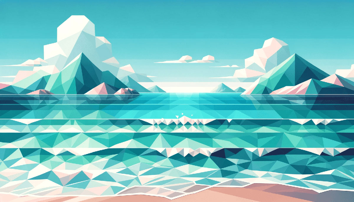
Cool tones suggest calm, trust, and precision. That’s why cold color palettes dominate healthcare apps, financial dashboards, and corporate interfaces where credibility beats excitement.
But slap the wrong icy blue on a food brand and watch conversion rates freeze.
This guide breaks down 15 tested palettes with hex codes, real use cases, and application rules. You’ll learn which cool schemes work for tech, when hue shifts matter, and how to avoid the sterile trap that kills approachability.
Whether you’re building web design systems or refining brand guidelines, these combinations deliver professional clarity without warmth.
Cold Color Palettes
Arctic Frost
| #F0F7FF | #C4E4FF | #8BB9DD | #4C8AB4 | #2B5D7A |
Best For
Corporate websites, fintech dashboards, healthcare portals. Clean, professional interfaces that need credibility without warmth. Financial reports and data visualization tools benefit from the cool undertones.
Color Relationships
Lightest shade works as background surface, mid-range tones handle interactive states. Darkest blue anchors headers and navigation. Powder blue transitions smoothly into steel tones for subtle depth without jarring shifts.
When to Use
When trust matters more than excitement. SaaS platforms, banking apps, medical records systems. Skip this for hospitality, food service, or creative agencies where approachability counts.
Pro Tips
Pair with crisp white space and charcoal text for maximum readability. Add a single warm accent (amber or sand) for CTAs to prevent sterile feel. Increase line height 1.6+ when using dark backgrounds to maintain breathing room.
Glacial Dawn
| #F3F6F8 | #E6EEF5 | #C2D0DD | #8CA0B8 | #556781 |
Best For
Minimalist portfolios, editorial layouts, quiet brand identities. Architecture firms and consulting agencies that value restraint. Print materials benefit from the muted gray-blue balance that doesn’t wash out on uncoated stock.
Color Relationships
Near-monochromatic progression from fog white through slate creates sophisticated tonal hierarchy. Each step provides just enough contrast for clarity. Steel blue midtones bridge backgrounds and text without harsh jumps.
When to Use
Introspective content, long-form reading experiences, premium service brands. When whisper beats shout. Avoid for youth brands, entertainment, retail with high energy expectations.
Pro Tips
This palette rewards negative space. Use the lightest tones generously, reserve dark shades for small type and icons. Test body text at #556781 against #F3F6F8 backgrounds for extended reading comfort.
Icy Teal
| #DBFAFF | #A8E8ED | #6AD6E0 | #2DB8C5 | #05192A |
Best For
Tech startups, app interfaces, digital product demos. Modern brands that bridge calm and fresh without feeling corporate. Works well for sustainability-focused companies, water filtration systems, marine conservation orgs.
Color Relationships
Teal sits between blue and green, balancing trust with vitality. Seafoam highlights against deep navy create crisp interaction zones. Light cyan works as airy backgrounds, mid-tones handle active states, near-black provides text anchors.
When to Use
Dashboard UI, onboarding flows, feature comparison tables. Anywhere clarity needs a pulse without chaos. Not ideal for luxury goods, traditional industries, or brands requiring gravitas over approachability.
Pro Tips
Reserve brightest teal for buttons and links only. Overuse kills the fresh accent effect. Combine with warm gray body text instead of pure black to soften digital harshness.
Powder Blue Mist
| #EDF6FF | #C4DDF5 | #8BB9DD | #4C8AB4 | #293447 |
Best For
Travel vlogs, nature content, outdoor brand storytelling. Clean winter aesthetics without clinical coldness. Email templates and newsletters that need soft professionalism with personality.
Color Relationships
Analogous colors create smooth visual flow. Pale sky tones transition through dusty blue into charcoal for controlled depth. Maintains cool temperature throughout without leaning sterile or harsh.
When to Use
Calm outdoor storytelling, cabin retreat branding, alpine tourism. Content with peaceful, natural energy. Skip for urgent messaging, bold entertainment, high-contrast gaming interfaces.
Pro Tips
Layer photography with cool blue overlays at 15-20% opacity to unify mixed image sets. Keeps visual rhythm consistent. Use charcoal (#293447) sparingly for headlines, let lighter shades dominate layouts.
Steel Shadow
| #F0F7FF | #9AD5FF | #4AB8FF | #0083C7 | #041B2D |
Best For
SaaS landing pages, software tutorials, product demos. Sleek digital atmosphere with polished tech edge. HUD-style overlays, futuristic UI concepts, cybersecurity branding.
Color Relationships
Icy white to electric blue to midnight creates strong visual hierarchy. Each step carries distinct weight for clear component separation. Bright sky blue provides energetic contrast against deep navy without warmth.
When to Use
App promos, product teasers, explainer videos. Digital-first brands that need sharp, confident presence. Wrong choice for organic products, wellness services, handmade crafts, vintage aesthetics.
Pro Tips
Apply brightest blue (#4AB8FF) to progress indicators and active states for instant feedback clarity. Dark navy backgrounds demand increased padding and generous whitespace to prevent cramped feel. Test small UI elements at multiple sizes since bright blues can vibrate against dark backgrounds.
Seafoam Slate
| #E1EBFF | #B8D4E8 | #68E2FF | #00C2E0 | #0081A8 |
Best For
Sports edits, fast-cut montages, short-form social content. Dynamic motion graphics that need energy without heat. Fitness apps, athletic wear brands, performance tracking dashboards.
Color Relationships
Cyan punch against cooler slate creates movement and intensity. Light periwinkle softens transitions without killing momentum. Strong saturation in mid-range keeps palette lively while maintaining cool foundation.
When to Use
High-energy content with cool aesthetic. Gaming streams, workout videos, competitive sports coverage. Poor fit for luxury retail, fine dining, professional services, contemplative content.
Pro Tips
Limit electric cyan to 10-15% of screen real estate. Too much creates visual fatigue fast. Pair with dark charcoal text instead of pure black to reduce eye strain on bright backgrounds.
Midnight Indigo
| #E1EBFF | #9DA9FF | #5860FF | #1F2A6B | #050710 |
Best For
Sci-fi trailers, music videos, dark mode UI. Holographic effects and immersive digital environments. Gaming montages, synthwave aesthetics, futuristic brand identities.
Color Relationships
Icy blues shift into saturated electric violet before dropping to near-black. Creates depth without warmth. Holographic purples work as accent glows, darkest tones provide deep space backdrops.
When to Use
Trailer-style edits, cinematic content, moody atmospheres. When drama matters more than approachability. Skip for accessibility-critical interfaces, children’s content, straightforward business applications.
Pro Tips
Use bright violet (#5860FF) for hologram effects, logo animations, title sequences. Reserve near-black for backgrounds only to maintain legibility. Check contrast ratios carefully since deep indigo can fail WCAG standards against dark backgrounds.
Cool Concrete
| #F3F5F6 | #E6EAED | #C8CDD2 | #9BA3AB | #6B737C |
Best For
Architecture portfolios, industrial design showcases, urban planning presentations. Material-focused brands that celebrate structure over decoration. Print catalogs, technical documentation, engineering firms.
Color Relationships
Pure monochrome progression with subtle blue undertones. Each shade provides functional separation without chromatic distraction. Cool grays read professional and refined, never dull when paired with strong photography or geometric layouts.
When to Use
Brands emphasizing craft, precision, minimalism. Content where imagery carries color, palette provides framework. Wrong for playful brands, emotional storytelling, color-dependent differentiation, children’s products.
Pro Tips
This palette demands excellent typography and layout since color won’t save poor composition. Rely on white space and scale for hierarchy. Add texture through photography, materials, or subtle patterns to prevent flat appearance.
Mint Shadow
| #DBFAFF | #B8F0D6 | #68E2FF | #00C2E0 | #0F766E |
Best For
Healthcare brochures, clinic websites, patient-friendly forms. Clean medical aesthetics softened by mint freshness. Spa centers, wellness apps, health tracking interfaces that need approachable professionalism.
Color Relationships
Mint green bridges cool cyan and deep teal without warmth. Light seafoam creates soothing backgrounds, darker teal anchors section headers. Sterile freshness balanced with organic undertones for accessible medical communication.
When to Use
Health tech, medical records systems, pharmacy branding. When clinical needs friendly. Poor choice for urgent care, emergency services, high-energy fitness brands, food service.
Pro Tips
Pair darker teal with warm gray body text to keep tone approachable. Use mint sparingly in backgrounds to avoid overwhelming pale sensitivity. Test on actual medical forms since light tints can wash out when printed on standard office stock.
Deep Teal Frost
| #E6F7F7 | #9AD5D9 | #4ABDBE | #008280 | #1F2A35 |
Best For
Corporate websites, B2B platforms, professional services. Bridges trust with modernity without trending trendy. Data dashboards, analytics tools, business intelligence interfaces.
Color Relationships
Light frost to vibrant teal to deep navy creates controlled progression. Mid-range teal supports strong hierarchy for headers and interactive elements. Cool grays keep pages professional, teal adds measured personality without disrupting credibility.
When to Use
Enterprise software, consulting firms, financial services. Professional contexts requiring polish over playfulness. Skip for creative agencies, lifestyle brands, entertainment, youth-focused products.
Pro Tips
Use lighter gray as section backgrounds for structured content blocks without heavy borders. Reserve brightest teal for CTAs and active states only. Pair with simple photography and thin-line icons to maintain clean visual rhythm.
Lavender Ice
| #F0EBFF | #D4C4FF | #B8A8E8 | #8B7CB8 | #556081 |
Best For
Beauty brands, wellness products, meditation apps. Gentle spirituality without New Age clichés. Skincare lines, aromatherapy, yoga studios, holistic health services.
Color Relationships
Pale lavender through dusty purple maintains cool undertones while adding softness. Muted hue prevents overly feminine read. Works as neutral alternative to gray in contexts requiring calm sophistication.
When to Use
Premium wellness, luxury self-care, contemplative content. When serenity needs refinement. Avoid for masculine brands, tech startups, urgent messaging, children’s products, food brands.
Pro Tips
Balance lavender backgrounds with charcoal text for readability. Too much pale purple creates washed-out appearance. Test print samples since lavender can shift pink or gray depending on color profile and paper stock.
Pewter Blue
| #F3F6F8 | #D6DEE6 | #A8B8C7 | #788792 | #455766 |
Best For
Editorial layouts, magazine templates, long-form content. Refined publishing aesthetics with contemporary edge. Annual reports, corporate communications, premium print materials.
Color Relationships
Blue-gray blend reads calm and authoritative without coldness. Each midtone provides distinct layer for components and furniture. Light surfaces support extended reading, dark anchors handle navigation and key typography.
When to Use
Content-heavy interfaces, research publications, thought leadership platforms. When substance trumps flash. Wrong for impulse-driven retail, entertainment, social platforms, youth culture brands.
Pro Tips
This palette rewards careful typographic hierarchy since subtle color shifts won’t carry all the weight. Increase line-height to 1.6+ for body copy comfort. Use darkest shade (#455766) for headings only, let lighter tones dominate to maintain airy feel.
Winter Sky
| #EDF6FF | #C4DDF5 | #9AD5FF | #4AB8FF | #2B5D7A |
Best For
Weather apps, aviation brands, outdoor gear retailers. Clear sky associations with crisp winter energy. Travel booking platforms, airline interfaces, winter sports coverage.
Color Relationships
Pale frost through bright sky blue to deep ocean creates natural atmospheric gradient. Light tones evoke open space, darker shades ground composition. Smooth tonal progression supports layered UI without harsh boundaries.
When to Use
Clean outdoor narratives, adventure travel, seasonal winter campaigns. When clarity meets nature. Avoid for tropical themes, warm climate brands, cozy indoor aesthetics, food service.
Pro Tips
Apply brightest blue (#4AB8FF) to primary actions for instant sky-to-action association. Keep backgrounds at lightest end to maximize airiness. Works exceptionally well with photography featuring clouds, snow, or water for cohesive visual language.
Silver Mist
| #EBECF0 | #D6D9E0 | #BEBEBE | #8CA0B8 | #367588 |
Best For
Luxury automotive, premium tech products, high-end industrial design. Metallic sophistication without literal silver sheen. Audio equipment brands, precision instruments, architectural hardware catalogs.
Color Relationships
Neutral grays with subtle blue cast create refined metal aesthetic. Cooler undertones prevent warmth while maintaining approachability. Mid-range blue-gray bridges neutrals and accents for versatile component styling.
When to Use
Premium product showcases, technical specifications, professional equipment. When material quality matters. Poor fit for organic products, handmade crafts, warm hospitality, children’s content.
Pro Tips
Combine with high-quality product photography where texture carries visual interest. Palette provides framework, not decoration. Add single warm metallic accent (brass or copper) in small doses for contrast without breaking cool foundation.
Cool Gray Teal
| #F3F6F8 | #C8CDD2 | #069494 | #006D77 | #293447 |
Best For
Environmental organizations, water conservation projects, marine biology platforms. Purposeful cool tones with natural associations. Sustainability reports, eco-tech startups, oceanography institutes.
Color Relationships
Neutral grays provide professional base, teal injects measured vitality. Charcoal anchors serious content while teal prevents sterile corporate feel. Balanced contrast between warm-neutral grays and cool-active teal creates dynamic stability.
When to Use
Mission-driven brands, environmental content, scientific communication. When purpose needs polish. Skip for luxury retail, entertainment, impulse purchases, warm personal services.
Pro Tips
Limit teal to 15-20% of composition for maximum impact. Overuse dilutes accent strength. Pair with natural photography showing water, coastlines, or sustainable materials for thematic coherence.
FAQ on Cold Color Palettes
What colors are considered cold?
Blues, greens with blue undertones, purples, grays with cool casts, and teals. These cool tones sit on the blue side of the color theory wheel.
Mint, lavender, slate, navy, and cyan all qualify as cold colors when they lack warm (red/yellow) undertones.
When should I use cold color palettes instead of warm ones?
Use cold palettes for finance, healthcare, technology, corporate brands, and data-heavy interfaces. They signal trust, professionalism, and clarity.
Warm palettes work better for food, entertainment, hospitality, and emotional storytelling where approachability matters more than authority.
Do cold color palettes work for print design?
Yes, but cool tints wash out on uncoated stock. Increase ink density slightly and rely on deeper shades for small typography like captions.
Test CMYK conversions since blues and teals can shift unexpectedly between screen and paper.
How do I prevent cold palettes from feeling sterile?
Add warm accents (sand, coral, amber) in small doses for CTAs and highlights. Use generous white space and quality photography to inject personality.
Vary texture through materials, patterns, or layered backgrounds instead of relying solely on flat color blocks.
What’s the difference between cool and cold color palettes?
Same concept, different terminology. Both describe blue-based palettes with minimal warm undertones. “Cool” and “cold” are used interchangeably in design contexts.
Some designers reserve “cold” for more muted, icy variations while “cool” includes brighter cyans and teals.
Can I combine cold palettes with other color schemes?
Absolutely. Pair cool tones with neutrals (warm grays, beige) for balance. Add a single warm accent for energy without breaking the foundation.
Analogous color combinations using blues, teals, and blue-greens create cohesive cool schemes with natural progression.
How do I choose the right cold palette for my brand?
Match palette mood to brand positioning. Tech startups need bright teals, financial services need muted navy, healthcare wants soft mint-blues.
Test palettes against competitor sites and assess whether your cool tones differentiate or blend into category norms.
Do cold color palettes affect user emotions?
Yes. Color psychology shows blues evoke calm, trust, and stability. Teals add freshness, purples suggest creativity, grays communicate neutrality.
Overuse creates detachment or coldness (literally), which works for clinical contexts but fails for personal connection.
What are common mistakes when using cold palettes?
Using too many shades creates visual clutter. Insufficient contrast between text and backgrounds kills readability. Ignoring accessibility standards for light blues fails WCAG.
Applying cold palettes to warm-category brands (restaurants, kids’ products) confuses users and undermines messaging.
How do I test if my cold palette is accessible?
Check contrast ratios using tools like WebAIM or Contrast Checker. Normal text needs 4.5:1 minimum, large text requires 3:1 for WCAG AA compliance.
Test with color blindness simulators since blues and greens can appear identical to users with deuteranopia or protanopia.
Conclusion
Cold color palettes deliver professional clarity when applied strategically. Blues anchor trust in finance, teals bridge freshness with credibility in tech, muted grays provide refined neutrality for editorial content.
The key is matching cool tones to context. Healthcare needs approachable mint, corporate demands authoritative navy, SaaS wants energetic cyan.
Test saturation levels against your color palette goals. Add warm accents sparingly to prevent sterile outcomes.
Check RGB values for screen accuracy, verify WCAG contrast ratios for accessibility, proof CMYK conversions before print.
Cool color schemes work when purpose drives selection, not trend-chasing. Pick palettes that serve user needs and brand positioning rather than personal preference.
Your hex codes are ready. Build something that performs.
Renowned for his expertise in logo design and visual branding, Bogdan has developed a multitude of logos for various clients.
His skills extend to creating posters, vector illustrations, business cards, and brochures. Additionally, Bogdan's UI kits were featured on marketplaces like Visual Hierarchy and UI8.
He also wrote in the past years on sites like Design Your Way, WebDesignerDepot, WPDean, Designmodo, Speckyboy, Slider Revolution, and more.
- The Airtable Logo History, Colors, Font, And Meaning - 12 July 2026
- How to Blur Background in Canva: A Quick Tutorial - 11 July 2026
- Typography Trends - 10 July 2026
Bogdan Sandu is a seasoned designer who has been designing websites since 2008. Renowned for his expertise in logo design and visual branding, Bogdan has developed a multitude of logos for various clients. His skills extend to creating posters, vector illustrations, business cards, and brochures. Additionally, Bogdan's UI kits were featured on marketplaces like Visual Hierarchy and UI8. He also wrote in the past years on sites like Design Your Way, WebDesignerDepot, WPDean, Designmodo, Speckyboy, Slider Revolution, and more.
You Might Also Like