

The Pfizer logo is one of the most widely seen corporate marks in the pharmaceutical industry. It sits on vaccine vials, medication packaging, hospital signage, and digital ads across more than 125 countries. And yet, most people couldn’t tell you what it actually means or how many times it has changed.
Founded in 1849 by cousins Charles Pfizer and Charles Erhart in Brooklyn, New York, the company has gone through roughly six distinct logo versions over its 175-plus year history. The current version, introduced on January 5, 2021, replaced the pill-shaped oval that had been Pfizer’s visual anchor since 1948. That is a pretty long run for any logo.
What makes the Pfizer rebrand interesting is its timing. The company rolled out its new identity right as its COVID-19 vaccine (developed with BioNTech) was being distributed worldwide. Whether that was strategic or coincidental depends on who you ask. But the result is clear: this mark is now tied to one of the most recognized public health campaigns in modern history.
What Is the Pfizer Logo?
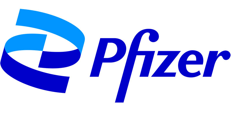
The Pfizer logo is a combination mark featuring a two-tone blue double helix symbol alongside a custom wordmark set in Noto Sans. It was introduced on January 5, 2021, designed by Sabri Akin at the New York agency Team, with brand strategy by Landor & Fitch. The helix represents DNA and the company’s focus on science-driven breakthroughs.
Here is a breakdown of the logo’s core attributes:
- Design Type: Combination mark (symbol + wordmark)
- Primary Elements: A stylized double helix emblem paired with the “Pfizer” logotype
- Official Introduction Date: January 5, 2021
- Designer: Sabri Akin, creative direction by John Clark and Amy Globus at Team Design. Brand strategy by Landor & Fitch
- Trademark Status: Registered trademark of Pfizer Inc., legally protected under U.S. intellectual property law
- Color Palette: Two shades of blue. French Blue (#0070BF) and Vivid Cerulean (#00AFF0), plus white and dark blue for the wordmark
- Usage Context: Product packaging, vaccine labels, corporate communications, digital platforms, advertising, and event signage
The 18-month project moved the brand away from its decades-old pill-shaped oval. Pfizer described the shift as “unlocking the pill to reveal Pfizer’s DNA: the power of science.”
How Has the Pfizer Logo Evolved Over Time?
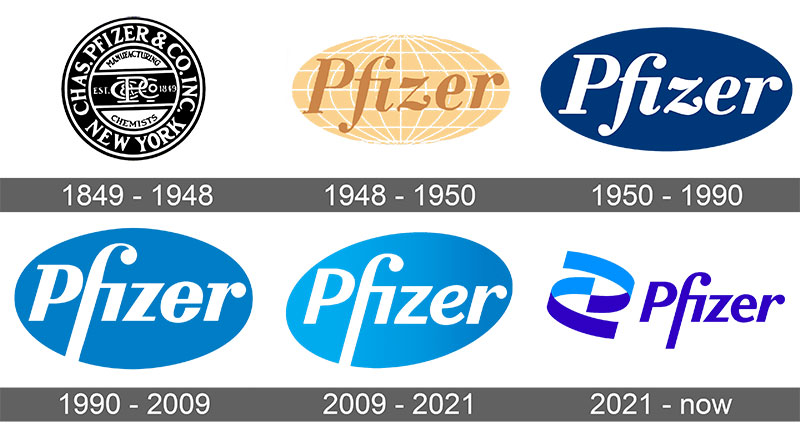
The Pfizer logo has gone through approximately six major versions since 1849, moving from ornate Victorian lettering to a pill-shaped oval and finally to a DNA-inspired helix. The most dramatic shift happened in 2021. That redesign was the first time in over 70 years the company stepped away from the oval shape entirely.
Original Chas Pfizer & Co. Logo (1849-1940)
The very first Pfizer mark was not really a logo in the modern sense. It was a circular badge with the full company name, “Chas Pfizer & Co.,” written around its perimeter in capital letters.
A black-and-white monogram sat on a horizontal banner in the center of the circle. Very Victorian. Very ornate.
This design lasted nearly a century, which says something about how slowly corporate branding moved back then. The colors were strictly monochrome. Black ink on white paper, because that is what you got in the 1800s.
There was no abstract symbolism here. Just a name, a monogram, and a circle. It worked because the company’s reputation was built on the quality of its chemicals and medicines, not a clever mark.
The First Oval Logo (1940-1948)
When the company shortened its name from “Chas Pfizer & Co.” to just “Pfizer Corp.,” a new visual identity followed. This was the birth of the oval, a shape that would stick around for the next eight decades.
White serif lettering sat on a horizontally stretched black oval. The letters “F” and “Z” had distinctive curved details that gave the wordmark some personality.
Still monochrome. Still no color. But the simplicity felt modern compared to the dense Victorian badge it replaced.
The Globe Logo (1948-1950)
This one is interesting because it only lasted about two years. Pfizer introduced a globe-shaped emblem with white meridian lines, using a warm yellow-brown color palette for the first time.
The globe was meant to reflect the company’s growing international presence. By this point, Pfizer was opening offices across multiple countries and had played a significant role in mass-producing penicillin during World War II.
But the beige and gold tones did not sit right for a pharmaceutical brand. It looked more like a travel agency than a drug company. At least in my opinion.
The Blue Oval Logo (1950-1990)
This is the version that really defined Pfizer’s visual identity for generations. The globe was simplified into a clean oval, the meridians disappeared, and the whole thing went blue.
Blue became the official corporate color from this point forward. The company name appeared in bold white lettering against the deep blue background. Strong contrast. Easy to read.
The logic behind choosing blue makes sense for a healthcare company. It signals trust, reliability, and calm. Most pharmaceutical logos lean on blue for exactly these reasons.
This version stuck around for about 40 years with only minor typographic adjustments along the way.
The Modernized Oval (1990-2021)
The 1990 update kept the oval but refreshed everything else. The typography moved to a cleaner sans-serif style. The signature “F” got its famous extended vertical bar, curving at the top and stretching to the bottom of the oval.
In 2009, a further refinement added gradient shading to the blue oval and tilted it slightly upward and to the right. This was supposed to convey progress and forward momentum.
Looked like a pill. Everyone said it looked like a pill. Pfizer never confirmed that was intentional, but it became the defining visual association for the brand during this era.
The DNA Helix Logo (2021-Present)
On January 5, 2021, everything changed. The oval was gone. In its place, two interlocking ribbon-like spirals in dual shades of blue formed a shape that references a DNA double helix.
The wordmark moved to a white background. The font got sharper. And the whole identity felt lighter, more digital-first.
Pfizer CEO Albert Bourla said the rebrand reflected a “smaller, science-based company.” The project had been in development for 18 months before its public debut.
The timing could not have been more perfect (or calculated). Pfizer’s COVID-19 vaccine was already making headlines globally, and the company’s public reputation had improved by 48 percent among Americans after reports of its vaccine efficacy.
What Do the Design Elements of the Pfizer Logo Mean?
The double helix symbol represents DNA, directly connecting the brand to genetics, biotechnology, and scientific research. The two interlocking spirals also suggest partnership and unity, reflecting Pfizer’s two stated values: a passion for science and a commitment to patients.
What Does the Helix Symbol Represent?
The helix is not just decorative. It is a simplified representation of a DNA strand, the building block of life and the foundation of modern pharmaceutical research.
Pfizer described the symbol as “unlocking the pill” to reveal the science underneath. The two spirals touch but do not fully close, leaving negative space between them. This was intentional.
If you look at it from a shape psychology perspective, curved and spiral forms tend to communicate growth, continuity, and organic movement. The open structure avoids feeling static or contained.
Some critics pointed out the helix spirals the wrong direction compared to actual DNA. That became a minor controversy on social media when the logo launched.
Why Did Pfizer Choose These Specific Colors?
Pfizer uses two primary shades of blue. They committed to blue even harder than before, which is a bold move in an industry where almost everyone uses blue.
- French Blue (#0070BF): The darker, primary shade. Used for the wordmark and the outer helix spiral. It communicates authority, trust, and stability. This connects to color psychology principles where darker blues signal professionalism
- Vivid Cerulean (#00AFF0): The lighter, secondary shade. Used for the inner helix spiral. It adds energy and optimism while referencing the lighter blue from the company’s previous oval logo
Pfizer themselves said it well: “In an industry awash in blue, we’re doubling down.” They turned what could be a weakness (blending in) into a statement of ownership. Most blue logos in pharma use a single shade. Pfizer went with two, and that distinction matters.
The white background is just as important. It creates breathing room and lets the helix symbol stand out. Clean. Clinical. Intentional.
What Typography Style Is Used in the Pfizer Logo?
The 2021 logo uses Noto Sans as its corporate typeface, a free font designed by Google. An unusual choice for a Fortune 500 company, but it makes sense when you think about it.
Noto Sans supports over 30 scripts and hundreds of languages. For a company that operates in 125-plus countries, multilingual support is not optional. It is a practical requirement.
The wordmark itself has been refined from previous versions. The rounded “z” and “e” from older logos became more angular. The kerning between letters feels tighter and more deliberate.
Pfizer described Noto Sans as “sleek and practical, minimal and inviting.” That tracks. It does not try to be flashy. It just gets out of the way and lets the helix do the talking.
What Are the Hidden Meanings in the Pfizer Logo?
The helix creates a subtle optical illusion. If you look at it from a distance, it still resembles an oval, the same shape Pfizer used for over 70 years. That continuity was probably intentional, though Pfizer has not confirmed it outright.
The 75-degree angle of the helix spirals creates a sense of upward momentum. Diagonal lines tend to imply movement and progress in design, and this angle matches the slight tilt of the previous 2009 oval.
The negative space between the two spirals also matters. It suggests openness, transparency, and collaboration rather than a closed, self-contained shape.
How Does the Pfizer Logo Compare to Competitor Logos?
Most pharmaceutical companies stick with wordmarks or abstract symbols in blue. Pfizer’s DNA helix sets it apart because it has a clear, identifiable concept behind it. Compare that to the more generic marks used by competitors, and the difference in storytelling is obvious.
The Johnson & Johnson logo is a script wordmark based on the founder’s signature. It feels warm and personal but very different in tone. The Novartis logo relies on a simple, clean wordmark without a distinctive symbol. The Roche logo uses a stylized blue wordmark that has barely changed in decades.
Merck keeps things straightforward with a teal-green wordmark. Sanofi went through its own major rebrand recently, using a stylized purple “S” shape. And Bayer still holds onto its famous cross design from 1904, which is probably the most iconic mark in the entire industry.
What Pfizer got right is specificity. A double helix means something. It is not just a shape. It connects directly to what the company actually does. That is harder to achieve than it looks.
What Are the Technical Specifications of the Pfizer Logo?
Official Color Codes
- French Blue (Primary):
- Hex: #0070BF
- RGB: (0, 112, 191)
- CMYK: (100, 41, 0, 25)
- Pantone: PMS 2175 C
- Vivid Cerulean (Secondary):
- Hex: #00AFF0
- RGB: (0, 175, 240)
- CMYK: (100, 27, 0, 6)
- Pantone: PMS 306 C
- White (Background):
- Hex: #FFFFFF
- RGB: (255, 255, 255)
Dimensions and Proportions
According to Pfizer’s official corporate identity site, the logo must be at least 75 pixels wide for digital use and at least 0.5 inches wide in print.
The clear space around the logo should equal the x-height of the Pfizer logotype. This means the minimum buffer zone scales proportionally with the logo’s size.
The emblem (helix) and logotype (wordmark) must never be separated. They function as a single unit. And Pfizer is very clear about this: do not recreate the logotype by typing it in a font. Only use the approved artwork files.
What Cultural Impact Has the Pfizer Logo Had?
The Pfizer logo became globally recognizable during the COVID-19 pandemic. Billions of people saw it on vaccine vials, vaccination cards, and news broadcasts. It went from a corporate mark that blended into the background of pharmacy shelves to something people could identify on sight.
That level of brand awareness is rare for pharmaceutical companies. Most people cannot name the logo of their prescription drug manufacturer. But Pfizer managed to break through that barrier, partly because of the timing of the 2021 rebrand and partly because of the vaccine’s global reach.
The logo also sparked design community debates. Some praised the clean break from the old oval. Others found the helix symbol generic or pointed out the DNA directionality issue. Either way, people were talking about a pharmaceutical logo, which almost never happens.
How Does the Pfizer Logo Fit Into the Overall Brand Identity?
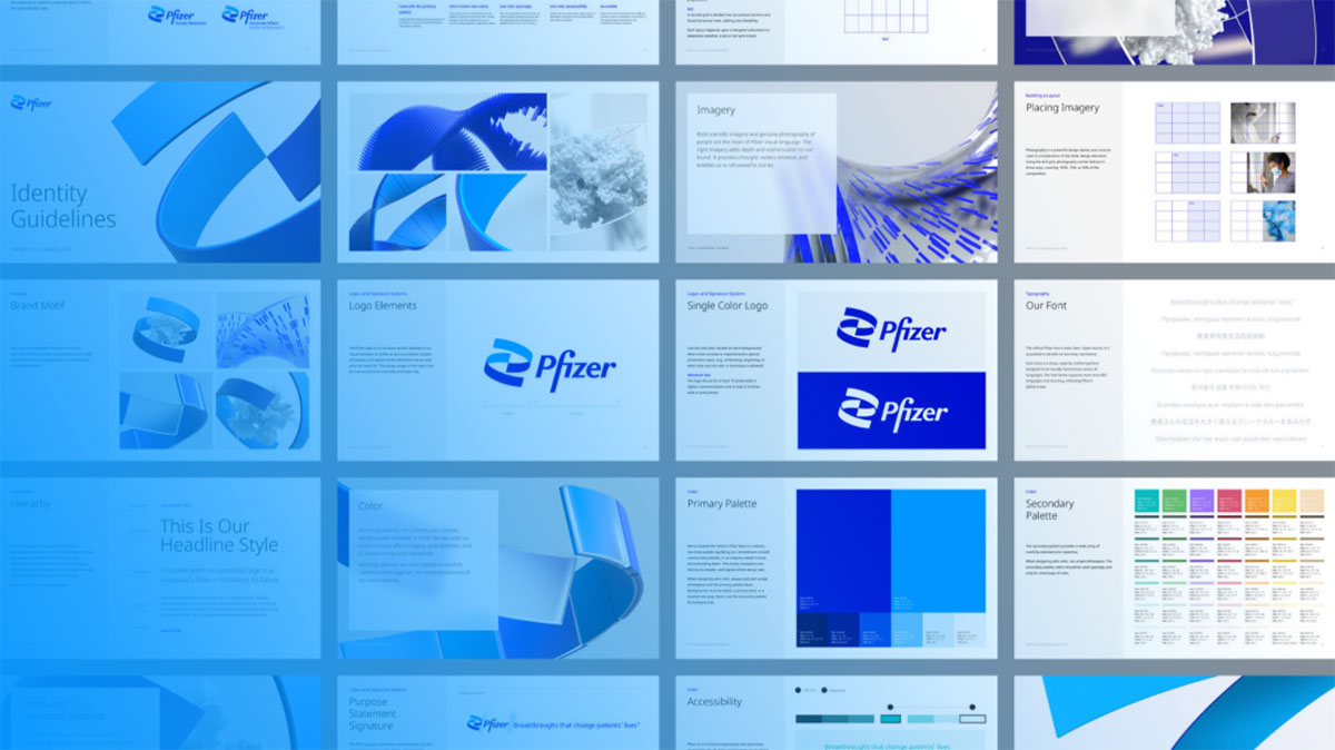
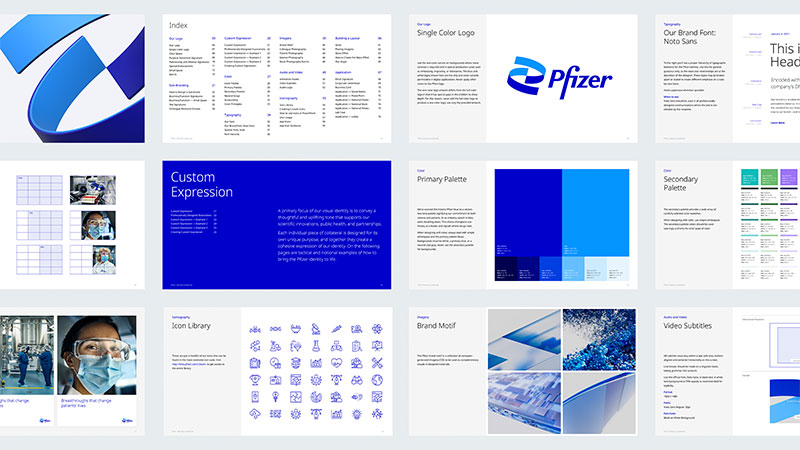
The logo is just one piece of a larger identity system built around the concept of “Science Will Win,” which was Pfizer’s pandemic-era tagline. The brand guidelines cover everything from the helix usage to photography style, voice and tone, and digital interface standards.
Photography in Pfizer’s brand system focuses on real people being helped by medical professionals. No stock photo smiles. No abstract lab imagery. This was a deliberate shift toward authenticity.
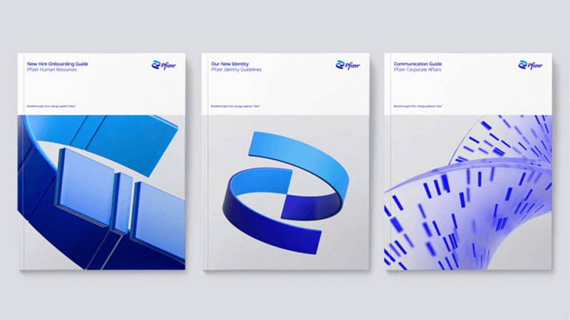
The two-tone blue color system extends beyond the logo into all brand materials. Packaging, presentations, event signage, and web properties all follow the same dual-blue approach. The identity also includes both 2D and 3D versions of the helix for different contexts, from print materials to animated digital content and motion graphics.
Pfizer’s brand style guide ensures the system stays consistent across their global operations. When you are working in 125 countries with dozens of product lines, that kind of control is not just nice to have. It is necessary.
How Should the Pfizer Logo Be Used?
Pfizer has strict rules about logo usage, and they publish them on their corporate identity site at id.pfizer.com. Here is what matters:
- Do not separate the emblem from the logotype
- Do not place the logo in a holding box or other shape
- Do not recolor any logo elements
- Do not alter proportions or add effects like drop shadows
- Do not recreate the logotype by typing it with a font
- Do not place the logo on busy backgrounds that reduce legibility
The logo has a one-color variant available for situations where more contrast is needed, like embossing, engraving, or letterpress printing.
For licensing and permissions, all usage must go through Pfizer’s corporate affairs department. The Pfizer name and logo are registered trademarks. Unauthorized use, reproduction, or modification can result in legal action.
If you need official logo files for approved purposes (press kits, partner materials, etc.), they are available through Pfizer’s media relations channels. Do not grab logo files from Google Images and call it a day. Those are often outdated, low-resolution, or incorrectly formatted.
Vector graphic files are the way to go for any print or large-format use. They scale without losing quality, which is exactly what you need when a logo appears on everything from business cards to building signage.
FAQ on The Pfizer Logo
What does the Pfizer logo look like?
The current Pfizer logo features a double helix symbol in two shades of blue, placed next to the “Pfizer” wordmark on a white background. The helix replaced the pill-shaped oval that the company used for over 70 years.
When did Pfizer change its logo?
Pfizer introduced its new logo on January 5, 2021. The redesign took 18 months and was handled by New York agency Team Design, with brand strategy from Landor & Fitch. It was the first major change since 1948.
What do the two blue colors in the Pfizer logo mean?
The darker French Blue represents trust and authority. The lighter Vivid Cerulean adds energy and optimism. Together, they reflect Pfizer’s commitment to both scientific research and patient care across its global operations.
Who designed the current Pfizer logo?
Designer Sabri Akin created the logo under creative directors John Clark and Amy Globus at Team Design. The corporate typeface is Noto Sans, a Google font chosen for its multilingual support across Pfizer’s 125-country presence.
What does the Pfizer helix symbol represent?
The helix represents a DNA strand, connecting the brand to biotechnology and pharmaceutical research. Pfizer described it as “unlocking the pill to reveal Pfizer’s DNA.” It signals the company’s shift from commerce to science.
What font does Pfizer use in its logo?
Pfizer uses Noto Sans as its corporate font, designed by Google. The wordmark itself is a custom version with sharper, more angular letterforms compared to older versions. You cannot recreate it by simply typing in Noto Sans.
Can I download and use the Pfizer logo?
The Pfizer logo is a registered trademark. Any use requires permission from Pfizer’s corporate affairs department. Official logo files are available through their media relations channels for approved purposes like press materials.
What is the minimum size for the Pfizer logo?
The logo must be at least 75 pixels wide in digital formats and 0.5 inches wide in print. Clear space around the logo should equal the x-height of the Pfizer logotype. These specs come from Pfizer’s official identity guidelines.
Why did Pfizer remove the oval from its logo?
The oval resembled a pill, and Pfizer wanted to move away from that association. CEO Albert Bourla said the company is “no longer in the business of just treating diseases” but curing and preventing them through breakthrough science.
How many times has the Pfizer logo changed?
Pfizer has had roughly six logo versions since 1849. The original was a Victorian circular badge. Then came the oval in 1940, the globe in 1948, the blue oval in 1950, the gradient update in 2009, and the DNA helix in 2021.
Conclusion
The Pfizer logo carries more weight than most corporate marks in healthcare. Its shift from a pill-shaped oval to a DNA double helix reflects a company repositioning itself around biotechnology and vaccine development.
Few pharmaceutical brands achieve that level of global recognition. The 2021 rebrand, with its dual-blue color scheme and Noto Sans wordmark, gave Pfizer a visual identity that actually matches its science-first direction.
Whether you are studying brand identity systems or just curious about why that symbol appears on your vaccination card, the story behind this mark is worth knowing. Good logo design does not just look clean. It tells you exactly what a company stands for.

Renowned for his expertise in logo design and visual branding, Bogdan has developed a multitude of logos for various clients.
His skills extend to creating posters, vector illustrations, business cards, and brochures. Additionally, Bogdan's UI kits were featured on marketplaces like Visual Hierarchy and UI8.
He also wrote in the past years on sites like Design Your Way, WebDesignerDepot, WPDean, Designmodo, Speckyboy, Slider Revolution, and more.
- The Beehiiv Logo History, Colors, Font, And Meaning - 18 September 2026
- Versatile Work Sans Font Pairing for Every Project - 16 September 2026
- Organize Digital Files Like a Pro Before Your Next Client Handoff - 16 September 2026

Bogdan Sandu is a seasoned designer who has been designing websites since 2008. Renowned for his expertise in logo design and visual branding, Bogdan has developed a multitude of logos for various clients. His skills extend to creating posters, vector illustrations, business cards, and brochures. Additionally, Bogdan's UI kits were featured on marketplaces like Visual Hierarchy and UI8. He also wrote in the past years on sites like Design Your Way, WebDesignerDepot, WPDean, Designmodo, Speckyboy, Slider Revolution, and more.
You Might Also Like


