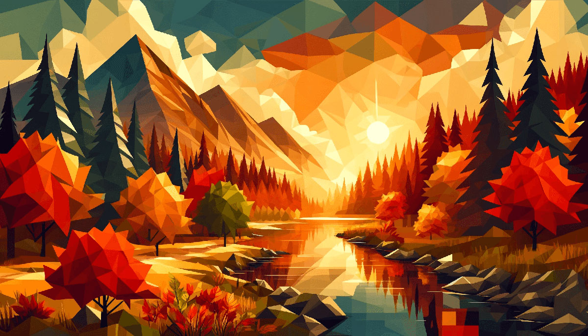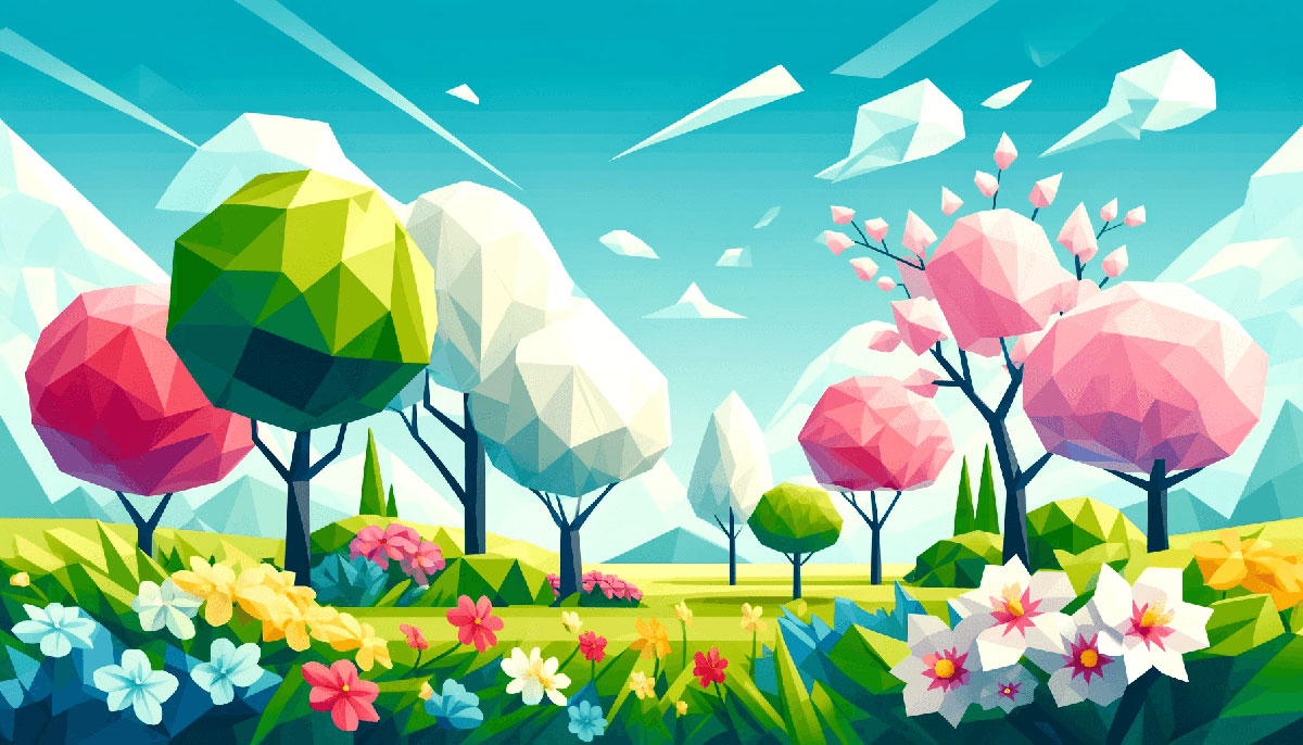


Neon Color Palettes for Daring Designers
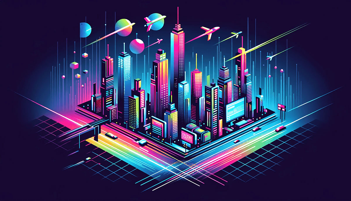
Imagine stepping into a realm where every hue vies for your attention, vibrant and unapologetically bold. This is the world of neon color palettes, a design cornerstone that has usurped conventional boundaries to deliver a visual feast of illuminating vibrancy.
In the heart of this chromatic revolution lie neon hues, orchestrating an electric symphony of lights and colors that breathe life into designs.
As we delve deep into the fluorescent allure of ultraviolet spectrums and saturated swatches, understand that this is more than just aesthetics; it’s a strategic symphony played on the keys of color psychology, backed by the precision of the RGB Color Model and the accuracy of Pantone matching systems.
Here, I impart insights carved from the intersection of theory and eye-catching practicality.
By journey’s end, you’ll have mastered neon design trends, cyberpunk overtures, and the ability to infuse your digital creations with that coveted glow.
You’ll leave equipped, not just with a palette, but with an arsenal of color theory, untamed creativity, and the know-how to electrify any visual challenge that awaits.
Examples of Neon Color Palettes
| #80B3FF | #F57D1F | #FF6868 | #15F5BA |
| #FFB5DA | #7E30E1 | #F0F3FF | #6420AA |
| #FF3EA5 | #BEFFF7 | #FFC700 | #FAEF5D |
| #F72798 | #1D2B53 | #FF7ED4 | #007F73 |
| #9EDDFF | #49108B | #E26EE5 | #A6F6FF |
| #FF204E | #FF004D | #F3F8FF | #FFF455 |
| #7E2553 | #211951 | #98E4FF | #836FFF |
| #5D0E41 | #FFBB64 | #EBF400 | #B6FFFA |
| #00224D | #4CCD99 | #000000 | #DCFFB7 |
| #A0153E | #687EFF | #FFEAA7 | #6499E9 |
| #A6FF96 | #8BE8E5 | #A076F9 | #982176 |
| #7091F5 | #97FFF4 | #ACFADF | #35A29F |
| #F94C10 | #793FDF | #E4F1FF | #94ADD7 |
| #E8FFCE | #D67BFF | #900C3F | #27005D |
| #BC7AF9 | #6F61C0 | #F8FF95 | #EDE4FF |
| #F11A7B | #9400FF | #D7BBF5 | #D5FFE4 |
| #FFA1F5 | #FEFFAC | #A084E8 | #FFB6D9 |
| #6528F7 | #AED2FF | #97FEED | #0B666A |
| #F8DE22 | #7C73C0 | #45FFCA | #FFFD8C |
| #FFE5AD | #FFFD8C | #C70039 | #071952 |
| #3E001F | #07005D | #FFFD8C | #FFFD8C |
| #FFDEB9 | #FE6244 | #FC2947 | #7149C6 |
| #FBFFDC | #D0F5BE | #98EECC | #79E0EE |
| #2CD3E1 | #A459D1 | #F266AB | #FFB84C |
| #FFA3FD | #E384FF | #865DFF | #191825 |
| #FFE79B | #DD58D6 | #9336B4 | #40128B |
| #FDFFAE | #E9FFC2 | #C3EDC0 | #AAC8A7 |
| #FF0060 | #F6FA70 | #00DFA2 | #0079FF |
| #B6EAFA | #FCFFB2 | #FFD3A3 | #FF55BB |
| #4F200D | #FF8400 | #FFD93D | #F6F1E9 |
| #FBFFB1 | #FFEBB4 | #FFBFA9 | #FFACAC |
| #FF5F9E | #E90064 | #B3005E | #060047 |
| #FFED00 | #16FF00 | #0F6292 | #000000 |
| #E3F6FF | #9DF1DF | #8DCBE6 | #FFEA20 |
| #F5EA5A | #FF78F0 | #A31ACB | #39B5E0 |
| #A555EC | #D09CFA | #F3CCFF | #FFFFD0 |
| #FF9E9E | #FFCAC8 | #F8F988 | #C0EEE4 |
| #0002A1 | #332FD0 | #FB2576 | #3F0071 |
| #379237 | #54B435 | #82CD47 | #F0FF42 |
| #FF7D7D | #FF6464 | #F8FFDB | #B3FFAE |
| #00F5FF | #FCE700 | #FF6D28 | #EA047E |
FAQ on Neon Color Palettes
What exactly defines a neon color palette?
Neon color palettes consist of bright, highly saturated hues that mimic the gas-discharge neon lamps’ glow. They lean heavily on vivid RGB codes to achieve that electric sparkle on digital screens.
This color family breathes energy into design, nudging it from mundane to the marvelously modern.
How do neon colors influence design aesthetics?
Neon colors inject a bold punch of life, often anchoring designs with a retro-futuristic feel. They harmonize with art deco nuances and 80s pop culture throwbacks, serving as a beacon for attention amidst conservative color schemes.
These fluorescent tones can make user interfaces break away from conventional and transform into captivating.
Can neon color palettes work for professional branding?
Certainly! A well-curated selection from the vibrant neon wheel can differentiate a brand, allowing it to stand distinctly.
The trick lies in balancing these luminous colors with neutral backgrounds. Branding that dares to tread this electrifying path reaps the rewards of memorability and character.
What’s the best tool to create neon color schemes?
Adobe Color shines bright when conjuring neon color schemes. Intuitive and feature-packed, it lets users mix, match, and explore fluorescent colors with a sense of wildness, controlled by sliders and RGB inputs.
It’s a favorite amongst the creative community for vivid vignettes of unexpected color combinations.
Are there specific neon colors that are trending right now?
Trends in cyberpunk color themes sway the spotlight frequently but currently, highlighter pinks, electric blues, and lime greens are the stars of the show. Such shades nod to our virtual reality-adorned era and make a staple in visual content creation that seeks to stand out.
Do neon colors affect the mood of my audience?
Unquestionably. Color psychology teaches us that bright hues from the neon color wheel can evoke powerful emotional responses, often associated with excitement, creativity, and playfulness.
They set a dynamic tempo for user experiences, leaving lasting impressions due to their high visibility and unconventional charm.
What are the best practices for using neon colors in UI/UX design?
For optimal impact, neon colors should serve as accents within UI/UX design—think buttons, highlights, or progress bars. Against muted backgrounds, they guide users’ eyes intuitively to action points.
Do respect the delicate balance; an overdose might turn the user experience into a visual cacophony.
How do I ensure neon colors are printed accurately?
Neon hues challenge the CMYK color model of standard printers. Specialized inks or Pantone spot colors are the messiahs here.
It’s crucial to communicate with your printer early to ensure they have the means to replicate the neon effect on physical mediums, like packaging or marketing collateral.
What are some popular applications of neon color palettes?
Nightclub design and fashion design frequently call upon neon’s electric charm to create stand-out looks and atmospheres.
Art installations seduce the senses under neon’s luminous veil, and graphic design uses these palettes for attention-grabbing posters and digital art, solidifying the presence of its subject.
How can I learn to balance neon hues in design projects?
Develop a keen eye for color relationships. Study neon RGB codes and understand how they interact. Experiment with glow palette tools online to create neon color gradients that transition smoothly.
Remember, neon functions best with careful thought—less is often more, and contrast is your closest ally.
Conclusion
Stepping through the kaleidoscope of neon color palettes has been quite the journey. Embracing electric blues, pulsating pinks, and vivacious greens, these vivid hues paint our world with strokes of brilliance that demand attention and evoke emotions of dynamism and zest.
This foray is more than just an exploration of fluorescent beauty; it’s a tactical dive into the heart of color psychology, and the strategic harnessing of digital art neon effects.
Armed now with knowledge of balancing neon’s visual punch and maintaining the sophisticated usability of designs, you stand ready to revolutionize the aesthetics of user interfaces, boost branding efforts, and electrify any canvas, digital or otherwise.
Let these pages be your springboard into the neon abyss. Go forth and apply this potent spectrum to online advertising, website color palettes, or even fashion neon accents.
May the charge of these luminous colors lead you to captivating, unforgettable creations. With boldness as your ally, transform the mundane into the unforgettable. Your palette awaits.
If you liked this article about neon color palettes, you should check out this article about winter color palettes.
There are also similar articles discussing spring color palettes, popular color palettes, vintage color palettes, and gold color palettes.
And let’s not forget about articles on light color palettes, dark color palettes, warm color palettes, and cold color palettes.
Bogdan Sandu, a seasoned designer with 15 years of diverse experience, has been designing websites since 2008.
Renowned for his expertise in logo design and visual branding, Bogdan has developed a multitude of logos for various clients.
His skills extend to creating posters, vector illustrations, business cards, and brochures. Additionally, Bogdan's UI kits were featured on marketplaces like Visual Hierarchy and UI8.
Latest posts by Bogdan Sandu (see all)
- Examples of Great Gym Websites to Inspire You - 30 April 2024
- The Activision Blizzard Logo History, Colors, Font, And Meaning - 29 April 2024
- Rainbow Color Palettes for Joyful Designs - 29 April 2024