
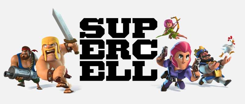
The Supercell Logo History, Colors, Font, And Meaning
Imagine a symbol that captures the essence of imagination and strategy—an insignia that millions around the globe recognize in an instant. The Supercell logo represents more than just a company; it’s the banner under which virtual worlds come to life.
Ensconced within the realms of Helsinki, a crucible for digital dreams, this emblem hearkens to a legacy hewn in mobile gaming.
Engaging with this script, one ventures into the core of dynamic brand identity woven into the fabric of entertainment.
An exploration that delves into the heart of visual culture in gaming, where aesthetics meet player experience amidst the battleground of Clash of Clans and the frenetic energy of Brawl Stars.
By the journey’s end, envisage a richer grasp of the magnetic power behind this deceptively simple design.
Unearth the significance that an artistic game app iconography confers in the colossal tapestry of the digital game artwork universe. Venture forth; let’s decode the anatomy of a digital colossus.
The Meaning Behind the Supercell Logo
A Symbol of Gaming Excellence
Supercell’s logo isn’t just a pretty design – it stands for something more. It’s the emblem of gaming excellence, creativity, and community. It communicates the DNA of a company that’s constantly challenging the status quo in the mobile gaming world.
Connecting Communities
At its core, Supercell is all about connecting players. The way the logo brings different elements together mirrors the way the company aspires to bring gamers together. It’s a gentle nod to the interconnected world of online gaming, where relationships form in split seconds.
The Creative Storm
The name “Supercell” itself refers to a type of storm. In many ways, this represents the storm of creativity and innovation they bring to their games. The logo? Well, it’s like the calm in the middle of that storm. The place where ideas take root.
The History of the Supercell Logo
Humble Beginnings
Back in the day, Supercell started with a simple, yet evocative design. The brand’s growth and evolution mirrored the transformation of its logo over time.
The Iterative Journey
No logo is born perfect. Supercell’s emblem went through various iterations, each refining and distilling its essence further. The journey isn’t just about aesthetics; it’s about reflecting the company’s maturing identity.
The Colors of the Supercell Logo
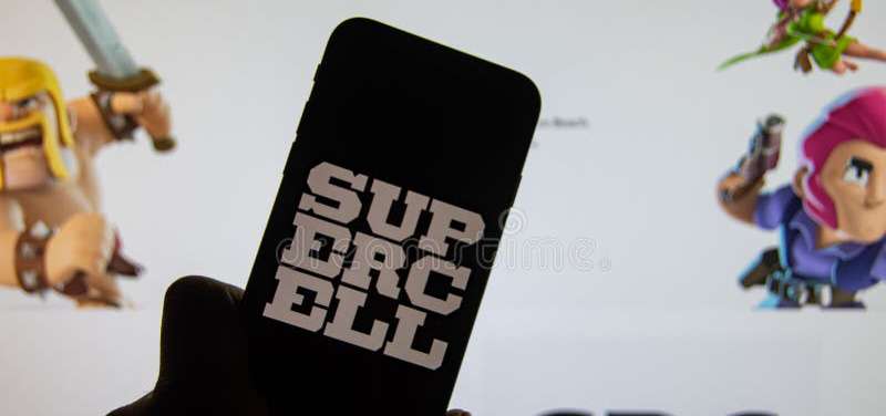
The Supercell logo primarily uses black and white as its colors, which are meant to signify quality and focus, allowing their games to stand out. The logo should always be given space to breathe, and the clear space is measured by the height of the letter E in the logo.
Additionally, the Clash Royale logo, created by Supercell, features a golden crown and uses specific color codes such as French Blue, Gingerbread, Selective Yellow, Black, and Spanish Gray to represent the game’s theme and objectives.
The Font Used in the Supercell Logo
Modern and Bold
The typeface used in the Supercell logo is both modern and bold. This resonates with the forward-looking and daring nature of the brand. It’s not just about legibility; it’s about making a statement.
Subtleties Matter
It’s the little quirks in the font that make it unique – the gentle curves, the sharp edges. They hint at both the soft and aggressive nature of the gaming worlds Supercell creates.
Gaming Impact and Legacy
More Than Just a Game Developer
Supercell isn’t just any game developer. Their approach to mobile gaming has left a mark. The logo? It’s a testament to that legacy. A brand that stands tall among giants.
Pioneering Excellence
When you think of innovative gameplay, community-driven experiences, and trendsetting mobile games, Supercell is often at the forefront. Their logo encapsulates that pioneering spirit.
Adaptability Over Time
Logo Evolution
With changing times, logos need to adapt. The Supercell logo has been adaptable, fitting seamlessly into various platforms, from app icons to merchandising.
Reflecting Changes
The subtle changes in design, colors, and fonts over time are a reflection of Supercell’s adaptability and responsiveness to the ever-evolving gaming landscape.
Every time you spot that emblem, remember, it’s not just a logo. It’s the spirit of a company that’s redefining mobile gaming, one epic game at a time.
FAQ On The Supercell Logo
Who designed the Supercell logo?
The emblem that has come to define Supercell was fashioned by the in-house creative talent at Supercell Oy.
They have a knack for blending simplistic design with broad appeal, encapsulating the essence of their brand identity within the vibrant gaming landscape they excel in.
What does the Supercell logo represent?
A beacon in the mobile gaming industry, the Supercell logo symbolizes innovation, community, and fun.
Crafted to embody the spirit of a company at the vanguard of digital game artwork, it speaks to both the unity and the creativity fundamental to the games developed under its banner.
Has the Supercell logo changed over time?
Just as the company has evolved, so too has its insignia. Minor tweaks have refined its impact.
However, change adheres to corporate branding principles, ensuring that the logo remains a steadfast icon synonymous with top-tier mobile gaming experiences.
Why is the Supercell logo simple yet impactful?
In the realm of branding and marketing, minimalism can be magnetic.
The logo’s simplicity ensures instant recognition, a vital facet in the noisy gaming sector. It’s that neat fusion of elegance and clarity that captures the gaze of gamers and the casual observer alike.
Can I use the Supercell logo for commercial purposes?
Tread carefully; the logo is a protected intellectual property.
The use of Supercell’s logo for commercial purposes without explicit permission infringes on legal grounds. Respect for trademarks is a non-negotiable in the business domain.
How does the Supercell logo enhance the company’s branding?
The logo anchors Supercell’s corporate identity, radiating a professionalism and polish that mirrors the caliber of their creations.
It’s a cornerstone of their visual identity strategy, a lighthouse guiding millions of avid followers.
What are the colors used in the Supercell logo?
Visibility and vibrancy walk hand in hand in the logo’s color palette. A striking blend of deep, authoritative blues with touches of energizing white strikes an ideal balance—the palette acting as a visual echo of innovation and trustworthiness inherent to the Supercell brand.
How important is the Supercell logo in gaming industry recognizability?
Vital. As icons go, the Supercell logo stands tall in the pantheon of the gaming industry’s visual lexicon. It’s a flag under which legions of loyal gamers rally, a signature of quality assurance in a highly competitive arena.
What psychological effect does the Supercell logo have on its audience?
Like any strong game development symbol, it’s crafted to elicit emotion—familiarity, anticipation, exhilaration. By embedding itself in the gaming psyche, it builds an unspoken bond with its audience, reinforcing the brand experience before the game even loads.
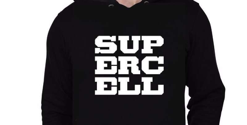
Where can I find official Supercell logo merchandise?
Head straight to the source, Supercell’s own online store. It’s brimming with authentic merchandise adorned with the iconic game app iconography, ensuring fans can adorn themselves with gear as bold as the games they cherish.
Conclusion
Crafting visions that resonate across the canvas of mobile gaming, it’s undeniable—the Supercell logo stands as a testament to design ingenuity. Straddling the realms of visual identity and corporate iconography, it whispers of battles waged, alliances forged, and stories yet untold.
Guided by insights from Helsinki’s gaming crusaders, imbued with echoes of Clash Royale’s thrill and Brawl Stars’ zest, the logo is more than a mere symbol. It’s a harbinger heralding the digital odyssey within each game. Vivid hues strike forth with the warmth of a familiar campfire, crafting an unspoken narrative etched in the annals of gaming company trademarks.
In the dance of light on screens worldwide, this logo—this cornerstone—holds court. It beckons. It promises. It remains indelibly etched as the moniker of play, power, and infinite possibility.
As the mosaic of online multiplayer game logos expands, this insignia prevails—not just as a beacon but as a legacy written in the language of pixels.
If you enjoyed reading this article about the Supercell logo, you should read these as well:
- Best multiplayer Android games to play with friends
- Download The Rocket League Font And Use It In Your Designs
- What’s The Call Of Duty Font Called And Are There Alternatives?
Bogdan Sandu, a seasoned designer with 15 years of diverse experience, has been designing websites since 2008.
Renowned for his expertise in logo design and visual branding, Bogdan has developed a multitude of logos for various clients.
His skills extend to creating posters, vector illustrations, business cards, and brochures. Additionally, Bogdan's UI kits were featured on marketplaces like Visual Hierarchy and UI8.
Latest posts by Bogdan Sandu (see all)
- The Columbia University Logo History, Colors, Font, And Meaning - 30 April 2024
- Seamlessly Blended: Gorgeous Gradient Color Palettes - 30 April 2024
- Examples of Great Gym Websites to Inspire You - 30 April 2024