What’s The Call Of Duty Font Called And Are There Alternatives?
Picture this: You’re maneuvering through a high-adrenaline mission in the latest Call of Duty release. Amid the chaos, have you ever paused to appreciate the silent hero? I’m talking about the font—a design, so tactical, it could pass for a special ops recruit.
In a universe brimming with bold stencil letters and military typeface, the Call of Duty font stands out.
It’s not just any typography; it’s a beacon of identity for one of the most iconic franchises in the gaming world.
Hang tight, because by the time we wrap this up, you’ll be as familiar with video game lettering design as you are with racking up killstreaks.
We’ll decode the DNA of this warfare lettering that’s crucial for game title branding, and why it’s more than just alphabet soup on your screen.
We’re diving deep into the realms of typography in branding, the nuances of digital typeface design, and even a touch of font licensing—because, hey, detail matters.
Whether you’re a seasoned graphic designer or a curious gamer, it’s time to zoom in on the tactical alphabet style that’s become a cultural staple.
About Call of Duty
Activision created the video game Call of Duty in 2003. From 2007, the shooter’s attention shifted from World War Two to contemporary times. Today, the game is available on PlayStation, Xbox, and Wii consoles as well as all major operating systems.
It is advised to use the “Call of Operations Duty” typeface, designed by Allison James of Chequered Ink, if you’re seeking for the Call of Duty font name to mimic the look of the logo in your own works. One of the most played first-person shooter video games in the world is called Call of Duty, and its emblem is easily identifiable. The original logo, which was created using the high-end typeface “Impact,” served as the inspiration for this font.
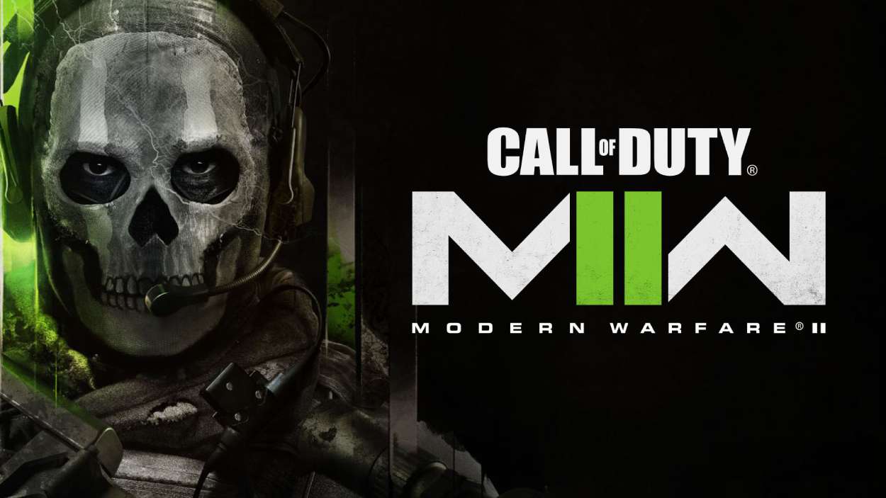
The Call Of Duty Logo
![]()
The Call of Duty logo has seen a slight change from its original design. The title is what draws the most attention because it effectively captures the game’s aesthetic and informational character. Just the characters’ size, shape, inter-symbol spacing, minor cuts, and color were impacted by the fixes. The modifications were evolving continuously.
The inscription in the logo was likely written in Impact Sans Serif typeface. The font is reminiscent of Call of Duty’s customized font. The color scheme is primarily monochrome. Black, gray in all tones, off-white, green, and red-orange are all included in its color gamut.
The Call Of Duty Font
The video game logos for the Call of Duty series don’t employ a particular font. There are a few fonts that closely resemble the original CoD font, though.

The font used for the Call of Duty logo is highly reminiscent of the Impact font, which was carefully created by Geoffrey Lee in 1965 and published by the Stephenson Blake style foundry.
Impact typeface is renowned for its tightly packed and substantial shapes that are intended to catch the viewer’s eye. The Impact-based Call of Duty font features a distinctive design that is both robust and elegant. It may offer any project a strong, polished appearance.
It’s also important to note how many video games have been inspired by the Call of Duty series. These games have several titles. The fonts used in one Call of Duty game might not always be the same as those used in other CoD games. The video game Call of Duty Black Ops Cold War is a prime example, as it employs the Courier font for the tweet.
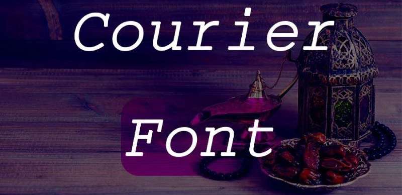
Howard Kettler created the monospaced slab serif font called Courier. In 1956, he designed the typewriter font used by IBM. However IBM didn’t register the name Courier as a trademark. This typeface, which has 399 glyphs, is highly attractive and perfect for usage in every situation. The modern age makes excellent use of the courier font.
Alternatives of The Call Of Duty Font
Eagle Font

M.F. Benton created Eagle Bold in 1933. It has hefty, distinctive spurs on the capital G and Q and is written in a geometric Sans Serif typeface. The Eagle Bold font’s all-caps appearance makes it ideal for magazine and book covers, posters, and packaging.
Faux Snow Font
Aenigma created the holiday and Christmas font Fake Snow. The typeface has a free license. Both personal and commercial use of the font are free. 94 distinct glyphs make up the 96 specified characters in the Faux Snow font.
Moon Runes Font
The delicate and very distinct Moon Runes Script font has elegant characters like ribbons and bells. This lovely typeface is ideal for holiday promotions and holiday designs. The typeface Moon Runes has a retro-classic appearance and a modern-classic feel. This font draws its design cues from minimalist dingbats and vintage signage. You and every designer will have a lot of possibilities thanks to the all-caps font’s more than 100 variants, which will allow for many different design projects.
Ed Gothic Font

The Ed Gothic typeface is great for display projects because of its condensed characters. This typeface was created using capital and lowercase characters that can be used for projects and display designs. It has a very condensed texture appearance that makes it simple to offer your creations a striking font impression. It can be seen as a heading on various websites. Designers are using this typeface in the bulk of their display designs because it is in high demand among them. Moreover, this design includes a partnering quality that makes it simple to combine with different font types.
IBM Plex Sans Thai Font
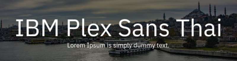
IBM A family of typefaces called Plex™ was created by independent Dutch type foundry Bold Monday and IBM BX&D designer Mike Abbink. Plex was created to highlight the special link between people and machines—an important theme for IBM since the turn of the century—and to convey the spirit and legacy of IBM.
As a result, a neutral yet amiable Grotesque typeface was created, which has outstanding legibility in print, online, and mobile interfaces and comprises Sans, Sans Condensed, Mono, Serif, and several more styles for various languages. The three designs of Plex function well separately and much better when combined. Employ the Mono to display code snippets, the Serif for editorial narrative, or the Sans as a contemporary companion. You have extra design alternatives thanks to the italics’ unexpectedly expressive character.
PT Sans Font
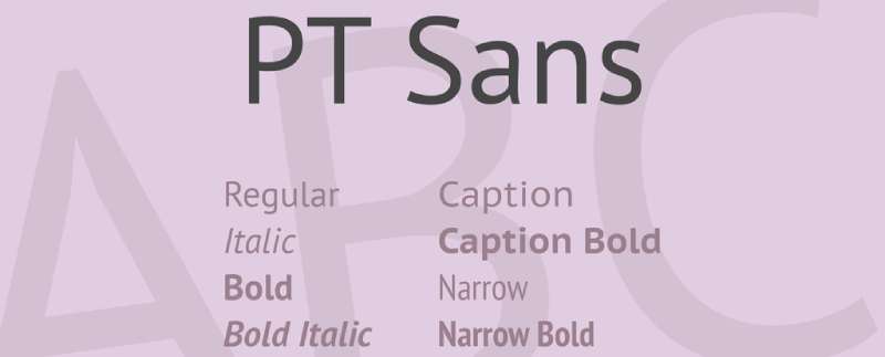
A widely used type family is PT Sans. It has eight styles: two narrow styles (regular and bold) are designed for documents that require a tight set; two caption styles (regular and bold) are for texts of small point sizes. Regular and bold weights with corresponding italics make up a common computer font family.
The layout mixes a conventionally conservative appearance with contemporary humanistic sans serif tendencies and is distinguished by improved legibility. These characteristics, in addition to their traditional uses in commercial applications and printed materials, made the typefaces suitable for usage in direction and guide signs, schemes, information kiosk screens, and other urban visual communication items.
Alternative fonts to the Call of Duty Font include:
- Alien Dude Font
- SAF Font
- Lucky Charms Font
Call of Duty Font Usages Ideas
- Making unique graphics to promote a team or clan in video games, such as posters or social media graphics.
- Using the Call of Duty font to create custom apparel or mugs with gaming themes.
- Creating unique banners, thumbnails, or profile photos for a personal Twitch or YouTube gaming channel.
- Creating a unique logo or branding for a blog or website dedicated to your gaming.
- Creating a unique title screen or intro for video game montages or other personal video editing projects.
- Creating a custom or team jersey or uniform for the e-sports league or competition.
License Info
This typeface may be used without charge for any form of private project or for personal use. If you want to use it for business purposes, you must obtain a license from an authorized website.
FAQ On The Call Of Duty Font
What exactly is the Call of Duty font?
Imagine a font that’s as tough and no-nonsense as the game itself. That’s what the Call of Duty font embodies. It’s a stencil style, often bold, made to project a military essence.
It’s not just any typeface; it’s a branding powerhouse for the COD series, oozing that combat-ready feel even in silent print.
Can I use the Call of Duty font for my projects?
Hit the brakes there, soldier! Usage rights matter. The font used in Call of Duty is typically proprietary; meaning, without font licensing, you’re in a gray area.
If you’re all for following protocol, check the terms or opt for similar, royalty-free military typeface options that won’t land you in hot water.
How can I download the Call of Duty font?
Eager to enlist this font in your design battalion? Officially, the Call of Duty font isn’t up for grabs. However, the web’s a treasure trove with typeface download sites offering close cousins. Just keep it legal—font licensing is a battlefield you don’t want to wage war on.
Is there an alternative to the Call of Duty font?
Sure thing! The internet is awash with LSI keywords like ‘tactical alphabet style’ and ‘warfare lettering’ fonts. Search for terms like “military fonts” or “stencil typeface” and you’ll find options that salute the vibe of COD without stepping on any legal landmines.
Why is the Call of Duty font so popular?
Its fame’s no fluke. The Call of Duty font resonates with the brand’s DNA—it’s strong, assertive, and instantly recognizable. See, it’s not just a font; it’s a symbol of the adrenaline-fueled gaming culture COD represents. That’s branding firepower for you.
What’s the best way to use the Call of Duty font in design?
Like seasoning a steak to perfection – with restraint and purpose. Whether you’re putting together custom gaming logos or game title branding, make it count.
The font’s boldness should amplify your message, not drown it. Use it to command attention where it matters most.
How do I add the Call of Duty font to my website?
Unless you’re allied with Activision or have secured font licensing, steer clear of using the exact font. But for that first-person shooter feel, there are free fonts inspired by military stencils. Add them via CSS, keeping load times and web compatibility sharp.
What makes the Call of Duty font different from other military fonts?
It’s not just another soldier in the ranks; it’s the decorated general. Call of Duty font goes beyond military typeface—it carries the weight of a branding legacy. It’s crafted to stand out, with a blend of impact and readability that tells the COD story at a glance.
How does the Call of Duty font contribute to the game’s branding?
Fonts are the unsung heroes of typography in branding. For COD, its font is an all-star, delivering that gritty, battlefield aura on every visual front. It’s not just selling a game; it’s an enlistment poster for a global army of fans.
What should I consider when choosing a font similar to Call of Duty for a project?
Lock and load your creativity, and consider this: Does it channel that tactical alphabet style? Is it legible under design fire?
Will it hold ground in different mediums like print and digital? Pairing a font with the project’s spirit while respecting font licensing and digital typeface design needs is key.
Conclusion
Wrapping this up, there’s no denying the impact a good font can make—you feel it, eyes riveted to the screen, in the throes of Call of Duty. Our foray into the tactical alphabet style might’ve felt like navigating a design minefield, but hey, we’ve made it through—no frags, no casualties.
Let’s circle back for a hot sec. We’ve unearthed alternatives that echo the essence of the COD typeface without crossing the battlefield of copyright laws. Learned the ropes of how typography in branding—like the die-hard military typeface used in COD—can elevate a brand to icon status.
And for the creatives locked and loaded to infuse their work with a bit of that first-person shooter vibe, remember: always double-check those font licensing terms—keep it above board.
So, mission accomplished? Here’s hoping this intel arms you with the know-how to deploy video game lettering design with the precision of a well-planned campaign. Stay sharp!
If you liked this article about the Call of Duty font, you should check out this article about the Batman font.
There are also similar articles discussing Superman font, Captain America font, Black Panther font, and GTA font.
And let’s not forget about articles on the Hulk font, Apex Legends font, Rocket League font, classic car fonts, and The Sims font.
Bogdan Sandu, a seasoned designer with 15 years of diverse experience, has been designing websites since 2008.
Renowned for his expertise in logo design and visual branding, Bogdan has developed a multitude of logos for various clients.
His skills extend to creating posters, vector illustrations, business cards, and brochures. Additionally, Bogdan's UI kits were featured on marketplaces like Visual Hierarchy and UI8.
Latest posts by Bogdan Sandu (see all)
- Rainbow Color Palettes for Joyful Designs - 29 April 2024
- The Bethesda Logo History, Colors, Font, And Meaning - 28 April 2024
- Out of This World: Space Color Palettes for Cosmic Designs - 28 April 2024