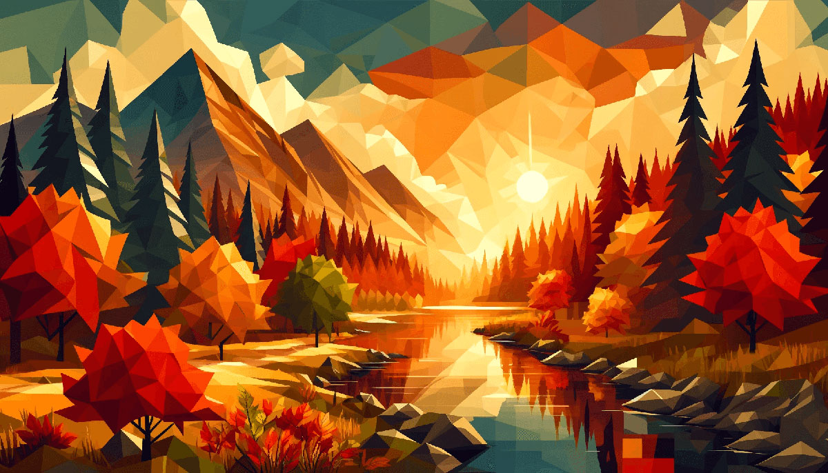

After Dark: Night Color Palettes for Mysterious Designs
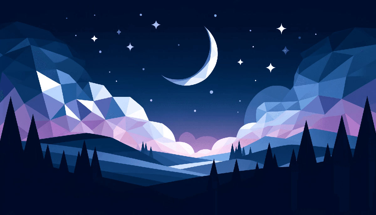
Imagine the cloak of twilight unfurling its hues across the sky, a breathtaking spectrum of indigo to the softest hint of midnight blue. This vista births a fascination with night color palettes that transcends beyond the heavens into the realm of design.
Here, the enigmatic allure of nightfall serves as a muse, whispering secrets of color harmony at night, guiding our hands to create visuals that embody the serene whispers of the nocturnal hours.
In this digital canvas we paint, you will discover how to harness the transformative power of moonlight hues and starry night colors to evoke emotions that resonate in the hushed stillness of night.
I will guide you through selecting dark shades and cool tone colors to craft a narrative that dances elegantly with shadows and light.
By the end of this exploration, your mastery over night-themed design will empower you to weave twilight color combinations into a tapestry of visual design for the evening—a skill coveted and celebrated in the world of aesthetics.
Delve into the mysteries of after-dark color selection; explore this new dominion where night sky gradients play hero to your creative vision.
Examples of Night Color Palettes
| #1B1A55 | #535C91 | #9290C3 | #070F2B |
| #FDAF7B | #BE7B72 | #824D74 | #401F71 |
| #F9E8C9 | #98ABEE | #1D24CA | #201658 |
| #910A67 | #720455 | #3C0753 | #030637 |
| #003C43 | #135D66 | #77B0AA | #E3FEF7 |
| #78A083 | #50727B | #344955 | #35374B |
| #EEE4B1 | #8C6A5D | #5F374B | #430A5D |
| #F2613F | #9B3922 | #481E14 | #0C0C0C |
| #FFD0EC | #81689D | #474F7A | #1F2544 |
| #DBAFA0 | #BB8493 | #704264 | #49243E |
| #FFD1E3 | #A367B1 | #5D3587 | #392467 |
| #C2D9FF | #8E8FFA | #7752FE | #190482 |
| #F6B17A | #7077A1 | #424769 | #2D3250 |
| #F05941 | #BE3144 | #872341 | #22092C |
| #200E3A | #38419D | #3887BE | #52D3D8 |
| #008170 | #005B41 | #232D3F | #0F0F0F |
| #F5F5F5 | #F99417 | #4D4C7D | #363062 |
| #F5E8C7 | #818FB4 | #435585 | #363062 |
| #A87C7C | #7E6363 | #503C3C | #3E3232 |
| #9EC8B9 | #5C8374 | #1B4242 | #092635 |
| #662549 | #4D3C77 | #E19898 | #5B9A8B |
| #451952 | #E5C3A6 | #5C5470 | #F7E987 |
| #352F44 | #FFF6E0 | #5C8374 | #272829 |
| #3F1D38 | #322653 | #EFE1D1 | #61677A |
| #7C81AD | #2E4374 | #93B1A6 | #183D3D |
| #D8D9DA | #4477CE | #B9B4C7 | #8CABFF |
| #9288F8 | #AE445A | #F39F5A | #A2678A |
| #FFD2D7 | #252B48 | #FAF0E6 | #8062D6 |
| #331D2C | #4B527E | #A78295 | #512B81 |
| #040D12 | #445069 | #35155D | #3F2E3E |
| #526D82 | #643843 | #116D6E | #2E8A99 |
| #F4EEE0 | #394867 | #5F264A | #99627A |
| #643A6B | #212A3E | #F1F6F9 | #9BA4B5 |
| #2D4356 | #B0A4A4 | #19376D | #0E2954 |
| #A76F6F | #A5D7E8 | #1F6E8C | #27374D |
| #957777 | #090580 | #576CBC | #46458C |
| #DDE6ED | #0B2447 | #435B66 | #84A7A1 |
| #EAB2A0 | #4F4557 | #6D5D6E | #321E1E |
| #C88EA7 | #393646 | #4E3636 | #E8A9A9 |
| #CD1818 | #E7CBCB | #9DB2BF | #F4D3D3 |
FAQ on Night Color Palettes
How can I create a night color palette for my brand?
Crafting a night color palette demands introspection. Start by pinpointing emotions you wish to evoke.
Dive into the depths of dark color schemes, blend them with your brand’s voice, and ensure cool tone colors align with your messaging, weaving a narrative as pervasive as the night itself.
What colors best represent the feeling of nighttime in design?
Nocturnal splendor is captured through midnight blues, whispers of deep purples, and the muted echo of star-kissed grays.
Embracing twilight color combinations that suggest the tranquil repose of dusk until dawn articulates the essence of the night.
Are there specific HEX codes that correspond with night colors?
Absolutely, HEX codes are the cartographers of the digital night. Seek the intense #0A0A32 for a profound midnight blue, the contemplative #4A4A72 for twilight’s touch, or the soft #1A1A40 whispering of evening shadows to anchor your nocturnal vision.
How do I match night color palettes with daylight themes?
Balance is key. Marry dusk color variations with dawn’s warmer patinas. Introduce transitional hues, such as dusky pinks or sleepy oranges, to ensure a harmonious transition.
This bridges the nighttime photography colors with daylight vibrancy, fostering a cohesive narrative.
Can you incorporate night colors into a website’s UX/UI design?
Incorporate dark website color schemes strategically for UX/UI tranquility. Utilize dark background palettes with pops of contrasting starlight whites or celestial color themes for an immersive, user-friendly interface.
It’s the digital equivalent of guiding by moonlight, leading users through the night with intuitive grace.
How do night color palettes impact mood and emotion in design?
Night-themed design and color psychology at night dance a tango of intrigue. Sombre color moods infuse depth and introspection, while a spark of starglow invites curiosity.
Invoke the serenity and mystery of the witching hours, and you’ll craft experiences that resonate with the soul’s nocturnal chorus.
What is the trend for night color palettes in 2023?
Trends whisper of celestial color themes taking center stage, with an emphasis on sustainability mirrored in earthy, dark tones.
Anticipate a ballet of moonlight hues and starry night colors, harmonizing with advancements in color harmony at night and responsible aesthetics.
How can I use night colors in an event design palette?
Night colors in event design tell a tale of elegance. Bathe your venue under a constellation of hues like black and navy palettes; add shimmering metallics to mimic starlight. It’ll feel like stepping into a ballad of the night, enchanting guests till the dawn.
What are the do’s and don’ts when working with a dark color palette?
Do let the dark shades anchor your design aesthetics, but don’t let them overwhelm. Contrast is your ally; bring cool tone colors to play with light and shadow. Embrace sombre color moods with purpose, and never forget the need for legibility and user comfort.
How do I adapt night color palettes for print versus digital media?
For print, anticipate ink’s absorption; go a shade lighter than the dark background palette you envision. Digitally, mind the screens’ luminescence; what whispers in print may scream online.
Test rigorously across media. Your night color scheme inspiration should translate beautifully, whether held or beheld on screen.
Conclusion
In the serenade of dusk, night color palettes reveal their potent charm. They whisper tales of enigma and serenity, narrating stories woven from the twilight hues that guard the threshold of dreams. The pilgrimage through this night-scented garden of color has shown that the right mix of midnight blues and starry night colors wields the power to transform spaces and emotions, warping the fabric of design into something ethereal.
As this journey concludes, remember the potency of a sombre color mood, the tranquility that dark shades offer, and the depth that a carefully crafted after-dark color selection imparts. Let this knowledge guide the hand to paint with moonlight hues, setting scenes where night-themed designs flourish. It is not just about aesthetics; it’s about crafting an experience, a visual whisper good enough to stir the soul – an ode to the night itself.
Bogdan Sandu, a seasoned designer with 15 years of diverse experience, has been designing websites since 2008.
Renowned for his expertise in logo design and visual branding, Bogdan has developed a multitude of logos for various clients.
His skills extend to creating posters, vector illustrations, business cards, and brochures. Additionally, Bogdan's UI kits were featured on marketplaces like Visual Hierarchy and UI8.
Latest posts by Bogdan Sandu (see all)
- Game Show Typography: What Font Does Jeopardy Use? - 9 May 2024
- The Carlsberg Logo History, Colors, Font, And Meaning - 8 May 2024
- Brewed to Perfection: Coffee Color Palettes for Warm Designs - 8 May 2024