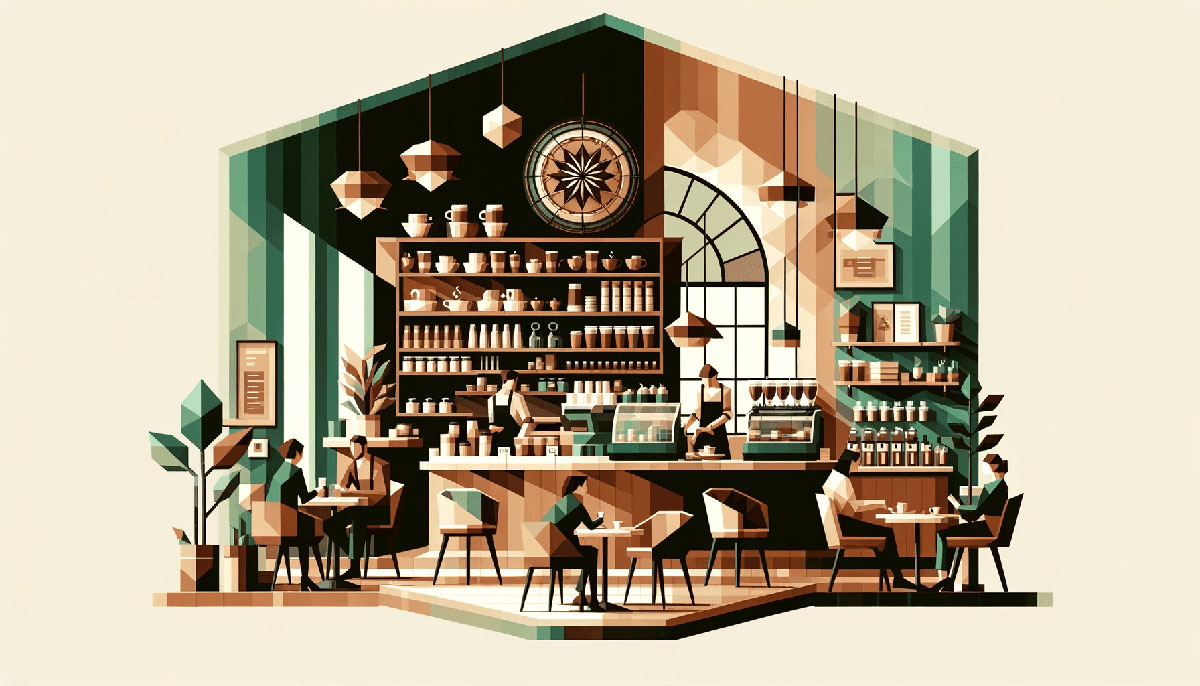
Brown tones dominate design palettes for one simple reason: they ground everything. Coffee color palettes take this principle further by offering warm neutrals that feel organic, approachable, and instantly familiar to anyone who’s watched espresso drip into a cup.
These shades work across branding, web design, and interior projects because they balance professionalism with comfort.
This guide presents 15 tested coffee-inspired color schemes with hex codes, practical applications, and combination strategies. You’ll see which palettes work for minimal interfaces versus rustic packaging, how to pair mocha tones with cream backgrounds, and when to choose espresso over latte shades.
Each palette includes specific use cases for café branding, packaging design, and digital interfaces built on color theory principles that actually hold up in production.
Coffee Color Palettes
Classic Espresso
| #38220F | #634832 | #967259 | #DBC1AC | #ECE0D1 |
Best Use Cases
Deep roast tones work for café branding, artisan product packaging, and rustic interior palettes. The darkest shade (#38220F) anchors logos and primary text with strong contrast against cream backgrounds. Light beige (#ECE0D1) keeps web interfaces readable while maintaining warmth for food blogs and portfolio sites.
Design Applications
Use the darkest brown for headlines and navigation in web design projects. Mid-tones (#967259, #DBC1AC) work well for product cards, buttons, and secondary UI elements without overpowering the layout. Apply cream shades to backgrounds in print design like menus or business cards for subtle texture.
Color Combinations
Pair #38220F with #ECE0D1 for maximum readability in typography hierarchies. Stack mid-browns (#634832, #967259) with beige for coffee shop menus and retail signage. Works with warm color palettes and pairs naturally with cream or ivory accents for wedding stationery.
Mood & Psychology
Evokes comfort, craftsmanship, and morning rituals. Deep espresso shades signal expertise and artisan quality, common in specialty coffee and bakery branding. Lighter tones reduce intensity while maintaining organic warmth found in earth color palettes.
Cappuccino Dream
| #4B3832 | #854442 | #FFF4E6 | #3C2F2F | #BE9B7B |
Best Use Cases
Foam-light palette perfect for wellness brands, boutique hotels, and lifestyle blogs. The near-white (#FFF4E6) creates breathing room in UI design while warmer browns anchor content sections. Strong for packaging design targeting premium coffee products or handmade soap labels.
Design Applications
Use #FFF4E6 as primary background across website layouts. Apply reddish-brown (#854442) to call-to-action buttons and icons for subtle emphasis without harsh contrast. Layer tan (#BE9B7B) in gradients for smooth transitions between header sections and body content.
Color Combinations
Combine #4B3832 and #FFF4E6 for clean text-background pairings in long-form articles. Mix #854442 with beige tones for invitations or event posters. Works alongside brown color palettes and complements cream color palettes naturally.
Mood & Psychology
Conveys relaxation, sophistication, and approachability. Foam shades (#FFF4E6) feel clean without sterility, ideal for spa and self-care brands. Darker browns ground the palette with stability common in financial and consulting services.
Mocha Latte
| #3E000E | #B58048 | #CEA47A | #E8D2B9 | #F4F3F8 |
Best Use Cases
Rich mocha tones suit luxury branding, high-end restaurants, and editorial layouts. Deep burgundy-brown (#3E000E) works for premium wine labels and chocolate packaging. Pale lavender-cream (#F4F3F8) adds unexpected elegance to beauty product lines and fragrance marketing.
Design Applications
Apply #3E000E sparingly for dramatic headers in poster design. Use mid-range browns (#B58048, #CEA47A) for product photography backgrounds that don’t compete with subjects. Layer #F4F3F8 as negative space in minimalist layouts following white space principles.
Color Combinations
Pair chocolate brown (#3E000E) with desert sand (#E8D2B9) for recipes and food color palettes. Stack golden browns with lavender-cream for wedding themes and event materials. Complements vintage color palettes and works with purple color palettes through the cooler top shade.
Mood & Psychology
Signals indulgence, refinement, and sensory pleasure. Dark mocha conveys exclusivity while sandy beiges maintain accessibility. Cooler cream notes (#F4F3F8) soften the warmth for gender-neutral appeal in cosmetics and skincare.
Warm Roast
| #3E1404 | #6A2B05 | #964315 | #BB6B24 |
Best Use Cases
Bold roast progression ideal for coffee roasters, craft breweries, and outdoor gear brands. Pure brown range (#3E1404 to #BB6B24) creates cohesive brand systems without needing neutrals. Works in leather goods catalogs, woodworking portfolios, and fall seasonal campaigns.
Design Applications
Build gradient color palettes using all four shades for depth in illustrations and motion graphics. Apply darkest (#3E1404) to text and icons, lightest (#BB6B24) to hover states and active buttons. Use mid-tones for borders and dividers that provide structure without harsh lines following graphic design principles.
Color Combinations
Layer all four browns in single compositions for rich tonal variation. Pair with orange color palettes or burnt orange accents for seasonal retail. Combines naturally with autumn color palettes and forest color palettes.
Mood & Psychology
Communicates authenticity, ruggedness, and tradition. Warm roast tones feel grounded and unpretentious, common in artisan and heritage brands. Darker shades (#3E1404, #6A2B05) project seriousness while copper tones (#BB6B24) add approachability.
Coffee Shop Vibe
| #AD6D2F | #E4BC84 | #80411E | #8F755F | #D2C1B0 | #37251B |
Best Use Cases
Classic café palette for menu boards, loyalty cards, and interior signage. Six-shade range provides flexibility for complex layouts without breaking visual cohesion. Strong for small business branding, local roasters, and community gathering spaces.
Design Applications
Use #37251B for primary text ensuring WCAG compliance with light backgrounds. Apply caramel (#E4BC84) and tan (#D2C1B0) for alternating sections in price lists and product grids. Mid-browns (#AD6D2F, #8F755F) work for category headers and wayfinding elements in physical spaces.
Color Combinations
Pair darkest (#37251B) with lightest (#E4BC84) for menu typography following typographic hierarchy. Mix warm browns (#AD6D2F, #80411E) with cooler taupe (#8F755F) for depth. Aligns with beige color palettes and supports neutral color palettes in multi-brand environments.
Mood & Psychology
Projects community, consistency, and neighborhood charm. Balanced warmth appeals across demographics without skewing too rustic or too modern. Darker shades establish trust while sandy tones (#D2C1B0) maintain friendliness and approachability.
Latte Macchiato
| #4E341B | #8B7156 | #CBC1B5 | #F4F4F4 |
Best Use Cases
Minimal four-shade system for clean interfaces, minimalist portfolios, and Scandinavian-inspired interiors. Near-white (#F4F4F4) dominates layouts while browns provide strategic accents. Effective for personal blogs, photography showcases, and professional service websites.
Design Applications
Dedicate 70% of layouts to #F4F4F4, use #CBC1B5 for cards and containers, apply browns (#4E341B, #8B7156) only to text and small UI elements. Follows minimalist design without sterility. Works in book cover design for literary fiction and memoir genres.
Color Combinations
Pair #4E341B text on #F4F4F4 backgrounds for optimal readability. Use #8B7156 for subheadings and #CBC1B5 for subtle borders implementing proper alignment. Matches light color palettes and pairs with gray color palettes for corporate applications.
Mood & Psychology
Conveys simplicity, clarity, and modern restraint. Soft greige (#CBC1B5) and khaki (#8B7156) avoid the coldness of pure grays while maintaining professional polish. Deep brown (#4E341B) adds just enough warmth to prevent clinical aesthetics in healthcare and wellness sectors.
Cup of Coffee
| #3C2F2F | #854442 | #6F4436 | #BE9B7B | #DFCCAF |
Best Use Cases
Balanced palette for hospitality brands, bed & breakfasts, and cozy lifestyle products. Reddish-brown undertones (#854442) differentiate from standard coffee schemes. Works for handmade ceramics, textile design, and small-batch food producers seeking warmth without orange overtones.
Design Applications
Use #3C2F2F for bold headers in editorial layouts respecting visual hierarchy. Apply terracotta-brown (#854442) to featured content blocks and accent walls in interior mockups. Layer sandy beige (#DFCCAF) as backgrounds for text-heavy pages, mid-tones for image overlays maintaining legibility.
Color Combinations
Pair dark browns (#3C2F2F, #6F4436) with cream (#DFCCAF) for recipe cards and cooking blogs within food color palettes. Mix #854442 with tan (#BE9B7B) for romantic wedding themes. Coordinates with pink color palettes through rosy undertones and red color palettes through terracotta shades.
Mood & Psychology
Signals comfort, hospitality, and home-cooked quality. Reddish notes (#854442) add subtle energy compared to pure browns while maintaining organic warmth. Lighter shades (#BE9B7B, #DFCCAF) prevent heaviness in digital interfaces and physical spaces.
Coffee Brown & Beige
| #472A28 | #56382E | #71503A | #A3795B | #C6AB80 | #F5F5DC |
Best Use Cases
Classic monochromatic progression from rosewood to classic beige (#F5F5DC). Six-shade range ideal for tone-on-tone designs in luxury retail and editorial spreads. Strong for leather goods, furniture catalogs, and architectural renderings where material variation matters more than hue variety.
Design Applications
Build depth using all six shades in single compositions without additional colors. Apply #472A28 for maximum saturation on logos, lightest (#F5F5DC) for page backgrounds, mid-tones for layered elements. Use for monochrome photography overlays and sepia-toned vintage effects.
Color Combinations
Stack dark browns (#472A28, #56382E, #71503A) as gradient bases. Pair beige (#F5F5DC) with mid-tan (#C6AB80) for soft contrast in text layouts. Natural companion to brown color palettes and extends neutral color palettes with organic warmth following color theory.
Mood & Psychology
Projects timelessness, heritage, and material authenticity. Monochromatic browns feel sophisticated without pretension, common in craft and artisan positioning. Beige anchor (#F5F5DC) softens intensity while maintaining earthy connection across the full tonal range.
Rich Coffee Tones
| #724E2C | #271300 | #9C6F44 | #563517 | #6F4827 |
Best Use Cases
Deep brown spectrum for outdoor brands, hunting gear, and bourbon packaging. Near-black shade (#271300) provides dramatic anchor points without pure black harshness. Works in tobacco-themed designs, men’s grooming products, and rustic lodge branding.
Design Applications
Use #271300 sparingly for high-impact headlines in poster design. Apply mid-range browns (#724E2C, #6F4827) to product photography backgrounds that enhance wood and leather textures. Layer #9C6F44 in UI elements like progress bars and loading states for subtle warmth.
Color Combinations
Pair darkest (#271300) with copper-brown (#9C6F44) for whiskey labels and cigar boxes. Stack chocolate tones (#563517, #6F4827) in gradients for depth. Complements dark color palettes and works with brown color palettes emphasizing richness over lightness.
Mood & Psychology
Signals masculinity, strength, and outdoors heritage. Very dark browns (#271300, #563517) convey seriousness and premium positioning common in spirits and tobacco. Warmer mid-tones (#9C6F44) maintain approachability within the bold range.
Coffee Cream Delight
| #F9F8EB | #EDE9DA | #E0DAC9 | #D4CBB8 | #C8BCA8 |
Best Use Cases
Ultra-soft cream progression for spa branding, organic skincare, and wellness platforms. All five shades stay light enough for backgrounds while creating subtle layering through saturation shifts. Perfect for yoga studios, meditation apps, and natural fiber textile brands.
Design Applications
Use #F9F8EB as primary background across entire layouts. Apply progressively darker creams (#EDE9DA through #C8BCA8) for cards, sections, and content blocks creating depth without contrast jumps. Works in web design for long-form reading experiences where eye strain reduction matters.
Color Combinations
Layer all five creams in single-page designs for tonal richness. Pair lightest (#F9F8EB) with darkest (#C8BCA8) for gentle text-background relationships in body copy. Natural match for cream color palettes and extends light color palettes with warmth.
Mood & Psychology
Conveys gentleness, purity, and calm sophistication. Whisper-soft creams feel clean without clinical coldness, ideal for wellness and self-care positioning. Subtle tonal steps (#F9F8EB to #C8BCA8) create hierarchy while maintaining peaceful atmosphere.
Coffee Brown Mix
| #38211E | #4A2C29 | #5B3739 | #704241 | #FEFED2 | #FAECC1 |
Best Use Cases
High-contrast pairing of deep burgundy-browns with pale yellows for bakeries, pastry shops, and breakfast cafés. Dramatic jump from #704241 to #FEFED2 creates instant visual hierarchy. Strong for vintage diner branding, artisan bread packaging, and country kitchen aesthetics.
Design Applications
Apply dark browns (#38211E through #704241) to text, borders, and icons. Reserve pale yellows (#FEFED2, #FAECC1) exclusively for backgrounds and negative space following white space principles. Use in packaging design where product photography sits on cream backgrounds with dark brown typography.
Color Combinations
Pair richest brown (#704241) with butter-cream (#FAECC1) for menu typography. Stack all four dark shades as gradient overlays on food photography. Bridges brown color palettes with yellow color palettes through warm cream accents.
Mood & Psychology
Projects comfort food nostalgia and homemade quality. Deep reddish-browns feel rich and indulgent while pale creams suggest butter, vanilla, and baked goods. High contrast (#38211E vs #FEFED2) ensures accessibility in signage and wayfinding.
50 Shades of Latte
| #8E653E | #634736 | #A68368 | #FFF8E7 | #FFFDD0 |
Best Use Cases
Balanced range from chocolate to cosmic latte (#FFF8E7) for versatile café branding and artisan coffee roasters. Mid-range browns (#8E653E, #A68368) provide flexibility between extremes. Works for coffee subscription services, bean packaging, and brewing equipment retailers.
Design Applications
Use #634736 for primary branding and logo marks. Apply #FFF8E7 to packaging backgrounds and website hero sections for soft warmth without pure white sterility. Layer #A68368 in product cards, pricing tables, and secondary navigation following graphic design principles.
Color Combinations
Pair darkest (#634736) with pale yellow (#FFFDD0) for maximum readable contrast in small text. Mix mid-browns (#8E653E, #A68368) for tonal depth in illustrations. Matches cream color palettes and works within warm color palettes naturally.
Mood & Psychology
Signals coffee expertise and morning ritual comfort. Cosmic latte shades (#FFF8E7, #FFFDD0) reference actual coffee-with-milk colors creating authentic connection. Mid-tones prevent monotony while staying true to coffee bean aesthetic.
Classic Coffee Palette
| #6F4E37 | #5A3E2D | #6F574E | #B3826C | #927869 | #BA9D8A |
Best Use Cases
Definitive coffee brown (#6F4E37) anchors this traditional palette for established cafés and classic roasters. Six shades provide complete range from dark roast to latte foam without leaving brown territory. Ideal for heritage brands, traditional coffeehouses, and nostalgic café revivals.
Design Applications
Use official coffee color (#6F4E37) for brand identity and primary touchpoints. Apply cooler taupe (#6F574E, #927869) for modern contrast against warmer browns (#5A3E2D, #B3826C). Works in print design for menus, business cards, and loyalty programs where brown authenticity matters more than trendy palettes.
Color Combinations
Pair #6F4E37 with lightest tan (#BA9D8A) for clean hierarchy in typography. Mix warm (#5A3E2D) and cool (#6F574E) browns for dimensional layouts. Core of brown color palettes and foundational for coffee-themed color theory applications.
Mood & Psychology
Represents authentic coffee culture and roasting tradition. Official coffee hue (#6F4E37) carries instant recognition while variations provide necessary design flexibility. Cooler taupes (#6F574E, #927869) add sophistication preventing overly rustic associations.
Coffee Latte Soft
| #F6F5F3 | #E6E2DC | #C6BBAE | #B6A897 | #AE9F8C |
Best Use Cases
Sophisticated greige progression for modern minimalist interiors, Scandinavian-inspired brands, and premium lifestyle products. Stays entirely in neutral territory without warmth or coolness dominance. Perfect for architecture firms, interior design portfolios, and contemporary furniture showrooms.
Design Applications
Use #F6F5F3 as primary background across clean interfaces. Apply progressively darker neutrals (#E6E2DC through #AE9F8C) for layered sections maintaining subtle depth without color distractions. Works in minimalist design where material texture and typography carry visual interest.
Color Combinations
Layer all five shades in tone-on-tone compositions following monochrome principles. Pair lightest (#F6F5F3) with darkest (#AE9F8C) for understated text hierarchy. Essential component of neutral color palettes and extends gray color palettes with organic warmth.
Mood & Psychology
Conveys refined simplicity and quiet luxury. Soft greiges feel expensive without showiness, common in high-end retail and professional services. Balanced neutrality (#F6F5F3 to #AE9F8C) appeals across demographics without strong personality statements.
Coffee and Cream
| #F6F5F3 | #DBC1AC | #967259 | #6F4E37 | #38220F |
Best Use Cases
Complete coffee journey from cream (#F6F5F3) to dark roast (#38220F) in five steps. Perfect for coffee education content, brewing guides, and roast level comparison charts. Works for coffee blogs, barista training materials, and bean selection tools where visual progression matters.
Design Applications
Use as literal representation of coffee gradations in product photography and educational diagrams. Apply #38220F for headers, #F6F5F3 for backgrounds, mid-tones for component states and interactive elements. Effective in visual hierarchy systems where darkness indicates importance or intensity following color psychology.
Color Combinations
Pair official coffee brown (#6F4E37) with cream (#F6F5F3) for maximum usability. Use all five shades in gradient backgrounds or data visualizations showing progression. Combines elements from brown color palettes and cream color palettes in complete spectrum.
Mood & Psychology
Tells complete coffee story from light to dark. Intuitive progression (#F6F5F3 to #38220F) communicates roast levels, strength indicators, and flavor intensity without explanation. Balanced range works across applications from playful café branding to serious coffee industry tools.
FAQ on Coffee Color Palettes
What colors go well with coffee brown?
Cream, beige, and ivory create soft contrast while maintaining warmth. For bolder combinations, pair coffee browns with burnt orange, sage green, or muted gold following color theory principles for complementary color schemes.
Charcoal and slate gray add modern sophistication to coffee palettes.
How do I create a coffee-themed color palette for branding?
Start with a primary coffee brown like #6F4E37 for your logo. Add two lighter shades (tan, cream) for backgrounds and one darker espresso tone for text.
Include one accent color outside the brown family for call-to-action buttons and highlights in your visual identity.
What’s the difference between espresso and mocha color palettes?
Espresso palettes lean darker with near-black browns (#38220F) and minimal cream accents. Mocha palettes include reddish-brown undertones and softer mid-tones that reference chocolate-coffee blends.
Mocha schemes feel warmer and more approachable than pure espresso ranges for café branding.
Can coffee color palettes work for modern minimalist design?
Yes, when paired with generous white space and limited to three shades. Use one deep brown for typography, one light cream for backgrounds, and one mid-tone for accents.
Follow minimalist design principles by removing unnecessary color variation.
What hex codes represent classic coffee colors?
Coffee brown is #6F4E37, espresso is #38220F, mocha sits around #6D3B07, and latte cream uses #FFF8E7. Cappuccino foam typically ranges from #F6F5F3 to #E6E2DC.
These RGB values provide starting points for custom coffee-inspired schemes in digital and print design.
How many colors should a coffee palette include?
Four to six shades provide enough flexibility without creating confusion. Include one dark anchor, two mid-tones for layering, and two light neutrals for backgrounds and negative space.
More than seven colors typically signals weak visual hierarchy in your design system.
Do coffee color palettes work for web design?
Absolutely, especially for food blogs, café websites, and artisan e-commerce. Pair dark browns (#4B3832) with cream backgrounds (#FFF4E6) to ensure WCAG accessibility standards.
Test color combinations for sufficient contrast ratios in body text and navigation elements following web design best practices.
What mood do coffee color palettes create?
They evoke warmth, comfort, and organic authenticity. Dark roast tones signal sophistication and expertise while lighter latte shades feel approachable and casual.
Color psychology research shows browns trigger associations with reliability, earthiness, and handcrafted quality in branding applications.
Can I mix coffee palettes with other color schemes?
Yes, coffee browns pair naturally with warm color palettes, earth color palettes, and autumn color palettes. Add forest green or terracotta for seasonal campaigns.
Avoid pairing with cool blues or bright neons which create jarring visual contrast against organic browns.
What’s the best coffee palette for packaging design?
Use high-contrast pairings like dark espresso (#38220F) with cream (#ECE0D1) for maximum shelf visibility in packaging design. Add one accent color like copper or burgundy for premium positioning.
Kraft paper textures enhance coffee palette authenticity in physical packaging applications.
Conclusion
Coffee color palettes deliver versatility that few color schemes match. From deep espresso tones grounding logos to soft latte creams creating breathing room in layouts, these warm neutrals adapt across web design, packaging, and interior projects.
The hex codes and color combinations presented here give you tested starting points, not rigid rules. Pair mocha with beige palettes for softness, stack espresso shades for drama, or mix cappuccino tones with autumn palettes for seasonal campaigns.
What matters most is matching palette intensity to your brand personality. Rustic cafés need different brown ranges than minimalist tech startups, even when both choose coffee-inspired schemes.
Test your selections against actual typography and imagery. The right coffee palette feels effortless once applied, grounding your visual identity without demanding attention.

Renowned for his expertise in logo design and visual branding, Bogdan has developed a multitude of logos for various clients.
His skills extend to creating posters, vector illustrations, business cards, and brochures. Additionally, Bogdan's UI kits were featured on marketplaces like Visual Hierarchy and UI8.
He also wrote in the past years on sites like Design Your Way, WebDesignerDepot, WPDean, Designmodo, Speckyboy, Slider Revolution, and more.
- Versatile Work Sans Font Pairing for Every Project - 16 September 2026
- How to Set Up a Digital Menu Board: Hardware to Layout - 15 September 2026
- The Arc Browser Logo History, Colors, Font, And Meaning - 14 September 2026

Bogdan Sandu is a seasoned designer who has been designing websites since 2008. Renowned for his expertise in logo design and visual branding, Bogdan has developed a multitude of logos for various clients. His skills extend to creating posters, vector illustrations, business cards, and brochures. Additionally, Bogdan's UI kits were featured on marketplaces like Visual Hierarchy and UI8. He also wrote in the past years on sites like Design Your Way, WebDesignerDepot, WPDean, Designmodo, Speckyboy, Slider Revolution, and more.
You Might Also Like