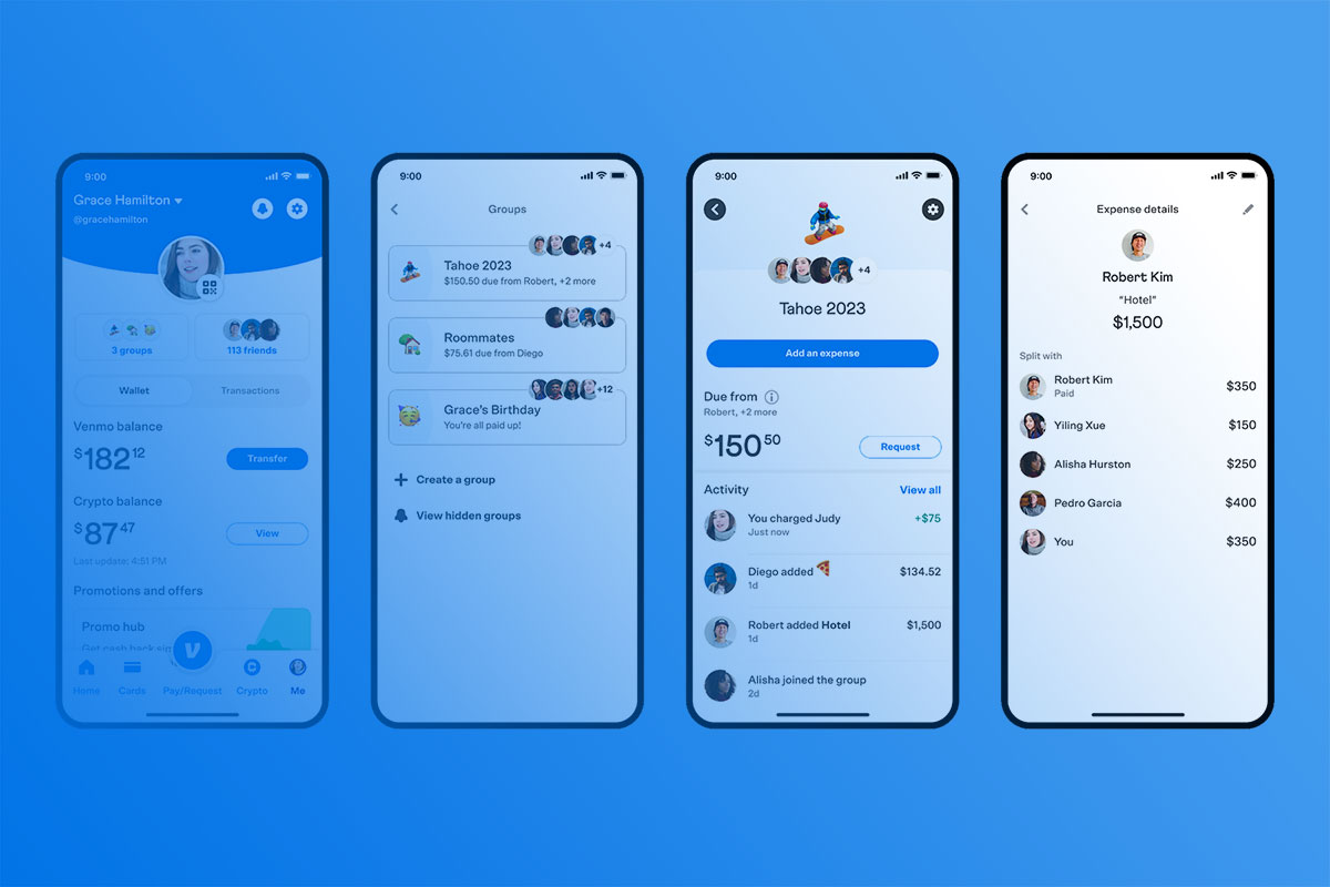
Ever notice how Venmo’s clean, friendly interface makes splitting dinner bills feel effortless? Behind that smooth user experience lies careful attention to typography choices that shape how millions of users interact with their money daily.
What font does Venmo use isn’t just a design curiosity. It’s a strategic decision that affects readability, trust, and the overall digital payment experience. The typeface selection influences everything from transaction clarity to brand recognition.
This deep dive reveals Venmo’s exact font choices, explains why they work so well for mobile payment interfaces, and explores how their typography decisions compare to other fintech platforms. You’ll discover the specific typefaces powering Venmo’s interface, the psychology behind their selection, and practical insights for anyone interested in digital design trends.
Whether you’re curious about fintech app design or planning your own mobile interface, understanding Venmo’s typographic approach offers valuable lessons in creating user-friendly financial applications.
Venmo’s Brand Identity

Development of Visual Identity
In the tapestry of digital payment gateways, the visual identity not only communicates the brand’s persona but also shapes user interaction.
When Venmo decided to revamp its aesthetics, it wasn’t just a makeover but a strategic renovation aimed at enhancing user engagement and trust.
This journey began with a creative alliance with Koto Studio, a powerhouse known for its innovative design solutions.
Collaboration began with one clear vision: infuse freshness while respecting the legacy.
The objectives were multidimensional – making the interface more intuitive, the visuals more vibrant, and overall, crafting an identity that users could resonate with and recognize instantly even in the cluttered space of digital wallets.
Elements of the New Brand Identity
Key elements define a brand’s visual identity, such as color schemes, logos, and typography.
Each element is a strategic choice contributing to the overarching brand narrative.
- Color schemes and logo design: Dabbling in the psychology of colors, Venmo’s new palette was designed to evoke feelings of reliability and convenience while adding a dash of joy.
- The logo, streamlined yet bold, bridges modern aesthetics with functional clarity, ensuring it stands out both in digital landscapes and physical transactions.
- Typography and typeface choices: When it comes to typography, every curve and weight holds significance.
- The chosen typeface needs to communicate trust and ease, pivotal for a brand dealing directly with financial transactions.
- In deciding what font Venmo uses, care was taken to select a type that was both readable and characteristically unique, reflecting Venmo’s friendly and approachable ethos.
Illustration and Imagery
Illustrations do more than fill space.
They narrate stories, evoke emotions and make interfaces engaging.
Venmo’s choice to incorporate illustrations within their branding was driven by the desire to create a more inclusive and user-friendly visual narrative.
- Role of illustrations in Venmo’s branding: More than just aesthetic enhancements, illustrations in Venmo serve as visual metaphors for the app’s functionality and ease of use, making the tech feel more accessible and less intimidating.
- Selection and style of illustrations used: Each illustration is crafted with a focus on diversity and relatability, ensuring users see a bit of themselves in each scenario depicted.
- This approach helps foster a stronger connection between the user and the app, making every interaction feel personalized.
Logo Design and Usage

Detailed Logo Guidelines
The Venmo logo is an emblem of trust and simplicity, designed to communicate security and ease in digital transactions.
However, maintaining its integrity across various applications comes with its set of guidelines.
- Description of the wordmark and its usage: The Venmo wordmark is designed to be simple yet memorable, featuring clean lines and balanced spacing.
- It’s not just a logo; it’s a promise of security and ease, a crucial aspect reflected in its prominent placement across all platforms.
- Specifications for the monogram and app icon: The monogram and app icon distill the essence of the Venmo brand into smaller, more versatile formats.
- While the monogram brings a formal yet approachable face forward, the app icon needs to be instantly recognizable even at smaller scales, emphasizing clarity and immediacy in design.
Logo Color Palette
Color consistency plays a vital role in brand recognition.
Venmo’s logo color palette is designed to be versatile yet consistent, ensuring brand recognizability across various platforms and applications.
- Colors for different backgrounds: The selection includes colors that stand strong on both light and dark backgrounds, maintaining readability and impact without compromising on aesthetic values.
- Recommendations for Monochrome usage: Monochrome doesn’t mean monotony.
- Even in grayscale, Venmo’s logos maintain their distinctiveness, adapted through different shades and tints to ensure visibility and brand recall.
Logo Placement and Spacing
Strategic placement and meticulous spacing ensure that the logo’s integrity is maintained across all branding materials.
- Clear space requirements: A cushion of clear space surrounds the logo, ensuring that it stands out without interference, maintaining its visual impact across all touchpoints.
- Minimum size and spacing guidelines: Keeping the logo discernible and effective regardless of scale is crucial, especially in digital formats where space can be at a premium.
- Defined minimum sizes and spacing ensure that the logo always looks its best.
Maintaining Brand Coherence

Consistency Across Platforms
A coherent brand identity transcends platforms, maintaining its essence across digital and physical mediums.
Whether it’s the user interface on the app or the marketing materials, each element needs to echo the core brand principles.
- Application of the brand identity in digital and physical mediums: From app screens to promotional swag, each touchpoint is an opportunity to reinforce the Venmo brand.
- The consistent application of visual elements ensures that the brand remains recognizable, irrespective of the environment.
- Ensuring uniformity in marketing and advertisements: Advertisement campaigns are the frontiers of brand identity, spreading the brand’s message far and wide.
- Consistency in these campaigns, from the visuals used to the messaging tone, ensures a uniform brand perception, crucial for building trust and recognition.
Internal Branding and Employee Engagement
Brand identity also permeates internal environments, influencing corporate culture and employee engagement.
- Incorporation of brand elements internally: The workplace is an extension of the brand.
- By integrating brand elements into the office environment, employees live and breathe the brand, further translating into their work and interactions with the customer.
- Engagement strategies for team members: Engaging team members with the brand goes beyond visuals; it’s about making them a part of the brand’s journey.
- Engagement strategies, from internal newsletters to branded team events, foster a strong brand affiliation that spills over into external customer interactions.
FAQ on What Font Does Venmo Use
What is the primary font used in Venmo’s mobile app?
Venmo uses Circular as their primary typeface across iOS and Android platforms. This sans-serif font provides clean readability for financial transactions and maintains consistency with modern mobile payment interfaces. The font choice supports Venmo’s friendly, approachable brand identity while ensuring optimal legibility on small screens.
Does Venmo use different fonts for different screen elements?
Yes, Venmo employs a typographic hierarchy with Circular in various weights. Headers use bold weights, body text uses regular, and secondary information appears in lighter weights. This systematic approach creates visual hierarchy that guides users through payment flows and transaction details effectively.
Is Venmo’s font custom or commercially available?
Circular is a commercial typeface developed by Lineto foundry. Venmo licenses this font rather than using a custom design. Many fintech companies choose Circular for its modern appearance and excellent mobile readability. The font’s geometric construction and humanist touches make it ideal for digital banking applications.
How does Venmo’s font choice affect user experience?
The font psychology behind Circular creates trust and approachability. Its rounded letterforms feel friendly rather than corporate, encouraging social payment interactions. The font’s excellent legibility reduces errors during money transfers, while its modern aesthetic appeals to Venmo’s target demographic of younger users.
What font does Venmo use on their website?
Venmo’s website maintains consistency by using the same Circular typeface across all digital touchpoints. This unified approach reinforces brand guidelines and creates seamless transitions between mobile app and web experiences. The font renders well across different browsers and screen resolutions.
Does Venmo’s font impact brand recognition?
Absolutely. Consistent typography across Venmo’s interface creates strong brand recognition. The distinctive letterforms of Circular become associated with the Venmo experience, similar to how other fintech brands use specific fonts for identity. This typographic consistency strengthens their digital payment platform presence in a competitive market.
What makes Circular a good choice for payment apps?
Circular excels in mobile payment interfaces due to its optimized character spacing and clear number distinction. The font’s design prevents confusion between similar characters like 6 and 9, crucial for financial accuracy. Its friendly appearance reduces anxiety around money transfers while maintaining professional credibility.
How does Venmo’s font compare to other payment apps?
While PayPal font choices differ, Venmo’s Circular stands out for its social payment focus. Unlike traditional banking fonts, Circular emphasizes approachability over authority. This typographic strategy aligns with Venmo’s positioning as a social money-sharing platform rather than formal financial institution.
Can I use Venmo’s font for my own projects?
Circular requires proper font licensing from Lineto foundry. The commercial typeface isn’t free, but similar alternatives exist for budget-conscious projects. Consider the font’s licensing terms and costs before implementing it in fintech app design or related projects requiring similar aesthetic qualities.
Has Venmo changed their font over time?
Venmo has maintained brand consistency with Circular since their major redesign. While minor adjustments to font spacing and weights may occur with app updates, the core typeface remains unchanged. This stability reinforces user familiarity and trust in their digital wallet experience.
Conclusion
Understanding what font does Venmo use reveals how thoughtful typography shapes modern financial technology. Circular’s success stems from balancing friendly aesthetics with functional clarity, proving that font selection directly impacts user trust and engagement in digital banking.
Venmo’s commitment to typographic consistency across platforms demonstrates sophisticated brand identity management. Their choice reflects broader fintech design trends prioritizing accessibility and social interaction over traditional banking formality. The geometric letterforms create emphasis where needed while maintaining readability at various sizes.
For designers and entrepreneurs, Venmo’s approach offers valuable insights into mobile payment typography. Consider how kerning, character distinction, and emotional resonance affect user behavior. The intersection of functional design and brand personality continues driving innovation in financial app interfaces.
Typography remains a crucial yet often overlooked element in fintech success, with Venmo providing an excellent case study in strategic font implementation.
If you liked this article about the font that Venmo uses, you should check out this article about the font that LEGO uses.
There are also similar articles discussing the font that SpongeBob uses, font finders, the font that Vogue uses, and the font that Cash App uses.
And let’s not forget about articles on the font that Balenciaga uses, the font that Wes Anderson uses, the font that Adidas uses, and the font that Time magazine uses.

Renowned for his expertise in logo design and visual branding, Bogdan has developed a multitude of logos for various clients.
His skills extend to creating posters, vector illustrations, business cards, and brochures. Additionally, Bogdan's UI kits were featured on marketplaces like Visual Hierarchy and UI8.
He also wrote in the past years on sites like Design Your Way, WebDesignerDepot, WPDean, Designmodo, Speckyboy, Slider Revolution, and more.
- Canva vs Midjourney: AI Design Tools Compared - 28 September 2026
- A Brand Identity Is Only Finished When Someone Else Can Use It - 28 September 2026
- Friendly Karla Font Pairing Ideas for Modern Brands - 26 September 2026

Bogdan Sandu is a seasoned designer who has been designing websites since 2008. Renowned for his expertise in logo design and visual branding, Bogdan has developed a multitude of logos for various clients. His skills extend to creating posters, vector illustrations, business cards, and brochures. Additionally, Bogdan's UI kits were featured on marketplaces like Visual Hierarchy and UI8. He also wrote in the past years on sites like Design Your Way, WebDesignerDepot, WPDean, Designmodo, Speckyboy, Slider Revolution, and more.
You Might Also Like