US street signs use Highway Gothic, a sans-serif typeface developed by the Federal Highway Administration (FHWA) and formally called the Standard Alphabets for Traffic Control Devices. The FHWA published the standard in 1948, and it has governed road sign lettering in the United States ever since. A second typeface, Clearview, was approved as an optional alternative in 2004 and is still used by a number of states today.
These 2 fonts cover nearly all guide, regulatory, and warning signs you see on American roads, but the exact one depends on the state and when the sign was installed.
What Type of Font Is Highway Gothic?

Highway Gothic is a humanist grotesque sans-serif typeface built around a single goal: maximum legibility at highway speeds.
The FHWA did not start from an existing commercial typeface. The series was developed in-house during World War II by the Public Roads Administration (the predecessor to FHWA), partly inspired by California DOT lettering practices from the period. The original shapes were rumored to be derived from Leroy Lettering Set stencils, a common drafting tool of the era.
The typeface comes in 7 series: Series A through F, plus a modified Series E. Each series varies in stroke weight and character width, allowing sign fabricators to pick the right density based on sign size and viewing distance.
- Series B and C: Narrow, used on compact signs or signs with long text strings
- Series D: The most widely used series on standard guide and street name signs
- Series E and E(M): Wider, for overhead freeway guide signs where letter size is critical
- Series F: The widest; used where maximum contrast and visibility are needed
Series A was officially discontinued in the US due to poor legibility at speed, though New Zealand still specifies it for certain applications.
For decades, the typeface used only uppercase letters. FHWA added formal lowercase designs for all series in 2004, following updates to the Manual on Uniform Traffic Control Devices (MUTCD). Regulatory and warning signs still require all-caps. Mixed case is permitted on guide signs, like green highway destination signs.
The letterforms prioritize open counters (the enclosed spaces inside letters like “e,” “a,” and “o”), consistent stroke widths, and generous letter spacing. These are deliberate [typography choices made to support fast recognition, not aesthetic ones.
Who Designed Highway Gothic?
The FHWA Series fonts were developed by the Public Roads Administration in the early-to-mid 1940s, with drafts used as early as 1942 on Pentagon road signs. The formal standard was published in 1948.
A Fonts Wiki source attributes the original design to Theodore W. Forbes. No single designer is officially credited by the FHWA. The typeface was engineered by a government body, not commissioned from a type foundry.
This is why no official digital font file has ever been released by the FHWA. The standard defines the letterforms through printed specifications and technical drawings, and all digital versions of Highway Gothic have been built by third parties based on those documents.
By the mid-1990s, type designer Tobias Frere-Jones of Font Bureau used the FHWA series as the starting point for a commercial typeface called Interstate. That font adapts Highway Gothic proportions for print and screen use and has since been adopted by brands including NBC Sports, TV Guide, and The Weather Channel.
Is Highway Gothic Free to Use?
The underlying letterform specifications are public domain, published by a US government agency. No copyright restricts the shapes themselves.
That said, the FHWA has never released an official digital font file. Every downloadable version of Highway Gothic is a third-party interpretation of the published specifications. Quality and accuracy vary. The most commonly used free options:
- Roadgeek 2014: Open-source digital reproduction of the full FHWA alphabet series, available for free non-commercial use
- Highway Gothic FHWA 2025: A free personal and commercial use font family built from FHWA public-domain outline data, updated for modern software compatibility (available at Befonts and similar sites)
- FHWA Series Font Family: Another free personal and commercial release based on the official specifications, also available on Befonts
If you need the font for actual sign fabrication rather than graphic design, URW++ offers OpenType versions with precise FHWA spacing tables. These are commercial and priced in euros. The Pixymbols series from Page Studio Graphics is another professional option.
For the Clearview alternative, Terminal Design sells the official commercial version of Clearview designed for agency and sign design use. It is not free. Knowing the difference between font licensing types matters here, especially if you are producing actual traffic control devices rather than creative work.
What Font Did Street Signs Use Before Highway Gothic?
Before the FHWA standardized Highway Gothic in 1948, US street signs used inconsistent lettering. There was no national standard. Sign lettering varied by state, county, and whoever fabricated the sign.
The California Department of Transportation played a key early role. California was testing and refining lettering systems for highway signs in the mid-1940s, and the resulting work fed directly into the FHWA’s national standardization effort. Before that, a heavy block-style lettering was common on 1920s-1930s signage, sometimes called “US Highway Old Style.”
The shift to Highway Gothic in 1948 was driven by the expansion of the US interstate system and the need for uniform, readable signage at the speeds those highways enabled.
Highway Gothic vs. Clearview: What Changed?
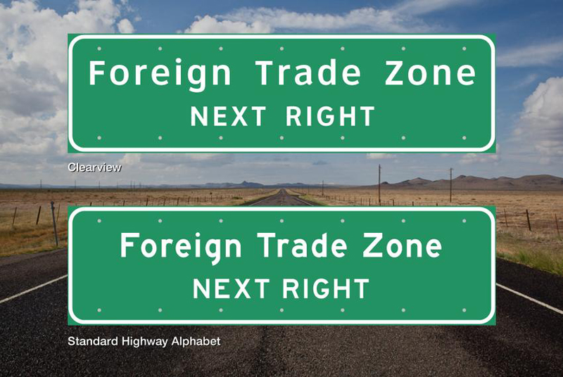
Clearview was developed over roughly a decade starting in the early 1990s by graphic designer Don Meeker and type designer James Montalbano. The impetus was a specific legibility problem: retroreflective sheeting, which had become the standard material for highway signs, caused halation at night. Headlights reflecting off the sheeting created a glow around letters, making tightly-spaced letterforms bleed together.
Highway Gothic’s narrower counter spaces made this worse. Letters like lowercase “e,” “a,” and “s” were particularly affected, and older drivers struggled most.
Clearview addressed this with 2 key differences.
- Larger counters: The enclosed spaces inside letters were opened up significantly to resist halation
- Higher x-height: The relative height of lowercase letters to uppercase was increased, improving mixed-case legibility
The FHWA granted Clearview interim approval in September 2004. Between 20 and 30 states adopted it. Then in January 2016, the FHWA rescinded that approval after reviewing 13 research studies, several of which found that Clearview’s apparent legibility gains were partly explained by the fact that researchers had compared old, worn Highway Gothic signs against new Clearview signs. Fresh signs are naturally easier to read.
Congress reinstated the approval in March 2018 as part of the Consolidated Appropriations Act. The FHWA’s current position: Clearview is optional and neither required nor recommended. Both fonts are legal. The result is a mix across the country, depending on the state and when each sign was installed.
| Feature | Highway Gothic | Clearview |
| Status | Standard FHWA (Series B–F) | Optional / Supplemental |
| First Adopted | 1948 | 2004 (Interim Approval) |
| Counter Size | Smaller, traditional | Larger, open |
| X-height | Standard | Higher |
| Night Halation | More susceptible | Reduced (Anti-blur) |
| Digital File | Third-party only | Commercial (Terminal Design) |
Free Alternatives to Highway Gothic
If you want a similar look for design work but prefer something more polished for screen or print, here are 5 solid options.
| Font | Why it’s similar | License | Source |
| Interstate | Directly based on FHWA Series; refined for print. | Paid | Type Network |
| Roadgeek 2014 | Faithful open-source FHWA reproduction. | Free (Non-com) | GitHub / Archive |
| Source Sans Pro | Humanist grotesque with wide, open counters. | OFL (Free) | Google Fonts |
| DM Sans | Geometric grotesque; high legibility at small sizes. | OFL (Free) | Google Fonts |
| Work Sans | Optimized for screen; matches FHWA Series D weights. | OFL (Free) | Google Fonts |
Interstate is the closest match in terms of actual DNA, but it costs money. For free options, Roadgeek is the most accurate reproduction of the real thing, even if it looks a bit rough in design contexts. Source Sans Pro is what I’d reach for if I needed something sign-like for a client project without it looking like a literal road sign.
How to Use Highway Gothic in Design Tools
In Figma
Figma does not include Highway Gothic by default. You need to install the font on your system first, then Figma will detect it automatically.
Download the Highway Gothic FHWA 2025 family from Befonts or a similar source, install it through your OS font manager, then restart the Figma desktop app. It will appear in the font picker. If you want to add custom fonts to Figma without the desktop app, you need the Figma Font Helper browser plugin.
In Canva
Canva does not list Highway Gothic in its free font library.
Canva Pro users can upload fonts to Canva directly. Download the .otf or .ttf file, go to Brand Kit, and upload it under “Uploaded Fonts.” Free Canva users cannot upload custom fonts. In that case, substitute with Work Sans or DM Sans, both available natively in Canva and close enough for most wayfinding-style design work.
In Photoshop
Install Highway Gothic through your OS (Windows: right-click .ttf > Install; macOS: double-click > Install Font). Photoshop reads system fonts at launch. If Photoshop is already open when you install, restart it. Full instructions on how to add fonts to Photoshop walk through the process in detail.
CSS / Web Use
Highway Gothic is not on Google Fonts. For web use, either self-host the font file or use a close substitute via Google Fonts.
“ / Self-hosted Highway Gothic / @font-face { font-family: 'HighwayGothic'; src: url('/fonts/highway-gothic.otf') format('opentype'); }
/ Google Fonts alternative / @import url(‘https://fonts.googleapis.com/css2?family=Source+Sans+3&display=swap’);
body { font-family: ‘HighwayGothic’, ‘Source Sans 3’, sans-serif; } `
If you are designing signage-style UI or wayfinding systems digitally, consider pairing Highway Gothic with a clean sans-serif for body text. The FHWA letterforms are optimized for large, isolated words at a distance. They do not perform well at small sizes or in dense paragraphs.
Why Did the FHWA Choose This Font?
The honest answer is that Highway Gothic was not chosen through rigorous typographic research. The original FHWA alphabets were never formally tested for legibility before adoption. James Montalbano, co-designer of Clearview, has stated that the FHWA series was the first time in US history that anyone had applied the principles of cognitive psychology to highway sign design when they started researching improvements in the 1990s. The original fonts predated that kind of evaluation.
What the FHWA prioritized in 1948 was standardization across a growing national road network, not typographic excellence. Before the standard, every state lettered signs differently. Highway Gothic gave engineers a consistent, reproducible system tied to grid-based dimensions and fabrication specs. Each letter series maps to specific sign panel sizes and legibility distances, making sign production predictable at scale.
The typeface’s sans-serif construction was a practical choice. Serifs add complexity that degrades at long distances or in poor light. A sans-serif with open letterforms and clear stroke contrast reads faster when viewed from a moving vehicle than a more detailed typeface would. That logic still holds.
The MUTCD governs every aspect of sign typography in the US, from letter height to stroke width to spacing ratios. These specs connect directly to things like letter tracking and line spacing in standard typography terms. Sign designers do not set these manually. The series system encodes them by default.
This is also why choosing fonts for signage in general follows a similar logic: legibility at scale, under variable lighting, for readers who have under a second to process the message. The FHWA has been solving that problem since 1948, and Highway Gothic, whatever its flaws, is still the answer most of the country uses.
FAQ on The What Font Is Used For Street Signs
What is the official font used on US street signs?
The official typeface is Highway Gothic, formally called the FHWA Series fonts.
The Federal Highway Administration standardized it in 1948. It covers guide signs, street name signs, and most regulatory signage across the country.
Is Highway Gothic the same as the FHWA Series font?
Yes. Highway Gothic is the informal name. The official designation is FHWA Series, with variants labeled Series B through F.
Each series differs in stroke width and character spacing, suited to different sign sizes and legibility distances.
What is Clearview, and is it still used on signs?
Clearview is a sans-serif typeface developed by Don Meeker and James Montalbano as a higher-legibility alternative to Highway Gothic.
It’s optional. The FHWA reinstated its approval in 2018, but does not recommend it over Highway Gothic. Some states use it, others don’t.
Why are street signs in all capital letters?
Regulatory and warning signs are required by the MUTCD to use all-caps lettering.
Guide signs, like green highway destination signs, are permitted to use mixed case since the FHWA added lowercase letters to all series in 2004.
Can I download Highway Gothic for free?
The FHWA specifications are public domain, but no official digital file exists. Third-party versions like Roadgeek 2014 and Highway Gothic FHWA 2025 are available free for personal and commercial use.
Which series of Highway Gothic is used on street name signs?
Series D is the most commonly used series for standard street name and guide signs.
Narrower series like B and C appear on compact signs with longer text. Series E and E(M) are used on larger overhead freeway signs.
How does Highway Gothic compare to Clearview in terms of night visibility?
Clearview was designed to reduce halation, the glow that retroreflective sheeting creates around letterforms at night.
Its larger counter spaces and higher x-height help letters stay distinct under headlight illumination, which was a documented problem with older Highway Gothic signs.
Is the street sign font used in other countries?
Yes. Australia, Canada, New Zealand, Malaysia, and several other countries use the FHWA Series fonts or close derivatives on road signage.
Some countries like Spain and the Netherlands use typefaces directly derived from the Highway Gothic series.
What font is used on green highway signs specifically?
Green interstate guide signs use Series E Modified (also called E(M)), the widest and most legible FHWA variant for overhead applications.
Mixed-case lettering with Series E(M) is standard on freeway destination signs across most of the US.
Are there good free alternatives to Highway Gothic for design projects?
Yes. Source Sans Pro, Work Sans, and DM Sans are the closest free options with similar humanist grotesque proportions.
For the most accurate reproduction, Roadgeek 2014 is the go-to. It covers all FHWA series and is free for non-commercial use.
Conclusion
If you ever wondered what font is used for street signs, the answer is Highway Gothic, a public-domain sans-serif typeface built around one purpose: getting information to drivers fast.
The FHWA Series standards, the MUTCD specifications, and decades of road sign legibility research all point back to the same system, still running on most US roads today.
Clearview came close to replacing it. It didn’t, at least not entirely. Both typefaces now coexist, and the sign typography debate between them is genuinely unresolved at the federal level.
For designers, the takeaway is practical: the letterform choices behind wayfinding typography are driven by retroreflectivity, stroke width ratios, counter space, and viewing distance, not aesthetics.

Renowned for his expertise in logo design and visual branding, Bogdan has developed a multitude of logos for various clients.
His skills extend to creating posters, vector illustrations, business cards, and brochures. Additionally, Bogdan's UI kits were featured on marketplaces like Visual Hierarchy and UI8.
He also wrote in the past years on sites like Design Your Way, WebDesignerDepot, WPDean, Designmodo, Speckyboy, Slider Revolution, and more.
- The Windsurf Logo History, Colors, Font, And Meaning - 10 October 2026
- How to Remove Background From Product Photos (No Photoshop) - 10 October 2026
- How Designers can Build a Stronger Online Creative Identity - 9 October 2026

Bogdan Sandu is a seasoned designer who has been designing websites since 2008. Renowned for his expertise in logo design and visual branding, Bogdan has developed a multitude of logos for various clients. His skills extend to creating posters, vector illustrations, business cards, and brochures. Additionally, Bogdan's UI kits were featured on marketplaces like Visual Hierarchy and UI8. He also wrote in the past years on sites like Design Your Way, WebDesignerDepot, WPDean, Designmodo, Speckyboy, Slider Revolution, and more.
You Might Also Like