Adult Swim uses Helvetica Neue Condensed Bold for its logo, a neo-grotesque sans-serif font published by Linotype.
The network adopted this typeface in 2003, when it redesigned its on-air identity to the now-iconic lowercase “[adult swim]” style, set in white against a black background.
—
What Type of Font Is Helvetica Neue Condensed Bold?
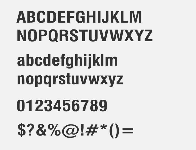
Helvetica Neue Condensed Bold belongs to the neo-grotesque classification within typography. It draws from the same tradition as Akzidenz-Grotesk and other 19th-century Swiss and German grotesques.
The condensed cut narrows each glyph horizontally without reducing stroke weight, which gives the Adult Swim wordmark that tight, punchy silhouette. Uppercase-height and x-height are both generous, keeping it readable even at small on-screen sizes.
Key characteristics:
- Uniform stroke width with no visible thick-to-thin contrast
- Near-horizontal terminals on curved letterforms
- Tight default tracking that suits broadcast lower-thirds
- Bold weight that holds up against dark backgrounds
This combination suits Adult Swim’s deliberately minimal aesthetic. The grotesque structure reads as neutral and anti-decorative, which lines up with the network’s anti-establishment programming identity.
—
Who Designed Helvetica Neue Condensed Bold?
Max Miedinger and Eduard Hoffmann created the original Helvetica typeface in 1957 for the Haas’sche Schriftgiesserei foundry in Switzerland.
Linotype later revised and expanded the family in 1983, releasing it as Helvetica Neue with a broader range of weights, widths, and optical sizes. That expansion introduced the Condensed Bold cut that Adult Swim eventually adopted.
Helvetica Neue Condensed Bold is a commercial, licensed typeface. It was not commissioned specifically for Adult Swim and is not a custom proprietary font. Any designer or studio can license it through Monotype or Linotype directly.
—
Is Helvetica Neue Condensed Bold Free to Use?
No. Helvetica Neue Condensed Bold is a commercial typeface sold under a proprietary Linotype license. It is not available under any open-source or free-for-commercial-use terms.
Licensing is available through Monotype Fonts (monotype.com) and MyFonts (myfonts.com), with pricing that varies depending on usage scope (desktop, web, app, or broadcast). Desktop licenses typically start around $35 per style.
Some third-party sites offer unauthorized downloads. Using those for commercial projects puts you at legal risk. Always get a proper font license before using it in client work or published designs.
—
What Font Did Adult Swim Use Before?
Adult Swim launched on September 2, 2001, using Franklin Gothic Bold for its original wordmark. That version featured uppercase red lettering, set without the square brackets now associated with the brand.
On February 23, 2002, the network dropped the red color and shifted to lowercase letterforms, still using Franklin Gothic Bold.
The switch to Helvetica Neue Condensed Bold happened on May 25, 2003, alongside the introduction of the bracket format, “[adult swim]”, that has remained unchanged since. The black-and-white color scheme became fixed at that point too, reinforcing the minimalist on-air visual identity.
Timeline at a glance:
| Period | Font Used | Style |
| 2001–2002 | Franklin Gothic Bold | Uppercase, red |
| 2002–2003 | Franklin Gothic Bold | Lowercase, black/white |
| 2003–present | Helvetica Neue Condensed Bold | Lowercase in brackets, black/white |
—
Best Free Alternatives to Helvetica Neue Condensed Bold
Helvetica Neue Condensed Bold is not available for free legally, but several alternatives come close enough for most design work.
| Font | Similarity | License | Source |
| Roboto Condensed Bold | Neo-grotesque structure, similar weight | Free (Apache 2.0) | Google Fonts |
| TeX Gyre Heros | Near-direct Helvetica clone | Free (GUST) | CTAN / direct download |
| Nimbus Sans | Very close letterform match | Free (AGPL) | URW++ / Adobe Fonts (CC) |
| Work Sans | Grotesque with strong bold weights | Free (OFL) | Google Fonts |
Roboto Condensed Bold is probably the most practical starting point if you’re working in Figma or Google Docs, since it’s already built into most design tools by default.
For printed materials or broadcast-style graphics, TeX Gyre Heros is the closest structural match. It replicates Helvetica Neue’s terminal angles and stroke uniformity better than most free options.
—
How to Use a Helvetica Neue Alternative in Your Projects
In Figma or Canva
Roboto Condensed is available directly inside both platforms without any installation. Set the weight to Bold, then tighten the letter spacing to around -1 to -2% to replicate that Adult Swim tightness.
Pair it with a solid black background and white text. The contrast does most of the work.
In Photoshop or Illustrator
Install TeX Gyre Heros via your system fonts folder. Adding it to Illustrator takes under a minute once it’s installed on your OS.
Use the Condensed Bold weight at high sizes with tight leading for bumper-style text cards. Keep kerning set to Optical rather than Metrics for cleaner results at display sizes.
On the Web (CSS)
Google Fonts provides Roboto Condensed with a simple embed. Add this to your HTML head:
“ <link href="https://fonts.googleapis.com/css2?family=Roboto+Condensed:wght@700&display=swap" rel="stylesheet"> `
Then set your CSS:
` font-family: 'Roboto Condensed', sans-serif; font-weight: 700; letter-spacing: -0.02em; text-transform: lowercase; `
—
Why Did Adult Swim Choose This Font?
The 2003 rebrand wasn’t a random aesthetic decision. Adult Swim needed to signal something specific: that it existed in a separate cultural space from Cartoon Network, sharing the same broadcast channel but targeting an entirely different audience.
Helvetica Neue Condensed Bold carries no nostalgia, no warmth, and no decorative intent. It’s the typographic equivalent of a blank stare, which is exactly what the network’s deadpan bumper cards were going for.
The lowercase “[adult swim]” format reinforced this. Lowercase reads as casual and confident rather than authoritative. Combined with the sparse black-and-white palette and non-sequitur text bumpers, the visual hierarchy basically collapsed on purpose. There was no logo trying to sell you something.
That anti-branding approach turned out to be very effective branding. The logo’s refusal to compete visually became its most recognizable quality.
Adult Swim’s design style aligns loosely with Swiss design principles in its use of a neutral grotesque typeface and rigid grid-based text placement. But it subverts those principles by stripping out any sense of institutional polish. The result sits somewhere between minimalist design and deliberate anti-aesthetic, and Helvetica Neue Condensed Bold is central to making that read correctly.
Brands like HBO and FX have taken similar approaches to typographic restraint in their on-air identities. Adult Swim got there first, and arguably went further. The contrast between the stark white text and the black background, with that specific condensed font weight, became immediately recognizable. You knew you were watching Adult Swim before you consciously read the words.
That kind of recognition is what good font selection actually does when it works.
FAQ on What Font Does Adult Swim Use
What font does Adult Swim use in its logo?
Adult Swim uses Helvetica Neue Condensed Bold, a neo-grotesque sans-serif typeface published by Linotype.
The font has been part of the brand’s visual identity since the 2003 rebrand that introduced the now-iconic “[adult swim]” bracket format.
Is the Adult Swim font a custom typeface?
No. Helvetica Neue Condensed Bold is a commercial font available for licensing through Monotype and MyFonts.
Adult Swim did not commission a custom typeface. Any designer can legally license and use the same font.
What font did Adult Swim use before Helvetica?
Before 2003, Adult Swim used Franklin Gothic Bold. The original 2001 logo featured it in uppercase red letters.
The switch to Helvetica Neue Condensed Bold happened on May 25, 2003, alongside the introduction of the square bracket logo format.
Is the Adult Swim font free to download?
Helvetica Neue Condensed Bold is a paid, proprietary font. It is not legally available for free commercial use.
Free alternatives like Roboto Condensed Bold or TeX Gyre Heros are the closest legitimate options for personal and commercial projects.
What makes the Adult Swim font so recognizable?
The condensed bold weight combined with tight kerning and a stark black-and-white palette creates an instantly identifiable look.
The lowercase “[adult swim]” format adds to it. Most networks use uppercase branding. Adult Swim deliberately went the other way.
What type of font is Helvetica Neue Condensed Bold?
It is classified as a neo-grotesque sans-serif, part of the same broad category as Arial and Univers.
The condensed cut narrows each glyph horizontally while keeping stroke weight consistent, which suits tight broadcast typographic hierarchy.
Who created the Helvetica Neue font family?
Max Miedinger and Eduard Hoffmann designed the original Helvetica in 1957 for the Haas’sche Schriftgiesserei foundry in Switzerland.
Linotype revised and expanded the family in 1983, releasing it as Helvetica Neue, which introduced the condensed and extended variants.
What font is used in Adult Swim bumpers?
The bumper cards primarily use Helvetica Neue Condensed Bold, consistent with the main logo font style.
Some bumpers also use plain Helvetica or similar grotesque cuts depending on the era and production team handling the on-air graphics package.
Can I use a similar font to replicate the Adult Swim style?
Yes. Roboto Condensed Bold from Google Fonts is free and comes close in structure and weight.
Set it in lowercase, apply tight letter spacing, and use white text on a black background. That combination captures most of the Adult Swim aesthetic.
Does Adult Swim use the same font across all its branding?
Mostly yes. The Helvetica Neue Condensed Bold sans-serif runs consistently across the logo, on-air bumpers, and most promotional materials.
Secondary typography in show titles and motion graphics sometimes varies by production, but the core brand font has stayed consistent since 2003.
Conclusion
If you’ve been wondering what font does Adult Swim use, the answer is Helvetica Neue Condensed Bold, a neo-grotesque sans-serif licensed from Linotype that has defined the network’s on-screen identity since 2003.
The typeface choice wasn’t accidental. Its tight condensed letterforms, uniform stroke width, and complete lack of decorative detail made it the right tool for a brand built on deadpan minimalism.
For your own projects, Work Sans or Roboto Condensed Bold are solid free alternatives that replicate the Adult Swim brand typography aesthetic without the licensing cost.
The Adult Swim visual identity proves that font psychology works even when it looks like you’re not trying.
Renowned for his expertise in logo design and visual branding, Bogdan has developed a multitude of logos for various clients.
His skills extend to creating posters, vector illustrations, business cards, and brochures. Additionally, Bogdan's UI kits were featured on marketplaces like Visual Hierarchy and UI8.
He also wrote in the past years on sites like Design Your Way, WebDesignerDepot, WPDean, Designmodo, Speckyboy, Slider Revolution, and more.
- The Airtable Logo History, Colors, Font, And Meaning - 12 July 2026
- How to Blur Background in Canva: A Quick Tutorial - 11 July 2026
- Typography Trends - 10 July 2026
Bogdan Sandu is a seasoned designer who has been designing websites since 2008. Renowned for his expertise in logo design and visual branding, Bogdan has developed a multitude of logos for various clients. His skills extend to creating posters, vector illustrations, business cards, and brochures. Additionally, Bogdan's UI kits were featured on marketplaces like Visual Hierarchy and UI8. He also wrote in the past years on sites like Design Your Way, WebDesignerDepot, WPDean, Designmodo, Speckyboy, Slider Revolution, and more.
You Might Also Like