
What font does Uber use in the UI and logo?
Typography—the unsung hero of branding—quietly influences how we feel about a company with its silent curves and compelling lines. Take a moment and picture the ride-sharing giant Uber; beyond its renowned service, there’s a visual force at play: the font that Uber uses.
This selection is no mere happenstance but a deliberate strategy that speaks volumes of Uber Technologies Inc. and its quest for brand recognition.
In this context, we’ll dive into the intricate decisions shaping the typography in branding, uncovering the significance of typeface characteristics within the Uber app typography.
It’s a tale of art meets utility, where every letter plays a pivotal role in the brand identity narrative.
Expect to unravel the threads of Uber’s visual identity system, corporate typeface, and the subtle prowess of responsive typography.
By the conclusion of our discussion, you’ll have a deeper appreciation for the typeface licensing particulars that govern this choice and why such deliberateness in design is not just an aesthetic pursuit but a core aspect of branding guidelines and brand consistency.
Through this lens, we offer more than just facts – it’s an insight into the fabric that weaves a coherent and influential visual design.
The origins of Uber’s bespoke sans serif typeface
At first glance, you may think that fonts should be among the lowest priorities for a ride-hailing app. But this isn’t true. A unique font can help a brand stand among the competition. Uber is no stranger to this knowledge.
Uber’s logo witnessed several changes during its 10-year-long existence. It has evolved gradually over the years. When Uber first came to be, the design studio chose to add a big red magnet under its name. However, they removed it in 2011.
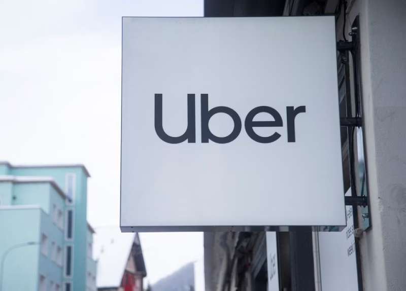
Uber has been using its current logo since 2018. Compared to the previous ones, it looks much friendlier and more memorable. Many new companies use custom typefaces and Uber is no exception. It uses a custom-made sans-serif font that makes it simple yet elegant.
The original Uber logo (2009-2010)
![]()
In its early stages, the company was called UberCab. The logo featured the word ‘Uber’ with a red magnet positioned right under it. It symbolized your ability to call a cab within a few seconds. The earliest logo was sometimes abbreviated as UC.
It used a sans-serif font and featured only black lowercase letters. The company soon realized that shorter logos were trendier and decided to remove the word ‘Cab’.
The 2012 Uber logo
In 2012, Uber decided to scrap the red magnet under its name. The company also transitioned from lowercase letters to uppercase ones. They also changed the bold font to a sleeker one. The updated logo remained in use until 2016.
The 2016 Uber logo

Uber’s in-house design team changed the logo again in 2016. They once again transitioned to a bolder sans-serif font. The lack of serifs made it look smoother and more modern.
The most notable part of the 2016 logo was the letter ‘E’. The horizontal strokes were cut diagonally instead of vertically. As a result, the logo looked much more dynamic and elegant.
The contemporary Uber logo (2018-present)

As of 2023, Uber‘s logo underwent the final change in 2018. As the company’s success grew, it decided to branch out to offer other services. These included scooters, bikes, and even forms of air transport. It wanted to create a new logo that would match this expansion.
Uber started its rebranding process in 2018 as it continued to expand across the globe. To create the perfect logo, the design studio came up with a sans-serif typeface known as Uber Move. It then rebranded all its products using this new font.|
The logo features elongated letters that are lowercase, apart from the ‘U’. It uses a bold font that makes it stand out on light backgrounds.
The app itself instead uses a white font set against a black background. Uber designed this final version of its logo to match other transportation companies’ sans-serif fonts.
What font family does Uber use?
The company has been using its custom-made font called Uber Move ever since 2018.
Designed by Jeremy Mickel from the MCKL design studio, it belongs to the sans-serif font family. Uber’s own design team and the branding agency Wolff Olins also contributed to Uber Move.
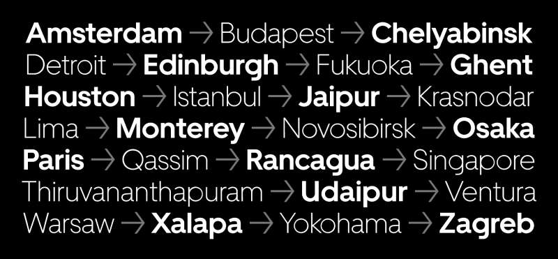
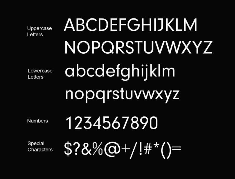
The font uses geometric letter shapes. However, its lowercase letters lean more toward the grotesque style. Uber Move comes both in a display and text version, making it suitable for screens of all sizes.
The custom font draws inspiration from sans serif styles such as Futura and Neuzeit Grotesk. The company decided to add elements from transportation fonts to these styles, resulting in Uber Move. The fonts came in four weights and two optical sizes, Their letters were slightly condensed and features geometric letter shapes.
The logo represents ambition, safety, and friendliness. Its font belongs to Uber, making it unavailable for public use.
What fonts similar to Uber Move can you use?
Although Uber Move belongs to the company, you can use other fonts that look similar. Here’s a list of 4 fonts resembling Uber Move.
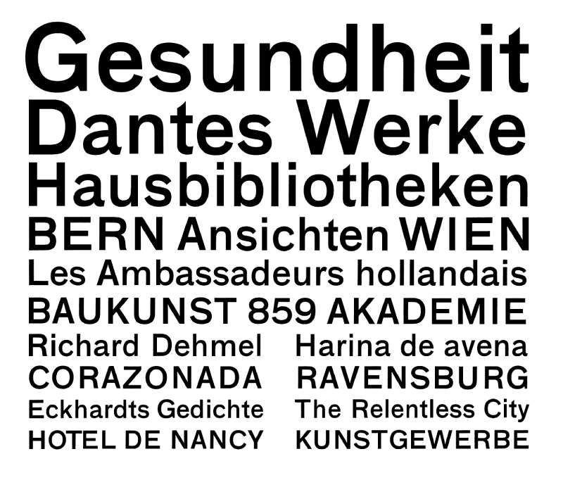
Neuzeit font
Created by Wilhelm Pischner in 1928, the Neuzeit font belongs to the sans serif family. Since Uber Move draws inspiration from Neuzeit, it’s only natural the two fonts look similar.
Futura font
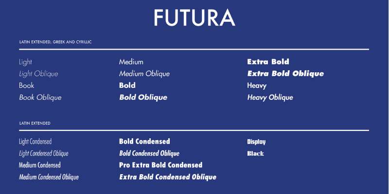
Designed by Paul Renner, Futura entered the scene in 1927. It emphasizes geometric shapes such as circles, resembling the Bauhaus design style. This is the second font that inspired Uber Move, which is why they look so alike.
Programme font
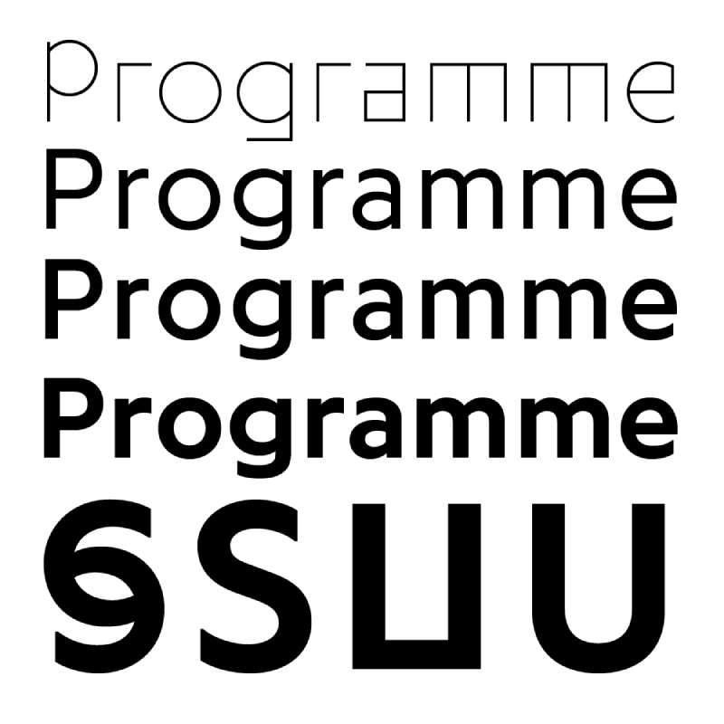
Released by Optimo in 2013, Programme is a sans serif font with roots in a computer program. That’s where it got its name. Though a designer later improved it, it still features some of the original qualities. The font comes in three weights and features rotated styles. These styles make the letters lean to one side.
Regular font
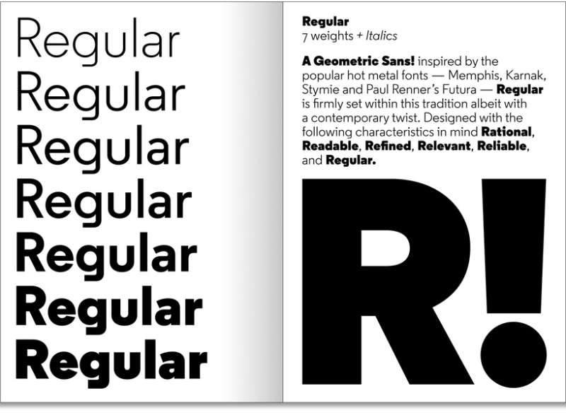
Designed by Henrik Kubel, this sans-serif font was released in 2013 by the A2-Type foundry. The creator decided to design this font after he saw a unique letter ‘g’ on a faded wall sign. It comes in seven weights ranging from light to black.
Other fonts that resemble Uber Move
Breite Grotesk
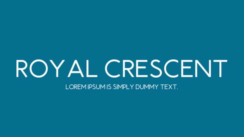
Royal Crescent
JMH Ava
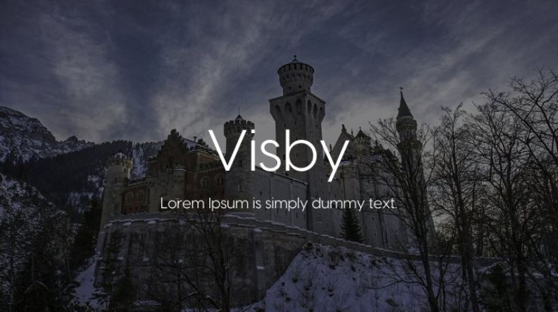
Visby
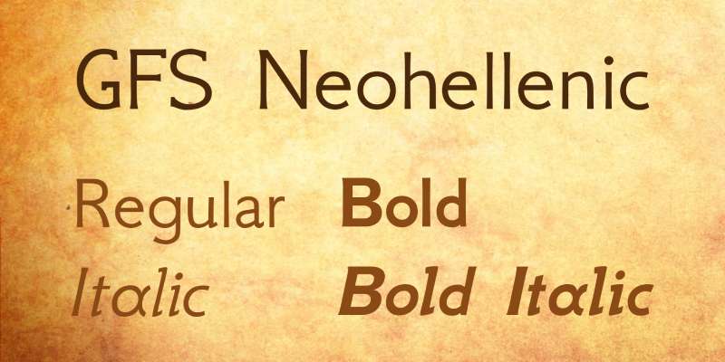
GFS Neohellenic
FAQ On The Font That Uber Uses
What Font Does Uber Use?
Uber’s bespoke font is called Uber Move. It’s a custom-designed typeface that took inspiration from the company’s need for clear, accessible, and highly legible text, suited for mobile and print.
Developed to help solidify their brand identity, Uber Move signifies a vital shift in Uber’s visual identity system.
Is Uber Move Available for Public Use?
While Uber Move is integral to Uber’s branding, it’s proprietary and not available for public download.
The company commissioned the typeface for exclusive use in its app typography, marketing materials, and logo, aligning with its branding guidelines to maintain a unique visual design.
Can I License Uber Move for My Projects?
No, you can’t license Uber Move. It’s a custom font design crafted solely for Uber’s use across its platforms and services, indicative of the company’s commitment to differentiated branding in a crowded marketplace.
Licensing isn’t an option, safeguarding the font as part of Uber’s brand assets.
How Does Uber Move Enhance User Experience?
Uber Move is meticulously designed with user experience (UX) design in mind. Its legibility and versatility across digital and print mediums facilitate user interaction, exemplifying responsive typography.
It reflects how typeface characteristics merge with functionalities to optimize visual communication.
Why Did Uber Decide to Create a Custom Font?
Uber’s pursuit of a cohesive branding experience propelled the creation of Uber Move. A custom font ensures brand consistency and distinction, underpining a unique visual identity.
It fosters an immediate, recognizable connection with users, which is cardinal in effective brand identity design.
What Influenced the Design of Uber Move?
Uber Move draws influence from typography in branding and transport iconography – aiming to resonate with movement and accessibility.
Its design considerations reflect brand guidelines and a motto of ‘getting from A to B,’ mirroring brand assets into the everyday user interface design.
How is Uber Move Different from Other Fonts?
Distinct from off-the-shelf typefaces, the uniqueness of Uber Move lies in its tailored approach to encapsulate Uber’s branding.
Its quirks are deliberately crafted to reflect a visual identity system that’s aligned with the Uber marketing strategy and corporate visual standards essential for brand reinforcement.
What Are the Characteristics of Uber Move?
Uber Move is characterized by its clarity and neutrality. Designed for legibility, it maintains a friendly yet authoritative tone, crucial for a brand identity font.
The typeface licensing exclusivity aligns the font firmly with Uber’s brand identity, giving visual cues synonymous with the user experience Uber aims to deliver.
How Did Uber Move Impact Uber’s Brand Image?
Since its inception, Uber Move transitioned to become synonymous with the brand identity of Uber.
Its clean and modern aesthetics have strengthened the brand’s visual identity and provided a fresh, yet familiar face to a brand redefining mobility, in turn affecting brand recognition positively.
Where Can I Find a Font Similar to Uber Move?
If you’re in search of something similar to Uber Move, look at fonts like Circular, Proxima Nova, or Gotham which share some typeface characteristics.
These reflect the geometric sans-serif family that offer versatility and modernity, albeit without the unique branding touch of Uber’s proprietary type.
Conclusion
Navigating through the essence of the font that Uber uses, we’ve dissected aspects from the deliberate curves shaping the Uber Move to the font’s strategic role within Uber Technologies Inc. The journey unveils a narrative beyond mere characters on a screen; it’s an unwavering commitment to brand identity and user connectivity.
- Concluding, Uber Move elevates more than just aesthetics; it’s a cornerstone of user experience (UX) design.
- It embodies typography in branding—a silent ambassador of the brand.
- Every stroke of Uber Move carries the weight of consistency, recognition, and the ethos of Uber.
This exploration reveals not just a typeface but a vessel of brand consistency, designed to navigate the intricate facets of visual identity with precision. It stands as testimony to the transformative power of thoughtful design in the dynamic world of branding. Let the takeaway be clear: in the realm of typography, intentionality reigns supreme—a sentiment well captured by Uber’s visual design decisions.
If you liked this article about what font Uber uses, you should check out this article about what font Adult Swim uses.
There are also similar articles discussing what font Louis Vuitton uses, what font Off-White uses, what font Airbnb uses, and what font MrBeast uses.
And let’s not forget about articles on what font Harley Davidson uses, what font Ford uses, what font Notion uses, and what font PayPal uses.
Bogdan Sandu, a seasoned designer with 15 years of diverse experience, has been designing websites since 2008.
Renowned for his expertise in logo design and visual branding, Bogdan has developed a multitude of logos for various clients.
His skills extend to creating posters, vector illustrations, business cards, and brochures. Additionally, Bogdan's UI kits were featured on marketplaces like Visual Hierarchy and UI8.
Latest posts by Bogdan Sandu (see all)
- The Red Stripe Logo History, Colors, Font, And Meaning - 9 May 2024
- Tie the Knot: Romantic Wedding Color Palettes - 9 May 2024
- Game Show Typography: What Font Does Jeopardy Use? - 9 May 2024