Notion uses Inter as its primary UI typeface across all platforms, including desktop, web, and mobile. Inter is a neo-grotesque sans-serif font designed by Rasmus Andersson and first released publicly in 2017.
Within the app itself, Notion labels its default font option simply as “Default” (which renders Inter), and also offers 2 built-in alternatives: Serif and Mono.
—
What Type of Font Is Inter?
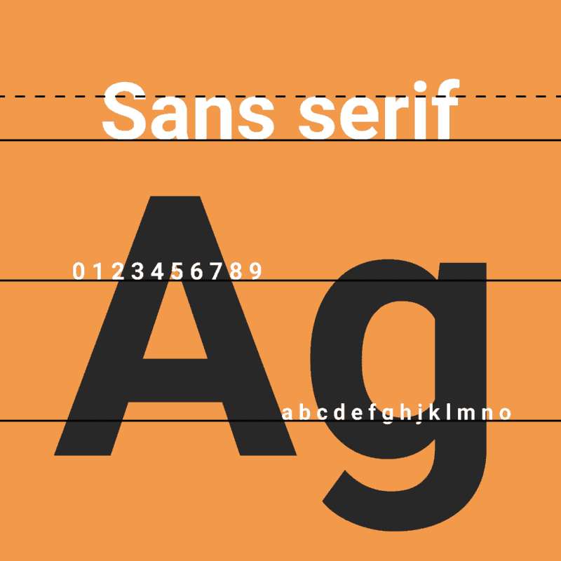
Inter is classified as a neo-grotesque sans-serif, sitting in the same typographic family as Roboto, Helvetica, and Apple’s San Francisco. It was designed from scratch specifically for screen rendering, not for print.
A few things make it stand out visually:
- Tall x-height – letters like “a,” “e,” and “n” sit taller relative to capitals, which helps readability at small sizes
- Open apertures – the open spaces inside letters like “c” and “e” stay readable even when text is tiny
- Optical sizing – the variable font version adjusts letterforms depending on the size at which they’re displayed
Notion uses Inter across multiple weights: Regular (400) for body text, Medium (500) for interface labels, and Bold (700) for emphasis. This creates a consistent typographic hierarchy throughout the workspace without relying on multiple typeface families.
The font’s clean, neutral structure also keeps it out of the way. You’re reading your notes, not admiring the letterforms. That’s kind of the point.
—
Who Designed Inter?
Rasmus Andersson, a Swedish software designer and developer, created Inter. He began the project in 2016 while working at Figma, initially under the name “Inter UI.”
The first public release came in August 2017. Andersson built Inter because existing options like Roboto struggled at small UI text sizes. He wanted something purpose-built for dense, screen-based interfaces.
Inter is not a commissioned typeface. Notion did not hire anyone to create it. It’s an open-source project maintained by Andersson, now widely used by Figma, GitLab, Mozilla, NASA, and Notion, among others.
According to Wikipedia, Inter was accessed 414 billion times on Google Fonts in the twelve months ending May 2025, with 57% growth year-over-year. That number reflects how dominant this typeface has become across the web.
—
Is Inter Free to Use?
Yes, completely free. Inter is licensed under the SIL Open Font License 1.1 (OFL), which allows free use in personal and commercial projects.
You can download it from:
- Google Fonts – fonts.google.com/specimen/Inter (note: the Google Fonts version omits some OpenType features to reduce file size)
- GitHub – github.com/rsms/inter (the full version, with all features intact)
- rsms.me/inter – the designer’s own site, with documentation and variable font files
The OFL license lets you use, modify, and bundle Inter freely, as long as you don’t sell the font files themselves as a standalone product. For most designers and developers, there’s zero licensing friction.
If you’re building a web project, learning how to use Google Fonts is the quickest way to get Inter loaded in under a minute.
—
What Font Did Notion Use Before?
Notion did not switch from a previously named proprietary typeface. Inter has been Notion’s default UI font since the platform’s early public versions, and the company never publicly documented a formal font rebrand.
What has changed is how users access font options inside the app. The 3-font system (Default, Serif, Mono) has been part of Notion’s page settings for several years.
Some sources reference “Notion Sans” as a distinct typeface, but this appears to refer to the default sans-serif option within Notion’s UI settings rather than a separately commissioned or named typeface. There is no publicly documented custom typeface called Notion Sans from a foundry.
—
What Are the Best Free Alternatives to Inter?
Inter is free, but you might want something with a slightly different feel for your own projects. These are the closest free alternatives:
| Font | Similarity to Inter | License | Source |
| DM Sans | Clean neo-grotesque, similar weight range | OFL (Free) | Google Fonts |
| Work Sans | UI-focused, slightly warmer tone | OFL (Free) | Google Fonts |
| IBM Plex Sans | Neutral, technical, similar x-height | OFL (Free) | Google Fonts |
| Roboto | Same neo-grotesque category, slightly more condensed | Apache 2.0 (Free) | Google Fonts |
| Nunito | Rounded terminals, friendlier feel | OFL (Free) | Google Fonts |
If you want the closest match, go with DM Sans or Work Sans. Both were designed with digital interfaces in mind and carry a similar neutral, professional tone.
For pairing ideas, the Inter font pairing guide covers combinations that work well for both UI and editorial contexts. And if you want to explore the broader category, there’s a solid breakdown of fonts similar to Inter worth checking out.
—
How to Use Inter (or an Alternative) in Your Projects
In Figma or Sketch
Inter is a variable font, so it loads natively in Figma with full weight and optical size control. No additional setup needed if you’re using Figma, since Inter is already baked into the font library.
For Sketch, install the font files from rsms.me/inter first, then it appears automatically in the font picker.
In Web Projects (CSS)
The quickest way to load Inter from Google Fonts:
“ <link rel="preconnect" href="https://fonts.googleapis.com"> <link href="https://fonts.googleapis.com/css2?family=Inter:wght@400;500;700&display=swap" rel="stylesheet"> `
Then in your CSS:
` body { font-family: 'Inter', sans-serif; } `
If you want the full variable font with optical sizing (the version Notion likely uses for sharper rendering), grab it from GitHub instead and self-host it.
In Notion Itself
Notion does not allow custom font uploads natively. You get 3 options: Default (Inter), Serif, and Mono. To switch, click the three dots (•••) in the top-right corner of any page, then select your preferred font under the Style section.
If you want something beyond those 3 options, a browser extension like Notion Font Changer (available on the Chrome Web Store) lets you apply any locally installed font across the entire Notion interface. It only works in the browser version, not the desktop app.
You can also add Inter or similar fonts to other tools. For example, how to add fonts to Figma covers the full process, and the same logic applies to most design tools.
—
Why Did Notion Choose Inter?
Notion’s product is text-heavy by nature. Users spend hours reading and writing in it, so the typography has to hold up at long reading sessions without causing eye strain.
Inter was built for exactly this scenario. Its tall x-height keeps text readable at small sizes, its open apertures prevent letters from closing up at lower resolutions, and its neutral character means it doesn’t pull attention away from content.
There’s also a practical side. Inter is open-source with an OFL license, which means zero font licensing costs at any scale. For a platform with millions of users across desktop, web, and mobile, that matters.
Notion’s design leans heavily on minimalist design principles: white space, clean layout, no unnecessary decoration. A loud or ornamental typeface would fight against that. Inter doesn’t. It sits quietly and lets the content do the work, which is exactly what a productivity tool should do.
Beyond Notion, Inter has become something close to a standard UI font for modern software products. Figma, GitLab, Mozilla, and NASA all use it. That kind of adoption signals something real about how well the typeface holds up across different contexts and screen densities.
Understanding font psychology helps explain the choice too. Geometric neo-grotesque typefaces like Inter read as modern, neutral, and trustworthy, without the stiffness of older system fonts like Arial or the personality-forward feel of something like Futura. For a tool that’s supposed to get out of your way, that neutral but polished quality is genuinely useful.
FAQ on What Font Does Notion Use
What is the default font in Notion?
Notion’s default font is Inter, a neo-grotesque sans-serif typeface designed by Rasmus Andersson.
It renders across all Notion platforms: web, desktop, and mobile. The app labels this option simply as “Default” in the page style settings.
Does Notion use Inter for everything?
Inter handles the UI, body text, headings, and interface labels. Notion applies it across Regular, Medium, and Bold weights to maintain consistent visual hierarchy throughout the workspace.
How many font options does Notion offer?
Exactly 3. Default (Inter), Serif, and Mono.
You switch between them via the three-dot menu in the top-right corner of any page. The setting applies per page, not globally.
What is Notion’s serif font?
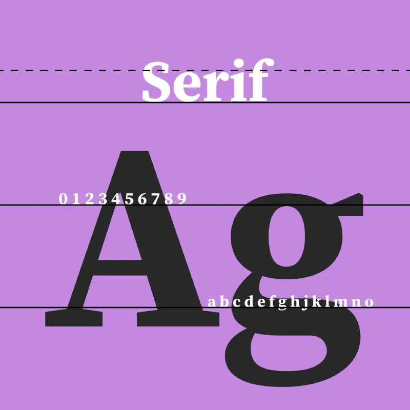
Notion’s built-in Serif option uses Georgia, a classic screen-optimized serif. It’s a good fit for long-form writing or content meant to feel more editorial. Georgia pairs well with clean sans-serifs for contrast.
What monospace font does Notion use?
Notion’s Mono option uses a standard monospaced font, suited for code blocks and technical drafts.
It gives pages a retro, terminal-style feel. Developers sometimes prefer it for note-taking during technical work.
Can you add custom fonts to Notion?
Not natively. Notion doesn’t support custom font uploads inside the app.
Workarounds exist: the Notion Font Changer browser extension works in Chrome-based browsers, and tools like Simple.ink allow custom fonts on Notion-powered websites.
Is Inter free to download and use?
Yes. Inter is licensed under the SIL Open Font License 1.1, making it free for personal and commercial use.
Download it from Google Fonts or directly from github.com/rsms/inter for the full variable font version with all OpenType features.
What fonts are similar to the one Notion uses?
The closest free alternatives to Inter are DM Sans, Work Sans, and IBM Plex Sans, all available on Google Fonts.
Check out this guide on DM Sans font pairing if you want to use it in your own projects.
Why did Notion choose Inter as its font?
Inter was built for screen-heavy interfaces where text density is high. Its tall x-height and open apertures reduce eye strain during long sessions, which fits Notion’s use case well.
Does Notion use the same font on mobile and desktop?
Yes. Inter renders consistently across Notion’s web app, desktop app, and mobile apps on iOS and Android.
This cross-platform font consistency is one of Inter’s main strengths as a UI typeface, since it was specifically designed for screen rendering at variable sizes.
Conclusion
If you’ve ever wondered what font does Notion use, the answer is Inter, a neo-grotesque sans-serif built specifically for screen interfaces and long reading sessions.
The choice isn’t accidental. Inter’s tall x-height, open apertures, and neutral character make it one of the most practical UI typefaces available today, and it costs nothing to license.
Notion gives you 3 built-in font options: Default, Serif, and Mono. For anything beyond that, browser extensions and third-party tools fill the gap.
If you want to use Inter in your own projects, grab it from Google Fonts or the inter font pairing guide for combination ideas that work well across both UI and editorial contexts.

Renowned for his expertise in logo design and visual branding, Bogdan has developed a multitude of logos for various clients.
His skills extend to creating posters, vector illustrations, business cards, and brochures. Additionally, Bogdan's UI kits were featured on marketplaces like Visual Hierarchy and UI8.
He also wrote in the past years on sites like Design Your Way, WebDesignerDepot, WPDean, Designmodo, Speckyboy, Slider Revolution, and more.
- The Windsurf Logo History, Colors, Font, And Meaning - 10 October 2026
- How to Remove Background From Product Photos (No Photoshop) - 10 October 2026
- How Designers can Build a Stronger Online Creative Identity - 9 October 2026

Bogdan Sandu is a seasoned designer who has been designing websites since 2008. Renowned for his expertise in logo design and visual branding, Bogdan has developed a multitude of logos for various clients. His skills extend to creating posters, vector illustrations, business cards, and brochures. Additionally, Bogdan's UI kits were featured on marketplaces like Visual Hierarchy and UI8. He also wrote in the past years on sites like Design Your Way, WebDesignerDepot, WPDean, Designmodo, Speckyboy, Slider Revolution, and more.
You Might Also Like