Cinematic Fonts: What Font Does Wes Anderson Use?
Ever paused a Wes Anderson film just to admire the meticulously crafted titles or captions? It’s no secret that typography plays a monumental role in his distinctive cinematic universe.
The question of what font does Wes Anderson use isn’t just curiosity—it’s an entryway into understanding his immersive, meticulously crafted visual storytelling.
This article takes you on a typographic tour of Anderson’s films, exploring how his iconic font choices serve more than mere aesthetics—they enhance narratives, build distinctive characters, and create instantly recognizable brand identity.
From the elegant scrolls of Futura in “The Royal Tenenbaums” to the bespoke lettering of “Moonrise Kingdom” by Jessica Hische, each font maps out an intimate aspect of his narrative style.
Dive deep into how these typographic decisions amplify mood, define periods, and shape perceptions, threading through them Wes Anderson’s signature charm and meticulous detail.
Whether you’re a design enthusiast, a film scholar, or a fan, here’s your lens to magnify one of the many fine details that fashion Wes Anderson’s films into timeless pieces.
Wes Anderson’s Signature Typography
The recurring use of specific typefaces across various films
Peeking into Wes Anderson’s toolbox rarely surprises us with typical choices, especially when pondering over what font does Wes Anderson use.
He’s got a penchant for specific typefaces that consistently bleed into the canvas of his filmography.
Remember “The Royal Tenenbaums”? The screen practically wandered through chapters bedecked in Futura.
Oh, and wasn’t it a hallmark, that crispness framing the eccentricity of the Tenenbaum family drama?
Then, a subtle cascade to alternative choices.
The picturesque landscapes and vibrant styles hinted at a transition—other typefaces began to emerge, styling each frame, enhancing quirks, and embedding personality.
Case studies from specific films
“The Royal Tenenbaums” — The Futura essay here is as extensive as the list of quirks housed by the movie.
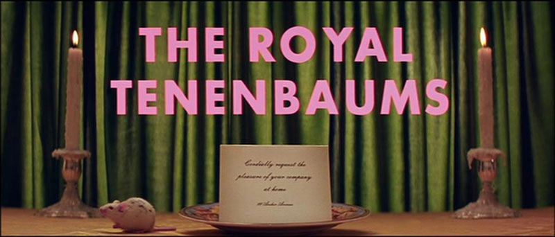
It wasn’t just the choice; it’s about employing it to convey unique emotional textures that push boundaries well beyond clichéd dialogues.
“Moonrise Kingdom” is where the winds changed.
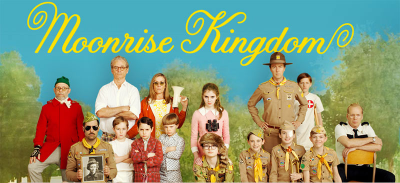
Enter Jessica Hische, with her magic wand, crafting the Tilda font that whispered of innocence while shouting of adventures.
Each letter, a tale spindled with youthful fervor.
“The Grand Budapest Hotel” — Imagine a tapestry, East European to its core, each stitch a typeface narrating a history, a romance entwined with a thrilling escape.
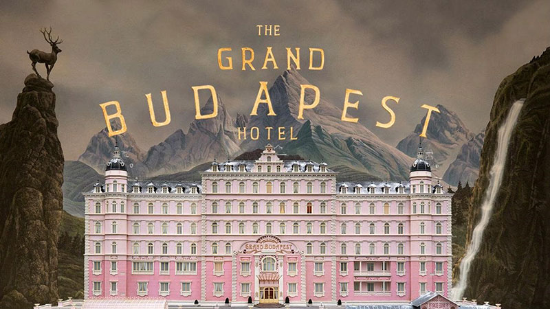
That’s what the fonts in Grand Budapest weave into the cinematic fabric.
The main fonts used in The Grand Budapest Hotel are:
- Archer: This font was used for the movie’s title and credits.
- Caslon Initials: This free font was used to recreate the vintage, old-fashioned look of the typography in The Grand Budapest Hotel.
- The font used for the actual hotel signage and other on-screen text was hand-drawn rather than a pre-existing typeface.
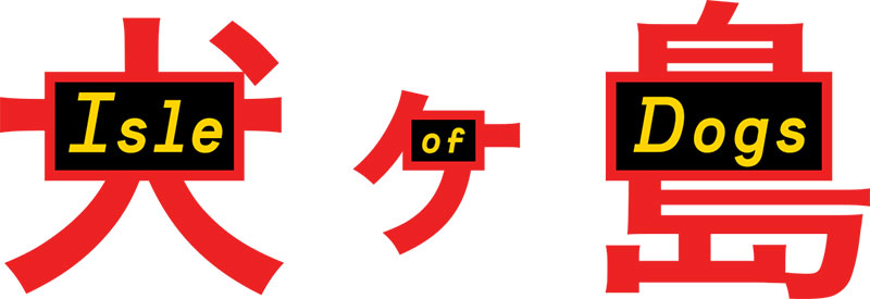
“Isle of Dogs” showcases an intriguing cosmopolis of typography, blending Eastern scripts with Western discipline, a visual symphony orchestrated through letterforms which speak a universal language.
Typographic Themes and Visual Storytelling
How typography contributes to the film’s narrativeTypography isn’t just type on a screen; it’s a time machine and a map.
The placement, the font choice, each element elevates the setting, emphasizing the era, or unfolding the geography of a scene without a single spoken word.
This is visual power, harnessed and directed to serve the narrative, layering it with deeper contextual meaning and a rooted sense of place.
Characters aren’t merely played by actors; they’re built, piece by piece, using not just fabric and dialogue but also through typography.
A character’s evolution or a subtle background tale can nest quietly within the letter spaces used in their world.
Typography in scene setting and mood creation
There’s an undeniable impact these typefaces have on us viewers.
The right choice can soften us up for a coming loss or jolt us into alertness with its stark boldness.
Wes Anderson’s typographic landscapes are mood pieces, each frame deliberated, ensuring that our emotions are perfectly aligned with his vision.
And how does it blend? Imagine a canvas where typography dances gracefully with symmetry, color schemes, and camera movements to create scenes that stick.
It never overpowers; it accentuates, enhancing storytelling through visual cohesion.
Analysis of Font Choices
Artistic implications of font selection
Fonts in Wes Anderson’s films do more than just fill a visual space; they’re an extension of his artistic self.
The retro, vintage styles chosen echo a nostalgia that’s unmistakably Andersonian.
He crafts periods and emotions not just through decor but through deliberate typographic choices that resonate with his thematic signatures.
Technical aspects of font usage in cinema
Designing this is no mere picking from a font dropdown.
It involves a meticulous blend of artistic flair and technical acumen.
Fonts for film have to be legible at varying screen sizes, harmonious with complex color palettes, and adaptable across diverse media formats—a high-stakes game where artistic vision meets the rigors of cinematic technology.
The Role of Typography in Wes Anderson’s Brand
Brand consistency through typography
Ever notice how you can spot a Wes Anderson film from just a title card? That’s the magic of consistent typographic branding.
Each font is a brushstroke painting a broader picture—distinct, memorable, undeniably his.
This recognition ties his viewers to a unique cinematic experience, his brand.
Influence on design beyond cinema
It’s not confined to the big screen.
Anderson’s typography has trickled down, influencing areas beyond filmdom.
Graphic designs, advertisements, and even product packaging sip from this rich fountain of stylistic innovation.
His typographic decisions inspire, finding a place in various creatives’ toolkit, playing a pivotal role between cinema and viewer, between art and its audience.
FAQ On What Font Wes Anderson Uses
What font is most famously used by Wes Anderson in his films?
Futura often graces the screen in Wes Anderson’s movies, providing that crisp, clean line that complements his unique storytelling and visual composition.
Does Wes Anderson use the same font across all his films?
No, while Futura is heavily favored, especially in earlier films like “The Royal Tenenbaums,” Anderson explores a variety of typefaces, each suited to the film’s aesthetic—from hand-designed fonts by Jessica Hische in “Moonrise Kingdom” to more eclectic choices reflecting local cultures in films like “The Grand Budapest Hotel.”
What typographic style defines Wes Anderson’s branding?
Anderson’s typographic style leans towards the nostalgic, often embodying vintage and retro themes that sync beautifully with his narrative and visual style.
This connection is reflected in each frame, heavily influencing the film’s brand identity.
Is there a specific reason Wes Anderson chooses such distinctive fonts?
Wes Anderson chooses fonts that complement his meticulous production design and contribute to the overall narrative.
Each font choice enhances the storytelling, helping to set the period, mood, and personality of the characters.
How does the typography in Wes Anderson’s films affect audience perception?
Typography in Anderson’s films meticulously sets scenes, enhances moods, and subtly augments narrative layers.
This thoughtful placement ensures viewers are not just watching a story unfold but are immersed in the artistically rich world Wes crafts.
Have any fonts been created specifically for Wes Anderson’s films?
Yes, for “Moonrise Kingdom,” Jessica Hische created bespoke hand-lettering which complements the film’s unique aesthetic and narrative style, showcasing how Anderson’s vision inspires custom typographic creations.
What role does vintage typography play in Wes Anderson’s films?
Vintage typography in Wes Anderson’s work underlines the thematic elements of nostalgia and whimsy that are signatures of his cinema.
These fonts resonate with his distinctive use of color, symmetry, and framing to transport viewers to a bygone era.
Can I use Wes Anderson-style fonts in my own designs?
Certainly! Many fonts that resonate with Wes Anderson’s style are accessible for public use.
Fonts like Futura are available widely, but always ensure you possess the right licenses for commercial projects.
What influences Wes Anderson’s choice of fonts?
Anderson’s selection is deeply influenced by the film’s era, location, and the personalities of his characters.
His meticulous nature ensures that every typographic detail complements the film’s visual and thematic motifs.
How does Wes Anderson’s typographic consistency contribute to his films’ brand identity?
The consistent typography fosters a strong brand recognition, enabling audiences to identify Anderson’s films swiftly.
This consistency supports a visually cohesive universe that fans not only recognize but also deeply appreciate for its artistic integrity and stylistic continuity.
Conclusion
Diving into what font Wes Anderson uses unwraps layers of his cinematic identity, each typeface a key to his visual narratives.
Beyond the consistency Futura provides, the forays into hand-designed fonts or culturally resonant typefaces amplify his films’ emotional textures.
Type harmonizes with his iconic aesthetic, telling stories that extend beyond spoken words.
Exploring these typographic choices, we glimpse how deeply fonts influence visual storytelling and brand identity in cinema.
In the realms of Wes Anderson’s meticulously crafted worlds, every font frames a time period or fleshes out characters—all integral to his unmistakable style.
It’s not just a font; it’s an invitation to a meticulously built universe, where every letter on the screen is a brushstroke in the larger picture of Anderson’s visionary tableau.
Bogdan Sandu, a seasoned designer with 15 years of diverse experience, has been designing websites since 2008.
Renowned for his expertise in logo design and visual branding, Bogdan has developed a multitude of logos for various clients.
His skills extend to creating posters, vector illustrations, business cards, and brochures. Additionally, Bogdan's UI kits were featured on marketplaces like Visual Hierarchy and UI8.
Latest posts by Bogdan Sandu (see all)
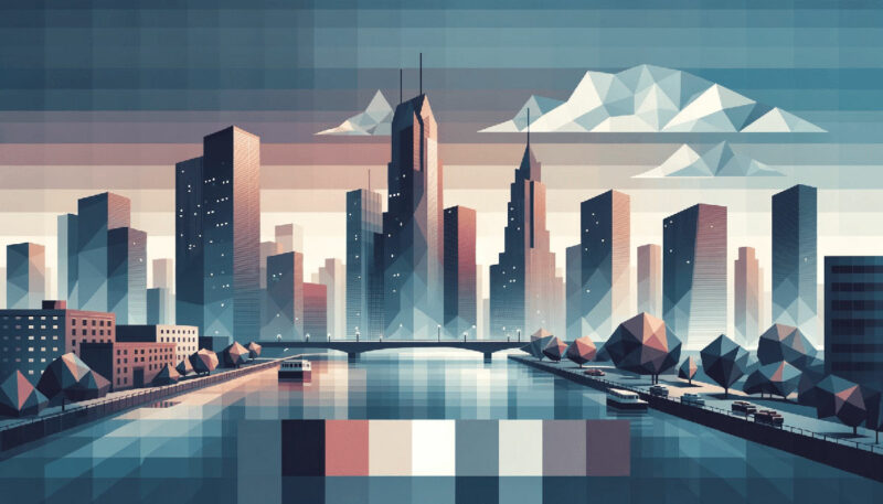
- Graceful Grays: Timeless Gray Color Palettes for Any Project - 20 May 2024
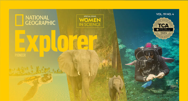
- Exploration in Type: What Font Does National Geographic Use? - 20 May 2024
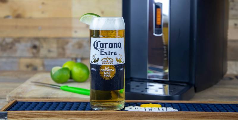
- The Corona Logo History, Colors, Font, And Meaning - 19 May 2024